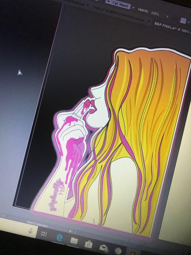
Today I have been messing around with the type for the front of Postcard 1.
I originally had the idea of “Graphically Pink” dripping down the arm but started experimenting with other ideas…
I figured that the pinkness of the overall image is actually quite obvious, I feel that when you look at the image you automatically see a love of pink and lipstick, the need for “Graphically Pink” in writing possibly isn’t needed. The colours are vibrant and I am hoping the overall image explains itself! I then went on to thinking about linking the 3 postcards as a series… I wanted some kind of logo or writing on this postcard; Ideally I wanted something that I could link all 3 with. The only other idea I have is the “Lost Angeleno” design that I did from my learning log sketchbook. I took that drawing and imported it into Illustrator and traced around it to create “Lost Angeleno” I then decided that I wanted to save the “Lost Angeleno” mainly for the LA inspired third postcard… I want to however link all 3 postcards with the same concept so started thinking of new ways to incorporate maybe just the “Angeleno” part on all 3 postcards. This first postcard represents pink so I decided on “Pink Angeleno” the second postcard shall incorporate the name “Angeleno” somehow and the third postcard shall be “Lost Angeleno”. They then all become part of the “Angeleno” series. The woman in my illustration shall be known as “Angeleno” as a whole.
What I am trying to create is a brand for these postcards; when you put them together you know they belong together and a theme runs throughout consistently.
The original “Lost Angeleno” sketch from my learning log sketchbookBeing digitally drawn using IllustratorWhat I have so far…
I wanted the writing on the first postcard to look like it was dripping with the melted lipstick. I watched a few Illustrator tutorials and read tips and advice and decided on creating this one. I quite like how it has turned out. It is still hand drawn from my original sketch but it has been further digitally created and altered to tie in with the theme of postcard 1. I feel I am gaining new skills and growing in confidence with creating in digital again.
So I haven’t updated my blog for a while now… but that doesn’t mean I haven’t been working on my assignment!…
I feel like whoever reads this blog update and is following my progress with my postcards are going to be like “Hurry up and complete it already!!” I seem to have been milking this out for ages! – As I’ve said previously though I struggle with time; I get 2 hours a day max and being a perfectionist mixed with the fact I am trying to relearn skills and learn new ways digitally might slow me down a tad!
This post shows how I have tweaked the shape of the strands of hair, changed the colours, kept the neon effect and am now messing around with new ways to display the “Graphically Pink” name. I had the idea to drip the lipstick down her arm and potentially have the writing coming from that.
I looked at a tutorial to try and get realistic drip effects. I have started to put this into action as you will see from the image I have uploaded! The next stage is to get the drips exactly as I want them to appear and drip the “Graphically Pink” from them and then work on adding depth to the drips; making them look more realistic by adding effects and blends.
I have drawn out postcard 1 on Illustrator….. The hard task is now deciding how I want it to look and which colour scheme to go with!
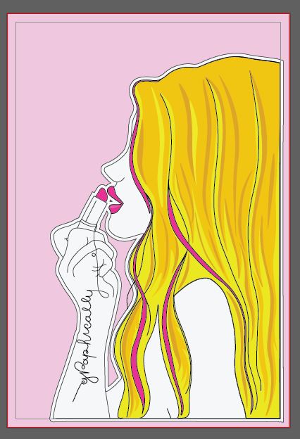
I originally stated I wanted the postcards to all be the same colours (Pink, Black and white) and be very simplistic and just simple line drawings. I have now had a rethink about this…
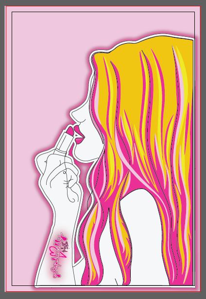
In my learning log sketchbook I collected examples from Paperchase of neon cards that I like the style and look of. I tried to replicate this in my Graphically Pink logo and I have now looked into replicating this for the first postcard. This would be the middle image above; I believe that this stands out the most because there is a contrast in colours, however I am still unsure that it stands out as well as the first image due to the hair being “busy”. I might change the blonde in the hair to a light pink yet to try and see if that makes a difference. The pink and the Black work well together, it is a pop of colour. I still like the first simplistic version though, I feel that the pink background works well against the simple hair colours. I am wondering though whether this would be enough to attract attention though and whether it would be enough to attract people to potentially buy into it.
I have also put cost implications onto my designs for industry printing by adding more colours.
I shall have a look into the pros and cons of each design… relook again tomorrow and see where I can further improve!
Positives:
The colours work well together
The hair colours work well and it doesn’t look too “busy”
There are elements of pink throughout, keeping the theme but not overloading the design with pink
It is keeping within what I originally stated I wanted by being simplistic and keeping its line drawing element.
Cons:
The colours don’t “pop” there is no contrast in colours
Nothing stands out on the whole image
Positives:
The neon affect works
“Graphically pink” comes across with the pink although maybe not entirely with the “graphic” (I feel greys when I think of that)
The colours contrast; there is a pop of colour.
Cons:
The hair feels too “busy” whether there is too much line drawing and colours within it or whether it is the yellow not working with the other colours I will have to rethink
Mixture of the first 2 combined
Positives:
has the neon affect
conveys the pink
Cons:
Still needs a “wow” factor – to stand out more.
The logo on the postcards also needs work and improvement. I have placed it on there for now to get a feel for how it might look and also so I am clear on the placement of it.
Last night I finished the mock up drawings of 3 of my postcards.
I have chosen to use Black and Pink as the final colours as it is simplistic, modern and the colours really work together. The illustration is based of very simplistic lines and a basic form. I have used Pink to highlight the important areas of the drawing. Having it all coloured in would draw the attention away from the key parts of the artwork. The “Lost Angelino” heart features on 2 of the postcards; I want this to be the logo for the series of postcards.
Postcard 1: She didn’t choose the pink life.. the pink life chose HER.
This postcard is the one that relates to “me” the most. It reflects self branding more than the other 2 because it has the pink lipstick which is what I am known for, it has the use of my Graphically Pink logo running down her arm from the lipstick. This reflects the blog name and also explains what I am all about. The illustration itself (although not of me! – she has a far better side profile and nose than what I ever will! :p) is in the style of me; I love to draw illustrations and drawings like this one. The woman in my drawing comes across as strong, independent and full of confidence! (She can conquer the world with that lipstick!) Hopefully when people view this postcard they will instantly recognise and link it back to me.
Postcard 2: ooh LA LA
This postcard has a cross between LA and everything Girl empowered, feminism and Girl Power! Don’t get me wrong…. I mean, I’ve dated or entertained in my time a few nasty egotistic, narcissistic men who have been intimidated by the fact I live my life by MY RULES… but by no means am I am full blown “man hate” feminist…YET! I like a good guy more than the next gal! 😉 but this postcard is representing the fact that I am all for girl code; standing by each other and lifting each other up rather than tearing each other down. Women don’t cut themselves a lot of slack and in todays day and age there is so much pressure on women to conform to standards; whether that be for our men, how we look, what we wear or in our careers… I am all for women being strong, independent and owning their own voice and rights to be whoever they want to be. This is the message I want to convey in this postcard indirectly.
The woman shows a softer feminine *vulnerable side (vulnerable in no way meaning to be walked over or taken advantage of; more like an innocent sweetness) with the fact she is bare skinned (exposed for who she actually is) and in her underwear making a strong statement.. but then she is also covered in sailor style tattoos which show an edgier, unique side to her. A side that is not scared to express who she is. Tattoos interest me; they are an expression of who you are, they can be beautiful, unique art pieces! The fact she is posing in her underwear also shows that she is not scared to reveal her true self to people or scared of what people might portray her as or dictated to what she should look like or wear. It shows a strong side. It also links back to how I have been stereotyped so much over the past few years in my appearance; I am trying to convey that it is ok to be who you are, to be who you want to be.
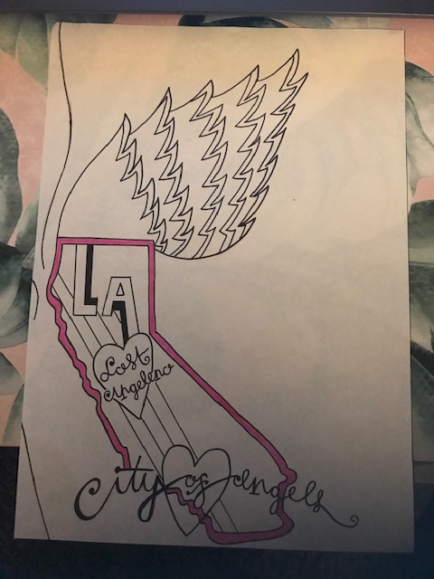
Postcard 3: Take my heart and fly with it (to LA)
This postcard represents my absolute love of LA.
I tried to link “The city of Angels” in with the illustration. The woman is an Angel or an “Angeleno” from LA. In my first drawings I drew the basic outlines of wings and had the idea to put a map inside one of the wings of California. The idea then developed into making the bottom wing the shape of the state of California. On a map this is what the outline of California would look like. The heart at the bottom is located where LA lies. This postcard uses Pink in one place; to outline the state of California.
I am not keen on the layout of the postcard however the image needed to be positioned more on the left because it needed to join onto the other 2 postcards. It is definitely the most simple out of the 3 designs but I think from looking at it that it is quite self explanatory.
Instagrammable
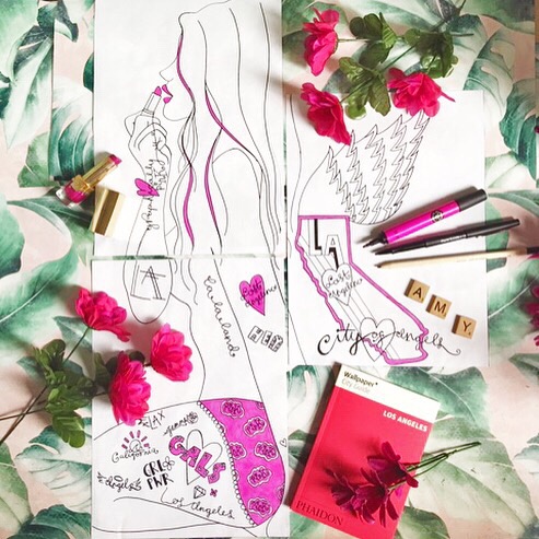
Doing the flat lay photography for these mock ups was fun. I wanted to upload these to my Instagram to see what the reaction would be. I wanted to do it in a more grand way though so I decided to use the App called “Giant square” to spread the image out over several squares. Overall it worked well. It makes my Instagram page jump out and I would use it again… however each image as an individual came out real low res which disappointed me! I had cleaned the image up in Photoshop and saved it as a high quality Jpg so I was surprised; I have put it down maybe to the app.
All that’s left now is to design the back of the postcards and to redraw these out in Illustrator and downsize them to A6 (postcard size) I am going to use the captions (next to each postcard on here) to be captions on the back of the postcard designs.
Over the last few days I have been looking into ideas for 3 of my postcards. I know the brief is to create a minimum of 3, however I want to create 6.
I want to look into Aesthetics v Ergonomics. I tried to look into design terminology that best described appearances and how the mind and body work and the two that stood out to me and best described what I am trying to achieve were Aesthetics and Ergonomics.
What I mean by this idea is that the expected final outcome would be for me to create 3 postcards based purely around who I am and what I like etc… These could be images relating to what I look like, what my favourite colours are, images potentially of my interests and hobbies. From looking at these postcards you would get a look into the aesthetics of who I am. Aesthetics are superficial in this case. I want to get across who I am beyond what you see in appearance.
This is where I thought of a second batch of postcards relating to the mind and body and am calling them the “ergonomics”. Ergonomics is how the body and mind react or work with something. You can mould designs to react to a human body; i.e you can design a pen with a spongy finger grip to make it more comfortable to hold and for the hand to write with. I want to create 3 postcards based purely around the mind and body of me. How my mind and body react.
I have already stated that the first 3 postcards are going to be very visual, a lot of pink and a lot of my influence. Hopefully they will be attractive to look at and be appealing to a female target audience. I want them to represent Graphically Pink, my love of LA and Girl empowerment.
From my research into postcards I then started to look at how I could make them into a series.. Looking at the Cosy Club examples they all link and use the same imagery and typography. I wanted to be able to put all mine side by side and be able to link them all together. Branding is very important; particularly self branding which is what this is to a certain degree. It is showcasing who I am and what I can achieve. I looked into different layouts and ways in which I could tie them all in together.
The idea I initially have is a side profile illustration I have drawn of a girl applying lipstick. I thought that this could be an idea for postcard 1 and tie in with the Graphically Pink and the fact that I am renowned for my bright pink lip colours… however, I then got to think about how it might look too repetitive repeating the same illustration over the series of 3 postcards each with a different theme (1 with Graphically Pink, 2 with LA etc) I then had the idea of what if I used the same illustration but cut it into 3 parts over the series of 3 postcards… In theory when the postcards are laid out on a table for example and placed together they will form one main big image but each one as individuals would still tell their own story…
What I have so far is a rough idea of how this could work. I have my drawn illustration all put together as one image but cut in places to form the 3 postcards. The illustration in general (although it is not of me!) represents pieces of me. It is very girly and feminine. Pink is the main theme. It has an almost innocent vulnerability to it showing a softer personality but also has a strong underlying message in certain parts of it.
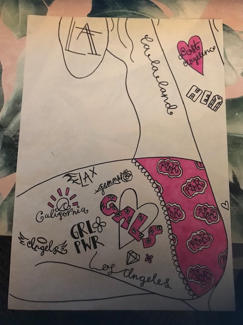
The first postcard would purely be the image of the girl applying the pink lipstick with the “Graphically Pink” running down her arm. The second image is her lower half of her body. I have tried to make this very feminine and delicate with the use of her naked top half body and pink, lacy, girly underwear. The nakedness of her top half and the use of underwear I am still debating.. It has to reflect me and what I stand for and the last impression I want is for the image to be taken out of context! (flashback to 2005 when I drew a business card with one of my fashion illustrations on it and the lecturer asked me if it was my intention to become a stripper when I got older with my “long legs”.. hmmm!) This is where I would definitely have to think about the cultural diversity of a design and who it might offend. The girls lower body though is covered in sailor style tattoos; each one represents either Pink, LA or girl empowerment. (Tattoo design; another interest of mine!) Although the girl shows a slight vulnerability in being half naked and in underwear she does portray a tough, sassy, rebellious streak with her feminist tattoos. There is a side to this that I am trying to get across that girls can be girls, women can be women and still have a voice, Have their own opinions and be who or dress how they want and still be strong individuals. The underwear also is meant to relate back to the Barbie logo or the Moschino Barbie logo which I showed in my learning log pages and also possibly to the meaning behind the Barbie branding “Girls can be whoever they want to be”.
Be who you are basically.
It still has a lot of improvement… There are still things I need to rethink and alter and the third postcard which is the wings relating to the city of Angels is still very much at the initial ideas stage.
one Initial Ideas sketches pageA rough layout of my illustration – trying to piece together how I want it to look.
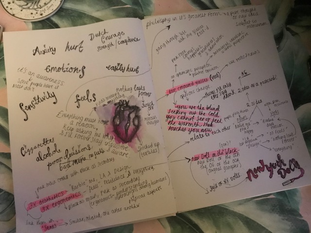
The heart… It is the core of our soul… It beats, it feels, it breaks a million times over but it is RESILIENT.
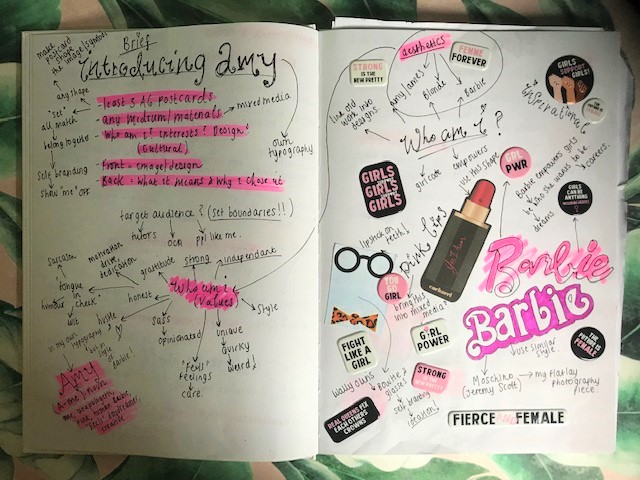
Resilience… I would say it is one of my greatest traits and its made me think.. Assignment one is based upon our likes/interests and who we are from first impressions… I can’t help but feel how superficial that seems though? I have had several people over the last few weeks telling me that who they imagine me to be (my aesthetics/my “branding”) is not what they expected at all… that in fact I run quite deep. What if I could base some of my ideas then about who I am underneath?
It takes courage to open up… to be your truest, most authentic self. Most of us probably take this for granted. Self love is overlooked. I would say my most attractive feature is my heart. It beats… it keeps me alive but most importantly it “feels”. It shatters into millions of pieces time and time over but it is resilient. I am resilient.
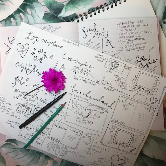
I am a deep thinker.. I always have been.. I overthink everything, I always ask myself why to each situation I face; everything to me has a reason and a meaning. My moods come in waves -I write down emotions I feel, thoughts, ideas… Below you will see a spread from my learning blog. I have brainstormed ideas around “the heart” I have played with my emotions, toyed with my feelings and asked myself how I can convey a message of who my soul actually is without needing to over expose raw feelings or use words. I have based some of this research around previous experiences, current moods and feelings and past events that has evoked reactions.
As I write this I already feel like I am way behind on my work already! As I said in one of my earlier blog posts I have the fear very much of failing or bad things happening! Anxiety very much creeps in! I have been struggling with time lately.. I have been reading, watching tutorials, making notes, sketching, brainstorming, getting inspired! juggling 2 jobs, trying to stay visible to the outside world and maintaining a social life!.. Almost 3 weeks in I think it’s time to put myself out there and show what I have been working on so far! – I have to admit getting to grips with wordpress and how I want to lay my blog out has taken a massive chunk of the limited time I have had! What I can say though is that what I have done so far I have really enjoyed! At home I have created my own little sanctuary to escape and create and so far I have some great ideas (I think!) that I can’t wait to develop! It’s Easter holidays for me now and 2 weeks to dedicate solely on my first assignment!
Trying to take people through your mindset and thoughts can be exhausting and sometimes it is difficult to communicate a thought process to someone who is completely unfamiliar with who you are and what you are all about! .. therefore I have included sketches from my learning log sketchbook! I have to say when I started I was totally confused as to what I should put in here but now I absolutely love this book already! 🙂
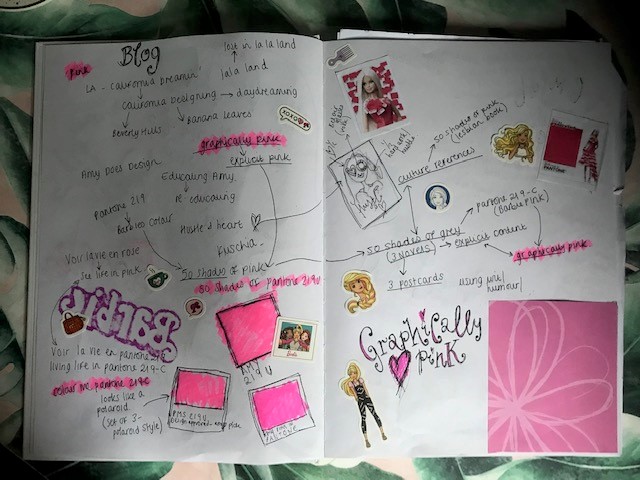
The first pages of this which I shall show you first basically explore around the ideas of who I am; my core values, morals and beliefs and then explore more into who I am in appearance and who I am in relation to my likes/dislikes/favourite places etc. As I wrote and sketched these thoughts I thought to myself “How do people see you and how would you like strangers to see you?” I have played very much on my nickname and the first things people think and see when they look at me. Barbie, blonde and pink. I do not want it however to look materialistic and narcissistic and purely based on aesthetics. I have toyed around the Barbie idea, the fact that it is “girl empowered” and she can be “whoever she wants to be” . I have explored colours, the meaning behind certain colours. I have taken pink as a colour and developed into further ideas for my blog name and any potential text that I might want to appear on my postcards. I have explored around the idea of a “series” of postcards, repetition and continuation. Type is another big influence I want to put on my postcards; I have studied tutorials and already started to form ideas around what I might want to create in my designs.
LA is one of my favourite places in the world, I want to include this somewhere in one of the postcards. I have attempted to scribble down initial ideas and played with words and names.
I wanted my first pages of my learning log sketchbook to be engaging; not only to me but also to anyone who wishes to look through it and get a better understanding into my mindset. I have included things I have collected which inspire me and give me ideas. I have looked into Ideograms and certain designers who used this into their own branding.
After completing the first few pages of my first initial ideas and thoughts I now have an idea where I want to head for my designs and postcards. I now plan on starting some sketchbook pages and developing these ideas further!