A crucial part of research is to see what is already out there on the covers of HG Wells books and to also see what the competing book titles are.
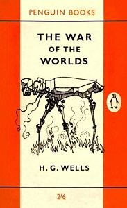
During an afternoon shopping sesh I decided to look in my local bookshop and see if I could find any of his books! I did! – only 2 though; both war of the worlds. I actually bought one so that I could dip in and out and read parts to maybe inspire me! The cover design on it though is not particularly inspiring or innovating! I then also decided to view some of the books sitting alongside it and see what it was competing against.
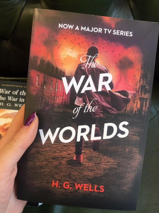

This is the copy that I bought.
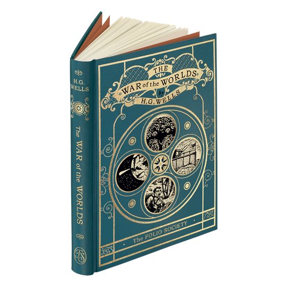
The copies of HG Wells The war of the worlds that I found did not inspire me much… The copy that I bought is a very simple cover. It uses just one illustration, a basic layout and very simple typography, (serif font). The book looks as though it is designed on a low budget. The book can not be aged though looking how it does. The other copy is slightly better but it still not depict the war of the worlds in a way in which I think it should. Again, it uses an illustration which shows the war happening. The use of colours in the illustration really give you a mood for what the feelings and the story might be. The use of red brings about danger, fire and mayhem. It uses a mixture of sans serif and serif script type for the title, I think that this is to give contrast and to make WAR and WORLD stand out. The script font is possibly in reference to the fact that the story is old. The illustration does most of the talking about what the book might be about, you buy into the book because of the illustration.
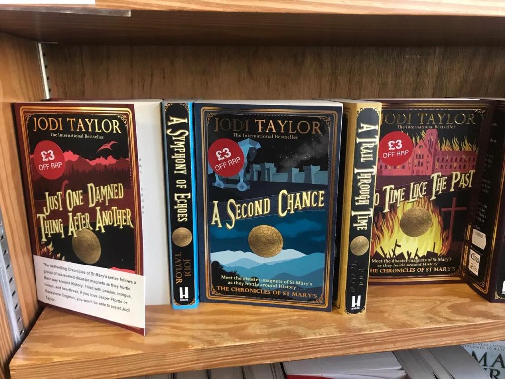
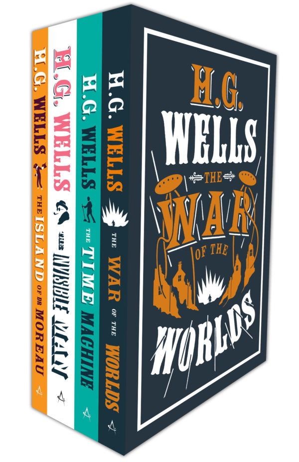
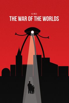
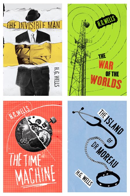
The photos above were sat alongside The war of the worlds. These show a set of 3 books. There is repetition in the designs; the typography, the layout and they all use 2 colours. They are bold, modern and stand out. These are more what I would have had in mind for HG Wells books. The style of writing and the typography they have used is like modern vintage, it is in an old style but made modern by the use of colour and placement on the cover. You can see that the books obviously follow on from each other.
- Same colours used on each
- vibrant colours
- modern
- Same page layout
- Author at the top of the cover
- Same image used on all three
- Same typography and same layout
- same ornate border around all 3
I then also remembered the fact that my dad left all his vinyl records at my house when him and my mum split… one of those was the war of the worlds soundtrack. I dug it out just to see what the cover of that looked like.
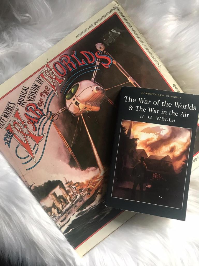
Although this vinyl record is not a book cover, it definitely works. The typeface matches the era of the story but also ties in well with the main image, there is movement. The image used gets your imagination working and entices you in to learn more. The illustration depicts a scene from the book where they are trying to escape down the Thames in a boat.
I then decided to search the internet for images of his book covers:


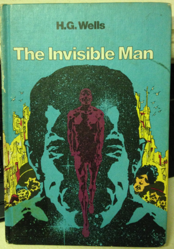


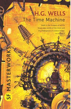
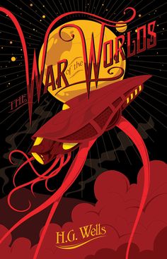
A lot of these covers are really old fashioned. I think that most were designed possibly in the 60s through to the late 70s judging by the artwork, the colours and the typography used. There are some hardback editions in here which I know are not relevant as the brief states paperback, but I like the intricate, detail on them. The use of the gold on the front really makes the piece a work of art. It looks expensive and timeless. There is a penguin edition of War of the worlds in there which has a sketch line drawing of what appears to be an alien, it reminded me maybe of the sketches that HG Wells would have drawn onto the pages of his diary (as I found out in my research about him).
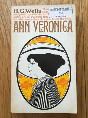
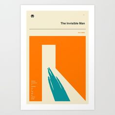
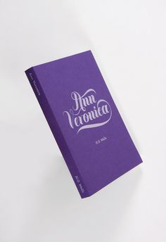
I want to look more into book covers for Ann Veronica as I felt there was not great deal of exciting covers for this one! One of the ones I found which is featured above uses what looks like very Art Deco typography. The typography is possibly a little early for the time the book went to publish.. I always believe Art Deco to be from 1920s onwards. Ann Veronica went to print in 1909. When I think of Ann Veronica I think of Mary Poppins because it is a similar time to when this story is set with the suffragette women!
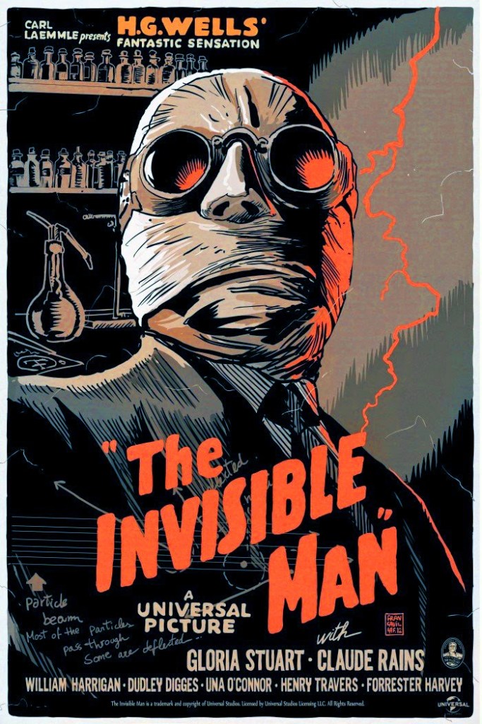
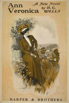
I did however find this poster, I took inspiration from the illustration mostly! It is in a modern yet vintage illustrative style, it reminds me of the illustrations that were popular and widely used in the 1960s.

I am still not a fan of the style of typography used but it shows how you can bring Ann Veronica into today without making her appear stuffy and old fashioned! (From what I believe of the story she is supposed to be young and rebellious!) The text is warped and twisted, I think that this is supposed to look like her high neck and shoulders. The main body text narrows in to create what I interpret to be her small nipped in waist. I wouldn’t say though that it is the nicest of layouts to look at. My eyes are taken everywhere and it is not particularly comfortable to read.
I think the next steps are to decide what books I want to design covers for, research more into the stories and pick out key ideas that I could use in the designs. I need to look more into the the Art and design eras from around the time period the books were published too. I want to make a link between “then and now” and make my designs “modern vintage”.


