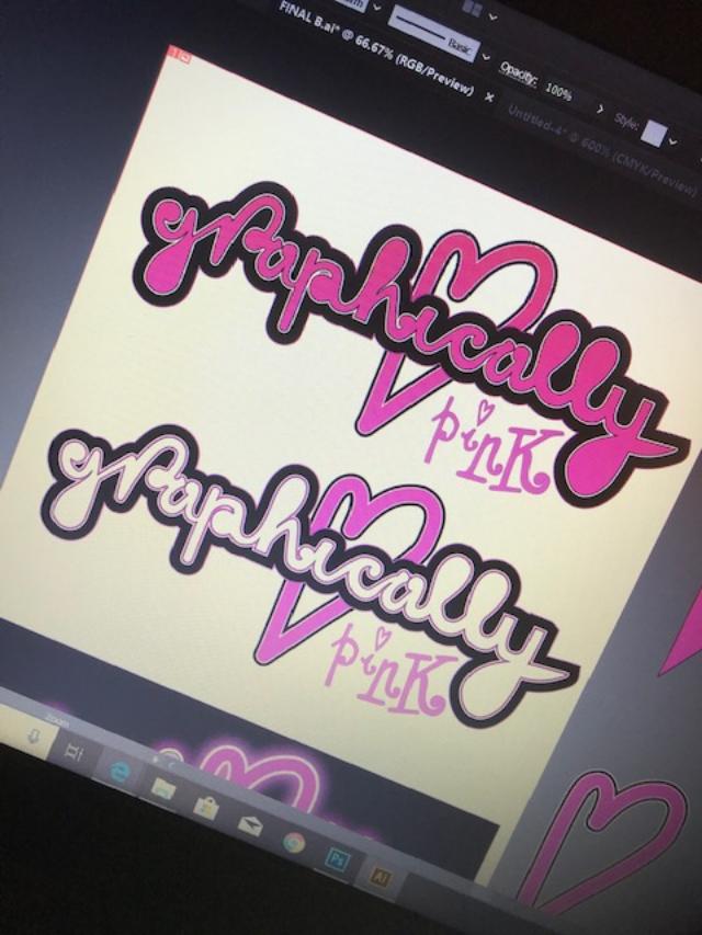
I know it’s not crucial to have this on my blog but I want to see it through to the end so that my page has some sort of identity! I am still getting back into using Illustrator! – Its been a long while! I’ve been having a go messing around with different effects to see what I can come up with! It was a 1am finish last night/this morning so what I have is still in my eyes a work in progress! – I am still not happy with what I see! It still comes across as flat and amateur looking in my eyes.. Although I wanted a fun logo; something big and bold, nothing too serious that conveys everything pink and which reflects me and my blog. It also have influence and inspiration from the Barbie logo and the Moschino Barbie logo which I have documented in my research and from my first ideas for assignment one.
Changing the colour scheme to try and see which one works better! – The logo is inspired by the “Barbie” and the Moschino Barbie logo by Jeremy Scott.
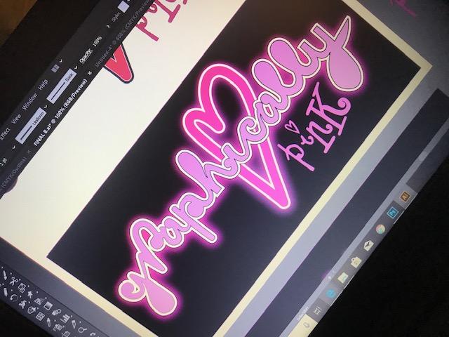
Trying it out in Neon
I like the neon effect – some of the postcards I documented in my learning log sketchbook use a similar neon effect. I might adjust this slightly though; I might add another Gaussian blur around the white areas on the lettering to try and brighten that glow. I like this but it is how well it would work without the black background.
Update on my logo design and layout for my blog!..
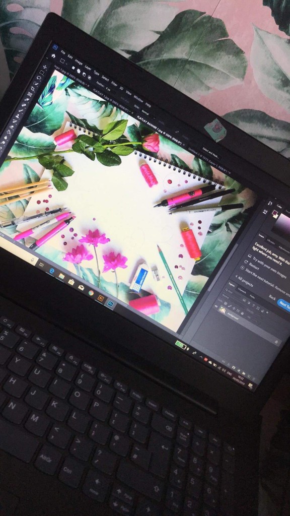
From looking on the internet and researching into how I could do a logo for the banner on my page I have decided to create and photograph a flatlay piece. I wanted it to convey “pink” but also to communicate art and design.
I decided to use my sketchbook and lay pink pantone pens, pink colouring pencils and some of my favourite marker pens etc to lay around the outside of it. I also went out and bought some pink flowers to lay around the outside
This is an update to my logo design! – Although it is nowhere near the finish line it has made progress!
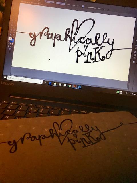
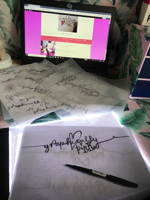
I took my sketch which you saw from my previous post and I cleaned it up in Photoshop changing the levels and making it into a black and white logo. I then imported it into Illustrator and image traced around the whole thing. The painful task I now have is smoothing out all the rough anchor points! At the moment it is looking flat in appearance… I am still unsure about it as a whole… Once I have sorted the lettering out I plan to add an effect to it. I am a little bit apprehensive using Adobe software again… It had been a long while and I am very much having to reteach myself and re familiarise myself with it.
I was researching online into different tutorials on text effects and found one where they used a flat lay photography piece and incorporated it into the text. I think this would be a nice idea for the top banner of my blog. Have an image relating to design and my theme and put my logo inside of it.
The image above is not finished yet! – I am still working on the anchor points!
I have been working on my wordpress blog for about a month now!.. I felt a bit of an idiot because I didn’t actually realise there was a very helpful template already made up to help me create this! – still! I have persevered! After spending at least a week trying to figure out how to create sub headings I have come out the other side! I want my blog to reflect me to the best of its ability but still look professional! (I’ve just realised I’ve insulted myself there!) I want it to become not only a blog to document my work and research but for it to be like a diary of my thoughts, ideas, procrastinations, events, tutorials I watch, books I read, people I meet! I really want to let people inside my world!
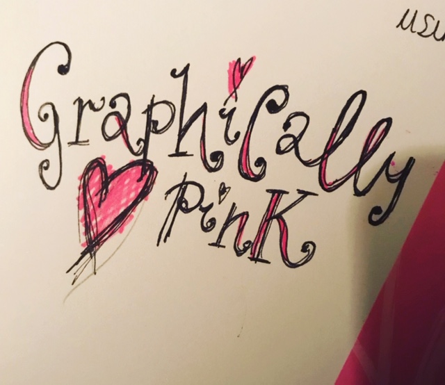
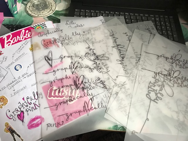
In the first days of starting the course I did some rough sketches for assignment one and literally sat for hours trying to think of a decent name to call my blog. “Amy’s OCA Blog” just wasn’t cutting it for me. I asked friends in group chats; their reply was “anything pink.. LA… banana leaves…” (my house is decorated like the Beverly Hills Hotel with banana leaves FYI) but I just couldn’t think of a name to relate Graphic Design and my love of pink and everything girly, kitsch, quirky and glam inbetween! My dad was round my house ripping my bathroom apart and he shouted out “I don’t know!…Graphically Pink?” however that might be fairly good?.. ties in Graphics with the pink and it portrays a sense of honesty; what I am striving for. One of my key values. So I instantly drew the name out in my learning log sketchbook and played around with the type, colours etc… just to see if it might work. For quickness I took a photo of the sketch and uploaded it to the title of my blog, I knew I would have to replace this with time to a more professional version.
This is where I have now been playing further with the logo design.. I have started with this rough sketch and attempted to further develop it. I want a logo that portrays femininity; delicate, soft, loving and warm in feeling. Pink is the perfect colour for this. I knew I wanted to use a feminine font. I am a big fan of hand lettering and for most of my artwork I use my own hand drawn lettering. I figured that I could draw a rough version out and then clean it up in Photoshop and image trace around it in Illustrator. Using a light box, my papermate flair pen and lots of tracing paper I drew out various versions of my logo until I reached one I was fairly happy with – I’m a perfectionist… I could keep going and going and still not find the “perfect” outcome! – but this I could see would look alright on the title banner of my blog page. It is not a decision to be taken lightly because a logo and first impressions are lasting. Once you put an image out there to the world you cannot reclaim it back or change it. The logo however I feel represents me, my brand and key morals and values to a degree. The hand drawn lettering is my own, the pink represents my brand and me and the heart and slight vulnerability of it shows my softer, honest, caring side.
This is what I have so far! – I have to now import the image into Adobe and make the logo a digital version!