Welcome along to city guidebook number 7! – Marseilles or Marseille ?……..
Marseilles or Marseille was the first question that I asked myself! I pondered at the fact that there might b a typo in the Core Concepts design book because everywhere I looked online it was saying “Marseille” however there is a French and an English version! Marseilles it is!
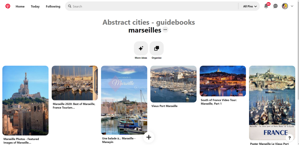
In my head Marseilles is one of them luxuriously warm places that celebs and people likewise might go and sunbathe their perfectly tanned and toned bodies on the front of a yacht! CORRECT! 😀 but in all seriousness I pictured a lot of blue skies and blue sea, yellow sunshine and boats and yachts everywhere. As usual I started looking for ideas and inspiration on Pinterest.
A lot of blue! The other thing I noticed was the port with the church on the hill in the background. I felt I could incorporate this into my design somewhere along the way.
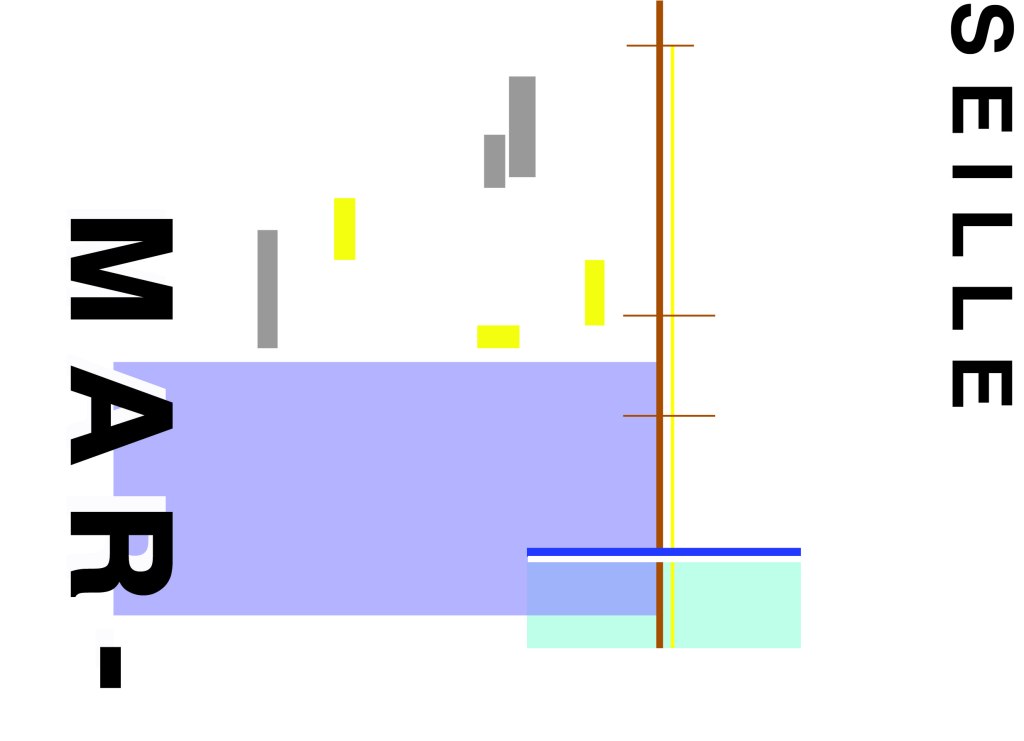
When I look at my design I feel a warm and happy feeling which is perfect for the weather and general feel of Marseilles. The blue represents the blue sky and sea. I have used a block of blue on the bottom left again as with all the other design guidebooks. It makes sure it is in keeping with the rest of the series but it also represents the sea. The rectangular blocks which work their way up to the top of the left hand side represent the hill and the buildings leading up to the 2 grey rectangular blocks at the top which is the church on the hill. On the right side of the design is the yacht or sailing boat with the sail mast. I have used yellow as a warm colour to contrast against the blues and greys. Blue is the dominant colour closely followed by thee subordinates which I believe to be the greys and turquoise. The accent colours in this piece which contrast against the rest of the design is the yellow and the brown of the sail mast.
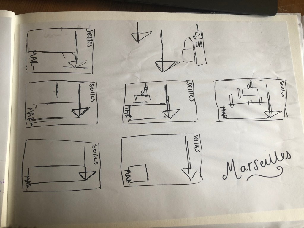
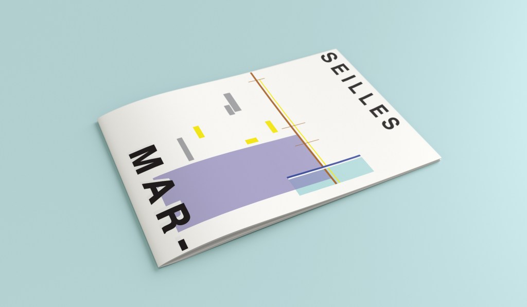
You might notice the typos between the 2! My confusion with Marseille vs Marseilles! This is the final mock up for Marseilles! I am pleased with how it has turned out – It has kept the abstract brief, is open to interpretation but I think portrays what Marseilles is all about! The colours are accurate and there are contrasting accent colours thrown in there to make the design interesting. The layout is the same as the rest of the guidebooks to keep it as part of a series.
Hello and thank you for joining me here at guidebook design 6 of 10: Marrakech!
When I think of Marrakech I think of warm sunshine, a lot of warm colours – oranges, reds, yellows, terracotta… I think of souk markets and rich spices and rich, bright colours; purples, pinks..
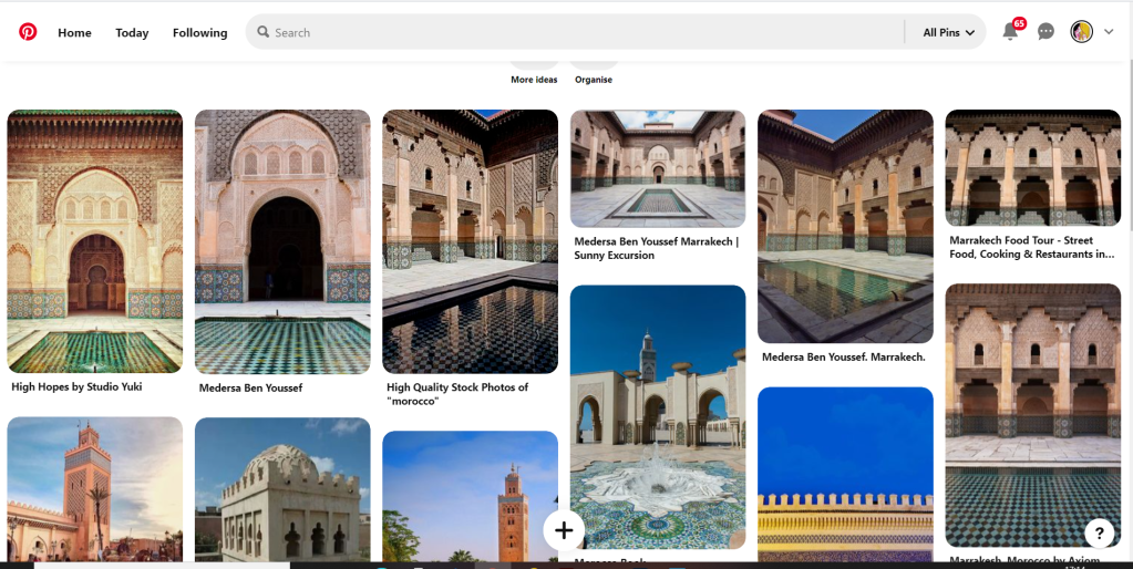
I started off the same as usual by searching Pinterest for some inspiration. What I found matched the idea I had in my head. The colours were very warm. A lot of terracotta orange appears on the stonework of the buildings. The buildings all look like temples with the arched shapes doors and windows and the intricate patterned tiles and designs that feature on the buildings. I knew I wanted to include the arch designs and some of the intricate tile patterns. The buildings all look luxurious and rich. The ideal colour to represent this is purple.
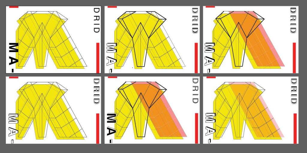
The building that appeared the most was the above: Medersa Ben Youssef. This was a college but now acts as a historical site. I liked the symmetrical design, the arches and the intricately detailed tiles that appear on the walls. I knew that I would try and replicate this in an abstract style for my cover. I had the idea to include the arch into the design, a diamond pattern to represent the tiles and maybe some blocks to represent the water at the front of the building.
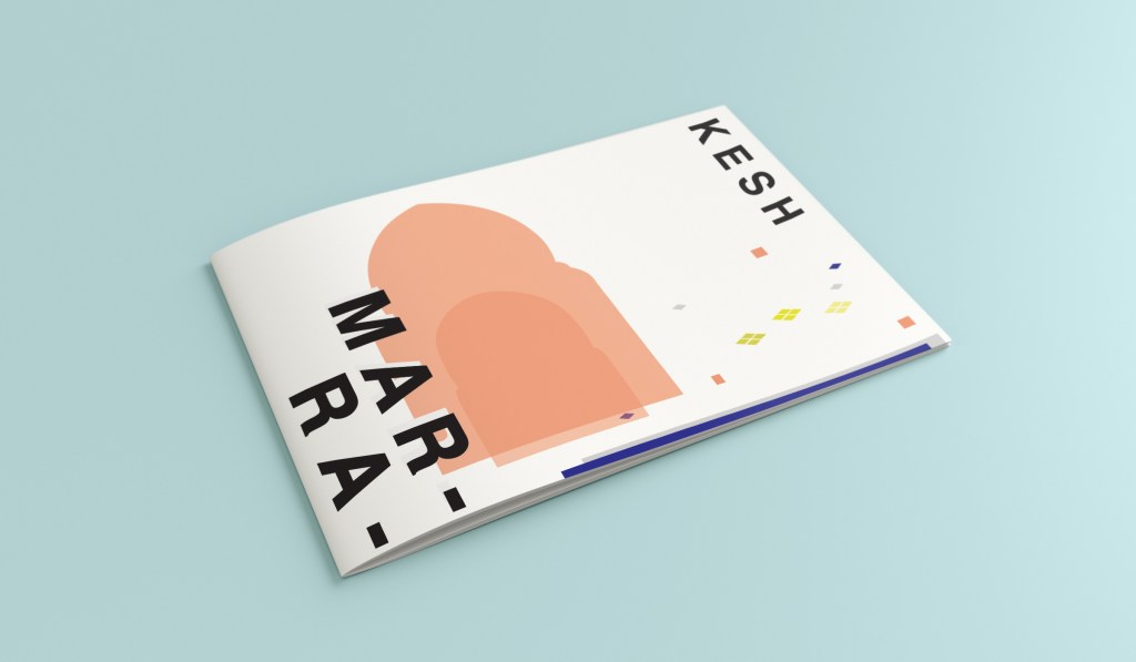
I overlapped 2 arch shapes with a different tint of terracotta. I chose a terracotta colour for the building to match what I found in my research findings. The arch designs also overlap the type on the left side which matches the rest of the designs for the other guidebooks I have done so far. Following the rule of 3 or thirds, I tried to split my cover into 3 again to get different design elements in each third. The 2 lines at the bottom represent the water at the front of the building and they also add some contrast against the warm colours. The diamond tile pattern I drew and split up across the negative space on the right side. I did not want to overwhelm the design and wanted to maintain as much negative space as I could. I have used purple to highlight wealth and luxury and a bright accent of yellow to again bring contrast but to also represent the bright colours that might appear on the buildings, the tiles, in the souk markets or in the spices. I think the eye flows naturally throughout this design with the diamond shapes adding a level of interest and also bringing the design to a close.
This is the final mock up for Marrakech. I am happy with it! It has kept the same layout as all the other guidebook designs I have done so far, it is keeping with the others and looks a part of the series. I have kept the abstract approach but again, it is open to interpretation but is obvious what it is portraying. The colours match what you would find in Marrakech but also contrast and work well together for the purpose of this brief. The terracotta is the dominant, the blue is the subordinate and the yellow adds a contrasting accent colour trying to fight with the blue for attention.
Welcome to the concrete jungle! – Design 5 of 10 – Manhattan!
Manhattan was one of the easiest cities to think of and find ideas for. It is a place full of buildings and architecture so tying this one in with the rest of the designs was easy. I began thinking of famous and iconic buildings in Manhattan; the Empire State Building being one of them. I then went to Pinterest to see what other images came up. There was a lot of images of the hustle and bustle of the city… skyscrapers, shops, people, yellow taxis, cars and pedestrian crossings.
I knew I wanted to play with the idea of the Empire state building and the fact that Manhattan and New York is like a concrete jungle. Central park played a part in my thoughts and ideas; I wanted to include a bit of nature in my design – this also allows the opportunity to bring some green into my design which would be a great contrast against the skyline of Manhattan.
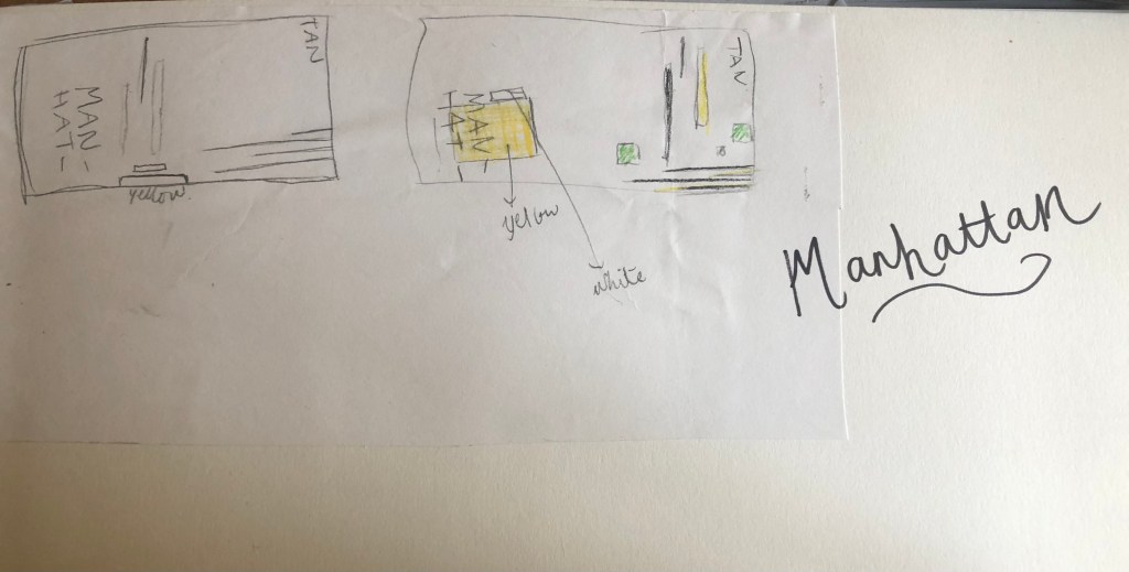
I used a block of yellow on the bottom left, once again this ties in with the rest of my designs so far. This yellow block represents a yellow New York taxi. The grey blocks that feature on it are the wheels and the top of the taxi. I placed a tiny block of colour at the top left also to add some interest and to draw the eye up to the top to work its way around the design. Yellow and black contrast each other brilliantly and they also represent the yellow cabs and the pedestrian crossings. The Empire state building I portrayed on the right side of the cover. I used blocks of black rectangles to represent this. It is abstract and can be portrayed in any way you want to; it could be the black lines on a pedestrian crossing or it could be the towers of the Empire State building.
In this design I feel the black and yellow equally fight with each other for attention, they are both very dominant in the design. The grey adds a little accent of colour to break it up.
This is the final mock up for Manhattan. I am pleased with this design, the colours work and contrast each other fantastic! It is modern and stands out and it maintains an abstract approach but it is still obvious as to what is being portrayed. The layout stays in keeping with the rest of the designs.
Hello again for design 4/10 of my abstract city guidebooks!- Manchester!
I love visiting Manchester whenever I can so I wanted to do this one a little justice! Manchester was the heart of the Industrial Revolution in England and is still known for its community spirit and hard work ethic.
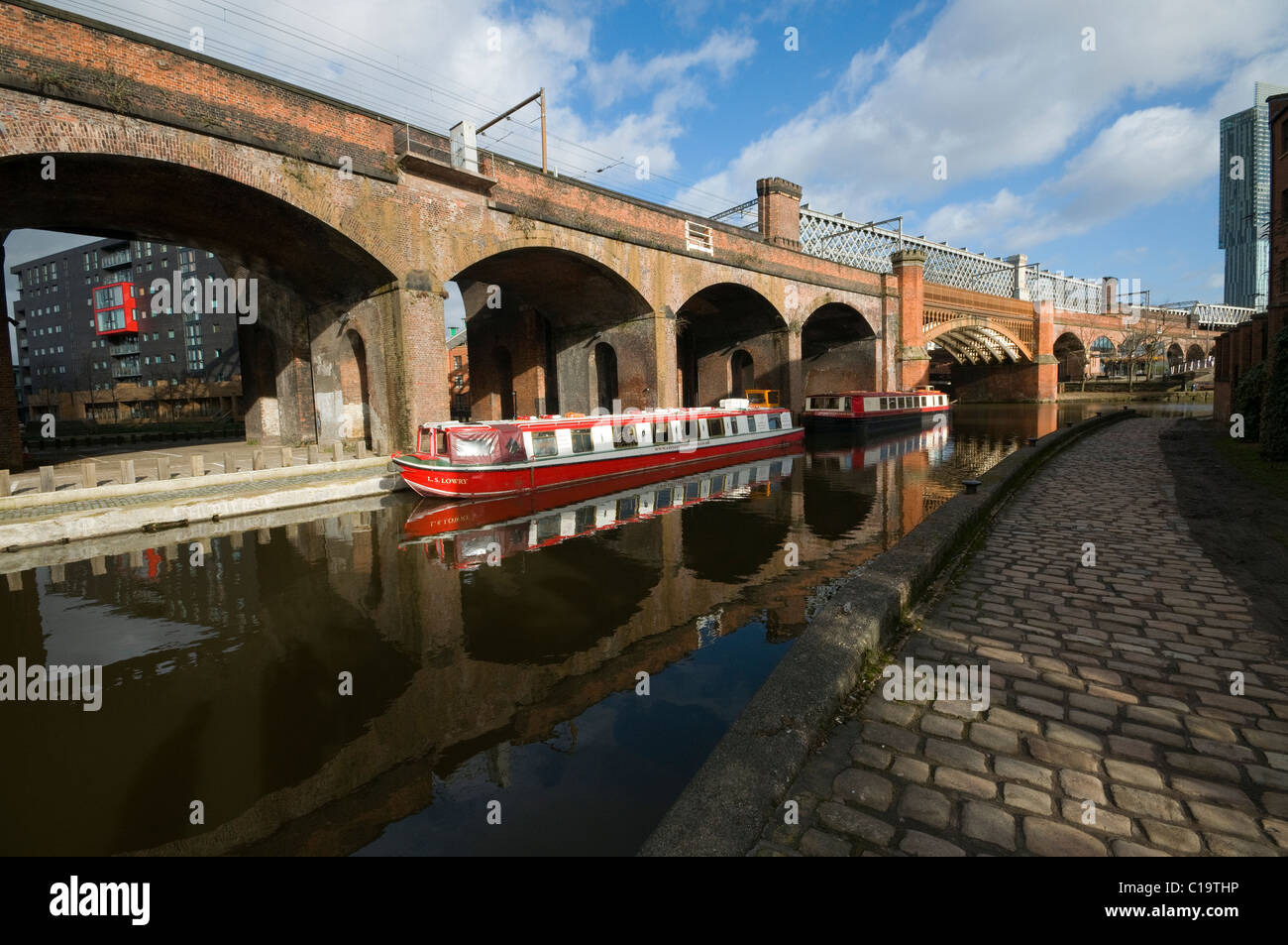
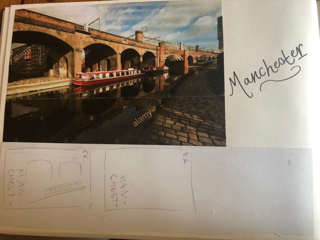
For all of the designs so far I have been quite modern in approach by designing for iconic buildings that are quite modern and new.. I knew that this would not be the case for Manchester. Manchester is renowned for its red brick buildings, the stonework, factories, chimneys, railways, railways viaducts, canals and the cotton industry. The colour scheme for Manchester would be reds, greys, stone and browns. With all this mind I went to Pinterest again for some inspiration, my initial thoughts were to go with the chimney idea but then when I found an image of a canal and a viaduct bridge I knew that this was the route I wanted to go down. When I drive to Manchester I drive under loads of them viaduct bridges; that is how you know you are getting closer to Manchester! In my head this seemed the right choice to choose.
I started doing the same as I had done for all the others; printed a copy of this out and then started to sketch the from it, simplifying it each time I drew it.
This photograph reminded me of the image the OCA used in our Core Concepts unit book to explain to us this brief:
The canal boat on the Manchester viaduct photograph is very similar to this image. I realised I could replicate the canal boat in a similar way.
I did do a lot more sketches for this guidebook, however I did them when I was in my full time job at a time when I had a 5 minute window in-between jobs.. for whatever reason they got mislaid!
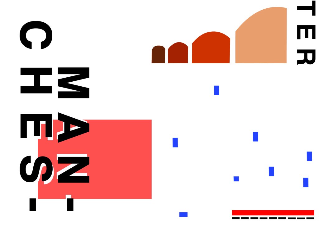
However, I developed a few ideas in Illustrator and eventually arrived at this one!
I have kept the same layout again as all of the others to keep them as part of a series. Again, breaking Manchester up into its syllables and using Helvetica. The idea of this was to use a main block of red on the bottom left, again in keeping with the other designs so far. This red block represents the infamous red brick in Manchester. Instead of drawing the viaduct bridge to look like a bridge I have in an abstract form used only the arches of the bridge to create the illusion of it. I have used different hues of brown from dark to light to represent the dark brick and industrial stonework. The blue squares add contrast and also help draw your eye across the whole piece. These blue squares represent the water; they represent when the sun sparkles on water and creates sparkling ripples. I have used different sized blocks again for contrast, to represent abstract and to add interest to the design. I wanted the eye to travel from left to right to the bottom with this design; that is why I have placed the abstract block canal boat along the bottom right. The red is the paintwork and the top of the boat with the black blocks being the windows. I was conscious again of placing objects along the edges of the design; the design needed to be able to breathe and to not be constrained to a box. In this design the red is definitely the dominant colour with the browns following as subordinate colours. They are warm so needed a cool colour to contrast against them. The blue is the accent colour, it is fighting for attention with the dominant.
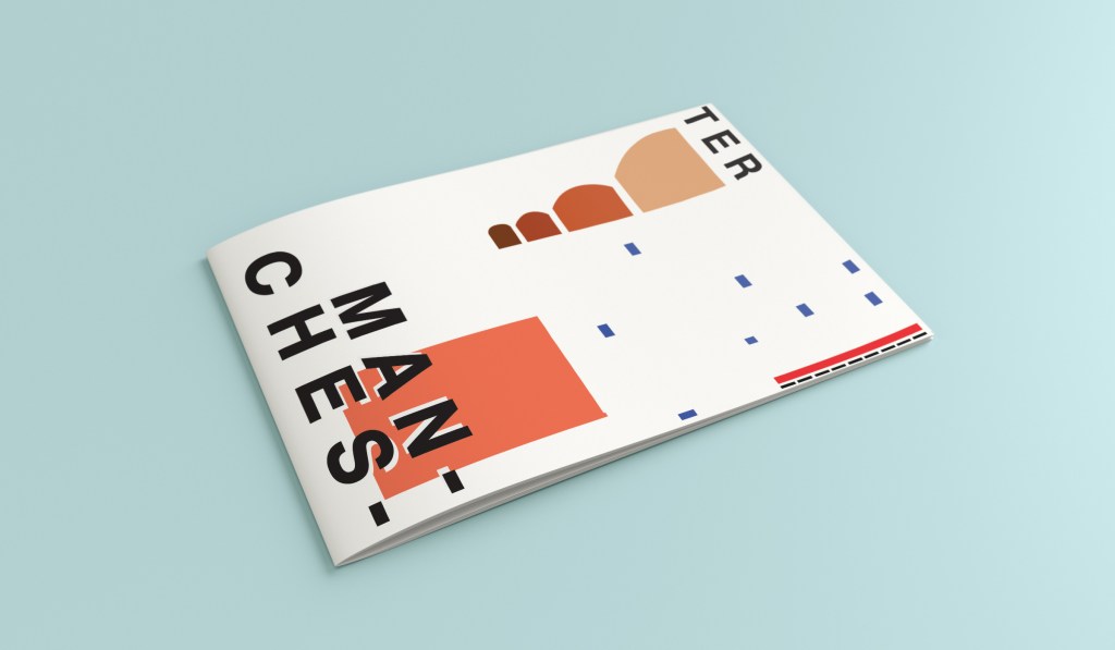
This is the final mock up for Manchester. I am pleased with how it has turned out, I think it is abstract and open to interpretation as to what is being showed but still obvious what is trying to be portrayed.
Hello! and thanks for dropping by to look at design 3/10 of my abstract city guidebooks- Managua!
I personally had absolutely no idea where this city was! (I am still confused! – but I do know it is on the bit that joins both Americas together!!) with my poor knowledge of geography I attempted to gloss over this and continue with my design ideas. Again, I wanted to keep the design concept and layout etc for this guidebook cover the same as the others so that it continues to form the series.. I was going in again simplistic and minimalist in approach, using architecture and iconic buildings as the basis of my design and taking key elements away to create my design.
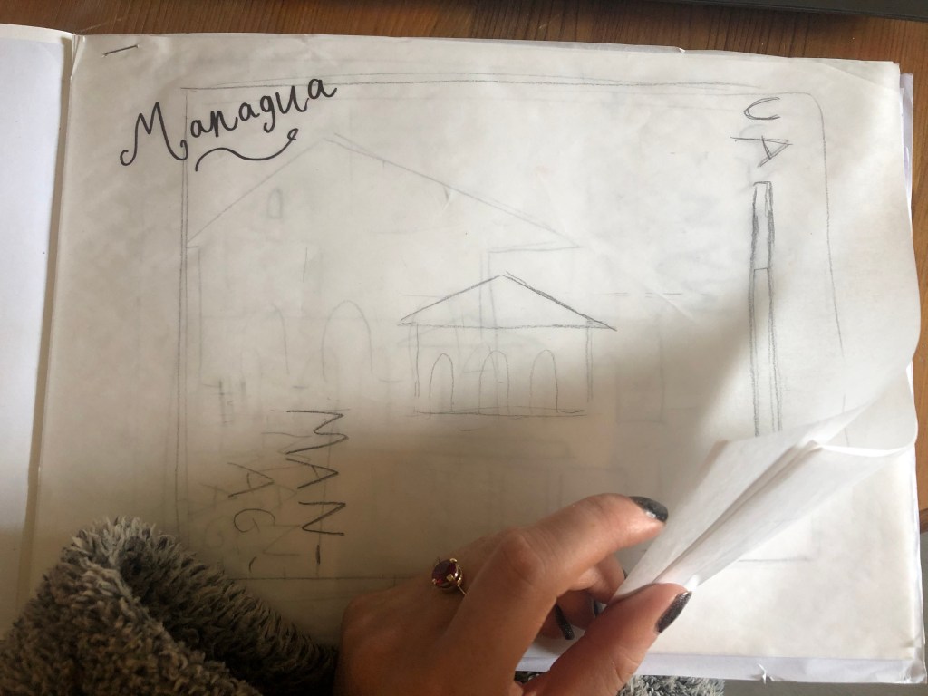
I started my initial research using Pinterest again; I looked up iconic landscapes and architecture in Managua and it came up with the cathedral as the main recognisable building of the city.
From first glance it looked like a complicated building to try and recreate in abstract! I took the same approach as last time and printed out this image tracing over it again and again simplifying it each time until I was left with the bare bones.
The main key features that stood out to me from the photograph was the intricately detailed stonework of the cathedral, the small cross that features in the middle of the cathedral on top of one of the triangular brickwork and the fact that the cathedral is in beautiful warm weather with 2 palm trees either side of it!
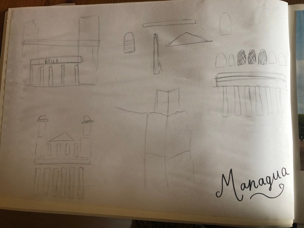
I used my rough sketches to figure out what to include in my final design.
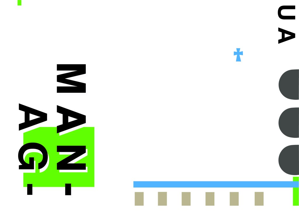
Again, I wanted to try and stick to the rules of thirds for my design and split the design into 3 sections on the cover. I wanted again to let the eye flow naturally across the whole page. Negative space once again played a big factor into the design, I actually base the design around the negative space each time. I placed a lot of the design to the edge of the page which can sometimes constrain the design to a “box” and restrict the design to be able to “breathe”; however, I still allowed for the design to “breathe” by not constraining the design all of the way around the cover. I added a tiny accent of green at the top left side just to give the eye somewhere else to hop to. The idea was for the eye to flow naturally all the way around the design. The bottom green blocks were representative of the 2 palm trees which I have obviously exaggerated and under exaggerated in size – representative of abstract also. The design is not accurate in scale, size or orientation to the building; the grey ovals on the right edge are representative of the arched windows in the centre of the cathedral and the bottom bar and grey small rectangles are a snippet of the pillars that hold the cathedral to the ground and the steps at the bottom. The cross I have kept small, it is always good to have contrast between elements on a design; the eye is drawn more to the cross and its location in the negative space on the cover- it is representative really to how small it is within the great vastness of the cathedral.
The dominant colours on this design accidentally are the black and grey of the text and the arched windows.. I know black and grey are tints but to me they draw me to the design before any of the other colours. The subordinate colour needs to be the green, although to be honest the blue stands out just as much as the green. It probably doesn’t help that these 2 colours are both cool and don’t particularly contrast each other well. As for accent colours… I would say I have designed something that doesn’t have a accent colour as such. In hindsight now looking back I could have added a contrasting colour as a tiny accent to the piece but I honestly just liked the use of these 3 minimalistic colours.
This is the final mock up of Managua! Overall, (apart from I mentioned that I could have used a warmer colour as an accent) I am happy with this design. I think I have met the abstract needs of the brief.
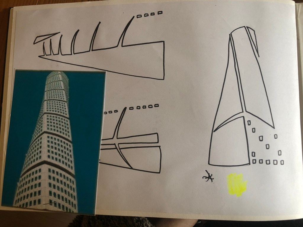
Welcome back to design 2/10 city guidebooks! – Malmo!
I was more aware of time (or lack of!) after completing design 1: Madrid, these guidebooks are time consuming! I decided I needed to try and cut down the research part of things although this first stage is crucial to achieving winning over a brilliant design outcome . I always start my research by searching Pinterest, it is the best place to find and record inspiration I find.
I had never heard of Malmo but after looking at some photos of the place and reading about it online, it now seems like a nice place to visit! I learned that Malmo is a modern coastal city in Sweden. I wanted to follow in the footsteps of Madrid by basing it around architecture and landscapes so I searched Pinterest to see what landmarks stand out in Malmo.
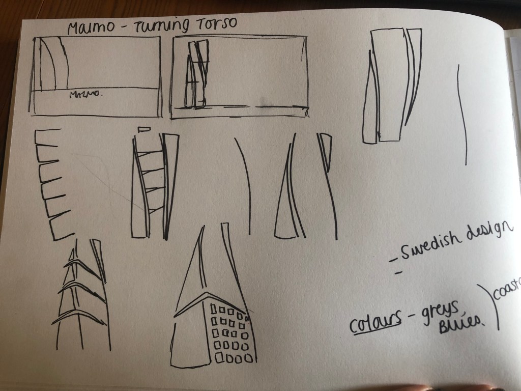
The most intriguing building that I found in Malmo was “The Turning Torso” it is regarded as the first “twisted skyscraper” in the world. It was designed by spanish architect, structural engineer, sculptor and painter Santiago Calatrava. It officially opened on the 27th August 2005 and reaches a height of 190 metres with 54 storeys and 147 apartments within it. In August 2015 the Turning Torso was the winner of the 10 year award from the Council on Tall buildings and urban Habitat. It also won the 2005 Gold Emporis Skyscraper Award.
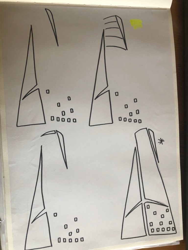
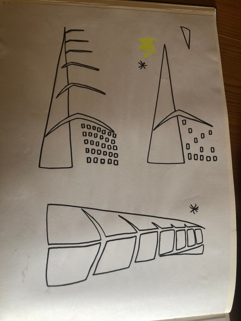
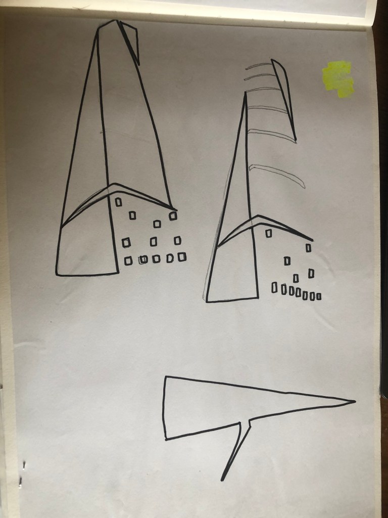
With the brief in mind I knew that I had to keep my design abstract, I was conscious that I didn’t want to make the design too pictorial and obvious as to what it was. I didn’t want to draw the Turning Torso onto my design and it be obvious what it was! The way I went about designing was to take a photograph of the Turning Torso and trace around it several times, each time taking something away so that I was finally left with the bare bones of the building. I then took the whole drawing apart and found clever ways to piece it back together but in an abstract way!
Sketchbook pages: First sketches and ideas
This is the photograph I found on Pinterest, I printed it out and I based my sketches off it:
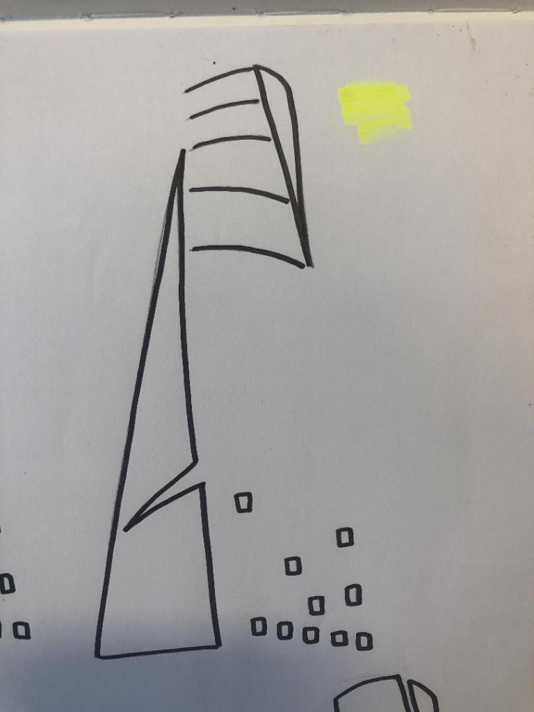
What I ended up with was a simplified sketch – the minimalistic “bones” of the building:
From this drawing it is still obvious what the building is, I took key parts of the building and simplified it down to its simplest recognisable form. This formed the basis of my final design.
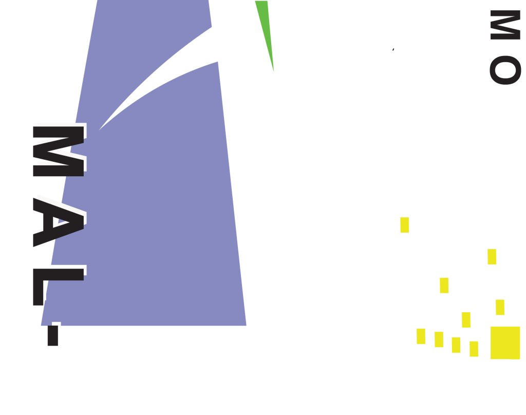
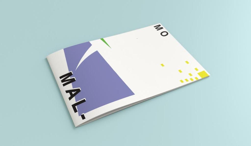
In my final design I kept the same layout as I did with Madrid as I felt that this would make the guidebooks become part of a series and be obvious that they all belonged together. I wanted to use quite “earthy” “beachy” natural colours because Malmo is a coastal town. I used blue for the Turning Torso which reflects the sky and sea and the fact that this tall building is between the two! I used a natural pop of green and yellow which would reflect sun and sand… Yellow being nice and warm also contrasts against the cool blue and green. I wanted to keep the design simple – I decided to split my design into thirds (rule of 1/3s!) and split the design up into each section. This lets the eye flow naturally and easily across the whole design. The yellow boxes allow for a pop of colour, add interest to draw the eye right to the end of the design but also represent the windows of the Turning Torso. The only flaw in my design is that I enlarged the Turning Torso to only show the lower half and a segment of the top… you can’t actually see the “turning” aspect. However, going down the route of keeping it very much abstract and not too obvious, I still really like this design and I think that you would still be able to recognise what the structure is from the key elements I’ve picked out even though they have been moved around and enlarged slightly. Negative space to me is just as much part of the design as everything else so I was adamant I wanted to keep a lot of space around the design but also to not restrict the design too much to its edges. I wanted it as a whole to remain “breathable”.
The location and how I designed the typography of “Malmo” was just as important as the rest of the design. I really toyed with the type layout again and kept questioning myself as to whether it was the right decision to make; I wanted to do something different and for it to look quite modern and edgy. Splitting Malmo into syllables also forces the eye to follow over to the other side of the design to see what the rest of the design is about.
This is the final mock-up of my Malmo guidebook! I am pleased with how it has turned out, I met my own expectations of how I wanted it to be and look like. The dominant colour used on this design is definitely the blue followed by the yellow being next in line as the subordinate colour. The green is fighting against the blue for attention which is exactly what the accent colour should be doing.
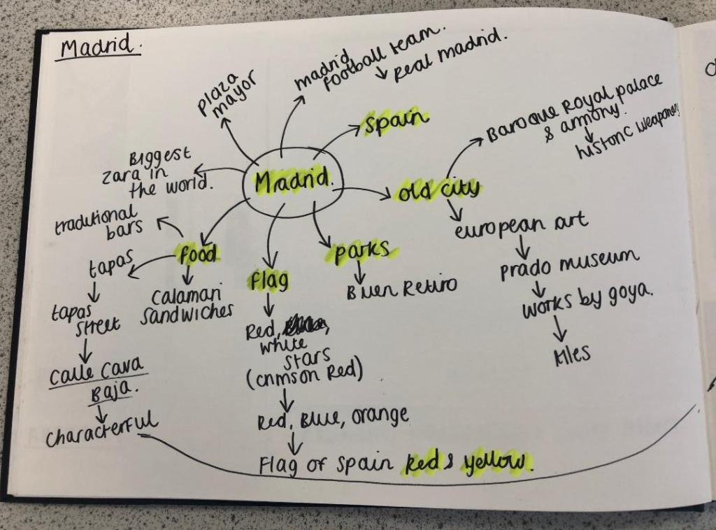
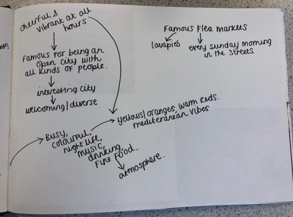
I started off feeling really overwhelmed by this exercise. As I mentioned in my introductory post, this exercise is notoriously difficult and challenging for many students and with this in the back of my mind I subconsciously was a little bit apprehensive about it! I started off with the first city on the list which was Madrid; A nice little start to the exercise as I am familiar with Spain even though I have never visited Madrid itself. I decided to mind map Madrid and see where my trail of thoughts led me…
Mind Mapping
I have to admit I did have a stalk on google of what some other students had done for this assignment.. the general outcome for this exercise was based around architectural buildings of the cities or famous landmarks which is completely understandable as the obvious outcome for “coloured blocks” would be buildings. I wanted however to try a different approach and see where that took me.
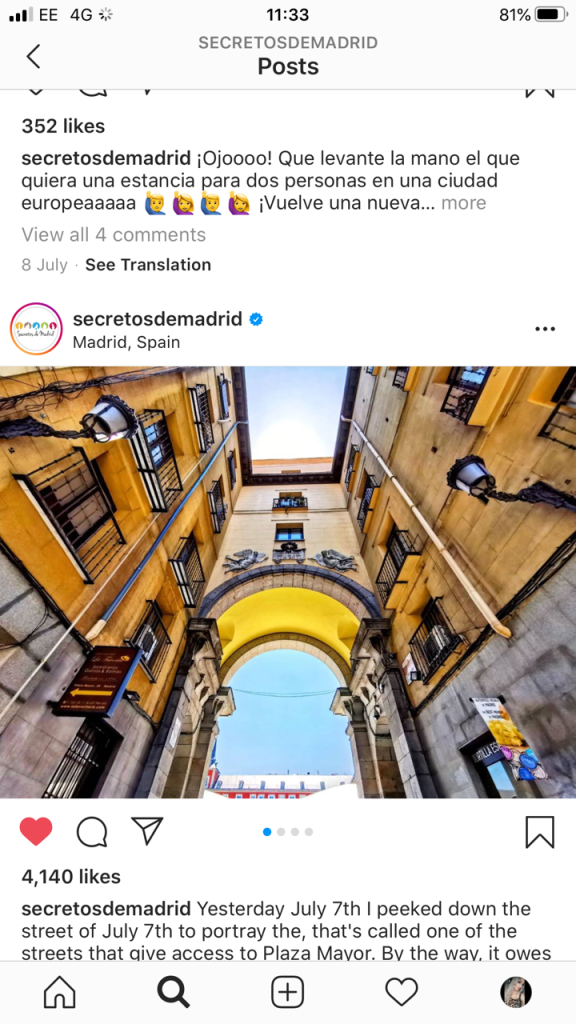
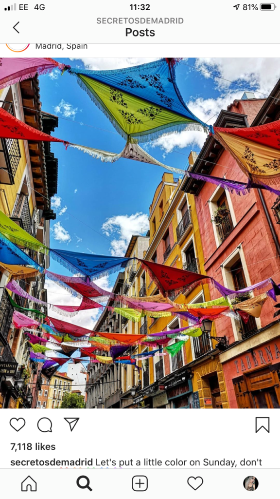
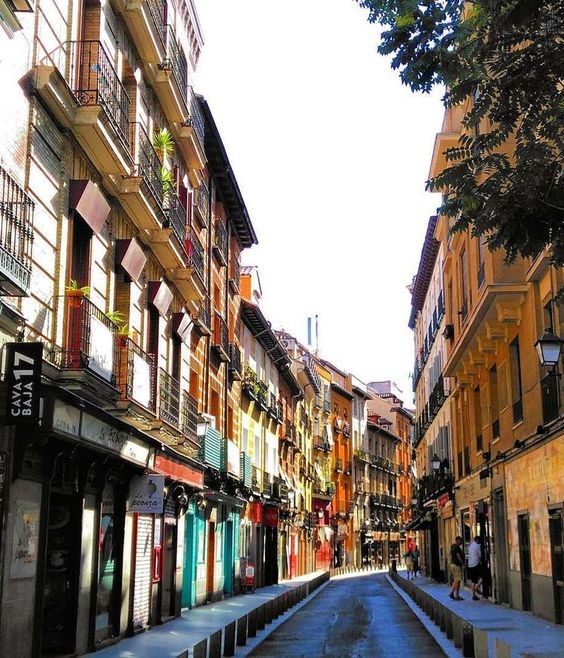
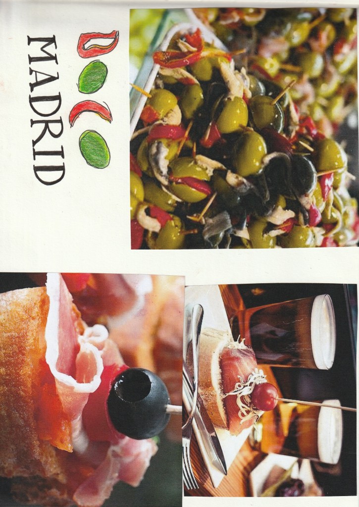
First Ideas
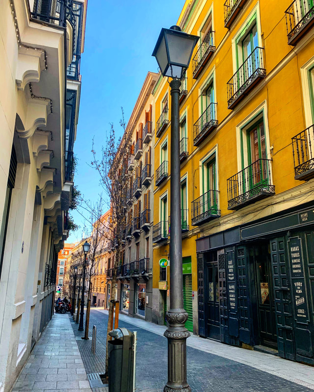
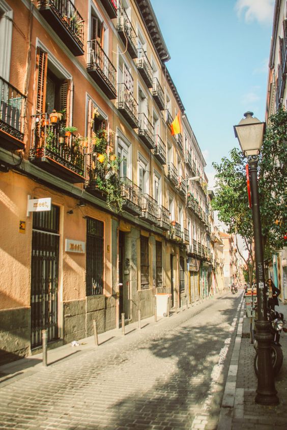
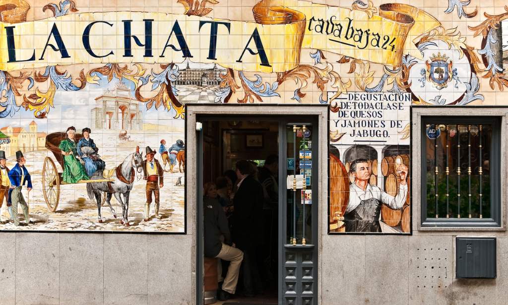
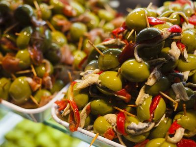
When I think of Spain in general I think of warmth and warm Reds, Yellows, Oranges, Black, busy, colourful, music, wine drinking, Tapas eating and a chilled way of life. Red, Yellow and Black features in the Spanish flag so I knew I had to use these colours within the design. Socialising, eating and drinking out is a big part of Spanish culture, especially having a drink and tapas in the afternoons or evenings so I wanted to convey this feeling throughout my design. I started to research on Google and Pinterest the different hotspots of places to eat in Madrid. The place which kept coming up the most was Caja Bava which is a brightly coloured street filled with Tapas bars. I collected several images of this street which I documented within my sketchbook and also pinned on Pinterest. I even watched a video of a short tour of the street just to get a feel for what it look like and the vibes it gives out.
These were also a few of the images which inspired me the most:
Colour Palettes
I had no idea what design I might create but I knew I would have to work out some kind of colour scheme, this is what I worked on next.
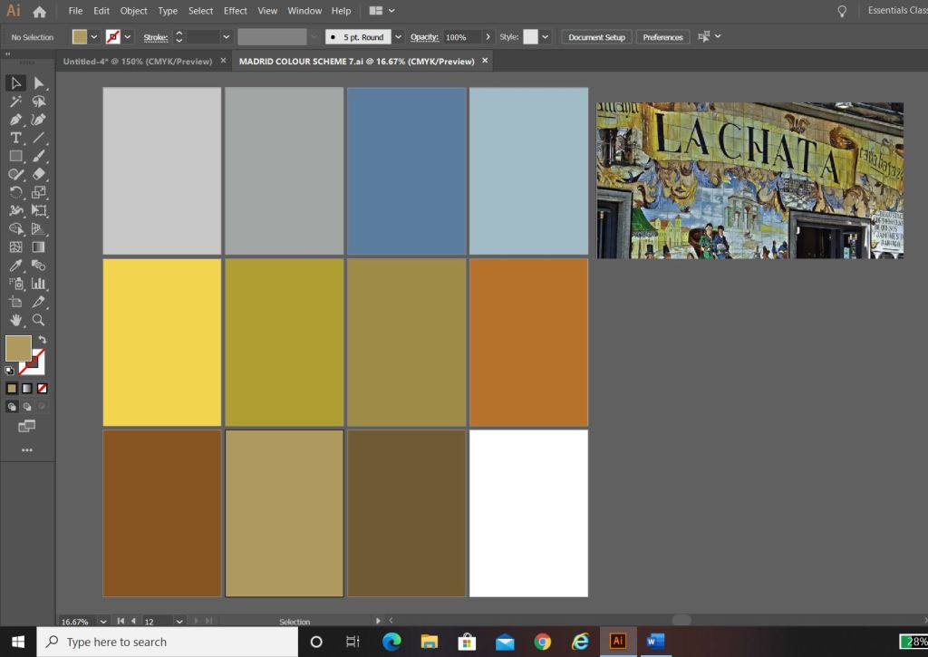
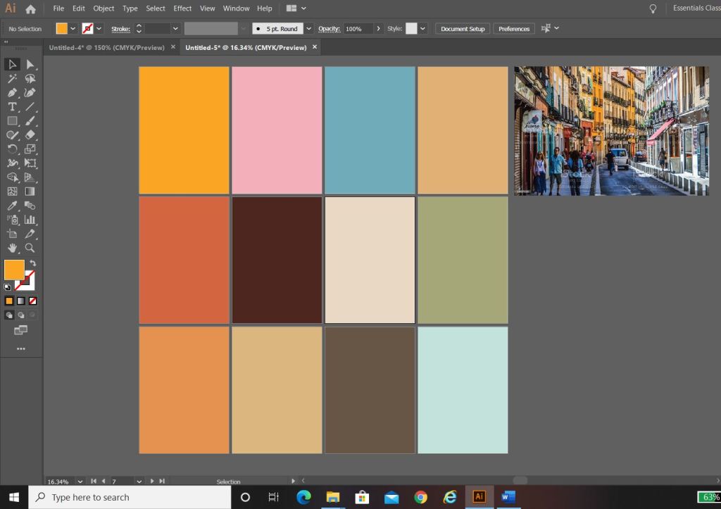
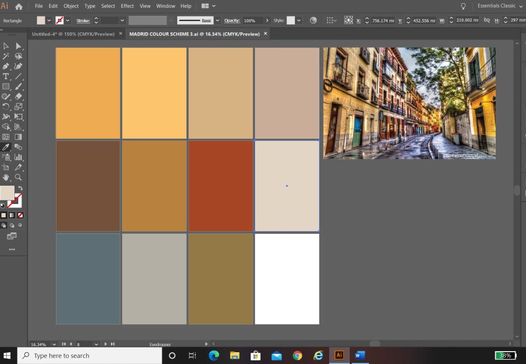
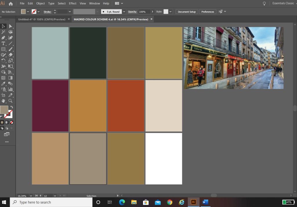
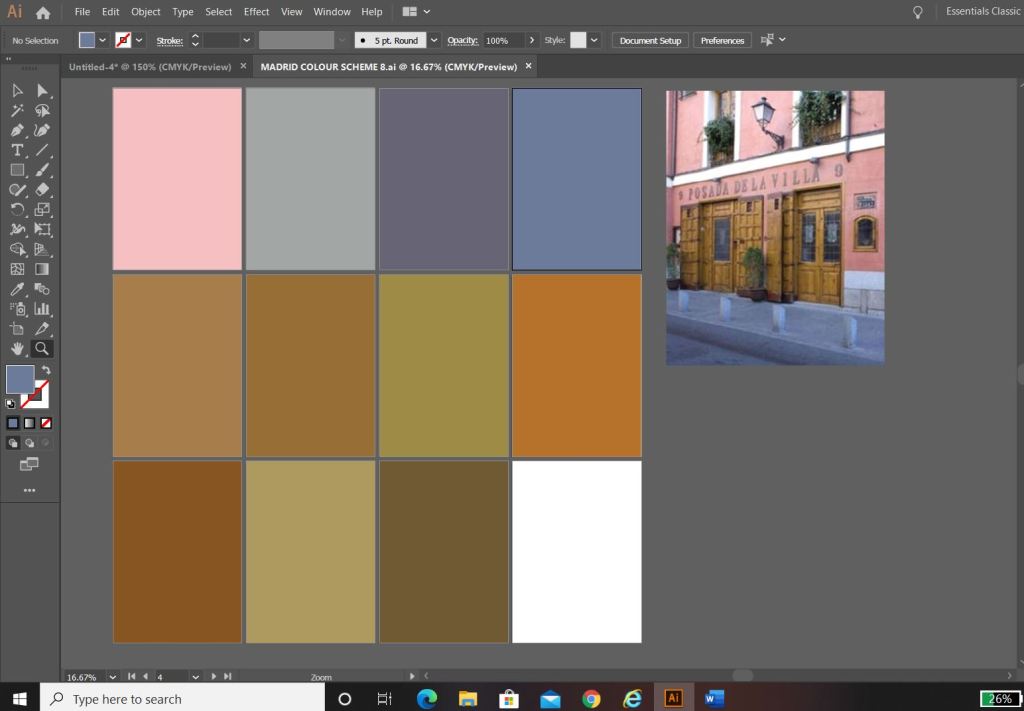
I used the photos that inspired me the most and in Photoshop using the eyedropper tool I picked out the colours that were most prominent in the photos. These would form a base for my colour palette.
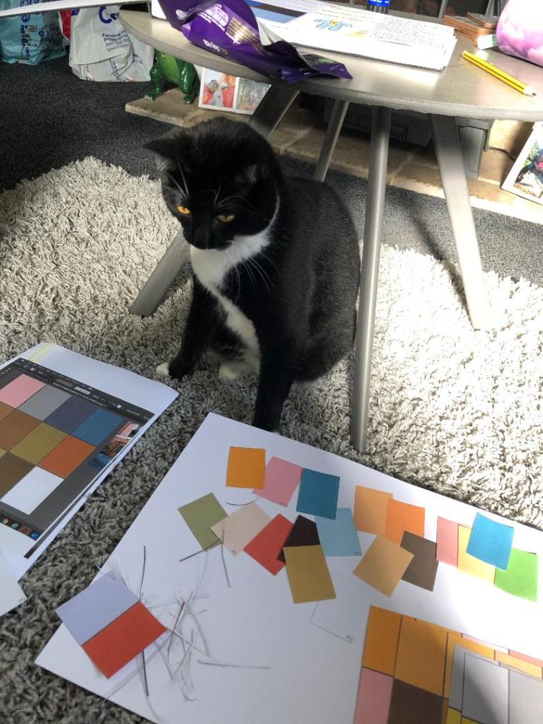
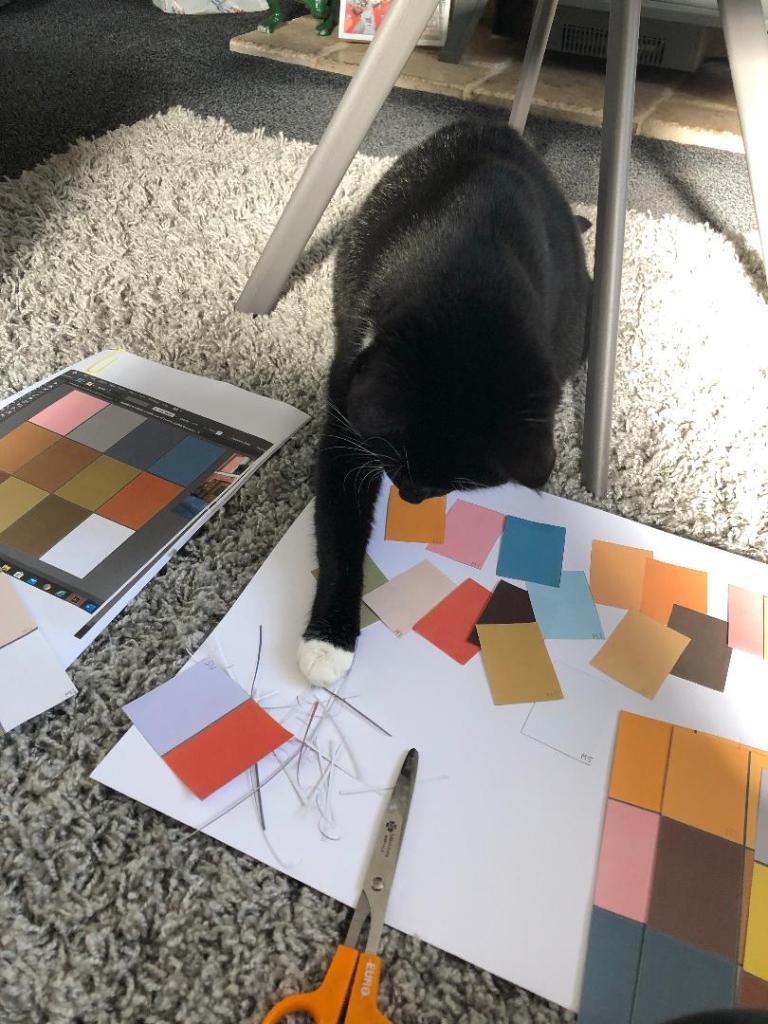
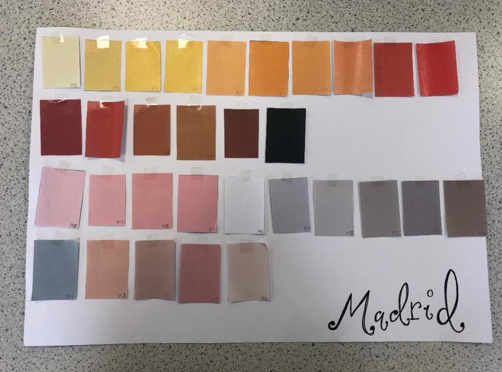
The above screenshots were the palettes that I created from these colours. I then decided to print all of the palettes out and arrange them all onto one sheet to pick out the main colours that could be used; I wanted to organise them into dominant, subordinate and accent colours. I had a little bit of help from my boyfriends cat Bridgette with this!…
The above colours were the ones that I narrowed down. I feel that they reflect the vibes, buildings, warmth and atmosphere of Spain and Madrid. After organising them in an order where I could see what colours worked with each other I then went on to think about the first design and how I would feature the abstract blocks of colour into my design…
Research points
I looked at a wide range of research points for this first design, I was really unsure of where to turn with the “abstract coloured blocks” I did an extensive browse on Pinterest (link below) where I created several folders filled with different images and I also looked up various abstract art and artists. As I said in my previous post I had help from one of my art teacher friends who directed me to a few artists to look into.
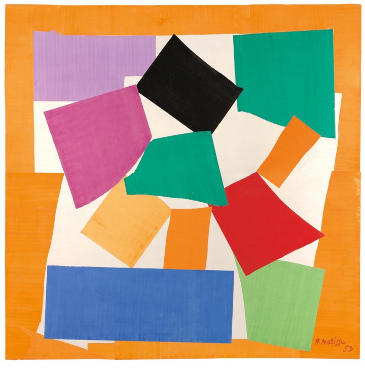
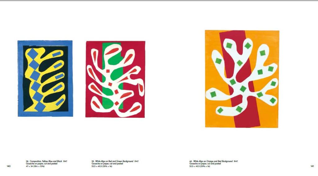
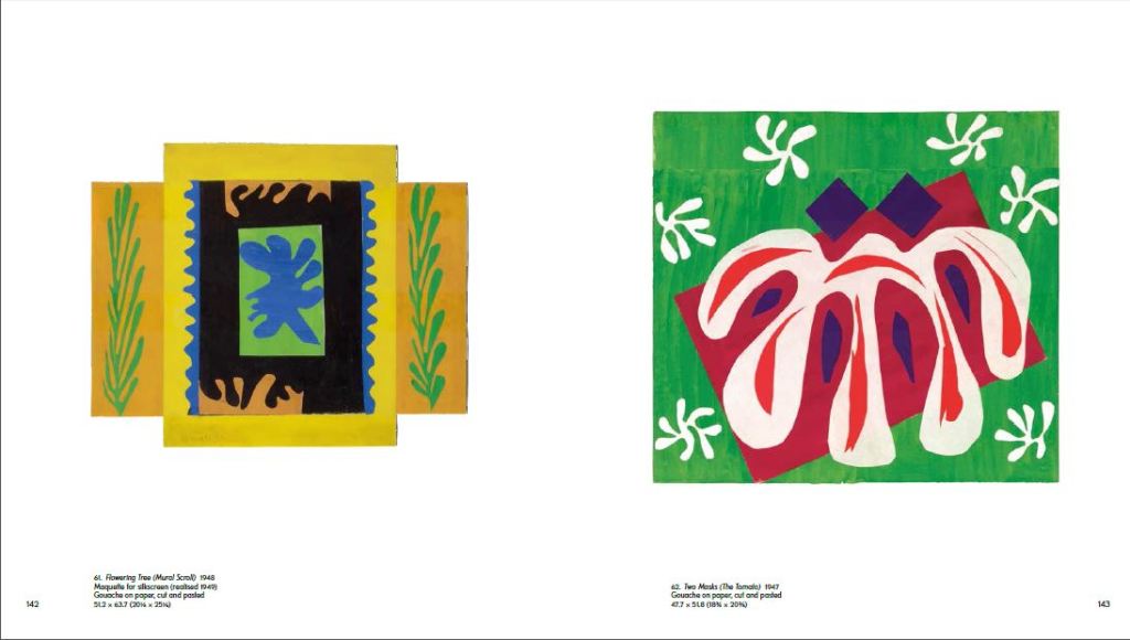
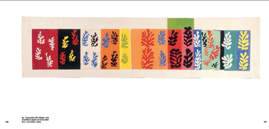
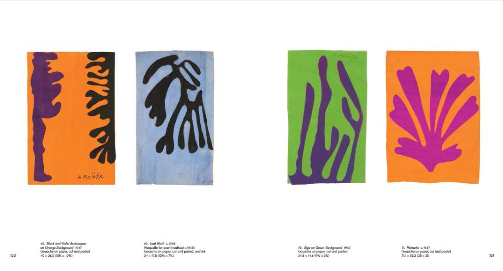
I found that researching into Henry Matisse was the most beneficial. Matisse towards the end of his life created art form cut out shapes which he then made into collages and blocks of colour. I did not think originally that these could be classed as blocks of colour but the more I researched into the artist I realised that he was quite renowned for his work related to colour.
The paper cut outs by Henry Matisse.
Matisse cut out a lot of leaf shapes from paper and used them to create abstract pieces – These were still considered as blocks of colour and it inspired me to think about creating simplistic shapes from objects that exist of one block colour and then make them abstract.
Development of Ideas
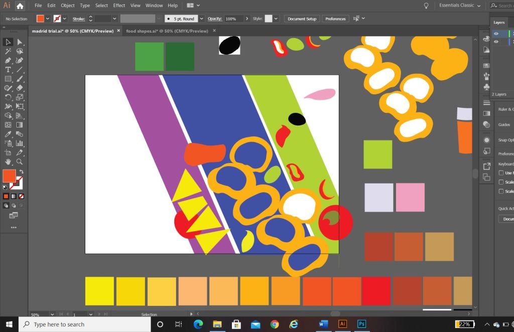
I started firstly to design and develop ideas down the food route; As I wrote further up my post, I wanted to explore around Spanish food as it is a big part of Spanish culture. I wanted to convey the bright colours, the exciting food itself, the social aspect and the busy yet laid back Mediterranean lifestyle.
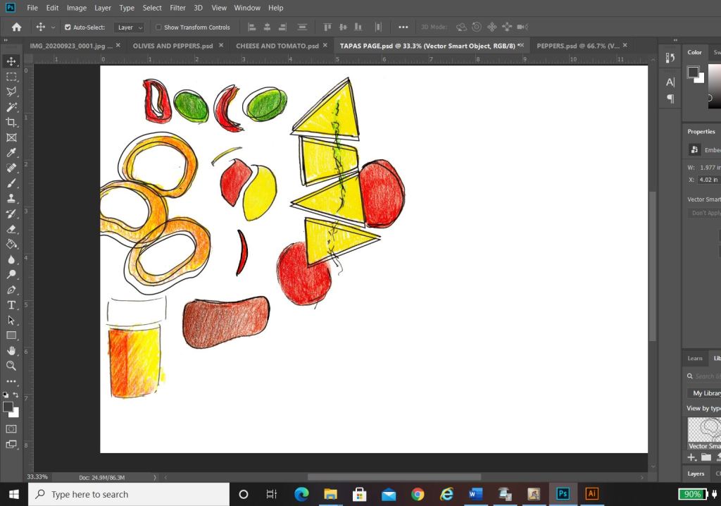
In my sketchbook I drew some initial sketches of some Tapas food just to give me a feel for what I could potentially include on a design.. I ended up really liking these little sketches and went on to create digital versions of them to try out on my digital designs;
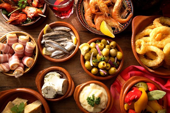
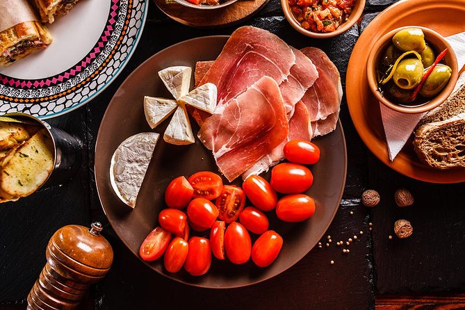
I created coloured sketches of Tapas food – Olives, Cheese, Tomatoes, Ham, Peppers, Chillis and Calamari. Calamari sandwiches are a massive deal in Madrid.
Digital Development
Development Idea 1
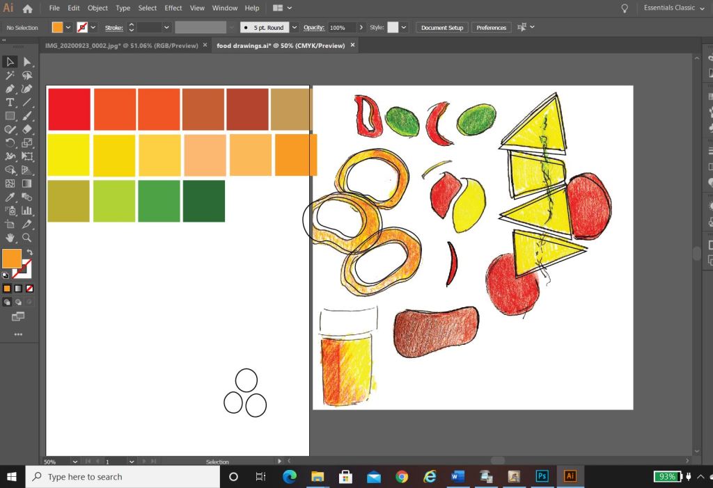
I started to rearrange the digital drawings of my food in different ways to try and form an abstract design with coloured blocks.. It was tricky! – I concentrated mostly around the calamari illustration; Calamari sandwiches are a delicacy in Madrid! They are a pretty big deal! I situated the Calamari illustrations between coloured blocks to try and get an abstract representation of Calamari in bread or a bread roll/bap. All in all I just felt that it was too “busy” and not quite abstract enough for my liking. I really struggled to interpret food as coloured blocks.. I hated to admit defeat as I really wanted to take a different direction from everyone else, however, landscapes and buildings are best interpreted as coloured blocks. I did a few more experimental layouts for my food idea and then swiftly moved on to try and rework the whole exercise out again.
Back to the drawing board!
Development Idea 2
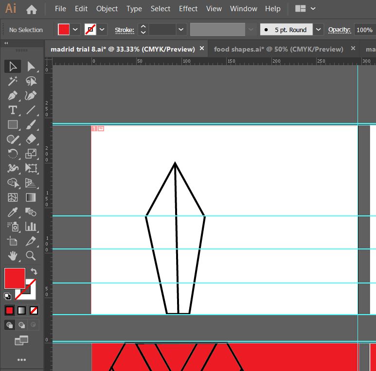
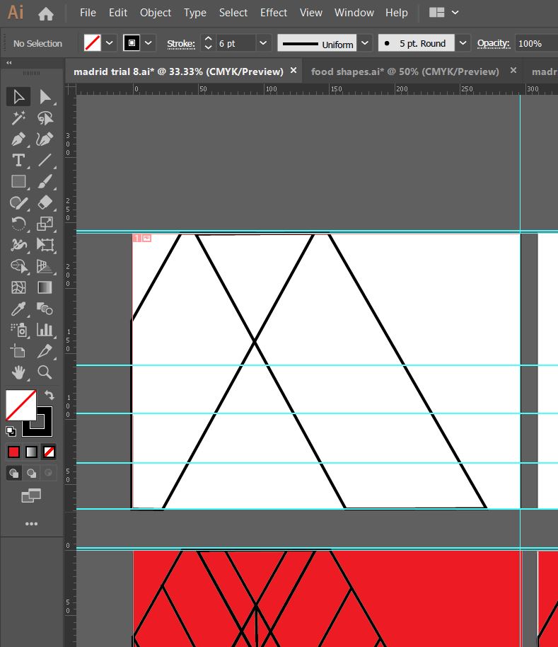
What I created next was completely accidental and out of sheer boredom and frustration with the exercise at the time! – I sat at my laptop screen on Illustrator and just drew random lines all over the place in a complete daydream and loss at what I was doing! By the time I had finished I could see a resemblance to the Kio Towers (leaning towers of Madrid) and then I gradually started to bring other influences in to it…
This started to look like the Kio Towers (the leaning towers of Madrid!)
I then added in the statue of Calvo Sotelo which is situated between the Kio Towers!
The towers together also look like an “M” for Madrid
The 3 elements all joined together!
I then added in the last feature… it looks like a Spanish bull with its horns coming out the top of the design.
All of the elements together to create this abstract piece!
I liked the geometric, modern feel of the abstract architectural illustration.
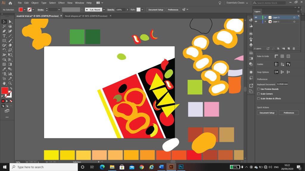
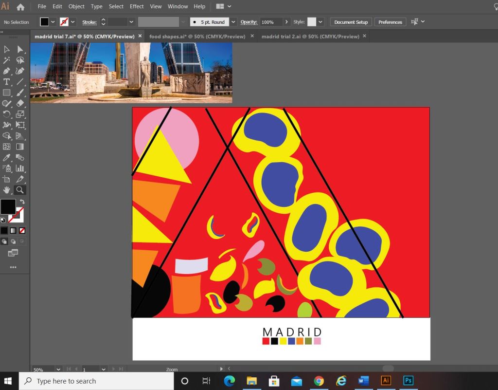
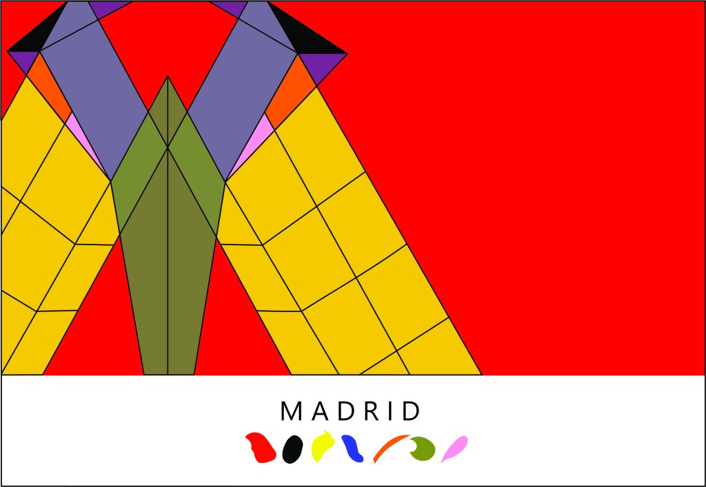
What I ended up designing was this above; I still really liked my little drawings of the food and was trying to find ways still to incorporate them into the design. I decided to use them below “Madrid” as a colour key for the piece; The colour of each food is a colour that featured on my original colour chart and which I have also used on the above abstract design. I did think that the food icons could also technically be classed as the blocks of colour. The colours are very “Spanish” in feel with the Red and Yellow but I have added contrasting colours in there with the Pink and Blue.
I wanted the typeface for “Madrid” to be simplistic. I knew I wanted it to be a sans-serif font as these are always the best for legibility, readability and best suited for titles and headings. I don’t really like using fonts or typefaces that are gimmicky or that are not well established, therefore I did question myself about choosing a typeface that I was unfamiliar with.. however, the one I chose (Leelawadee) did seem quite appealing and attractive for the piece. The only issue I had with the whole design was that the typography did not match the “abstract” feel; in fact I still felt that the whole piece wasn’t edgy or abstract enough. The blocks of colour that I used seemed flat, it seemed as if I was just colouring in blocks for the sake of making them a colour. I think I had too many colours, my thought process moving on from this stage was to potentially limit the amount of colours to possibly 3. I could pick 3 colours that have strong relations to the country (e.g. the country’s flag colours). For Madrid it would be yellow, red and Black.
Development Idea 3
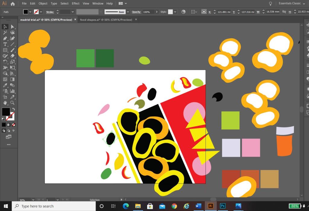
I tried the design again but this time around tried not to play “too safe”. I wanted to experiment more with the typography and the layout (although not too much!.. I chose good ol Helvetica again for the font!) I had the idea to break Madrid up into its syllables and rearrange them coming slightly off the page.
The above screenshots show how the development progressed.. I much prefer this idea. I messed around with the orientation of “Madrid” at the end of my experimenting I found that Madrid should be written facing the spine and not the pages. It has more impact when you look at it, it stands out and it looks more abstract in design even though there is still a strong geometric influence to it. I have added the red bars in the design because they help to frame the overall design and give it structure. The red boxes are focal points that draw your attention to the design. I made one much smaller and thicker than the other for contrast. I feel in general the design is comfortable to look at; the eye flows comfortably throughout it. I then had to develop it further to get the coloured blocks into the design.
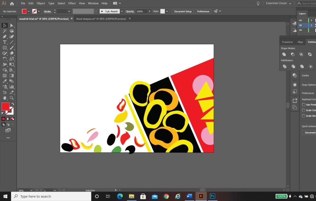
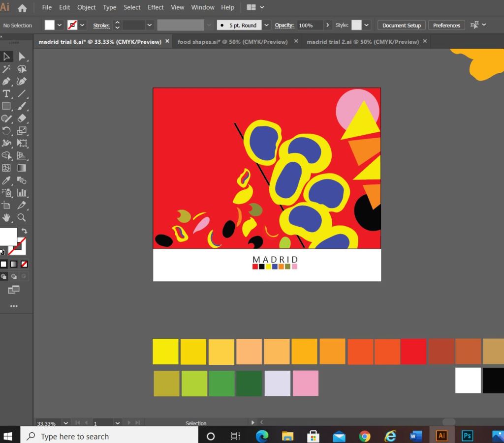
I developed it further (above) experimenting with outlines on the text and contrast of the typography with line weight and thickness. I started to add colour to the blocks. I also outlined the shape of the abstract bull which ties in nicely to Madrid and Spain as a country. The colours I have used are Red and yellow with Black and white added in. The Red and yellow I overlapped and lowered the opacity to mix the colours to create an orange hue. The middle bottom design stands out the most for me.. it has contrast with the typography (Bold vs. regular, black vs. white, big vs. small), the overall layout is more abstract, the bull line work ties in nicely to the city and country and the colours all contrast and compliment each other and are blocks. (yellow=dominant, orange= subordinate and the light pinky red and bold red are accents)…
….
However, I still felt like it was “too busy” the line work took away the “block” aspect of the brief. I wanted to keep the design as simplistic as possible, so I went about developing it even further.
This is what my final design looks like! I simplified it right down to the basic shapes which I think helps you to recognise the landmarks in the design better. I added accent colours in each corner to draw the eye and attention over the whole design.
“Once I get the first one designed and finished, the others should flow quite easily”
Amy Holmes – This was said to her boyfriend after almost ripping her hair out from trying to find an outcome for 1/10 guidebooks! 😀
Exactly what I said above! I knew that this exercise was notoriously difficult and that after I had the first one designed the other 9 should flow and follow the same design thought process and layout etc.. This was true, the others flowed along quite nicely afterwards with the exception of hitting a few “brick walls” along the way.
Take a look at my other 9 posts to see the final designs for each city!
What are subordinate, dominant and accent colours?
Colour combinations and palettes
Designer profile – Josef Albers
Displaying colour palettes
What is Abstract?
References
Moving forward…
Colour is the skin of the world. Colour was the hue of number. One who knows how to appreciate colour relationships, the influence of one colour on another, their contrasts and dissonances, is promised an infinitely diverse imagery.
Sonia Delaunay
The Brief
First Thoughts
Before I even read this brief through properly I had my doubts!.. This is the infamous exercise that I have seen so many other students struggle and feel frustrated by via student chat down email!… It is a bit unfair really but I suppose I had already judged this exercise before I even studied the brief. The brief itself is rather demanding – demanding of my full attention to get it right! Abstract art is not an overly familiar or strong subject of mine and when I sat back and thought about it for too long it did seem like a proper challenge to complete 10 guidebooks all in this unfamiliar abstract territory! I did though push past this initial fear and read more deeply into the brief to see what the most important factors were. The most important really is colour; The whole of part 2 Core Concepts has been purely based around gaining knowledge of colours and colour theory so therefore making sure that I used this built up knowledge by choosing the right colours on my designs was paramount.
I did have a cheeky google search of “Abstract cities OCA” just to see what students (past and present) have achieved with this exercise. I did notice that almost all learning logs that I viewed had taken the route of architecture or buildings, going against the grain as always I decided that I might like to try and do something different. The brief stated “city guidebooks” and this is quite open; city guidebooks to what though?- Architectural buildings of the city? The most popular tourist attractions? City guidebook to food and drink? Guidebook for the fashion aware out there – retail/shops?.. From first glance of some of the cities I already had my “feels” and first impressions of them; for example, Madrid with its warm colours and amazing traditional Spanish food and drink! The challenge of trying to portray something like that in abstract made it even more appealing! I decided I would just let my “feels” design for me and take me to where I wanted to go!
First things first though…
What are subordinate, dominant and accent colours?
What on earth are they?…
After doing some google research and identifying the subordinate, dominant and accent colours on various images I saw, I was confident I 100 percent knew what they were..
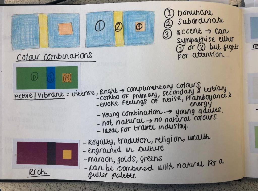
DOMINANT – The colour that appears the most or fills the vast majority of space within a design. It is the most dominant colour! This is the colour that communicates the message of the design. It should communicate key morals, traditions and values and also evoke feelings.
SUBORDINATE – This is the next colour in line; It usually fills the next largest space after dominant. It should contrast or compliment the dominant colour. For example; yellow and Blue.
ACCENT – Accent is a small area of colour which is extremely competitive and attention seeking! (Think of her as the youngest sibling of the family! :p) This colour can be sympathetic to either dominant or subordinate and be just as striking but it must be used sparingly so as not to draw attention away from the other 2 main, important colours.
Colour combinations and palettes
Colour combinations or palettes are extremely important in design, (as I found out in the exercises previous to this one) they can create moods or an atmosphere, evoke feelings, create nostalgia and even control parts of the human body. Creating the right colour palette to cater for what you’re designing is crucial.
The above images from my sketchbook show dominant, subordinate and accent colours on several different colour palettes which cater for different designs and settings.
Active/Vibrant
An Active/Vibrant colour palette is normally made up of bright, complimentary primary, secondary and tertiary colours. This colour palette evokes feelings of noise, flamboyance and energy. It is a very modern “young” palette and because of its energy and its “busy” appearance it makes it an ideal palette choice for use in the leisure and tourism industry.
Rich
A rich colour palette conveys royalty, tradition, wealth and religion. When I think of this colour palette I think of hot, luxurious places like Morocco and Dubai. I think of rich fabrics and I think of rich spices and foods. The colours usually comprised in this palette are maroon, gold and rich emerald greens. This colour palette is engrained with tradition and culture.
Muted/Calm
This colour palette is very quiet, relaxing, calming and peaceful. It is the perfect palette for use in the health and beauty industry. The colours used in this palette are muted down, there is a lot of white in the hues. The colours are very soft and feminine in appearance. In this combination the accent competes against the dominant for attention. Although used sparingly, the accent will make as much impact as the dominant does in this palette.
Pastel
The pastel palette is very similar to muted/calm – the hues contain a lot of white to tone them down, however Pastel does contain more warm tones than muted/calm. Pastel combines warm and cool tones (e.g.pink and blue) which makes it perfect to use in baby products. The colours portray youth and innocence.
Natural
A natural colour palette uses colours from the great outdoors. This makes this palette ideal for anything with rustic charm, outdoor leisure activities etc. One of the most obvious feelings that come to mind with this palette is Autumn with the leaves falling and the changing colours. The colours associated with this palette are browns, reds, oranges, warm pinks and sky blues.
Designer profile – Josef Albers
I decided to add a little bit of a designer profile in here as I thought it was relevant. I was doing some background research on colour and I kept coming across Josef Albers and his work involving colour and his theory behind it. Looking at pieces of his work actually helped me to understand exactly what this brief might be looking for in terms of the colours and the abstract influence. I also looked at previews and YouTube videos of his book “Interaction of Colour” which seem to be a crucial “must read” resource for artists and designers alike.
Josef Albers studied at Bauhaus and then in time was invited to teach colour theory there. Before enrolling as a student at the Bauhaus in 1920, Josef had been a school teacher in and near his hometown of Bottrop in Germany. Initially he taught a general elementary school course; then, following studies in Berlin, he gave art instruction and he developed as a figurative artist and print maker. Once he was at the Bauhaus, he started to make glass assemblages from detritus he found at the Weimar town dump and from stained glass; he then made sandblasted glass constructions and designed large stained-glass windows for houses and buildings. He also designed furniture, household objects, and an alphabet. In 1925, he was the first Bauhaus student to be asked to join the faculty and become a master. At the end of the decade he made exceptional photographs and photo-collages, documenting Bauhaus life with flair. By 1933, when pressure from the Nazis forced the school to shut its doors, Josef Albers had become one of its best-known artists and teachers, and was among those who decided to close the school rather than comply with the Third Reich and reopen adhering to its rules and regulations.
I will need to choose and display colour combinations effectively a) for deciding which colours to use in my designs and b) for how I use the colours on my designs.
This image above shows how colours are displayed according to their relevance on the design they have been chosen for. The grey is the dominant colour; it is displayed using a big block of colour. The subordinate colours are the next block of colours; slightly smaller in size to show their importance in relation to the dominant and these colours are contrasting colours. The accent colours are the smallest blocks of colour. They are just as important as the rest of the colour palette but only sparingly in a small amount.
When I choose the colours for each book I will make a colour palette which looks very similar to this one to show the order of importance each colour will have on my design, it will also be useful for me to see how well the colours work with each other.
What does “Abstract” mean and what is it?
I am quite fortunate in the fact I work in a secondary school and have close contact with the Art department! Zoe one of my friends and the Art teacher is a great point of contact for if I need guidance on anything art based for my work! She suggested a few areas to look into and the work of Henry Matisse massively inspired me… I will touch back on this later on in this exercise…
Abstract art from what I believe, is a non representative visual depiction of something that already exists but uses line, shape, colour, form and gestural marks to achieve an adaptation of it.
In simple “Abstract” is “abstracting an idea or distancing an idea away from its object. Abstract is pulling a depiction away from any literal, representational reference points.
Abstraction can be traced back to Impressionism, Post-Impressionism and Cubism. All three of these helped to realise the idea that art could be non-representative.
Modern abstract art was born early in the 20th century. It was completely radical for its day. Artists began to create simplified objections with little or no reference to the “real” world.
We will never know who started off abstract art but a key artist who is always credited for creating abstract art is Wassily Kandinsky as he created paintings of floating non representational forms as early as 1912.
Abstract art now lives in the art world in many forms. It is two- and three-dimensional. It can be vast or small. Abstract art can also be made with many materials and on many surfaces. It can be used in concert with representational art or completely abstract. Artists creating it often focus on other visual qualities like colour, form, texture, scale and more in their non objective work.
From doing this introductory research I am now more familiar with what the brief is asking of me and can now move forward into thinking about my ideas for my guidebooks. I will start off with the first city on the list which is Madrid.
Stay tuned for my future posts on the ideas and development around my city guidebooks!
Johannes Itten was a swiss painter and a teacher at the Bauhaus design school in Weimar. Itten developed colour theories which focussed on both the science behind colour and the emotions that the colours evoke. He wrote “The Art of colour” in 1961 and one of his quotes was “He who wants to become a master of colour must see, feel and experience each individual colour in its many endless combinations with other colours.”
Itten was very spiritual; a believer in mysticism, he once explained that colours must have a mystical capacity for spiritual expression without being tied to objects.
Itten was born on November 11th 1888 in Sudern-Linden in Switzerland. He trained as an elementary school teacher in his teenage years where he became interested in exploring the psychology of individual students. In 1916 he was invited to become one of the Bauhaus’s earliest instructors, he left the Bauhaus in 1923 after consistently arguing about which direction the school should take. He went on to open his own school in Berlin until it was closed by Nazi regime in 1934. Relocating to Switzerland in 1938, he spent his remaining years writing books and teaching design courses. Itten died on March 25 1967 in Zurich.
Colour theory and the colour wheel
What is colour theory? – Colour theory is a combination of art and science, colour theory helps to show the artist or designer what colours work well and look best together and this is mostly done using the colour wheel.
The colour wheel was designed by Issac Newton in 1666 and it basically maps the colour spectrum onto a circle, the colour wheel is the main basis of colour theory because it actually shows the relationship between colours.
Colours that loo good or work together are called a colour harmony. A colour harmony can create a look or feel. The colour wheel is used to find these colour harmonies by using the rule of colour combinations. Colour combinations show the positions of all the different colours in order to find colours that work together.
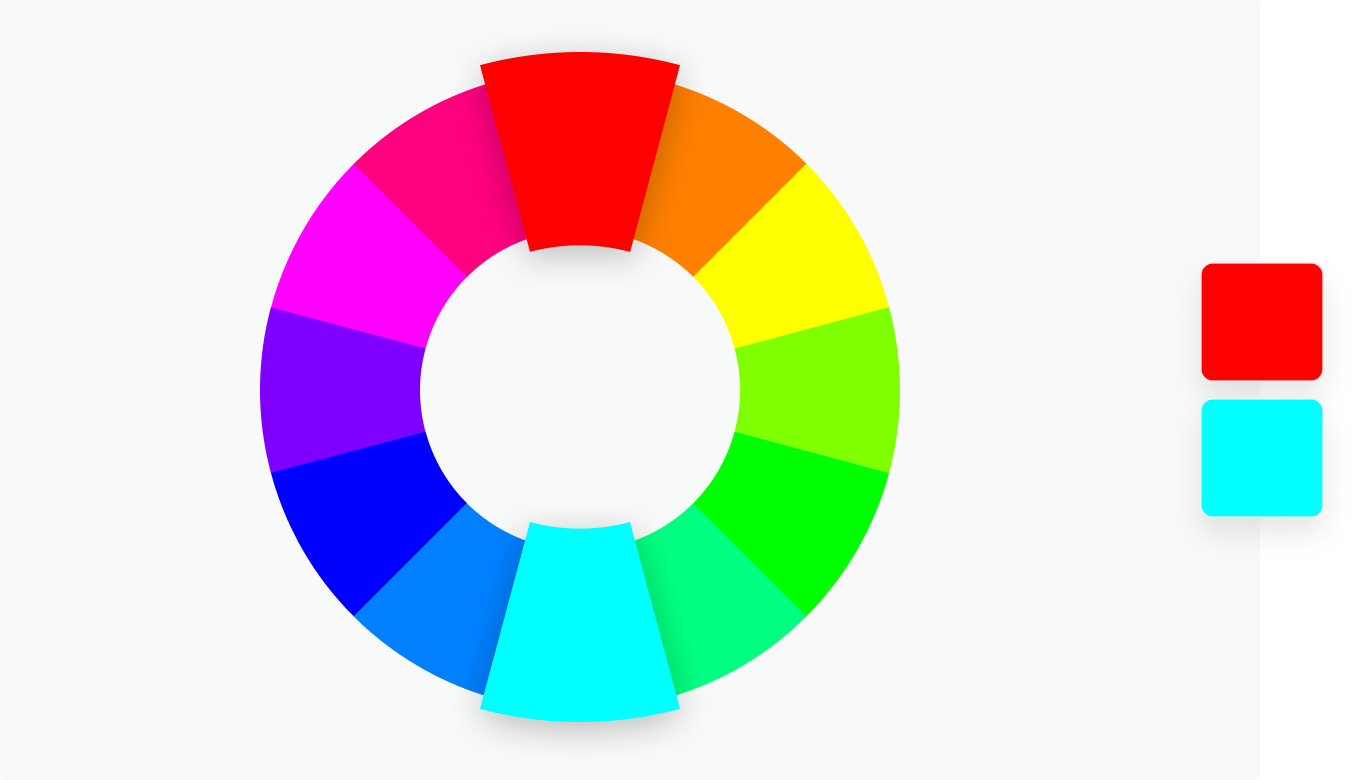
Complimentary colours
Complimentary colours sit opposite each other on the colour wheel, when put together these colours will have contrast and impact. They will appear more prominent than if they were with a similar colour.
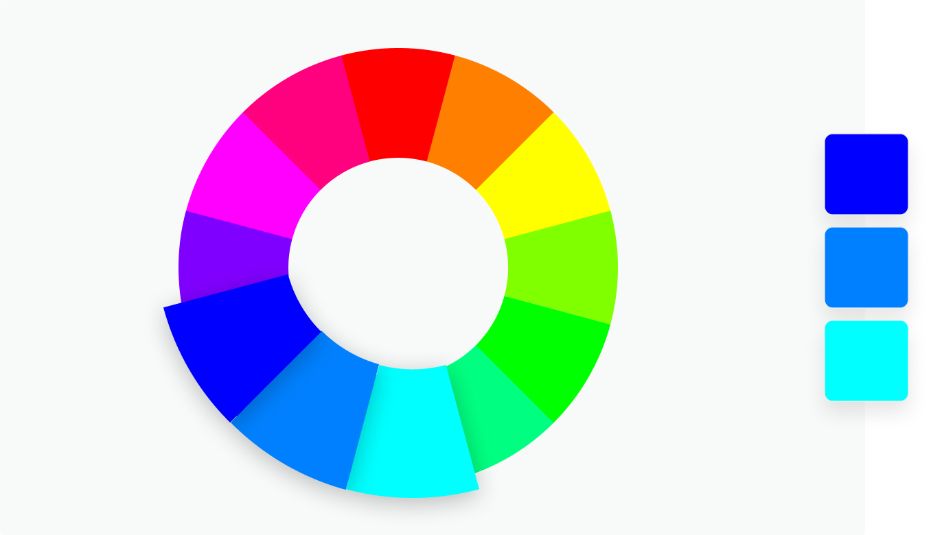
Monochromatic
Monochromatic is when colours are split into 3 different shades of the same colour. These provide a very subtle, versatile, harmonious colour combination.
Analogous
Analogous is when 3 colors are side by side on the colour wheel. This colour combination is versatile but can be overwhelming. To balance the colour scheme out choosing an opposite complimentary colour to accompany would work well.
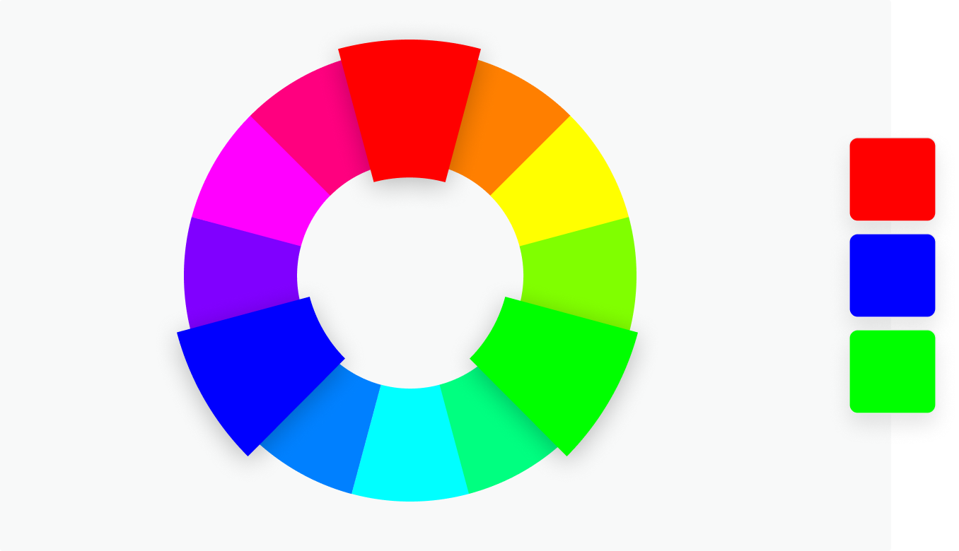
Triadic
Triadic combinations are three colours (evenly spaced on the colour wheel). which together provide a high contrast colour scheme. This combination creates bold, vibrant colour palettes.
Tetradic
Tetradic combinations are four colours that are evenly spaced on the colour wheel. Tetradic colour schemes are bold and work best if one colour is dominant and the other colours are used as accents. The more colours there are in a palette, the more difficult it is to balance.
Primary, secondary and tertiary colours
There are 12 main colours on the colour wheel. The colour wheel is divided into primary, secondary and tertiary colours.
Primary colours –These colours are red, green and blue. In the RYB colour wheel, primary colours are colours that can’t be mixed from other colours.
Secondary colours – These are colours that are created when you mix together primary colours. There are three secondary colours. In the RYB colour wheel, the secondary colours are purple (red mixed with blue), orange (red mixed with yellow), and green (yellow mixed with blue).
Tertiary colours – These are colours made by combining a secondary colour with a primary colour. There are six tertiary colours. In the RYB colour wheel, the tertiary colours are red-orange, yellow-orange, yellow-green, blue-green, blue-violet, and red-violet.
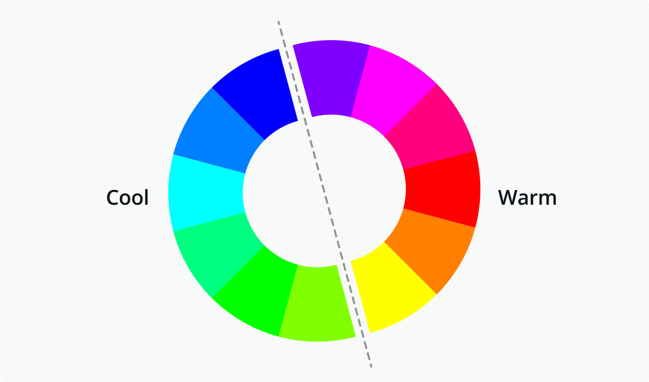
Warm and cool colours
The color wheel can also be divided into warm and cool colours.
The warmth or coolness of a colour is also known as its colour temperature. The colour combinations found on a colour wheel have a balance of warm and cool colours. Different colour temperatures evoke different feelings. Warm colours evoke cosiness and energy whilst cool colours are associated with serenity and calmness. Warm colours are Red through to yellow and cool colours are blue, green and purples. An example of something associated with warm colours is the sun and water for cool colours.
Shades, tints and tones
You can create shades, tints and tones of colour by adding black, grey and white to a base hue (a solid colour from the colour wheel).
Shade
A shade is created by adding black to colour, this will darken it creating a deeper and richer colour.
Tint
A tint is created by adding white to lighten a colour This can make a colour less intense and is useful when balancing more bold, vivid colour combinations.
Tones
A tone is created by combining black, white or grey with a colour. Like tints, tones are subtler versions of the original colour.
Hue, Saturation and Luminance
A hue is any colour on the colour wheel. Once you have picked a colour you desire, you can adjust the saturation and luminance of a hue.
Saturation – The intensity or purity of the colour.
Luminance – The amount of brightness or light in a colour.
Colour meanings
Red
Red is a colour that can be associated in more than one way; it is known for anger, violence, fire, warfare and caution (red traffic lights) but it is also known for being associated with love – love hearts, cupid and Valentines day. Red can also be symbolised in the celebrity world for being glamourous and elegant (think VIP and red carpets).
Red can also have a physical effect on people by raising blood pressure and respiration rates. In interior design Red is not a particularly good colour to use as a paint colour on walls (especially in a bedroom where you relax) as red is such an aggressive colour it has a non calming effect. Red is also seen as a very sexy colour on women. A woman wearing a red dress catches the gazes of men more than any other dress colour.
In China red is the colour of prosperity, happiness and good luck and in other eastern cultures brides wear red on their wedding day. In South Africa red is the colour of mourning and can also be associated with communism.
Orange
Orange is a very bright, vibrant and happy colour. It is associated to the Mediterranean and fruit by the same name; because orange is associated with oranges it also has links to health and vitality.
Orange is also associated with the Autumn season. It has strong association with pumpkins, orange fallen leaves, hay bails and anything else linked to autumn! Orange therefore represents change and changing seasons.
Yellow
Yellow is the brightest warm colour. It’s associated with happiness and sunshine. Yellow can also be associated with deceit and cowardice; calling someone yellow is calling them a coward.
Yellow is also associated with hope which is shown when yellow ribbons are displayed by families who have loved ones at war or the Macmillan yellow daffodils to symbolise support with cancer. Yellow is also associated with danger (think of the annoying, pesky wasps in the summer!) although not as strongly as red.
In Egypt yellow is their colour of mourning. In Japan, it represents courage and in India it’s a colour for merchants.
Yellow is happiness and cheerfulness! Softer yellows are commonly used as a gender-neutral colour for babies (rather than blue or pink) and young children. Light yellows also give a more calm feeling of happiness than bright yellows. Dark yellows and gold-hued yellows can sometimes look antique and be used in designs where a sense of permanence is desired.
Green
Green can represent new beginnings and growth. It also signifies renewal and abundance. Green can also represent envy or jealousy – Green eyed monster!
Green can also be related to wealth, stability, renewal, and nature (green is the colour of money!). Brighter greens are more energising and vibrant while olive greens are more representative of the natural world.
Blue
Blue is often associated with sadness – “feeling blue” “blue Monday” or crying tears. Blue is also used extensively to represent calmness and responsibility. Blue lighting is used in Doctors surgeries and hospital waiting rooms to calm down patients before they are seen and also blue is the most popular colour to be used to decorate the walls in schools as again, it is seen as very calming. Light blues can be refreshing and friendly. Dark blues are more strong and reliable. Blue is also associated with peace and has spiritual and religious connotations in many cultures and traditions (for example, the Virgin Mary is generally depicted wearing blue robes).
Purple
Purple is associated with wealth and luxury. In ancient times the dyes used for creating purple textile products were extracted from snails and were very expensive which meant that only royals and the very wealthy could afford them. Purple is associated with creativity and imagination, too.
In Thailand, purple is the colour of mourning for widows.
In design, dark purples can give a sense wealth and luxury. Light purples are softer and are associated with spring and romance.
Black
Black is commonly associated with power, elegance, and formality. A woman who wears a black dress can be seen as very elegant and sophisticated. On the negative side it can be seen as a very sad colour associated with evil, death, and mystery. Black is the colour of mourning in many Western countries.
White
White is often associated with purity, cleanliness, and virtue. White is commonly worn by brides on their wedding day in western countries. It is also associated with the healthcare especially with doctors, nurses and dentists and their uniforms. White is associated with all things good – Angels being the common image of this.
In much of the East, however, white is associated with death and mourning. In India, it is traditionally the only colour widows are allowed to wear.
In design, white is generally considered a neutral backdrop that lets other colours in a design have a larger voice (negative space!). It can help to convey cleanliness and simplicity and is popular in minimalist designs.
To summarise:
Red: Passion, Love, Anger
Orange: Energy, Happiness, Vitality
Yellow: Happiness, Hope, Deceit
Green: New Beginnings, Abundance, Nature
Blue: Calm, Responsible, Sadness
Purple: Creativity, Royalty, Wealth
Black: Mystery, Elegance, Evil
Gray: Moody, Conservative, Formality
White: Purity, Cleanliness, Virtue
Brown: Nature, Wholesomeness, Dependability
Tan or Beige: Conservative, Piety, Dull
Cream or Ivory: Calm, Elegant, Purity
With all this colour theory in mind, I will now continue to complete the exercise by creating my different blocks of colours.
For starters I made a rough list of colours that I like and dislike:
Colours I like
Fuschia pink
Hot pink
Pastel lilac purple
Sky blue
Bright sunshine yellow
Mediterranean Orange
Black, white and grey – particularly when I use them in design for nice clean, simplistic design.
Colours I dislike
Dark green
red
Brown
Mustard yellow
navy blue
Baby pink
dark purple
maroon
burgundy
ivory/cream
I then put these colours into grids opposite each other at absolute random just to see what they looked like together. To do this I created grids in Illustrator and then filled the boxes with swatches of colour.
From doing the 2 grids of colours it was supposed to allow me to see which column of colours worked the best. From reading the brief apparently the column that I dislike the most is supposed to actually look the best; I am not sure I agree! I think both the columns stand out just as much but neither really in a massively positive way! Out of the two columns I still like my “like” column.
I then started on choosing colours for all of the 26 words. Some of these words were easier than others. I also found that without realising I used the same colours for a few words which are similar in meaning; Wonderful and zany and precious and luxurious. Precious and Luxurious I used rich colours which represent wealth and royalty; navy blue/dark purple represents royal luxury whilst green represents money and wealth. Zany and wonderful I used 2 really bright colours which represent to me happiness and fun! For jumpy I used 2 clashing colours which make you slightly uncomfortable when you look at them, I think this represents jumpy. For unhappy I chose blue which represents water and tears and grey which represents grey skies and rainy days. They are very dull colours, however they work together! – A dark blue and a lighter grey which have contrast and work together. For angry and dangerous I chose similar colours – Red and black which both represent anger and danger and black and yellow which represents caution and danger.
This exercise definitely made me think about colour combinations; the meanings behind the colours, contrasting and complimentary colours and what colours really do not work together.
This is probably one of the kindest exercises I have had so far in this unit! – I went into this exercise fairly confident that I could come away with some good compositions. This exercise reminds me of the poster design videos by Chris Do on YouTube . In these videos he explains the theory behind effective poster design;
the rule of thirds.
Not putting things in the corners – do not put the design in a “box” give the design room to breathe with space around it.
Making sure that there is a natural flow from the eye between the objects on the page.
Making sure that any split words should be split by syllables only.
Negative space is a MUST – you can never have too much negative space; negative space is as much a design choice as the main design itself.
This is the link to one of these videos which massively helped me in a previous exercise for a poster design!
Even though the videos I refer to are related to poster design, they still have relevance to this exercise. This exercise is all about;
Composition
layering
hierachy
contrast
This exercise is not as simple as putting a few design elements into a box in different variations, (which is what I was trying to explain to my boyfriend as he sat watching me wondering why I was finding it so complex!) There is a reason and a thought process behind everything in design – no matter how simple it might seem! There is a lot of psychological theory behind the practise!
The human brain and eye are very clever things! The brain will try and fill a space or gaps where there is any, (negative space) and the eye will only see things in a particular way… the most attention seeking element first followed by any least important information.
In the western world we read from left to right, where we position text on a page therefore is vital, our eyes will immediately seek left to right. The most important design element on the page needs to be positioned in eye line focus to the eye, be the right size and in the right place. Design elements should not be placed in the corners either, this will constrict the design to a “box”, there is no space or room for the design to breathe around it. Keeping all this in mind I planned how I would start this assignment and how I would create all the 20 designs…
Pen and paper trials
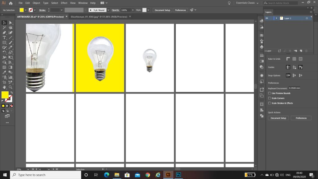
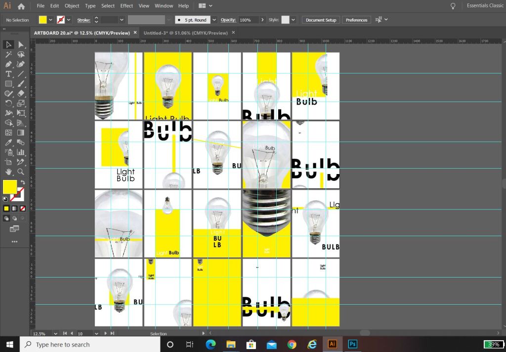
The best way for me to come up with different layouts and compositions was to use traditional pen and paper and draw some up. I knew that I wanted to use Illustrator or Photoshop to complete the finals and I was thinking around the best way to show 20 designs all at once – I decided to use 20 art boards to display them on. I created the art boards in Illustrator and then screenshot the screen and printed off a few pages to practise drawing the layouts onto it.
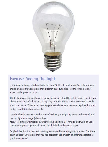
I then just quickly before I started any rough drawings, trialled out downloading the light bulb image (I imported it into Photoshop, cut around it and removed the white background) I picked my colour for the blocks – yellow, I felt this best described “light” and the light bulb and I then went on to try and choose a font. I knew I wanted a sans-serif, modern looking round font to match the feel of the bulb.
The font I decided to go with was Century Gothic. It is very simple, legible, modern looking and meets what I was looking for with its rounded shape. I like the kerning with this font also.
With everything decided, I then drew out some rough designs.
I then transferred these over to my previous document that I set up on Illustrator.
I had my document set up with my 20 art boards and started putting the different elements in place on them, however working with the rule of thirds I decided to create myself a grid to work to. This helped a lot! I found that placing the objects within this grid made the designs have more flow and look more professional.
Final Artwork
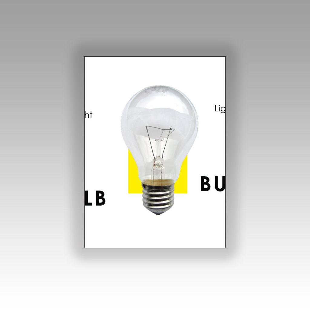
This above design is my favourite. It was a completely accidental piece – I ended up cutting my text in half by accident but really liked how it turned out. I wanted the text to speak rather than the image so I used parts of the lightbulb that possibly would not be identifiable if they appeared on this piece alone. Going back to Chipp Kidd and the “apple” lesson; a photo of an apple does not need “apple” written next to it. A light bulb does not need “lightbulb” written next to it to identify what it is, this is why I have only chosen parts of the bulb where you would have to guess what it is – the text speaks for itself. I wrote “light” in small at the top to emphasise light and lightness – plus I really liked the use of negative space in this design. The contrast between dark, big and bold text next to the small, light text draws more attention to the design. I incorporated the block colour into the letter L.
This piece reminds me of something that David Carson would possibly design – subconsciously my influence from Carson and Cranston came out to play with this piece.
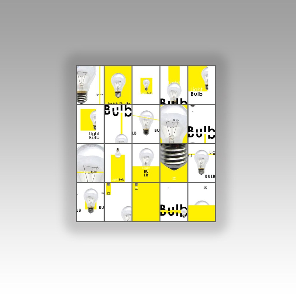
This piece oozes more negative space. The colour block in this piece fills the page. Again, I used part of the bulb rather than the whole image – just because once again I did not want to use “light bulb” twice with the image and text. I emphasised the light and dark contrast again with “light” and “bulb” using bold and regular text. I wanted to keep the negative space so kept everything very minimal and small at the top. The eye is drawn there first and all information is taken in.
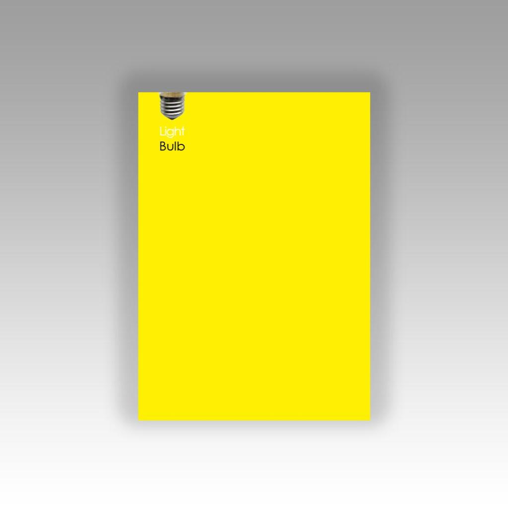
I relied solely on my grid of thirds for this design. I made sure that there was a design element in each third of the grid. This design does not naturally flow, however there is structure to it. I have gone against my rules though and split words without syllables. I quite like the modern feel to it though and again the contrast between light and dark in the typography. I have placed the block of colour behind the light bulb in this piece – layered up the colour block to the image – to add depth, contrast in colours and to separate elements of the design. I have kept a lot of negative space within this design once again.
Self Critique
I was actually surprised at how long it took me to complete this exercise, it was a whole afternoons work. The design possibilities with this are endless! I could have designed easily another 20. I found that I became more confident and less “rigid” in my approach by the end of the exercise.
I started off fairly unconfident with the typography part involved in this exercise but then by the end I started experimenting with cutting up letters and repositioning text to come up with some creative responses. I found that I was experimenting with one design and then seeing other new ways I could change it, I found that I was taking one design and then altering it to create endless other possibilities. It has definitely been a good exercise to “think outside the box”, to problem solve and work on a constrictive, closed brief.