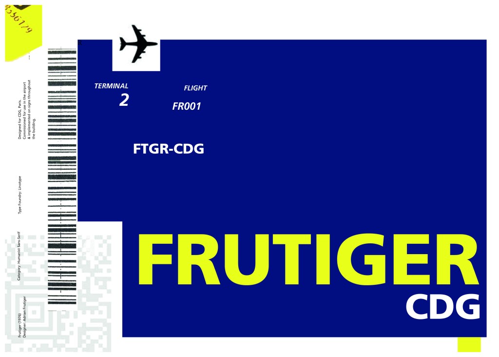
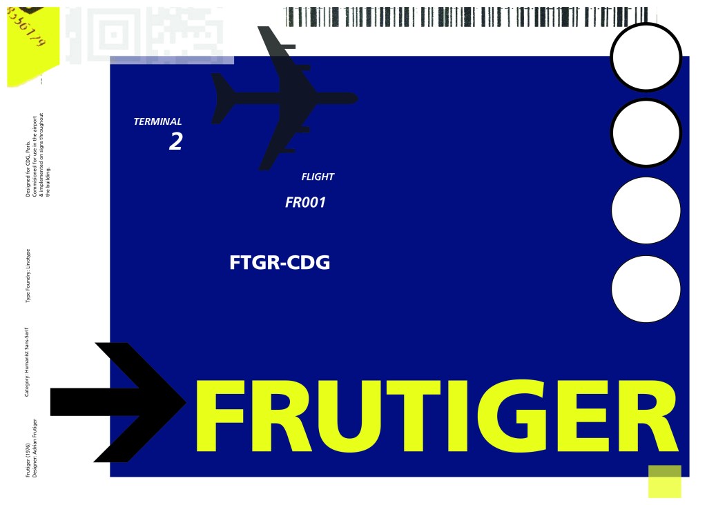
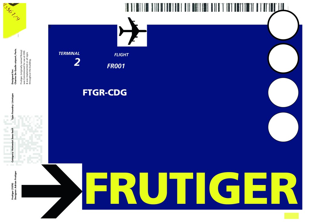
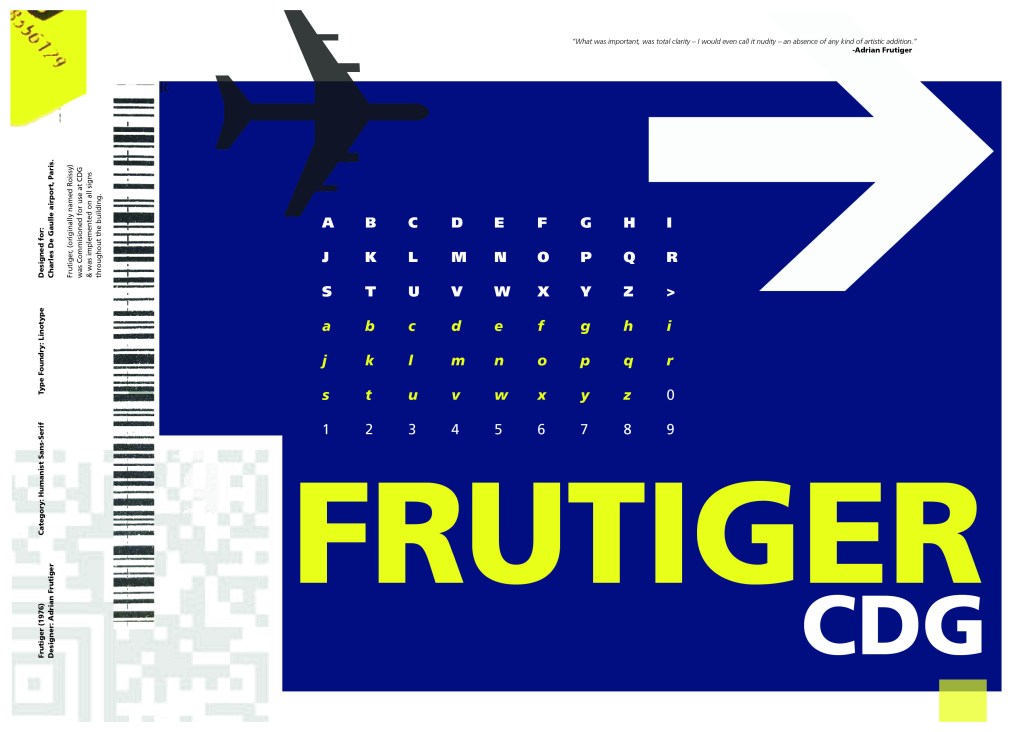
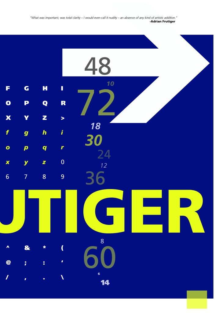
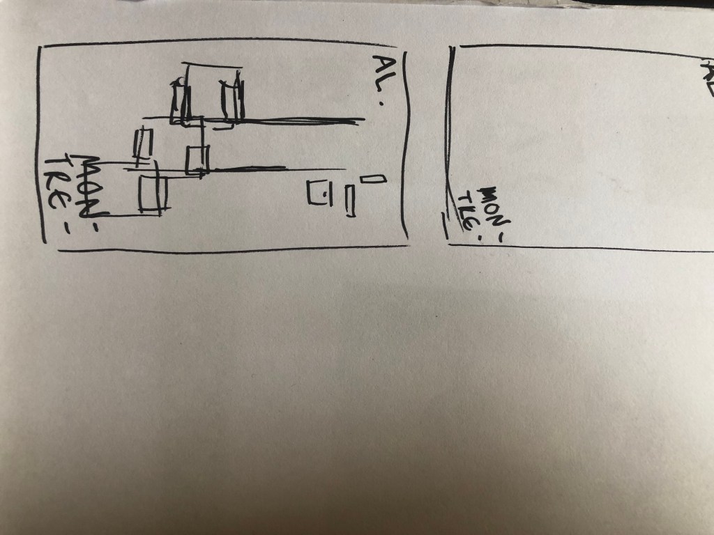
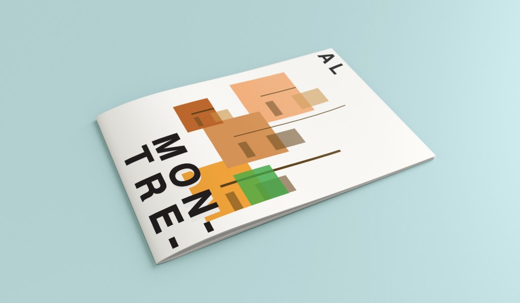
Following on from Univers, I chose to do another famous typeface by Adrian Frutiger.
Frutiger is a Sans-Serif and was designed to be legible at any size. It was originally commissioned by Roissy Airport in Paris, (Charles De Gaulle) when it was first built to design all the signage in the airport. The airport wanted a new directional sign system. It was going to be named “Roissy” in 1972 after its success but was then Frutiger was approached to make the typeface suitable for print and it was then named after the designer himself.
The way forward for this layout design seemed quite obvious; to base it around signage and CDG airport. The first idea I had was to make the layout look like a baggage tag or boarding pass with the barcodes and airport names etc.. taking a little bit of inspiration from my Casetify Pangram phone case… My idea was to scan some barcodes in and then create another “swiss grit” style design.
I did ask my boyfriend if he had any boarding passes kicking around from his visit to Dubai a few years back (I haven’t travelled abroad in a few years now!) and he did have one boarding pass that I managed to take a QR code from and import into my design;
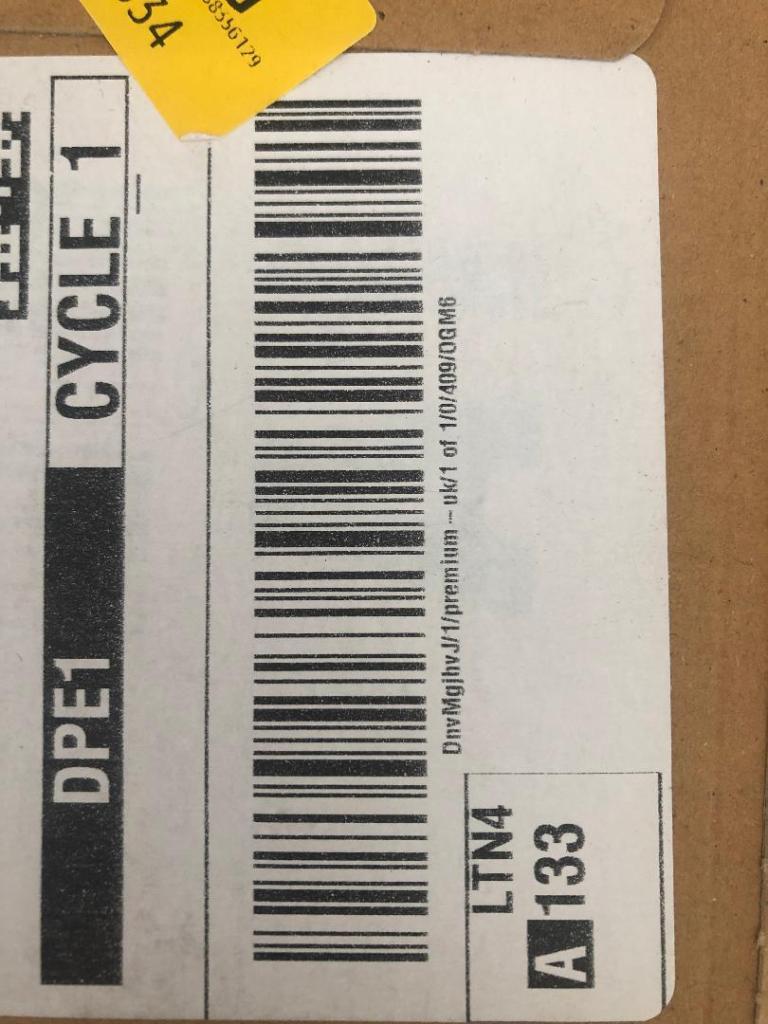
I also keep a bag full of different cardboard and paper textures and barcodes and anything interesting I could potentially use in my designs; I found a relevant barcode that I could use.
I felt like I needed some images of airport signage next. I did not want to take images from the internet because they would be very low resolution and would ruin my clean, legible design. The only way I could use airport images in my work was to import a web image of a sign and then trace around it in Illustrator to produce a high quality vector image. I did this for a plane and an arrow.
After I had collected these bits I decided to just take it straight into Adobe to try and make into a layout for the typeface. As you can see from the design development, It took me several attempts to get to the final piece! I had a lot of design elements to cram onto one page and I wanted to keep it as clean and as minimal as I could so it was a case of moving elements around the page to see what worked the best. I wanted the design to flow and to not be “too busy”. I think the version I decided on works the best.
Design Development – stages to the final design!
These are all the development stages I had to go through before I reached the final design.
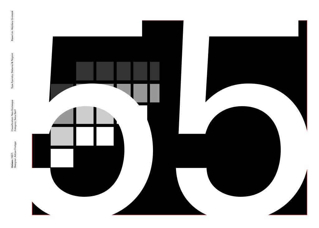
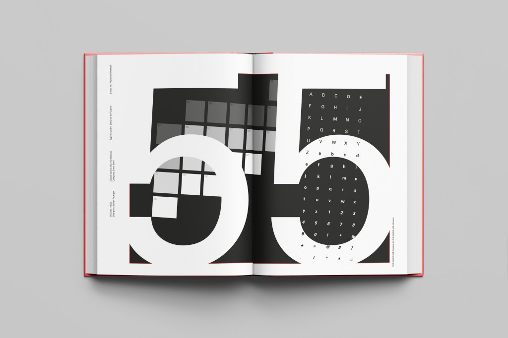
Another typeface I chose for my Sans-Serif collection was Univers. I have already used Helvetica and Akzidenz Grotesk and this is the third typeface that relates to all those; they are all based upon Akzidenz Grotesk. Univers again played a crucial role in Swiss style. I did worry that by doing all three of these typefaces that they would be too similar as they are often mistaken for each other but if I am creating a specimen book for my own personal use I would use all 3 of the typefaces in my work.
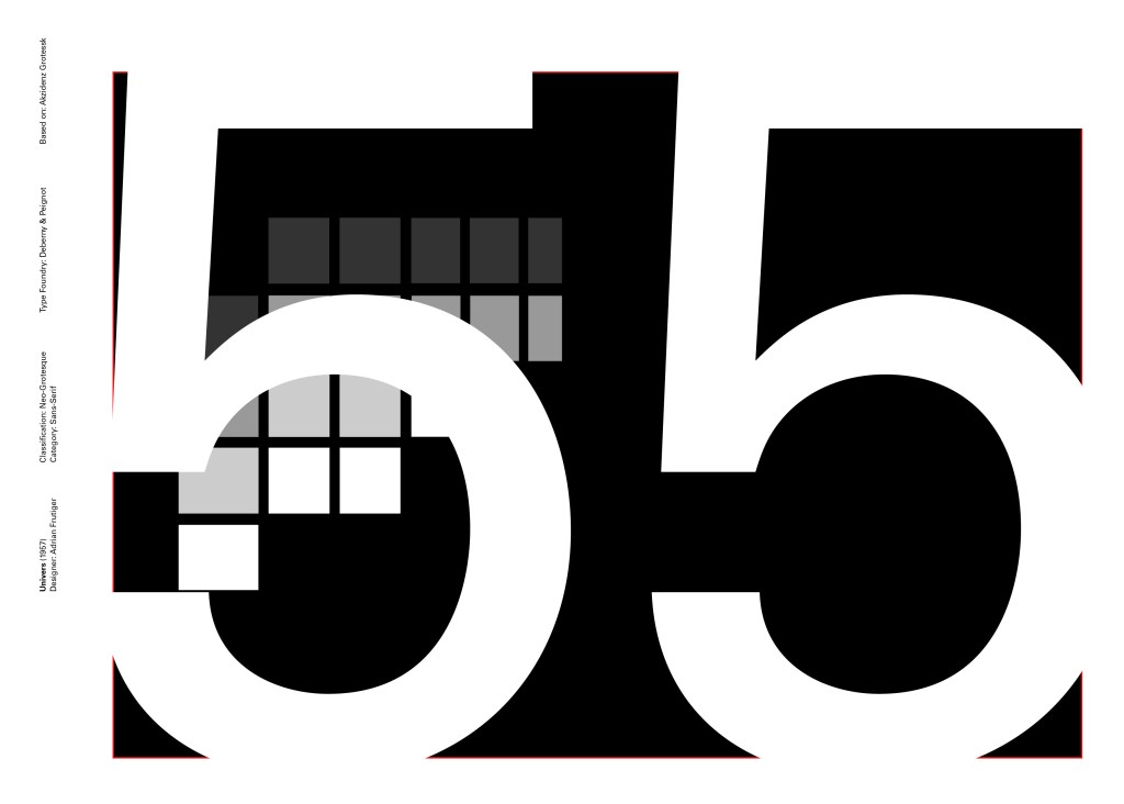
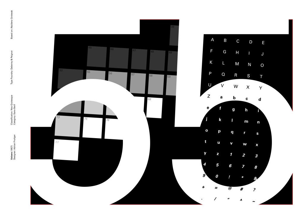
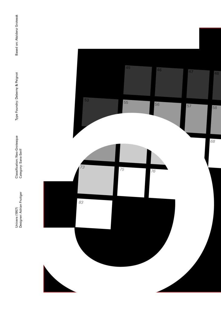
I tried to make the design for this slightly different to the others that I completed to date; Univers referenced the periodic table and Adrian Frutiger took a different approach to designing it then anyone ever had before. He wanted a table system that showed the different typeface weights and variations as numbers instead of names. Frutiger has since used this method in more of his type designs.
55 was crucial in the design of Univers; how Frutiger designed the whole typeface was to design “55 Roman” first and then base the other variations and weights around that. I decided to use this as the main design in my typeface book. I tried to be more experimental with this layout, using the 55 as part of the negative space in my design. I did want to bring in the periodic table element but struggled to keep it looking clean and simplistic. In the end I used blocks of colour to represent the periodic table influence on the typeface and I think this worked well.
Design Development – The stages of reaching my final design and layout!
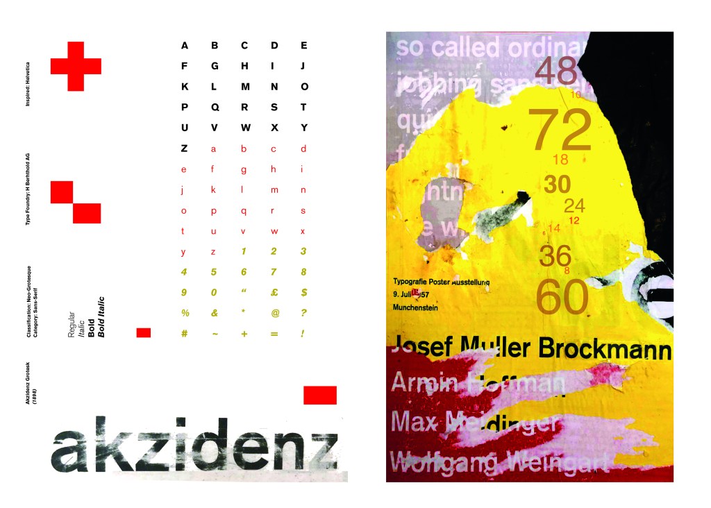
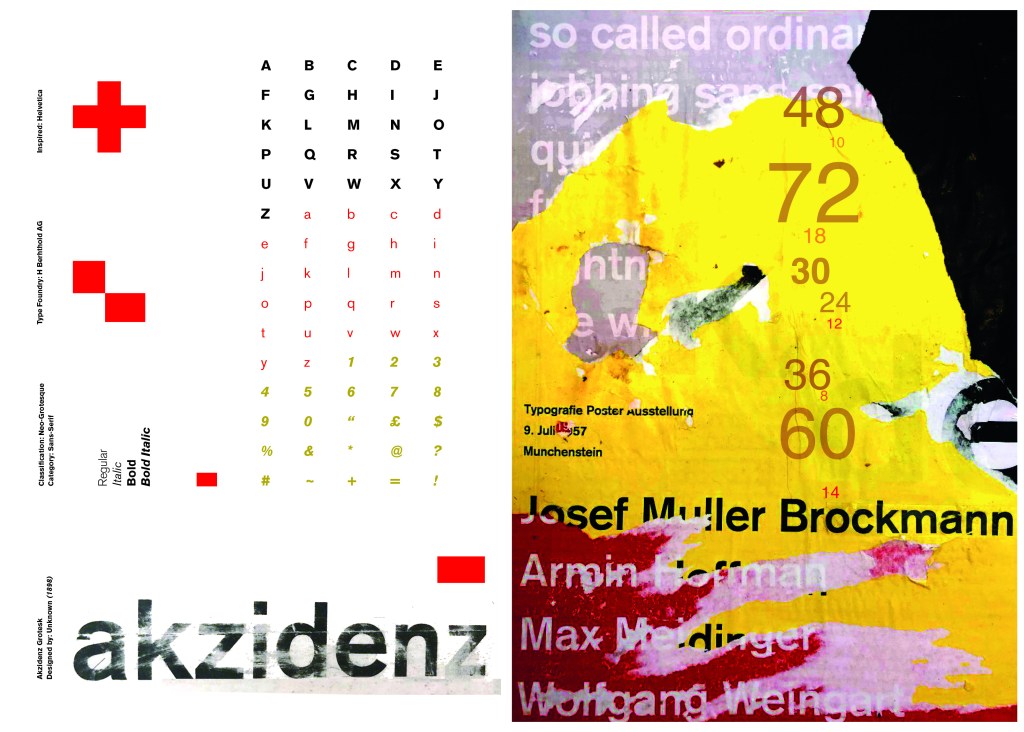
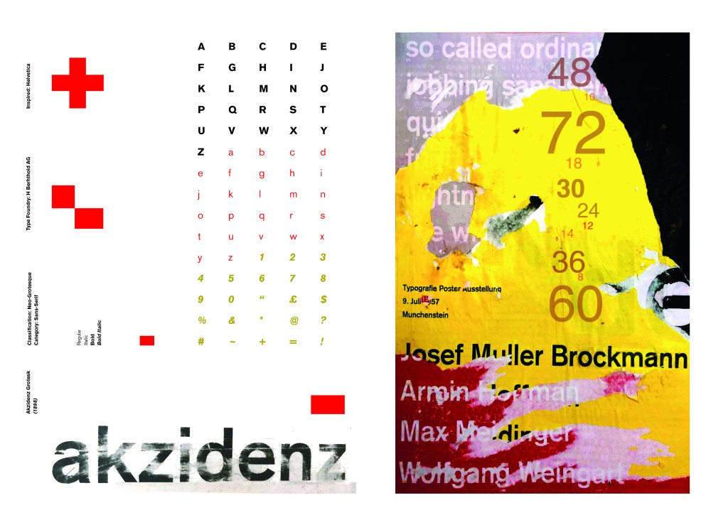
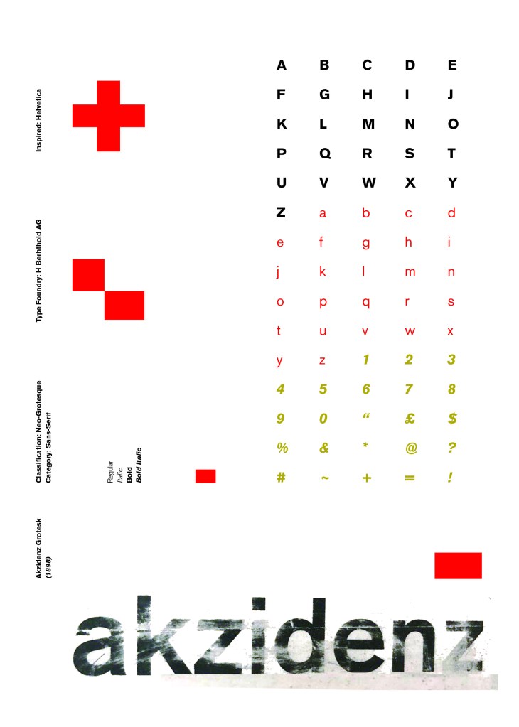
I wanted to carry on down a similar path for my next typeface, Akzidenz Grotesk was the next best Sans-Serif to choose. Akzidenz Grotesk’s history goes back further than Helvetica’s but despite this, they are still closely related. Akzidenz Grotesk was the inspiration behind the design of Helvetica.
Akzidenz Grotesk was known as the “jobbing” typeface; what this means is that it was heavily used in trade printing, advertising and forms that were made at the time. The typeface was designed to be seen from a distance. “Akzidenz” comes from the German language and means trade printing for an occasion or event. The latin term refers to it as “that which happens, a casual event, a chance”. I liked this saying and used it further in my design (I will come to that later!)
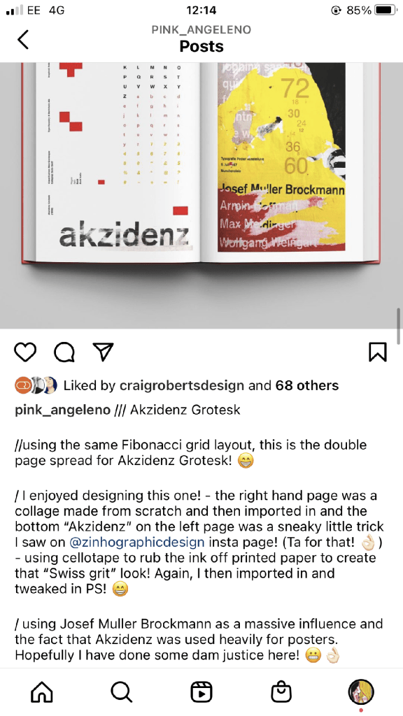
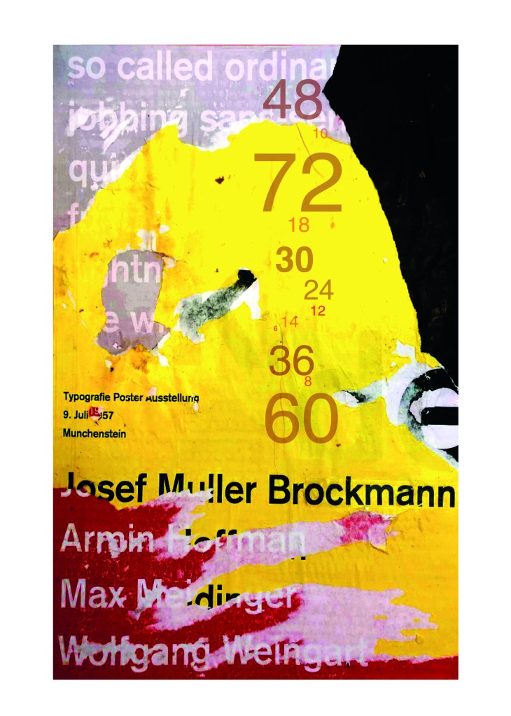
Keeping in mind that Akzidenz Grotesk was used predominantly in advertising and posters I decided to base my design around this, researching further I also found that Josef Muller Brockmann heavily used Akzidenz Grotesk in his poster designs.
Josef Muller Brockmann
Brockmann was a Swiss Graphic Designer but also the pioneer of the International Typographic Style which tied in brilliantly with this typeface. He was recognised for his clean use of typography, shapes and colours in his designs. His work mainly consisted of poster design. I bought a book about him and studied his posters to see how I could get a similar style for my own design. I also did some in depth research on Pinterest again to get some ideas and a feel for his style.
I found an image on Pinterest which caught my attention and gave me an idea for my design:
Composition 5 by Eduardo Seco
I liked the way the colours pop and contrast each other and the different styles/weights and sizes of the text also work together to create contrast. I felt I could create something like this using Akzidenz Grotesk, the Bauhaus colours and make it look like “trade printing or advertising with the modern influence of “Swiss Grit”.
I wanted to create the poster layout for my type specimen pages but just didn’t know how to do it…yet.
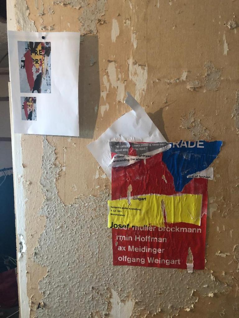
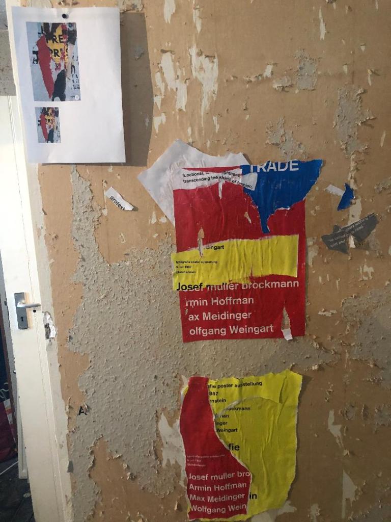
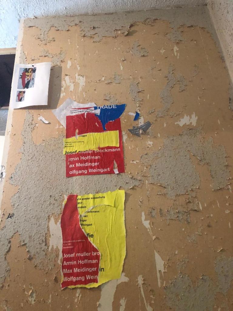
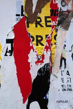
Using the image from Pinterest to vaguely copy, I knew I had to layer up and collage different posters to recreate that torn and ripped look. I decided to create a poster with a made up event (A typography exhibition in honour of Josef Muller Brockmann) then layer up behind it contrasting colours and different type relating to Akzidenz Grotesk. The only implication was that I wanted to actually create my poster on a real wall and photograph it and then import it into Photoshop to do any adjustments etc.. The issue was where would I find an urban wall when I live in the country? and how would I even get out to photograph one during lockdown?.. I then looked no further than home because we are currently renovating our house and the upstairs second bedroom wall is being ripped out and is covered in plaster, paint ripped off.. ideal for the urban look! I created a few A3 pages with different colours and pages filled with Akzidenz Grotesk type and then printed them off to later PVA glue onto the wall with a roller which I hoped would give a wrinkled, worn feel.
I enlisted my boyfriend with the roller to help glue them on! I needed someone who (no offence to Chris because he is super talented with cars and a brilliant Motor Vehicle Teacher! :p) has no creative flair or direction and would just stick random pieces anywhere without overthinking it! I procrastinate too much and am too regimental in my approach which is something I did not really want! I wanted it to look random and “rough” . At the end of the evening after doing these posters I decided I needed to go away and have another go printing off more sheets and make further alterations. The blue that I used was too much and it wasn’t layered how I wanted it to be. We just ripped pieces of paper and layered them on top of each other, what I needed to do was to print 4/5 pages and stick them all on top of each other and rip into them to reveal a page at a time.
The next day in my lunchbreak at work I decided to trial a test piece on some card I ripped off a cardboard box; it was rough in texture so I thought it would have the same similar feel to a wall. It turned out to be perfect! I scrapped the wall idea totally and used this as my final piece for my design.
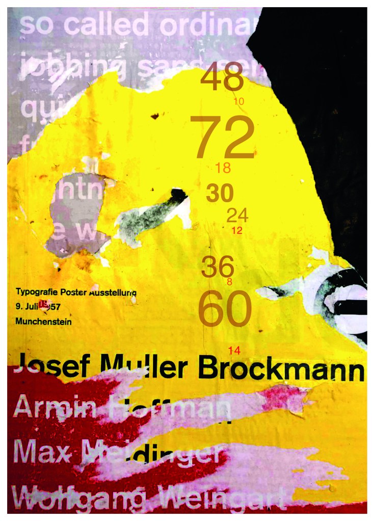
I then imported it into Photoshop and made some minor adjustments like changing the brightness/contrast etc. I also added the type point sizes onto the side of it to show what the type looks like at different sizes. I created 2 more pages on my Indesign document below my Helvetica pages and imported my collage poster into Indesign to start my final layout!
Digital Development
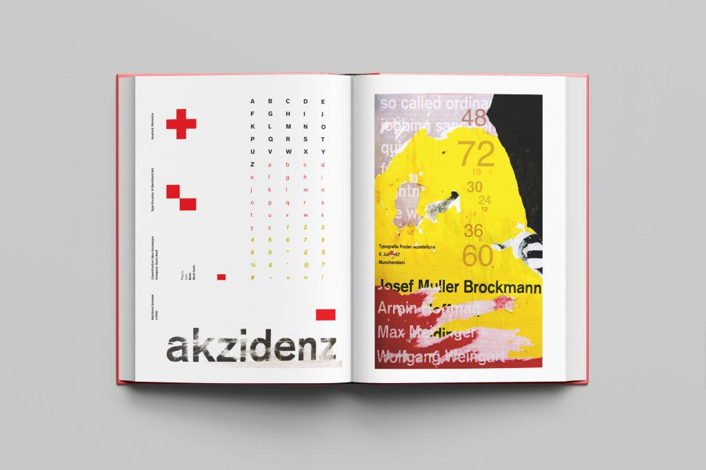
Again, I wanted a layout that was minimalistic and clean with lots of negative space. I decided to place the poster on the right hand side page and place the character alphabet of Akzidenz Grotesk on the left side.
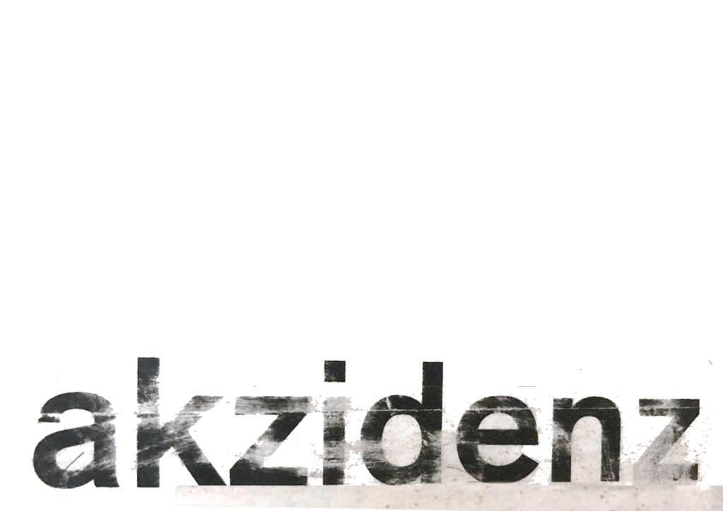
I wanted to use Red as a predominant colour again as it represents Swiss design and also the Bauhaus influence. I wanted to be in keeping with the “Swiss Grit” style of the poster though with the “Akzidenz Grotesk” heading and decided to try something experimental and different… I watched an interview with Chris Ashworth about a year ago where he explained what sort of experimental “grit” typography he does such as sticking type to the bottom of his twin girls school shoes so that when they return back from school in the evening the type is all ragged to give that worn down texture. He then uses this in his pieces rather than using digital textures. I wanted to do something similar for the type on my page. I decided though to try the cellotape method… I made friends with a Graphic Design student on Instagram who is also into Swiss Grit and he did a demo on his page of how he created his “gritty” type. He printed his type out using a laser/inkjet printer and then covered the text with cellotape and gradually pulled away at it to rip the ink off the page onto the cellotape. It worked! It gave a great gritty texture to my type which I then imported in and tweaked to become part of my layout.
Design Development – The stages of reaching my final design and layout!
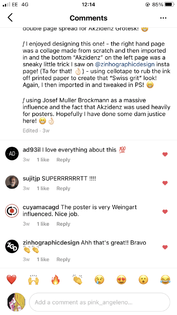
The final layouts were received VERY well when I uploaded them onto Instagram. It got the most likes my page has ever got and everyone seemed to love it! I felt very proud of this piece when it was done!
My Instagram screenshots
The final design pages and final mock up
The final mock up!
Responding to Tutor feedback…
“The sketchbooks evidence in between stages, idea development and layout/mark making: do you have any evidence of the planning for the laying for the Aksidenz poster? Is this a place where you could experiment with textures and layering with surfaces and drawing media?“
I have sketches in my sketchbook and images that I found on Pinterest that inspire the collage that I did for the Akzidenz Grotesk poster:
Work by Eduardo Seco
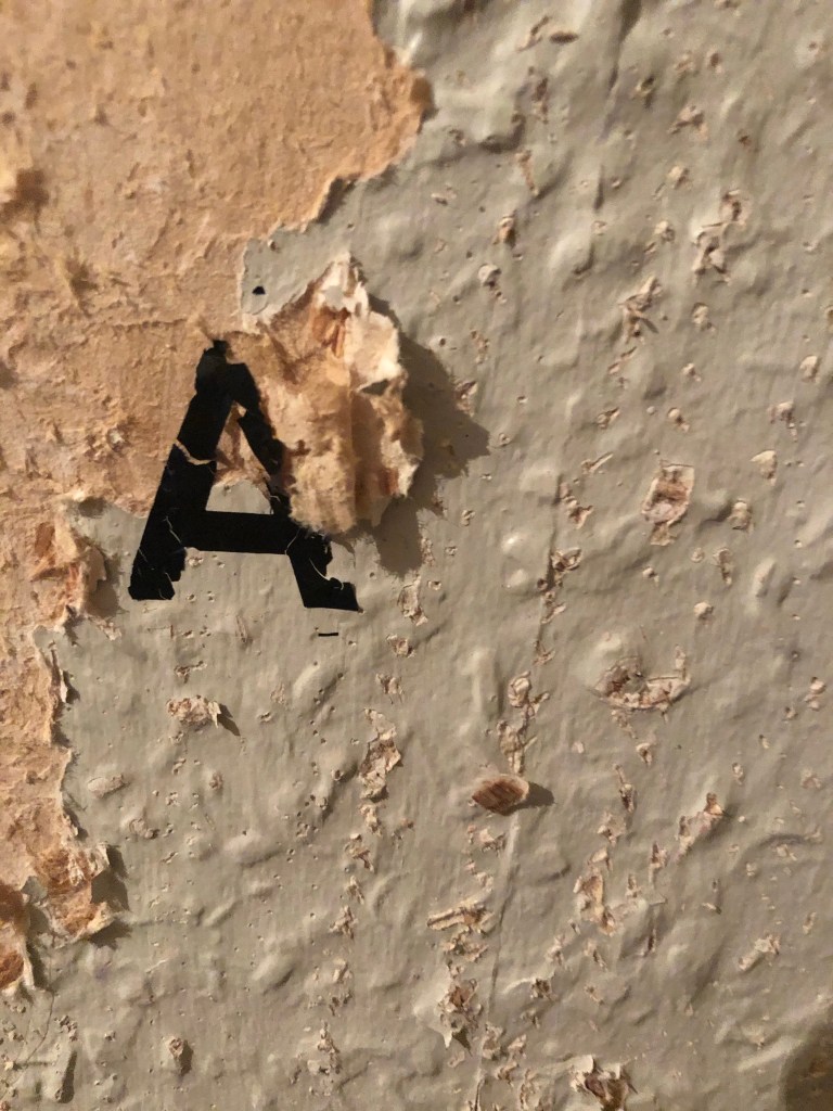
I agree with the feedback that I didn’t document the Akzidenz Grotesk collage all too well… but it was created entirely how it is pronounced!.. a complete happy AKZIDENT!
I had no idea really how to put the collage together for Akzidenz Grotesk. I tried first on the wall of my house PVA glueing different sheets of coloured paper that I printed out from my printer at work and this just did not work. I tried rubbing Letraset on the walls too, My plan originally was to create the poster on the wall using Letraset letters or printed type on sheets of paper that I would dampen and then rub off onto the wall!
Another thing that inspired me was a few photographs I took of the side of my old cooker… When I moved house in October 2020 I rented my house and inside it I had an awful, old cooker (possibly from the 1970s!!) when I moved it out to clean it I noticed some markings on the side of it. It was quite cool and I took the photos to bank in my resources for any future projects:
I knew I wanted to create this kind of effect but I was struggling as to know how…I then had the idea of photographing some different textures and then importing them into Photoshop to play around with for my poster. These were some of the textures I found, (again, they were all from the upstairs of my house which is currently now only starting to be renovated!)
The textures idea just wasn’t gritty enough for me though… This is where I went to work the next day feeling really frustrated at the fact that I didn’t know how best to create the idea I had in my head!!
I have a very rigid “Neat” approach to my work, everything I do is very structured and organised and I couldn’t quite get myself to create something “messy” enough!- I needed to switch off and just become careless and wreckless to see what I could create!! I had another go on my lunch break when I had the classroom to myself; I filled a paint palette up with PVA, found a screen printing roller to layer it on smooth and what I ended up with was the unexpected, perfect finished piece! I have photos that I have found in my design archive of me creating this final piece but other than me being really inspired by some collage work I found on Pinterest it happened without any prior planning or any planned sketchbook experimental work.. it was completely by accident! A really happy accident! I literally just created pages in Microsoft Word (my work laptop did not have Adobe at the time!) of block coloured pages and pages with some type using Akzidenz Grotesk, I printed them out using the laser printer and then layered them up on top of each other using PVA glue. Carelessly I just ripped sections away to reveal layers underneath. The idea was to create the feel of a really old billboard that has had hundreds of posters ripped off and layered on in its time in a really rural area of a city..
The final piece was perfect for me! In fact it seems such a shame to pack it away with all my Core Concepts work that I have thought about framing it as a showpiece!
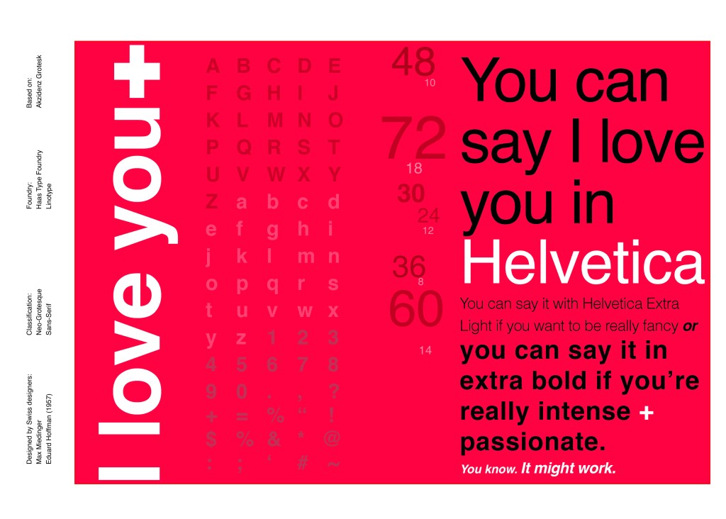
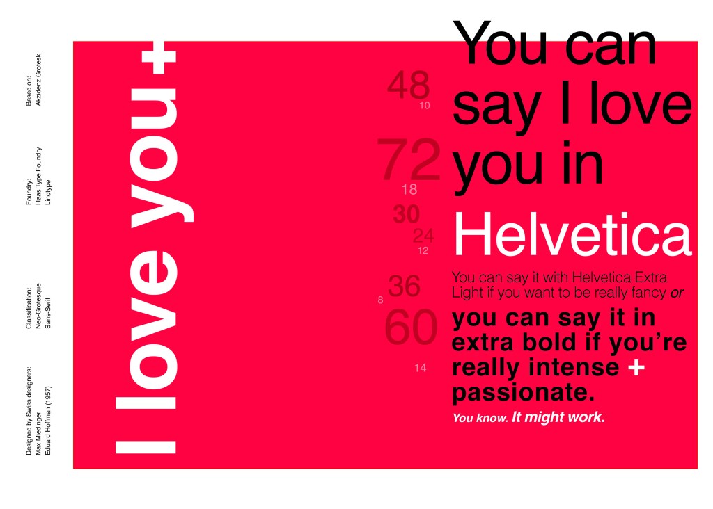
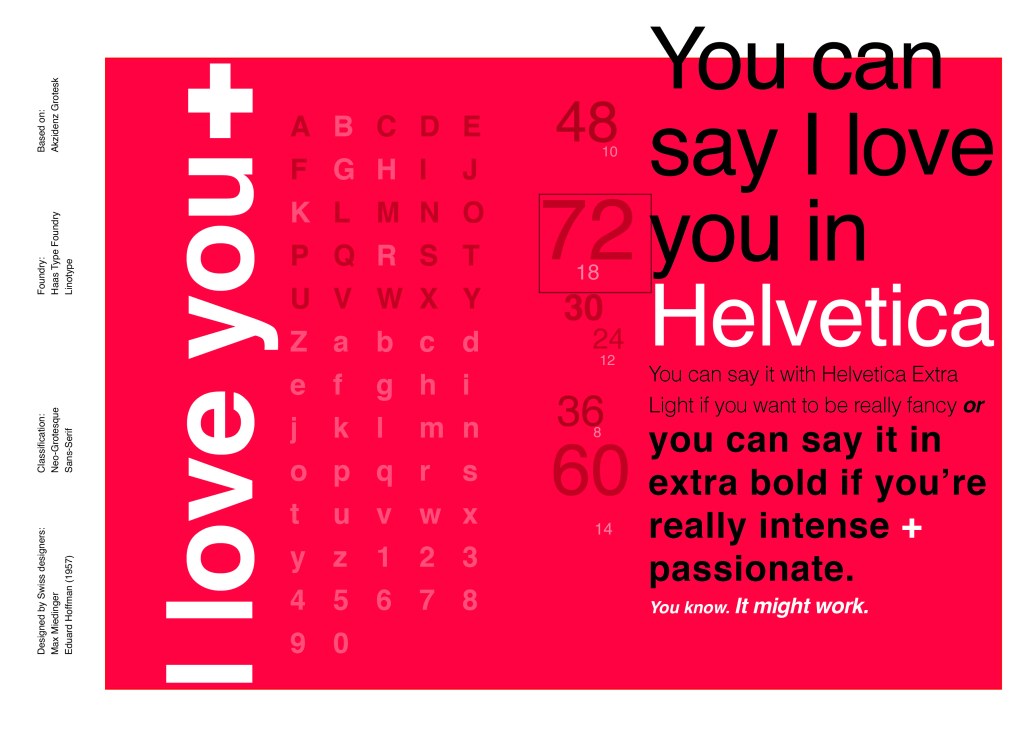
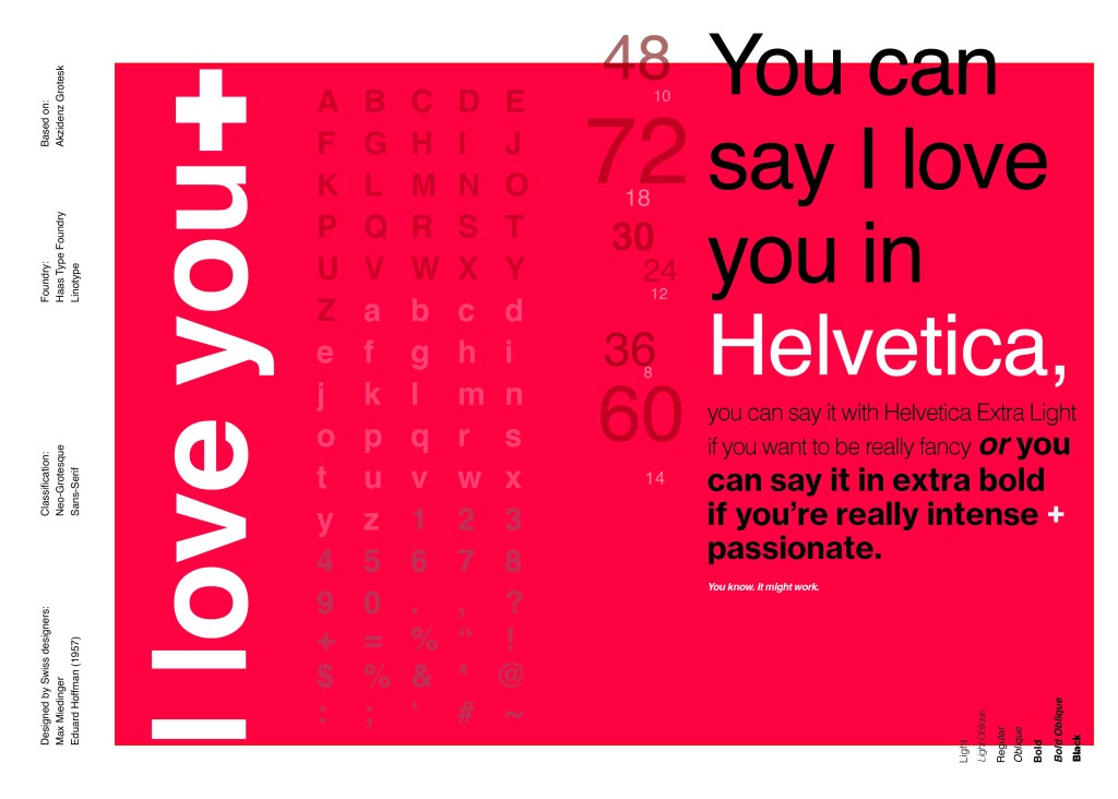
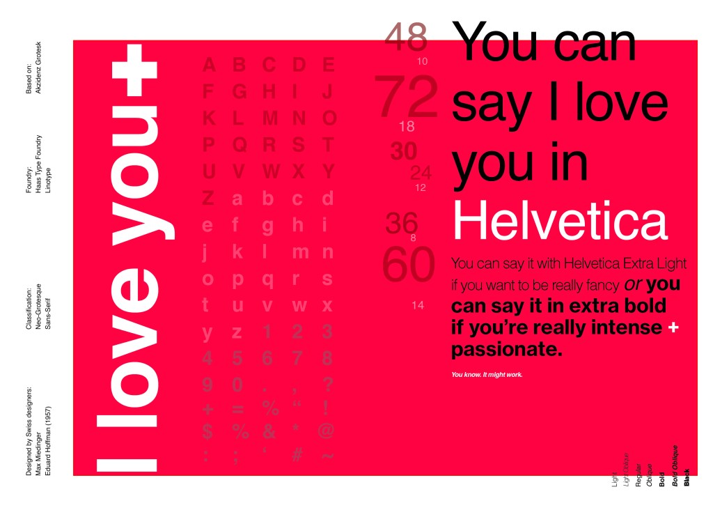
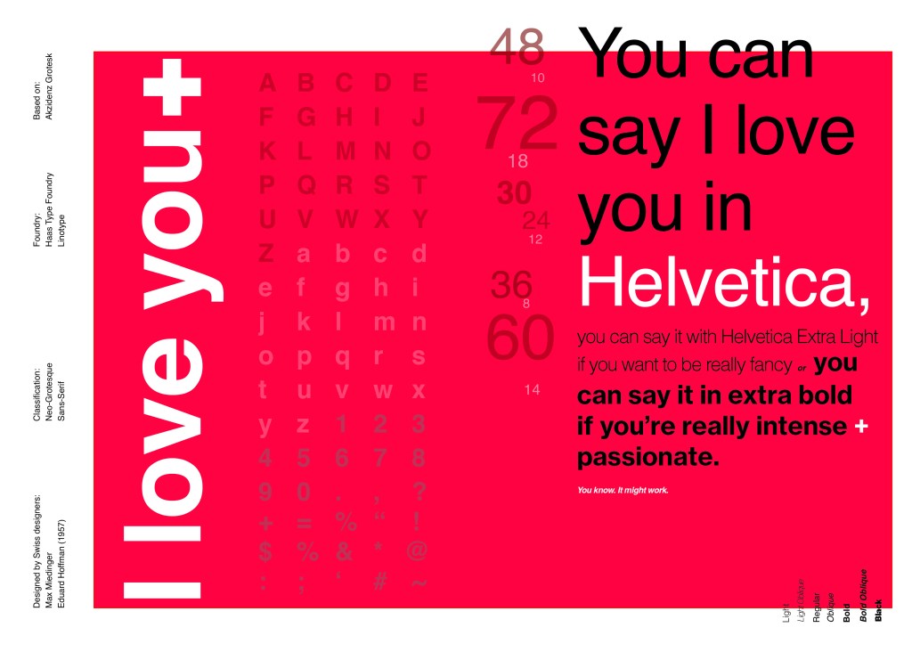
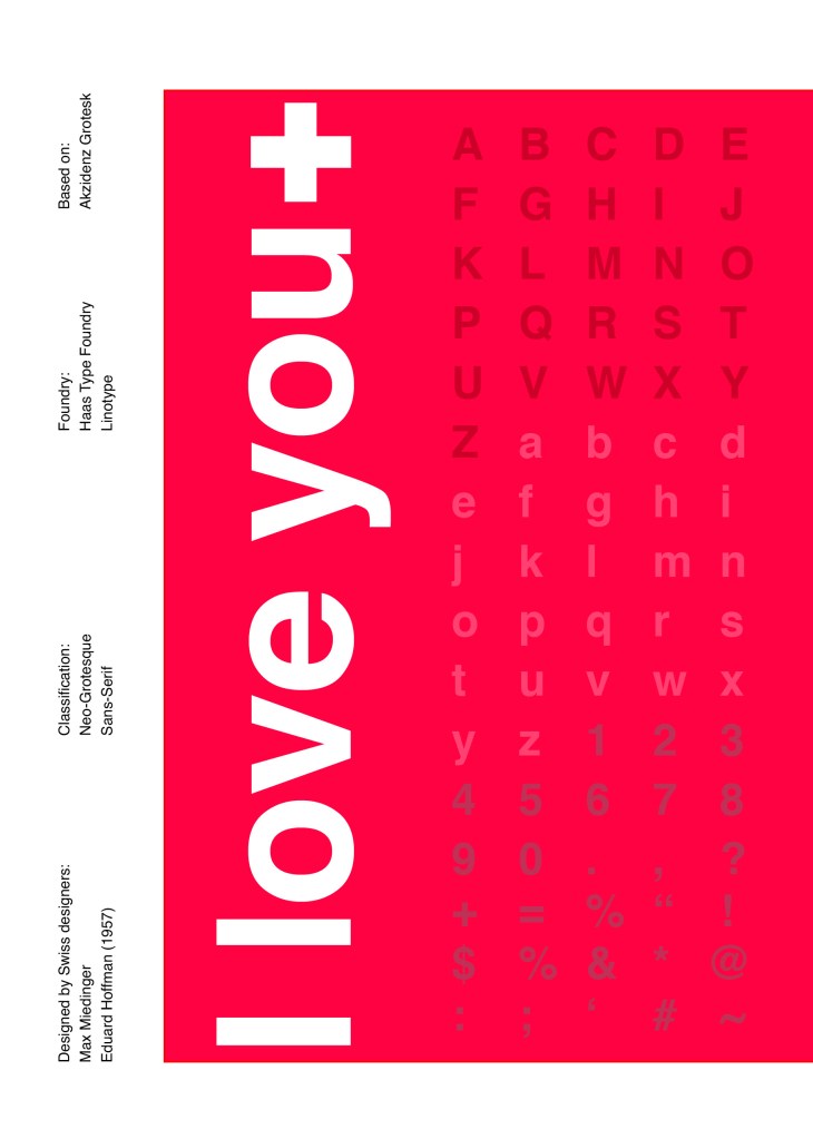
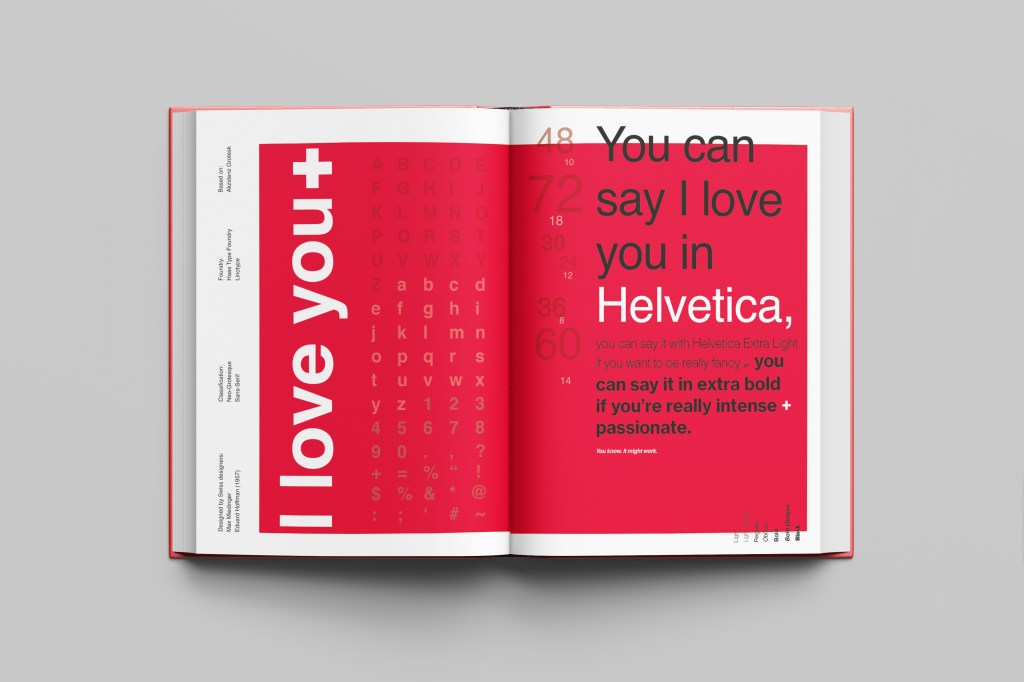
When you think of Sans-Serif there is only one typeface that comes to mind immediately and that is Helvetica. Helvetica is possibly a designers all time favourite. It was designed in 1957 in a new world after the war where the need for function over beauty prevailed. There was a need for clarity, function, cleanliness and for text to be readable, legible and straight forward communicating. The mantra was “less is more” and “form follows function”. The focus became on the content rather than the design and any ornate detailing. The designs of the time were very mathematical; Designers of the time designed religiously around the grid. Bauhaus at the time was also a massive influence.
For this design I wanted to represent everything that this typeface stands for; minimalism, cleanliness, Swiss designed and legible. I started off by doing some intensive research into the typeface; I used Pinterest as I always do to look at lots of type specimen books that already exist for Helvetica. I watched the film Helvetica again, I bought a book all about the history of Helvetica.. I really went deep with the research!
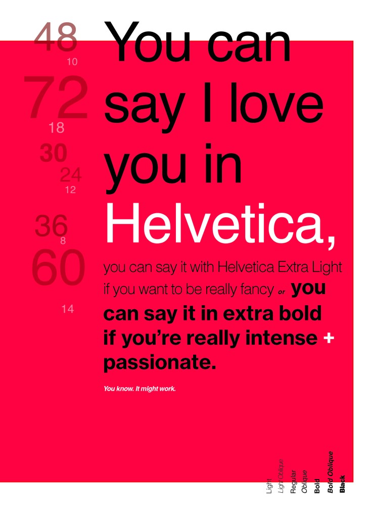
I noticed that a lot of type specimen books use “The quick brown fox jumped over the lazy dog” to showcase their typefaces with the different styles/weights/widths etc.; I did not want to do that. It just did not fit in with the feel of the typeface at all! I was really making myself nervous about completing this double page layout for the fact that I wanted to do the typeface justice and didn’t want to design something awful. I decided to refresh myself on the typeface by re-watching the film “Helvetica” for some inspiration and ideas, It was from this that I got the idea to use one of the quotes from the film;
You can say, “I love you,” in Helvetica. And you can say it with Helvetica Extra Light if you want to be really fancy. Or you can say it with the Extra Bold if it’s really intensive and passionate, you know, and it might work.
Massimo Vignelli
I decided it would be a good idea to use this on my main design to replace “The Quick Brown Fox”. I actually used Helvetica Extra Light and Extra Bold when I wrote the quote to show the different styles and weights of Helvetica on my type specimen page.
I used Red as the dominant colour and the red Swiss cross in my design to represent the origins of Helvetica.
I then started to lay everything out onto my pages and reorganise. I wanted a lot of negative space. It needed to be minimal and to not be ornate in any way.
Design Development – The stages of reaching my final design and layout!
I was really happy with how my final design and layout turned out and it was also well received on social media when I uploaded it to my college Instagram page!
The first part of this exercise brief was to create a book of typefaces that I can refer back to for my future design work.
The brief specifies that I need to organise them into:
Sans- Serif
Serif
Script
Decorative fonts
Fixed width, pixel or Techno
I had seen examples of this brief in other students work and I felt really apprehensive starting it! I always thought that Typography was an area in design that I really couldn’t get to grips with so I was really nervous about starting part 4 of Core Concepts with this first real exercise. However, reflecting back now on this finished exercise I can confidently say that I think it is one of the best pieces I have done to date! I have learned so much about typography and the typefaces that I never knew before. Designing the pages for each typeface required me to research in depth all about the typefaces; how they are best used, the history behind them, artists who may have used them strongly in their work… and it also required me to research into type specimen books, layout design and grids. The brief specified to create a book; It did not mention how many typefaces for each category I should do, how many pages it should have or how simple/detailed it should be so I had to go with my own judgement and create a book that I would personally want to read if I was buying it in a shop. I had a snoop online at some of the outcomes that several students had done for this brief just to see whether I was thinking along the same lines. Some of the students had simply listed the typefaces onto one document one beneath another with an example of the different characters beside it but I knew that his definitely was not the route I wanted to take. The brief specified “book” which to me means professionally designed in InDesign with the pages all laid out with the grid system etc. I decided to go down the route of creating a double page spread for each typeface in InDesign. I chose to design double pages for each typeface because of hierarchy. I wanted each page to be easily readable, comfortable on the eye, appealing to read and look at and most importantly I wanted the use of negative space which I would not have achieved with single pages.
Research
I next needed to decide which typefaces to use. I mostly use Sans-Serif typefaces in my work and am most familiar with them so these were easy to choose. I like Swiss design and the International Typographic Style of the 1950s (Swiss Style) and I chose all typefaces to reflect this. I had to research more into Serif typefaces; although I am familiar with some I rarely use them in my work and as for script, decorative and pixel/techno I really had to research! I do not like gimmicky fonts! I also researched into existing old/modern type specimen books just to see what sort of thing should be expected from my own designs and to give me an idea of the direction to go in. The next thing I wanted to do before I started to design my pages was figure out which grid system I would use in my designs. As I have stated on many of my previous posts, I am a big fan of Chris Do and his YouTube channel; The Futur. On one of his videos he explored the Fibonacci Grid. I had never heard of this grid before but decided to give it a go and I was surprised actually by how well everything complimented each other and linked together by using this grid system. In a very early post I stated F*** the grid! I 100% see the error in my ways now! – There is no way anything good can be created without using a grid! When I had researched everything I needed to, I then went on to design my pages. I created the whole book using InDesign and based around the Fibonacci Grid. I used a similar layout for all of the pages so that it is clear that they belong in the same book but I tailored each double page spread around the style of each typeface, how they would have originally been used and their era etc. I am sure that months down the line when I have progressed in my learning further I shall disagree but here and now I am really proud of every page in this book!
My Fibonacci Grid!
The book!
I am really proud of how this book has turned out! The pages are as follows:
· Page 1-2: Helvetica
· Page 3-4: Akzidenz Grotesk
· Page 5-6: Univers
· Page 7-8: Frutiger
· Page 9-10: Futura
· Serif
· Page 11-12: Baskerville
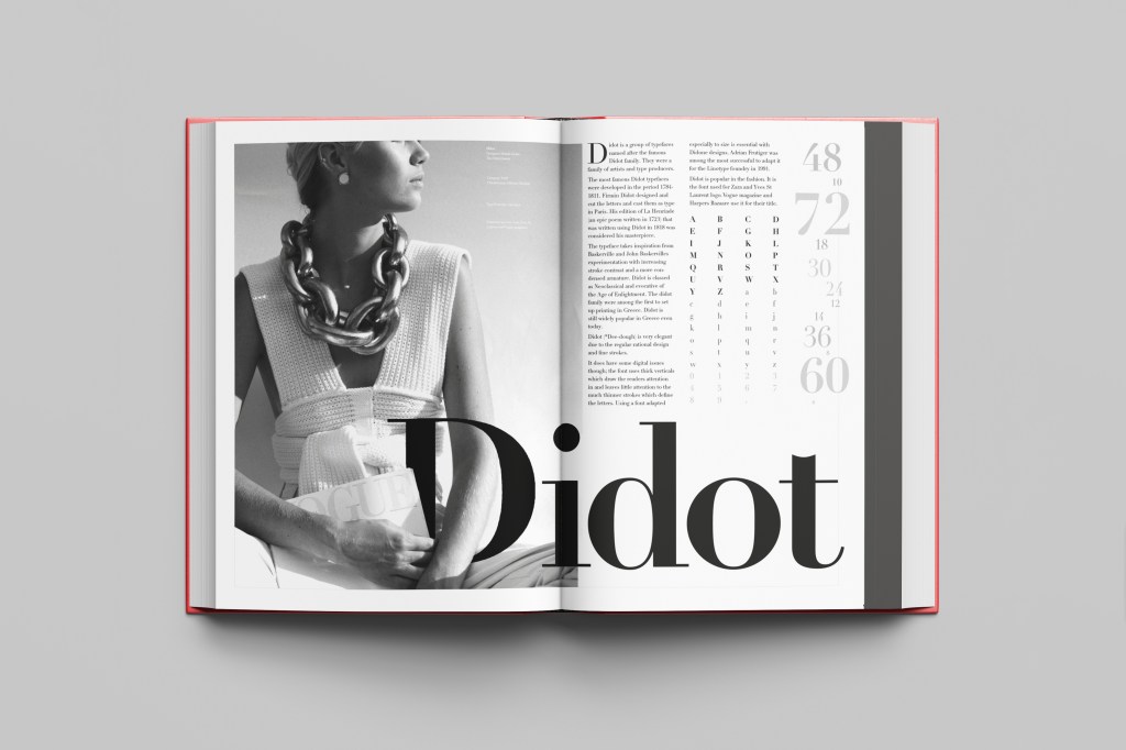
· Page 13-14: Didot
· Page 15-16: Mrs Eaves
· Script
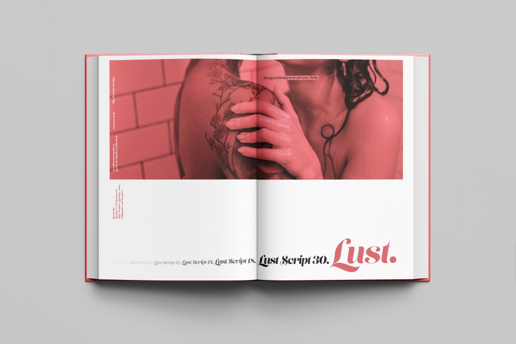
· Page 17-18:Lust
· Decorative
· Page 21-22:Chantal
· Fixed width, pixel, Techno
· Page 25-26:Lo-Res
Here are photos of the final mock ups but on the sub sections to this page is each individual page design and the type and ideas behind it!
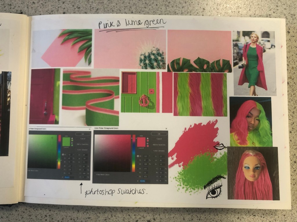
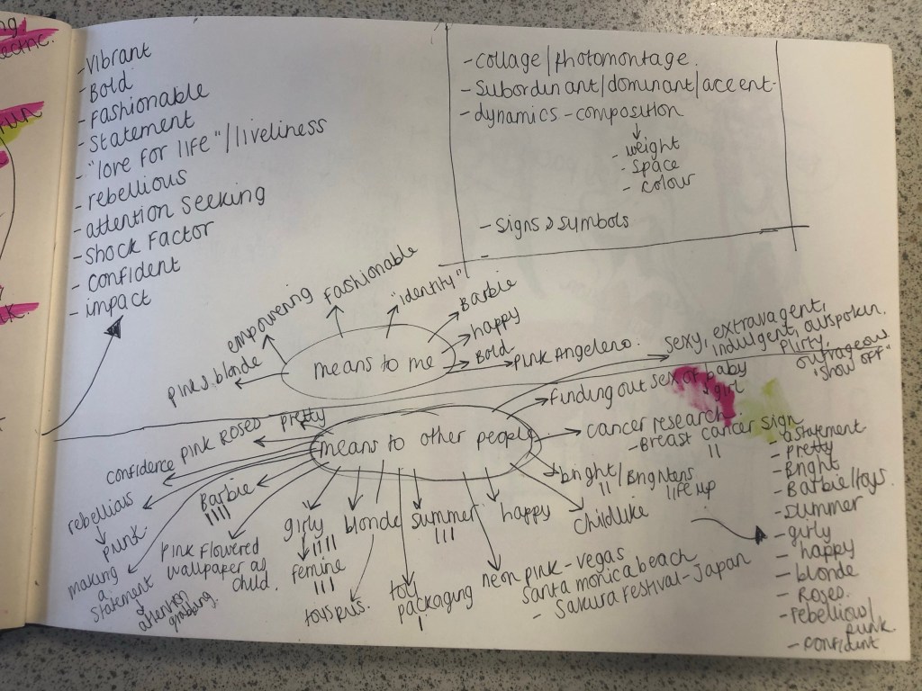
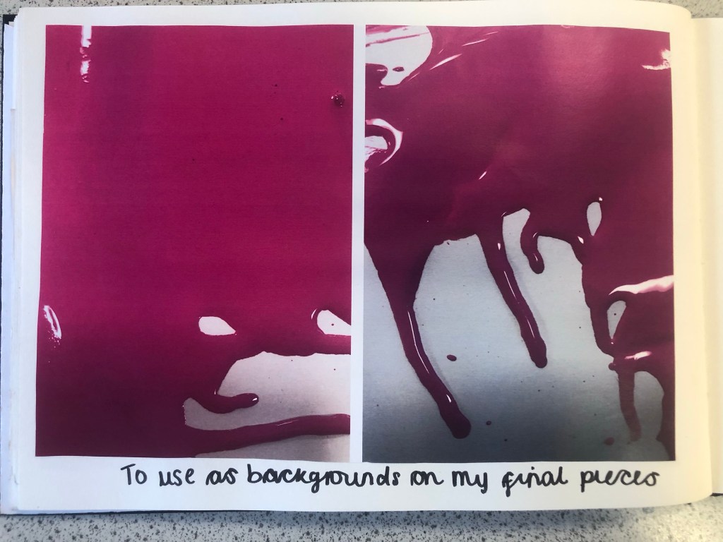
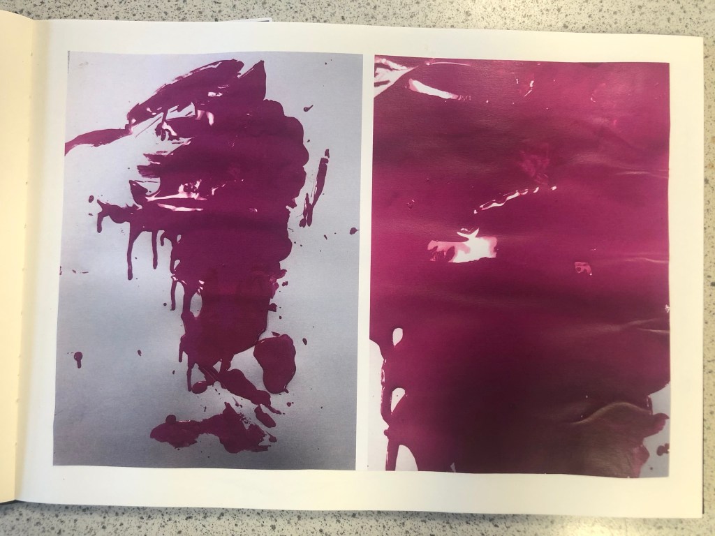
I approached this brief feeling fairly confident! I knew exactly what colour I would choose… PINK! In particular though, a more grown up Magenta Pink; It is not “pink pink” it’s not Fuchsia but it’s somewhere between the 2! I thought that the most difficult thing would be to convey what the colour means! I have never really thought about what the colour Pink does to me! 😀 All I know is that I am drawn to anything Pink and it just makes me feel happy and girly! I am familiar with colours on the colour wheel so knew what the complementary colour would be – lime green! I knew that I would have to research further to come up with some good ideas!
Research – Mood Boards
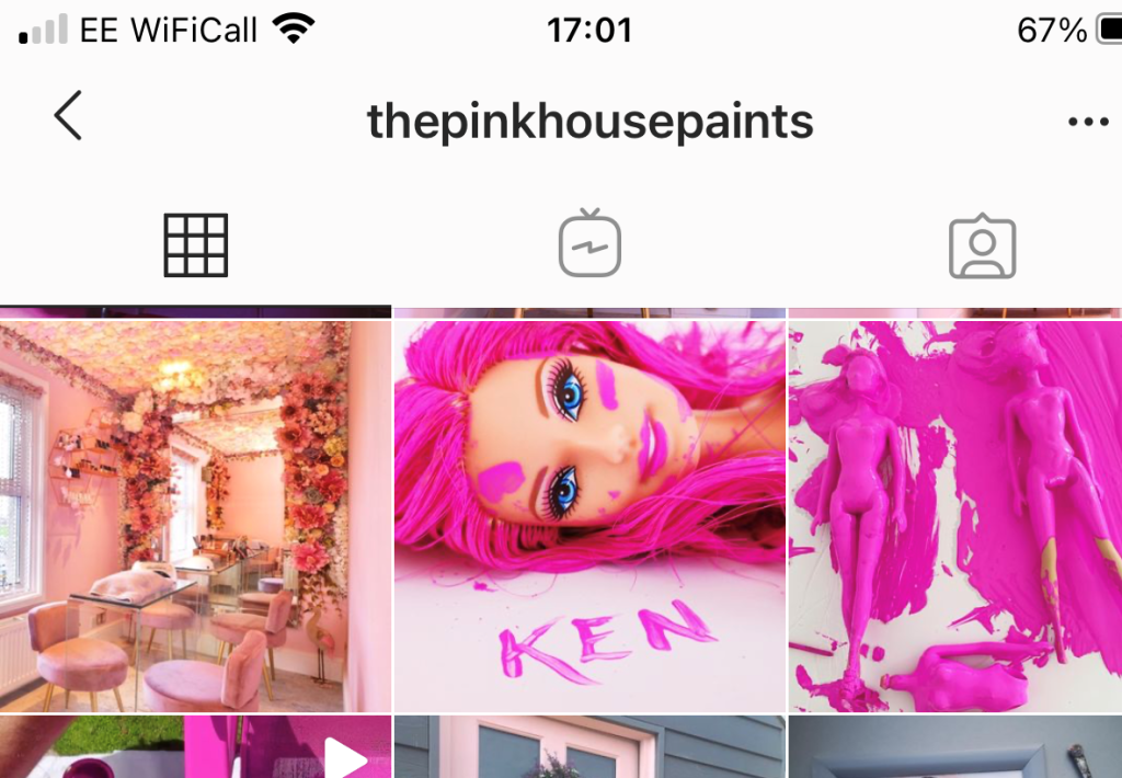
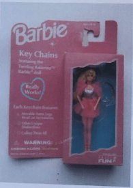
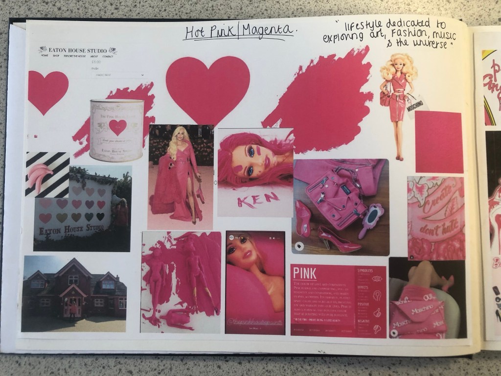
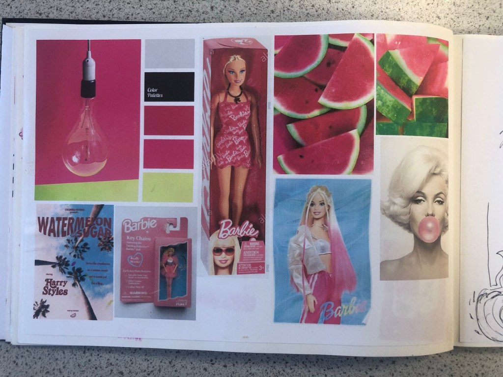
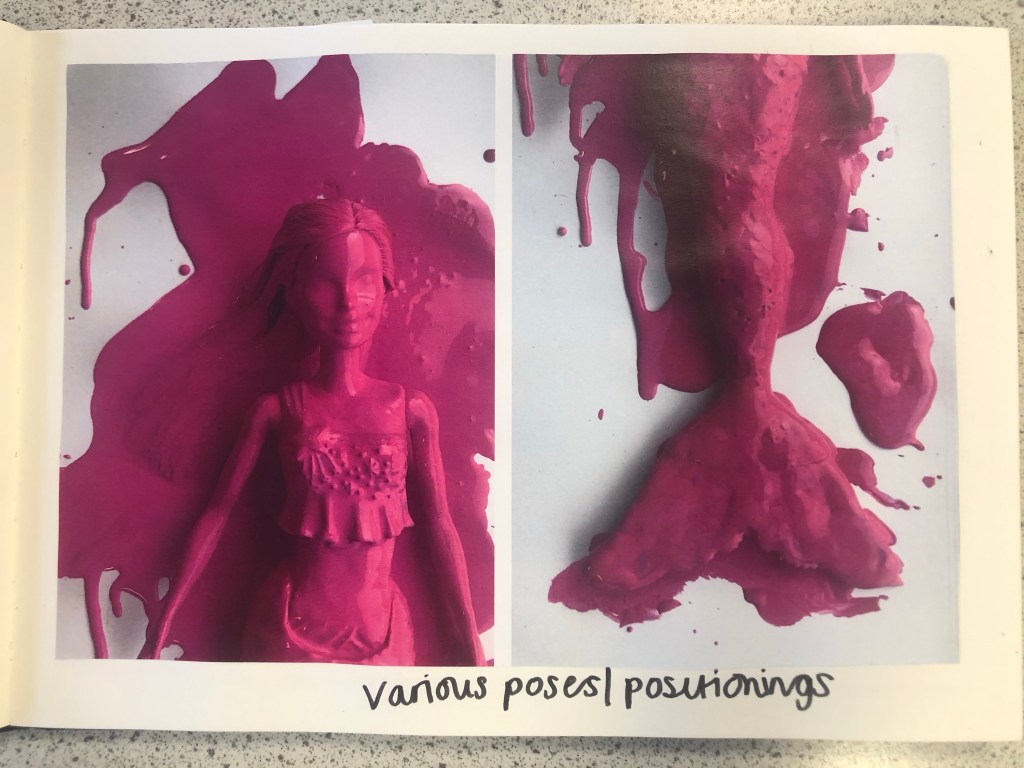
Whenever I begin with the research process I always start off with moodboards and mind maps. I started a brand new sketchbook for this assignment and began with some moodboards that I filled with images which I find appealing and that make me think of Magenta Pink the most. When I think of Pink I automatically think of Barbie and the hours of fun I had as a child playing with their long blonde hair, dressing them in bright funky outfits and collecting lots of hot pink accessories for them! My first 2 pages of my moodboards were inspired completely by this. A big source of inspiration also came from Eaton House (The pink House) in Essex which I had the joy of visiting almost 2 years ago now! (I have a post and some photos abut it in my “places to go people to see” menu at the top of site!) Eaton House now have a line of interior wall and magic (fabric) paints and I felt compelled to include this on my moodboard also, one of the paints is called “Ken” and it is a bright hot Magenta Pink. I found myself ordering a tester pot to see what the fuss was about and to see if I could use it as mixed media for this assignment. One of the images that stood out to me from Eaton House was one of their photographs they took for their Instagram page advertising “Ken”.
The photograph shows a Barbie completely covered and dripping in the pink paint, I liked the look of this and it gave me ideas; it was basically them messing around to see how consistent and bright the paint actually was before they sold any – basically grown ups playing around with Barbie’s but in a different way- Experimenting with paint colour! That is exactly what this colour is; It is like it was made for having fun! It is bold, attention seeking and experimental! It is the grown ups answer of a colour to mean play time!
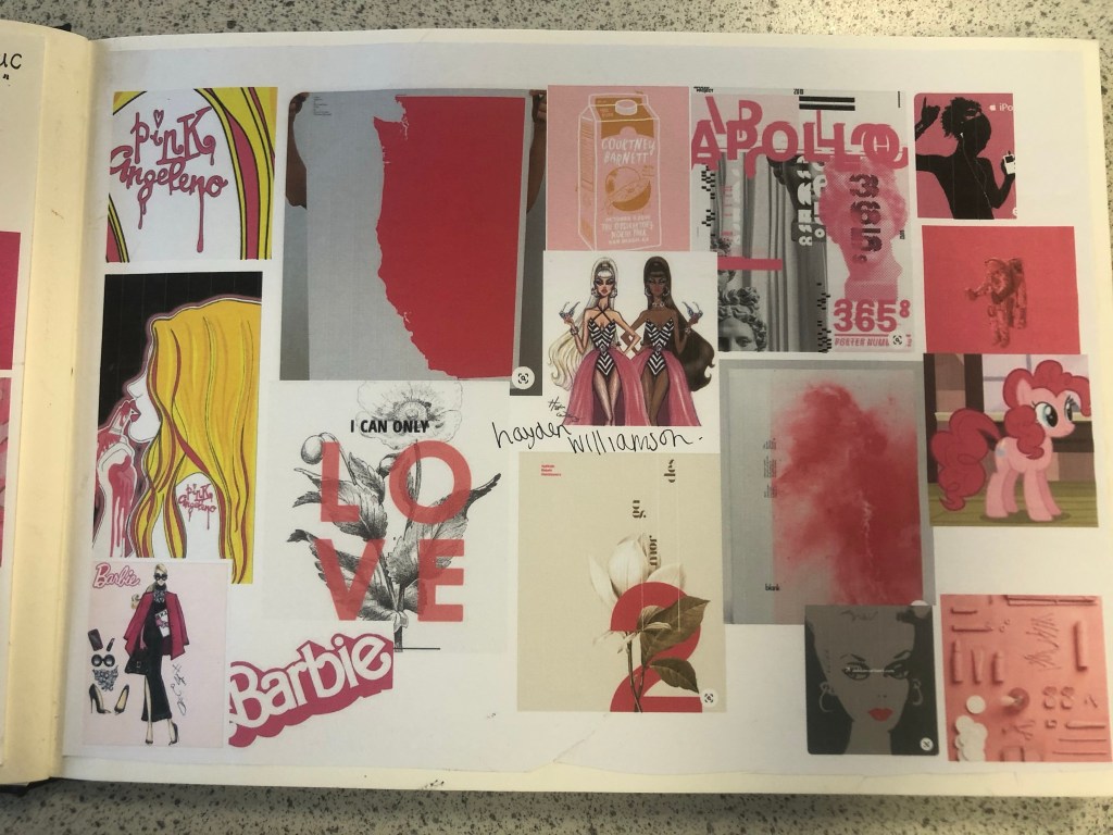
I also looked at the Moschino Barbie range from Spring/Summer 2014. I am lucky to own a few pieces from this collection (I only wish I had them all!) for whatever reason, every time I see this collection I am inspired!- I absolutely love it! It was only right that I included the images onto my mood board. I also included on my moodboard illustrations that I did for my Assignment 1 and from where I got my blog name “Pink Angeleno” from, my Assignment 1 very much emphasised the fact that I love the colour pink! I looked into fashion illustrations by Hayden Williamson (He did a Barbie illustration series) and I looked into pink branding, pink films (Legally Blonde!) and pink poster art. I wanted to get as many images as possible to sum up what this colour means (colour theory), who the target audience is and what the colour means to others (emotionally).
My last page of my mood boards was based around the complementary colour. I wanted to see how well Lime Green and Magenta worked together side by side and I also wanted to research into the uses of those colours. The images that appeared the most in my search were pink backgrounds with palm trees in front or banana leaves (think of the Beverly Hills Hotel!) It was very clear from the images that these colours represented summer!
Having visual references on my pages helped inspire me more in my ideas. I then moved on to mind mapping.
Research – Mind Mapping
The first page of mind mapping was me exploring the meanings/emotions behind all 3 colours; Pink, Magenta Pink and Lime Green. I then looked at all the answers I had mind mapped and underlined the ones that both colours (Magenta and Lime Green) had in common:
Confident
Vibrant and bold
fashionable
fun
statement
“love for life”
rebellious
liveliness
impactful
attention seeking
shock factor
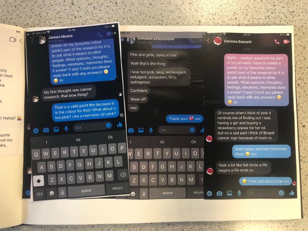
I knew that these were the factors that I would have to take forward into my first ideas and designs. My second page of mind mapping I concentrated on what the colour means to me and to others. I decided to ask some close friends and family what Pink means to them, what it reminds them of and what they think of when they hear the word PINK! I sent a message out through social media to ask people their thoughts on the colour; Luckily I had some good replies back! Almost every answer I received back from females mentioned Barbie and remembering the bright pink packaging from their childhood! It is very stereotypical also that Pink automatically reminds people of “Barbie girls” .I wanted to play on this in my designs as this is how most people see pink! The other answers were:
a statement
pretty
bright
Barbie and “pristine pink packaging!”
Toy packaging
Summer
Girly
Happy
Blonde
Roses
Rebellious/ punk
Confident
Vegas neon lights
Japanese Cherry Blossom trees
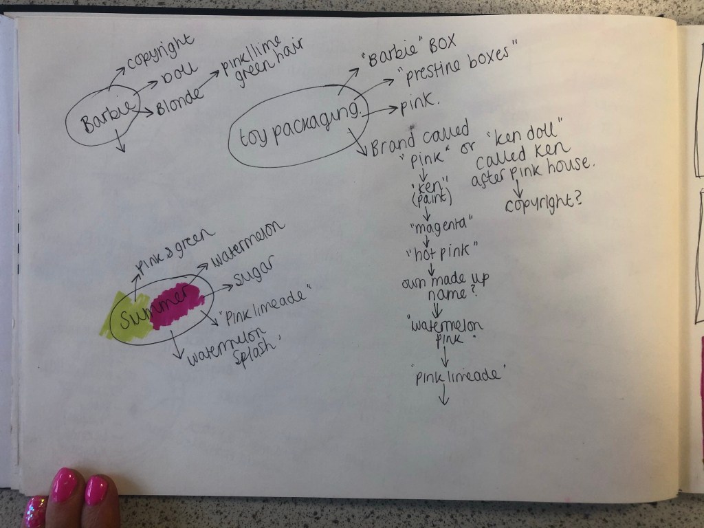
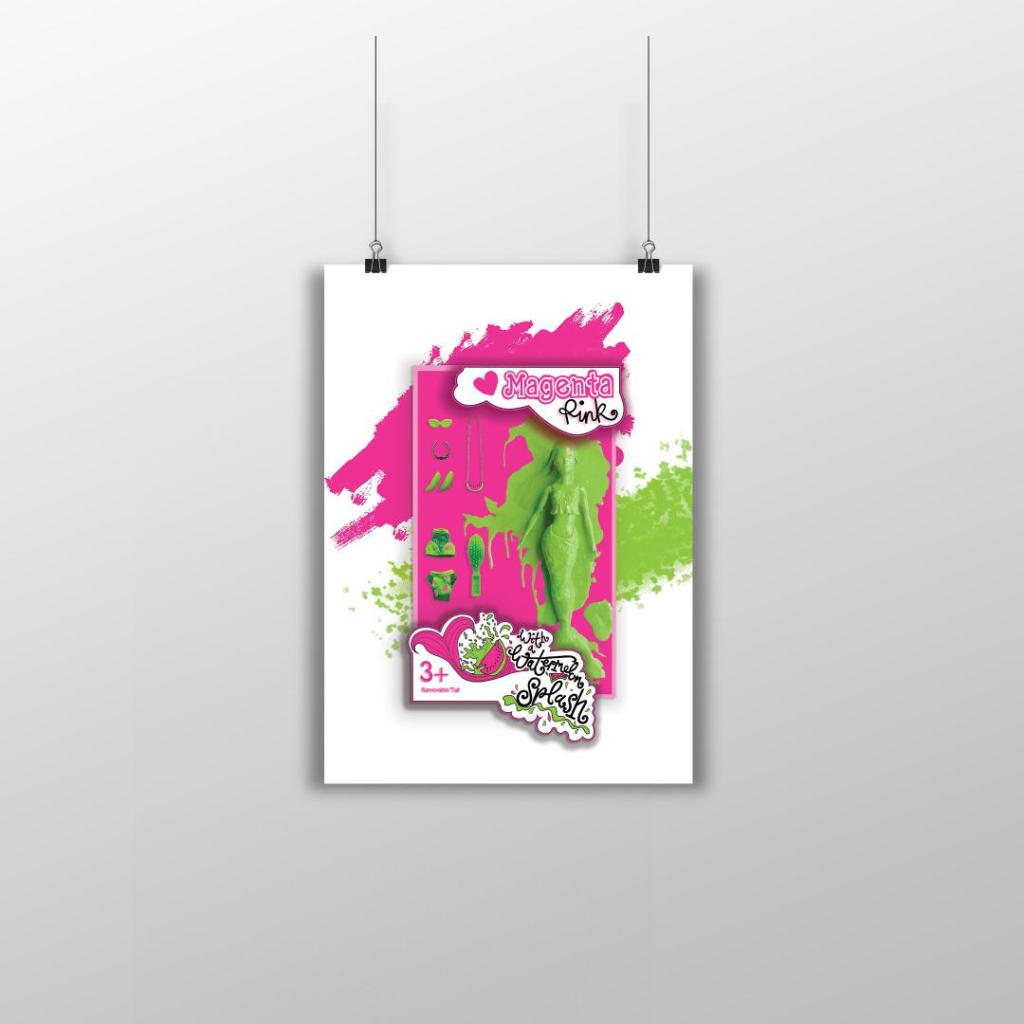
I knew from these answers that I definitely wanted to focus on how the colour reminds people of their childhoods with Barbie’s and the pristine pink toy packaging. The first idea I had was to make the poster into toy packaging.. instead of making the poster the colour Magenta pink, using some images to represent Magenta and writing about that colour I wanted to create something on the poster that represents the colour without the need for explanation but which is also playful and different in approach. Another answer that regularly came up was that people saw Magenta as attention seeking, bold and very confident. I wanted to show how Magenta is seen as the “grown up pink”. I could do a poster based around how Magenta is girly, pink, playful and brings out your childish side but is also a grown up striking pink, bold in appearance, rebellious and very confident! How could I bring the Lime Green into this idea though?…
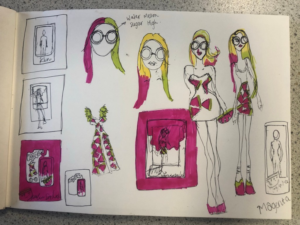
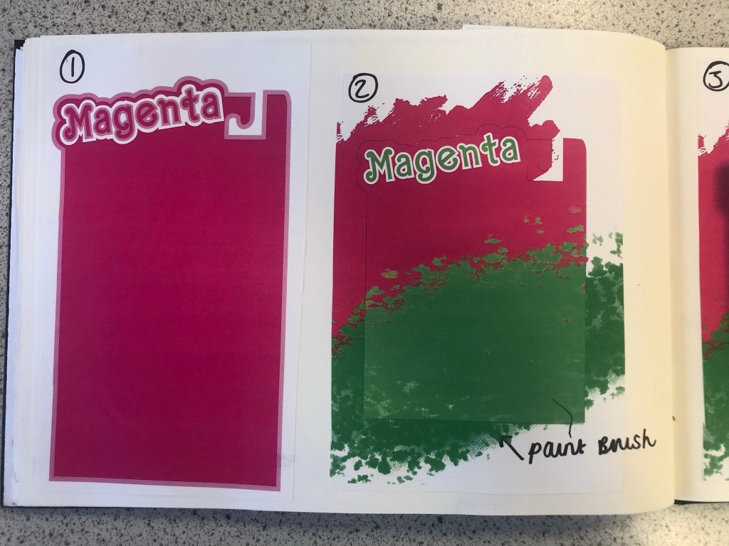
First Ideas/Sketches
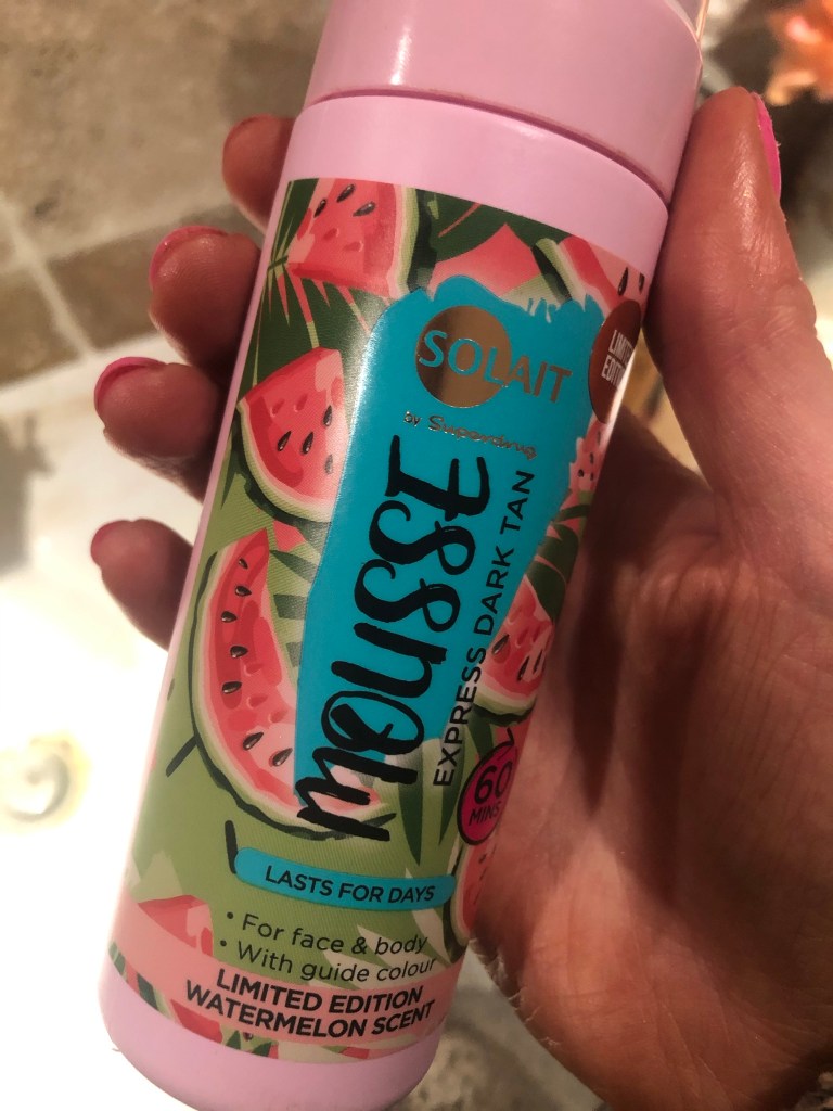
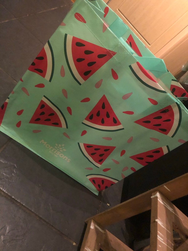
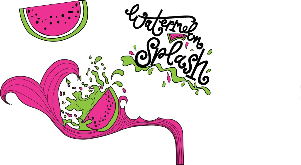
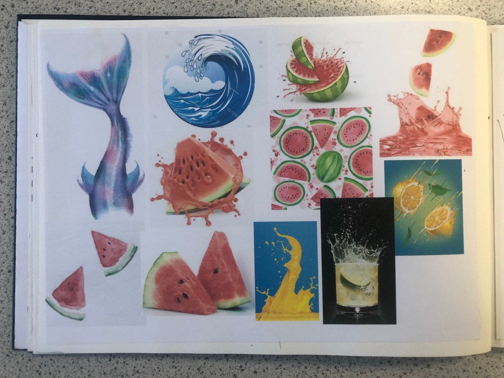
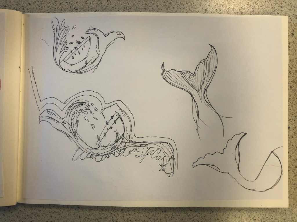
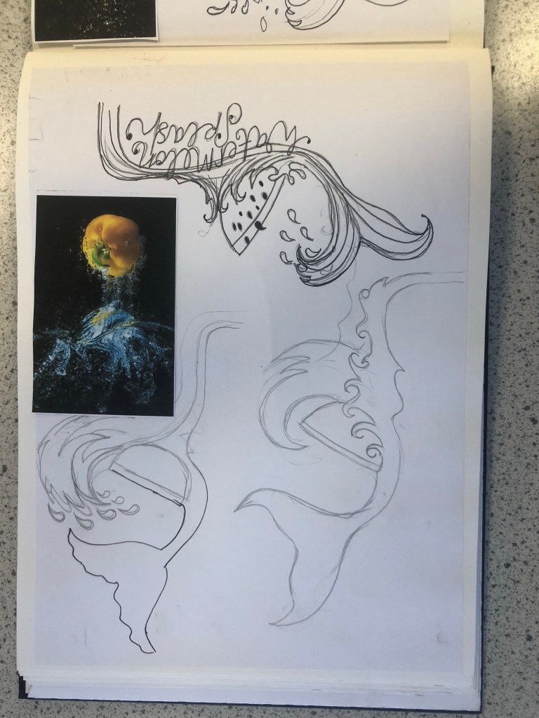
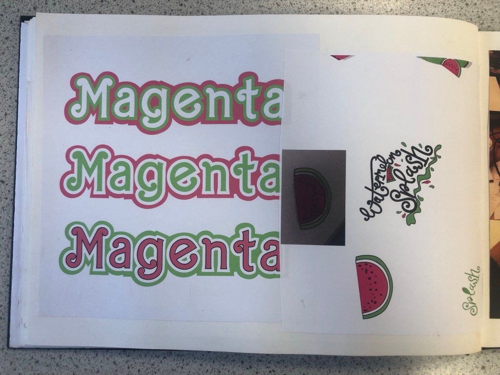
When I think of Lime Green and Magenta together I instantly think of Watermelons. I know Watermelons are usually Red and Green but in my mind I had the idea of brightly coloured vector art resembling a Lime Green and Magenta Watermelon. How would I bring a watermelon and toy packaging together to create a design though?.. In the back of my head I still had the Barbie doll that Eaton House poured into the paint playfully; If I could recreate my own version of this and bring it into my toy packaging design? I mind mapped around how I could bring the Watermelon into the design. Watermelons also represent summer so I knew I had also met one of the emotions that people feel when they think of Pink. The idea I had was to create limited edition doll packaging; make the doll a watermelon special doll but I needed a clever name for this. I mind mapped names that I could use for the limited edition packaging. I came up with “Pink limeade”, “Watermelon Pink” and my favourite “Watermelon splash”. The splash would symbolise the clash of the 2 colours coming together (Magenta and Lime Green). It also gave me the idea to use a mermaid doll which would further represent the “splash”. Since designing my posters I have looked around the high street and retail shops and seen a few designs that feature Watermelons:
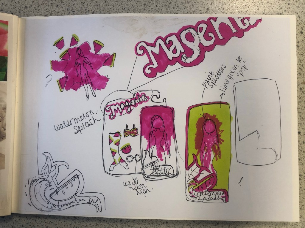
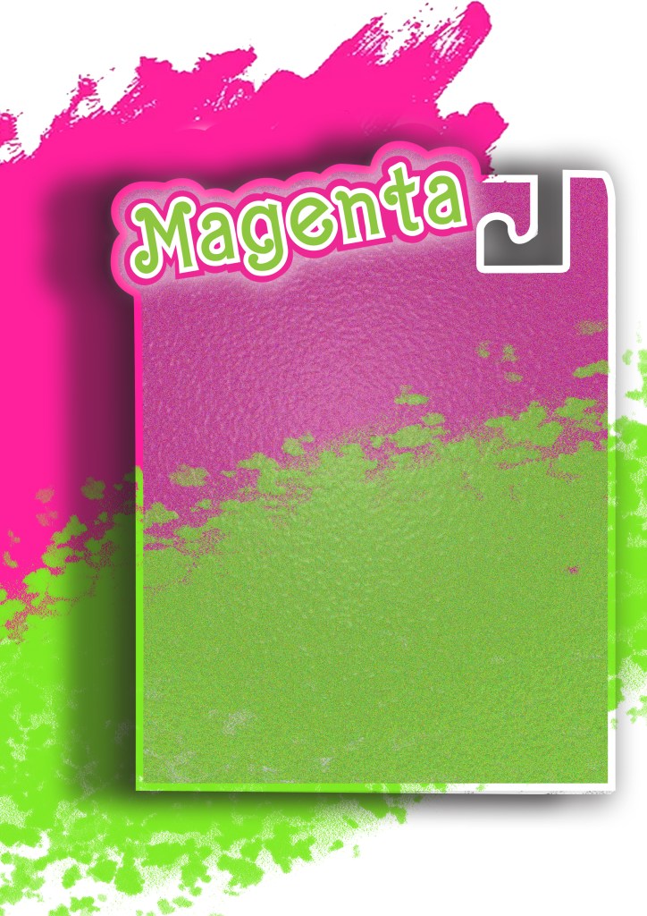
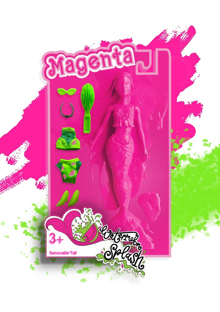
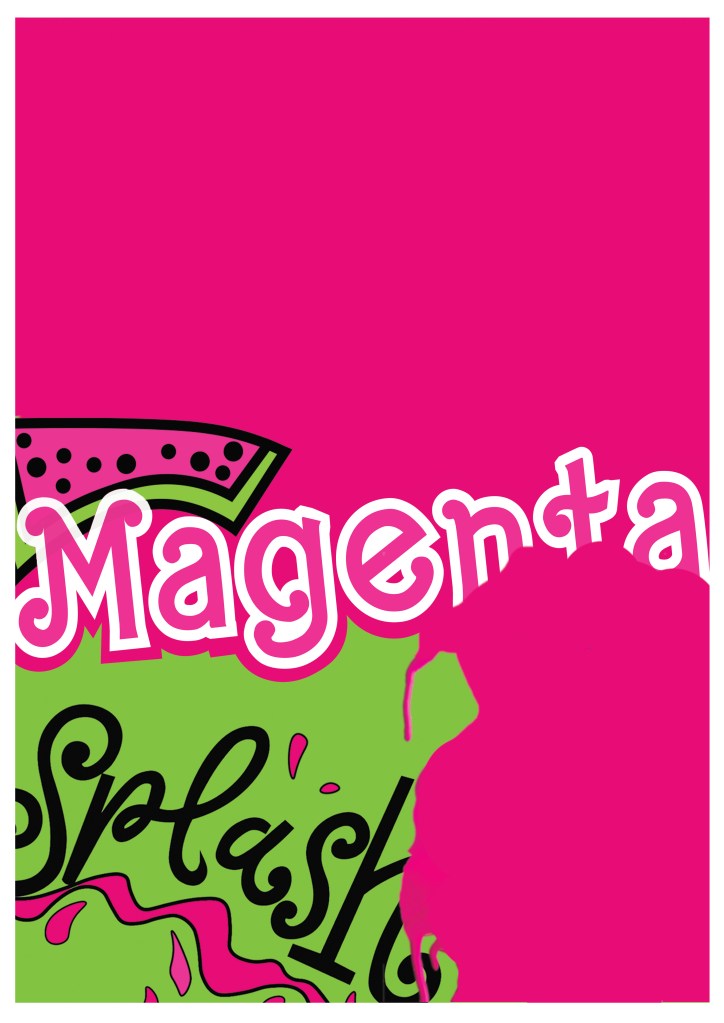
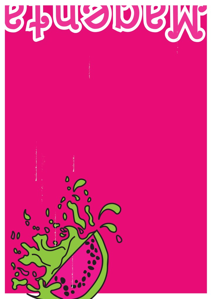
If I was designing toy packaging for my poster I knew I had to be clever and not use the name “Barbie” because of copyright purposes. I needed another name. I did ponder the thought of designing a packaging for a Ken doll and using the Eaton House “Ken” paint as the colour I was designing the poster for but I decided to keep it for a female target audience as the colour is mainly seen as feminine. I needed a name for a female doll that would be representative of Barbie but not be Barbie… I simply thought of – “MAGENTA”.
I started to sketch some ideas based around this idea in my sketchbook. I drew out some toy packaging and some illustrations of dolls wearing brightly coloured Watermelon clothing and accessories. I was not sure whether I wanted to use the “painted Barbie” idea or whether I wanted to create a vector art illustration doll.
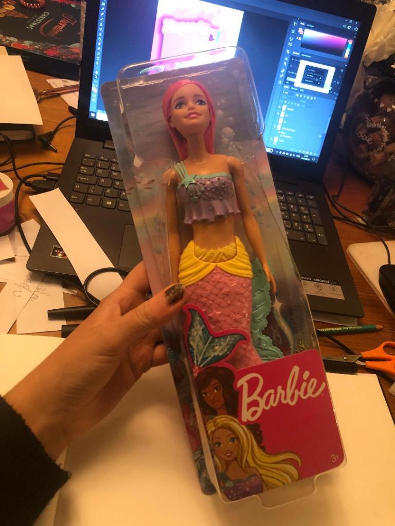
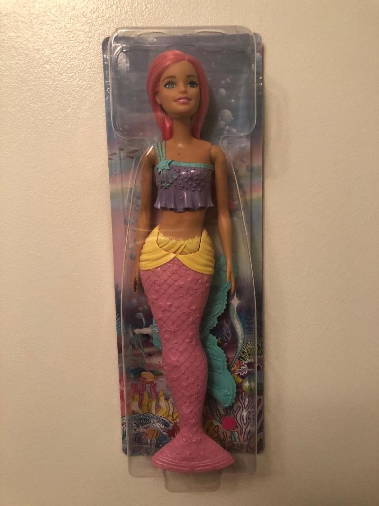
I drew some ideas for a mermaid doll with a Watermelon tail but then came back to the idea of the Eaton House painted doll and searched Amazon to see if there were any mermaid Barbie dolls I could buy and use. I found one on Amazon for £13. She had already pink hair and a removable mermaid tail. I could use this to experiment with the “Ken” paint just how Eaton House did.
Development
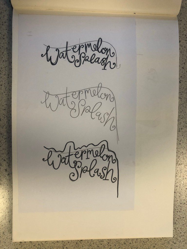
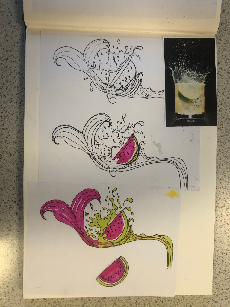
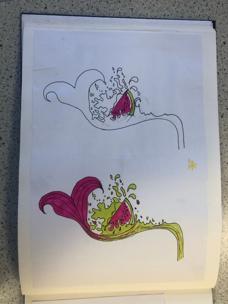
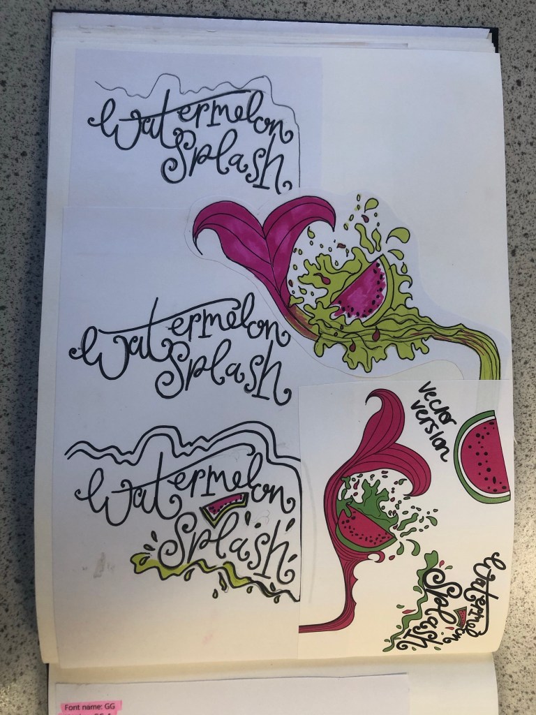
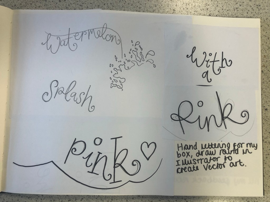
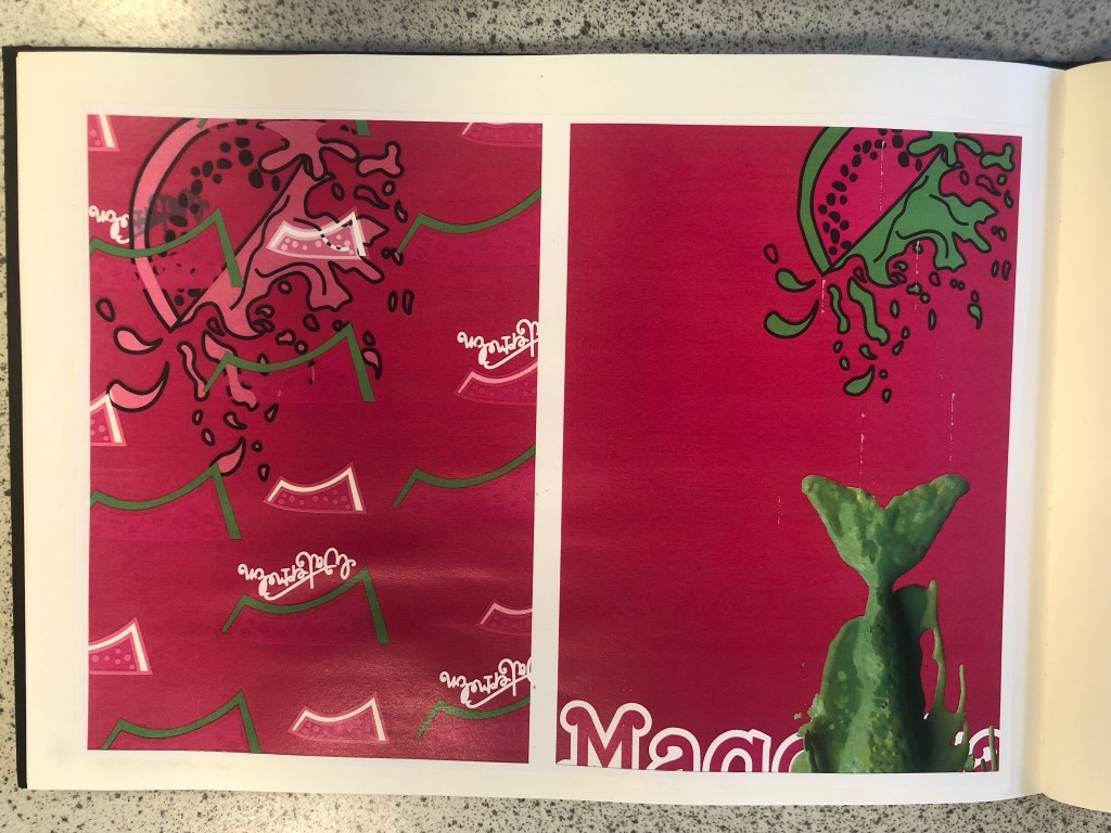
I then started to develop ideas around Watermelon Splash. I made another mood board filled with watermelons of all shapes and sizes, mermaid tails and splashes of water to see how I could represent the “splash”. I then started to draw up ideas based around this. I knew I wanted to include my hand lettering in this assignment as I like to turn my own writing into vector art whenever I can, so I started to sketch up “Watermelon Splash” in a style of writing that might be appropriate for the design. I came up with a strong design that I really liked and then decided to develop it further by drawing several versions of it with different splashes, different shaped watermelons and different positioning of the text.
My final drawing for “Watermelon Splash” I was very pleased with. I scanned it into my laptop and drew around it all in Illustrator. I was left with my final vector art which I could edit to my hearts content around my final design.
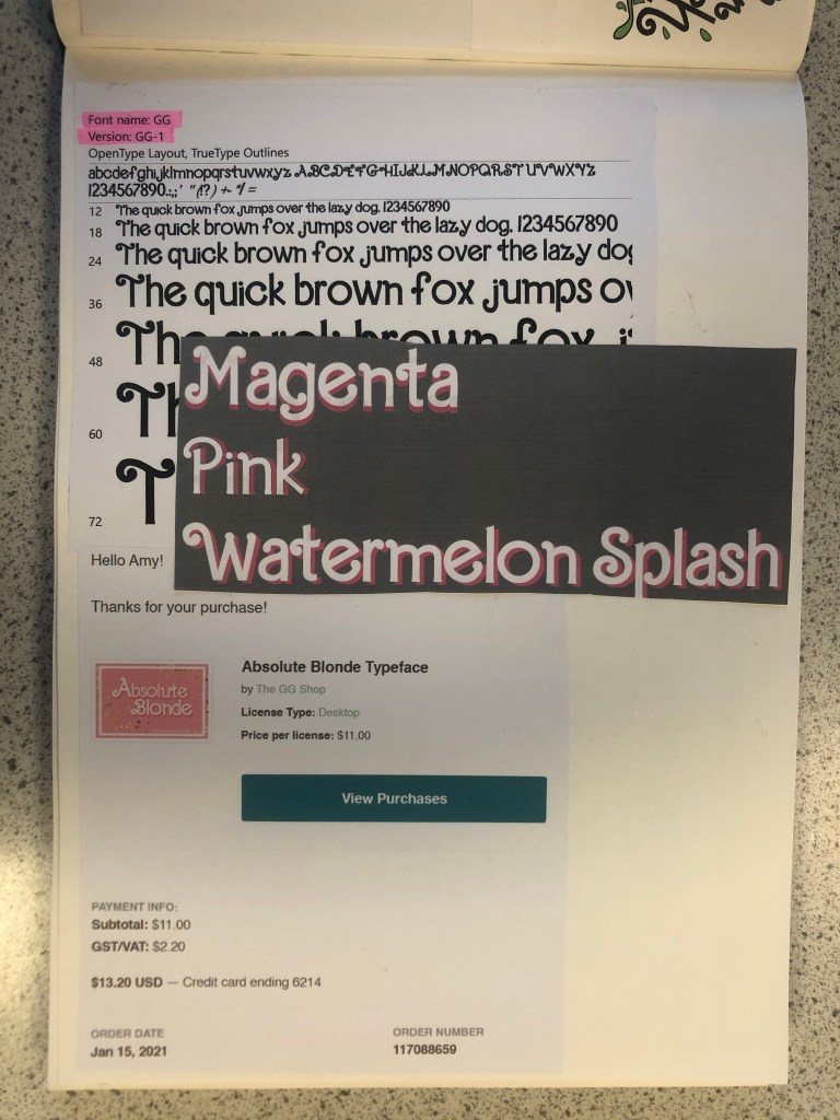
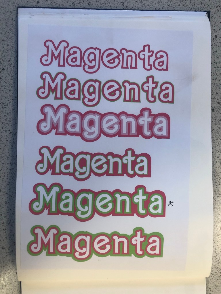
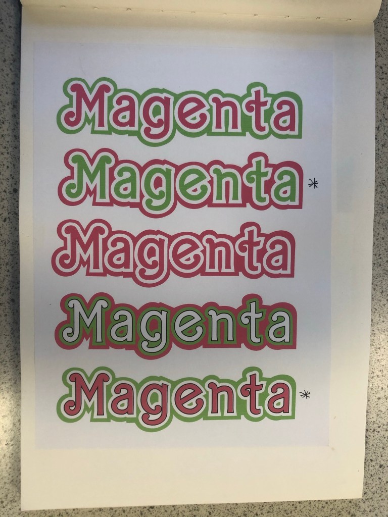
Which Typeface?
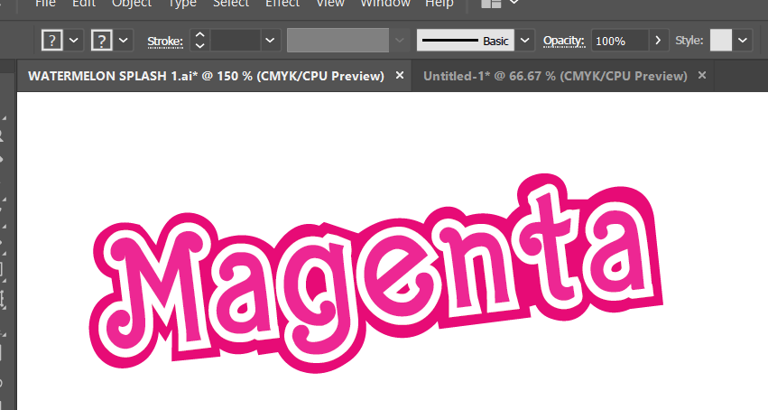
The next stage in my design process was to find a suitable font for “Magenta”. I wanted to use a similar typeface in my design to the “Barbie” font so I started to sketch with the idea that I would use my hand lettering to turn into vector art in Illustrator, however it seemed like such a long process that I decided to have a look online and search for any similar that I could download and use. I found one on Creative Market website that I had to purchase for $11. The typeface appears as GG when I install it onto my computer but it is called “Absolute Blonde”. The owner of the typeface created it when she was trying to desperately search everywhere for a “Barbie like” font to use in some invitations. This appealed to me! I could type what I need and then convert the type into editable shapes to turn into vector art!
I created my vector art from the font and then messed around with various colour schemes for Magenta. I wanted it to stand out against the Magenta background that I had planned for my design. I was conscious also that I needed to make sure that there was contrast and visual dynamics with the type and design.
This is the version that I eventually decided on for my design:
Designing the packaging
There is an image on one of my mood boards which shows doll figurine packaging with a hook at the top of the box to hang off pegs in the shop. I decided originally to go down this route of designing similar packaging. My idea was to have Watermelon inspired clothing and accessories in the packaging and then have the painted doll outside of the packaging covered in pink to match the rest of the poster.
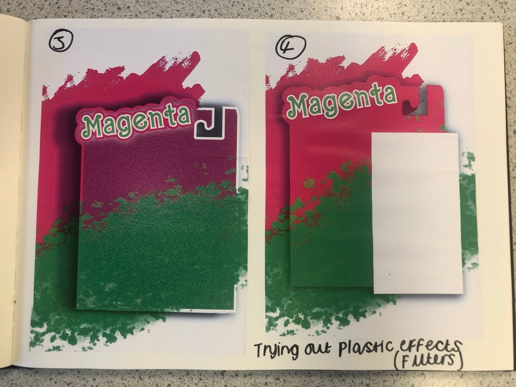
I am still an amateur at Photoshop so I struggled a bit at the start to try and learn how to try and do different things that I wanted to do. My main struggle was how to make the packaging look realistic and plastic-shiny. I drew out my packaging in Illustrator and then imported it over to Photoshop to edit further with filters and effects. It took several attempts for me to try and make the packaging look half realistic with drop shadows and the plastic film filter effect and even after all these attempts it still looked rubbish! I imported plastic film photographs over and lowered the opacity and laid it over the top of my design to see even if that would work but it still looked bad! The Magenta and Lime brush strokes in the background were taken as inspiration from one of my mood boards. I created this by using the brush tool in Photoshop.
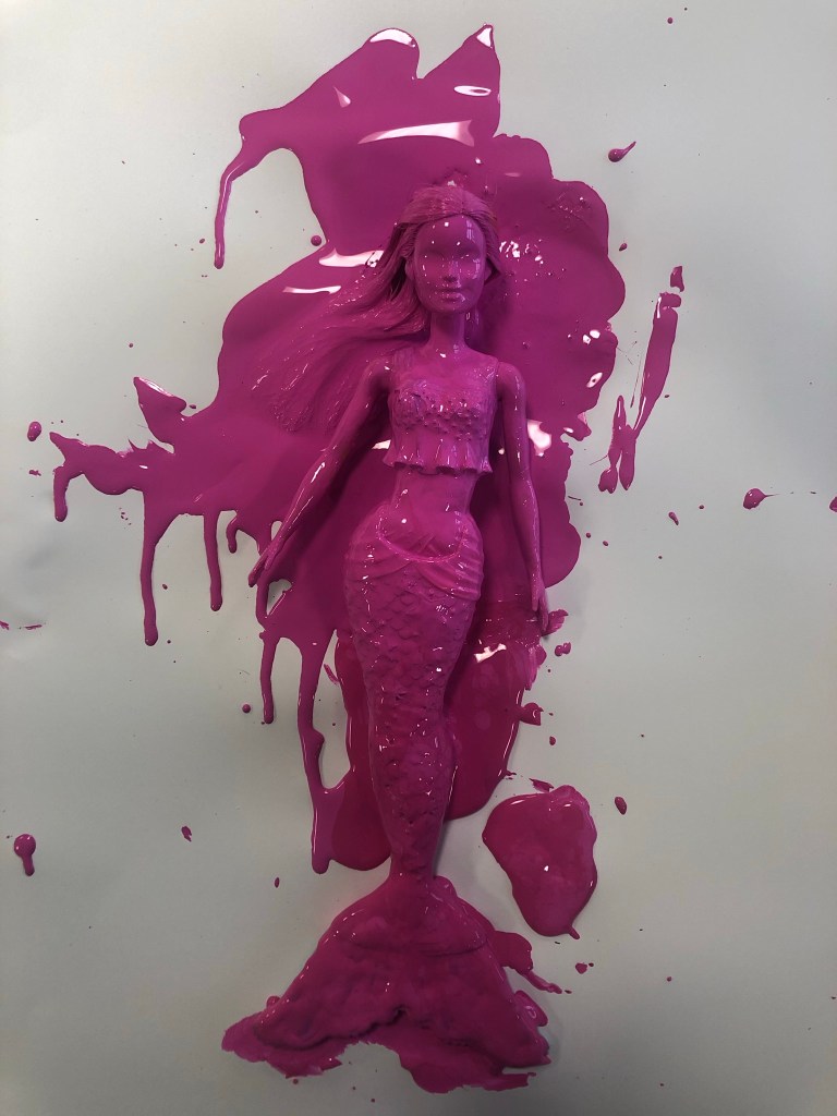
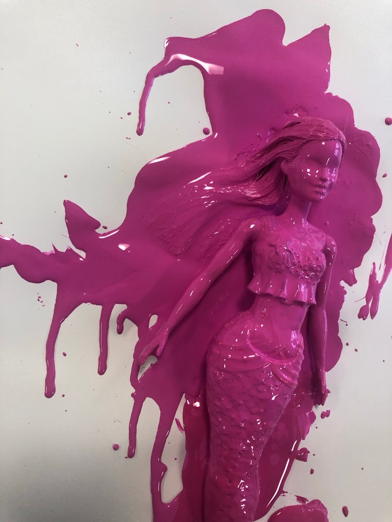
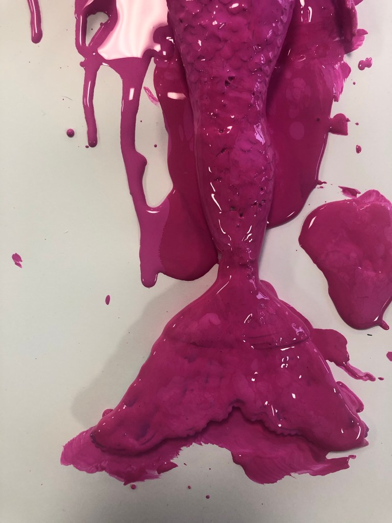
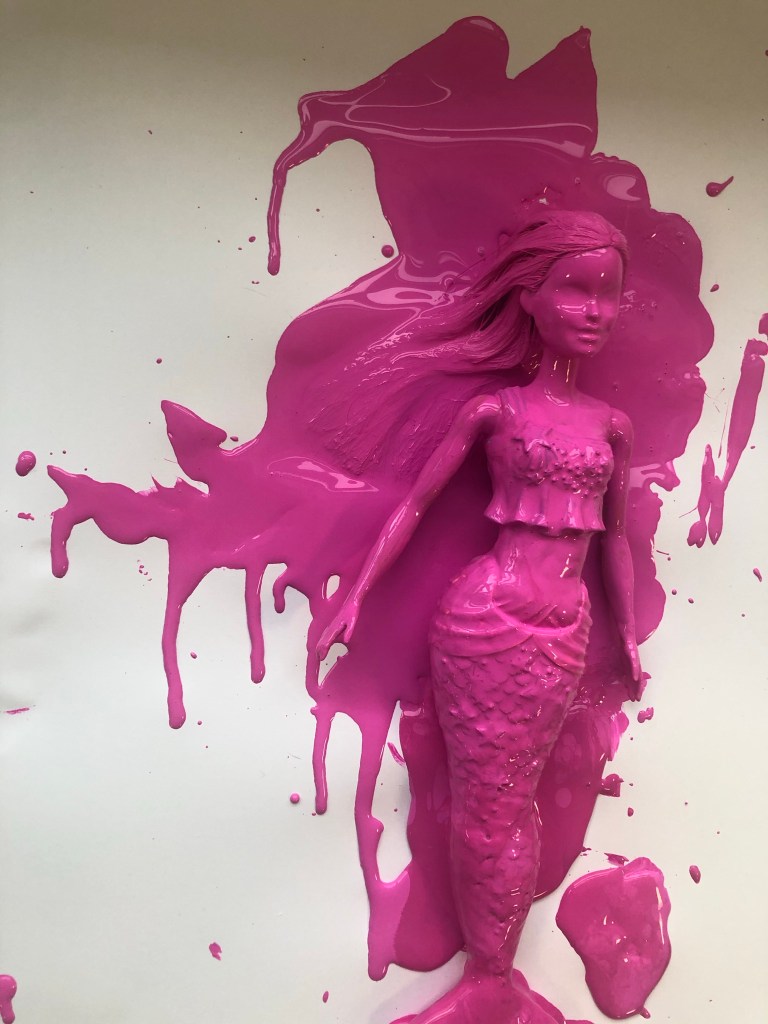
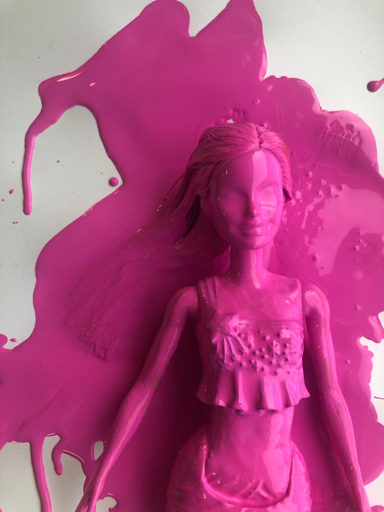
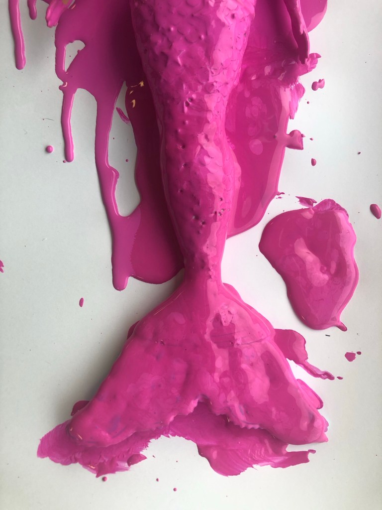
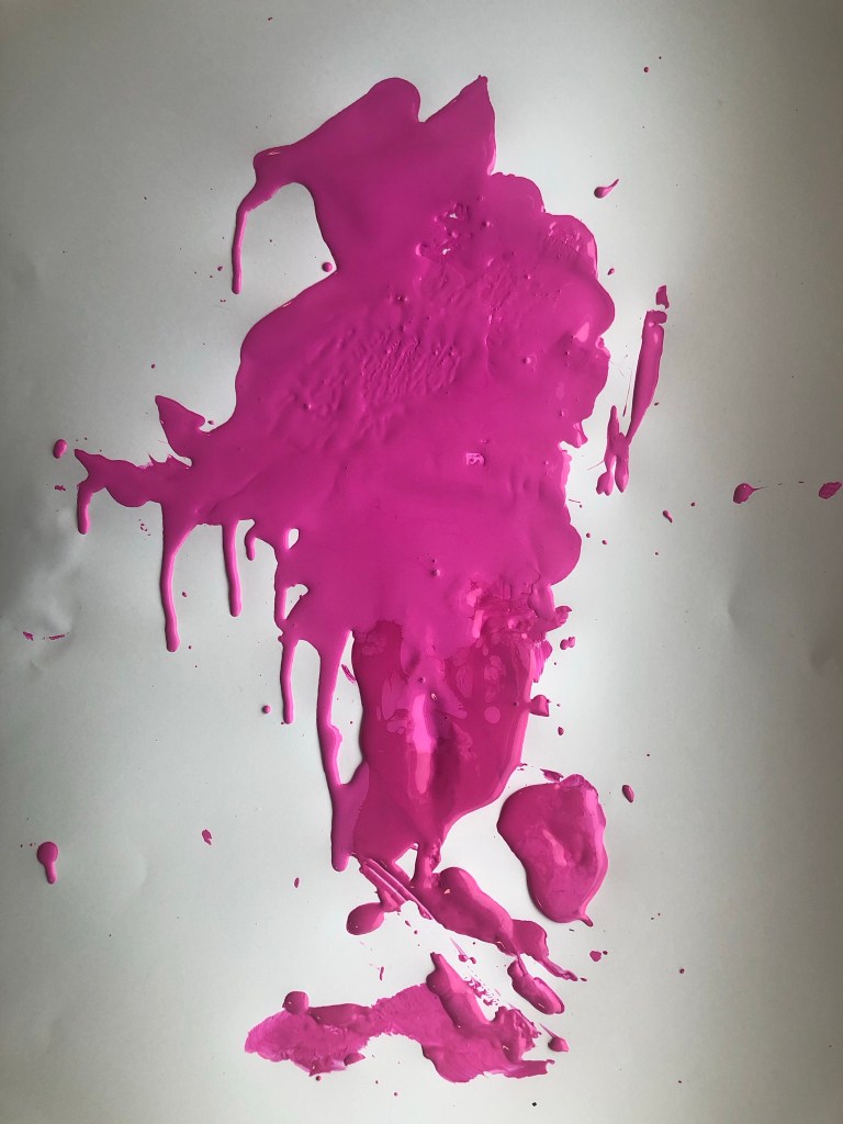
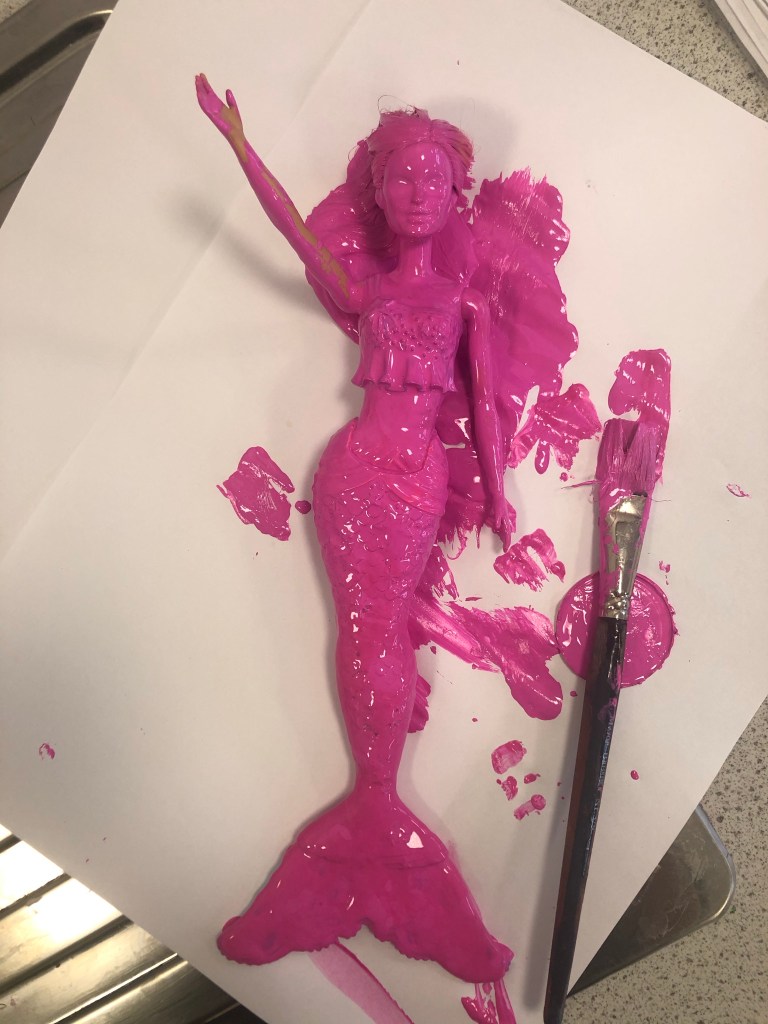
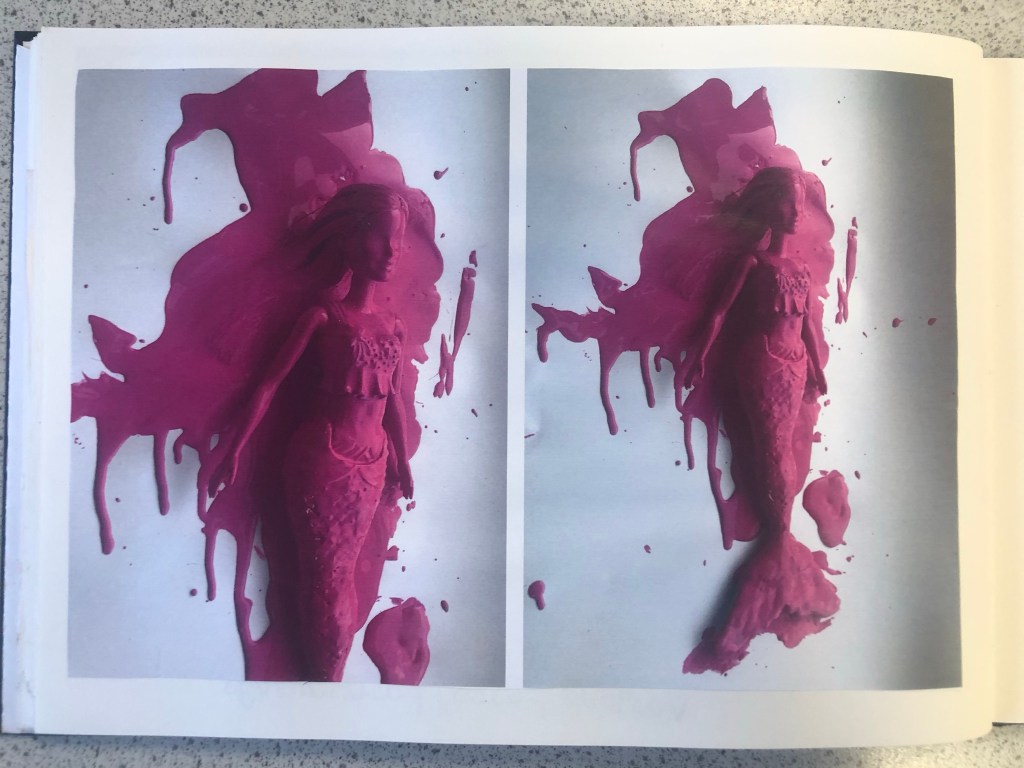
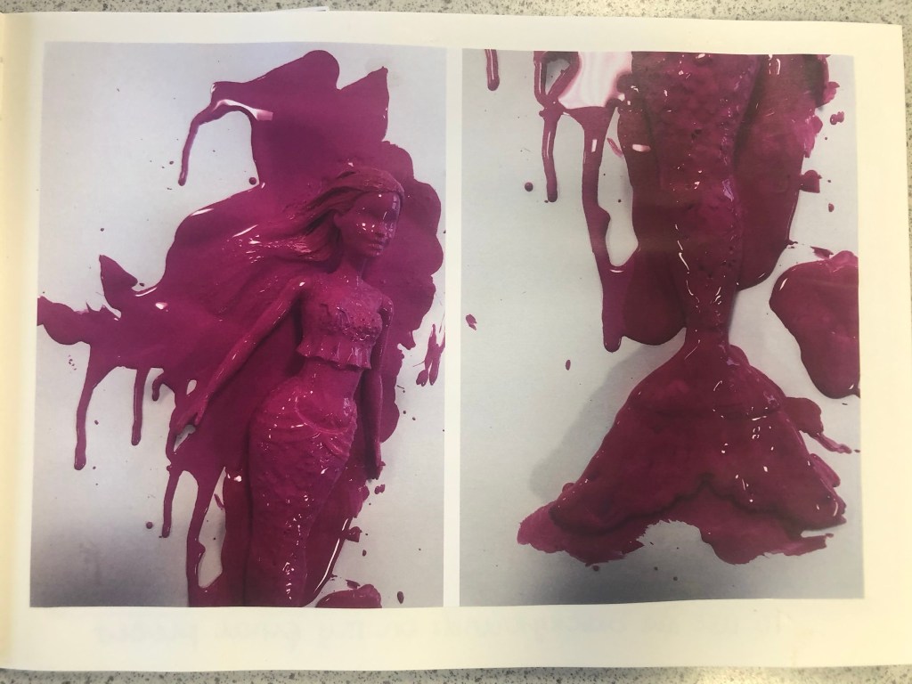
The next step before I continued trying to make my packaging look realistic was to take the doll and pour the paint over it to take photographs to see if any could be used as part of my design.
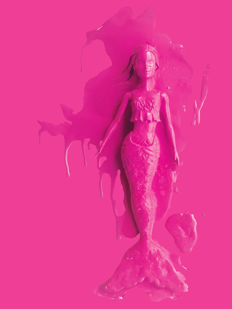
These were the photographs that I took at different angles. I then took my chosen photograph into Photoshop and adjusted it, gave it a Magenta background and took away the background noise.
It was then time to work on the packaging some more!
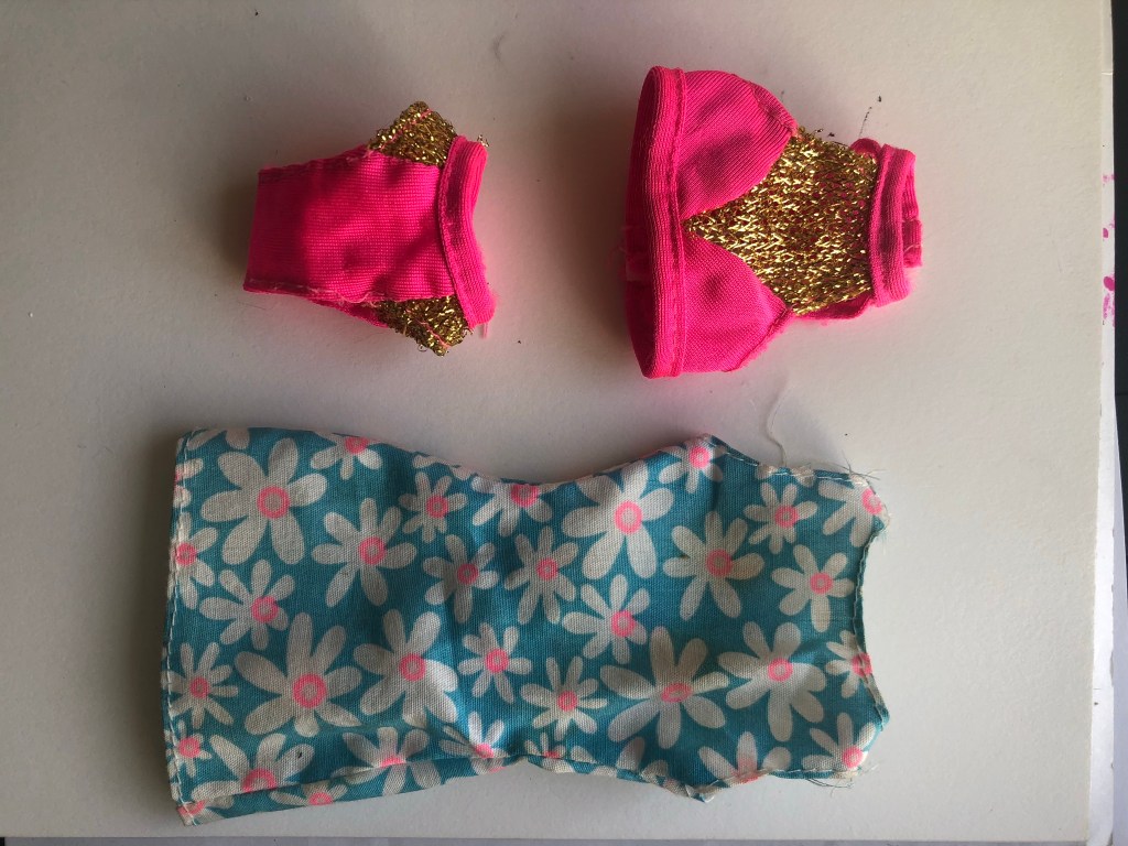
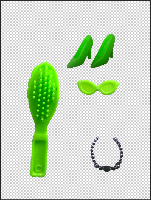
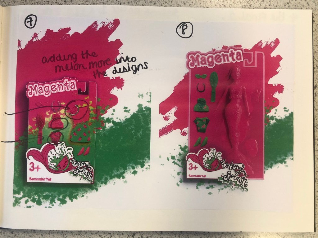
I still have a collection of Barbies and Barbie accessories in a storage container, so one day I decided to go through them and see if I could find any accessories that might be relevant to my design which I could alter to represent Watermelon Splash. I found a few which would:
I then altered them in Photoshop to make them match my Watermelon Splash theme and to place onto the packaging.
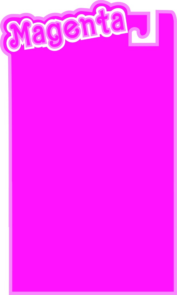
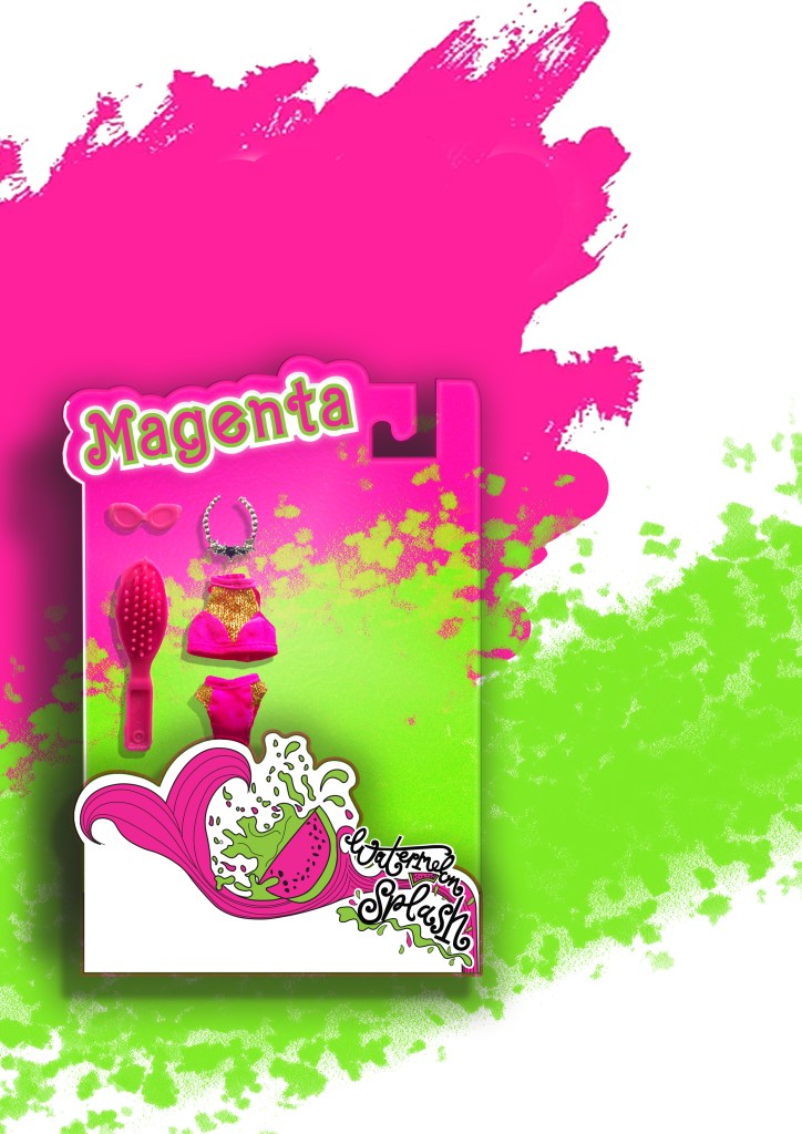
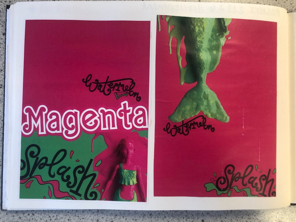
I started to like more and more of what I was creating. It was only when I had finished the 3rd development image below that I realised I needed to change the packaging again.. I included the doll into the packaging for this last development image but it still had the hook at the top of the box to hang it off a peg in the shop, realistically a heavy full sized doll would not be placed on a peg hook. I went back to Illustrator to create another packaging design. The colours however on these designs were working for me. I made Magenta the doll completely Magenta and then the Watermelon Splash around her was the bright, vivid Lime Green clothing and accessories.
The 3rd development where I decided the packaging needed to change once again.
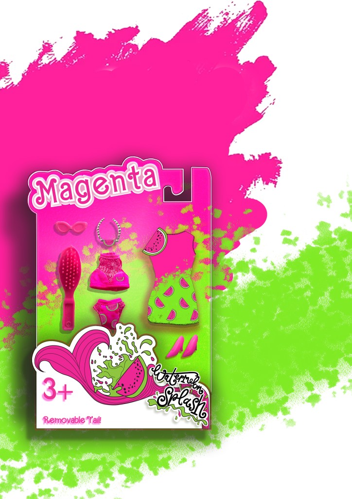
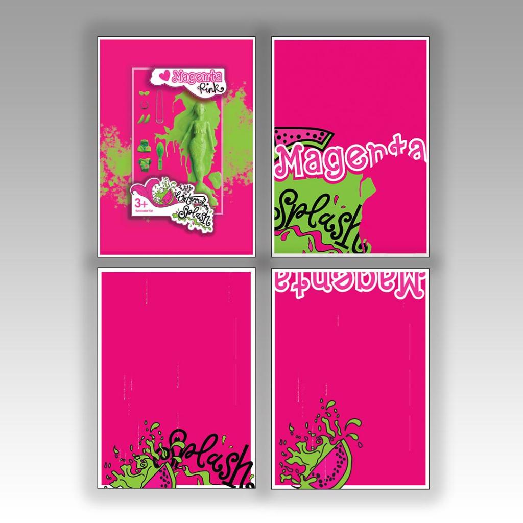
Final Artwork
I then relooked at designing the box packaging to get rid of the hook at the top and make it look like an actual box. I ended up with 2 outcomes which I really struggled to choose the final artwork from:
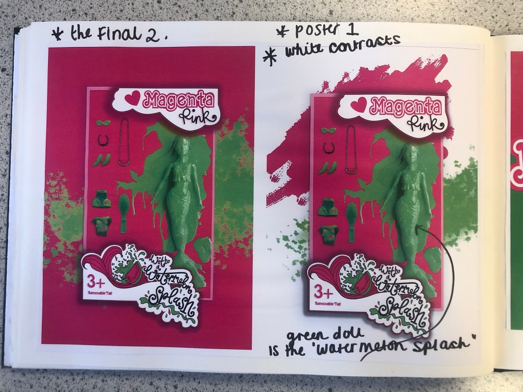
I changed the colour of the Magenta doll on these final versions; I just felt there was more of a contrast making her green, also I wanted this to represent the Watermelon Splash! I then really debated which background to have – did I want the poster mostly filled with Magenta Pink or did I want the white background with the colour popping out? I decided to go with the all Pink version, the reasons behind this are so it is definitely understood which colour I am designing for. The Magenta is the dominant colour and the Lime green contrasts and accents the pink. I think I have created a different approach to designing and celebrating a colour, I have created a quirky outcome. I think I have met the brief of celebrating a colour and what it means to myself and others. I did extensive research to see how others felt about the colour and then I designed based around the answers for this final design. I think it is obvious that the colour I am celebrating and designing for is Magenta Pink and the contrasting complementary colour is Lime Green. How I have brought the 2 colours together with the doll packaging and the limited edition Watermelon Splash idea is quirky in its approach. I am pleased with how it has turned out.
My final artwork
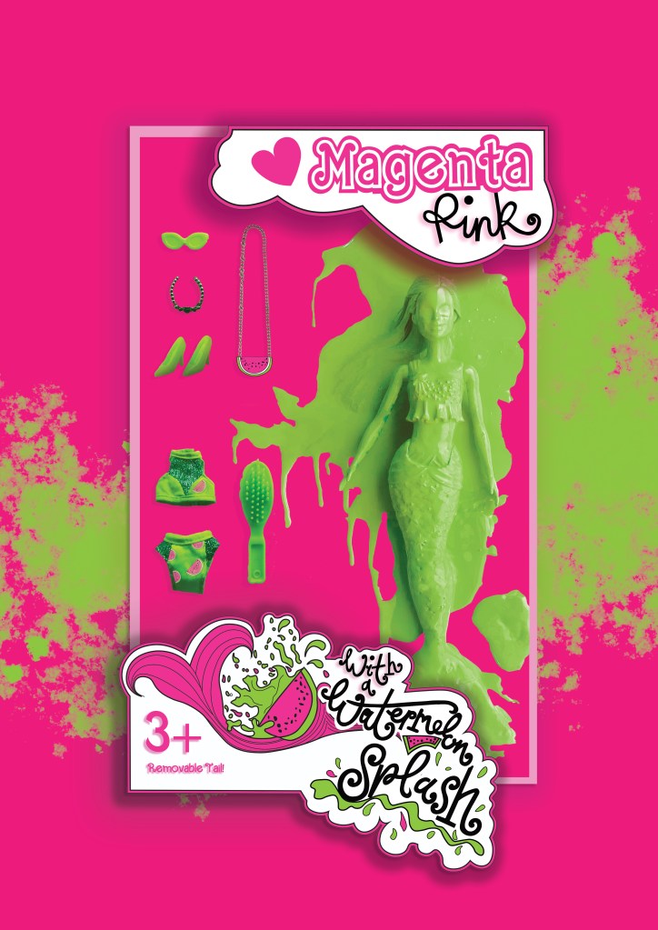
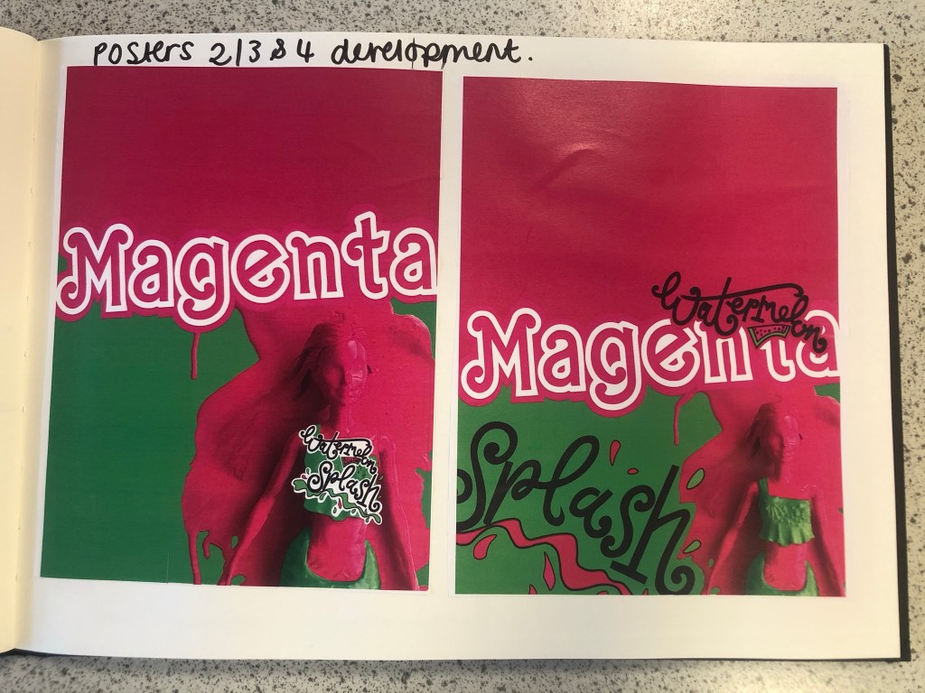
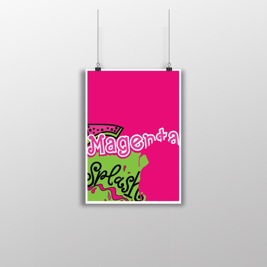
Poster 2
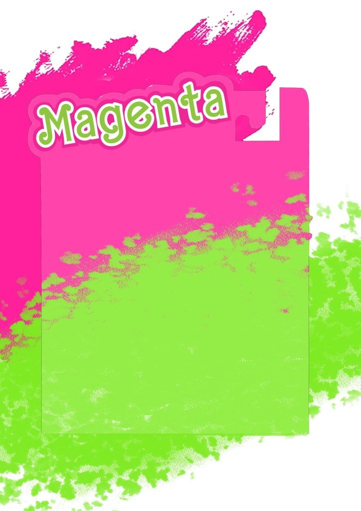
This is my final design for poster 2, (one of the variations of my final posters). I like how strong this design looks, the colours really work well together and makes everything pop! I created a white border around the design as this adds contrast against the Pink, it helps to break the colours up and make it more interesting. I took elements from my final artwork and used them to create this version. I wanted all of the posters to work well as a series and to make sure that they clearly represented Magenta as the celebrated colour so I filled the whole space with Magenta Pink. I wanted to make sure that negative space was a massive part of the design so I split the design into thirds and kept the top completely empty. I used the paint splash from when I painted the Barbie in this design. The paint covers part of the “Magenta” text. I like how this has done that, it looks like a chunk has been bitten out of it – more or less like how you would eat a Watermelon! I have used part of my Watermelon Splash vector art too and that works well with the paint splat. I used an illustration of the Watermelon rather than using the wording itself. It brings together images and type to convey a message.
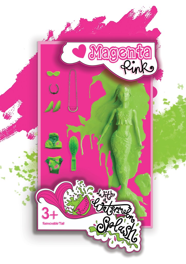
Poster 3
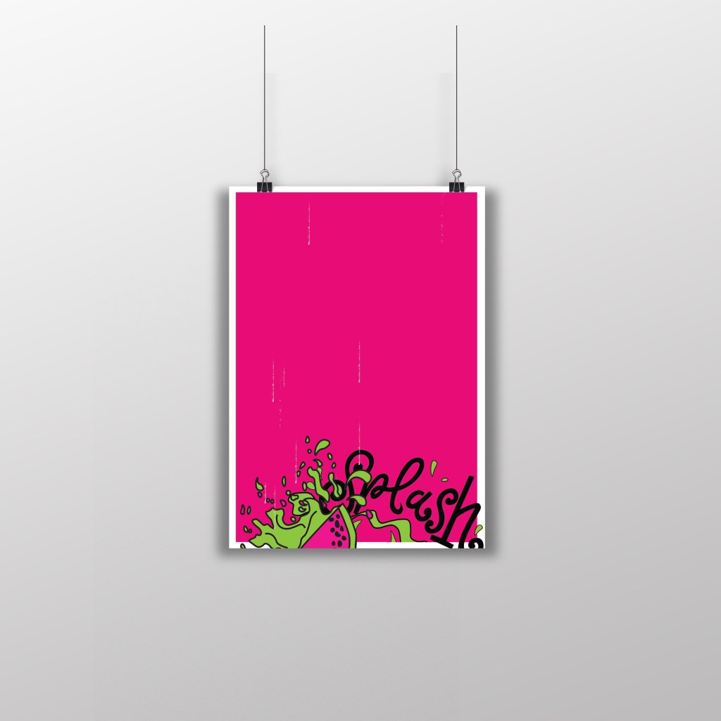
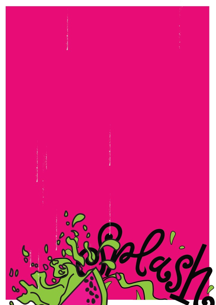
This is my final design for Poster 3, another variation of my final artwork. I have kept this one very similar to poster 3. I have made negative space a massive part of the design by keeping the top part of the poster completely free. To keep it in keeping with the other designs, I once again placed the white border all the way around it to again break the pink up and let it contrast against the white. There are tiny scratches of white on the left hand side and centre of the poster; these were completely accidental from where I imported the vectors over from Illustrator to Photoshop and accidentally left some of the noise on the jpegs. I moved these “scratchings” in Photoshop and made them drop down the page to look like refreshing water droplets. Again, with this design I took elements from the final artwork – on this one I took part of the Watermelon Splash vector design and placed it at the bottom of the design like it is falling into water to create that “splash”. I like how this design is quite simple but effective. The poster really stands out with the colours and once again I think it is clear what colours are being celebrated.
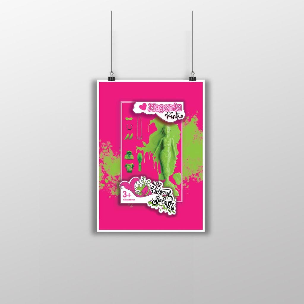
Poster 4
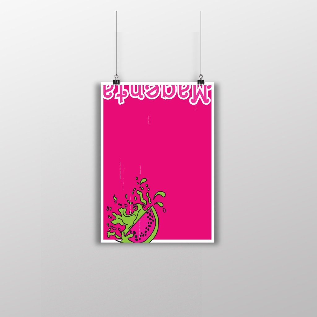
This is my final design for poster 4 (another variation to my final artwork). I really debated this design; I debated the type at the top of the poster and the fact that it is cut in half, upside down and not very legible. There was just something about how this poster looks though that made me change my mind and keep it! I kept the poster in keeping with the others again with the white border, negative space and making Magenta the main colour throughout the whole piece. I think that if you place all of the posters together it is obvious that they all belong together, they celebrate Magenta and that they are all variations of each other.
Hello and welcome to my blog post for my Photomontage exercise!
Contents of this post:
Foreward and final design
The Brief
First ideas/sketches
Research
Digital Development
Final mock up and design outcome
Foreward and final design
I felt it important to write a foreward for this blog entry as I made a point of posting a sensitive, censored design on my Instagram account (@Pink_Angeleno). I linked this post to my Instagram so that people could see the final uncensored design and to also learn some facts and my thoughts and feelings behind it. This subject is very close to my heart and it is because of this that the final design for this brief might be considered a little too strong and controversial for some. This is totally OK! Keeping in mind that everyone is entitled to their own views, I respect that there might be differing opinions to my own (especially on social media) so decided to keep this design mostly to showcase on here for the purpose of my coursework and blog only.
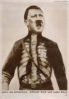
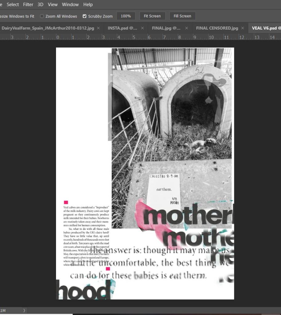
The brief required me to create a photomontage piece around something “political”; animal rights was an option to choose from. I instantly knew I wanted to base my design around animal welfare. Since I was very young I have been aware of the treatment of animals all around the world, (Thanks Mum for educating me with the Animal Action magazines back in the 90s!). I have always cared about animals and I consider to be well educated on where food and animal products originally comes from. It was only though when I started to dig that little bit deeper below the surface that I decided to live a meat free life from the age of 21. The image that haunted me the most from one of the magazines I read as a child (eventually my mum had to stop my magazine subscription because it upset me too much) was a new-born calf placed inside a lorry ready to be shipped abroad for a horrendously long journey ahead, to have a short life (16 weeks) inside a tiny little crate before it would be slaughtered for one meal for someone completely ignorant and oblivious to only be completely forgotten about by the next meal. No mum in sight, nobody to love it – I remember feeling the heartache when my mum explained what long but short journey that little calf was going on and the urge to want to help it. I guess 25 years later this is my way of trying to justify that.
Everyone is entitled to their own views and opinions and I would never shove my opinions, thoughts or vegetarianism down someone else’s throat, this is not what I or this is about. I have friends, family, my boyfriend who eats meat… I mean, hell! I even have to feed my cat chicken with my bare hands!! I have friends who go out shooting rabbits and pheasants just for fun… This is just the way I live though, my journey, my thoughts, my feelings.
In my opinion it’s all about respect. It is about being educated enough to know that every living being has a right to be respected and that every single creature on this earth has exactly the same birth rights to live, breathe, love and to not endure intentional pain or suffering. We all bleed the same way, there is no hierarchy to our intelligence or to mankind being considered a higher species, no one really has the right to “play god”. I think that when we form respect for each other and for the planet and its animals we become more compassionate and build an overall better place to live – we become educated to then make more informed decisions. Whether they be the same opinions or not.
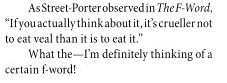
I had to laugh to myself though when I started my research for this exercise and found an article online featuring a celebrity backing the food television programme “The F word” a highly paid, arrogant show which cooks up dishes that no mere, ordinary mortals would ever be able to afford the ingredients to let alone cook (or in my case want to cook!) themselves. I quote “celebrity food fad”. In this particular article the celeb in question claims to have been “educating” people on “good veal”. The views I state I cannot stress enough are entirely my own, but having read this I believe she ironically is the only person uninformed, uneducated and completely in a state of “ignorant bliss”. She obnoxiously does not seem to make a connection between life and food. It makes compelling reading. I have included the shocking, hilariously uneducated snippets from it on my final design, I will put my hands up, she did not write some of these quotes – she clearly wasn’t the only idiot writing in this article.
My particular favourite quote from the article being: “the best thing we can do for these babies is to eat them”. Why?! Can we not just simply leave them alone and let them live?! I am sure there is more to life out there than needing to eat veal.
My second favourite being the absolute irony and p***take that Veal is “especially liked by young children” How funny eh? babies eating babies?.. go figure.
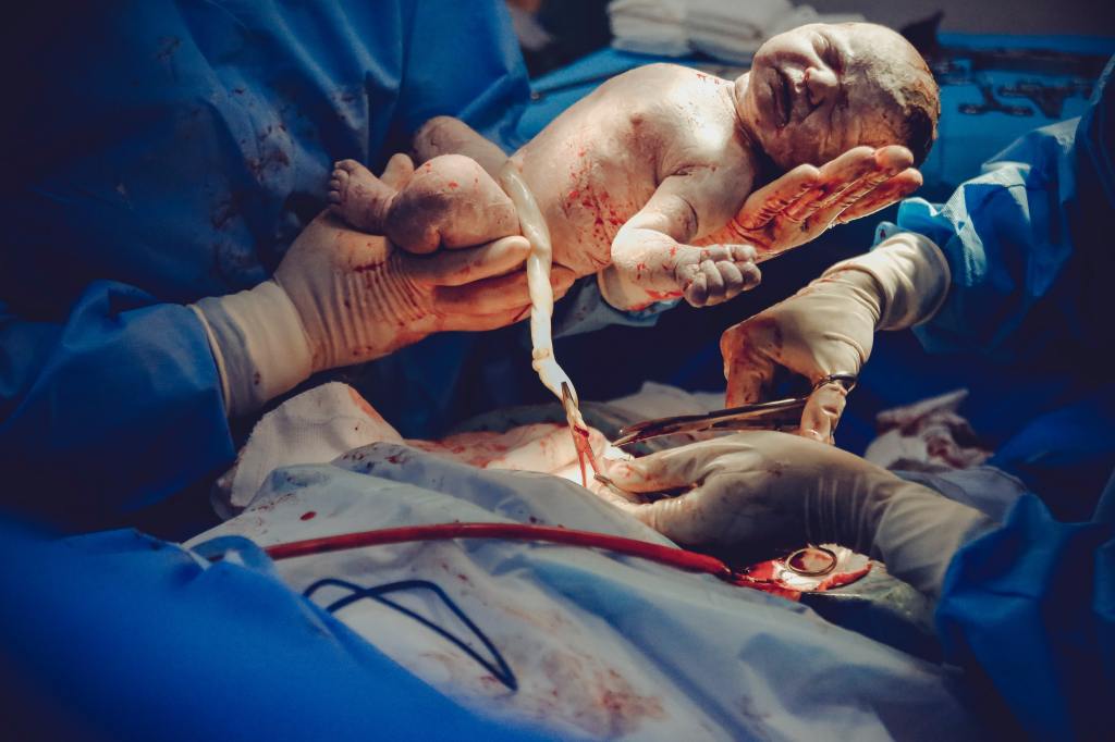
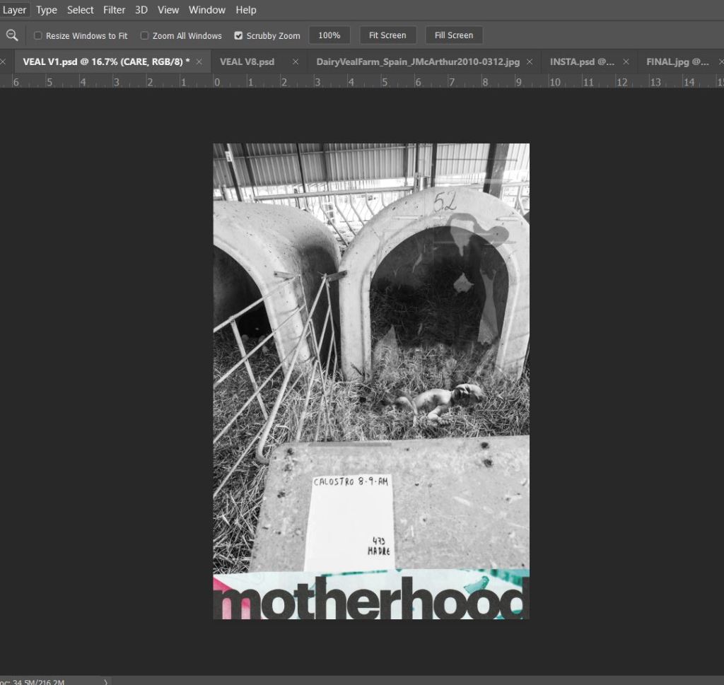
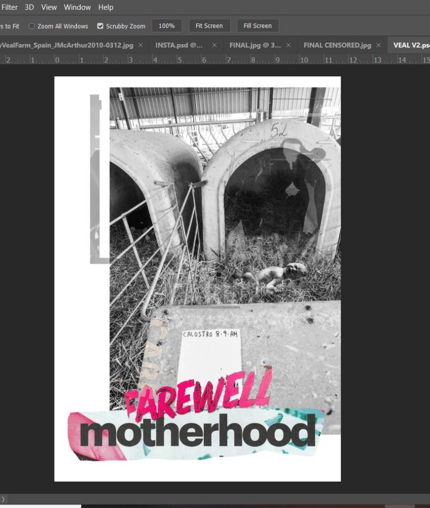
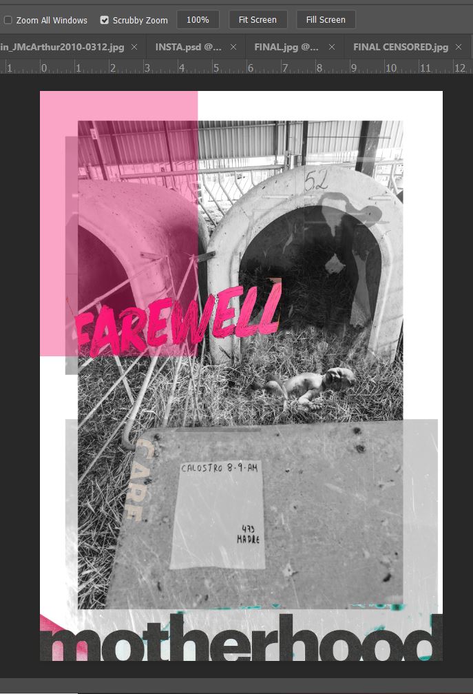
Talking of babies, this is where controversial and sensitive enters my design. Calves are ripped apart from their mums as soon as they are born, the lucky ones are wheel barrowed a short distance to live for 16 weeks in what I can only compare to what look like masses of white war gravestones. A tiny confined crate where they are chained, cannot move, turn around or groom themselves just so that their muscles become tender and unformed for the meat on someone’s plate to be “good, delicate, pink rose veal”. For the unlucky souls they can be shoved onto lorries and shipped abroad as young as 2 weeks old to places like Spain to again have the same lifespan and bleak future. These calves are so young and long too feed from their mother so much that they have been known to try and suckle the very hands of the humans that then go on to torture them. They are babies, babies starved of their mothers and their mothers milk. A baby refused their right to be loved by a mummy and to live. This is where my opinion creeps in, calves are no different to human babies being stripped of their birth right and their mummies… cue my controversial childbirth image replacing a calf in its veal crate…
My design is a nice little nod to Raygun; David Carson, Chris Ashworth and the newbie on the scene -Roy Cranston but more of that fun stuff later in the post! The childbirth photograph was taken from Pexels; a free stock photo website where you simply credit the photographer at the end as a way of thanks.
Thanks Vidal Balielo. A big thumbs up from me.
I wanted my photomontage to be strong… to have a powerful message and to push my “safe” boundary. The design is controversial but hopefully not too controversial to really offend or upset people, that was never my intention. My intention was to highlight a connection between humans vs. animals. In the photograph I have used on my final design (courtesy of Jo-Anne McArthur and We Animals) the farmer actually calls the calf Joanne; named after Jo-Anne McArthur who photographed the image, but it also shows how the farmer has made the connection to call the calf a human name. There is no difference between us as humans and the animals at all.
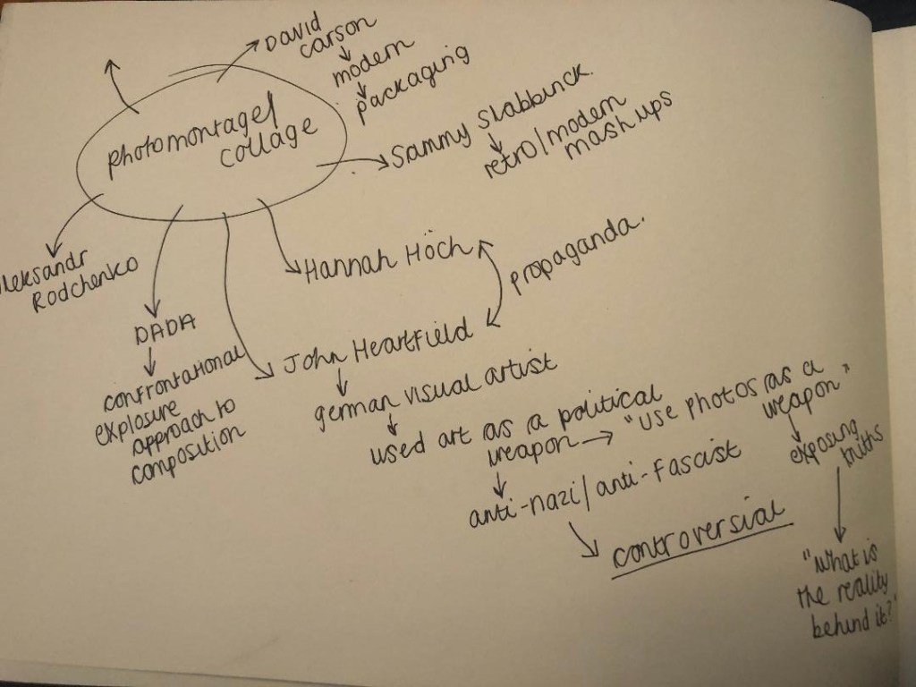
The Brief
When I first read this brief I quite liked the sound of it. I have experimented with type and collage in a similar way before with other exercises and assignments and this was the perfect opportunity to practise further! I am a massive fan of Raygun magazine, I love the style and layout of it and the works of David Carson and Chris Ashworth within it. Roy Cranston is another of my favourite up and coming designers. I think my overall design shows an influence from these.
First Ideas/sketches
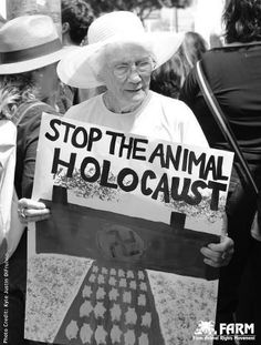
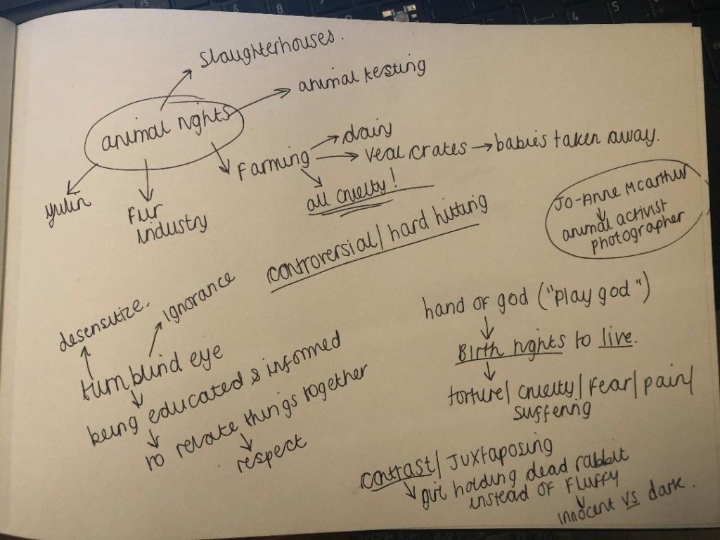
As said in my foreward I decided to go along the lines of animal welfare and I did have a lot of ideas as to what I could do for this. I knew that I wanted my design to push boundaries and be controversial. I wanted something to be as strong as my opinions towards it. My first idea was to compare the holocaust to taking animals to slaughter. There are protests where people have called it “The animal holocaust”.
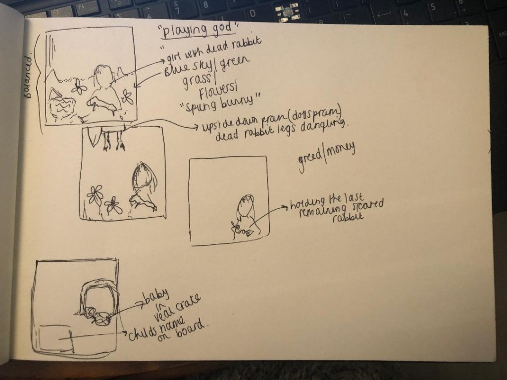
I had no idea though how I would have tastefully and sensitively montaged that together. The whole idea of it seemed too insensitive and distressing. I also had the idea of comparing an image of the 100’s of veal crates to the 100’s of white unnamed war grave stones but again could not find a justifiable link between the 2. I then toyed with the idea of animal testing and the fur industry.. a contrast between dark and innocent. For example one of my ideas was to use a little girl holding her pet bunny but instead of her fluffy friend it would be a dead skinned rabbit.
I drew some sketches out to give me more of an idea where I could go.
Research
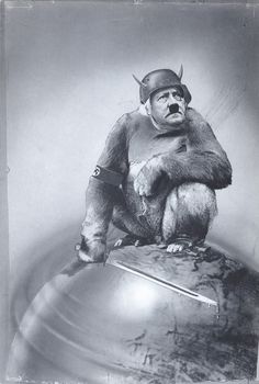
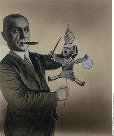
I did some research on some photomontage artists; a lot of the work was produced during the war. Propaganda, Anti-Nazi/fascist material. I created a Pinterest board of some of the images I found along with other animal rights images and then researched further into the people who had made them.
One of the most popular photomontage artists was John Heartfield. During the war he created Anti-Nazi printed material; all of it was quite controversial – controversial enough that the Germans did try and catch and kill him! This is the sort of artist I needed to indulge myself with because he produced shocking media with a message which is something I wanted to do myself with my own design.
Digital Development
I then decided I was going to choose from 2 options; the fur industry – directed towards the cruel killings of white rabbits for their fur in Spanish factories or the Veal industry.
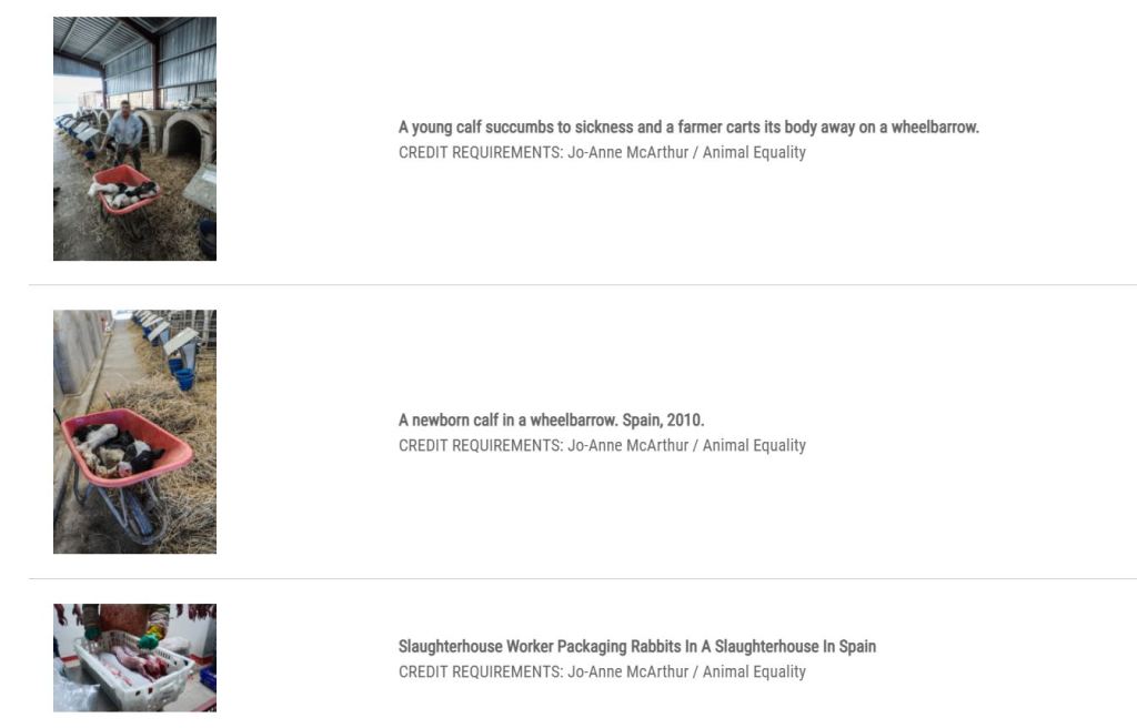
I firstly decided that I needed to get hold of some photos that I could use in my design without worrying about copyright laws. I started to look at animal activist groups that I follow on social media to see if they had any images that I could potentially use. I found a leaflet that Viva send out but the postage would have gone beyond my deadline for this exercise so I decided to venture on and see what else I could find. I searched for “controversial animal welfare advertising” on Google and came across an article about a book called “Hidden” that explores through the use of photographs the horrendous conditions and trauma that animals go through just before the end of their lives. I cannot take my hat off enough to the photographer who captures these events – Jo-Anne McArthur – her courage to put herself in a situation where she cannot do anything other than record what she sees to pass on in hope to educate us all. I then realised that as well as releasing this book, there is also a website called “We Animals”
On this website is a section full of archived photographs which are free to download. They are not easy viewing at any rate. The images themselves are horrific. The reasoning behind taking them is justified though with the fact that it is bringing issues to light and taking them out of the shadows. All you simply do is choose the photos you wish to use (I added some pretty hard hitting images) and then add them to an area on the website called “the light box” where at the end you fill out a form to request to use the images and state what you wish to use them for. There is an option to donate to this great cause too, this enables work to continue to highlight these issues that happen all over the world (which I did!).
Where I went after here was a bit of a mess! – If anyone reading this is familiar with Soundgarden and Black Hole Sun then you might be able to relate to me with the following! –
It gets much worse….. :s
My idea here was to transform this innocent little girl with her white bunny…
…into something a little bit more hard hitting to highlight again how we look after our pet rabbits at home but then there are farms in Spain that savagely kill them for their fur and meat. It was also trying (in my head) to represent “playing god” (I was going to place the living bunny in a dolls pram!) After spending the best part of a day learning how to use the lasso and stamp tools I gave this up as a bad job. The only thing I did learn is that my Photoshop photo manipulating skills need drastic improvement! :S
I then moved onto the idea of exposing the veal crates. This was much more successful!
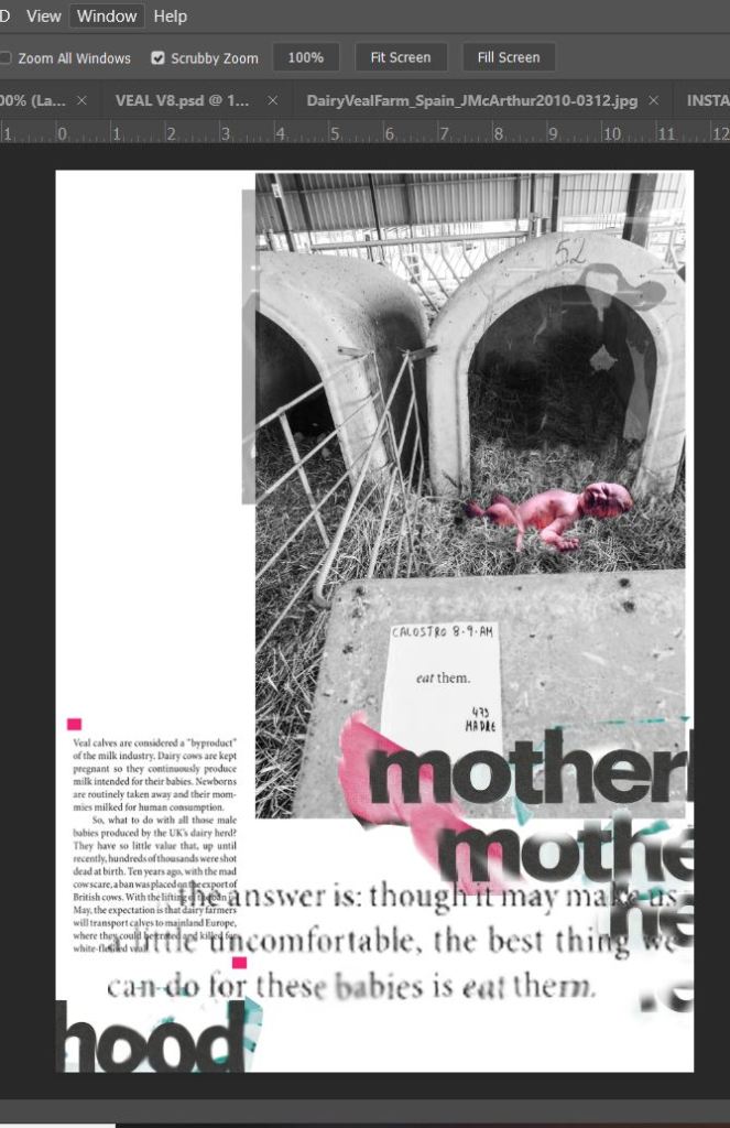
I started off with the photograph I downloaded from We Animals, the photo that I chose was quite heart-breaking in itself – the farmer filmed the calf being born, separated and then placed in this prison. To further add insult to injury he then named the calf as a last attempt to relate or add sentiment to the being as though it was just a child’s soft toy.
I imported the photo into Photoshop with my idea of swapping the calf “Joanne” with a baby.
These are some of the development screenshots that I did:
Final mock up and design outcome
I am really pleased with how this looks and how it has turned out! On my screenshots above, I did a version of this but without the use of negative space and it is amazing how much better a design can look with space!! In hindsight though I could have tried a crammed packed design to represent the lack of space the calves get!..
I like how in the back of my mind the work of David Carson and Raygun magazine is very prominent; I feel like this has a strong influence of that with the overlapping and manipulated text. I used contrasting colours – Black and white photography and text with a pop of pink.. why pink? Pink is very feminine and nurturing and caring – maternal. I used a newspaper article online to be the source of the body text and my captions on the front. I did not need to add text, but felt that having some hard hitting facts to support the image wouldn’t go a miss – the image speaks for itself to be honest. The photograph does not quite hit the edge of the page border – this is because I don’t want to restrict my design to a “box” I want it to breathe! I added a pink filter to the baby to show that the baby is very much living and a new-born but also to pop out against the black and white photograph. The “motherhood” text was a title that I found in a magazine as was “farewell” in my original development work. The cow in the vague background on my design was from a trip to Tesco earlier this week!
Overall I feel that I have not done too badly in this exercise. I work more in Illustrator so experimenting with Photoshop was a challenge at times – I had to Youtube and search Skillshare tutorials to know what I was doing with manipulating photographs at certain points, (lasso and clone tool) I think I managed merge the baby quite convincingly into the original photograph. I am pleased with the layout – I am using negative space more and it is making a significant improvement in my designs. I did try and find more “paper media” for more collage in this exercise though, there was not much in the style that I wanted or which covered the subject matter. I still think I have successfully met the brief though with the media ad methods that I have used.
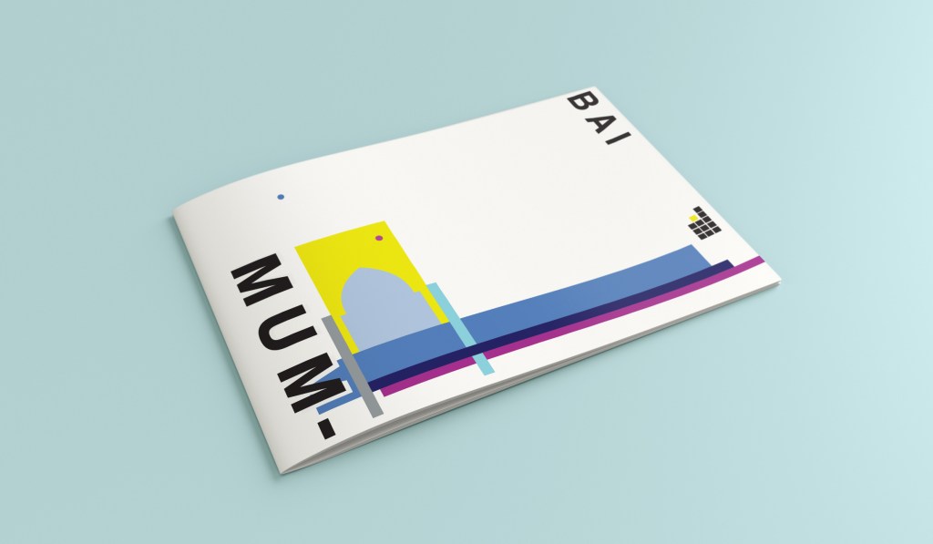
Hello and thank you for joining me on the last of my 10 city guidebook designs! 10 of 10 – Mumbai!
This is it! The end of the infamously difficult Abstract Cities exercise! I won’t lie to you and say I am not happy to see the back of this exercise! BUT! moving on to the write up of my last design!
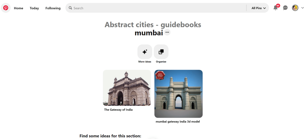
Again, my lack of geographical skills led me to question whether Mumbai was in Africa or India… India! (*eyeroll!) so I felt it best to do the normal and to search Pinterest for inspiration and ideas!
The most popular image that appeared was The Gateway to India. It reminded me a lot of the design that I had done for Marrakech, in my head I was conscious that I had to try and make this design look different.
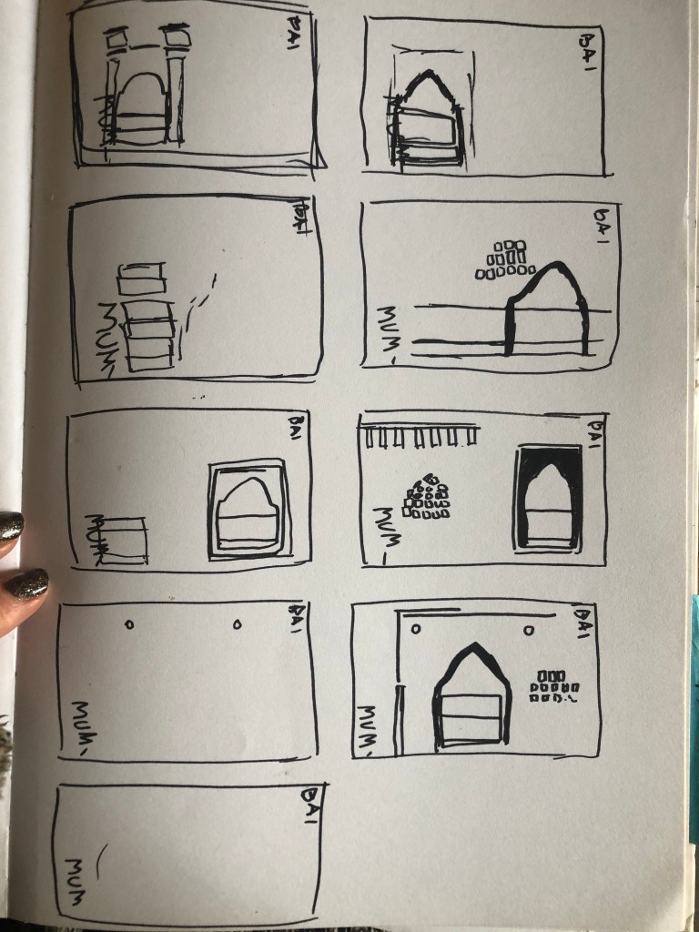
Again, I tried to pick out important features from the building which I could include in an abstract way on my design. I didn’t want to draw the building as it is on the cover because that would not be portraying it in an abstract light. If I picked out key features and then simplified the design I could place key elements of the building on my cover.
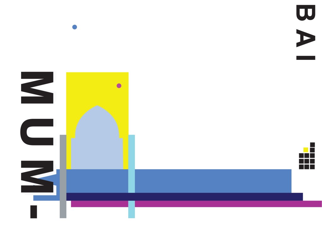
The colours of Mumbai are very similar to that of Marrakech, India is very rich in colour. Purple is the best colour to represent wealth, richness and luxury. On the photo of The Gateway of India that I found on Pinterest, it showed water in the background inside the gateway. I had a look on an aerial photograph of this and it showed that the gateway is almost on water. I included this on the design going through the gateway as it appears on the photo but then travelling it across the cover to take the eye on a journey across the design. The yellow block represents the warm sun but also acts as the actual door or gateway. The 2 circles in my design appear on the photograph in the doorway, they are decorative on the actual gateway. I have taken them and split them up over the design to keep the eye interested in all areas of the design. There is a lot of negative space in this design which I like. The design is not constrained to the edges and it has plenty of room to breathe. The black squares which bleed out over the right hand side edge are windows that appear in one of the arched windows on the photograph. I have used them to add contrast and to give a level of interest to the design. The blue is the dominant colour in this design with the yellow following closely behind as a subordinate. The accent colour is the rich purple. The layout is the same as the other 9 designs I have done in this series. They are all in keeping with each other, the repetition is there.
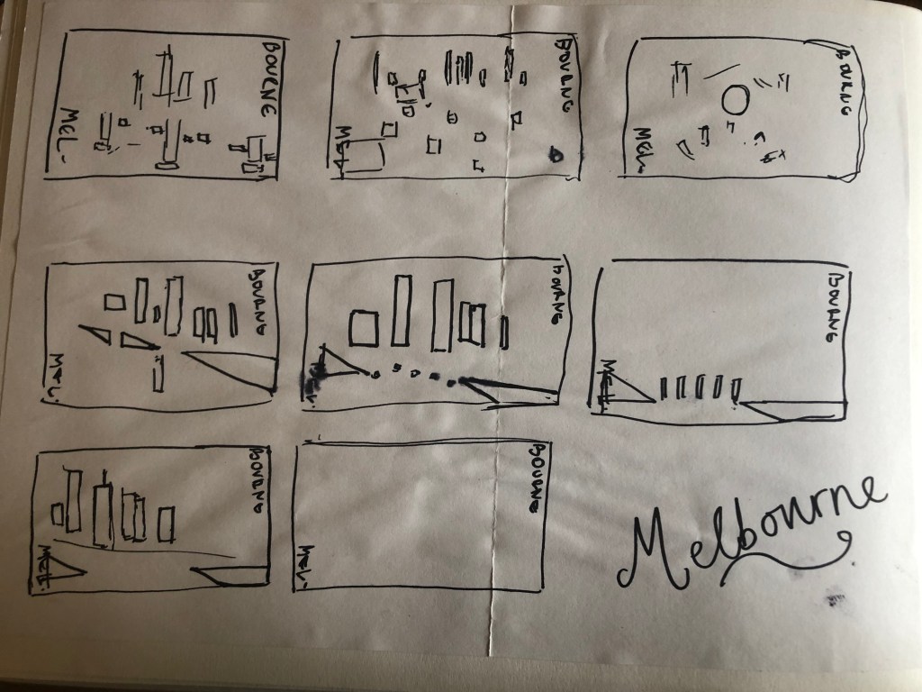
When I think of Montreal I think of Canada and Canadian moose’s, Mounty’s and all things stereotypical!
Brushing my naive knowledge of Canada to one side I decided to do the usual search on Pinterest to get ideas and inspiration for this one!
What appeared and grabbed my attention more than most was the Habitat 67 development. This housing complex is abstract in itself! It met the brief and it seemed like the perfect choice to feature on my cover!
In March 2012, Habitat 67 won an online Lego Architecture poll and is a candidate to be added to the list of famous buildings that inspire a special replica Lego set. Lego bricks were actually used in the initial planning. Initial models of the project were built using Lego bricks and subsequent iterations were also built with Lego bricks.
I didn’t actually do a lot of sketching for this one because I knew I just wanted it to be comprised of blocks of colour to represent Habitat 67. I knew that I could develop it as I went along in Illustrator.
I started from the bottom of the design and added a pop of green for the accent colour which represents the tree at the bottom of the complex. I then wanted to work my way from the bottom left to the top right so that the eye flows naturally ad comfortably up and across the design. I wanted negative space so kept the bottom right free for this. I created several blocks of squares and rectangles with overlapping colours to best represent Habitat 67. I think this is the most abstract design in the 10 that I have done, it works put quite nicely because this is the city in my eyes with the most abstract landscape. I used different weights in the blocks and line to create a contrast. There is repetition in my design, I tried to replicate the appearance of each apartment of Habitat 67 as they appear in reality.
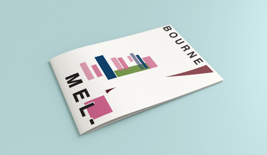
Hello and thanks for meeting me here at city guidebook number 8 of 10- Melbourne!
When you imagine Melbourne you see sun, sea and surf! I found myself getting confused between Sydney and Melbourne though! :s Again, I did a search on Pinterest for ideas and inspiration.
What I noticed was a lot of photos with Pink hue skies. Pink is a colour I know I haven’t used much in my designs so far, so I decided to use Pink and make it a dominant colour in this design. Pink is modern, confident and warm so it would make it an ideal colour for this popular city. An iconic structure in Melbourne is the Princes bridge, it appeared in a lot of the photos on my search. Melbourne is a coastal city with a lot of landscape and structures but there is also a lot of green around the city. This is something else I would include!
Similar to my design that I did for Manchester, I didn’t want to draw the bridge looking exactly like a bridge.. I wanted to leave it open to interpretation and make sure that the abstract was present with it. I took a photo of the bridge and sketched it out above using only its simplest form. The bridge uses triangles as part of the design so I used this as the main frame for it.
This is the final mock up. I feel like this design is very balanced. The design has a centre point where everything comes together and then there is a lot of negative space and room for the design to breathe. This design allows the eye to travel from the bottom left to the top right. It flows naturally ad comfortably. As I said, I wanted to use Pink as the dominant colour. It is bright and modern and confidently portrays the atmosphere of Melbourne. To break the pink up I used a cool blue, this brings contrast between the 2 colours. A pop of green was used to represent the natural environment which does appear within the city itself. This I feel fights with the blue for attention but it is definitely the attention seeking accent colour of the design. The bridge itself is built from the triangles which appear on the real thing. It is seen to appear in the distance and then come closer to finish at the forefront of the design. It is the bridge in this design which perfectly balances this design. The eye flows comfortably across the design.