Exercise: If the face fits (part 2) A short story – “I thought I loved him, now I’m not so sure..”

Part 2 of this exercise was to design layouts for 4 different commisions! – Overall I found this a very long exercise to complete! I loved designing for the typeface specimen book but by the time it got to part 2 I was finding it tedious!

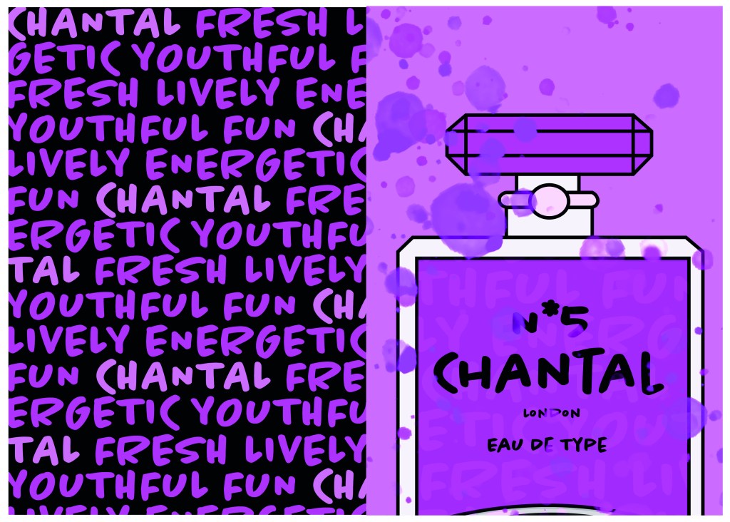
I completed the commissions – but I don’t love them… I think because I was out of my comfort zone with gimmicky typefaces (and the fact I had to use several of them!) and that there was a lot of text for a very limited space. I struggled with the lack of negative space in my designs.

Version 1: Trashy womens magazine!

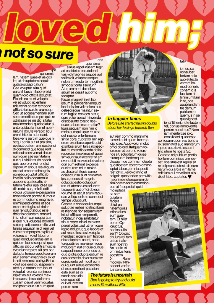
I started off with the short story “I thought I loved him, now I’m not so sure”. This is the first of 3 versions I have done for this article; this version is for a women’s weekly gossip style magazine.

I went to the shop and bought a copy of “Real people” magazine to have a look at some of the layouts in there to see what I could do for my layout. The colours that were used were mostly red, yellow, blue, green, black and white. A lot of the images were placed in chunky, brightly coloured boxes and the typefaces were mostly Sans-serif; again with brightly coloured outlines around the text. The background images behind the layout mostly related to the articles that were being written and that is why for mine I decided to do a broken hearted background. I created this by drawing a broken heart in Illustrator and then repeating it to make a block pattern. I then imported it into InDesign to place behind the text. I then created the zig zag part along the top to represent “broken”. I made the title quite big along the top of the article to draw people in to what the article is about, the “not so sure” part is the second piece of information the reader needs to read so I made that a lot smaller but in white so that it still stands out.

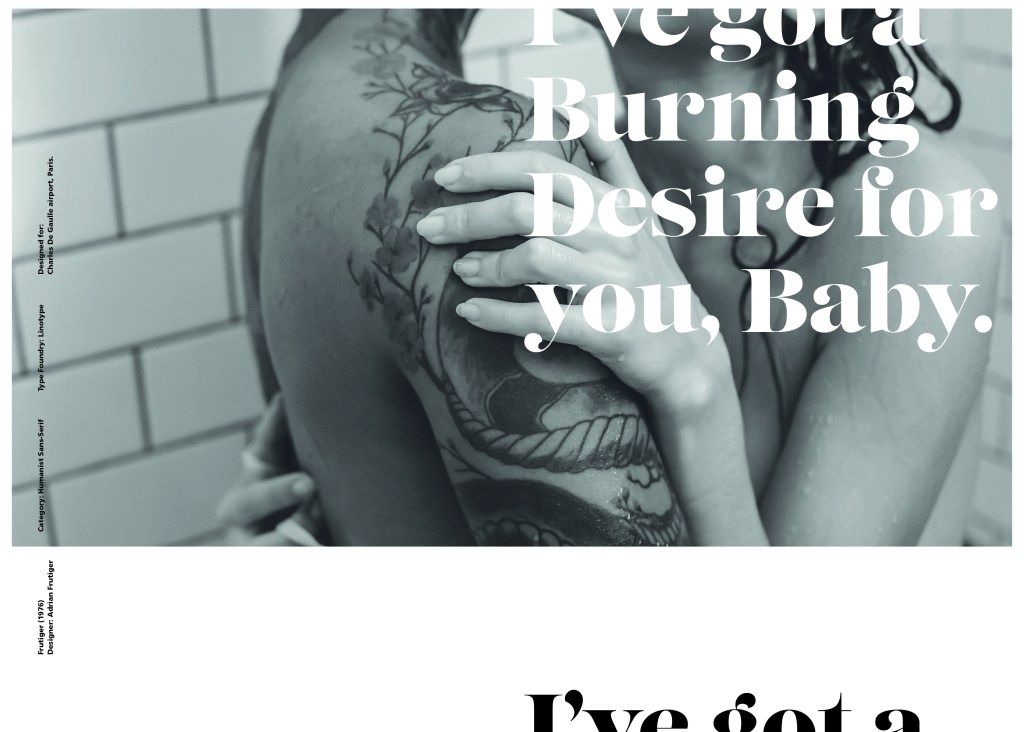
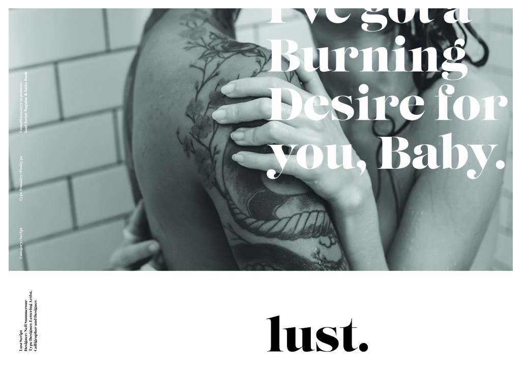
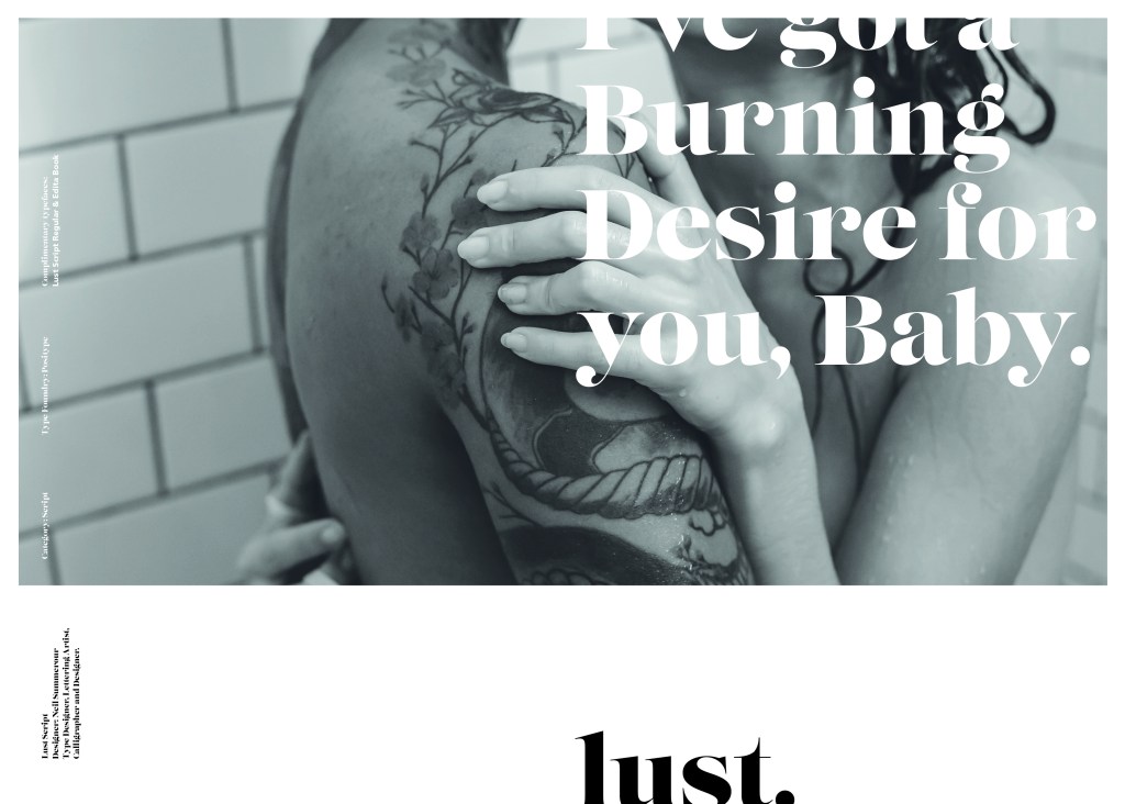
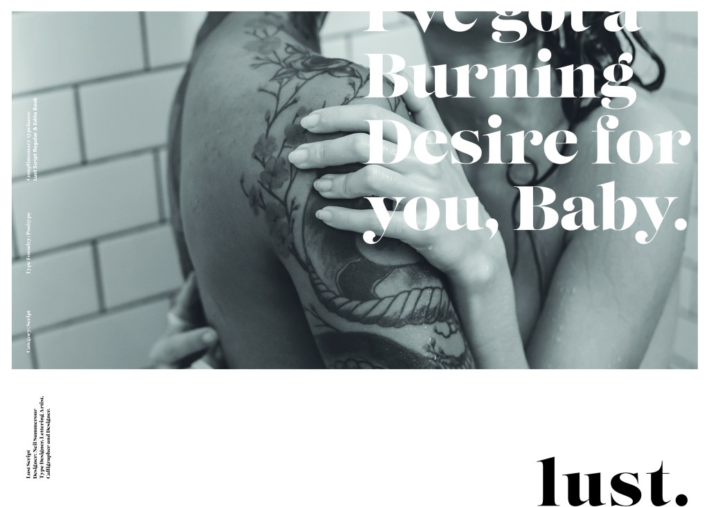
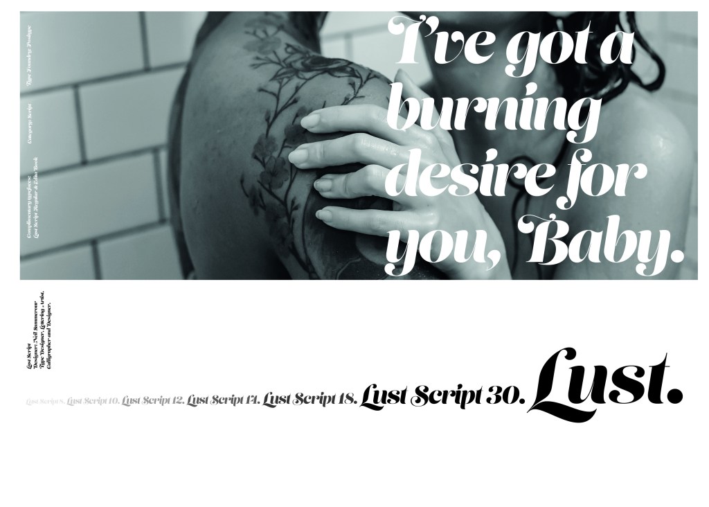
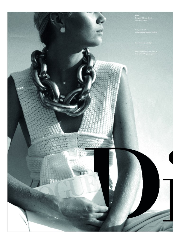
These are photographs that I found on Pexels.com for my articles. I wanted images that showed the couple in “happier times” I chose these photographs that are shot in Paris to pose as like old fake holiday photos of the couple! The first photograph where he is staring at her intently but she just does not seem connected to him felt ideal for the main image! It is in Black and white as well which always seems more thoughtful and moody and they were ideal for my next article which was for a glossy high end magazine!

Layout number 1 with 1300 word count.

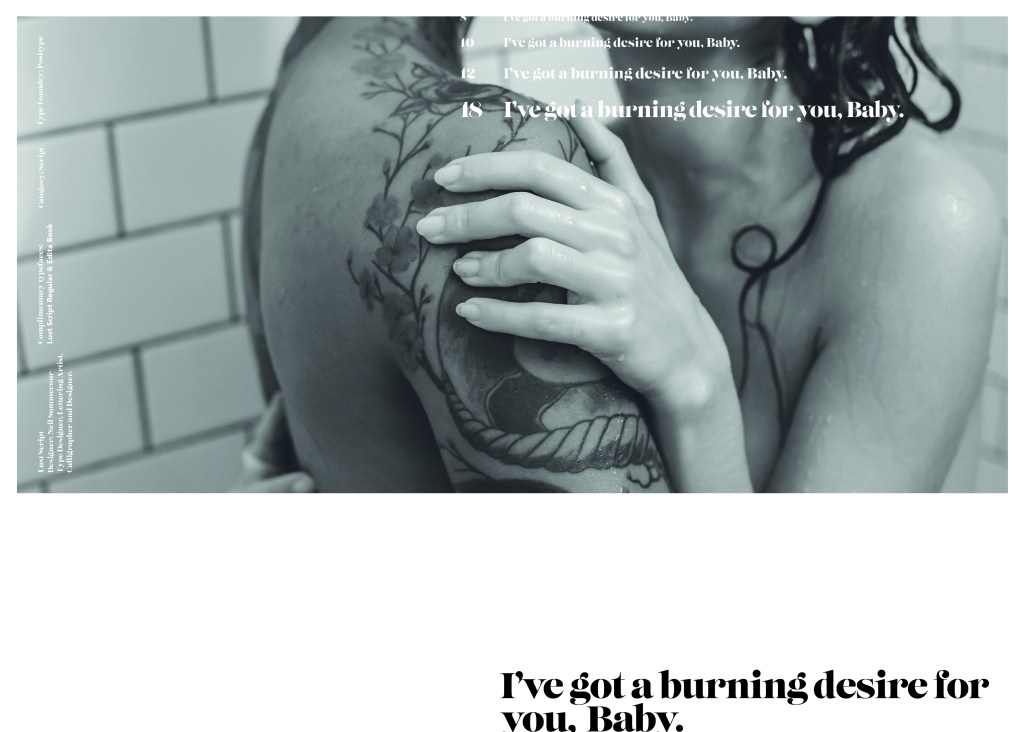
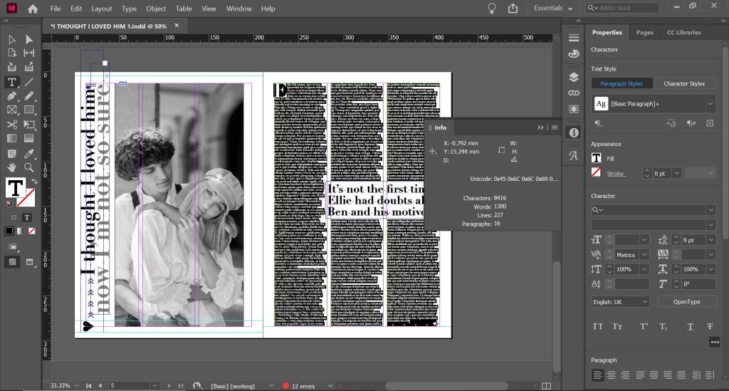
I struggled to fit 1300 words into my articles, especially when I used a lot of images and quotes in larger text. I created an 8 column grid for the layout which would allow the text to flow nicely throughout it. I had to fit the text to the images to allow the text to flow around them. My images were placed in a chunky box of colour just like the articles I researched. I used Neue Haas Text Pro 55 Roman for the main copy text and Neue Haas Grotesk Text Pro 76 Bold Italic for the title. I also used Neue Haas Text Pro 56 Italic for the smaller pieces of text along the bottom. I know that these are not 3 different typefaces but they are different styles and weights and still make great differences to the look of the layout. I had to adjust the leading and kerning of the text in the article to make sure that I had no hyphenation within the copy and I was wary of leaving widows (although I have left one on the first page, first paragraph!) I was also wary of leaving massive rivers in the text although this was easier to control because the layout is left justified.

The final mock up

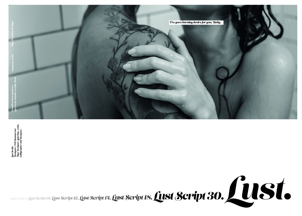
Version 2: High end glossy magazine

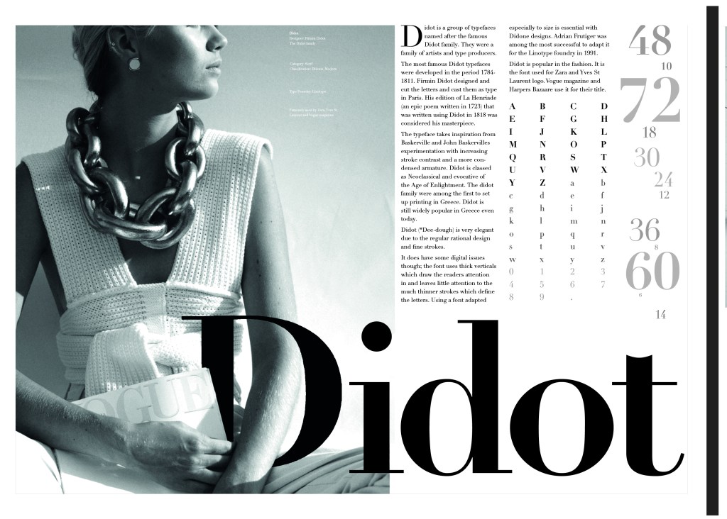
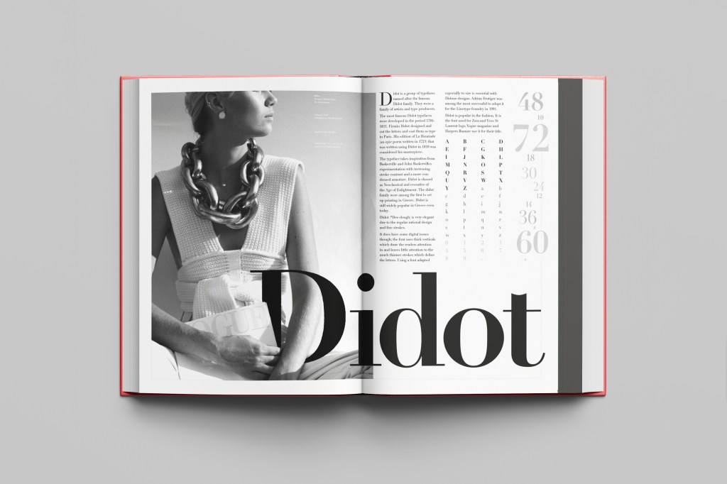
I researched into magazines such as Elle, Vogue and Harpers Bazaare for this article. The one thing I notice about articles like this are that the typefaces that are used are very feminine, light, delicate and ornate. Didot is a very popular choice for these style of magazines and this is what I used for the body text of this article.

The typefaces I used were: Didot LT Pro Roman for the body copy, Didot LT Pro Bold for the headings

Black and white for photographs in these magazines is also a popular choice. Black, white and greys are very prominent in these style layouts. I also noticed that fancy magazines use glyphs at the end of the articles; I decided to use a heart one to match the feel of the article.

The article layout with the final 1300 word count

I still have issues and things I would change with this layout; looking at it now as a finished article, to separate the text up slightly I could have indented the text at each paragraph just to make it look less intimidating to the eye. I am also not entirely happy with the side title. I tried to make it large enough to stand out but at the same time still have contrast against the rest of the layout, I made parts of it bigger than the rest to emphasise on them particular words so that they stood out first. I am now wondering if it is trying to hard to compete next to the main image. I also again only used one typeface but with a different style and weight; however, I still feel it brings contrast to the piece.

The final mock up!

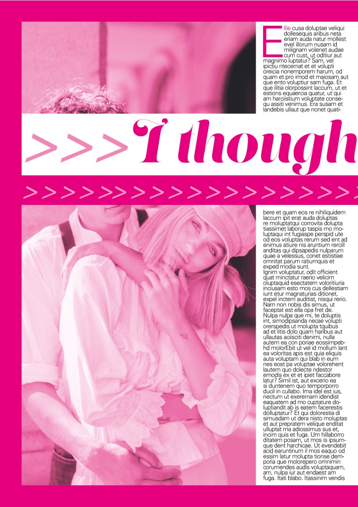
Version 3: A weekly glossy magazine (such as Grazia)

The layout with the 1300 word count

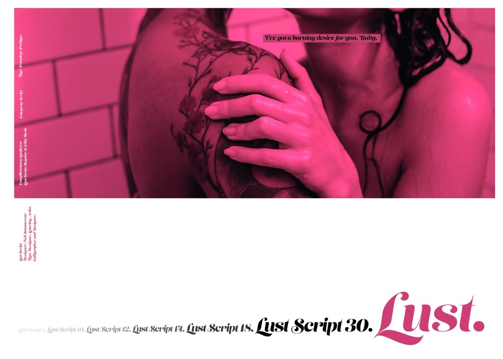
I researched Grazia magazine mostly for this layout. Grazia has a high end feel but also has similar articles to what gossip magazines have. I have tried to design a layout with a combination of both magazines. This article has a similar layout with the grid and columns as what my high end magazine article has but uses more images and “fun” typefaces.

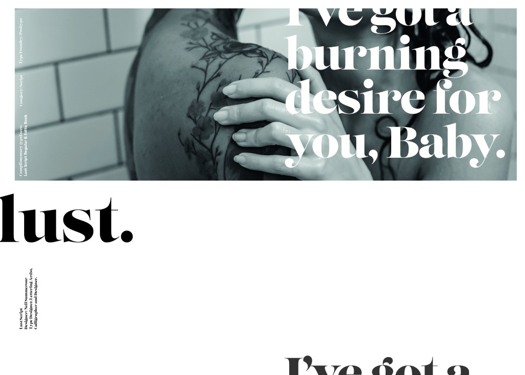
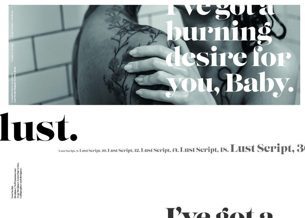
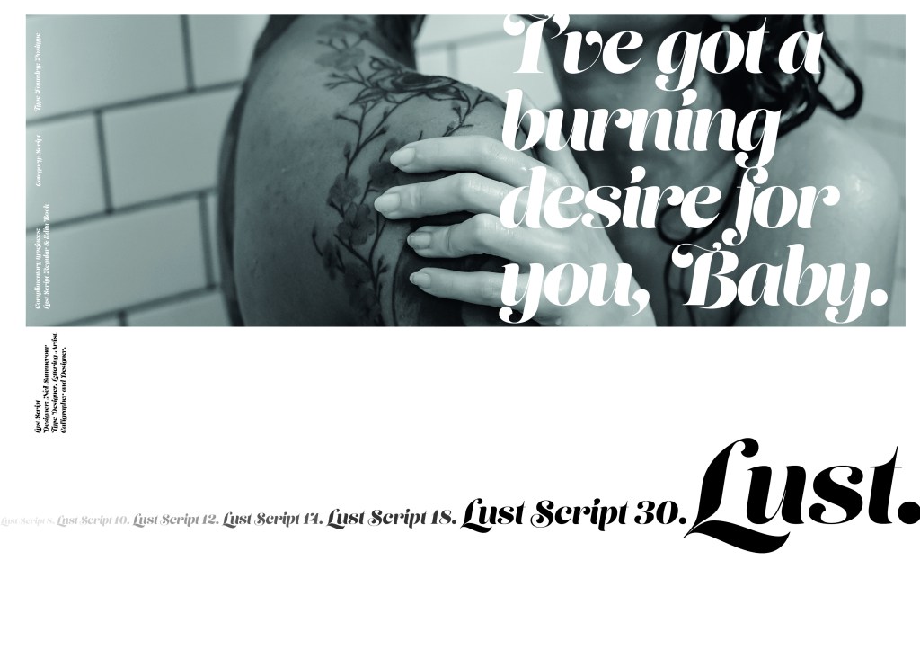
I used more typefaces in this layout, I used Lust for the main heading, Neue Haas Grotesk 56 Italic for the smaller heading and Univers Light for the body copy.

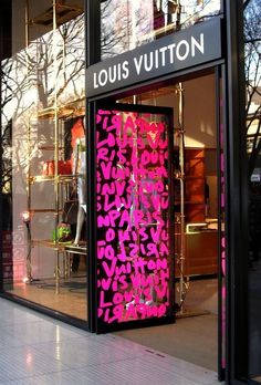
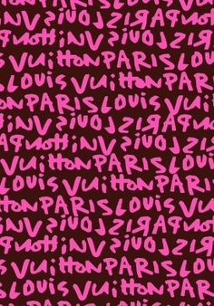
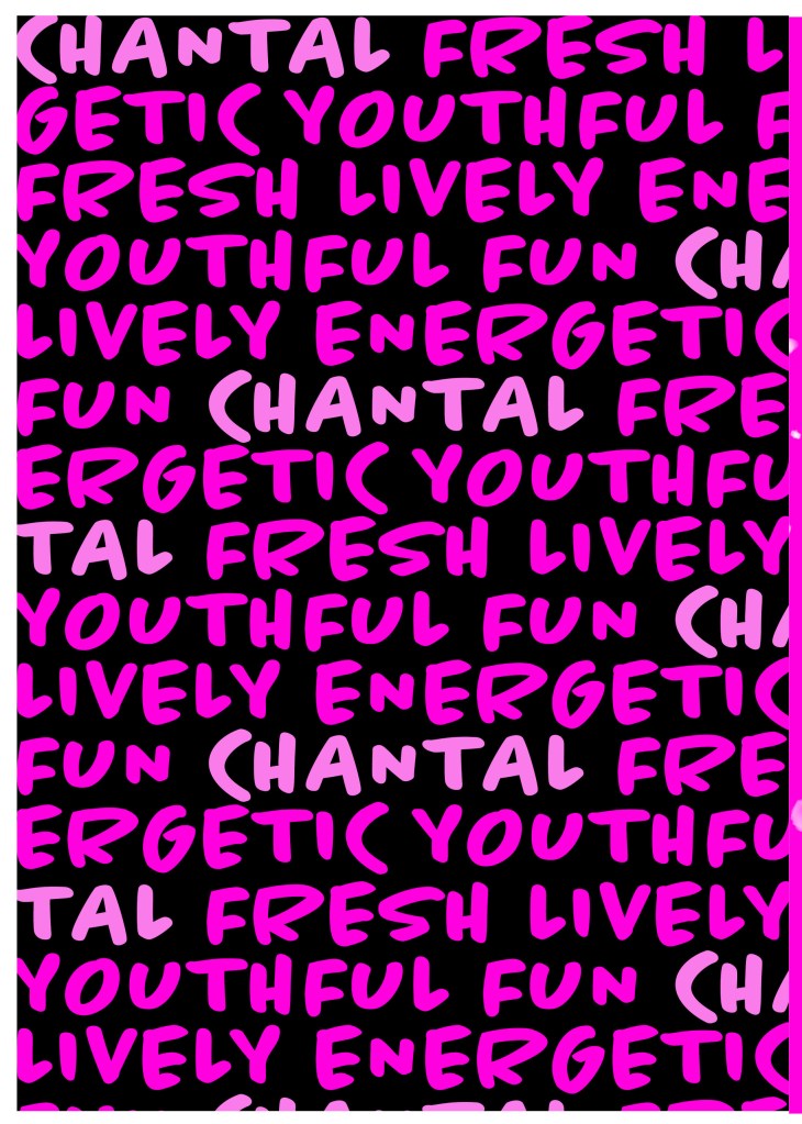
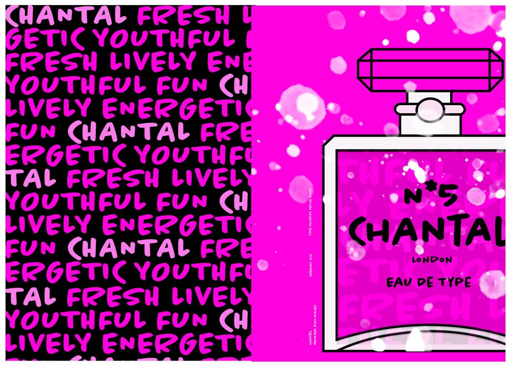
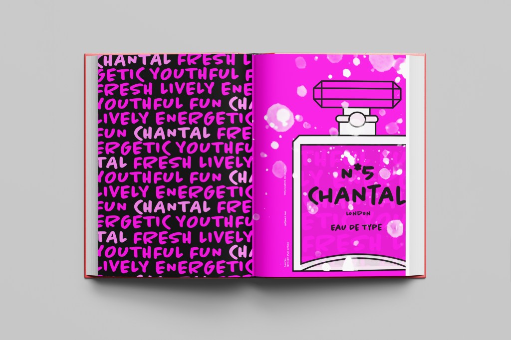
I also noticed that Grazia uses a lot of symbols in their magazines so I decided to break the title up by using arrows. The eye is drawn to the main top line of the title first and then you follow the arrows to read the last part of the title. I wanted to bring an element of colour into the article like the gossip mags but also keep a classier feel like the more top end magazines so I decided to go in the middle by creating a similar feel to black and white but use Pink to replace black. Pink is also feminine which is the target audience for the magazine and also relates to the subject of the story. I put a border around the layout (similar to my first trashy mag article!) and I chose to keep the text justified left, as this is always the desired choice to choose when designing book/magazine layouts but again I wish I had added indentation to the paragraphs to separate the text up slightly so it is less blocky and harsh on the eye.

The final mock up!

Exercise: Lorum Ipsum

For this exercise I had to choose an article from a magazine and copy it’s layout and design as closely as possible.

I chose an article from Elle magazine about Rosie Huntingdon Whiteley to copy from. It looked like an interesting article to copy because it has an image, headings, sub headings and uses different typefaces throughout the design. There is also an element of negative space around the title which has been arranged to suit the space. The only thing I dislike about this article is the typeface for the quote below the main title.. I just feel that it closely matches the body text in size and weight. I think that there should have been more contrast between the two typefaces, that the quote should have been written in Bold to stand away from the body text. I want to say that the quote should have used a bigger point size but I think that if the typeface was changed to a bold sans-serif (or even just sans-serif) there would be much better contrast between the two.

There are 2 different typefaces used for the titles.. one looks a lot like Meta condensed (a bold, condensed sans-serif) and the other is a very light sans-serif. Sans-serif are thee best typefaces to use for headings as they are easily legible and they stand out. I think the designer of this layout wanted to add an element of contrast between the 2 typefaces by making one bold and condensed and the other one light and regular so that they stand out against each other. I did an Adobe font search for all the typefaces on this layout but it did not come up with a definite answer as to what they all were; it came up with similar looking typefaces, one which was Meta condensed which I already recognised.

I started off with looking at the first left hand page. I measured the columns and margins, the text box sizes and the distances between the titles and the main body copy. The layout consists of the titles, the quote, the body copy, part of the image, the page number and the website in the lower right hand corner. There are 2 wide columns for the body text which fills up most of the room on the page, they use a serif typeface for the main text. The typeface that they use looks like a traditional book typeface – most high end fashion magazines use a similar typeface (popular ones like Vogue for example use Didot) this typeface in my opinion looks too rounded for Didot and again I tried to do a photographic search for it on Adobe but it did not recognise exactly what typeface it was, it just came up with similar ones. At the beginning of each paragraph it is indented which separates the text up slightly and makes it less “blocky” and more reader friendly. The text is also fully justified which is a brave, bold choice in the world of design as mostly “flush left, right ragged” is the desired choice. It just allows for natural flow and even space between letters and words which make it comfortable to read for the eye.

The quote (“For a model and entrepreneur..”) is a script, Italic typeface. I do not like this typeface although I can see what the designer has tried to do by by connecting to the audience of the magazine by using quite a feminine typeface and making the quote look like an informal, friendly chat but I feel that using an Italic Sans-serif would have looked stronger, it would have stood out and given more contrast to the layout as a whole. It probably would not looked as feminine as what it does now but it would have allowed the eye to pick out the different boxes of text easier and make it more more reader friendly and appealing to look at.

The page number is in a serif typeface; it looks very similar to “Lust” a typeface I used in “If the face fits” exercise. It is a very bold and chunky typeface with a prominent serif.

The second page again is a very similar layout; the image though on this page takes over a lot of the top left corner. The main text is again in 2 wide columns with the page number and website along the bottom margin. There is another quote using the same script typeface as before and in the same point size. Again, I measured out all the columns and margins and text boxes etc and they are all exactly the same as the previous page.

There is a yellow speech bubble at the top of the page which uses a regular sans-serif typeface. The speech bubble is in yellow which makes it stand out against the rest of the article, it is most likely in yellow to stand out because it is wanting you to visit the website.

This is what my layout looked like as I was copying it. I had to choose typefaces that closely matched the original ones as Adobe fonts did not recognise what exact typefaces they were. The 2 quote text boxes were recreated using a slightly bolder typeface as I couldn’t find an exact script font like the one that was used in light.

The typefaces I used were:

Ingra Thin (for the title) – 36pt – Leading 60 – Tracking -100

Acumin Pro Extra Condensed (for the bold text in the title) –

Le Monde Livre Std (used for the quotes) – 17pt – Leading 17 – Tracking 25

Freight text pro, Book (used for the main text) – 14pt – Leading 16 – Tracking -50

Arial Regular (used for the speech bubble and website at the bottom) – 10pt – Leading 12- Tracking 0

Lust Regular (used for the page numbers) – 12pt – Leading 14pt – Tracking 0

***

The layout as a whole…
A finished mock up of the layout I recreated.

Exercise: A Typographic Jigsaw puzzle

The Brief

My first thoughts of this brief was that it seemed quite simple! I was wrong though! It took me several hours to complete! The way I look at fonts now has also completely changed! I knew that designing typefaces was a complex thing and I knew about the different parts of the type (anatomy of type) but I never knew typefaces were disassembled into the different sections to then create the letters as a whole.

This was my final finished outcome for this exercise which I think is correct…

I started out by measuring a baseline by using a, e and o as a measuring guide. I sat them on the baseline and then drew the X-height line above them and Cap height. I was then able to measure out the ascender and descender lines.

Exercise: Playing with words

The Brief

This was the first exercise in Unit 4: Typography and I can see why we was set this exercise to understand that type can look like words and the different typefaces that you use represent the feeling or meaning of the word. This exercise did take a lot longer than what I expected! – but this was probably because the majority of the exercise was done by hand! It was a little bit tedious by the end of it and there was a lot of words to represent! Some of the words I really had to sit and think about too! There were some words I even had to look up the meaning of them because I had never heard of them! It might look like an easy exercise from first glance but it did require some brain work!

The exercise specifies that we used Helvetica as the typeface at 48pt to print out the words; this made me chuckle a little bit because there is a debate about using Helvetica to represent a feeling or meaning of a word; a lot of modern day designers such as David Carson strongly disagree that Helvetica represents a word or feeling of the word. In the film Helvetica he states that “explosive” written in Helvetica is not explosive at all! “Happy” in Helvetica does not feel happy at all. The typographers of typography past and those typographers who design strictly around old traditions disagree with Carson that Helvetica cuts out the unnecessary, ornate, decorative “crap!” and communicates straight to the point strongly and boldly. I am a mix of the 2 opinions… I believe that a typeface plays an important role in a design and representing the mood, feel and subject of the design but I am also a massive fan of sans-serif typefaces and the simplicity, modernity, legible effortless designs that can be created by using them.

Making the words visual

I printed out my sheets using Helvetica and then cut the words up to create my visuals. I used the whole A4 sheet as my blank canvas, I wanted to make good use of negative space and really think about where I was going to place my words within the space.

Digital Development

My favourite words were speed, squeeze and shatter. I feel that these 3 worked the best overall and I decided to take them through digitally to develop further…

Firstly I drew out visually what comes to mind when I think of the word and then I imported them in to adjust in Photoshop and Illustrator.

This exercise was more difficult than I originally thought… Helvetica as a typeface is difficult to make “visual” I had to rely on using illustrations and effects to really get the feel of the word across. For “squeeze” I used the entire width of the page and literally squeezed the text on, the lemon and lime give the feeling of being squeezed.

For speed I used the original typeface (Helvetica) and drew around with a fine liner creating a hatched lines to give a “speed” effect. I like the “shattered” one the most. This was created by typing out “shattered” and then cutting chunks of it out using Illustrator. I placed them in such a way to look like it had shattered in the middle of the layout.

Overall this exercise made me learn how type can be used in a visual way to represent an emotion, verb or feeling; typefaces are all designed very differently and each and every one is designed to look a particular way and to better suit different designs. When we see type that looks like what it is supposed to represent, we can associate and relate with it more.

If the face fits (Part 1: Type Specimen Book) Lo-Res

When it comes to decorative/ fun or “gimmicky” typefaces I am not very knowledgeable! In my work I mostly use Sans-Serif which is why I have made my specimen book “Sans heavy”! For this section of my specimen book I had to do my research and look into different typefaces that I could use for pixelated/fixed width fonts. I started by looking at Adobe fonts on Typekit. I found one called Lo-Res which gave me the most ideas for my design. It is also designed by Zuzana Licko which is interesting because she very successfully designed Mrs Eaves but this typeface in my opinion seems a far cry from that! I cannot say I am a fan of this typeface at all; in fact, I am not a fan of this category at all and I shall probably never use this typeface or any in this particular category ever again unless the brief directly states it! It did however still give me good ideas for my design…

I follow an Instagram account called “Designer humour” and it is full of funny memes relating to the design industry and stupid things clients ask or say, this typeface made me instantly think of one of those memes that I read;

“I am just sending you the Hi- res logo… It’s in Word is that OK?

Lo-Res is a very pixelated, hard to read typeface and it lends itself well to the quote above! I decided to create the whole layout in the style of an email from a non-designer sending a designer their “high res” files!

Digital Development

I had the idea in my head of making the whole double page spread look like the screen of a computer with the emails open and for there to be an email on there from the “non-designer” with a Microsoft Word attachment which I would then link back to Lo-Res.

I firstly needed an email with a fake Word document to then edit in Photoshop. I got my boyfriend to send me a fake email with a word attachment on it so that I could use this as a base for my design.

I deleted Chris’s name and information and replaced it with a fake name. I then started designing different layouts around this. I found that using the whole screen on my layout was too much to look at. I needed to strip it down to its bare minimum. I started to delete elements down to it’s essential to see if it made the overall design better.

Once I deleted elements it did make the overall design better.. I then decided to move around what was left on my page for better hierarchy. The eye needed to flow and skim over the content better. What I ended up with was a lot of negative space with elements thoughtfully placed across the spread. I added there are 2 main focal points on the design and that is the Word attachment and the Lo-Res quote. It needs to be clear almost straight away what the pages are all about.

The Final Mockup

If the face fits (part 1: Type specimen book) Chantal

When it comes to decorative/ fun or “gimmicky” typefaces I am not very knowledgeable! In my work I mostly use Sans-Serif which is why I have made my specimen book “Sans heavy”! For this section of my specimen book I had to do my research and look into different typefaces that I could use for decorative fonts. I started by looking at Adobe fonts on Typekit. I found this one called Chantal which from first sight gave me lots of idea what I could do for the design for it in my specimen book!

Chantal was designed by Rian Hughes in England, other than the designer there is limited other information about the typeface so I designed the layout for the pages how I thought the typeface should be used and interpreted the typeface in my own way.

From first sight looking at Chantal it instantly made me think of a Louis Vuitton design that was used on handbags a few years back and also on some of their shop displays, I thought I could recreate a similar thing for my design. As well as reminding me of the Louis Vuitton designs it also reminded me of some Chanel bottle designs that I have seen and pinned on Pinterest, luckily Chantal is a play on words with Chanel so I chose to do a fun, gimmicky play on Chanel with Chantal!

Chantal seems to me to be a typeface that doesn’t take itself too seriously! It looks like it has a lot of fun! I really enjoyed designing these pages for Chantal, it is probably one of y favourite layouts and it is definitely a typeface I shall use in my future designs!

Digital Development

I designed and created most of my design for this using Illustrator and Photoshop. I started off by designing the left side page first. The first page was inspired by the Louis Vuitton design and I had the vision of the first page filled with pure type. I typed out my text how I wanted it (I used the words Fresh, energetic, youthful, fun and lively as this is how the typeface was described on Adobe Fonts) and I repeated the words across the page, I converted them all into shapes so that I could adjust the colours further and move elements if I needed to. Using a black background and a vivid hot pink gave the design contrast and made it look really modern and eye catching. This design is clearly going to be aimed at women, I am not sure that the typeface is aimed at Females specifically but that is how I have interpreted it.

The next stage was to design the “Chanel” play on words part of the design. I decided to draw out one of the famous Chanel No5 perfume bottles in Illustrator but change the name to “Chantal no5”, London (where the typeface was made) and Eau de Type. I really liked how it came out! I then added some effects to the bottle; I used the paint brush tool to create like bubbles of the perfume spraying out and I used part of the type and lowered the opacity to place it behind the perfume bottle to look like the bottle is filled with type. I am really pleased with how it all turned out!

I only came across one problem while creating this design (one that I was able to sort out easily). I accidentally created my Illustrator document in RGB which was good because it gave really vibrant colours but it is not suitable for print; my InDesign document was set to “Print” which meant that when I imported the Illustrator document over to InDesign it came out really dull. I changed the settings over and it soon fixed itself and the colours came out looking lovely again!

When I had created the pages in Illustrator I then exported them and imported them into InDesign to create the final layout. I added the text in white on the right hand side which gives information about the type and the designer.

The really dull version

Design Development

The Final design

The exported Jpeg

The Final Mockup

If the face fits (Part 1: Type specimen book) Lust

Script Typeface called “Lust”

When it comes to decorative/ fun or “gimmicky” typefaces I am not very knowledgeable! In my work I mostly use Sans-Serif which is why I have made my specimen book “Sans heavy”! For this section of my specimen book I had to do my research and look into different typefaces that I could use for Script fonts. I started by looking at Adobe fonts on Typekit. I found one called Lust which attracted me the most and the name of the typeface gave me scope to use that in my design.

Lust was designed by Neil Summerour in the USA. There is limited information on this typeface other than letting the look and name of it do the talking!

The typeface is very modern and looks very feminine to me, just like its name though it manages to lure you in with its swirls and curls and fancy serifs. I wanted to design around “lust” and my first thoughts were of a seductive image or an intimate couple. To help give me a better idea I searched Pexels.com for any relevant images I could use on my layout. I actually searched for the image I used on my final piece in my work time on my work laptop.. the image download was called “Erotic shower” (**shocked face!! – just hope my workplace does not check internet history!!) LOL!

The original “Lust” (Erotica shower.. **embarrased face!) photograph! Downloaded from Pexels.com courtesy of Tim Samuel

This design surprisingly was the most developed piece I have done; I seemed to trial many versions of this before I got to the final piece! The piece was originally in Black and White until I realised it looked very cold considering it should be about love and lust and all things warm and fuzzy! – I took the original photograph and put a reddy- pink filter on it and that improved it greatly!

I also had the idea again to use a phrase or quote instead of “The Quick Brown Fox….” for some reason when I see this image and read “Lust” it reminds me of a Lana Del Rey song called Burning Desire, I used the chorus from that song in my early development to replace “The Quick Brown Fox” but it looked too busy, eventually I settled on having it in small inside the photograph. It seems like a little thought bubble or moment between the 2 people now with the location I have put it. It adds just another little bit of interest to the piece.

Digital Design Development

The Final design

The Final Mockup

If the face fits (Part 1: Type specimen book) Mrs Eaves

The last Serif typeface I chose was Mrs Eaves. I like the story behind this typeface and it also ties in nicely with Baskerville.

Mrs Eaves was designed in 2006 by Zuzana Licko in 1996. It is a variant of Baskerville. Baskerville is known for being absolutely perfect, stark and sometimes hard to read and Licko went out to create a version that was softer and more feminine in approach.

Mrs Eaves was named after Sarah Eaves; Baskervilles live in housekeeper who would later become his mistress and eventual wife. It was the story that drew me in to this typeface.. Sarah Eaves was John Baskervilles live in house keeper whose husband went on to leave her and her 5 children. Sarah in time became Baskervilles creative assistant and mistress and then when Sarah’s estranged husband died, they were married. Sarah Eaves was very much the woman forgotten in typography.

I wanted to bring an element of this story into the design; again, similar to Baskerville I had the idea to create a book design for the layout and tell the story of Mrs Eaves but then I saw that Mrs Eaves has the most beautiful ligatures and I wanted to do something with this. At college when I was 17 we had a project (similarly worded to this exercise actually!) called “create a type-FACE” or something similar where I had to create an actual face out of typefaces. I thought about creating a similar thing on my layout using just ligatures. I had the idea of a very feminine pattern and then possibly repeat printing it across the page. What I ended up with though was slightly different; I am a little bit disappointed because this is one of my least favourites looking back on it and it seemed to have so much more potential at the beginning but time was very much against me in this exercise.

I created a very similar layout to Baskerville as the 2 are related back to each other and then started messing around with the ligatures to make a feminine looking pattern. The pattern I created looks a bit like a Celtic cross, it reminds me of something that would appear in a stained glass window. It has a traditional yet modern feel to it. I tried to turn the opacity down on the design as I still think it looks a bit harsh but tuning it down just made it disappear into the backdrop.

Digital Development

The final layout

The final mockup

If the face fits (part 1: Type specimen book) Didot

This was the typeface I was quite looking forward to designing for! Didot typeface is very elegant looking and is used in glossy, expensive fashion magazines such as Vogue and Harpers Bazaar. Didot is named after the Didot family who were artists and printers. Didot was inspired by Baskerville which is another reason why I have used it as part of my type specimen book.

Didot is most famous for being on the cover of Vogue as “Vogue”, because of this I wanted to create a layout that represents high fashion magazines. Vogue magazine always has a celebrity or a fashion model on their cover so I wanted to include a similar thing in my layout. I went onto Pexels website and typed in “Vogue” and it came up with an image of a woman in fashionable clothing holding a Vogue magazine close to her chest. It seemed like the perfect image to use for this design!

There were a few more variations of this photograph as well which I downloaded in case I wanted to use different images on my layout:

The next step was to import the photograph into Photoshop and then adjust the colours. I wanted it to have a Sepia filter to it; Black and White photography suits High quality fashion magazines more and looks good on a layout for contrast. I wanted to put the “Didot” heading on my layout but didn’t just want to place it on the page with no creativity.. I decided to make the D part of the photograph by using layer masks again to mask part of the D out to look like she is carrying the D as an accessory in the photograph. I think it works well! I decided to do the rest of the layout in a similar style to a fashion magazine with the text in 3 columns and one column talking about the history of Didot.

Digital Development

The final mockup

If the face fits (Part 1: Type Specimen book): Futura

Futura is the last Sans-Serif typeface in my collection! I chose this one because again it is a classic and it also ties in well with the Bauhaus era along with the other Sans-Serif typefaces that I have chosen.

I did take a more modern approach when designing this layout though; instead of staying with traditional Bauhaus colours (Red, Yellow, Black, White) I was inspired by a German slogan “die Schrift unserer Zeit” (“the typeface of our time”) It gave me futuristic/modern vibes and I decided to play off this when designing my layout!

Futura reminds me of “future” and the future is modern and a mystery to us yet… I designed Futura around the theme of modern, futuristic space vibes with vibrant colours and an interesting layout.

The Futura is now

I had the idea to create planet-like orbs using Photoshop by using my brush tool and layer masks. I used this technique on one of my posters that I did for the “365 a poster a day challenge” I started a few years back. I masked the orb area out and making my paintbrush big, airbrushed different colours over each other to create a planet effect. I then copied it twice more create 2 in both corners. I really like the effect it gave. The bright colours contrast against the black to really make the design stand out. I also created contrast between small and big text.

Design Development – The stages of reaching my final design and layout!

The final page layouts

The final mockup