Last night I finished the mock up drawings of 3 of my postcards.
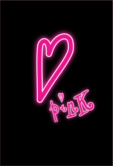
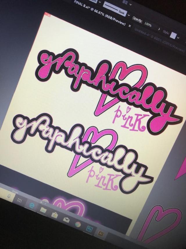
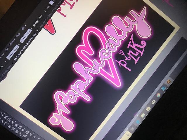
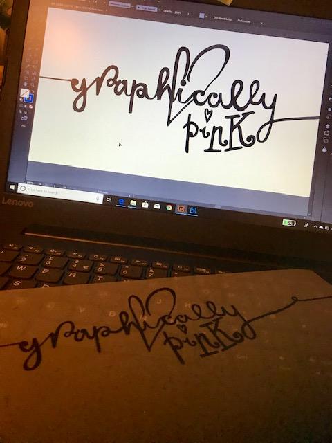
I have chosen to use Black and Pink as the final colours as it is simplistic, modern and the colours really work together. The illustration is based of very simplistic lines and a basic form. I have used Pink to highlight the important areas of the drawing. Having it all coloured in would draw the attention away from the key parts of the artwork. The “Lost Angelino” heart features on 2 of the postcards; I want this to be the logo for the series of postcards.
Postcard 1: She didn’t choose the pink life.. the pink life chose HER.

This postcard is the one that relates to “me” the most. It reflects self branding more than the other 2 because it has the pink lipstick which is what I am known for, it has the use of my Graphically Pink logo running down her arm from the lipstick. This reflects the blog name and also explains what I am all about. The illustration itself (although not of me! – she has a far better side profile and nose than what I ever will! :p) is in the style of me; I love to draw illustrations and drawings like this one. The woman in my drawing comes across as strong, independent and full of confidence! (She can conquer the world with that lipstick!) Hopefully when people view this postcard they will instantly recognise and link it back to me.
Postcard 2: ooh LA LA
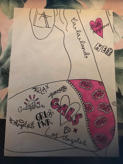
This postcard has a cross between LA and everything Girl empowered, feminism and Girl Power! Don’t get me wrong…. I mean, I’ve dated or entertained in my time a few nasty egotistic, narcissistic men who have been intimidated by the fact I live my life by MY RULES… but by no means am I am full blown “man hate” feminist…YET! I like a good guy more than the next gal! 😉 but this postcard is representing the fact that I am all for girl code; standing by each other and lifting each other up rather than tearing each other down. Women don’t cut themselves a lot of slack and in todays day and age there is so much pressure on women to conform to standards; whether that be for our men, how we look, what we wear or in our careers… I am all for women being strong, independent and owning their own voice and rights to be whoever they want to be. This is the message I want to convey in this postcard indirectly.
The woman shows a softer feminine *vulnerable side (vulnerable in no way meaning to be walked over or taken advantage of; more like an innocent sweetness) with the fact she is bare skinned (exposed for who she actually is) and in her underwear making a strong statement.. but then she is also covered in sailor style tattoos which show an edgier, unique side to her. A side that is not scared to express who she is. Tattoos interest me; they are an expression of who you are, they can be beautiful, unique art pieces! The fact she is posing in her underwear also shows that she is not scared to reveal her true self to people or scared of what people might portray her as or dictated to what she should look like or wear. It shows a strong side. It also links back to how I have been stereotyped so much over the past few years in my appearance; I am trying to convey that it is ok to be who you are, to be who you want to be.
Postcard 3: Take my heart and fly with it (to LA)
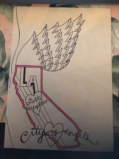
This postcard represents my absolute love of LA.
I tried to link “The city of Angels” in with the illustration. The woman is an Angel or an “Angeleno” from LA. In my first drawings I drew the basic outlines of wings and had the idea to put a map inside one of the wings of California. The idea then developed into making the bottom wing the shape of the state of California. On a map this is what the outline of California would look like. The heart at the bottom is located where LA lies. This postcard uses Pink in one place; to outline the state of California.
I am not keen on the layout of the postcard however the image needed to be positioned more on the left because it needed to join onto the other 2 postcards. It is definitely the most simple out of the 3 designs but I think from looking at it that it is quite self explanatory.
Instagrammable
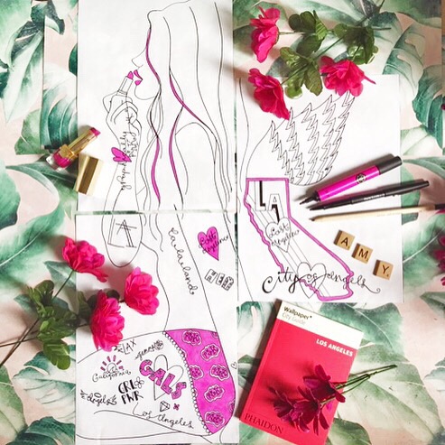
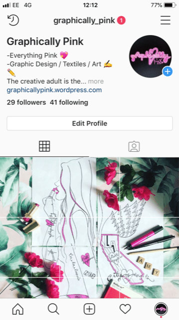
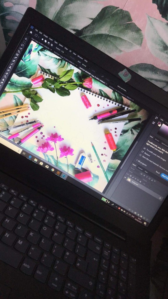
Doing the flat lay photography for these mock ups was fun. I wanted to upload these to my Instagram to see what the reaction would be. I wanted to do it in a more grand way though so I decided to use the App called “Giant square” to spread the image out over several squares. Overall it worked well. It makes my Instagram page jump out and I would use it again… however each image as an individual came out real low res which disappointed me! I had cleaned the image up in Photoshop and saved it as a high quality Jpg so I was surprised; I have put it down maybe to the app.
All that’s left now is to design the back of the postcards and to redraw these out in Illustrator and downsize them to A6 (postcard size) I am going to use the captions (next to each postcard on here) to be captions on the back of the postcard designs.