The Russell-Cotes Museum

So I have had a break (first break away in 2 years actually!) I went away for the week on a girls holiday just me and my Mum to Bournemouth. We was so lucky because the weather was LUSH! heatwave all day everrrry day!!

Look at that view!! the sun!! the sea!!

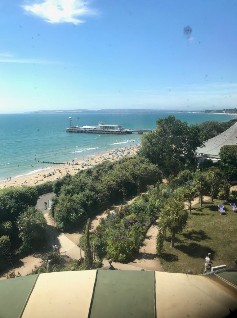
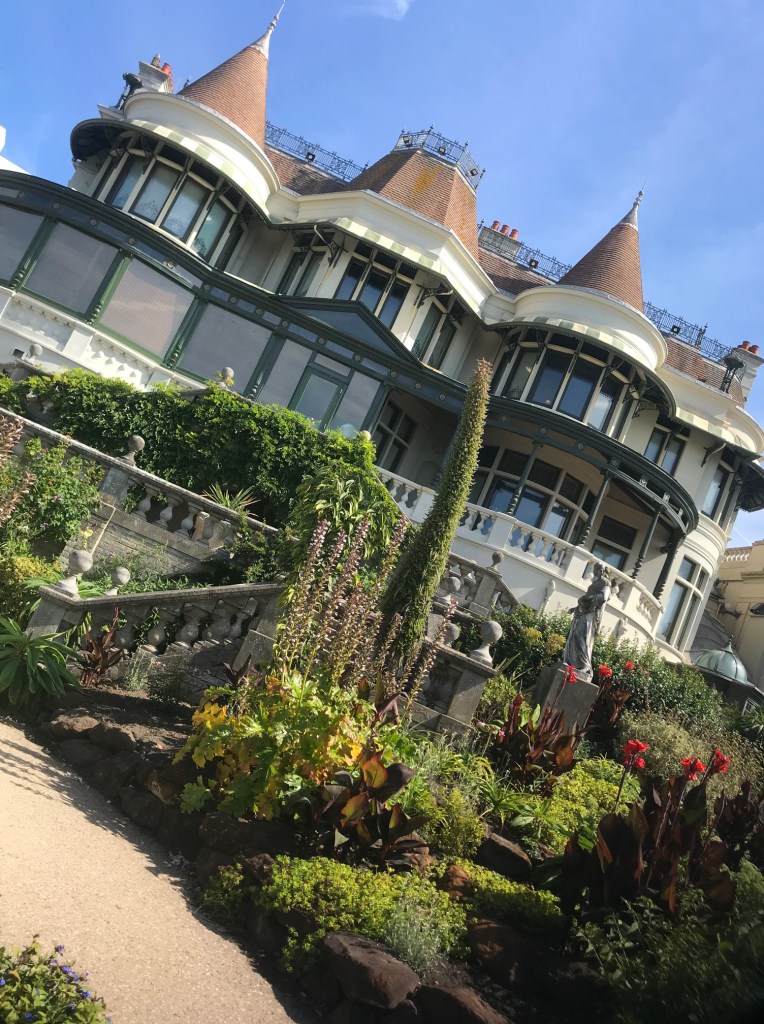
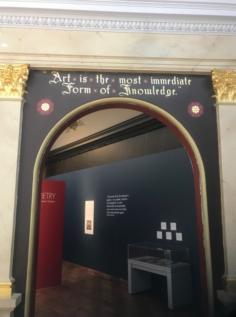
I wanted to make the most of my break away but also try and find some Arty stuff to be inspired by. After a google search and seeing some posters around Bournemouth I came across the Russell – Cotes museum; although it isn’t really Art and Design as such it looked like an interesting walk around for the morning.

The morning turned into mid-afternoon as we had a guided tour and the tour guide ran over his chat by an hour and a half! He was however very knowledgeable and did give us a good insight and picture of the house and the extraordinary couple who owned it! I feel like if we hadn’t of had him to guide us around we would have walked around this house at the strange artwork wondering what on earth it was all about!

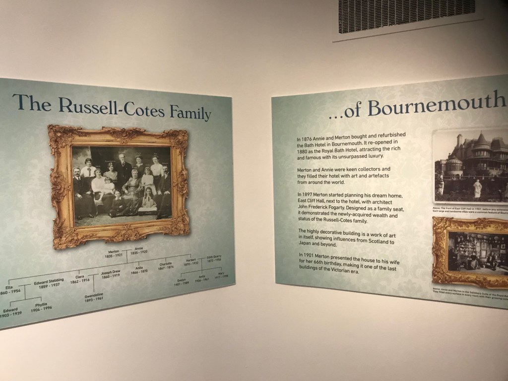
Basically Russell – Cotes (Merton) built the house to give himself “celebrity status” in Bournemouth but also as a gift for his wife in their later years. They both enjoyed travelling the world and bringing back artwork and souvenirs from their travels and putting them into the house but also in the Royal Bath Hotel (which they also owned- next door to the house!)

Merton was a delboy! – He came from nothing and by just being a bit of a “jack the lad” he managed to climb the social ladder and mingle with royalty and celebrities. He was obsessed with celebrity life and liked to collect items from celebrities of the day. If he was alive today he would definitely buy his copy of heat magazine for the celeb gossip!!

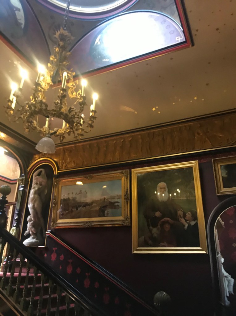
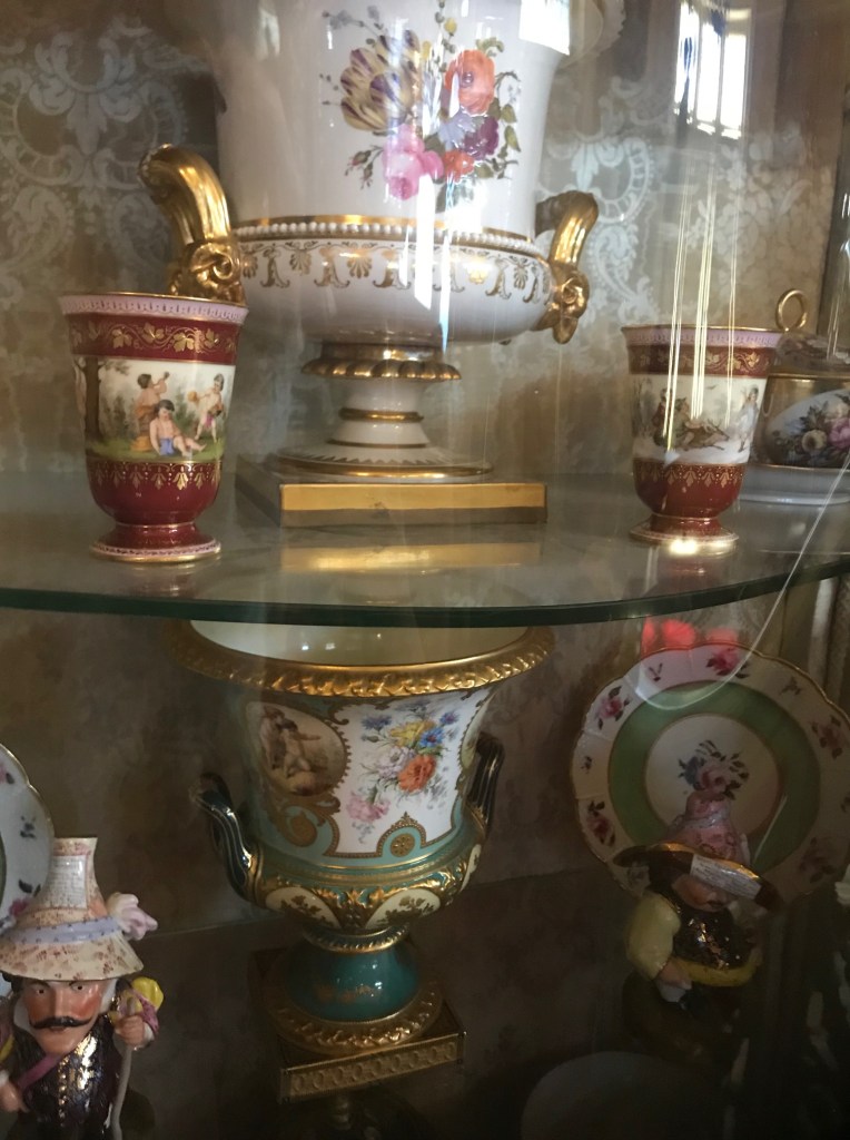
However, the day consisted of browsing around his weird and wonderful art collection and looking at the original house. He certainly was a unique man for his day and age; the “marble” pillars in the house were made of fake marble… the “leather” wallpaper and “embossed plastered ceilings” were all fake! All wallpaper from a catalogue at the time! He faked it until he made it!

He fabricated stories to get people interested In his house and hotel and even lied about his origins.. trying to pass himself off for an aristocratic Cotes family that he had no relation to! He created family coats of arms which he placed all over the house – these interested me because he took icons from his wife’s history and his own and then made them into symbols for the coats of arms!

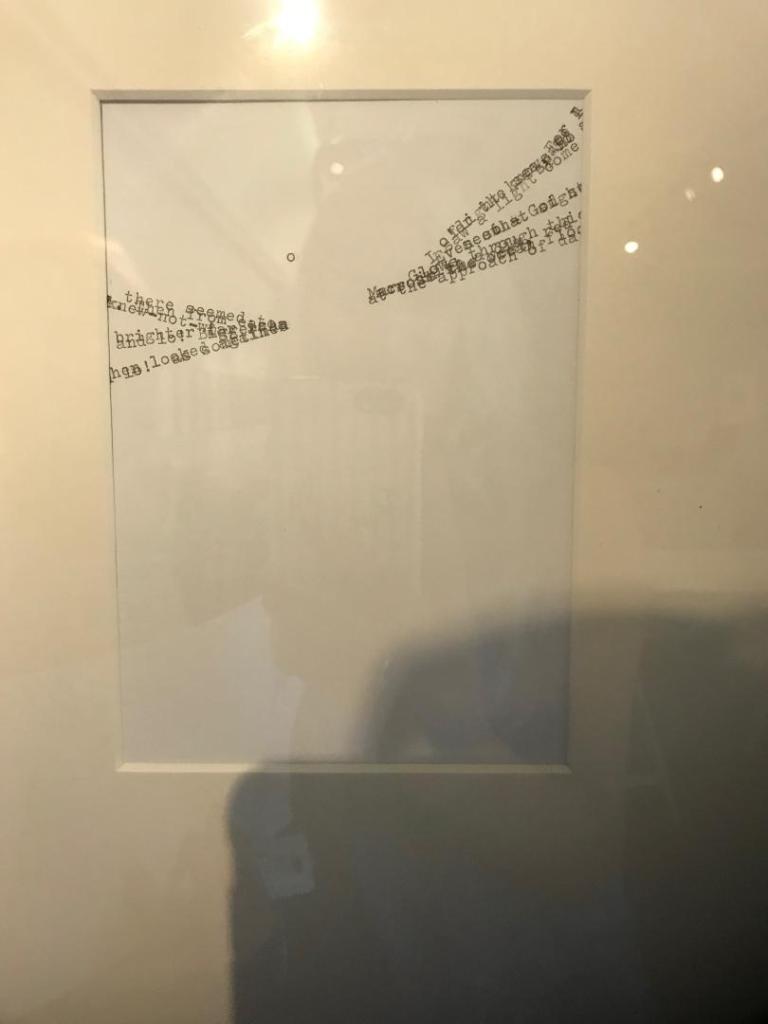
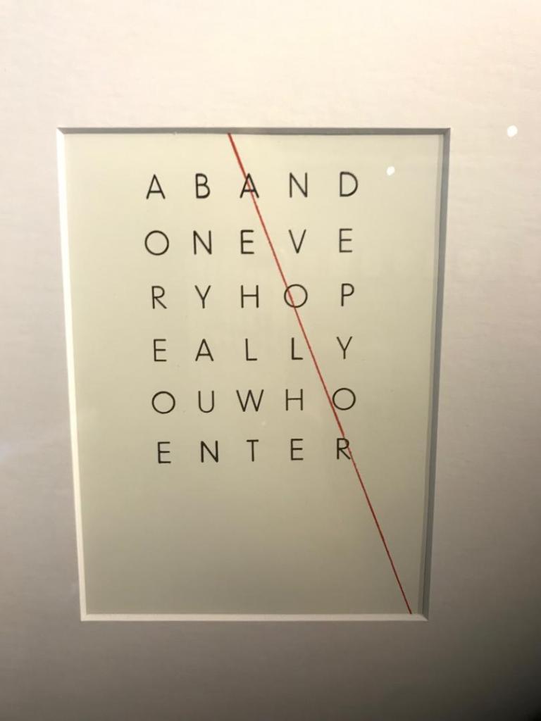
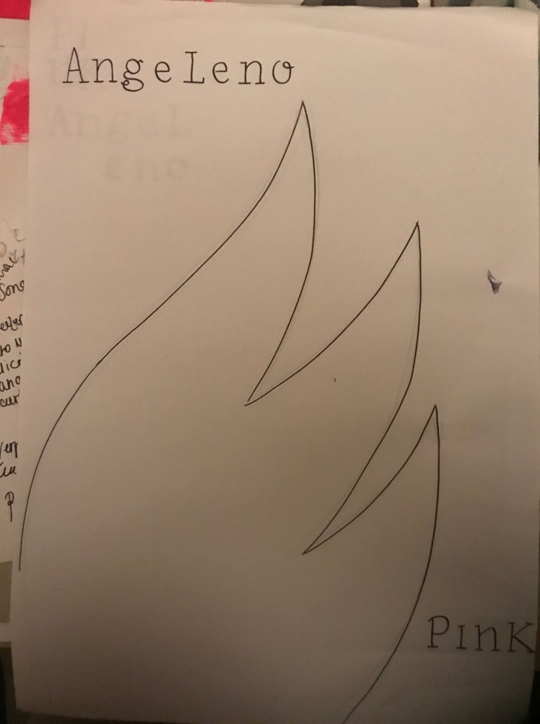
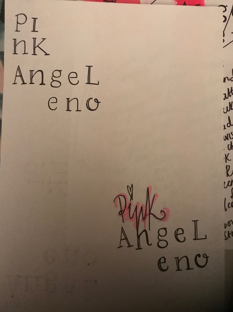
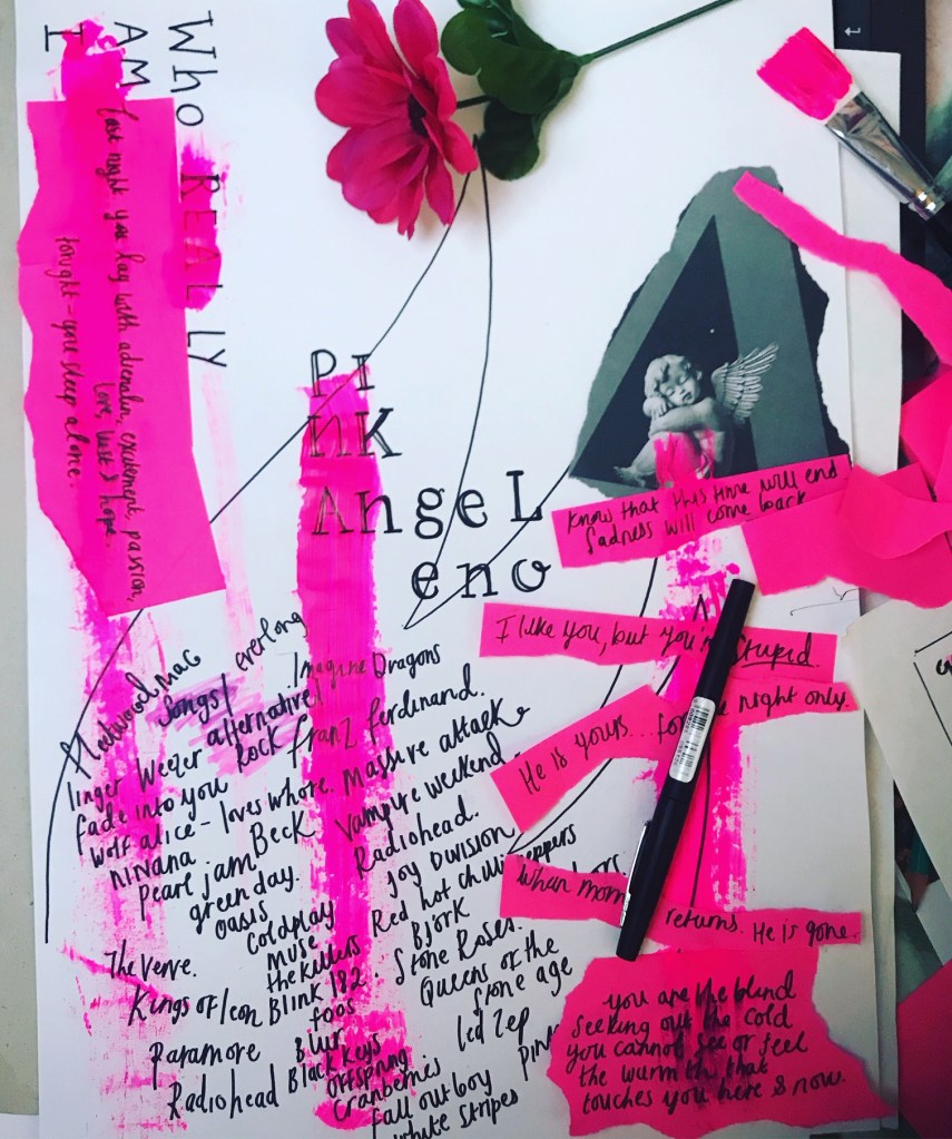
There was a strong influence of cherubs too; I have noticed that cherubs are making a comeback and are quite fashionable at the moment! I have done a post about this! (It relates back to my postcard designs!) The cherubs for him symbolised the love for his wife.

There was a room in the house that was my favourite, the morning room. The original roof in this room was destroyed in the war when a German parachute mine destroyed the East cliff. They then enlisted an artist called Anna Zinkeisen to repaint the ceiling. She was well known for designing posters for London transport, the original Quality Street tins and the murals on the R.M.S Queen Mary liner. I felt that this is a connection to Design history. The ceiling portrayed Aurora riding in on her chariot.

I just found this artwork charming and very feminine. The tour guide told me she designed the early Quality Street tins and now I can definitely see a resemblance between the two! She definitely had a style!
Image result for Anna Zinkeisen quality street

Some of her work I have researched into since! Definitely has a Graphic Design influence!

Image result for Anna Zinkeisen quality street
Vintage Mackintosh's Quality Street by BackroomVintageStore

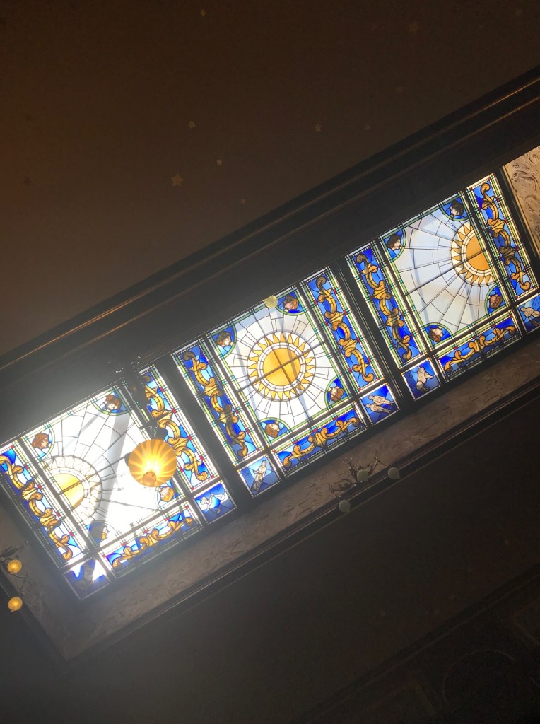
Another thing about the house that gave a subtle nod to Design and the thought processes behind it was the stained glass roof and a fountain in the main entry room. The tour guide explained to us that the stained glass mirrored the fountain design; The design is the sun rising, the sun being at its highest in the day and then again setting. It used simple symbols.

Overall it was a very pretty place to visit with a lot of history and passion for what they both obviously enjoyed. They virtually gave everything away at the time of their deaths and they passed on their house to the people of Bournemouth to be a museum to which it still stands today.

Experimentations and answers to problems that appear in dreams…

Kinda feel the last week or so that I am losing my way slightly..

I have had such a busy work/social schedule that in all honesty I haven’t had time to sit down and do a great deal of work… It had been a case of dipping in and out of it whenever I can!

I have so many ideas and visions in my mind of what I want for this design that I feel like they have all become jumbled, mixed up, developed and maybe a little lost along the way. I need to get back to what my original message is for this postcard!

I was thumb nailing some layout ideas for postcard 4 to try and see visually where my idea could go. The above photo is the evidence of that. I have illustrated the typewriter wing, the black background to tie in with the other 3 postcards, the pink paint and the grunge style type.

I want to carry on with my original idea that I had for this postcard and make this design edgy, alternative, rough around the edges and full of my own thoughts, values and morals to give a deeper meaning of “me”.

From my research and looking at the LMU magazine, they used a cherub to symbolise the “Angeleno” I wanted to do similar but using one of my own illustrations. I feel like my illustration ties in more with the feel of the other 3 postcards.

I then wanted to experiment with the type more… I feel like the idea that I had wasn’t edgy or grungy enough. I really want to step outside my comfort zone with this idea and really try to make the type visual as well as just simply communicating a message.

My original idea for the type on this postcard was “Lost Angeleno” I felt though reflecting on this that it does not tie in with the theme of this postcard. The theme is me opening up and exposing my thoughts, feelings, beliefs, morals and values as well as showing an interest and influence from magazine design, David Carson and “grunge type”. I felt the feel was also too “girly”.

I had the idea one night earlier in the week of still using the “lost angeleno” but in a different context. Earlier in the week I felt pretty lost in my thoughts… My friend told me to “get out of my head” the theme of this postcard is very much all my thoughts so I had the idea of “getting lost” in thought. “Lost in my head” and then the idea of “lost Angeleno, get lost” came about. I then realised I could join “Get Lost” into the letters of “Lost Angeleno”. My only issue was that I couldn’t seem to find inspiration to make the “Get Lost” stand out from the “Lost Angeleno” I went to bed that night stuck on the idea….

I woke up early hours that morning weirdly having dreamt about this idea!… In my dream I used brown paper as collage to separate the letters slightly and stand it out from the rest! I decided to give it a go!..

I then developed the idea further to try and bring out the “grunge” more.

On this one above I experimented with trying to make the “lost” look like it was getting lost. I had the idea of the S and the T fading into the background and getting further away from the rest of the type.

This one I messed around with ink, I quite like this effect…It definitely gives it that dirty, grunge feel. I am not sure though how I could make the “get lost” stand out from Angeleno using this effect. I wanted the ink to rub and run at the end of the letters so that was legibility and readability is poor. This represents an idea or message being lost. It also gives a nod to Carson who says the quote “Don’t mistake legibility for communication.”

This is the whole double page of my learning log sketchbook with the mixed media experimentations.

Typewriter Art

Last night I decided to experiment with some typewriter art!

I have an old Oliver typewriter that my friend gave me a few months back (I just thought I would write my weird quotes or poetry on it!) but after I visited the NCCD Typographic exhibition at the weekend it gave me inspiration to try out some art with it.

For postcard 3 I have already explained that I want it to be mixed media with paint, letterpress, stencilling, lino etc.. I want the wing design to be on this postcard so I had the idea of putting the type into the wing design.

I have never used a typewriter before; after struggling with the ribbon and wondering why it originally wouldn’t print (I had it on the wrong colour setting!) I messed around with a couple of sheets to try and get the hang of it! I was quite pleased with the outcome for a first attempt! I do however want to have a few more tries and see if I can make the text more legible and experiment with the appearance of it more so that it is not just block text.

The text that I have used is not random. I listed out a list of things that are my morals/ beliefs/ thoughts/feelings/ affirmations.

I am made of sugar and spice and all things nice, I am pink and blonde. I used to hate pink and blonde.  I am formed from every value and belief that was taught and shown me. I am human, I have flaws, feelings and emotion. I have insecurities from every negative idea of myself that was placed in my head. I am not the opinions of others. I am a daughter, granddaughter, sister and friend. I wear the scars of every man I have ever loved and lost. I am the strength from the scars that have brought me hurt. My heart has been broken into a million pieces but it keeps beating. I am resilient. My head overthinks and my heart doesn’t listen to it. I wear my heart on my sleeve. I have the tattoo to prove it. I am 32 but feel 23. I fear getting old. My cat is my best friend, I am his too. I do not dress to fit in. I will not conform. I was not born to be basic. I wear pink lipstick because it is me, not because I hide behind it.  I know more than I speak. I sometimes act ditzy because it is cute. I live for the summer. I live for the weekend. I live for the here and now. I am not defined by the material posessions I own. I believe everyone has a path to follow. I believe I am trying to follow mine. I don’t believe in timeframes or restraints. I will not be constricted to a box. I am frayed around the edges. I have more issues than vogue. I have yet to have my time. I don’t think ignorance is bliss. The best things are not left unsaid. Communication is the breakdown of everything. Love does not happen at first sight and Feelings hurt more than jumping off a tall building. One night stands are overrated. In fact they are crap. I can’t do casuals. I catch feelings. I get hurt.  Catch sun rays, not feels. The effort someone shows you really does reflect their interest in you. I do not want to be cold even though the world makes me feel this way. I drink my feelings. I smoke them too. Sometimes I do both to piss you off. I self destruct at times and I don’t care. I am sensitive. I was taught this is a bad thing. I try to not be tainted by the badness in the world. I overthink. I daydream. I still hold onto hope. My idealisms ruin my soul. pizza is life. Pink wine in the sunshine. Alcohol leads to bad decisions, it numbs pain and anxiety, dutch courage leads to letting inhibitions go..Bad men too. I always like stupid boys. I like stupid unavailable boys. Commitment phobe? Grow up hun. It is ok to get drunk alone. It is ok to cry it out. It is not ok to drunk text. Let him go. My sister is wrong, I do like hugs. I like cuddles in bed. Wrapped up in arms. I do like attention. I am an introverted extrovert. I am imperfectly perfect. I wont be perfect for you. I want what I can never have. When I have it… it’s not all that. I am moody. I like control.I get angry. Anger is passion. Passion is care. Caring is having a conscience. A conscience is feeling the pain of others. Empathy.  I like sad songs. I like listening to lyrics. I like to analyse them. I need to let go. Let it bleed. Let it hurt. Let it heal. I need to trust my instincts. I need to not give benefit of the doubt. I need to stop making excuses for people. I need to cut myself some slack. I am doing the best I can.  

This runs quite deep, some of the feelings and opinions on this are quite raw and honest. They delve into matters of the heart mostly. I wanted it to represent elements of Design and inspiration from designers but also include who I am in with that. This explores typography and the history of old print but does it in a way where it is still conveying who I am.

It is not particularly legible or easy on the eye but this is purely creating pictures out of type. If you wanted to read close enough into the words and really study what is written then you still could.

Los Angeles lovers

Shopping in Peterborough town this weekend and spotted this in H&M. If it was a bigger size I would have bought it because everyone knows how I love a LA tshirt!

I saw the cherub/Angel design and although it is quite simple in design I quite like it. I like the line drawing. It has the “Angeleno” theme. I quite like the line drawing black and white element behind it. I could use a similar thing in my designs.

NCCD – Quentin Blake Exhibition

On Sunday I visited the Quentin Blake exhibition. He is purely illustration but as I include a lot of my own drawings and illustrations in my work I decided to have a look and see how he created them and how he works.

He does all his illustrations using ink pens.. if he goes wrong with his drawings he pastes pieces of paper over the original and starts again. He uses a lightbox to trace out his original drawings and then he layers them up to make changes or add further illustrations onto it.

You wasn’t allowed to take photos at this exhibiton (although I didn’t realise that until I had taken some :S) so I might as well add them on here so they are not wasted! :p

NCCD Exhibition – Typographic Dante

On Sunday I decided to visit the National Centre for Craft and Design in Sleaford. I visit there occasionally just to see what exhibitions are on and to just get general inspiration for my projects and work.

There was 2 exhibitions on this time; Quentin Blake which I have done a separate post for and this one which is the Typographic Dante.

I only realised later on in the day when I fully read up the hand outs from the exhibition that the guy who created all of the pieces (Barrie Tullett) was actually one of my lecturers from when I was briefly at Lincoln University many moons a go.

I liked the exhibiton as it explored all different areas of type and print. The focus of the exhibition was to show how he visually communicates type into art to convey the story. The media used was letraset, lithoprint, lino, letterpress and typewriter art. I am particularly interested in the typewriter art and letterpress – as written in my design development this is what I have said I want to do for one of my postcards. Having read more about him (I only vaguely remember him for his lectures on magazine design and layout!) I have found that he has written a book on typewriter art which I am interested in reading.

These are some of his prints and design development:

Biker Pink Angeleno chic!

So I decided to have a bit of fun – still related to my course and Assignment 1 though. I really liked my Pink Angeleno logo that I designed so decided to do something with it – a piece of self promo!

Walking around different places lately I have seen a number of girls wearing hand painted slogan leather jackets. I then stumbled across a lady on Instagram who hand paints jackets for a living – designing them for hen parties and for wedding day props (Mrs…….. written on the back)

I decided to go to Primark and buy a £14 faux leather jacket and design my own. I used neon pink acrylic paint which I researched into (I did look at leather paint but it was too pricey!) and these are the results!

So far it has had mixed reviews! – I have had some people ask me what it is all about and what it means and why? and that it is too bright but then I have had a lovely lady who I follow on Intsagram, (she is a blogger living in LA) tell me that she loves it and she would like one!

I think it’s personal opinion… you will either love what I do or hate it!

Who REAL ly am I; Postcard 3

(From my unreleased book; “Things I’ll only ever say when drunk”) 😀

From my previous post I started to look at sketches and ideas for postcard 3. As I have stated I want postcard 3 to be raw, honest, and an insight into who I am underneath the “aesthetics”. As I previously wrote, I haven’t included so far in my designs a reference to Graphic Design, an era or any particular designers. What many people do not know about me is that I love alternative/rock music and this links in nicely to my interest in the grunge type movement of the 90s. I want this postcard to still tie in with the other 3 but show rawness, sensitivity, a deeper vulnerability and a sense of who I am underneath. Again, As I stated in my last post I found on pinterest some ideas which have helped me in my first few rough drawings.

From these first thumbnail sketches I started to experiment with the type, paints, post-its… I am waiting for a typewriter ribbon in the post for my typewriter input on it and I need to lino print some letters when I get some more free time.

Starts off with a simple hand drawn type writer text and the basic wing shape that I want on my design
Continues on to break rules; Making the text a part of a design and not just to be legible and easily read.
Introducing “who REAL ly am I.
experimenting with some neon pink acrylic paint. Literally just getting a brush and aggressively running it down the page.
I sat and thought that the “Pink” didn’t look very “Pink” and “fun” so tried to use my hand lettering from before to make it more appealing… I decided it wouldn’t work.
Instead I just opted to splash it with the pink paint and incorporate some of my favourite alt bands. This was a rough list I used to write down my list of bands and then actually decided to use it for the actual piece. It is raw, edgy, grungy in appearance.
One of my vunerable moments. I write my emotions/moments/how I feel at certain moments in my life in my sketchbook. I wrote this randomly one night – It just poured from my mind. I decided to use some of these moments in this piece. An insight into the real me.
This is what I have so far.

Grunge Type inspiration; Postcard 4

Postcard 4 is going to reflect my areas of interest within Graphic Design.

I want to make this postcard very much a mixed media piece.

My interests in Graphic Design are Typography (even though this is an area I need to improve on!) magazine design and layout and using more hand drawn/arty elements.

I have looked on Pinterest for inspiration and have decided I am going to use a range of different media for this postcard;

  • Homemade DIY letterpress/stencilling type
  • lino printing
  • Typewriter
  • marker pens/highlighters
  • ripped paper/neon pink post-it notes
  • collage of magazine cuttings 
  • Acrylic paint and spray paint
  • Photoshop 

I have always had an interest in grunge type – just like how Alternative music is my favourite; grunge type is very much this but in a visual form! If the alternative 90s songs I like were written in art form they would be written in grunge type! Grunge type is visual Nirvana!

However my design so far is quite feminine and soft in appearance. The grunge look is messy, chaotic and can be “dirty” looking. I plan to do a grunge look but soften it by using pinks. The grunge look is rebellious and my postcards have a certain feel of that with the theme of it being strong, feminism, independent, not playing by rules and wearing/looking how you want to.

I have looked at a few styles of Grunge type and some stood out to me and gave me ideas on what I could try out in my own designs. I particulary like the typewriter one. (I have an old typewriter at home I have meaning to use in a creative way.) I figured I could type some words out relating to my postcard and layer them up in a similar way to the one I found on Pinterest.

I will do some mixed media pages in my sketchbook to experiment with the different techniques.

The typewriter idea. I like how the letters are all layered on top of each other.
This image gave me an idea based around the Angeleno angel photo I found in the LMU magazine. I thought I could use that image and create a similar thing in my design.
I like the Pink colours used and the style of the “Acid Wash” and “say anything”. These look like they have been stencil or lino printed.
This image has given me the idea to bring the lipstick drips into my design. I could drip the lipstick off the type similar to this image and then it would continue to tie in with the previous postcard designs.

Welcome to the Beginnings of postcard 4! :)

This weekend has been.. well!… I have definitely had better! After allowing myself Sunday and Sunday only to mope around in my head with my own stupid thoughts! 😦 I pulled myself together last night on my night off and spent 8 hours.. (yes 8 hours, I really needed the distraction!) on binge watching the whole series of Lost once again and trying to finally get these postcards done!

Ideally I want to have them done for the time I break up from work for the summer in 3 weeks time.

I seem to be spending so long on them but I am a perfectionist; I know that can be seen as good and bad in this industry!! I really want to finish my first assignment and know that I did the best I could. I feel like I am testing my strengths and really pushing myself again after not studying for so long. I can feel my confidence building and my skills progressing in each postcard I am completing.

I feel that I have good ideas for the final 2 and I really want to see them through to the end right.

I started off last night by doing the changes I labelled on my post-its from my previous post. I wanted to get postcard 2 finally complete! One of my lovely friends at work gave me a printer to help me with my work, so last night I could finally print stuff out at home instead of emailing it to myself at work! I printed out the 2 completed postcards last night and laid them together again and I am pleased with the outcome.

(** The only thing I need to change is the colour of the pink.. It prints out a red colour. I need to find the correct pantone colours and match them to my designs so that they print correctly.)

Thanks for the printer Mark! 🙂

I decided to keep the LA tattoos on here even though I wrote that I would take them off.

I then started on postcard 4. I have hopped from 2 to 4 because for postcard 3 I am planning on some mixed media work. This is the one I want to be inspired by Design and magazine layouts and by David Carsons work which I am interested in. I plan to bring in paint, marker pens, collage and some home DIY letterpress work on this one. I have started on postcard 4 for now because postcard 3 runs into this one.

The hand runs over from postcard 2 to 4.

I started again by taking my original drawing of the LA wing map and placing it into Illustrator, and with the pen tool tracing around it.

I am going to change things on it from my original drawing as now I have had time to sit down and look at it I can see ways to make it look better and tie in more with the other 2.