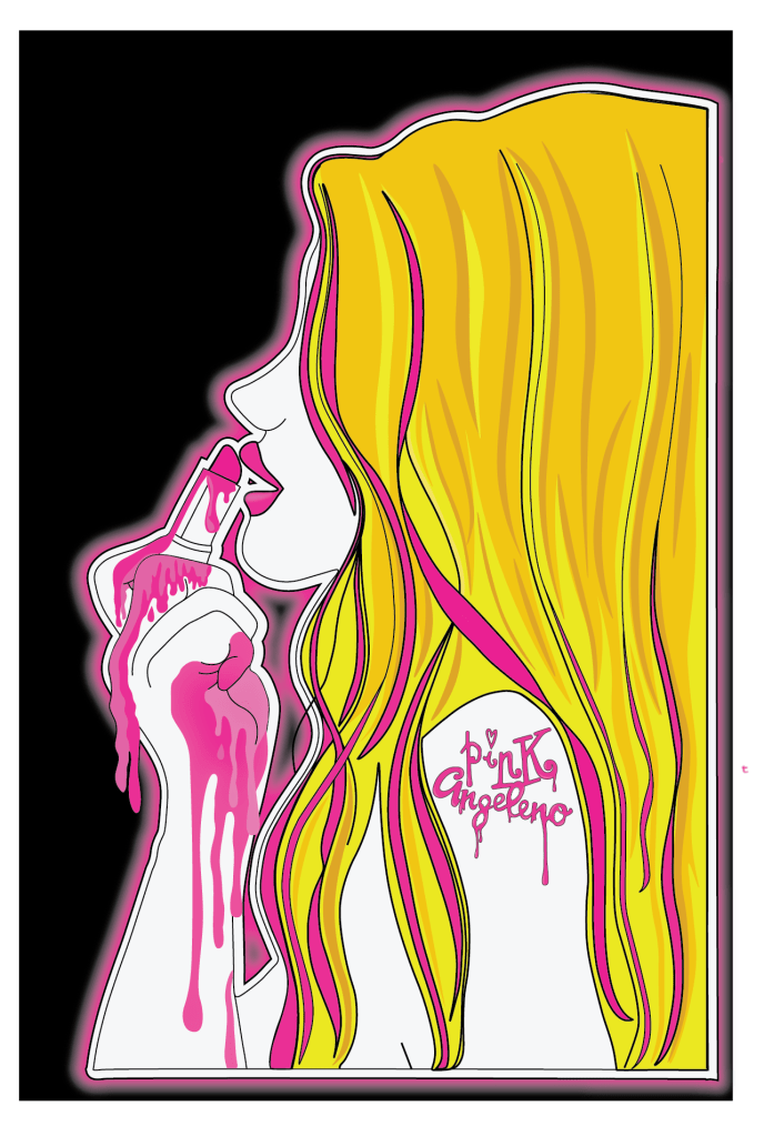
What you see here is basically an aesthetic introduction to who I am and what I like. I jokingly now refer to “Pink Angeleno” as my aesthetic alter ego!
The idea behind it is to convey who I am – Pink and Blonde with an overall love of Pink and a love for wearing bright fuschia pink lipsticks on the daily! Angeleno comes from the native latin term for local LA people but also symbolising my love and passion for the city!
My style is very girly and illustrative which comes across strong on this design. The design is one of my original drawings which makes it even more personal to me.
It has been a while since I wrote my last post but since my last post I have actually completed (I think!) the fronts of my postcards!!! 😀 (I still have the back to design however).
I changed a lot on my design since the last post. I completely reworked the final 2 postcards – still keeping the same idea and concept but just completely changed them around!
I was feeling frustrated on my last post that I could not find a way to include the wing onto the design, I spent days trying to think of ways and then decided I needed a break from seeing it and did some other illustration side projects! By the time I went back to it a few days later I was actually surprised that I actually knew instantly where to go with it and what needed doing! I completed the final 2 postcards in 2 days! This was good but it also made me feel silly because I have spent so long on this assignment in general!
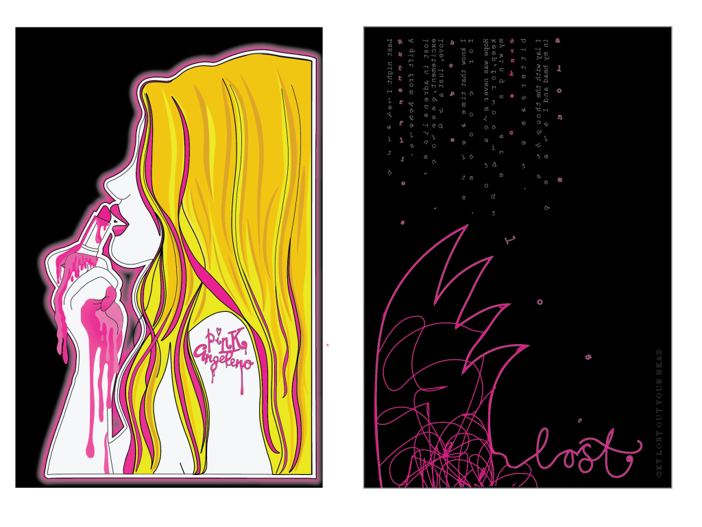
These are what I have for the postcards!
Postcard 1 and 3 have not changed, They are still the same illustrations that I did.
Postcards 2 and 4 however have changed a lot!
I shall start with Postcard 2! – This one is the postcard that I wanted to express emotion and feeling through. I wanted it to be raw and honest and show who I am on the inside. In the last post what I ended up with was a very dark and spacious design; I decided that it did not tie in all too well with the other pink, bright and girly postcards so I needed to find a way to keep it edgy but also bring it back a little bit!
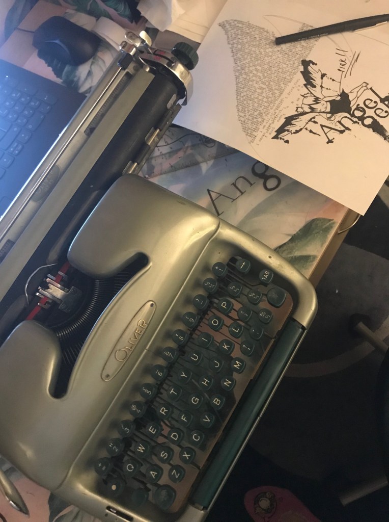
I am interested in typography; I have stated before though that I feel It is not one of my strongest areas. My original ideas for this design were using the typewriter and using mixed media and raw type for the design. This changed though to me finding a suitable font which looked like typewriter type and using that instead. In my last post the placement of this text was set in the middle of the design, I have also changed this. One of my original ideas was for the text to “fall down” I decided to position the text along the top of the postcard and reflect it so that the text is backwards. You can still read it from left to right except that the text is backwards now. This makes it more believable for it to fall down to the bottom of the page. I then took the last words of the sentence and dropped them down the page. The idea for this wasn’t to be legible or easy on the eye to read. It is supposed to be messy and confusing and more of a visual impact than being legible. The mind is a messy place and this reflects in my type. The content of the text is still the same, it is still my original poem writing that I did.
The next problem was getting that wing in!… I decided that it needed to be simplistic and not too big so as to not take the attention away from the main design and also so that the negative space was not lost. I drew an outline of a wing in rough with the pencil tool and decided to keep it because it actually looked alright! In theme with the other designs I made it pink and put a neon glow behind it. I then wanted to get the “get lost” heading in there somewhere but decided that the original “get lost” that I designed worked better with the LA themed postcard (being that it is about Angeleno and “lost” Angeles etc) I needed an alternative heading for this postcard. I still wanted it to be about getting lost in your head so in the same style as the wing I took the pencil tool and drew an outline of “lost” I then tidied up the curves, put a neon glow behind it and I felt like it worked.
In the theme of a “messy mind” I thought I would add some pink scribbles into the wing.. this would add some detail as well as highlight the messy mind. After I had finished this I felt like I liked the effect and the overall design but that also it reminded me of the “mind” logo that already exists. I hadn’t thought about this existing logo at all prior to this design so a part of me was dissapointed that it resembled it slightly but there was also another part of me that was reassured that my thought process thinks in a similar kind of way to the professionals! 😀
The above images are postcards 2 and 4. Again, 2 has not changed. The idea for 4 however stays the same but the style has been changed! This postcard represents my love for LA. I wanted to also though keep it similar to postcard 3 with the edgy rawness of it.
I decided that I wanted to try something different for the inside of the wing; I still kept the shape of it to look like the Californian west coast but I felt like I wanted to try something a bit different with the inside of it.
I visited LA 5 years ago and while I was there I took a fair few photos! I browsed through the photos trying to find something that might look appropriate. What I found was a photo of the LA skyline from up in the Hollywood Hills. The photo looked murky and dull (even though it was a heatwave of a day!) from the haze of the sun and the smog from the city down below.I felt that this looked raw and edgy enough for my design. The original photo looked good but I felt it needed to tie in with the pink theme so I took the original photograph and altered it in Photoshop to make it completely pink. This is what it turned out like:
I then imported it back into Illustrator and clipped the photograph to the shape of the wing.
One of my really early ideas was to include bands I like or lyrics into the design. One song that stands out to me as LA themed in particular is “Under the Bridge” by the Red Hot Chilli Peppers. It is a song where basically he explores loneliness and isolation (mainly through drug use however!) but explains how he felt like the only reliable thing he had in his life was living in LA and just moping around the city. I decided that these were good lyrics to include. They tie in well also with postcard 2. I used a grid system but also lined the lines from the pylons in the photograph to my text. I decided to place the text into what look like white torn pieces of paper. I felt this gives a more alternative look.
There are still elements of Illustration on this postcard as the illustration from postcard 2 crosses over onto this one with the hand. (I have also realised from looking at it that the foot should also cross over, I will need to fix this!)
I have again dropped some of the text on this postcard to look like it is falling and most importantly have used the original “Get lost – Angeleno” logo. I have also used the drip effect which I drew in Illustrator and used in the first 2 postcards. Overall I really like the look of this postcard!
Let me know what you think! – I am pleased however with what I have achieved so far! 🙂
So.… my last post slated the grid. F**k that grid!… I take all of that back! I thought I could take my normal approach to “playing it by eye” but my eyes suck on this design!
I decided firstly to work on the text design I put on my previous post. I messed around with a whole load of ways for it to appear! (I think I saved 10 layouts for it in total!) changing the colours, adding dripping text, taking away dripping text, adding ink splats, making it blurry, taking the blur away!….. exhausting!
I reached this version and decided this worked. However, the problem was then getting all the text I wanted to appear onto it with the typewriter type. There was a massive bulk of text!
How to get all of this into a small space?…
The photos above show how I tried to mess around with the layout and getting the typewriter text into such a small confined space! This was a trial run really to see what it could look like.
I then imported the photo of the text into Photoshop and adjusted it to then bring into Illustrator. This is what I ended up with. I didn’t like it. There is too much going on.. it looks cramped, nothing particularly stands out on it. I came to realise that my typewriter idea was nothing more than a good idea. I can not make it work on this design. My next idea was to use “fake” type written text… use an existing font which looks like typewriter text. I chose Courier New as it seemed the closest. The next step was to change the text because there was just way too much of it to take in! I sat and thought for ages about what I could use in its place; What shows the thoughts and emotions that run through my head? What shows who I am deep down inside? What could show my vulnerability and “raw” me….
A few months ago during a bittersweet moment in my life, I documented this late at night in my sketchbook (I write things that I feel in poem form in my sketchbook at times when I feel I need to vent! – It’s like a visual Bridget Jones’s diary! ha!)
Even though I wrote this piece after several glasses of vino (potentially whiskey too!) I actually really love the sentiment of it. It means something to me and it is still something I am dealing with.. so I decided to alter the wording slightly to fit in the theme of the “angeleno” and see how this might work on my design instead..
Does it show who I am? Check! Does it show raw feeling and emotion? Check! Is it vunerable? Check! Does it run deeper than just aesthetics? Check! Can I tie it in with the theme of the design? Check! Has it 100% been created and written by me? Check!
I did make a typo in “adrenaline”
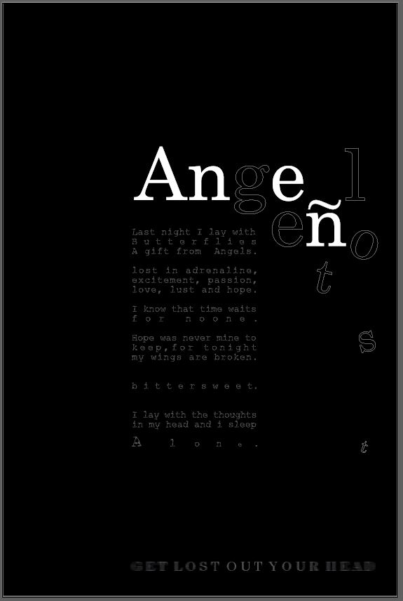
What I ended up with was this. At the time of designing this I thought I had got it spot on… the next day however, hated it! Loved the poem.. that makes the piece in my opinion! Hated the layout, colours… The background colour needed to be black to tie in with the rest of the postcards so I knew I would have to alter a lot of the design to reach this outcome.
This is when I realised that despite my “f**k the grid” I actually needed the grid. I then spent time splitting this piece in a 3×3 grid. What I then ended up with was a million times better! This is also the part where I experimented with a million different ways to display the “Angeleno” part. The eye was drawn to the “Ange” but nothing else.. I needed the hidden “get lost” part to be visually visible more. These are some of the layouts I tried out!
This last photo is where I am currently at. Using the grid has definitely given it more structure and made the design visually work better!
The black background works better than the white and now ties in with the other 3 postcards. I chose to use white for the “Angeleno” text. I think that the transparent cut out part on the “Get lost” works because it is not tying to be as visible as the rest of the text and also part of the letters are getting lost by being cut up.
I have justified the text.. I did think against this but I feel it works well. I have altered the kerning on some of the sentences to stretch some of the words out. I wanted to emphasise the “bittersweet” and the “for no one” and “alone” these were the most important feelings in this piece of writing. “Alone” is in its own space and getting lost into the rest of the design.
I have yet to add more pink into the design. I also need to try and incorporate the wing into the design. I am not sure how I am going to do that just yet…I also want to put some words getting lost floating into the background.
I am pleased with where I am at with it at the moment, it is certainly a lot better than it was!
I hate grids. I feel like a complete amateur to admit that they are so confusing and half the time I get totally lost wondering what on earth is going on with them.. so many lines, so many rules to follow… so many rows, columns, gutters, boxes….F**k the grid! Many times I have found myself quite literally lost in my copy of “making and breaking the grid”. I choose to break it! – literally f**k the rules! I am not saying I won’t ever learn and use the grid in future though; it is more than important but yet one of them frustrating things I shall eventually one day I am sure master… I mostly (as bad as it may sound!) work from what I feel looks right by eye or feels right. Negative space I CAN however abide, appreciate and understand…
As I wrote in my previous post I wanted to look at an existing font and then bring it into my design rather than just using my hand lettering which could look again… amateur! I chose Century as it matched my hand lettering the closest.
I then attempted to experiment in InDesign with the layout and appearance of how it might/could look. Making sure that I tried to make that “Get lost” element GET LOST!
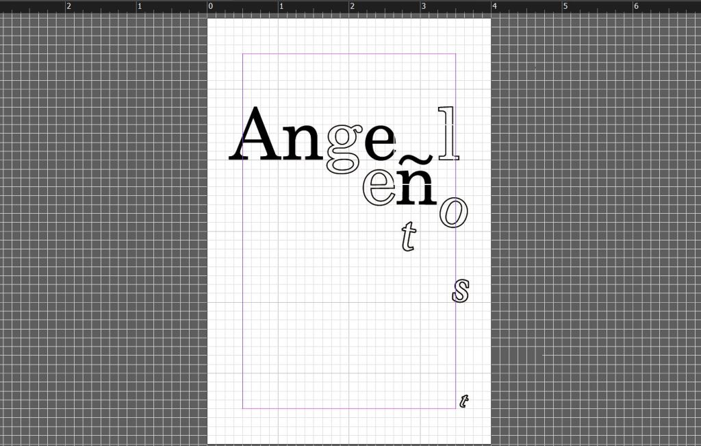
I looked at the way I could use black and white on the letters, I feel the middle one works the best with this – it highlights the N which is important in the history of Angelenos. In the history of LA and Angelenos it was a debate whether to get rid of the accent above the N. It was assumed at the time that careless Anglo typesetters left it on there as an error. I feel this is important in the history of type, print and the history behind my design.
Overall I quite like the appearance of it. It is now just figuring out everything else around it; the mixed media experimentations and ideas that I had to make it appear more “grungy”. I need to get the wing onto it somehow to tie in with the whole design… again, it is how to do this without ruining the spacious, simplistic look that it has evolved into. I need to bring the typewriter art into it also..
Working some more on my Cherub design idea I decided to scrap the Angeleno Cherub and just concentrate on the Typography aspect of the design only.
I have ideas in my head of how I want the type to look but it is taking some time getting it right. Typography; although I am interested in it the most, it is the one area I have always struggled to get right.
I need to interlink “Angeleno” with “Get Lost” cleverly, to try to make the two work together and to be easily redable to the viewer but also visually show the “getting lost” element.
I drew up some thumbnail sketches again to try and visually get my ideas down on paper:
Mostly on the left hand side page; Trying to work around the positioning of the type. I need to create some kind of grid system for the layout of the type.
Here I was trying to experiment more with the colours of the page. I need this one to match the other 3 postcards and to do that I need to have elements of pink and yellow. I was thinking about a yellow wing and making the pink a part of the type somehow.
I have done some research into some of layouts and ideas that I really like:
This page is from David Carsons book. I like how you can visually see what the name is although it has partially disappeared. This kind of idea would work well with the “getting lost”
This is also from David Carsons book. It cleverly shows elements of text missing. It is combining type and making it visual. Visually conveying what it literally is saying.
These are from “Typewriter Art” by Barrie Tullet. In my head I want to make the wing from typewriter type but it is difficult to line up the words perfectly to the shape of my design. Having studied these images closely I think I have now figured out a way to do it more flawlessly.
Moving away from the typewriter element for a moment, these are some of the ideas for the get lost type element. I have experimented with ink, Styrofoam block printing and just a simple plain style. I originally wanted the grunge look to appear on my design, I need to think of ways to still bring this in without making the design too much.
Experimenting with Styrofoam block printing.
It didn’t go too well in all honesty. This is the simplistic version; some of the letters are partially missing to show the “lost” element. I feel Like I need to space the letters out a bit more to show them getting lost. I need more negative space for them to get lost in. At the moment I think the design idea has too much going on with it. I think I need to sit down and find ways to make it more simple yet still effective.
The ink version; just to give a rough idea of what it might look like. The ink ties in well with the typography idea and with the typewriter art.
Moving forward I think I like the idea of this but the current lettering is hand drawn so is not as professional as what it could be. I think I am going to choose an existing font and then use it as a starting point to mould into my own type. I then need to work on the layout and spacing of the lettering.
Some more design inspiration that came to me this morning however was from a book called “Show your work” (I might write a blog post about this book at a later date). I was pulling it out of storage for a friend to borrow and flicking though the pages gave me some inspiration for type layout.
I like the cool, spacey, chilled back vibe of these pages. They have the sort of feel I am aspiring for in my designs at the moment.
Following on from my last development post about the fact that I needed a cherub on my design; I designed what to me after much thought looked more like a fairy than a cherub.. I decided after seeing a trend for cherubs at the moment (my last post on “Be inspired”) that it would be relevant to try and recreate my own for my piece.
I did some research on Pinterest into the styles of Cherubs, I am not a fan of them in all honesty… So I wanted to find a more modern take on them.
I came across one which I found amusing, it reminded me of Banksy’s style. I am a fan of his work. I had the idea of trying to cut a stencil design of one and then spray paint it or just paint it over the top of the type on my postcard.
After researching into a few more styles I decided to have a go at making my own version and this is what I ended up with:
I decided to add a dress (which I originally thought I would make pink; or I still might!) and added the pigtails to give it more an edgy/modern appeal. I might change this yet also.. The idea I have is that the type will go above the wings and then I shall make the letters fall down onto the wings and into the palm of her hand. I quite like the hand lettering and the style of it with the ink smudges.. It gives that more rough/grungy look.
I tried to make the separate parts of this design into a stencil using acetate but it just didn’t work well.. The different parts of the design were far too small and fidly to cut out.
All the different development stages.. lots of paper!
I started typing the type above the design to see how it would work.. I decided I need to make the letters start falling a lot earlier than what I did on this original piece.
This is what I am left with at the moment. A page full of changes that I need to do. I am also aware that this postcard will look a whole lot different to the other 3 so I need to find a way to try and make this one tie in to the other 3. The other 3 are very illustrative with Illustrator but this one is very traditional in the sense everything is done by hand.
Also from one of my previous posts I need to add the “Get Lost” element into it somehow.
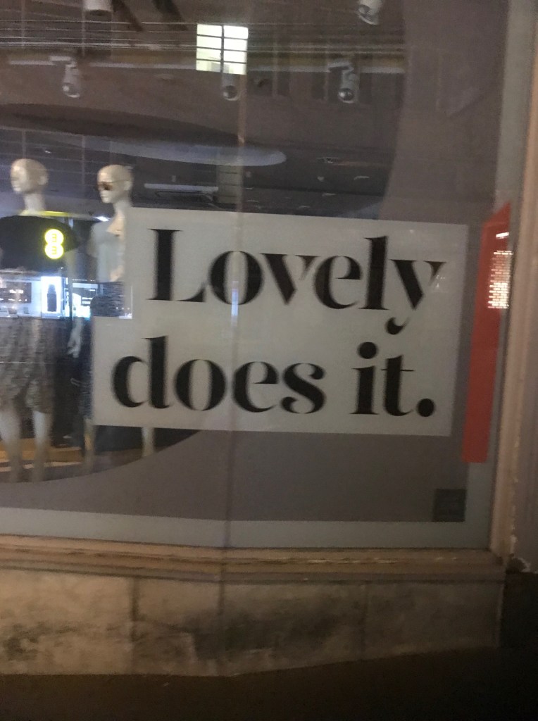
Feeling inspired on my drunk walk home after a Saturday night out on Bournemouth town! – The youths and yobs or “tweens” as I refer to them were shouting around, running everywhere like loons… It really did remind me of a scene from Shaun of the dead! – Unless you fitted in and made zombie noises you were about to get ate! Random old guys eyeing me up with my legs out in my skirt; “Look at the legs on youuuuuu” **Here I am eye rolling…. I got a glass bottle launched at me by a rather aggressive member of a hen party… I was feeling quite the target being the small town gal I am! BUT that didn’t stop me on my mission to pause in the moment and stop to photograph Topshop window and the typeface that I took an instant like to! 😀 #dedication
My mums words – “Cmon Amy let’s move!.. nevermind photographing a stupid sign in a window! we are targets here!!” haha! sorry Mum! :S
If anyone would have asked what I was doing…. it’s called Design mate… I don’t think you have it. 😀
Bournemouth – We loved you really… I’m just from the Shire and it was a little mad! LOL! xo
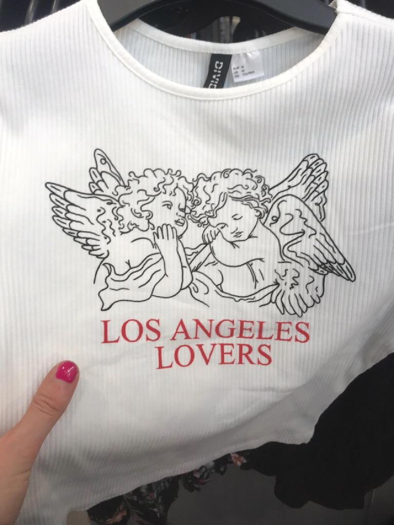
I wrote in one of my previous inspiration posts about the Los Angeles Lovers tshirt I found in H&M (below)
Well.. looking around I can definitely see an upcoming trend for them in the fashion stakes! I found another top with them on the other day. The thing is… I am not sure I like cherubs… I always associate them with graveyards rather than high end fashion and anything remotely nice! 😀 However, they do tie in quite nicely with my Lost Angeleno theme… My aim for this week is to draw my own cherub to put on one of the designs on my postcards.
Also with visiting the Russell – Cotes Museum there was a strong theme of cherubs everywhere there! – associated purely with love though!
Not meaning to sound like an ex lecturer of mine (he was an arse!!) but the type above really does need the typographic police!! #justsaying !
I can definitely use these finds though to help inspire my illustration!
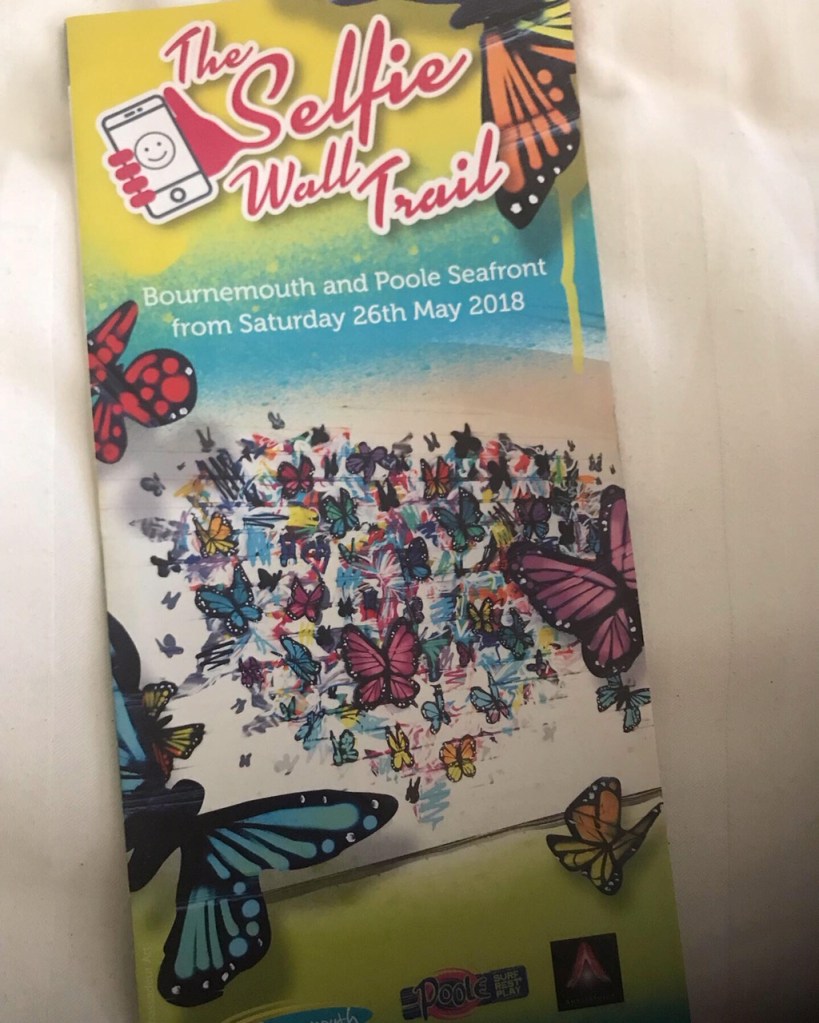
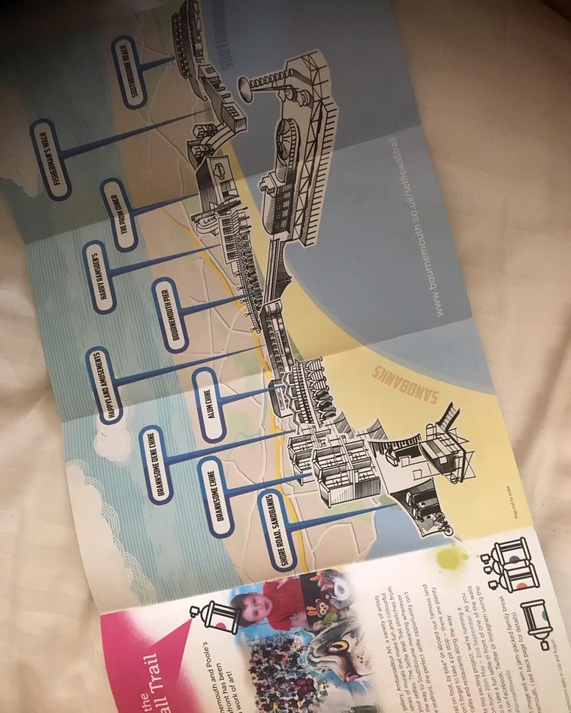
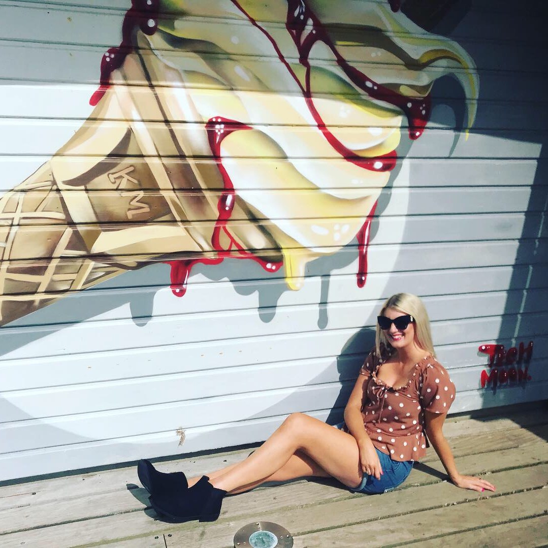
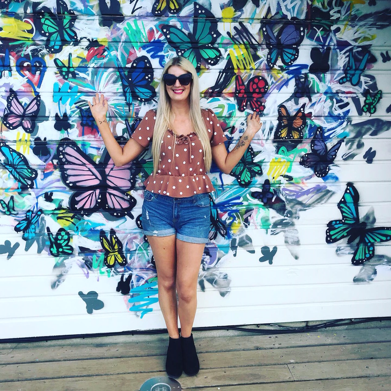
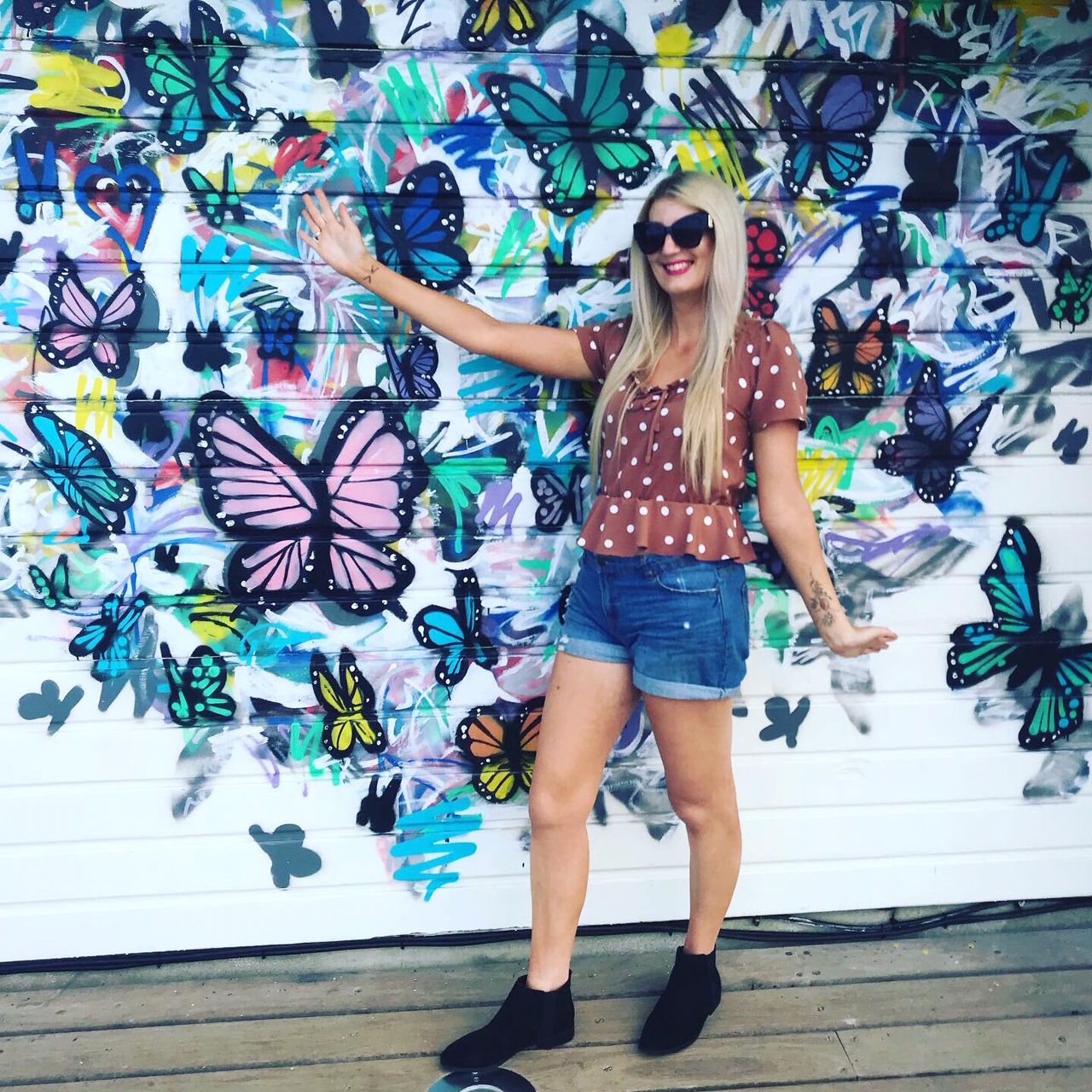
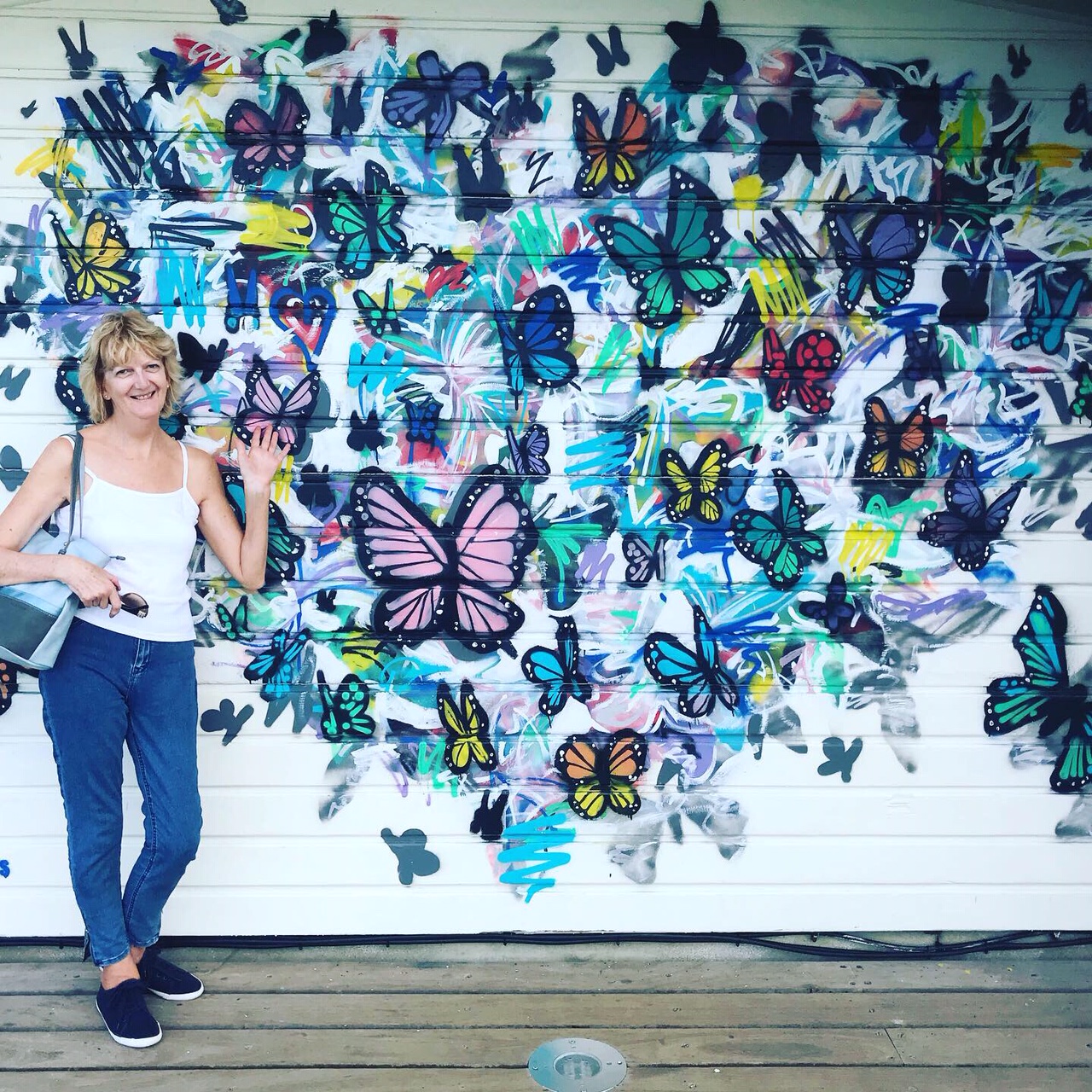
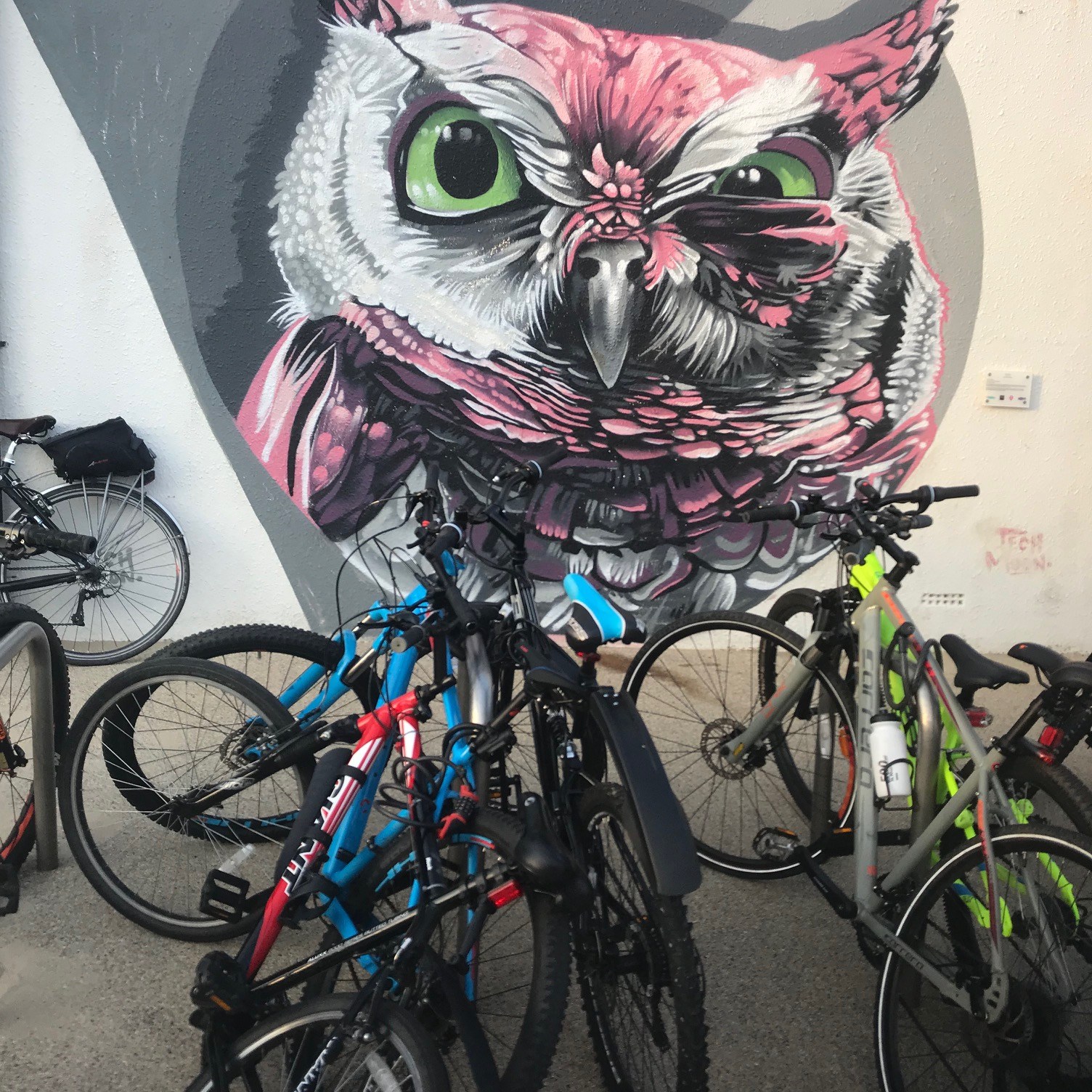
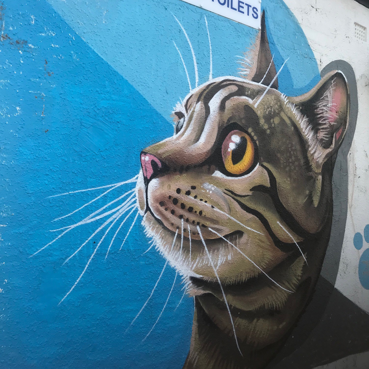
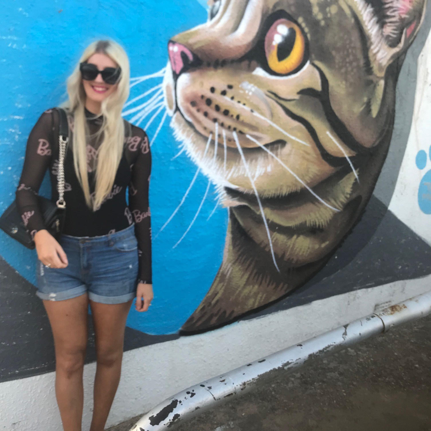
Again, on holiday in Bournemouth looking for something fun and arty to do.. I went into a gift shop and found this leaflet on the side. I have always loved wall murals and artwork on the side of buildings etc. I think this interest started with Banksy and his work..
I decided to try and find as many of these art pieces as I could, travelling along the coast to the different places on the map. Some were easy to find and some were more difficult. (They required some sleuth work on Instagram trying to look at everyone else’s photos and what landmarks they were near!)
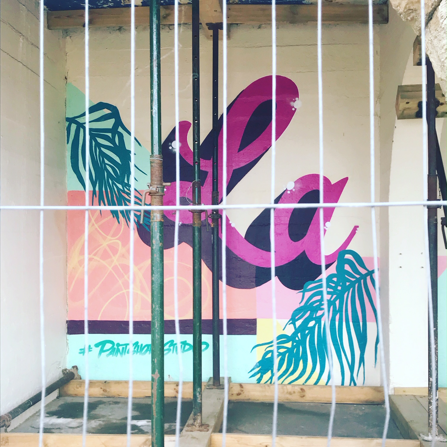
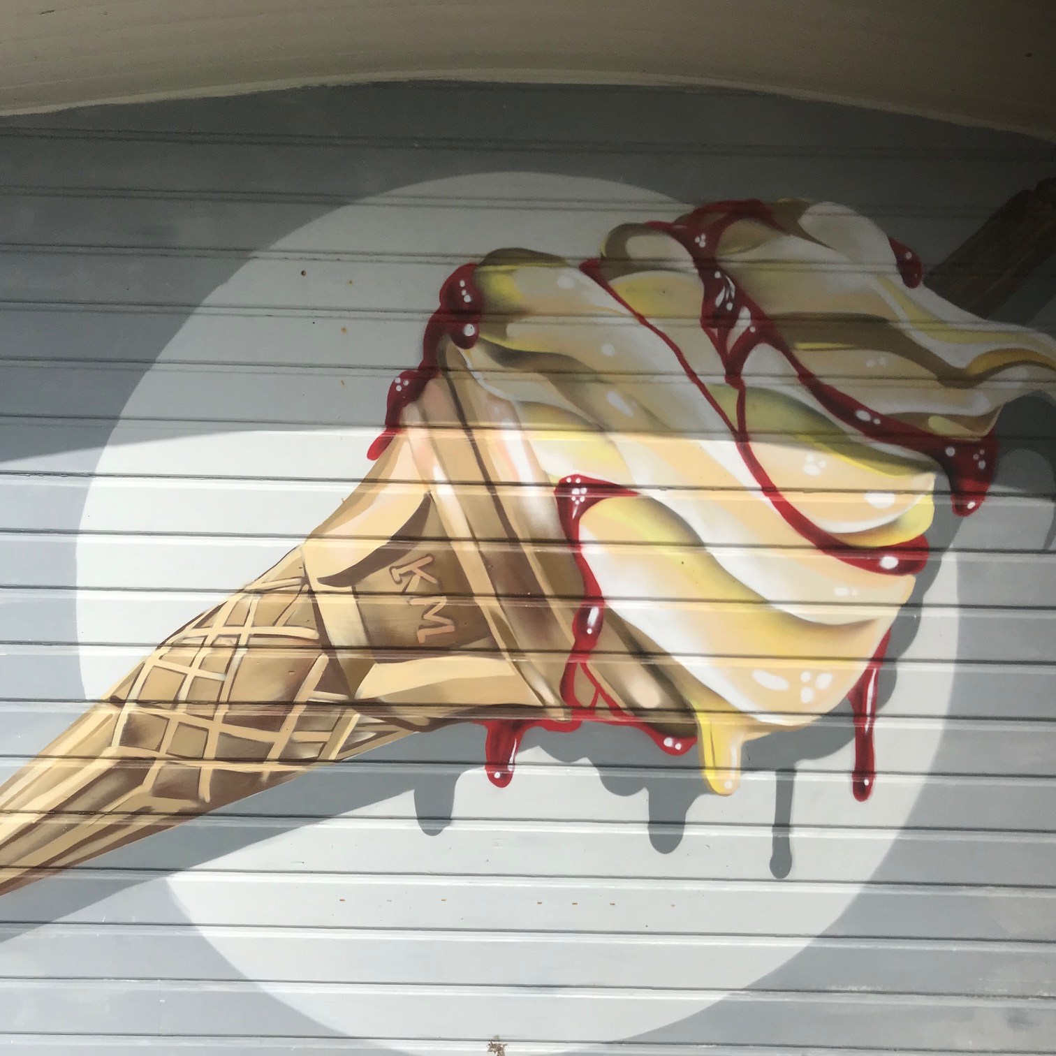
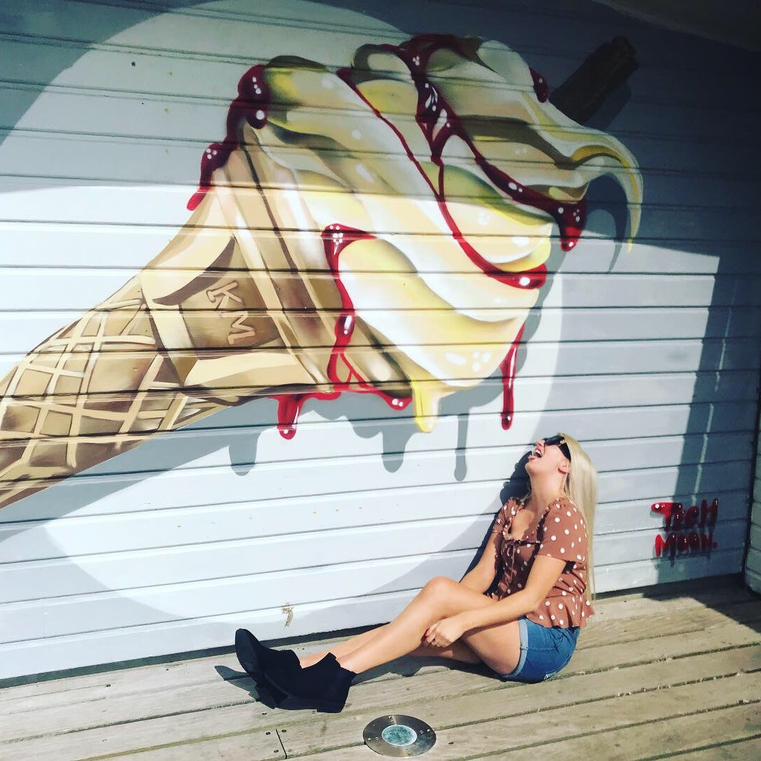
Here are a few that I found.. (well, I also dragged my Mum around also trying to find them! :D)
Each piece of art had the tag of the artist so I was able to have a little stalk at the work of them all.
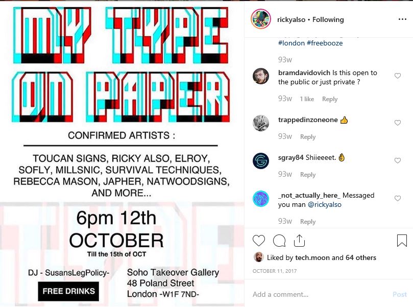
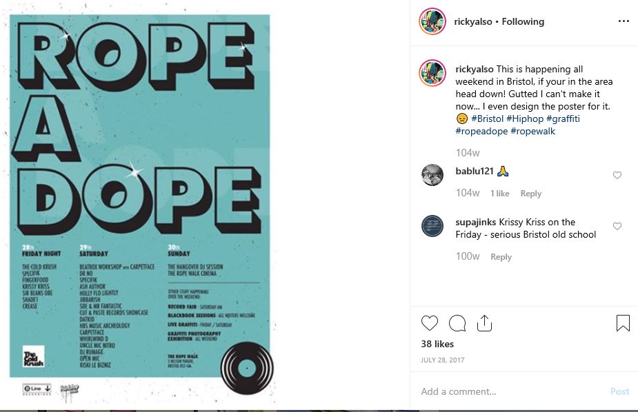
One of the artists called RickyAlso had an exhibition I would have liked to have gone to (It was in October 2017!! :s) called “My type on paper” where he exhibited some of his work. He specialises in wall murals but particulary Typograffiti
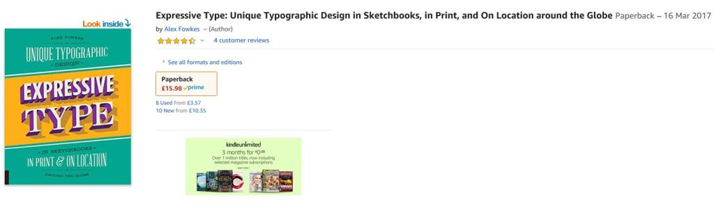
His work appears in a book that I wouldn’t mind having a look at. I like this style of art and the way he visually displays type.
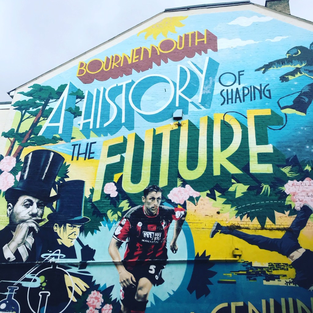
He also drew the wall mural that I saw as I came into Bournemouth and took a photo of!
On my weeks holiday in Bournemouth.. when I googled “Arty stuff to see and do” it came across a post on some colourful beach huts! (The beach hut equivalent of the Pantone chart I believe!)
The one I was particularly interested in was number 66 in it’s fantastic shade of Barbie Pink! I had to insta this! 😀
Ignoring everyone’s jokes about my fascination with this pink beach hut I carried on and made them very much Insta famous on my account!