Postcard Designs and Development; The backs of them.

I got so caught up with designing the fronts of the postcards that I forgot totally about the backs!! oops!…. so here is my development process for the backs!!

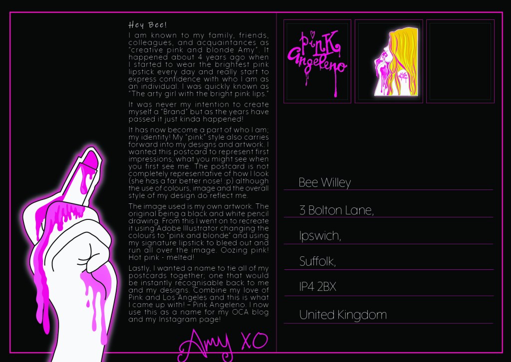
I decided that I didn’t want a plain and boring back, I wanted the backs to all be the same but tie in with the front designs. The usual layout for a postcard is a split down the half of the postcard; the right side for the address and the left side to write the postcard. I decided to use this layout for mine.

I carried on the pink and black colour scheme and included the image of the hand and the lipstick, it looks like the lipstick is writing the message on the postcard.

I included a space for a real postage stamp and used my designs as part of some fake stamps alongside that one.

I have written my name in my signature handwriting and made it hot pink.

I decided to type my message on my postcards using InDesign. I messed around with a typographic grid and justified text and overall what I see on screen I like the look of. However, when I printed it out the text is very small and the legibility is not very good with the white against the black. I thought this would work well with having some contrast but with having to have such small text to fit into a small space the legibility is lost.

This is the first postcard.
The First Design process

I then decided to change it to try and make it more legible. I created white squares for the text to fit into and reduced some of the text.

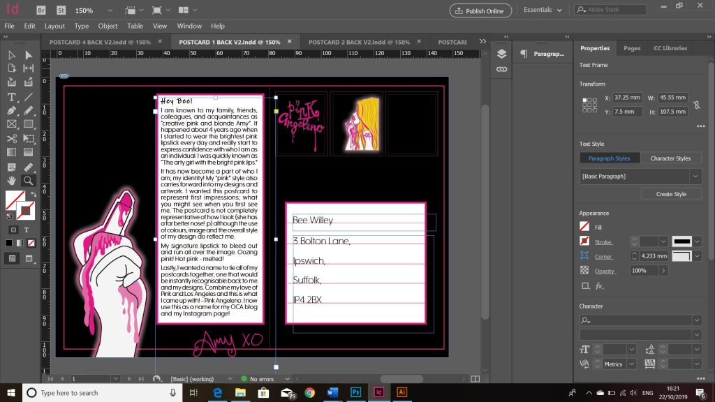
This is more legible than what it was. This would also work for if the postcard was handwritten also.

I think that this design would work better if the postcard was hand written. There is a bigger white space to write in. The text would be bigger and it would be more legible.

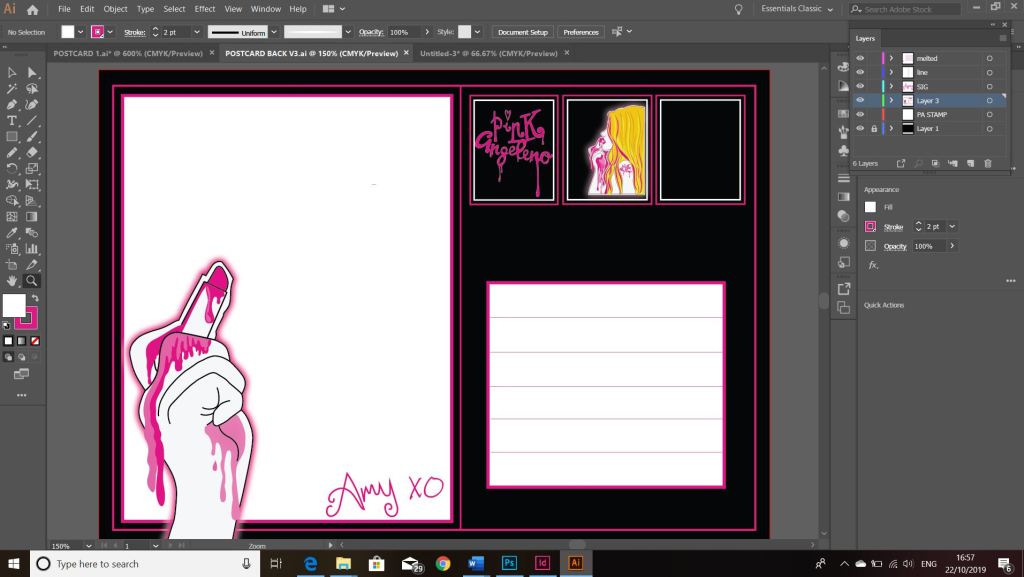
The blank space however does look too blank… the lipstick is there but isn’t writing anything.. I decided to write something coming from the lipstick; the best thing I could think of is my signature XO which I use when signing off any of my blog or emails.

These are what I ended up with. The blank white space is now great for handwritten or typed postcards and still has the personality that I wanted it to have.

Typewriter Art: A Modern Anthology by Barrie Tullet

I visited the NCCD at Sleaford and looked around the Typographic Dante exhibition that was on. The typography and the typewriter art fascinated me. I loved it. Although it was a very small exhibition I took so much inspiration and ideas from it..

The actual person behind the exhibition used to teach me at University over 10 years ago so although the whole university experience wasn’t a good one for me, I was able to overlook that!

I then decided to research into his work after the exhibition and stumbled across his book on amazon. His style of work was what I was looking t trying to recreate for my assignment one postcards so I was eager to buy a copy and see how it was done!

The book goes into the history of typewriters and the earliest documentations of typewriter art and then explores the work behind some typewriter artists.

The book is beautifully illustrated with many great examples of work and it gives you a thorough insight into typewriter art and typography being created using a typewriter. This book demonstrates how to literally make words visual; turning text into images.

David Carson: Nu Collage (and my 5 mins of fame)

Always been intrigued by the God of Grunge type and the 90s “It” boy of Graphic Design I decided to treat myself to his latest book Nu Collage. The theme of this book seems very different from all of his others, this bases around all different collage works he has produced over the past few years from random litter he has found on the streets to murals and scribblings he might stumble upon on the streets. It focuses around his different studios in Barcelona and California. It is a very colourful book to read and the way it is bound is truly beautiful… however the design element lacks in this book. I feel that this edition is very metaphorical in its approach… the way he sees different things in the random objects he makes and finds.

I did however have my 5 minutes of fame on his Instagram! (which I enjoyed bragging about to my fellow design friends! ;p) I waited what seemed FOREVER on receiving my SIGNED edition 😉 It was probably 6 weeks in the post in all honesty; I was starting to think Mr. Carson had forgotten my order! However! the day it arrived on my doorstep I snapped a very basic, uninteresting photograph of it in all its glory and posted it to my @pink_angeleno instagram page (tagging him in it) and expected nothing more than a few likes from my designer friends…

Nope!…. he reposted it to his page and tagged my design account in it and made a few comments… my absolute horror at being tagged and reposted by one of the most influential/controversial designers of our time using the most dullest flat lay photography I have possibly ever taken in my life! 😦

The saddest thing also is that I will never ever (despite the higher standards of my own instagram feed photos) receive as many likes as this photo did! (1260) haha! *quality not quantity Amy ;p

Nevermind! Here is my claim to fame in all its glory! all hail Mr. Carson!

The crappiest photograph I’ve possibly ever taken!!!
Oh hello @Pink_Angeleno on David Carsons feed ;p
Signed by the man himself! – still in my dressing gown from collecting the post!

“fake” News.

I have always loved magazines. I have an actual magazine addiction!

Whenever I go shopping a trip to WHSmiths always happens. As sad as it sounds I love looking at magazines!

I think the love stemmed from childhood! – Whenever my Mum went food shopping on a Friday I would help her just so I earned my reward of buying one of my fave magazines! It was either Twinkle or Girl talk.

Twinkle was a girly comic magazine, I loved the girly illustrations.. weirdly enough at that age I remember loving the smell and feel of the paper it was printed on! 😀 and most of all I also secretly loved the free gifts! ;p

Image result for twinkle magazine 1996

Girl Talk was a more grown up magazine. I loved the comic strip style of stories they had in there but they used real people in photographs for the stories. It was filled with stories, articles, hair and beauty, fashion and art. I loved it! I picked up my first copy aged 7 and a bit when my Dad took me up town for the day.. my mum would never have let me buy “grown up” magazines but she was bed ridden with pregnancy sickness with my sister and my Dad being clueless didn’t know the difference! ha!

Image result for girl talk magazine

Then after that came Mizz and Shout and Smash Hits and Top of the Pops.. I was a teenager by then and at that point the only things that mainly interested me were the centre topless posters of the latest celeb hotty and the hair and beauty articles to make your crush fancy you!

Image result for mizzmagazine

I bought my first copy of Cosmopolitan in my first year of college. We had to look at advertisements for one of our assignments and my friend Bex bought a copy which I was looking at. Cosmo was really expensive for me back then, I had a Saturday job but I really couldn’t justify a fiver on a magazine! I twisted my mums arm (I think she was worried I was buying it for the sex advice buy hey!..) and from that day on I have been a non-recovering magazine addict!

Image result for cosmopolitan mischa barton
This was the actual copy! 2003

Since starting this course however I now pay more attention than ever to the layouts, typography, images used, slogans, headings, colours…

This is where I have decided just for fun to make some “fake” news. Practise my skills while designing fake magazine articles. Hopefully as I progress I will see improvement and progress!

Unrequited Love… Love sucks. Part 1.

Without going too much into my feelings.. my bruised, trampled pride! This is a subject that has recently affected my life… I didn’t want to turn it completely into a negative experience though, I decided to write about it to a) get it all off my chest and bring closure for myself and b) for good practise; practise layouts, typography, Photoshop, InDesign… pretty much everything I have sucked at until now of course! ;p

I have always loved magazines and the area I would potentially like to go into is magazine design. I thought that this article would be the perfect starting point for a “fake” practise article.

Let’s turn a great big negative into a positive!

I wrote up my feelings, my story, factual snippets etc and then decided on the type of design I might want to use for my fake magazine article!

I wanted to include myself in the article (as narcissistic and self indulgent as this may sound!) After all it is my article, my feelings, my opinions and my story! This involved photographs.. I wanted the photographs to be serious and professional looking but also reflect me and be a bit cheeky in appearance. I wanted them to be quite vulnerable and to reflect how I am feeling right now. I paint a lot of faux leather jackets so decided that I could paint one with a slogan on the back that might reflect the subject of my article.

I decided on “Love sucks” because it is playful in approach, modern and appeals to the younger generation. I wanted the photographs to be black and white but for the pink on the back of the jacket to show.

Here is my thought process:

I enlisted my sister (who is a bit of a pro with a Nikon 😉 to help take my photographs.

I then took them into Photoshop and adjusted them to make them suitable for my article! These are what I ended up with. 2 out of the 3 photographs were actually outtakes! They were not in my original sketches at all!

These are what I ended up with!

I then realised that the amount of effort put into this so far needed equal effort in making the actual article look good! I suck at Indesign, grids and typography! (well I think I do!) as much as I enjoy it, it is one of them subjects that I never seem to master; although I think this is because I have never spent the time studying it and practising!

I needed to create a typographic grid.. After researching and watching a tutorial as to how to get it right.. I created one! I filled it with placeholder text to get a feel for what typeface I would use and how it would potentially look.

This is what I ended up with!

I then placed my article into the document and messed around with the layout, typeface and point sizes etc..

This is currently where I am at! It is no where near finished! I still have to add the title and rearrange some more as at the moment the text is quite “heavy” to read.

Also I am debating on justified vs left alligned..

I like the look of justified, always have despite the fact it is frowned upon a fair bit in design. I have always believed that justifying text is justifed (see what I did there! :p) when it involves a lot of body text. Fully justifying text takes a lot of time and work to get it right (as I am finding out!) I have spent a lot of time already altering the line spacing, the leading, trying to fix all the rivers in my text.. it is hard work! I then went to the shop last night and decided to look at some existing magazines… ideally I would have liked to look at Vanity Fair as their layouts are very “text heavy” and they set the standards for high quality articles.. however, I don’t think my town is that stylish because I can’t seem to find a copy anywhere! The magazines I did look at such as Grazia, Cosmopolitan and Hello Fashion magazine all have their articles left alligned. It is now making me wonder whether to carry on adjusting and fixing what I have.. or simply set it to left alligned. I fancy a challenge though and for someone that is not too savvy at layouts as of yet, I could do with the practise!

Answers on a postcard please ;p

Sh*t the bed Pink! – Beauty article

I am trying to do a practise piece a week (alongside actually sending my first assignment off!) I want to improve my skills using Photoshop, Illustrator and Indesign. I want to trial some pieces around what I am interested in; Magazine Design.

I got the idea for this piece from a name that a group of my old gym mates used to call me for wearing my pink lipsticks.. “Shit the bed Pink!”I was reminded of this phrase a few weeks ago when one of the girls suggested I needed to design a lipstick and call it this shade! I was thinking about what “fake” article I could do for my practise and decided that I could do this!

The idea is “shit the bed pink!” – It’s not for your Grandma. When people think of bright pink lipsticks they either think of their Grandma wearing the most hideous shades of neon candy pink or they think of Pat Butcher from Eastenders back in the day! (showing my age!) I wanted to show in this article that pink is the new modern IT colour and that it is definitely not just for your Granny.

I decided to use my own photographs, I did a nice little flat-lay on my patio which involved one of my Grandmas old pink floral tea cup and saucer, some pink food colouring to dye the “tea” pink, a lacy doily and a nice little cross stitch handkerchief my Grandma cross stitched and a selection of my favourite lipglosses I use on the daily! I also included Polaroids of Baddie Winkle; she is a 92 year old Instagram star, renowned for her love of pink and dressing like she is 20! I thought this would show an edgy, cool, humerous side to “It’s not for your grandma”

I took the flat lay photograph how I wanted it to appear (took about a million photos actually!) and then imported them in to edit in Photoshop. I wanted a clean, crisp, modern look to my spread. I wanted the colours really pop.

This is the final layout! I am the least experienced with designing layouts and using InDesign so I decided to give it a go! I watched a tutorial on using the software, I have used it before in the past but a long time ago! I needed a refresher! My weakness is also Typography even though I have an interest in it.. I wanted a sophisticated typeface that looked feminine and soft but also professional. I decided to download Didot. I like the serif style of it and the way the curves on the letters look very feminine and elegant. I messed around with an illuminated letter and glyph at the end of the body text.

The only things I would be really picky with are I would make the “Pink” stronger in appearance as it blends into the puddle a bit. I would also add actual shades of the lipsticks next to the images of them, this is how it would appear in a professional magazine.

“A Rose is a Rose is a Rose”.

I have decided to try and create at least one piece of practise work a week.. Although it does not directly tie in with my uni work it will help me to progress and learn and to try out new things. Another important thing to remember also is that it will be improving my confidence with using design software again. I could also potentially use some of these ideas and use them in my uni work if it was appropriate.

The first piece I created I wanted to give it a go using Photoshop again. I have never been strong using Photoshop, I have never quite got the hang on editing photos; then again the last time I properly used Photoshop was over 10 years ago when tutorials and software was not readily available.. We had to rely on a “dummies how to guide ..” book! ;D

I like scouring Pinterest for deep and interesting quotes and stumbled across one by Gertrude Stein – “A rose is a rose is a rose” one of my favourite quotes I live by is “It is what it is” and this pretty much has a similar meaning; it means “things are as they seem” things are and are meant to be exactly as they are.

I decided to use the “power of 3” and use 3 roses for my piece. One of my fears in life at the moment is that I feel I am dangerously falling behind everyone else my age.. I feel like I am lacking in life compared to what others are doing and achieveing. It is something I tell myself to get into control; everyone moves along at their own pace in life, there are no deadlines. I worry that time will run out and before I know it I will be old and done! I wanted to portray this originally with 3 roses at different time ages.. one being fresh, one being mid age and one that is withered and dead. I decided against this and just went for 3 identical roses.

I knew roughly that I wanted the layout for this piece to be clean and sharp looking. I knew how I wanted to arrange the type on the page roughly also.. this helped me in arranging the roses for the flatlay photography piece. I photographed the roses outside on my patio using white card as a backdrop.

I took many different photos at different angles but came to the decision that these 2 would be the final ones,

I then went about altering the image in Photohop, changing the brightness/contrast/saturation/levels etc..

I was really happy with the outcome! I changed the colour of the rose to really make the pink pop! I changed the levels to also make the white of the background stronger and brighter.

I then went about the layout for the piece. I wanted it to be clean and minimalist.

I used a typeface called “Quiche Sans” I feel that it stands out but also looks feminine, delicate and clean cut. I am interested in fashion and beauty magazine design so I feel that this would work well within one of them. I used layer masks to make the text work around the photo of the Roses.

I then wanted to include a little bit of text. “A rose is a rose is a rose” and position the wording around the 3 roses. I wanted the design to be quite spacious and minimalistic.

This is the finished piece!

Postcard 4

This is postcard 4!

This postcard is supposed to carry on from postcard 3 – It is raw feeling/ emotions/my love of LA!

I really like how this one turned out! My original idea for this one was to have an illustration for the inside of the wing and to use hand lettered type for the main text. I wanted to keep it in keeping with postcard 3 though ad experiment with digital typography with a small amount of illustration.

I feel like the photograph makes this piece. The photograph I took up in the Hollywood Hills 5 years ago. It gives atmosphere to the piece but it also relates to the theme. The pink saturation works well.

I wanted the piece to be thoughtful yet still have the theme of LA. I chose the song “Under the Bridge” for the content of the type because it is exactly that! The song is mostly about drug use which isn’t relevant but it’s also about wandering around aimlessly lost and feeling like the only place you have is the city you live in, you wander her streets and don’t feel quite as alone. It ties in well with the “lost” Angeleno and also with my idea of “getting lost out of your head/thoughts”.

I really like the type I did on this one, it took me ages to get it right but I feel it was really effective in the end. “Get lost” out of Angeleno. “Lost Angeleno” “getting lost out of your head/thoughts” the song lyrics I also blurred out and made it look like they were pieces of scrap paper.

To tie in with the other designs I needed to add some illustration. The hand crosses over onto this design from postcard 2. The hand is almost holding one of the “scrap pieces of paper” I have also added the graphically pink drips dripping off the bottom of the wing map onto one of the pieces of text at the bottom.

I used a grid system for this piece but I also used the lines from the pylon in the photograph to cross over onto the design and use that to help position some of my text. I feel this gives an almost geometric feel and it works really well.

Postcard 3

This is postcard 3!

This postcard I designed to be a bit more different from the other 2. I wanted to show more of a “Graphic Design” element. I have an interest in typography and hand lettering (although they are not my strong areas) I wanted to push myself out of my comfort zone with it.

I explored a lot of different ways in which I could design this postcard… I experimented a lot of different mixed media techniques and ideas but ended up going back to designing purely digitally.

I wanted to use my old vintage type writer to design this postcard. I researched into typewriter art and visited a typography (using typewriter art) exhibition (“see my places to go, people to see” section of my blog!) I wanted to create the type with the typewriter and make it fall down the postcard. This was really tricky and actually did not look as effective as I imagined so I ended up creating it all digitally.

The text I have used for this piece is a poem I wrote myself. It is raw emotion which is what I wanted to portray. It shows real feelings. I decided to place it along the top of the postcard in the end as it is more believable for the type within it to be falling down that way. I reflected it and made the text backwards so that the type was facing downwards on the postcard. I took the last words from each sentence and dropped them down to create the falling effect. The text is really hard to read and not very legible at all.. this is the point, it is supposed to be messy and confusing to read; as messy and confusing as the thought that was in my head.

The wing was the most difficult part of this design to include. I did not want to use up all of the negative space and I wanted to try and keep it in keeping with the rest of the design. I decided that the design was quite dark and needed brightening up, plus the fact the darkness of the design did not match the vibrance of the other postcards… this is where I brought the pink in. I matched the other postcard designs and gave the wing a neon effect and then also added the hand lettered word “lost”. This was done with the pencil tool and then I tidied the curves up afterwards. The messy scribble part of the wing was brought about by a quote… “The creative mind is never a tidy place”. I instantly thought of mess and scribbles and this is why I brought this element in… I did decide after though that it reminded me very much of the existing “Mind” logo.

Overall I really like how this turned out!

Postcard 2

This is Postcard 2!

This postcard is conveying values, moral and beliefs that I stand for. They are very feminine (you might say feminist?) beliefs. I wanted to convey being a strong, independent, girl empowered female!

The illustration represents me but isn’t however representative of me! This postcard carries on from postcard 1, (the second half of her body). I wanted to show a strong vulnerability to her, shes delicate because she is a sensitive female but shes strong because she has strong beliefs and a strong mind set. She is half naked in pink girly knickers to show her femininity and to show her softer more vulnerable sensitive side.

The tattoo on her arm “Stupid Cupid – who needs love?” and the list of boys names (unrecognisable) scribbled out on her arm show that she has had heartbreak but still comes out the other side stronger.

I have used illustrations to show the morals, values and beliefs. I have shown these in the form of tattoos on the illustration. Although I am not covered in tattoos myself; I do have some! Some of which I have designed myself! I have an interest in quirky, personally designed tattoos.

They represent “being you” self love, being single and independent, girl power and girl empowerment, my star sign (Cancer the crab) is also present.

The colour Pink is also domineering this design. Living up to the name “Graphically pink!”