“That’s very macabre but very good!” – Mum, 21/11/2019
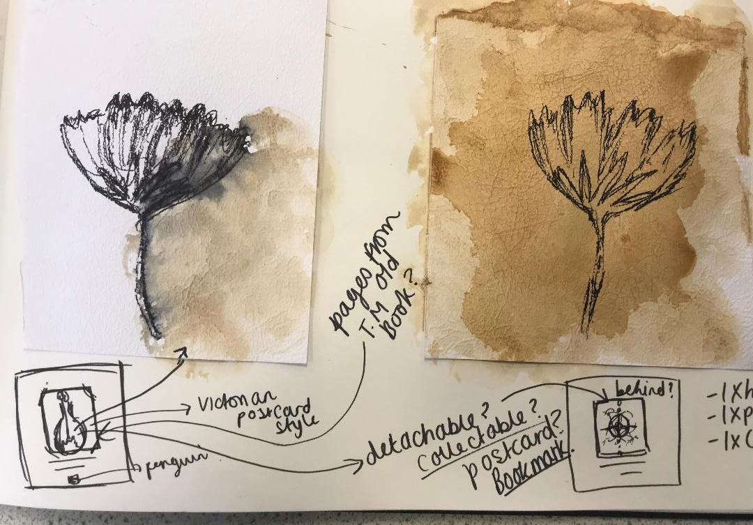
I worked some more on the development of my final idea, I had another go sketching out what I would like on my final cover to see how it would work! When I have completed the drawing it is my plan to copy it several times and experiment with different looks and techniques (I want to try the tea staining and watercolour again)
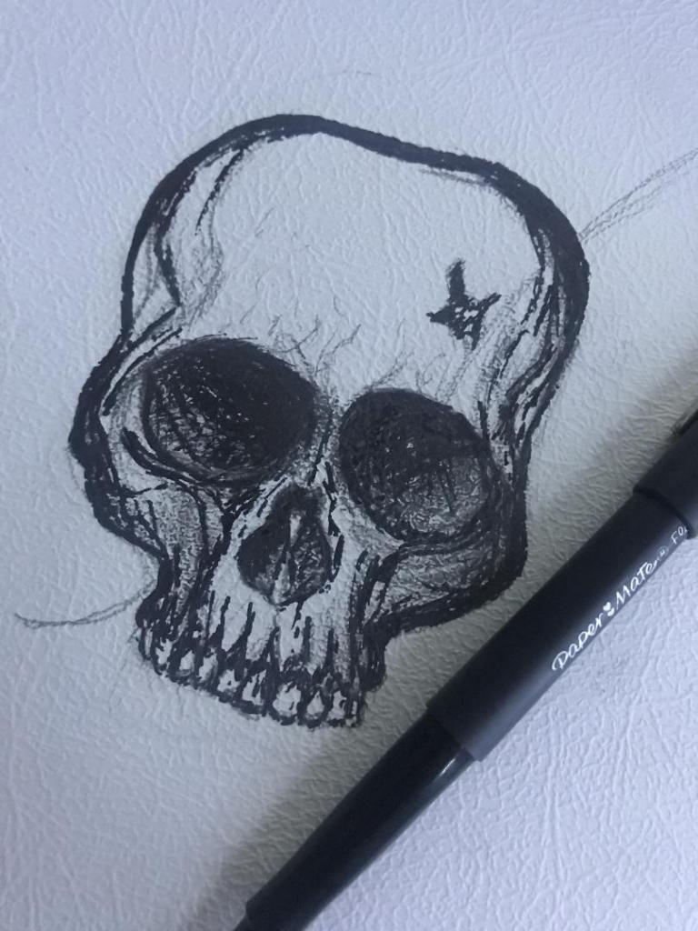
I feel that even in one night since I drew the first rough drawing that I have improved massively! I kept quite light on the shading with this one so far and it does look much better. I also felt like I was trying to compare how good my drawing skills are with everyone else I was looking at online. Obviously I was looking at examples of ink drawn pieces and I felt myself trying to make mine look similar.. it was only when I stepped back and looked at a really good ink drawing I did back in October that I realised to myself that I am good at ink drawing but that I just have a different style! I shouldn’t try and sway away from this to be like everyone else because mine is just as good but in different ways!
It is nice to sit back and do some drawing though and improve my skills so I shall give it a few more attempts before hopefully I shall feel I can settle for one final one to take forward and be happy with!
Last night when I got home from work I decided to sit down and have a go with some experimental drawing. I know what idea I want for my final cover and can visualise in my head how I wish it to look but I actually have to try and make that a reality!
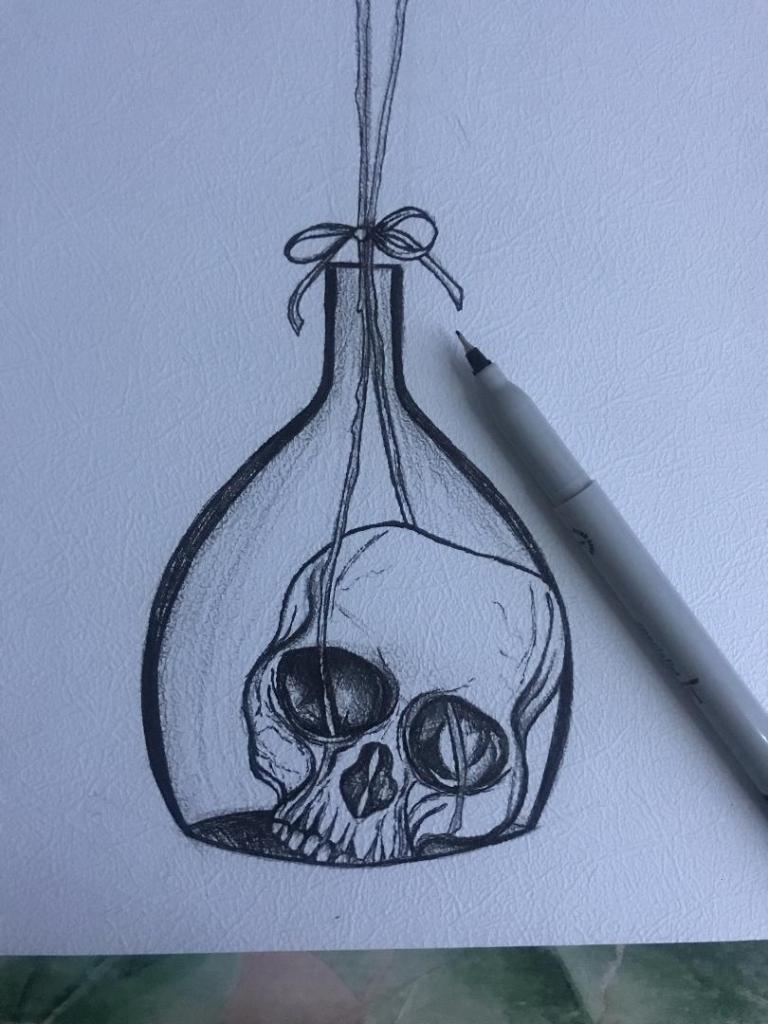
I want a potion bottle with a skull sitting at the bottom of it and the flowers coming out of the skulls eye socket straight out the top of the vase. The water in the bottle I want to look murky and dirty as it represents the Morlochs underground. I decided to give it a go drawing a skull in ink and then go from there!..
I have Pinterest (link below!) so I decided to have a look at different skull drawings and try to copy one off there!
This is what I ended up with! The first one being the drawing at the beginning before I added shading etc.. I think I have made the skull too dark with the shading and on the final piece I shall make it a lot lighter. I like the tea staining that I added though, I like how it has ran with the ink and gives a very murky effect.. (I still feel though it could have ran some more!) I could even try this with different colours using watercolours instead of the tea staining.
Overall I am pleased with my first attempt.. I have not sat down and drawn for a while and when I do draw it is never anything as dark as this! 😀
I shall have a go at repeating the drawing with different ways and techniques until I am happy with what I have achieved!
I feel like for the last week or so I have gone round in circles between 2 design ideas and how I could make them work together without making the book cover seem “too much”…
The first idea I had (from the first pages of my sketchbook) was the 2 white flowers inside a bell jar; I then went on to try and make this have some steampunk influence with the use of cogs, thermometer and piping but after further development I realised that it would be a lot nicer kept much simpler and potentially as a simplistic ink drawing.
the first sketches
The Steampunk influence
I then explored with the possibility of drying flowers (they are still drying out and I may return to this idea yet!) and using this as part of the front cover – photography with the Victorian influence of flower drying. The idea then moved on to me looking into Victorian botanical drawings inside old botanical books and ink tattoo style illustrations which would be modern yet play a massive influence on the ink drawing I visualised for my cover.
The first photo idea
The botanical style
I realised that I would need a mix of the 2; the feminine, botanical flower influence mixed in with some scientific, industrial, steampunk, “time” element.
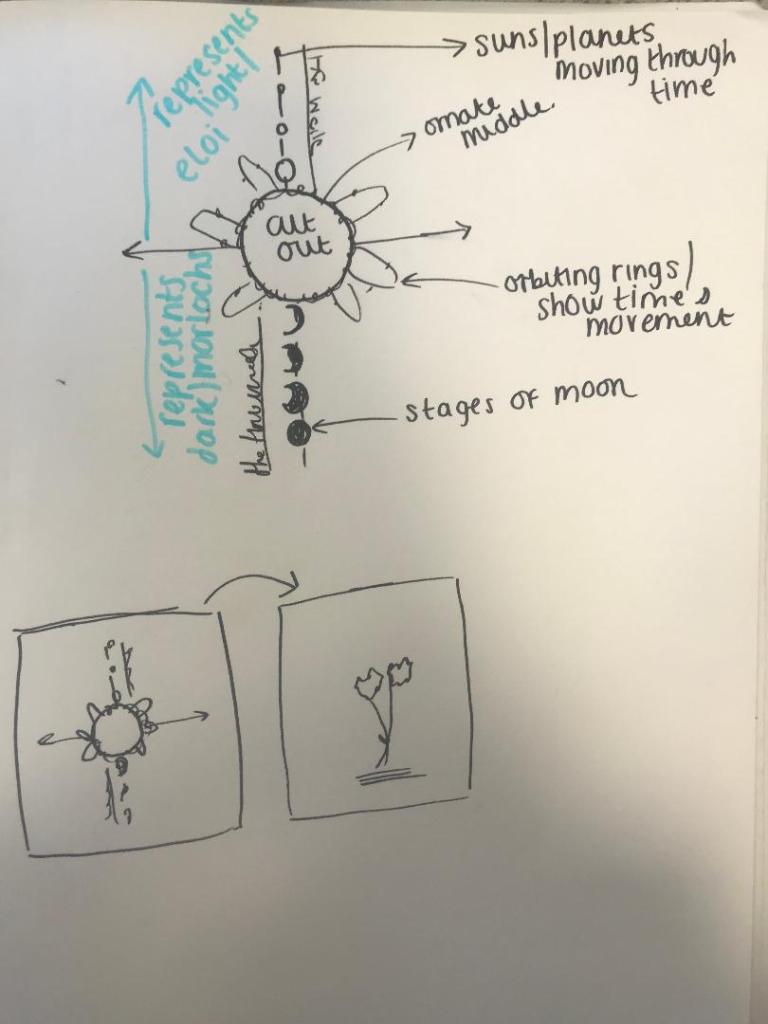
My other design idea was using symbolism. Inspired by tattoo designs I found on Pinterest; I featured the moon, the sun, the flowers, the talking rings from the book and orbiting rings to represent space and time. With just the flowers alone it would not be fully representative of “time” the time machine or the subject of the book. This style would be quite modern; I was thinking of ink drawing it but then importing it into Photoshop and doing similar to the Skillshare tutorial that I watched earlier on in my research stage where the designer altered the colours and made it look much more modern.
I toyed with how I could use both ideas on one design without making it all look too much…
I then explored with the idea of using 2 different designs on one page by using different media for each idea and then overlaying them somehow on the cover… maybe like a collage or different textured paper on different colours to add some contrast to the 2 pieces. I had an idea in my head of drawing the bell jar, a top part of a skull sat at the bottom of the jar and the 2 white flowers growing out of one of the eye sockets. (the skull representing the darkness from the Morlochs underground) I want to push myself to create something that is “darker” than what I would usually explore. In my last assignment the feedback was to explore with different textures so I feel that this ties in nicely. I then thought I could potentially draw this design onto textured, mottled, old looking paper and make it look like one of the old Victorian botanical books/postcards I looked into…
It was then a question of how do I get the other design concept on there…
From my earlier research I had already looked into book jackets, designs on inside covers and laser cut covers.. I established that these were better suited for hardback editions. Designing for a paperback edition leaves less scope for creativity and I feel like I shall have to pick between my 2 ideas. I have had the idea though to potentially take the brief further as I would ideally like to use both of these designs:
Create one paperback, ornate cover where I shall pick one of the design idea concepts only (possibly the botanical one).
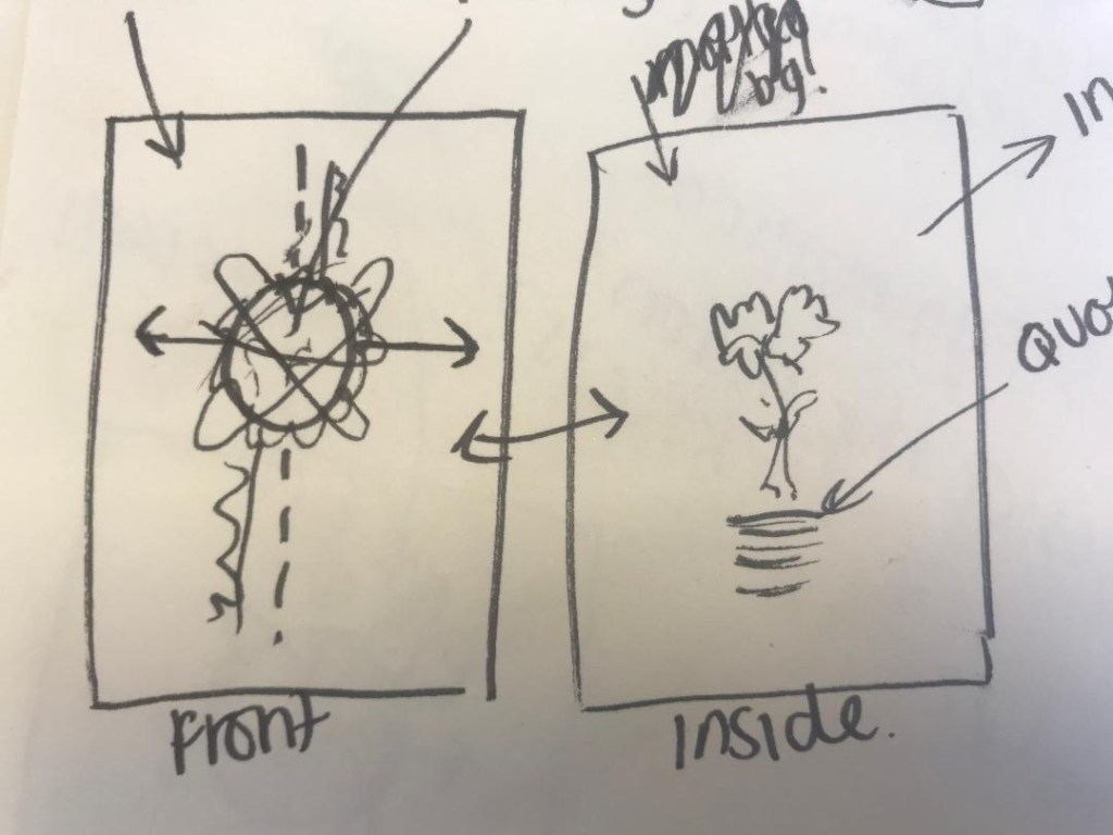
Create one hardback edition where I shall use both of the design concepts and place the botanical design on the front with the “time” design on an inside cover.
Create a special collectors edition where I shall use the botanical design as a detachable postcard or bookmark which when removed from the cover will reveal the “time” design underneath.
My next stage from here is to start with drawing some ink drawings of my designs and seeing what they look like and how they work and to also look into different types of paper and textures!
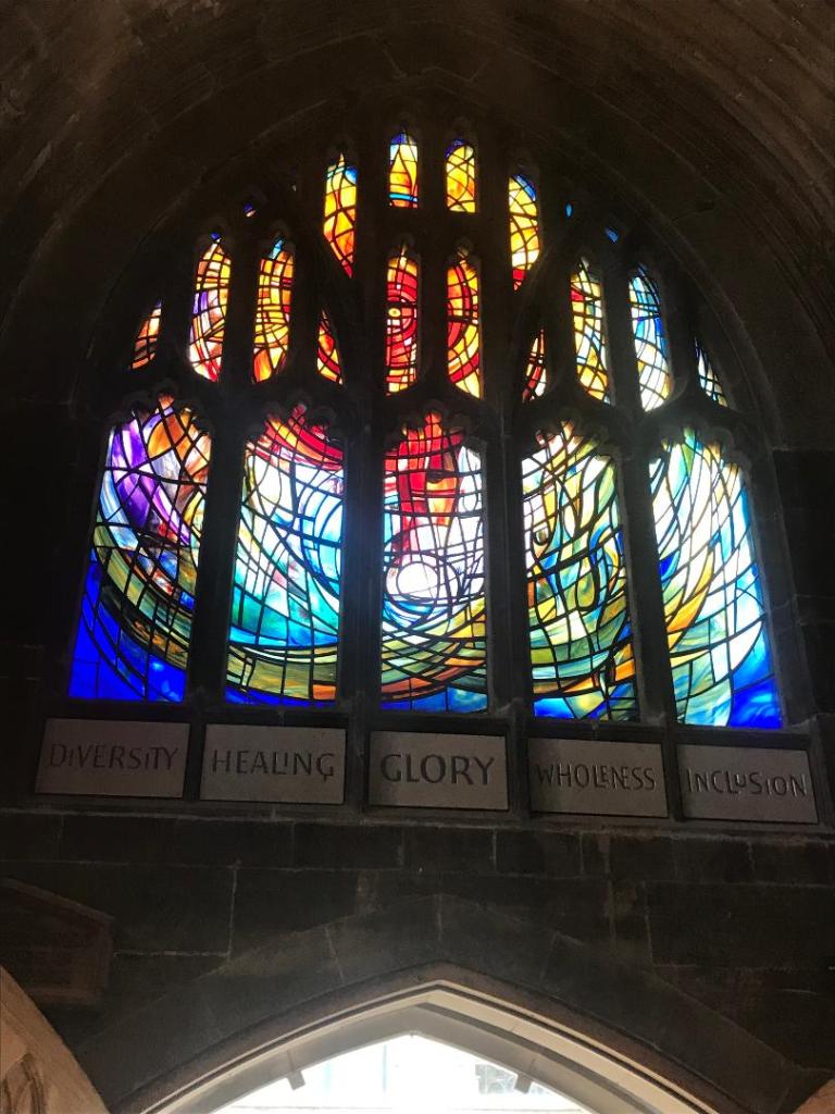
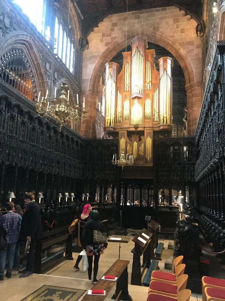
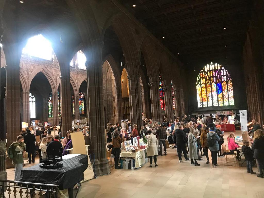
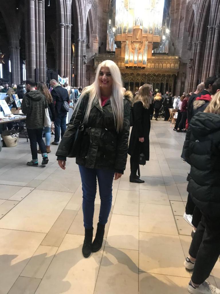
This weekend I took some time out.. time out from working non stop and spent the weekend in Liverpool and Manchester. I had not been for about 5 years so it was nice to go back!
The main reason behind going (other than I needed a break!) was because there was a print fair in Manchester Cathedral on Saturday; featuring designs and work from graduates, designers, illustrators and fellow creatives! I wanted to see what there is out there!
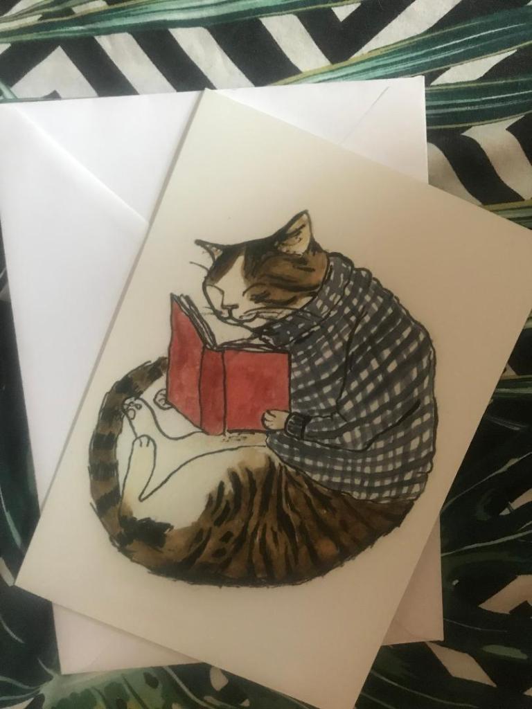
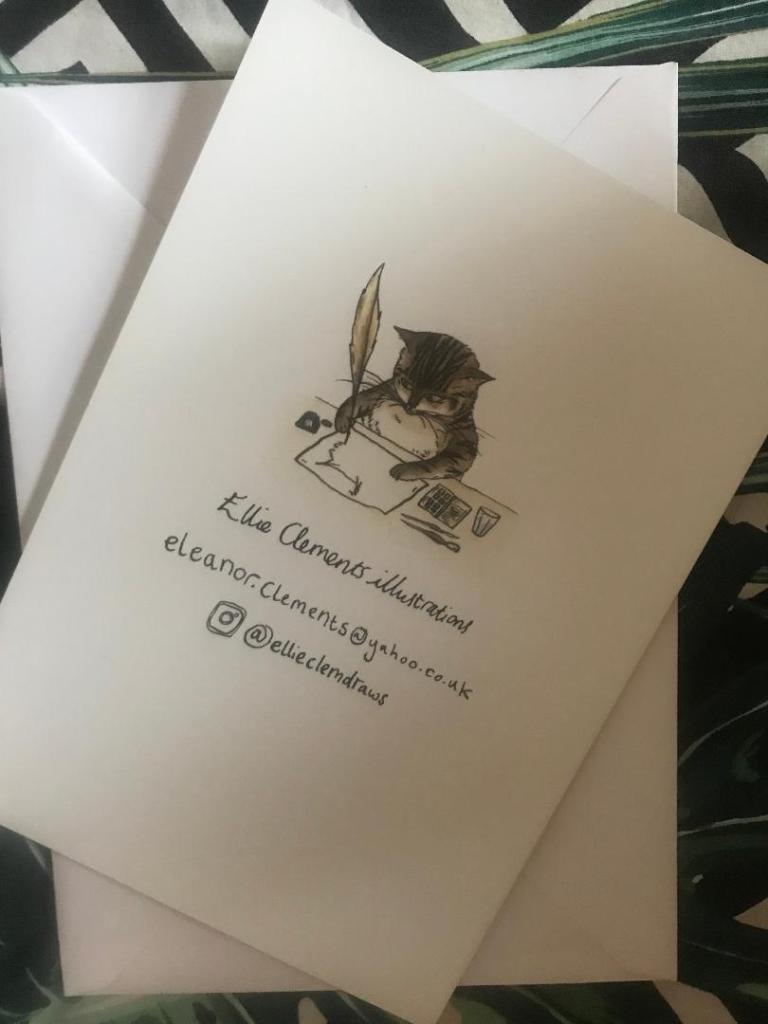
It was very busy and featured some brilliant work from local artists. The majority of the work was screenprinted and there was also a lot of illustration work. I was drawn to an illustration by a lady there called Ellie Clements @ellieclemdraws of a cat reading a book! 😀 I don’t know what it is about the drawing but I just loved it!
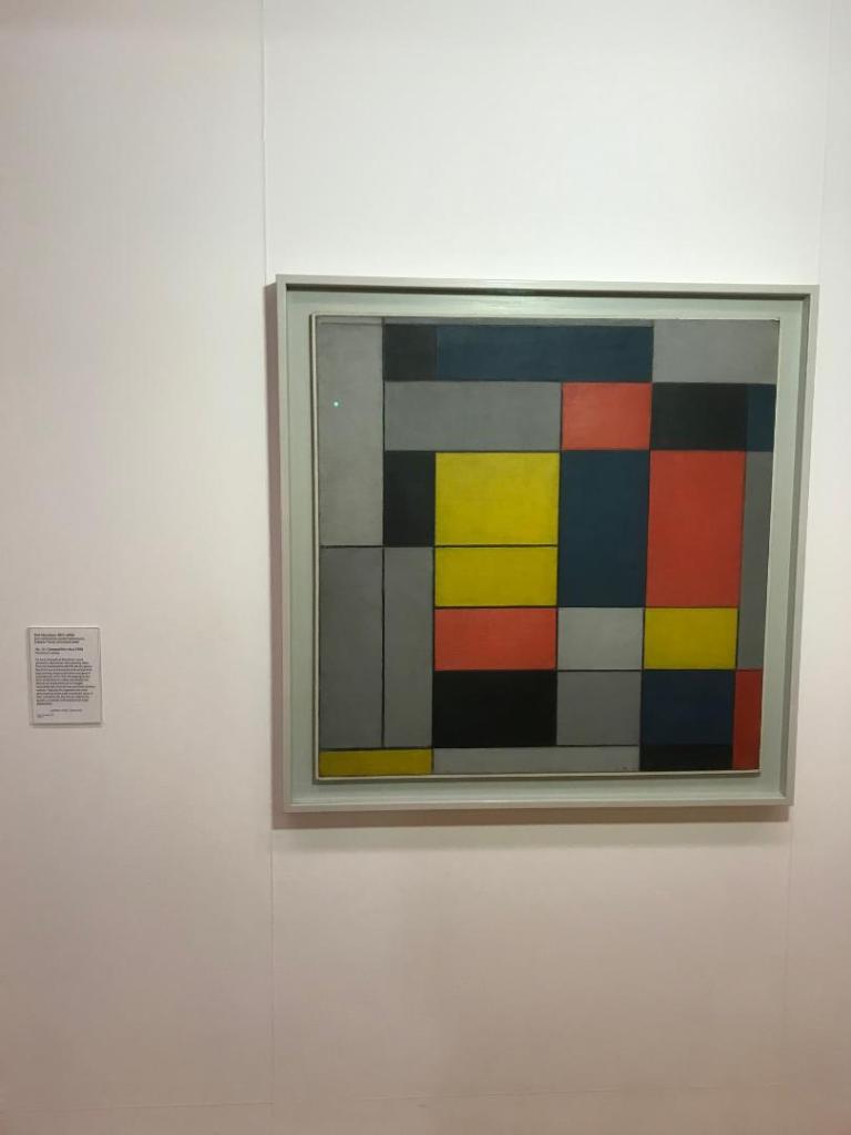
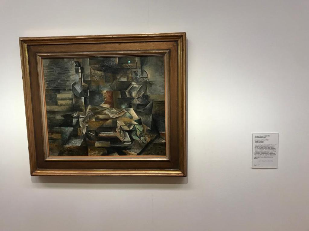
I also spent the saturday afternoon and night in Liverpool. I had a look around the Tate museum.. usually I don’t get much inspiration from the type of work that features in this gallery but this time there was art which might help me with my work!
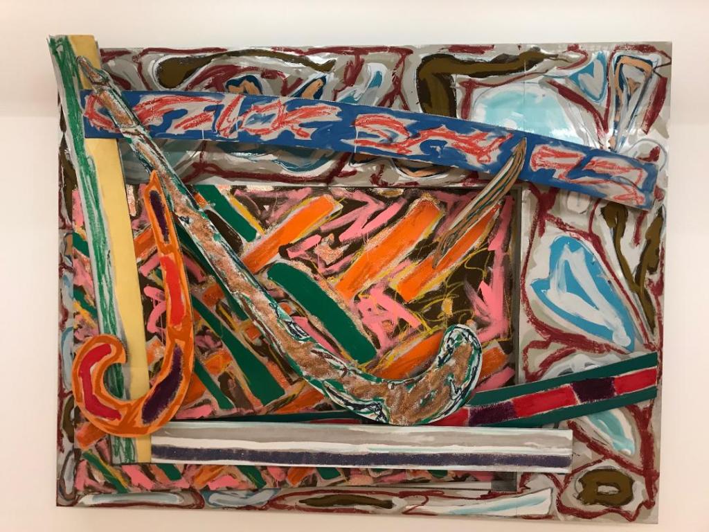
They had work from Lowry in one of the upper galleries; a lot of the art that featured alongside his was also very industrial – inspired by the industrial revolution. There was also work from Mondrian from the De Stijl movement and also some cubist work!
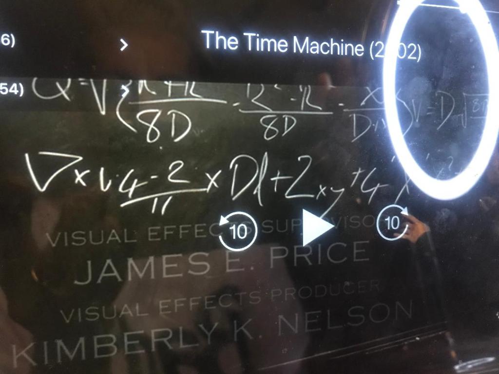
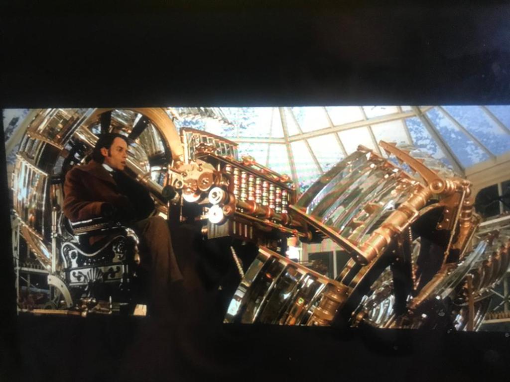
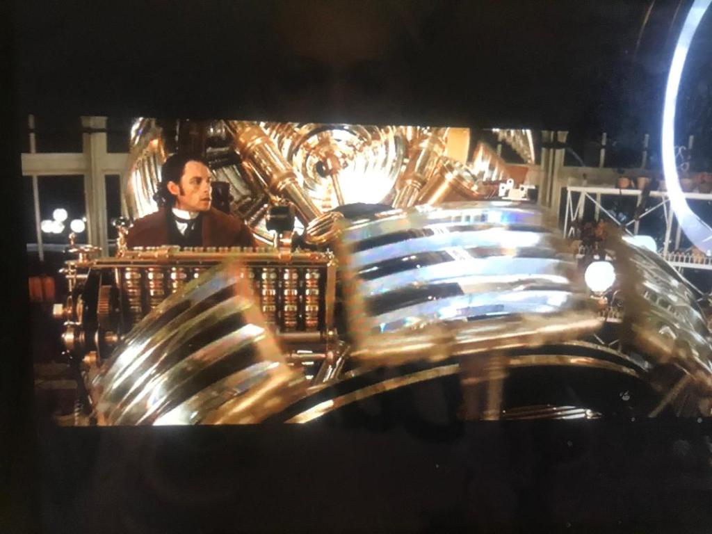
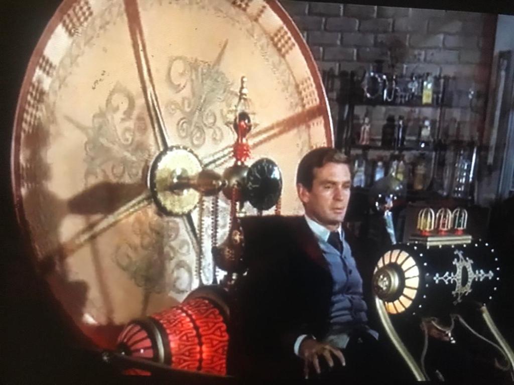
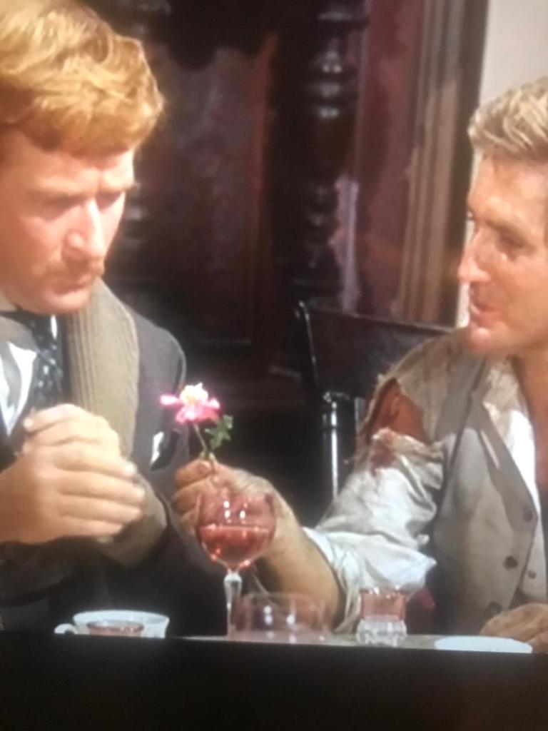
A few people have told me that they made a film based around the HG Wells book so I had a look on Amazon prime and found one that they made in 2002 (featuring a singer from back in the day that we used to listen to! – Samantha Mumba!)
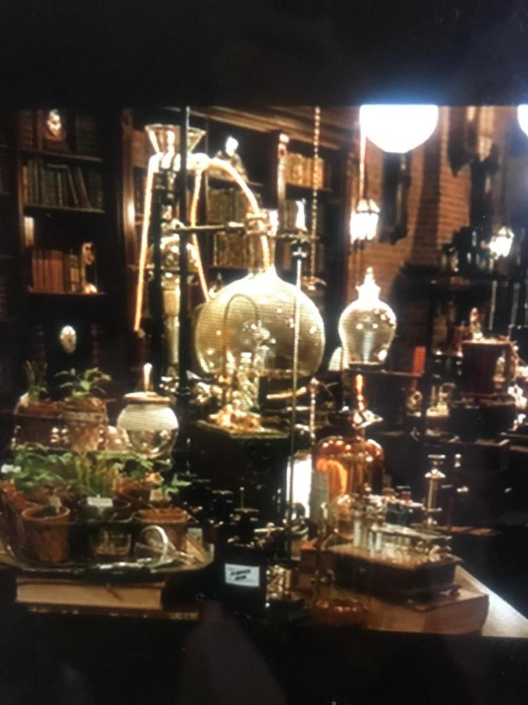
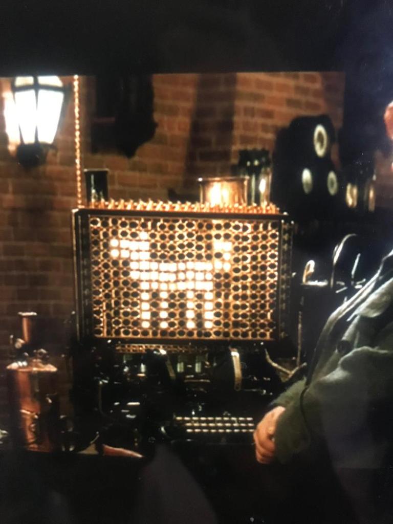
The story differs slightly from the book with the fact that it bases around the man trying to turn back time to get his fiancee back who gets shot but it is still set in the Victorian era. There is a lot of inspiration at the beginning of the film when it shows you his time machine (crystal and brass!) and the area in which he works; all equations on a board, bottles and beakers and lots of Science inspired things!
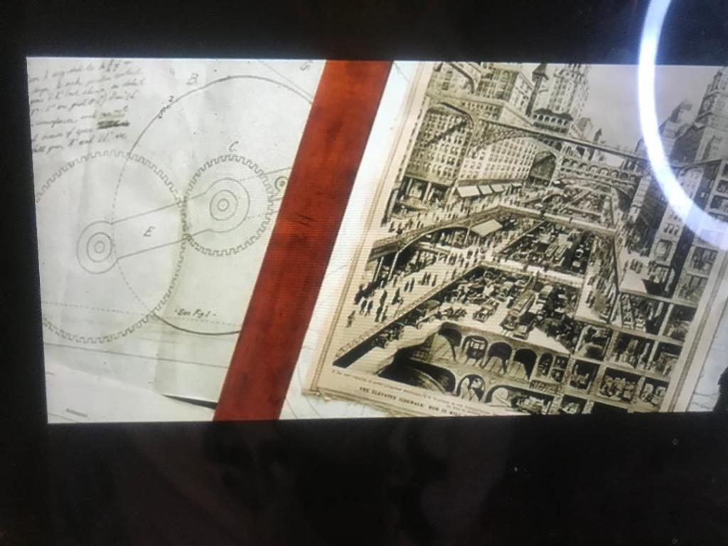
I took some photos of some of the scenes of this film to record on here and to also look back on for some design inspiration. The 4th photo across on the slideshow shows an image that looks very similar to an image I recorded a few posts back that I found in a Futurism book. It is very representative of the Industrial Revolution. There is also a scene in the film where he looks at pocket watches; I included sketches of pocket watches in my sketchbook also.
The film has stayed true to the book in which it has made the time machine brass, gold, shiny and with crystals (the 10th image shows a crystal lever) I can take a lot of inspiration from what I see in these images. There is a massive use of rings, circles, gold and geometric shapes.
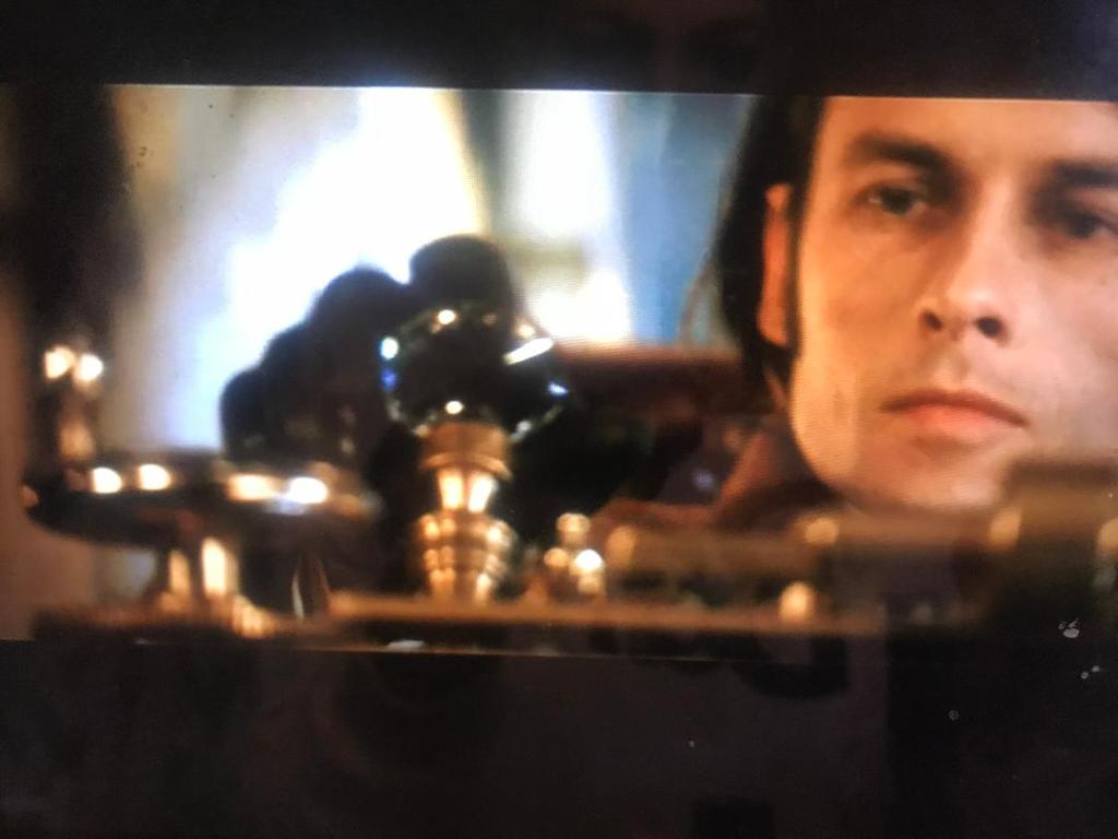
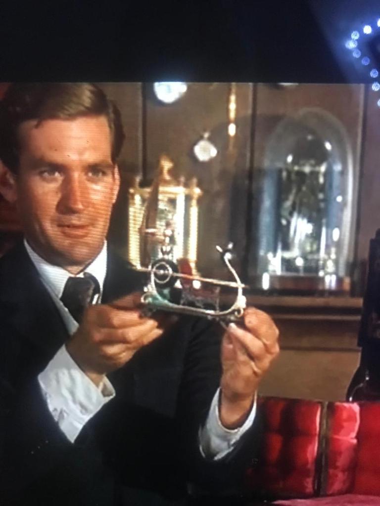
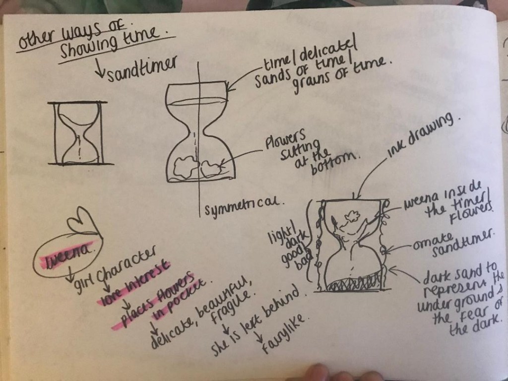
I then went on to watch the 1960 version, this version stays true to the book more than the 2002 version. There is a lot of things in that film that featured in my first sketches such as sand timers, pocket watches…. one thing though which was featured in the film was an ornate sun dial – this is a different way of showing time. Again, I took some photographs that I thought might help and influence my designs:
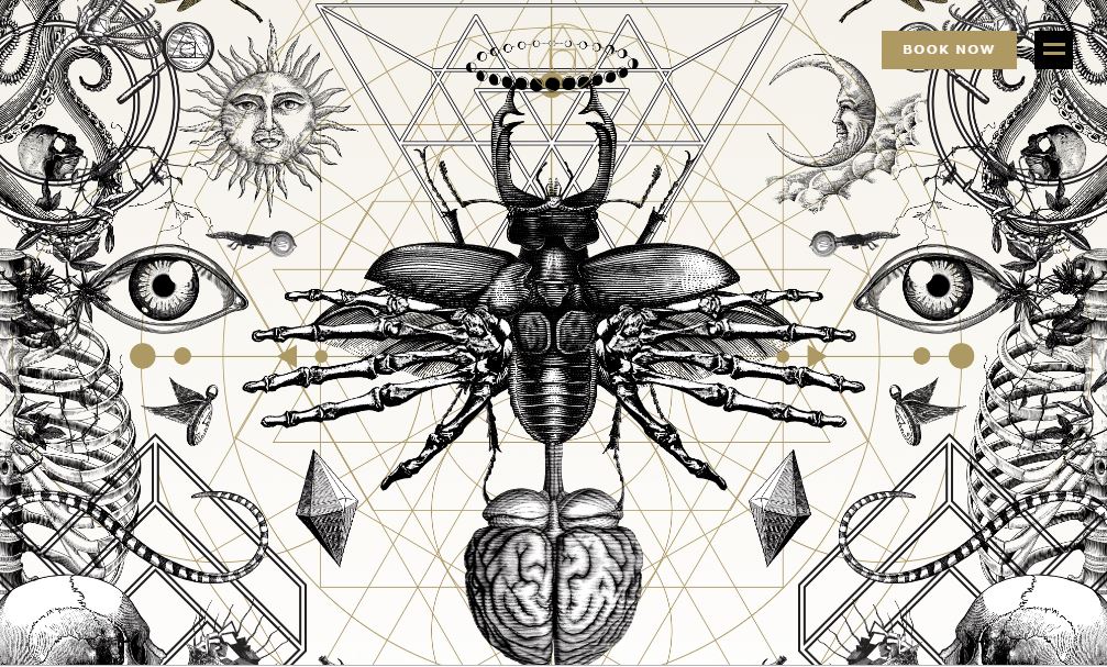
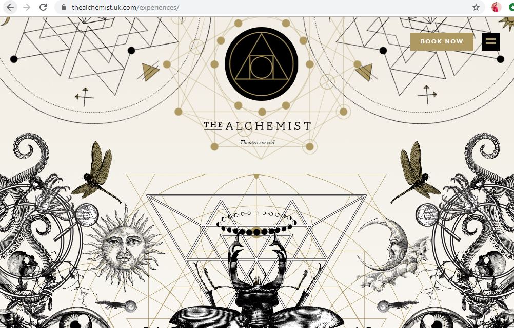
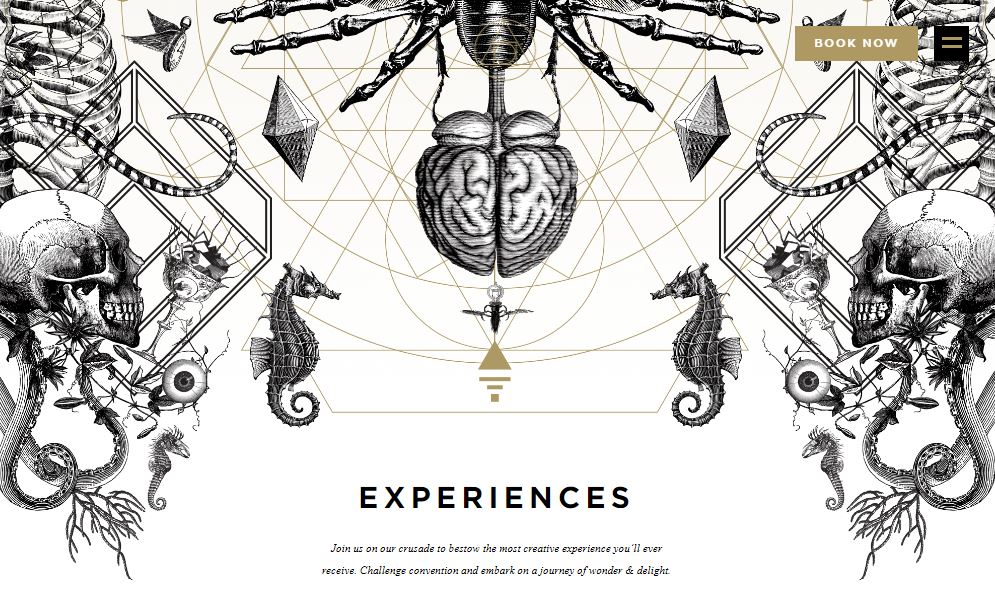
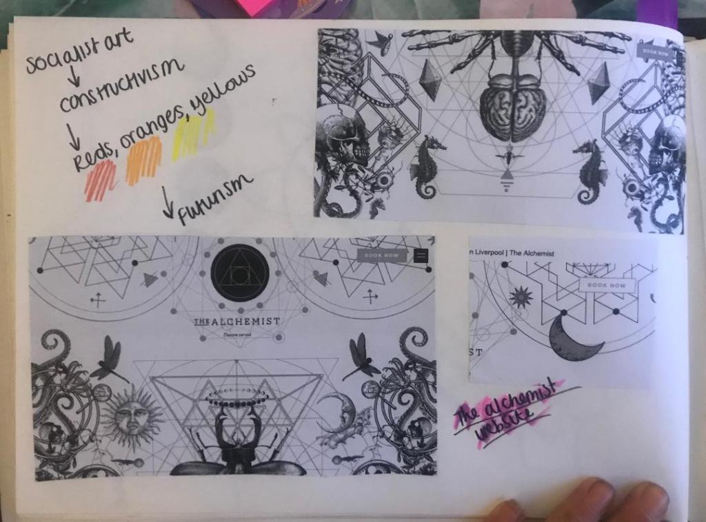
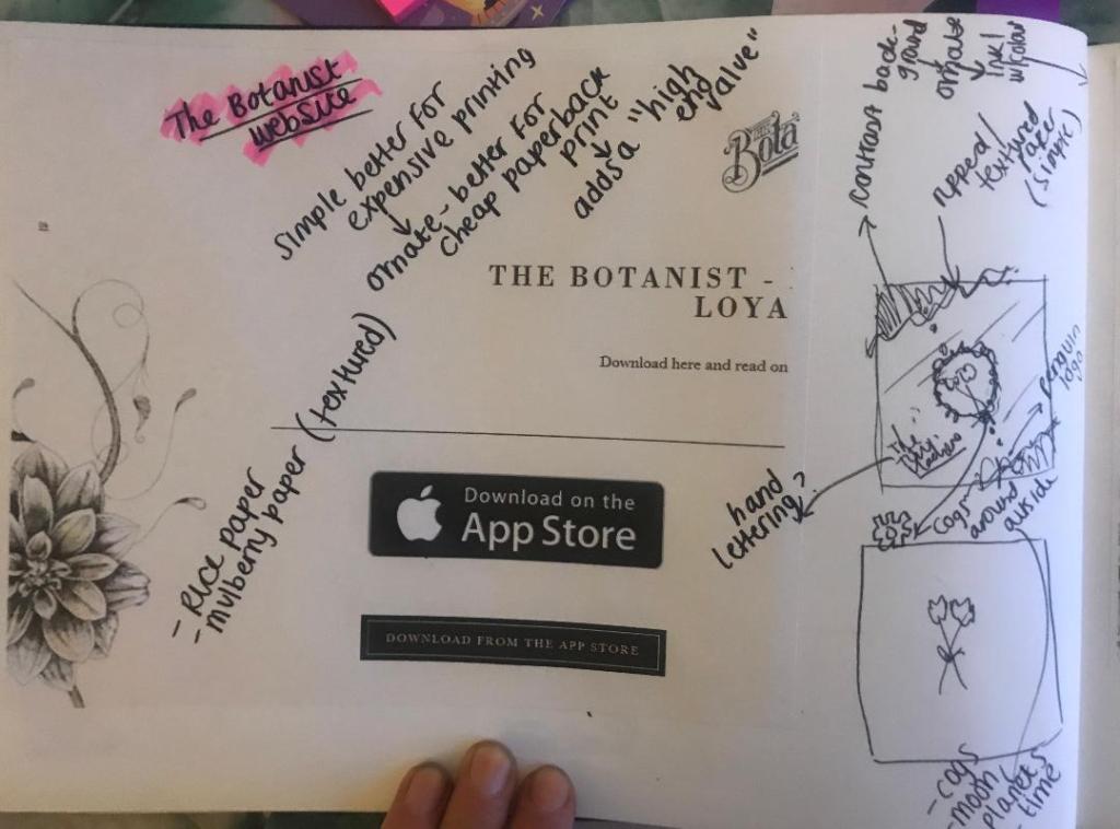
Yesterday I was asking ideas for my designs from our textiles teacher at school who I work closely with everyday; she asked me if I had ever been to two bars called “The Alchemist” and “The Botanist” as these would help me possibly with ideas! – I have heard of them, (I have heard of The Alchemist because I am aware that they do really extravagant looking cocktails!) – however, being from the shire where nothing much goes on, I have never yet been to one! I had a look at the websites and instantly knew that the designs that I saw on there would help inspire me for my own!
The designs that feature on The Alchemist website are monochrome which I love, they have elements of Steampunk as there are cogs and machinery as part of the designs.. but they also have a touch of femininity about them with the delicate flower drawings. There is repetition in some designs and symmetry just like the William Morris ones I looked at.
I decided to print some of the website pages out, stick them in my sketchbook and sketch ideas around them..
Whilst sketching these ideas I watched a video on Skillshare by Jessica Hische, a lettering artist explaining how she designs book covers. One of the helpful pointers I took from her was: Make the design simple if it is a costly print job, if it is a paperback book and a less costly print job make it “ornate” this will add a high end value to it.
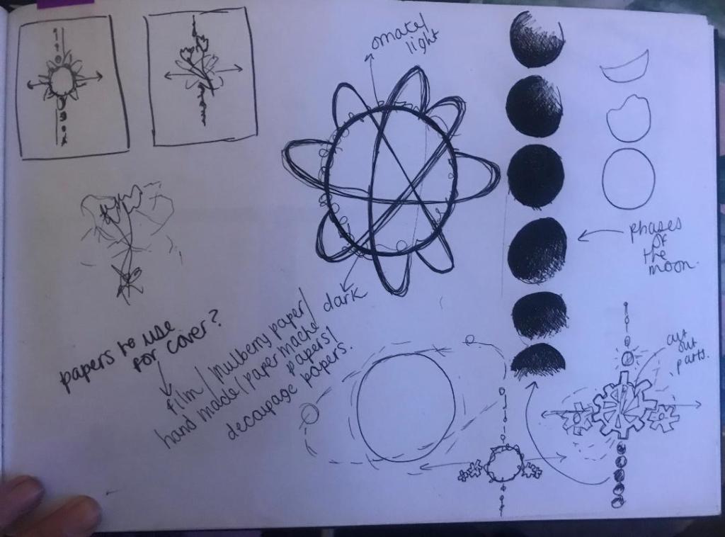
In my sketches I explored around little ideas based around science and space and line drawings of delicate flowers etc.. I brought back the bell jar idea in the later ones though as I feel as much as I was quick to dismiss it for a while, it is still relevant to the book and still a good idea.
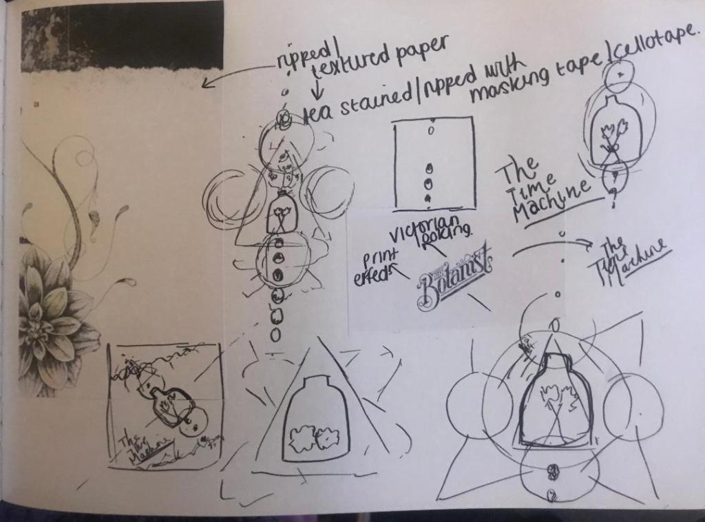
I looked at The Botanist Typography and copied next to it in the same style, The Time Machine – I felt the way this looked worked well! Obviously I will make mine look different! (I might even do hand lettering for it)
The slanted positioning of it too made me think of De Stijl and Constructivism art – The way that the work is very geometric and typography at angles… It made me think that I could do the layout of the book similar to this idea… Here are some examples of what I mean:
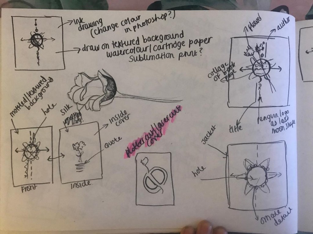
By the end of this little sketching session I had this idea below which I liked the feel of the most. The design would be on a mottled, ripped sheet with a contrasting background behind it. The centre part would feature the flowers, the bell jar or both and all around it would be mechanical cogs, crystals, ivory.. all relating back to the actual time machine. the typography would be alongside it at an angle which relates back to the Socialist views of the author and the hidden meaning of the book.
I am now going to sketch some more developments of this to see how it could work!
From my last post where I was toying with the idea of a more simplistic cover of 2 white flowers, I have done some more sketches and a bit more research! – I know I go overkill on research but I find that exhausting every avenue gets me useful links between my designs. The more knowledge about the book, the more ideas I get for my designs!
I won’t lie, I have only skimmed this book… flicked through some pages and scanned with my eye for the useful bits. I have also done some YouTube reviews and read what avid fans on Amazon have said about it! – all this is useful because actually everyone focuses on the true meaning of the story rather than the time travelling. The true meaning behind the book is actually quite thought provoking, romantic and sad!..
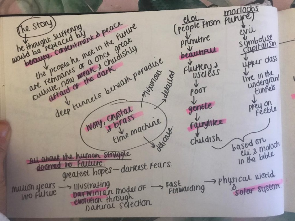
The time traveller (who has no name) travelled in time to the future (in an ivory, crystal and brass time machine – which might be useful in my designs!) as he thought that the suffering of his people would be replaced by beauty, contentment and peace in the future. He was wrong, the people he met in the future were remnants of a once great culture. The people known as Eloi were socialists – gentle, beautiful, kind fairy like people. They were very primitive and only had basic supplies, they were poor. They were however also weak, childish and afraid of the dark. They lived above the ground in fear of the Morlochs. The Morlochs lived underground in dark tunnels, they were the opposite of who the Elois were. They were Upper class capitalists, nasty and preyed on the feeble. These 2 groups of people in the book were metaphors for upper and lower class in HG Wells Victorian times. They symbolised capitalism in Victorian England which was something HG Wells was deeply against. The book is about the human race and how it is doomed to fail.
The first ideas I had for the bell jar and cogs I now feel is too harsh for the design of this book. I now feel that I want to focus on the soft, delicate nature of the book.
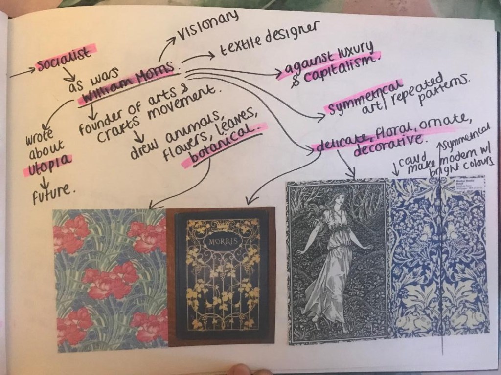
I had a look at the style of William Morris. He was a textiles designer, a poet and he was also interested in Science Fiction and the future just Like HG Wells. He published a book based around Utopia. He was also a socialist just as HG Wells was. He was against capitalism.
His style of work is very ornate and bases around plants, flowers and botany. His work is very symmetrical and repeated.
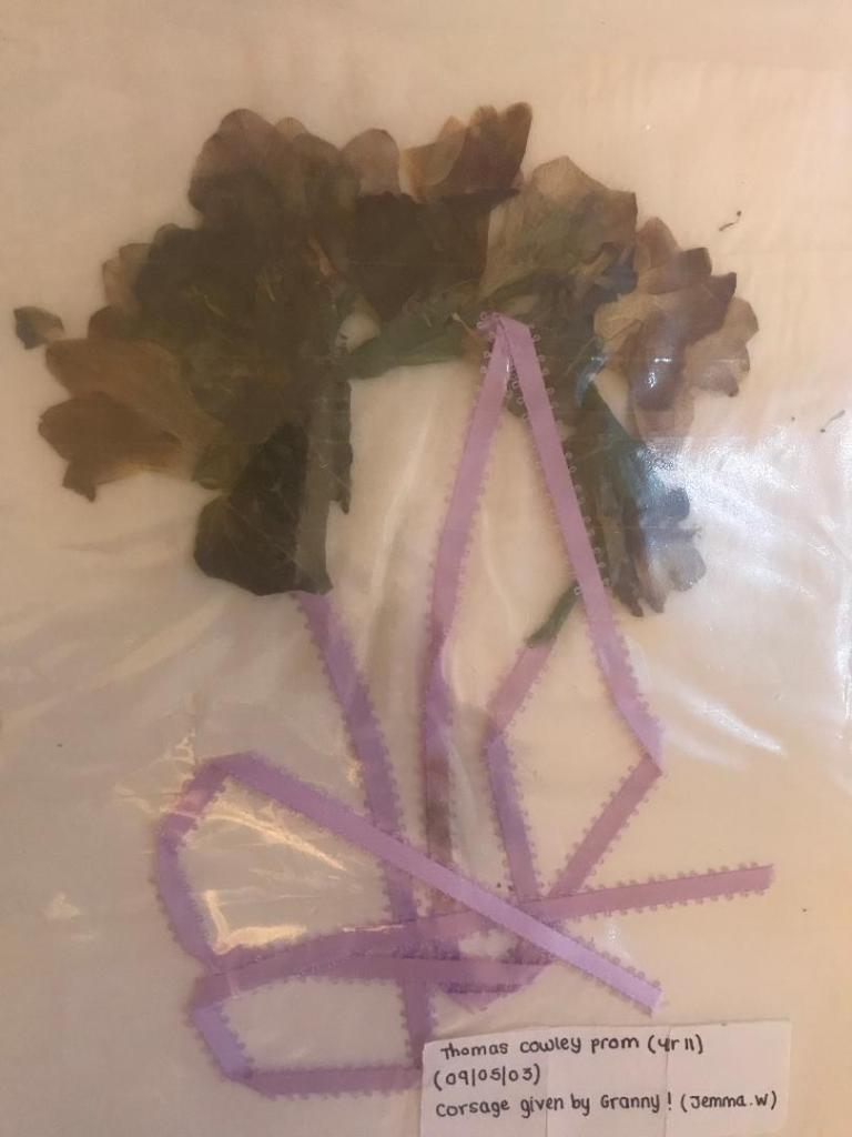
These are pages out of my sketchbook that I have done to explore ideas around this, there is also one of my now really dead 15 year old prom corsage!! (I really didn’t press this professionally!)
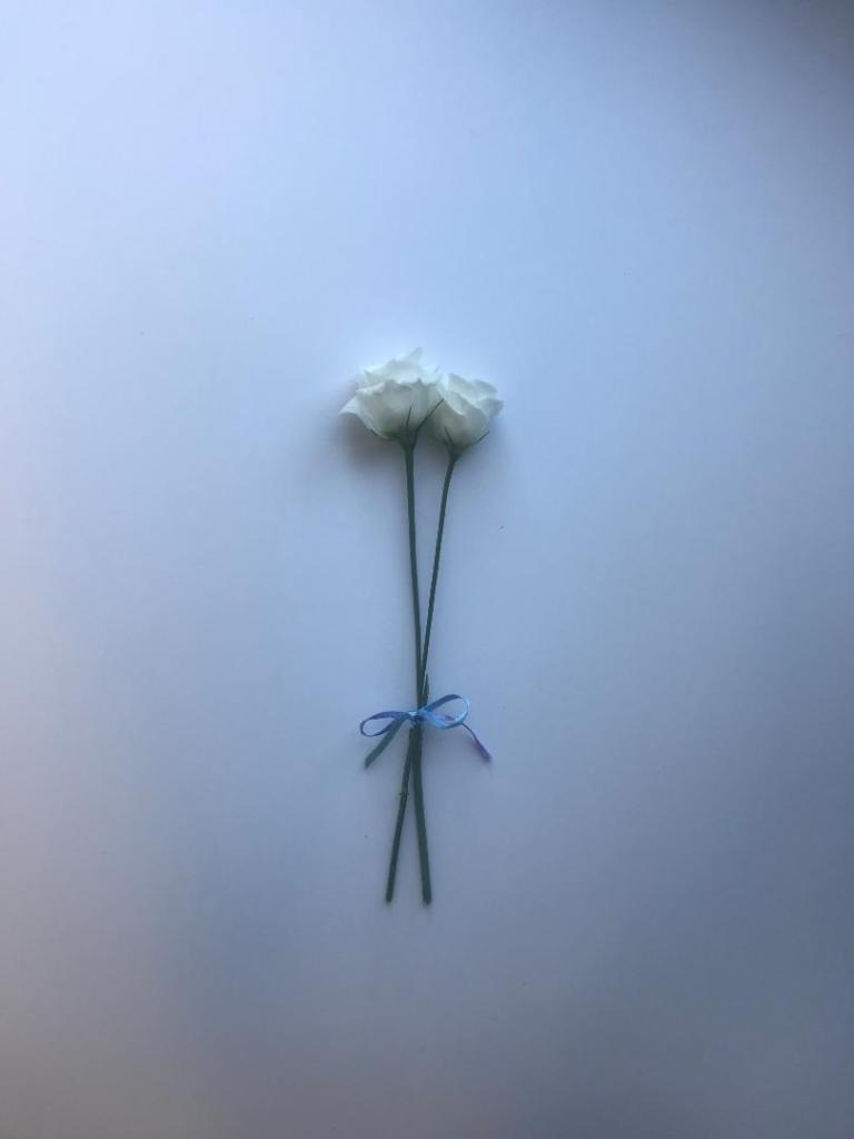
I decided to buy a bunch of white flowers with the idea to photograph 2 of the flowers. I thought that if I photographed them alive first and then dead and pressed I could choose between whichever option looks the best.
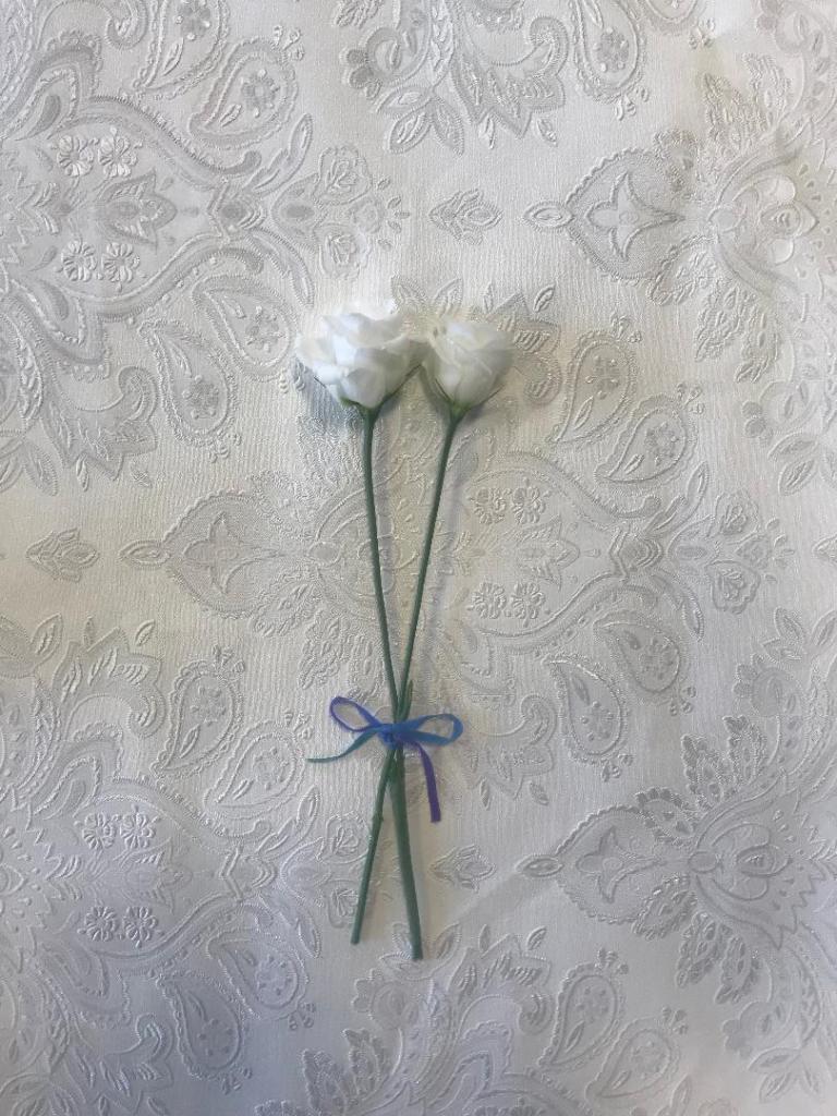
looking pretty at my school desk!
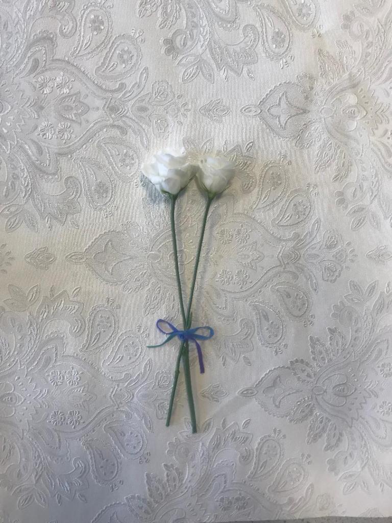
Looking pretty in my home office!
I have photographed them on different textures; card, silk and a decorated wallpaper. The silk did not look good, you couldn’t really see the shine of the fabric as I wanted and there were a lot of creases. The card worked the best. I am going to also try and find some mulberry paper (paper for decoupage) as this will really give a textured look.
These are some I have taken so far:
I felt that this idea would work for a hardcover book more than paperback- (I would use the flower photograph for the hard front cover and then make a book cover jacket which would go over the top with cut out parts where you can see the flower through) although I could adjust the design to work for paperback. I explored around symbolism a bit for the idea… The image below tries to show roughly how it would be and look like..
If I was to adjust this to make it suitable for a paperback I would put all the elements together just on one cover.
I shall have a play around again and see what works the best!
Today, as I was sitting googling what the white flowers in The Time Machine might have possibly been and looked like to help me draw them in my designs, I came up with another potential idea…
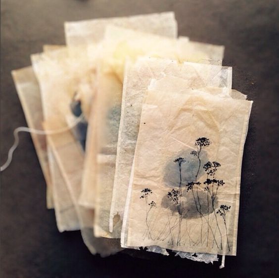
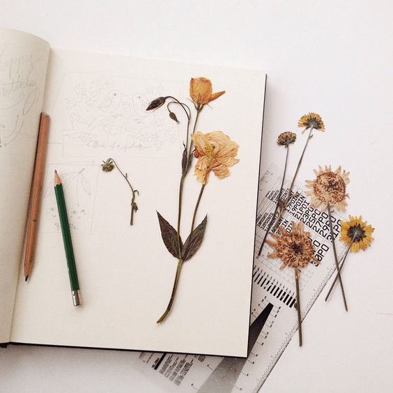
Flower preserving!…
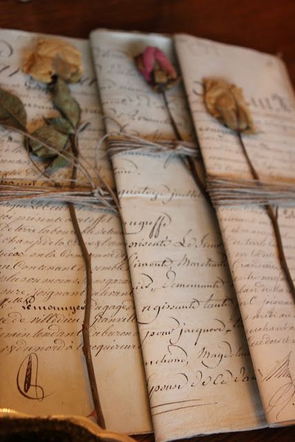
The images of the dead “white withered flowers” that google produced for me reminded me of a prom corsage that I attempted to preserve 15 years ago.. it then made me think that flower preserving is actually an old Victorian pastime! (another link!) I then had the idea in my head of a photographic book cover of 2 preserved white flowers possibly on a mottled, textured background to give the book an old feel, (In Victorian times flowers were preserved onto silk) and then some simplistic typography for the title and author. This design would show how in the story the flowers are fragile and delicate and show a sense of love and kindness.
In Victorian times flower preserving was a popular pastime but it was also a way to collect, record and study different species of flowers. Botany is the study of plants and flowers. This brings the science link into the designs too.
The images above are just a few I found of flower preserving examples.
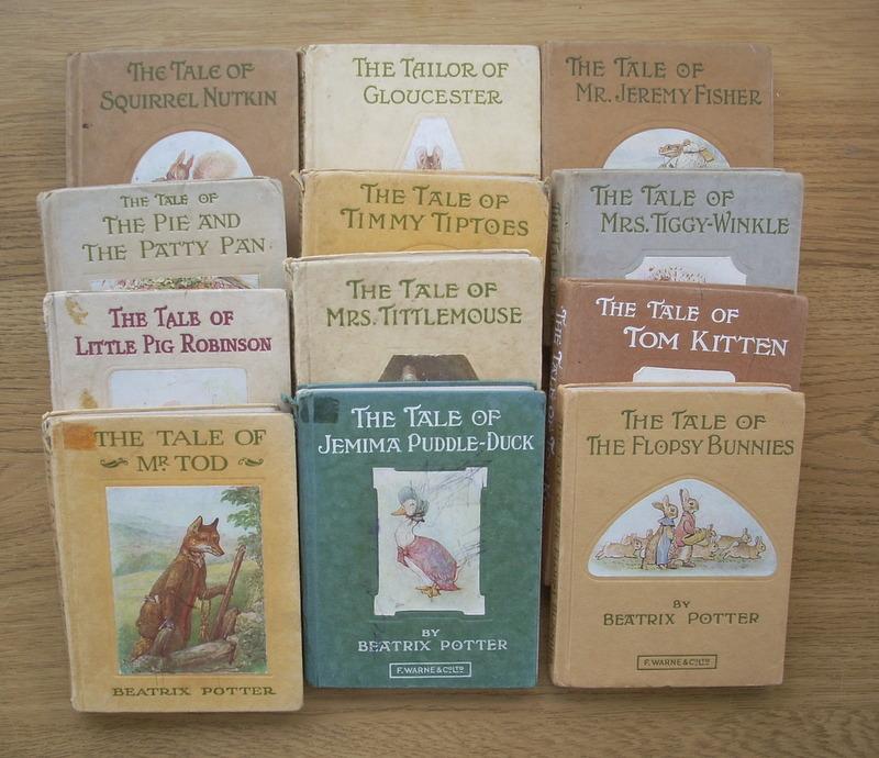
When I was sketching ideas and writing notes for this, some books came to mind that I read when I was younger.. I had a whole set of Beatrix Potter classics (I think they belonged to my mum) The typography style that features on them is something similar that I would envision for this design. The layout of the books and the texture is something that I would want to take inspiration from.
This is a page from my learning log sketchbook, these are drawn at literally the moments the idea came to me!
I think that if I successfully designed and created this cover as I imagine it, it would be a beautiful work of art as well as work as a timeless classic.
From doing earlier research (Chipp Kidd’s video) He mentioned that classic books are usually covered in plastic to protect them and to also keep their value… I then thought about placing the preserved white flowers onto my mottled backdrop and then covering them in plastic and photographing it..
These are the Beatrix Potter ones that came to mind! The stories are classics and the book covers are standing the test of time (I think they have been reused and modernised on reprints of these books in recent years..) The covers here are hardback but the idea behind it is still the same for both hardback and paperback.
How could I make the other 2 covers similar to this design?
The Time Machine – Would have the preserved flowers
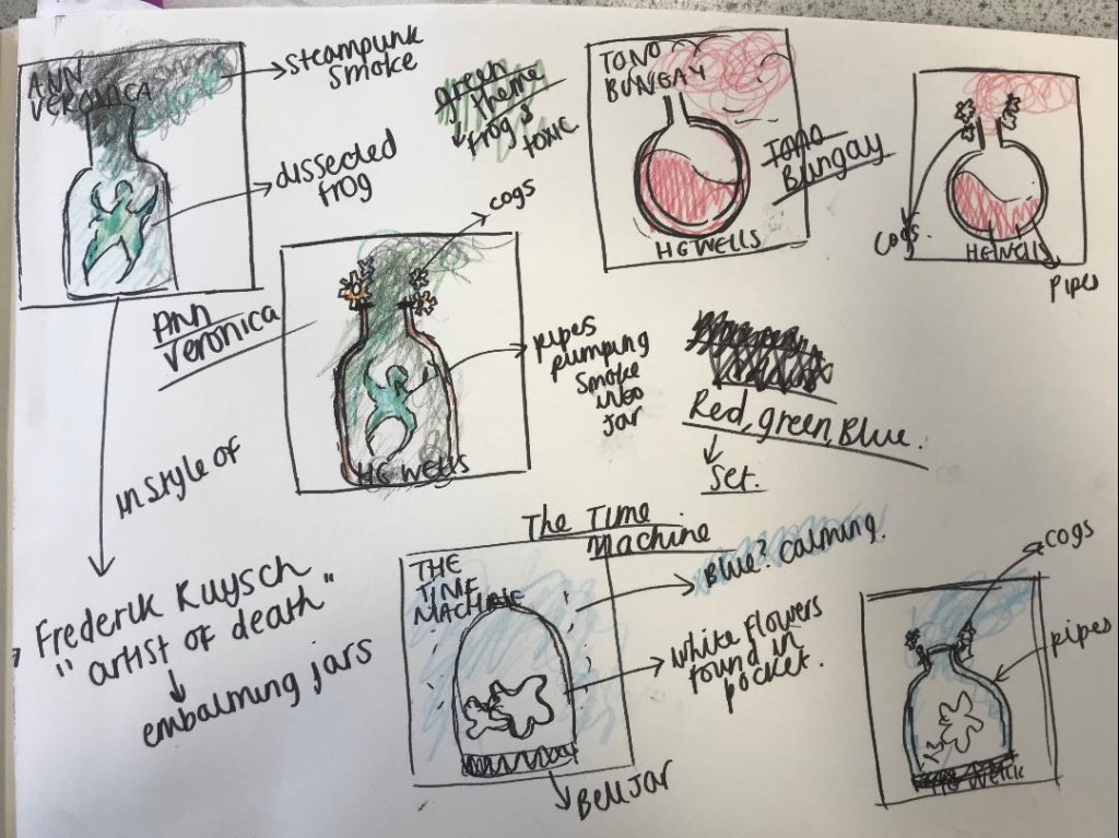
Ann Veronica – possibly a photo of a frog or a scientific drawing of a dissected frog
Tono-Bungay – Maybe an old medicine bottle on its side with some coloured liquid pouring out onto the page…
These are just some ideas that I can explore and further look into… I might have a go at preserving 2 white flowers which I could potentially use for a design.
**update 12/11/2019
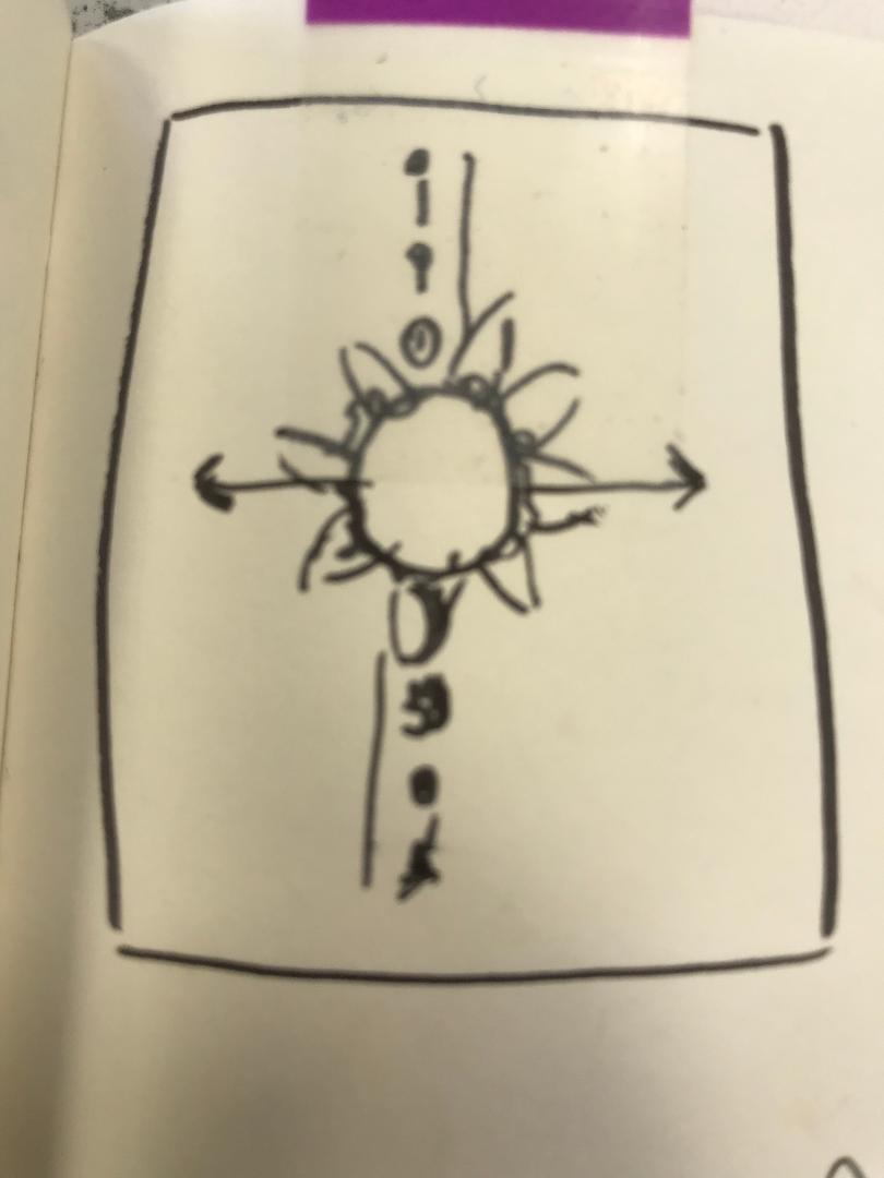
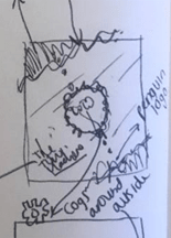
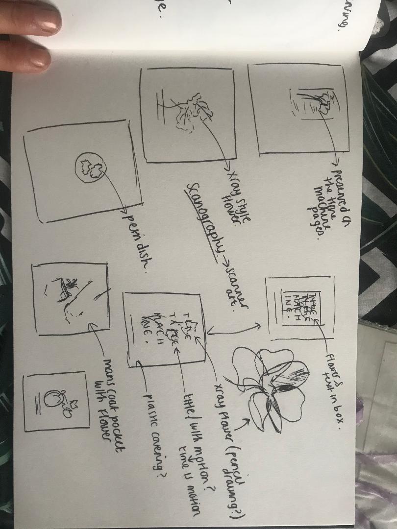
I did some more sketchbook ideas last night (see below), trying to problem solve around the ideas I have to make them work (I started drawing out a mock sketch for the bell jar idea and I am not sure of it!..)
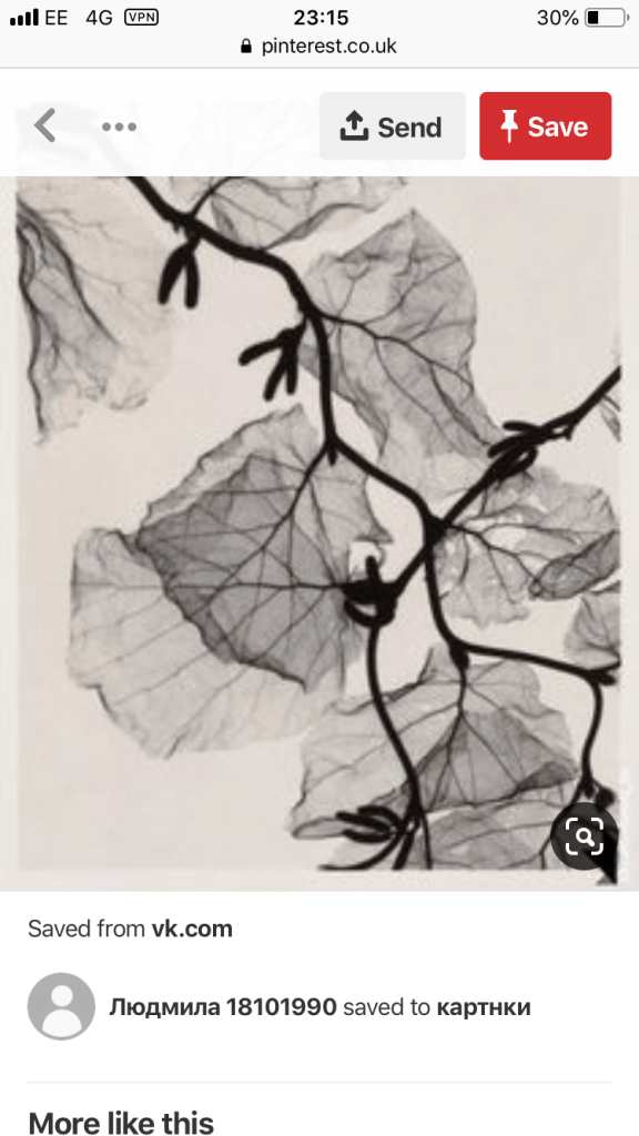
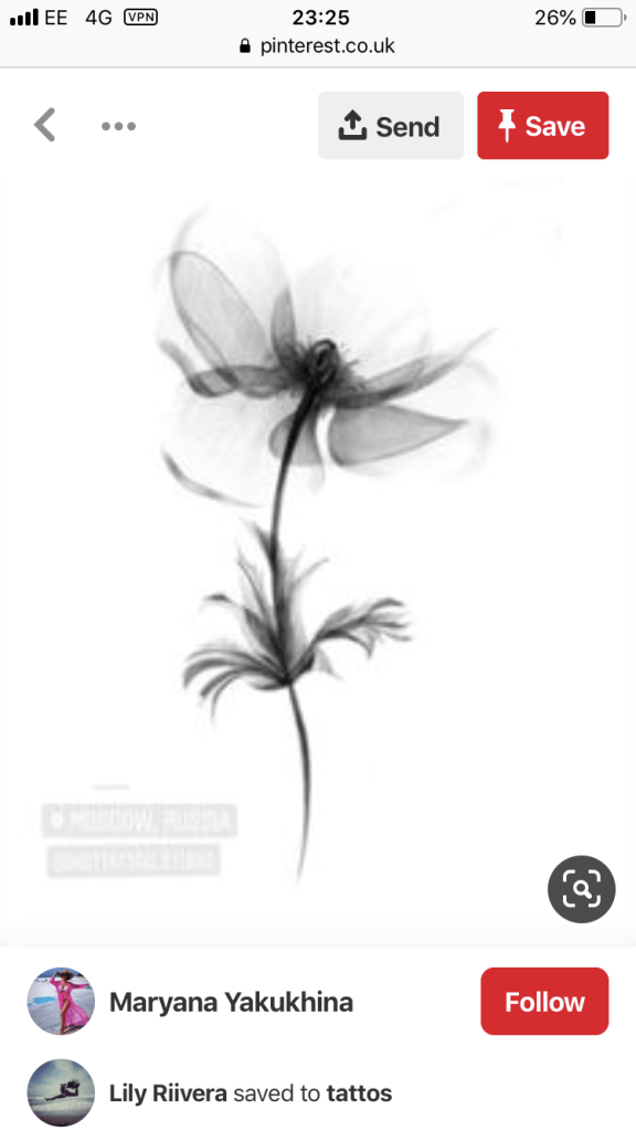
so I looked back at the flowers idea. I found some images that gave me some inspiration; they were mostly of x-rayed flowers, (obviously I cannot x-ray some flowers myself!) I could use this idea though to maybe draw a similar idea in pencil to get the delicacy needed… or I also looked into scanography, which is simply put – Scanner art!
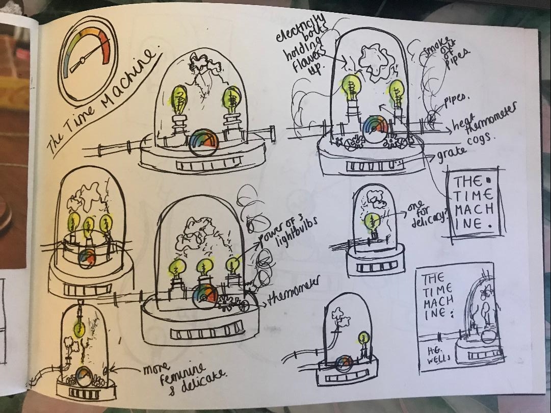
From thinking about ideas on my last post I have now spent some time sketching out some ideas for The Time Machine.
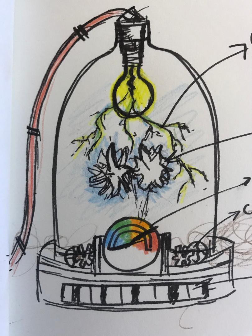
I had the idea for this one of placing the white flowers inside a bell jar and then adding some pipes or smoke to give the Steampunk/Science influence. I wanted this one to be the most delicate out of all 3 because of what the flowers represent (love and affection between 2 characters)
I started off by doing ideas based around lightbulbs shining into the bell jar and heat thermometers.. The idea is that the lightbulb is the hope keeping the flowers alive, the hope of what lies for us all In the future and that kindness lives in the future. The flowers are delicate, we are all subject to mother nature. The heat thermometer controls the levels of smoke being pumped into and out of the bell jar and also is a massive Steampunk influence. I have decided to do electric, static, lightening bolts coming from the lightbulb which are in theory holding the flowers up – I guess this is the science aspect to the idea.
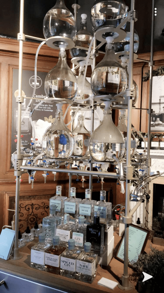
I quite like the idea of bell jars, medicine and potion bottles etc… It reminded me of a photo I took in Cambridge in the summer of the Cambridge Gin Factory. (see below) the bottles and the way the shop was laid out fascinated me. It gave me inspiration for this piece.
The Cambridge Gin Factory
I also today visited the NCCD in Sleaford (National Craft Centre Design) and saw these jars as part of a display in one of the windows.. They are still a thing that is obviously used!
But these are some of the sketches (below) that I have done so far! I think I have the idea for the first book – I now just need to draw out a final drawing and know how to bring typography into it!