


The Time Machine: Design Development (cont)
I have been a bit slow on development the last week or so… I have also been trying to work on something I want to start in the new year. (I’ll do a separate post for that!)
I watch a lot of SkillShare tutorials to learn different effects and skills to further improve my design work digitally. My last post mentioned how I studied a Duotones class by teachers called Evgeniya & Dominic Righini-Brand, Graphic Design & Photography well I also studied another one of their classes for creating a screen printed effect. I thought this might add an “older” more vintage feel to the piece.
After I had finished the tutorial I also uploaded the finished piece to the Skillshare page for others to see (which is unknown for me!!- stepping out my comfort zone!) Here is the link below to what the tutor had to say to my piece!
https://www.skillshare.com/projects/224662

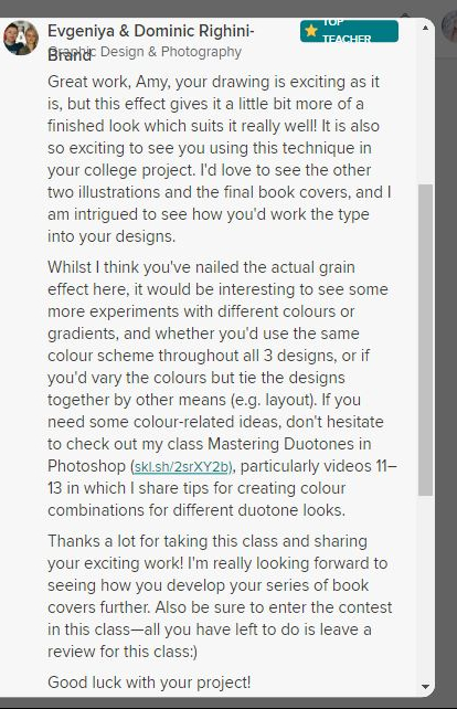

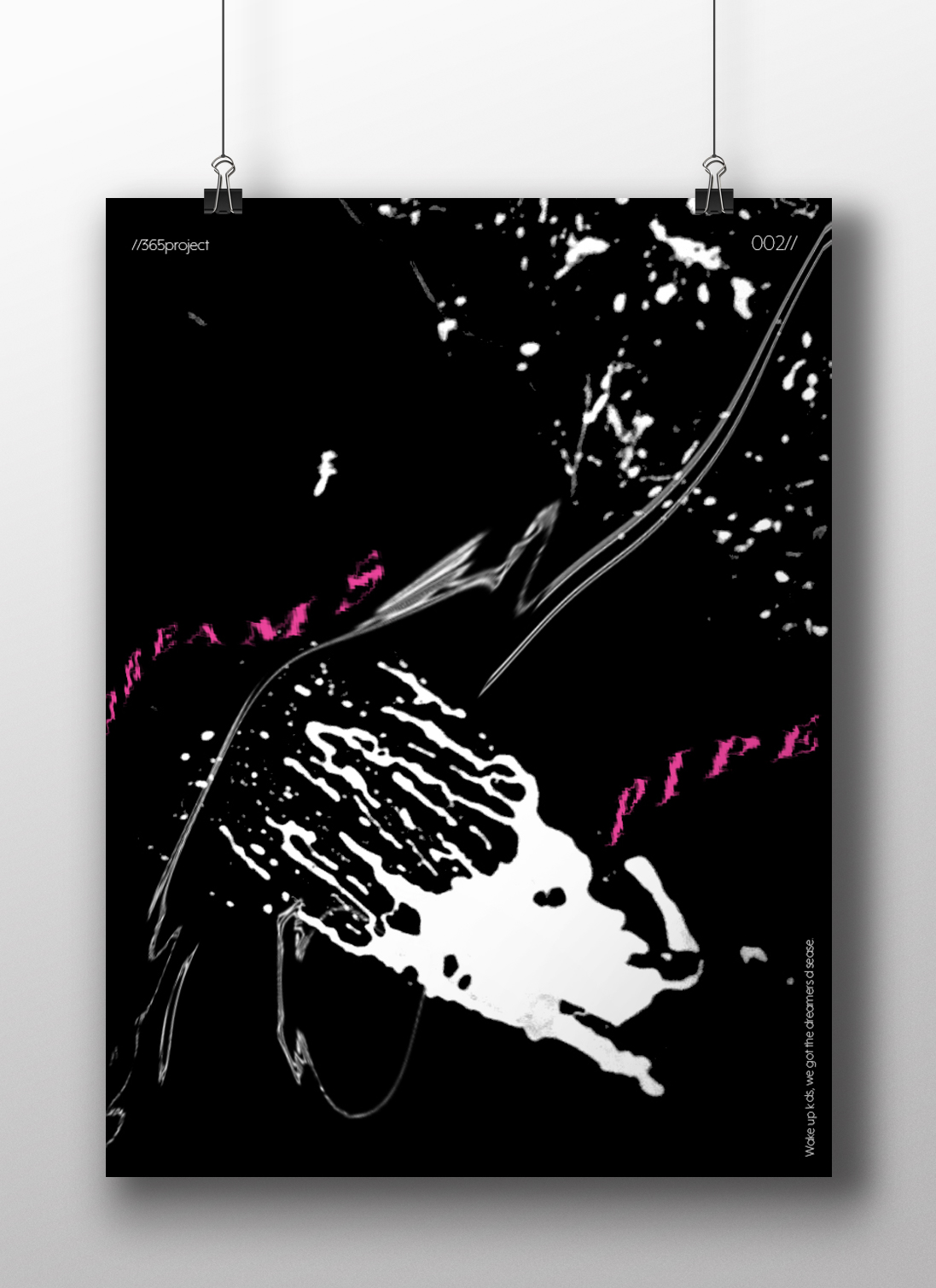
Out of all the trials I have done so far though I have to say I like the first one pictured above! I also posted it to my Facebook for the opinion of everyone else and they all agreed that this one stands out the most and the contrast between the black and yellow works the best. I am now going to draw the other 2 designs and then bring them into Photoshop and do the same digitally as this one. I will change the colours on each though so that they each have their own colour scheme.

The Time Machine: Digital Development – Duotones
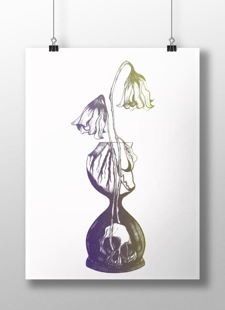
With my final ink drawing I decided to import it into Photoshop again and change the colours.
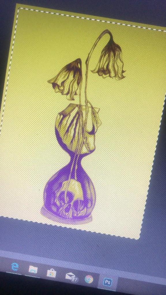
With the first version I adjusted the colours, brightness, vibrancy and saturation etc and then decided to use the pen tool to select certain areas to add colour. I like how it looks as a black and white ink drawing so I decided to only add colour to a few selected areas such as the flowers and the inside of the sand timer. The hand forms as part of the sand so I needed to keep this dark!
I like this as it still keeps the original drawing but also adds a hint of the yellow. It makes it look like an old fashioned image.
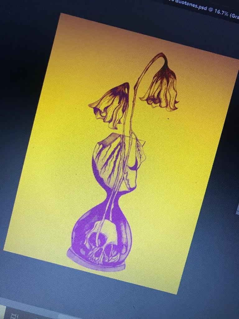
I then saw a tutorial on Skillshare about Duotones which I decided to watch. It was a lengthy tutorial (2 hours in total) but by the end of it I felt confident in creating my own.
However, It still needs some work!…
I need to adjust the colours some more because at the moment I have kept the duotones quite dark. In my opinion duotones are bright and modern in appearance and the colours should work well together, contrast and “pop” out!
I want to use yellow on this cover; the white flowers at the end went wilted and brown in appearance – I was thinking of a mustard yellow to try and closely match this. Yellow is also a bright happy colour which I think reflects the Eloi people but by making it that little bit dark and mucky looking reflects the evil within the book.
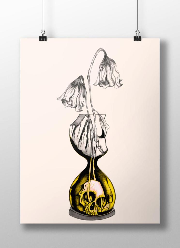
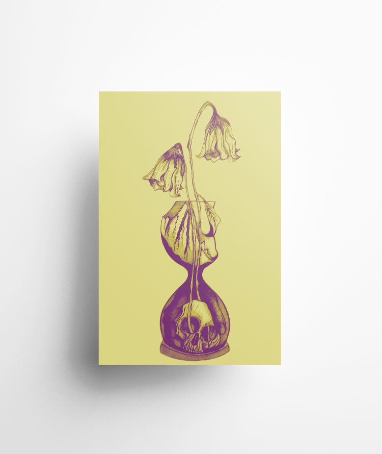
The above images are what I had a mess around with! I think the second attempt on the right works better. The colours stand out more and it catches your eye. The colour scheme I used on this one was a yellow and purple – complimentary colours so that they contrast.
The plan is to add the text over the top potentially as an overlay, this will give a modern and interesting look to bring the book into todays era.
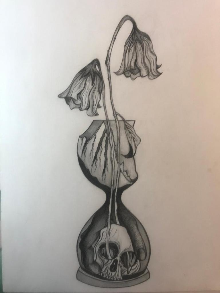
The Time Machine: Design Development (cont.) AND a finding…
Last night I finished off shading and drawing the LAST drawing I am going to do for this book title!! – I am still unsure about the hand (I can’t draw hands at all!..) but just like the quote; “Don’t be afraid of perfection, you won’t ever reach it.” I need to call this one quits now and make it into an actual cover! – 2 more designs left to design!
This is what the final piece turned out like:
I then imported it in Photoshop and started editing the colours etc… I am still at this stage now, I like where it is heading though!

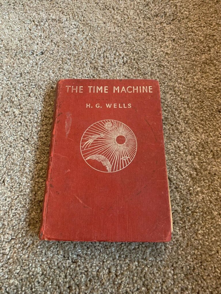
I was however disappointed to find this on my colleagues desk……
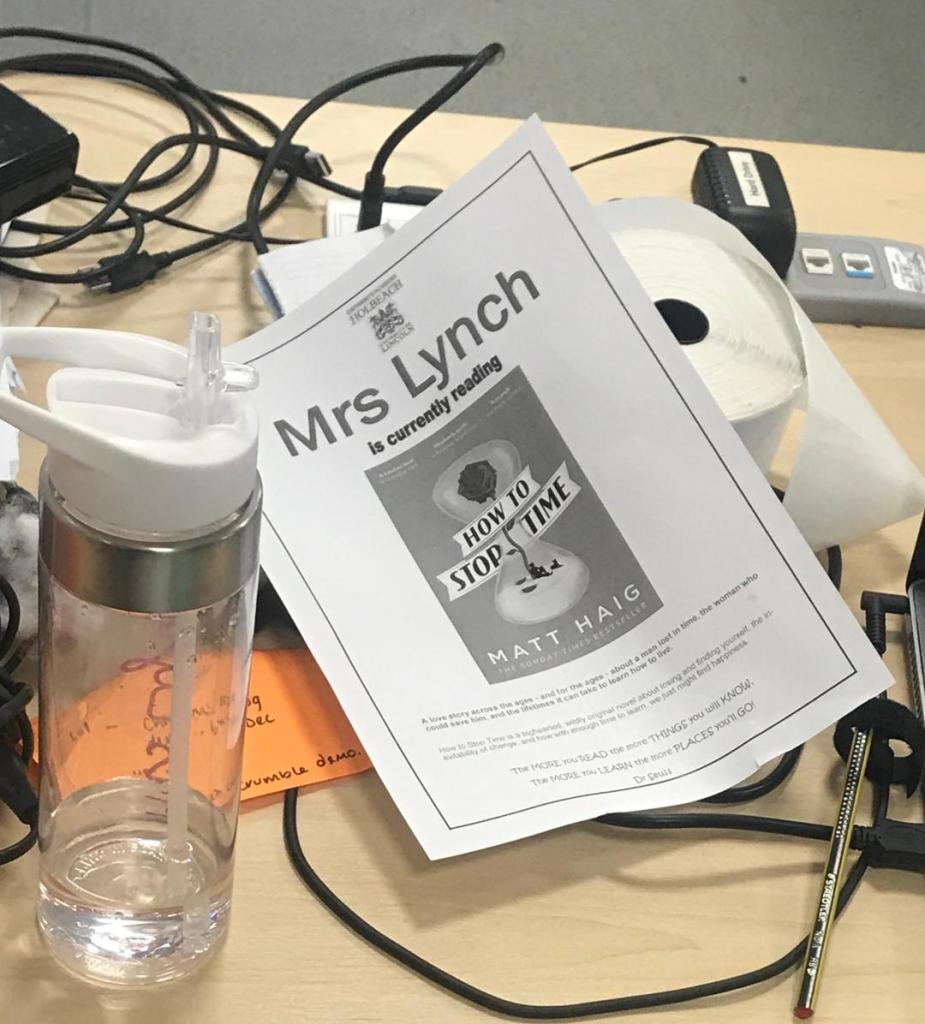
As part of a learning reading thingy we do for the students at school, each teacher has to put the book they are reading in a frame mounted on the wall outside their classroom door in an attempt to inspire students to read! This was sitting on the desk waiting to be framed! I noticed immediately the design on the front is very similar to mine! – My first initial reaction was “RIGHT!! NOW I’VE GOT TO START ALL OVER AGAIN!!” but then logical Amy responded with “well, at least you know you are on the right tracks when your work is similar to that of other designers and successful published books” I thought however it was worth documenting! My colleague was also very complimentary when she said “Oh yeh! they are similar!.. but this version is rubbish! have you seen it in colour? – it’s a plain blue background and not very detailed at all!” *cue me logging onto Amazon and finding this:
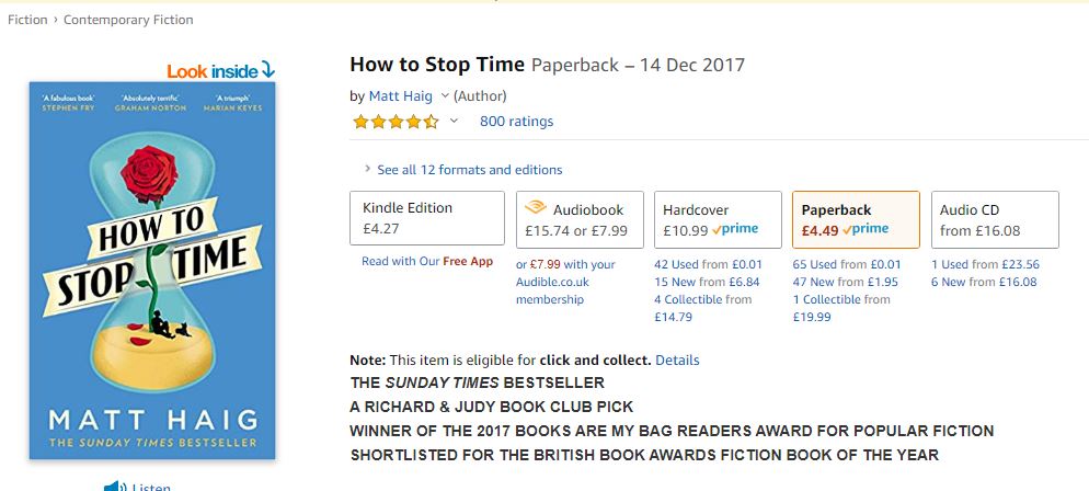
Its a best seller!….
The Time Machine: Drawing Development (cont.)
I have back tracked slightly from my last post!….
Sat on my break at work and I was asked how my uni work is going, I reached for my phone and passed it around the table to show what I have been working on… The feedback was good! – everyone thought my drawing was good!… however, there was some slight confusion as to whether the flowers were coming out of an hourglass timer (sand timer) or a regular broken vase… Having another look after a few days apart from it I could see where this could be confused. Although I was pleased with my drawing I felt like it was still missing elements.. I decided to redraw it… AGAIN! but this time make sure it is obvious that the flowers are coming out of a sand timer and not a “vase”!
I changed the flowers slightly also.. I was unsure of doing this but I think it could work…
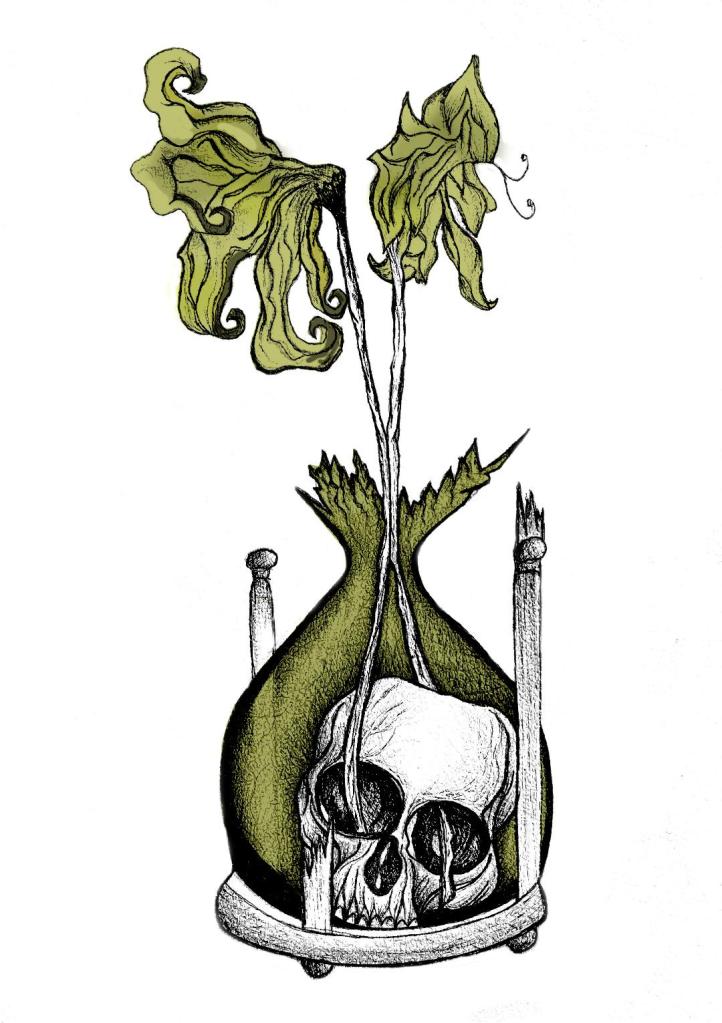
My flowers before looked quite wilted and withered and were a generic flower.. What I have drawn now are 2 white roses. I debated on using roses as the book states “2 white flowers” but when I looked up the symbolism behind white roses, to give someone white roses represents purity, inncocence, kindness and love. All of these traits are what Weena gave to the time traveller.
The sand timer (hour glass) has sand in the top half coming down to the bottom of the timer, before the sand hits the bottom of the timer it forms into a hand which holds the skull. The hand shows authority and dominance and represents the Morloch people. The skull represents the cannibalism aspect in the story; “killing the Eloi like cattle.”
This is what I sketched up last night:
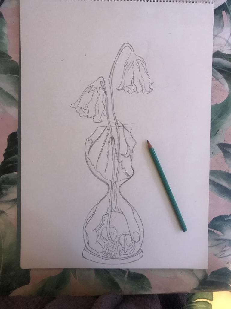
It took me forever to get the hand right, I am hoping it will look even better once it is inked.
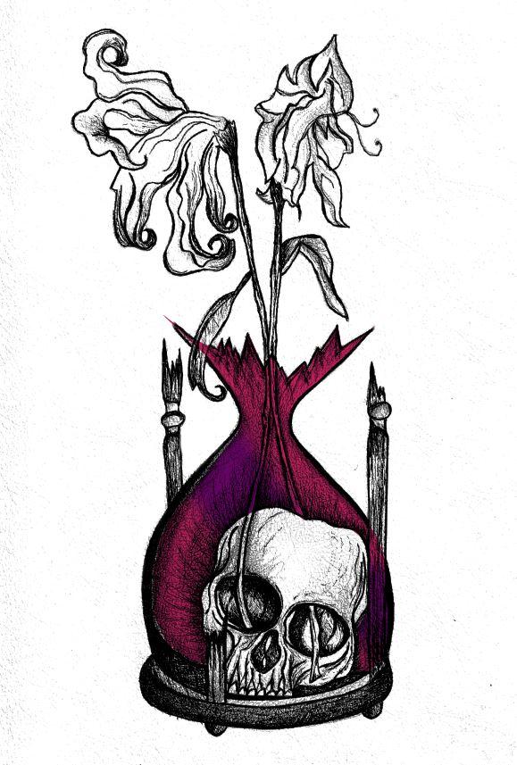
I was not happy with the broken glass on my last drawing. I accidentally at home smashed a circular wine glass, I decided to keep it and use it to draw from for the broken glass aspect of my drawing.

So far I feel like this design works better than the previous one, I shall get it inked out and then see some more!

The Time Machine: Digital Development
Yesterday I decided to have a go importing my hand drawn ink design into Photoshop and have a play around!
I am not a pro at Photoshop to say the least, so the tutorial I watched on Skillshare a while back that I wrote in my blog about really helped me!..
I decided to change the colours, I want each of the 3 books I design to use 3 different colours and work as a series in that the designs are the same and also the colours tie them together. The flowers in the Time Machine are white but dead, brown and withered at the ends so I decided to alter the colours to match this… I went with a white/murky yellow/black colour scheme.
To get me familiar with changing the colours and doing certain things in Photoshop I had a play around first, this was the trial starter piece..
Using the pen tool to draw around areas and making them a selection so that I could add colour to the area and then multiply to blend it in with my line drawing. I then created a clipping mask on a duplicate layer to further blend more colour in.
When I felt more confident I then started on a proper version;
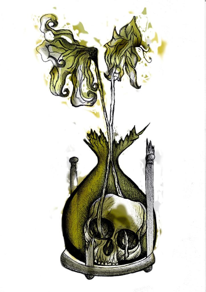
This one I kept the colours quite subtle… I coloured in all of the flower shapes with a murky yellowish colour and carried this on into the hourglass. I liked it but it didn’t shout out at me..
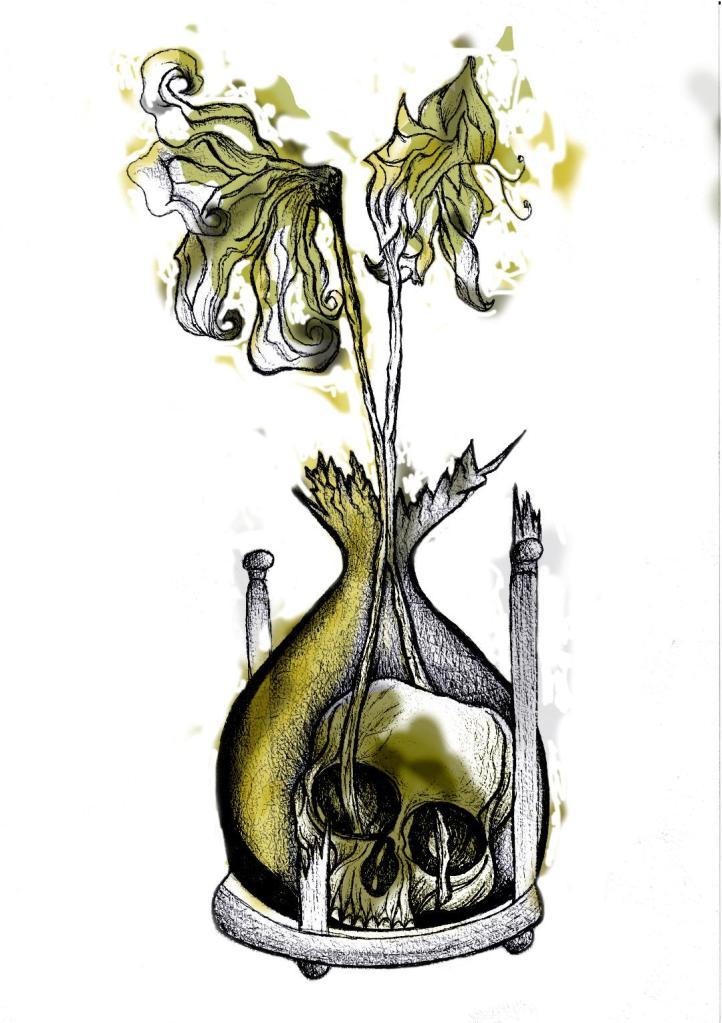
With this version I messed around more with the colours and blending them to create 2 tone effects. I accidentally moved the flowers layer but actually quite liked it being out of the shape slightly.. It gave a mix of the 2 colours; white and yellow. I also created like a water colour/watermark effect at the top of the petals.
In this version I made the colours more deep and murky. I feel the colours are the strongest in this version. Overall I am happy with the progress I have made with it and the new skills I have learned, however It still needs improvement… I now need to find ways of how to make it work on a book cover with the typography element etc.. I think though that I shall draw the other 2 book designs and then take all 3 of them together and then look into layout and typography etc..
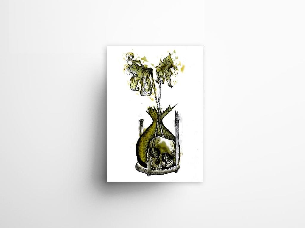
I also looked at mockups for displaying work more professionally on my Instagram account. I downloaded a simple poster mockup document and then added a drop shadow around the edge of my image.
The Time Machine: Drawing development (cont.)
Last night I finished the second attempt at my drawing! – The new and improved version with the “time” element. I feel that when you look at this image you can get more of a feel about what it is relating to rather than the version with just the bottle. it works better as an overall design for the book as it gives away more of what the story could be about.

I think I shall develop this a little bit by importing it into Photoshop and adding different colours. I think I shall also experiment with different media; watercolours, pencil crayons etc… I have also bid on an old 1950s edition of Time Machine that is falling apart specifically so I can tear the pages out and collage them into my design (That’s if I win it!). I want to experiment a little bit more!


The Time Machine: Drawing Development (Cont.)
I finished off my first design drawing of the skull inside the botanical bottle and the 2 white dead flowers out of the top.
I am very pleased with how it looks! (and it looks quite nice on my insta feed! ;p)

However!…… I feel like I am diverting away from the purpose of the book (with my pure shock at how decent this actually looks after so long not drawing!!) – I feel like it is lacking the “time” element… The whole purpose of the image on the cover is to give a snippet of what the book is about, at the moment it could be about anything! The bottle could be seen as a normal vase so it’s not as though the science part I am trying to portray gives it away!
I thought back to the hourglass timer idea I had in my sketchbook and began to think about how I could bring that back into my designs..
I scoured Pinterest (see below!) I wanted an hourglass timer but a broken one; I wanted the flowers to protrude out of the broken glass. The Middle tattoo on the link below is the one that gave me the idea for my next drawing.. I could turn the bottle on my present drawing into the bottom broken half of an hourglass timer.
The drawing would then have the “time” element, the cannibalism story of the Morlochs with the skull and the 2 white flowers which symbolise that the time travel happened and represents the love from Weena.
This is what I have so far!…

Book Cover Design: Inspiration and influences
This page features everything that I have found out and about on my travels that have inspired me in this exercise.
I have found influence and inspiration in a lot of places while I have been out and about and seeing different things. I have been amazed at that when you are actually aware of what you are seeing around you that you actually find a lot of relevant research and things which link!
I guess this page is like a moodboard of everything I have found!


The Time Machine: Design Inspiration
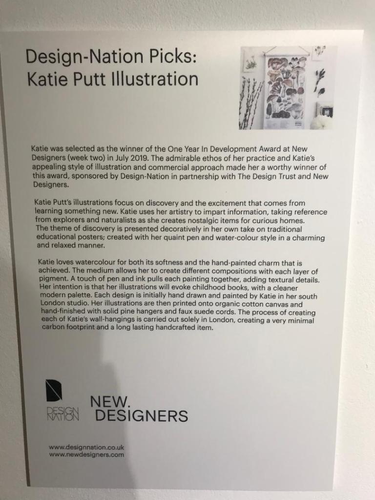
Katie Putt Illustration
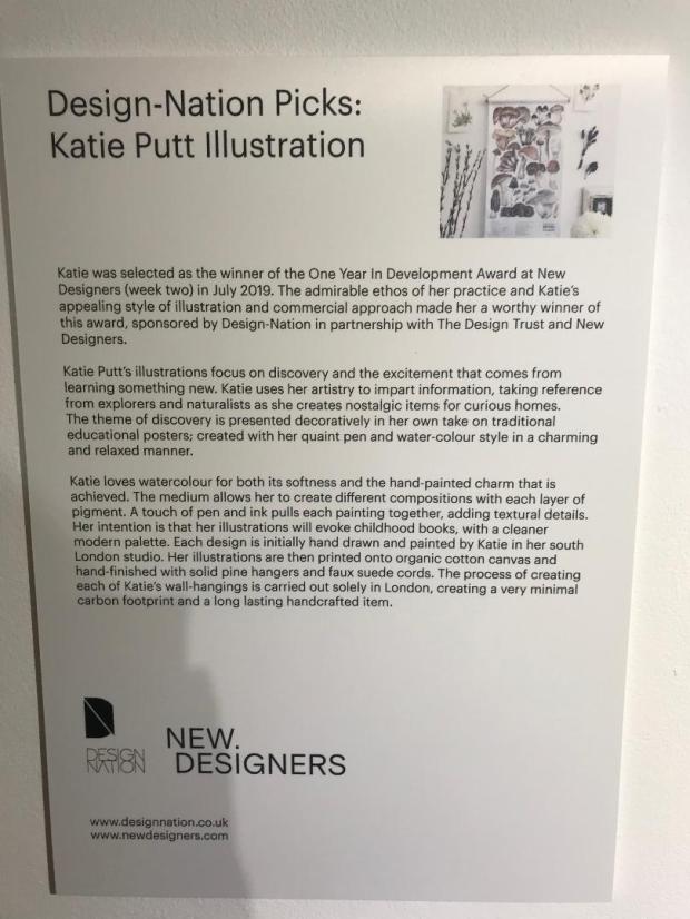
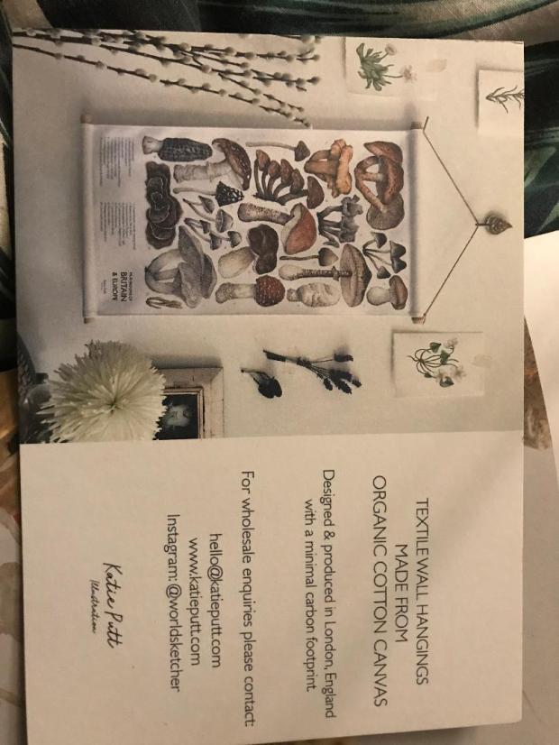

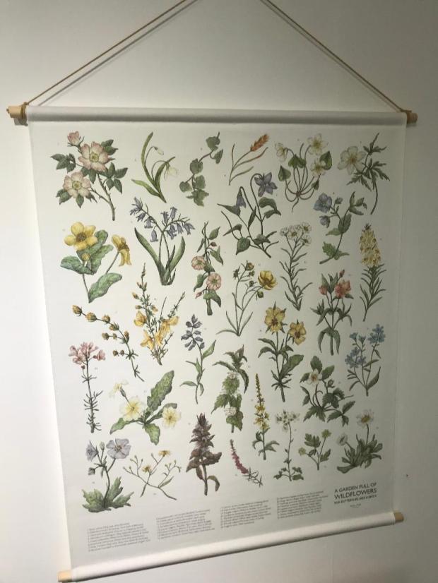
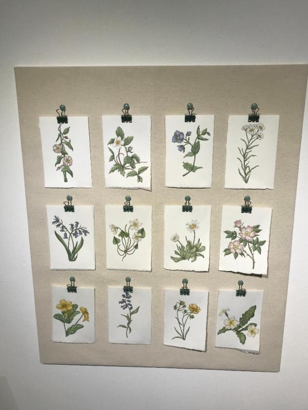
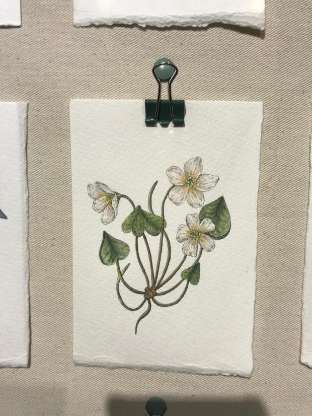
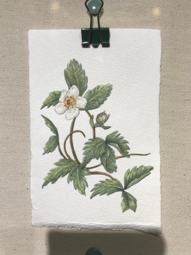
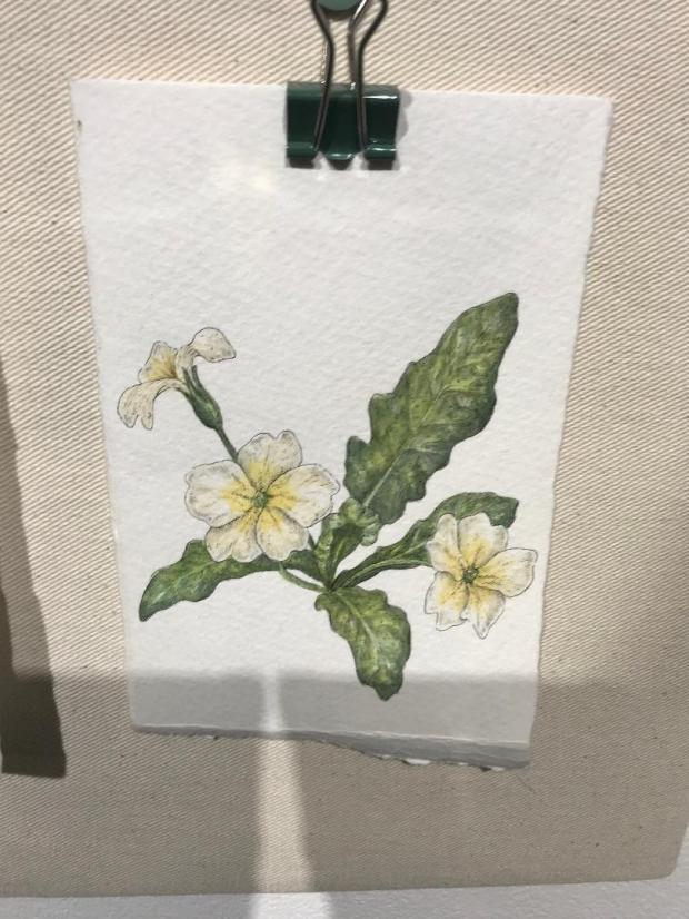
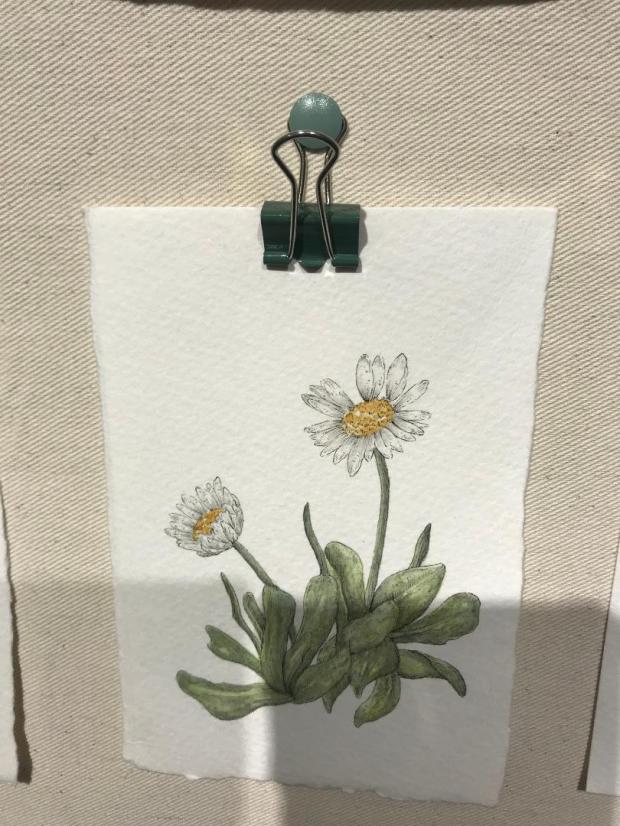
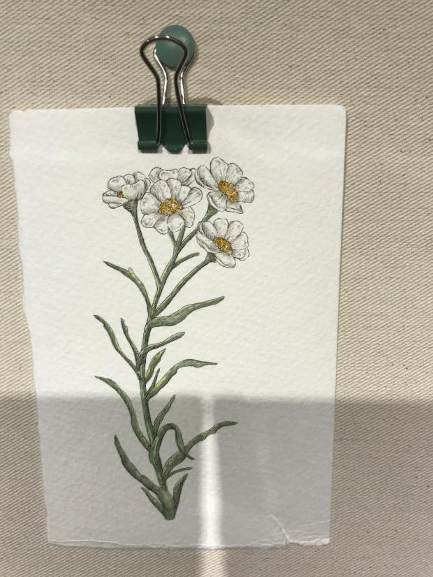

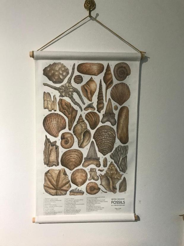
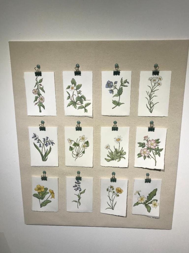
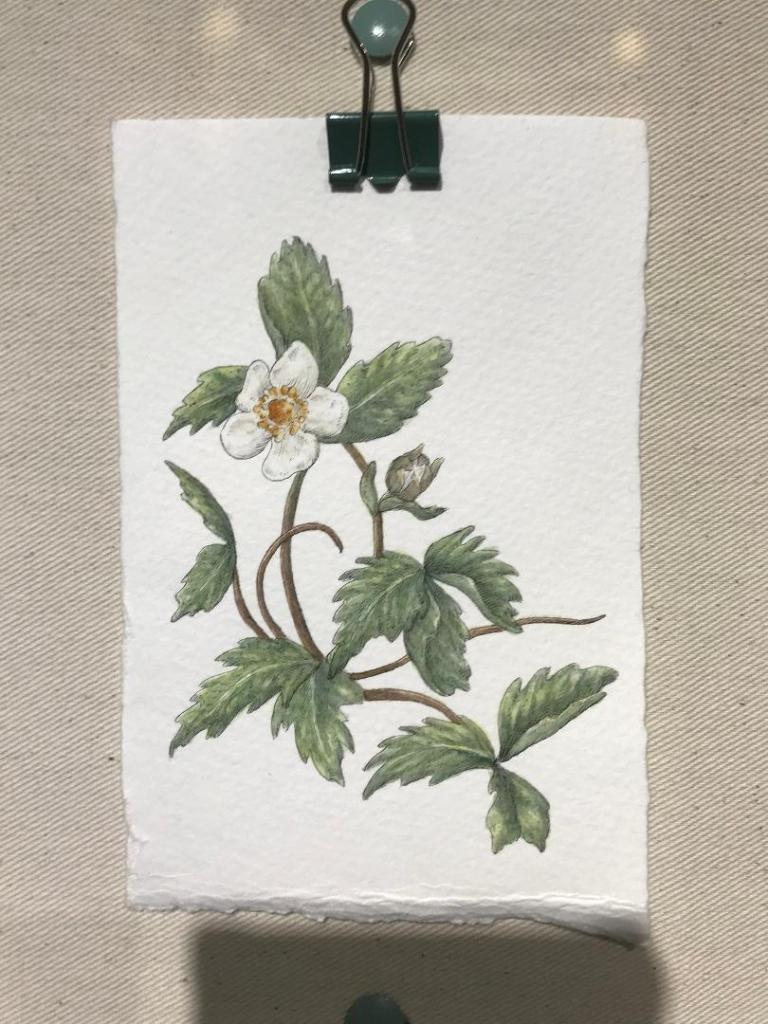
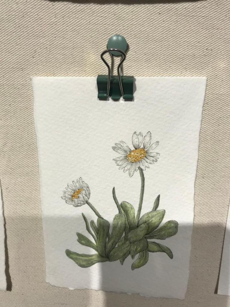
At the weekend I had another look in the NCCD in Sleaford. There was featured work from a designer and Illustrator called Katie Putt. I felt like her paintings and work are relevant to record in my learning log because what I am tying to achieve for my final book covers are very similar.
Katie bases her work around botanical flowers, insects, shells, fossils and Dinosaurs. Her work is based on curiosity and discovery. There were a few of her wall hangings in the gallery and I think her work is beautiful! Some of the paintings were similar to mine in the fact that she had painted them onto ripped, textured watercolour paper. I have drawn my designs so far using Ink pen but I shall also experiment by adding colour and using watercolour to create a washy effect.
