


Book Cover Design: The sketchbook pages


That’s a wrap! :D Book cover design exercise DONE!
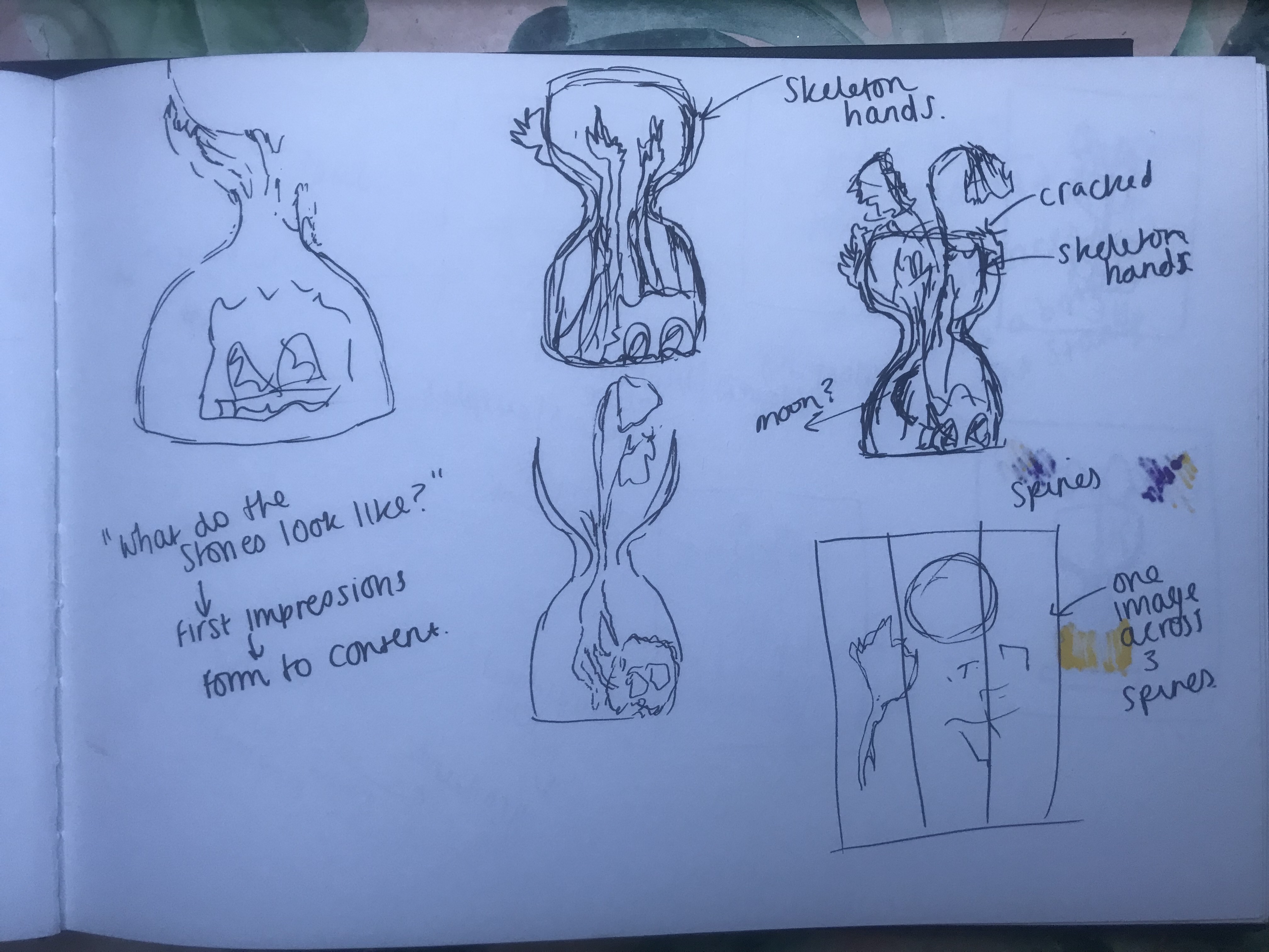
Following on from my last post I have now finished the Book design exercise!! (well!… almost! I wrote this post a few days ago and have been keeping it in my drafts! – I have relooked over my designs and seen one potential flaw!… I have written about it at the bottom of this post!)
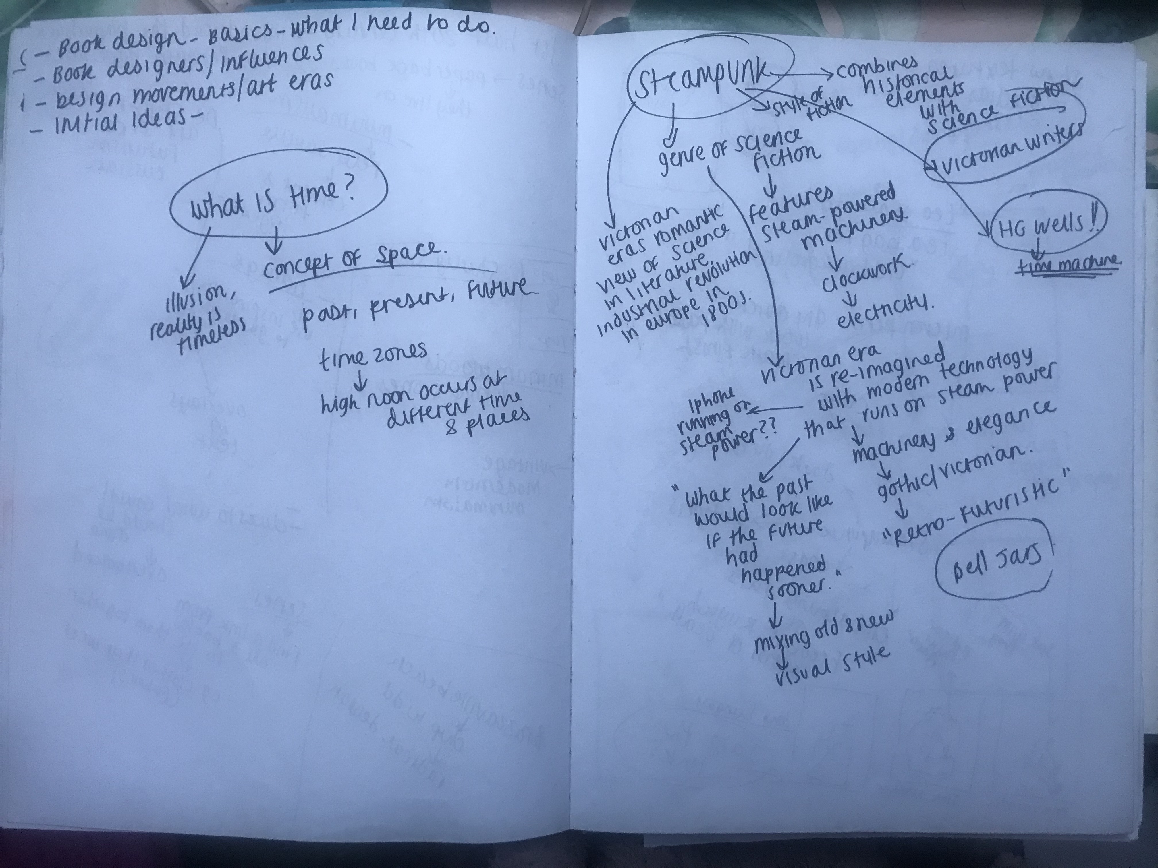
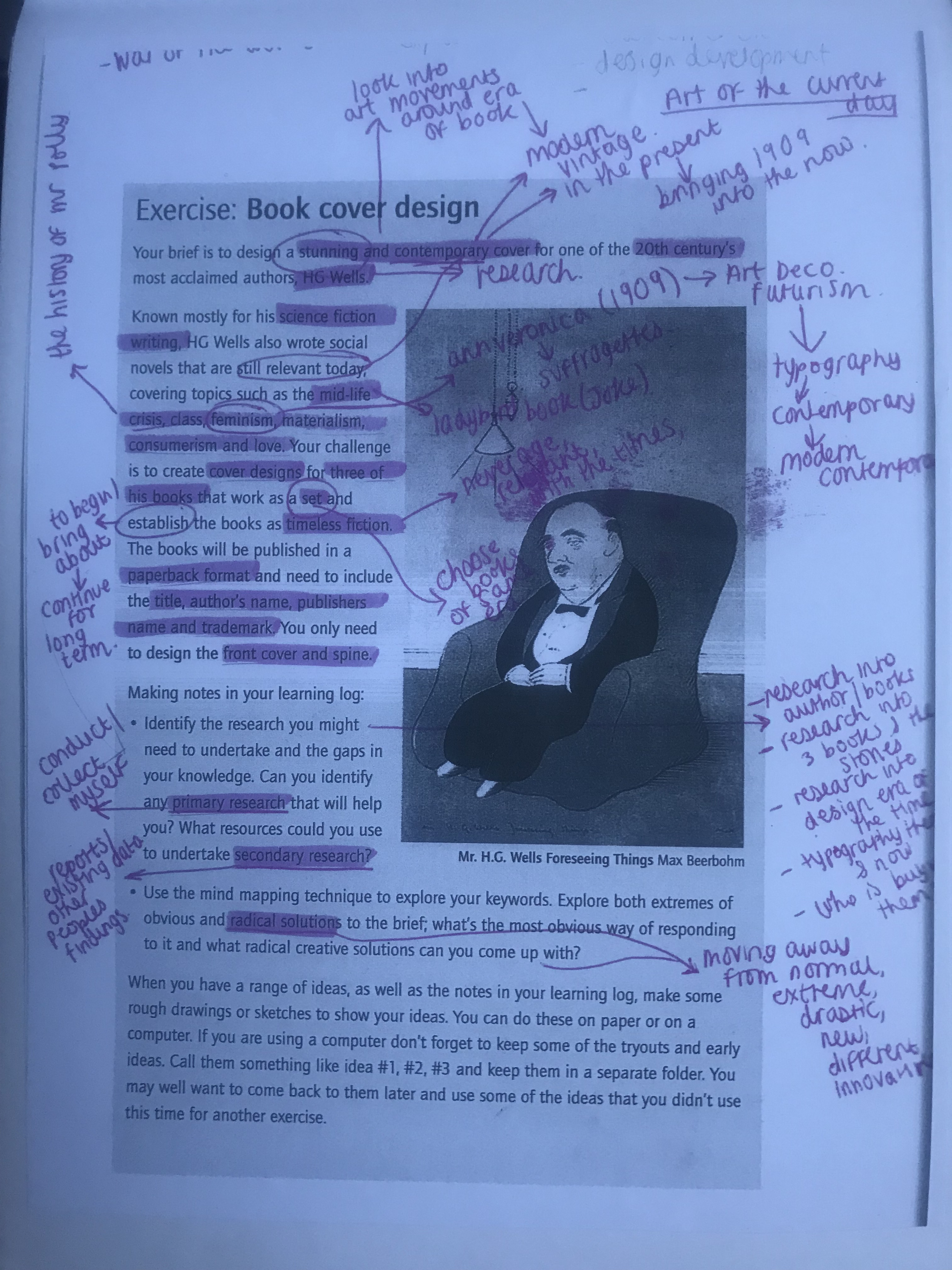
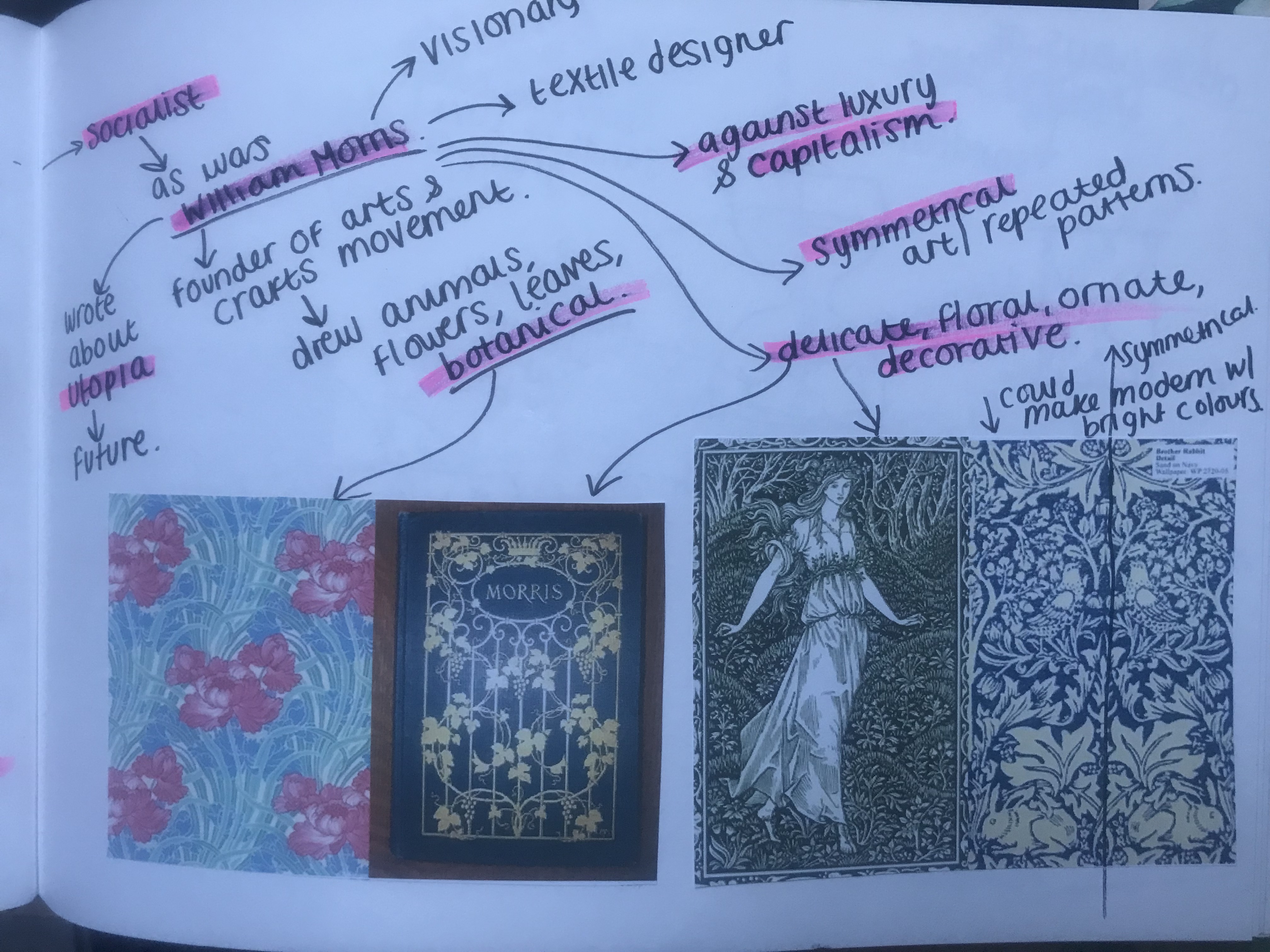
As I said in my previous post I was feeling very apprehensive about starting this exercise. I didn’t know anything about the author and did not know anything about any of the books he had written. Book design is something that I had never looked into or done before and I was completely overwhelmed with where to start with it. Finishing this exercise I feel that I have learned a lot from researching into the author and his books, watching TED talks by Chipp Kidd about successful book design and looking into existing designs out there. I feel I have achieved successful final design outcomes. I really enjoyed this exercise and as I said in my previous post book design is something that I would potentially like to go into.
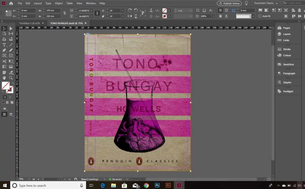
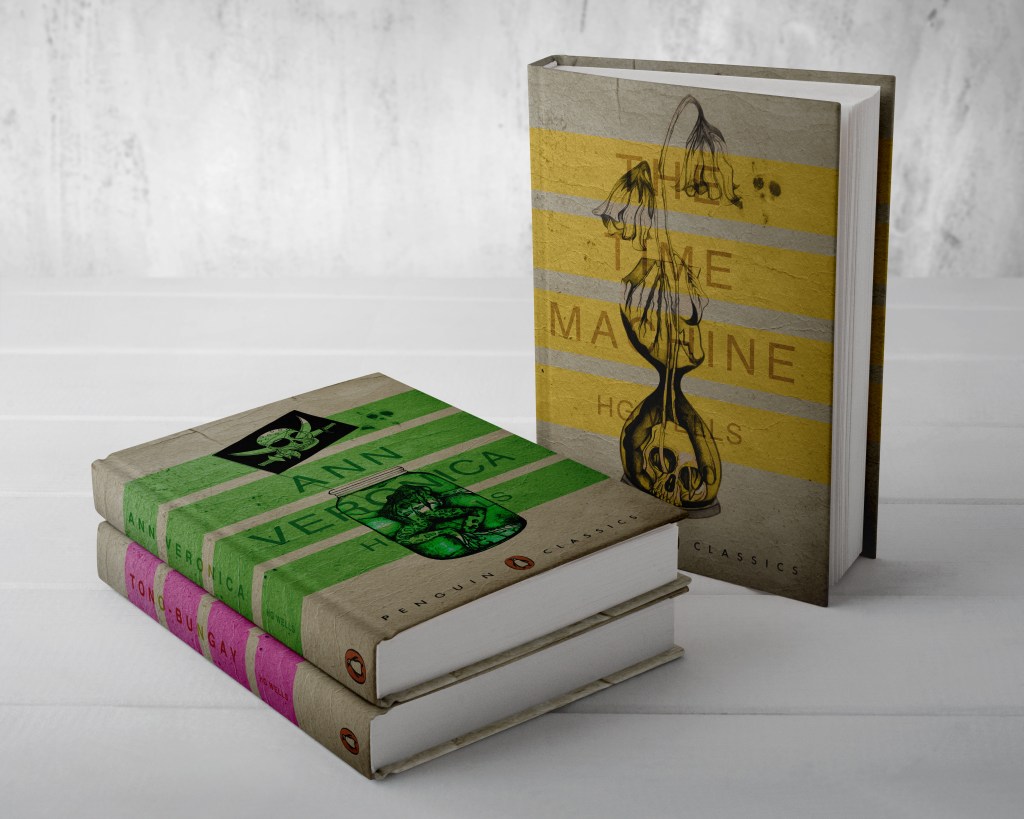
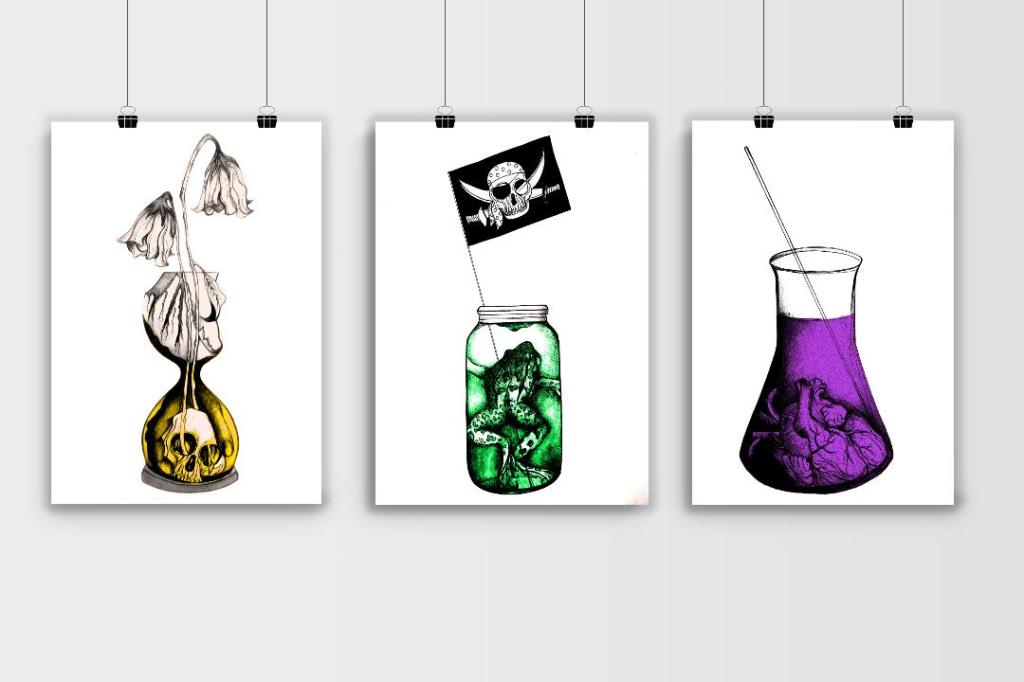
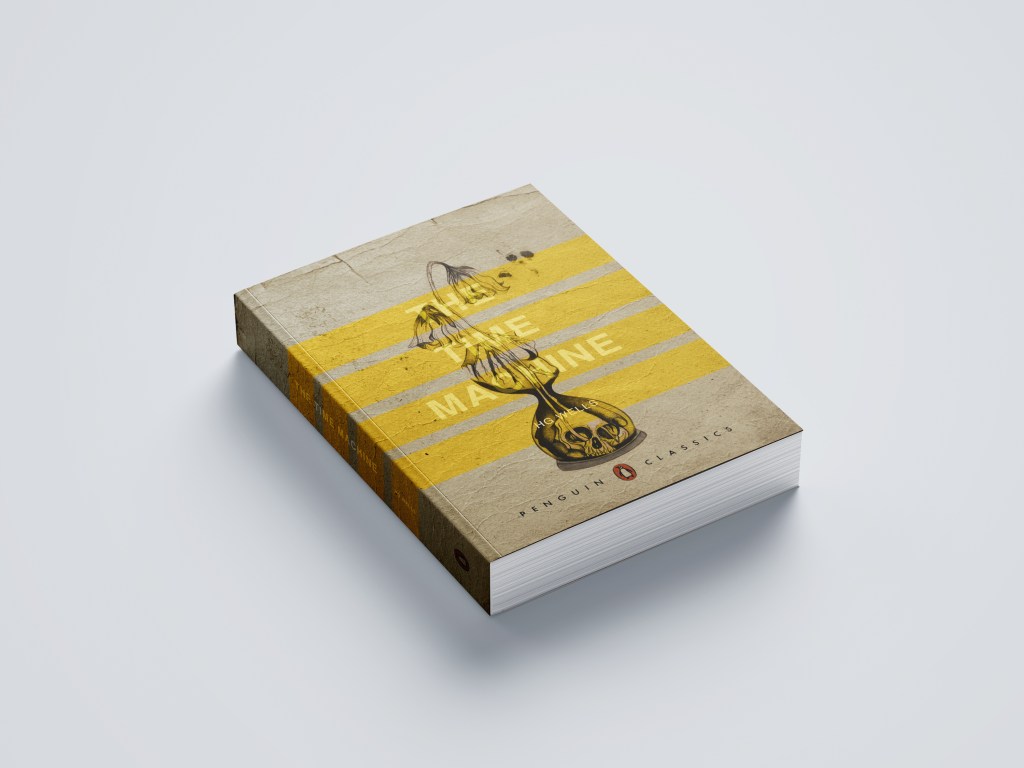
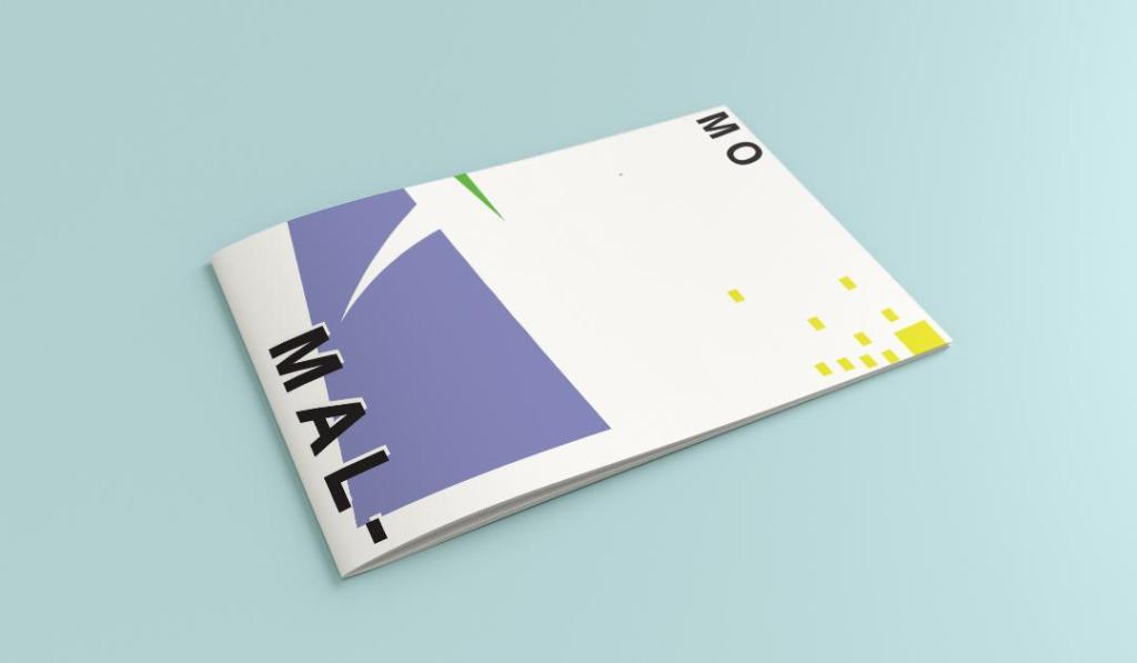
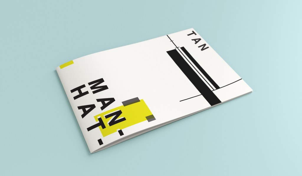
From my last post I adjusted the typography on the books; although some parts of the text are still hard to read, I actually quite like this effect. I also designed the spines. Once I saved the designs as PDFs I then imported them into InDesign. I set up the document in InDesign and worked out how big to make the spine by calculating the number of pages by the weight size of the paper used in paperback books (usually 80gsm). The calculations came up to about 4mm but I decided to work larger than that so that I would have more spine to work with in the design. I then created PDFs and mockups for my final designs. The mockups that I did for my Instagram posts I mocked up on hardback books. There are lots of free downloads online for free book mockups but most of them are for hardback books. I specifically wanted one to feature all 3 books at the same time. The mockups below show this.
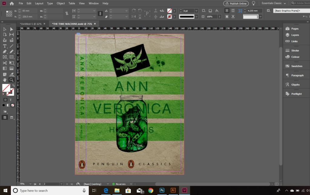
The images above are the PDFS of my final designs with the spines. The screenshots below are the makings of them in InDesign.

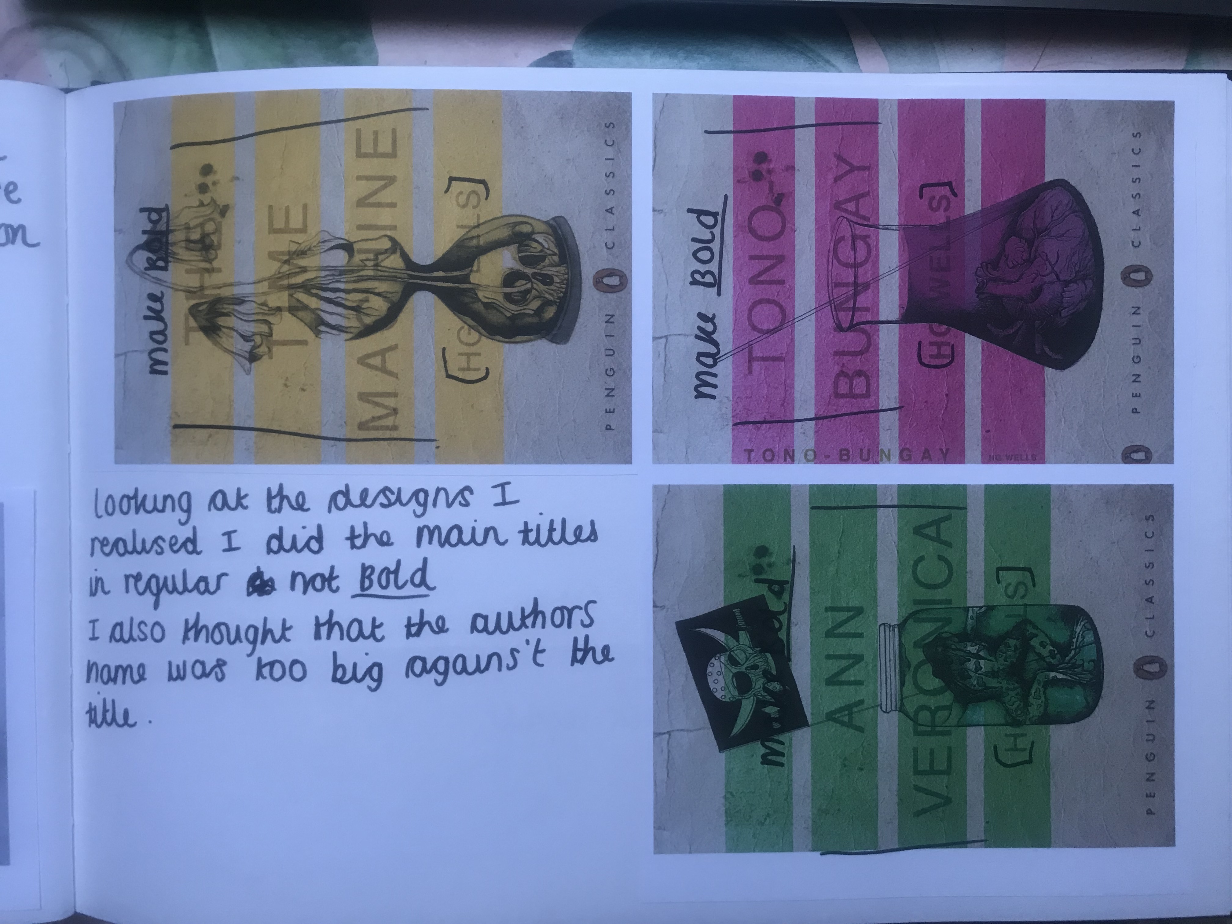
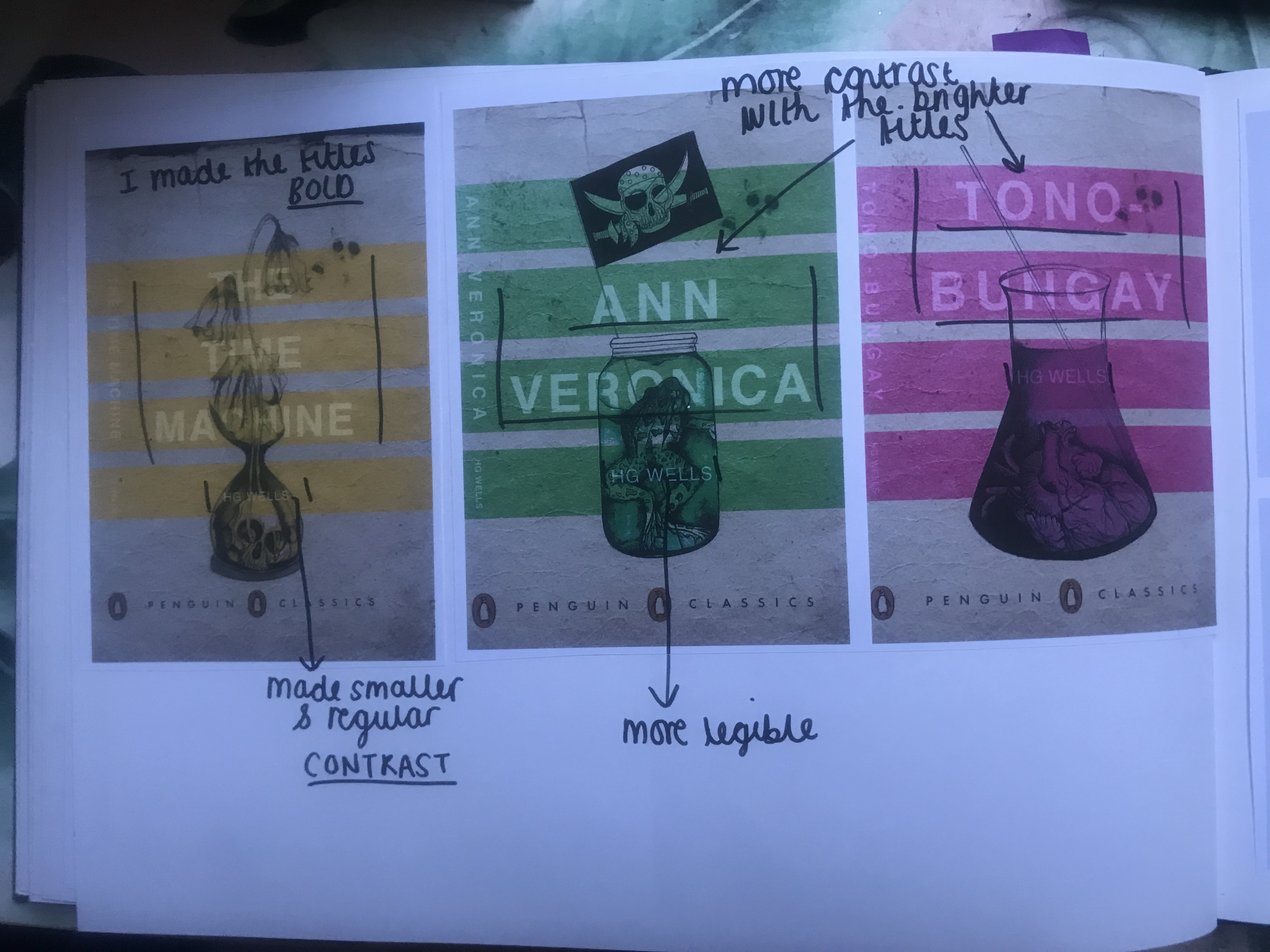
*** Since writing this post as a draft a few days ago, I watched a poster critique by @thechrisdo. I know that this is book design and not poster design but the same rules still apply. It was so obvious that I don’t know why I did not spot my mistake earlier!… I haven’t made the titles of the books bold. I need to make the titles bold and the authors name in regular. This will show contrast between the 2 and also make the title stand out more. I may even adjust the tracking of the titles also.

The final stages! – Making the HG Wells FINAL book covers!
I have FINALLY reached the final steps to this exercise! I have really enjoyed the design process though even though it has been a long and overdrawn one! – I always said I didn’t want to half ass it and I wanted to make sure that when it was complete that I had done the very best that I could have done with it! Putting the typography onto it and making them into book covers was a really daunting prospect! – However, I can go to bed tonight knowing that I am one step closer to making them look like the real deal! Doing this exercise has really made me also think that going into book design is something that I would want to do. I find now that whenever I go into bookshops I am scanning the shelves for the covers and not necessarily the books! Researching into Chipp Kidd and purchasing some of his books as well really interested me and made me think deeper into what really goes into the design of a good book cover!
“Never judge a book by its cover….. Unless you’re a designer!”
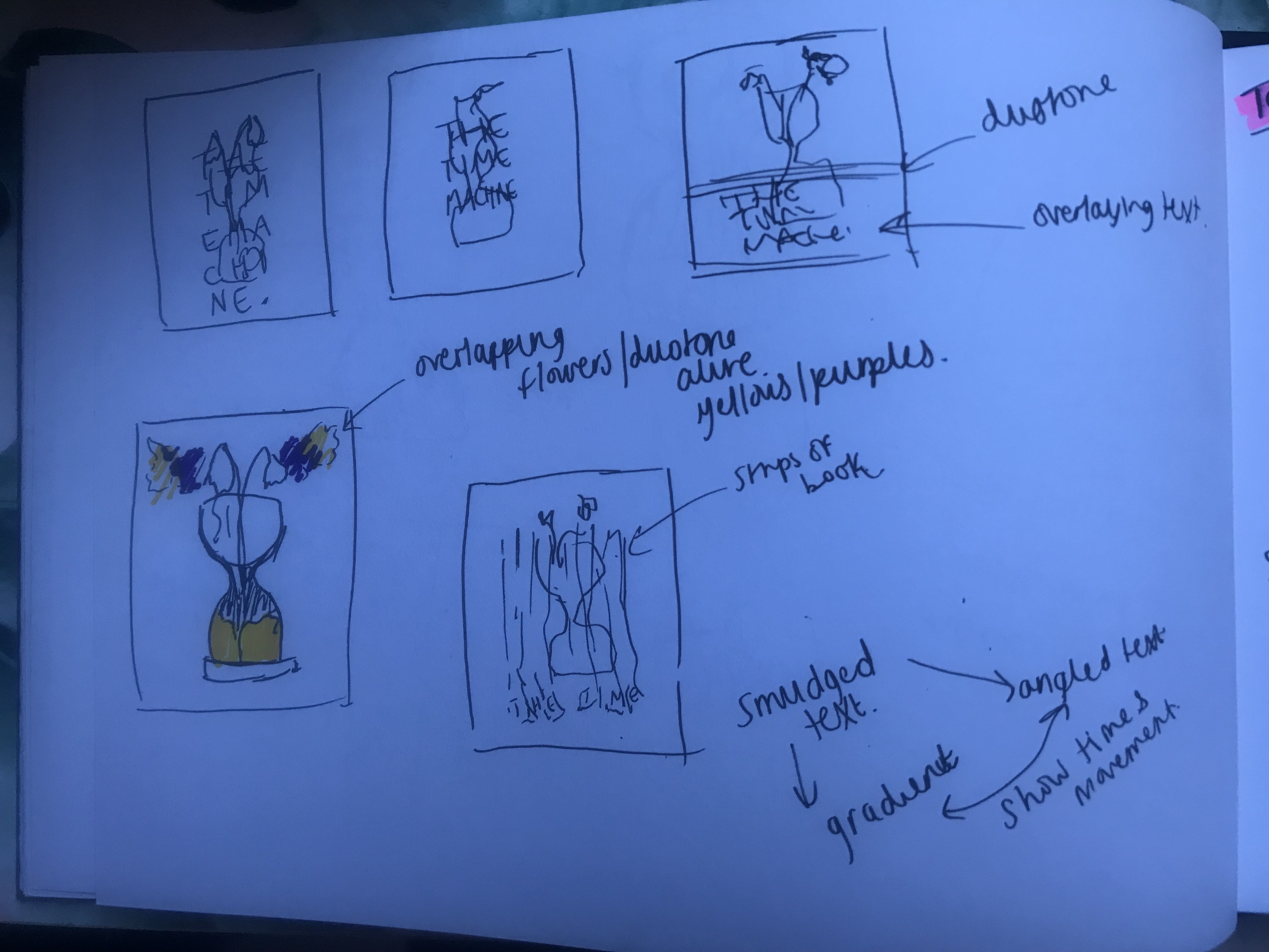
I started off with the 3 designs I tweaked on Photoshop (below):
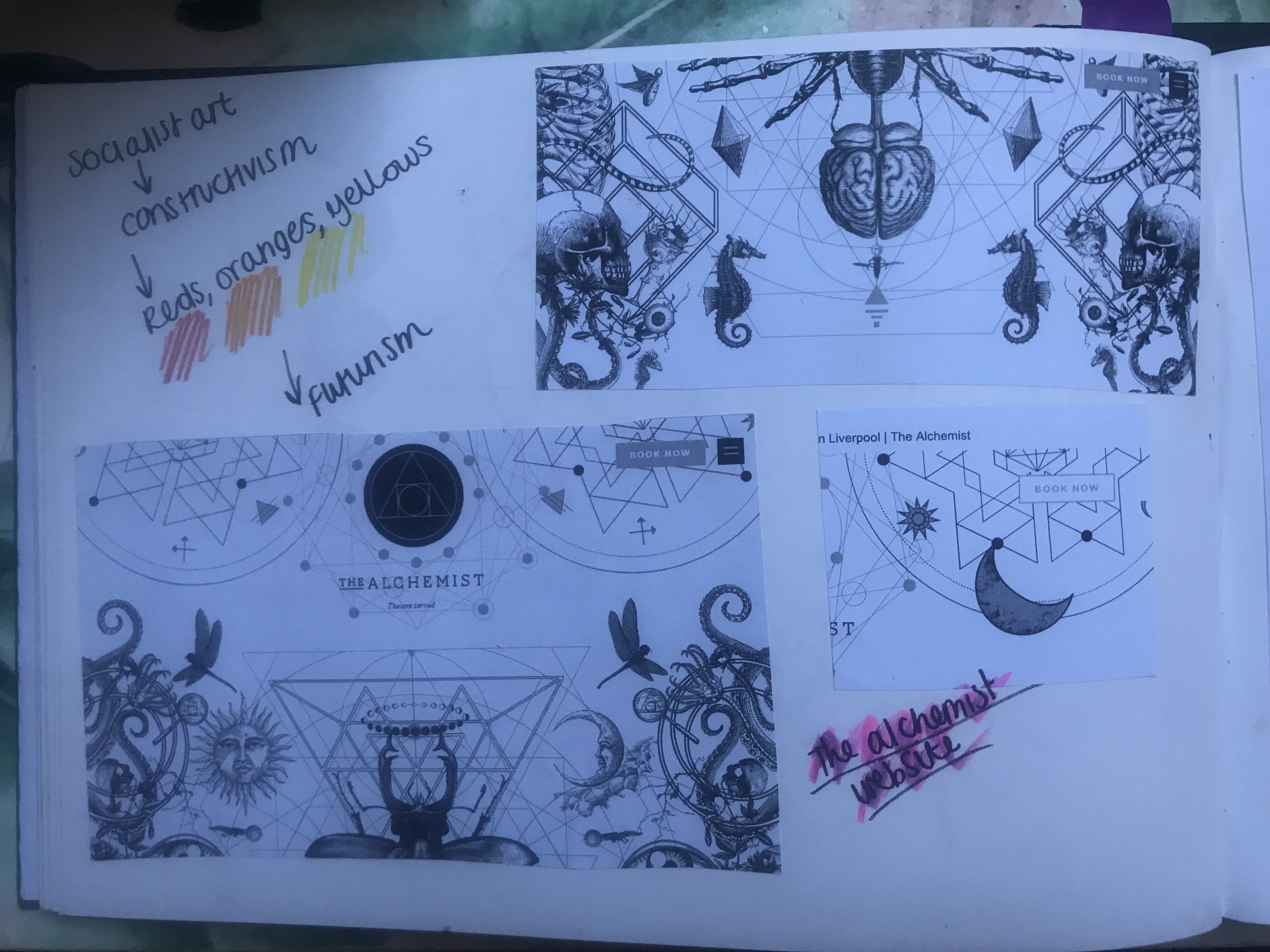
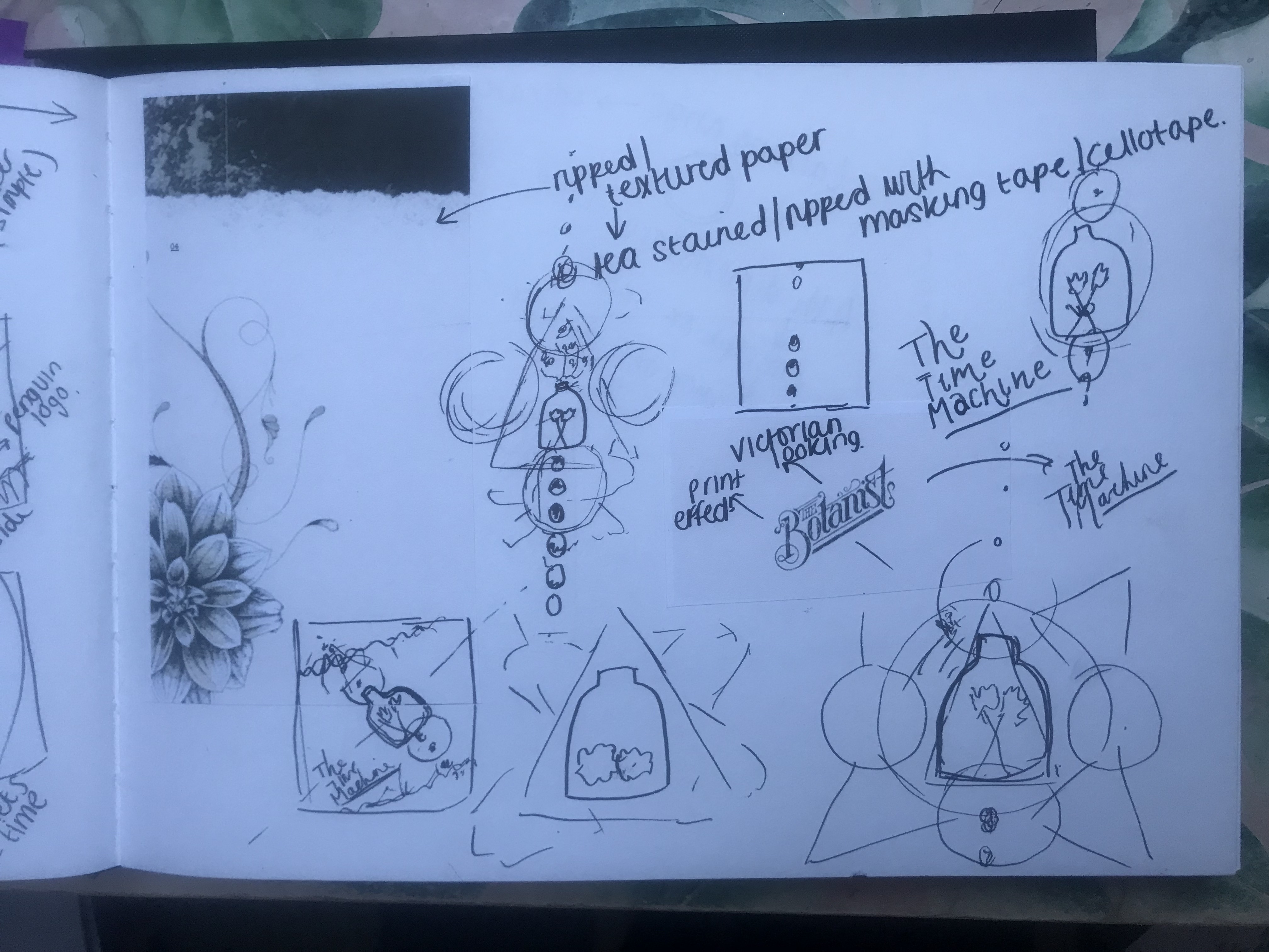
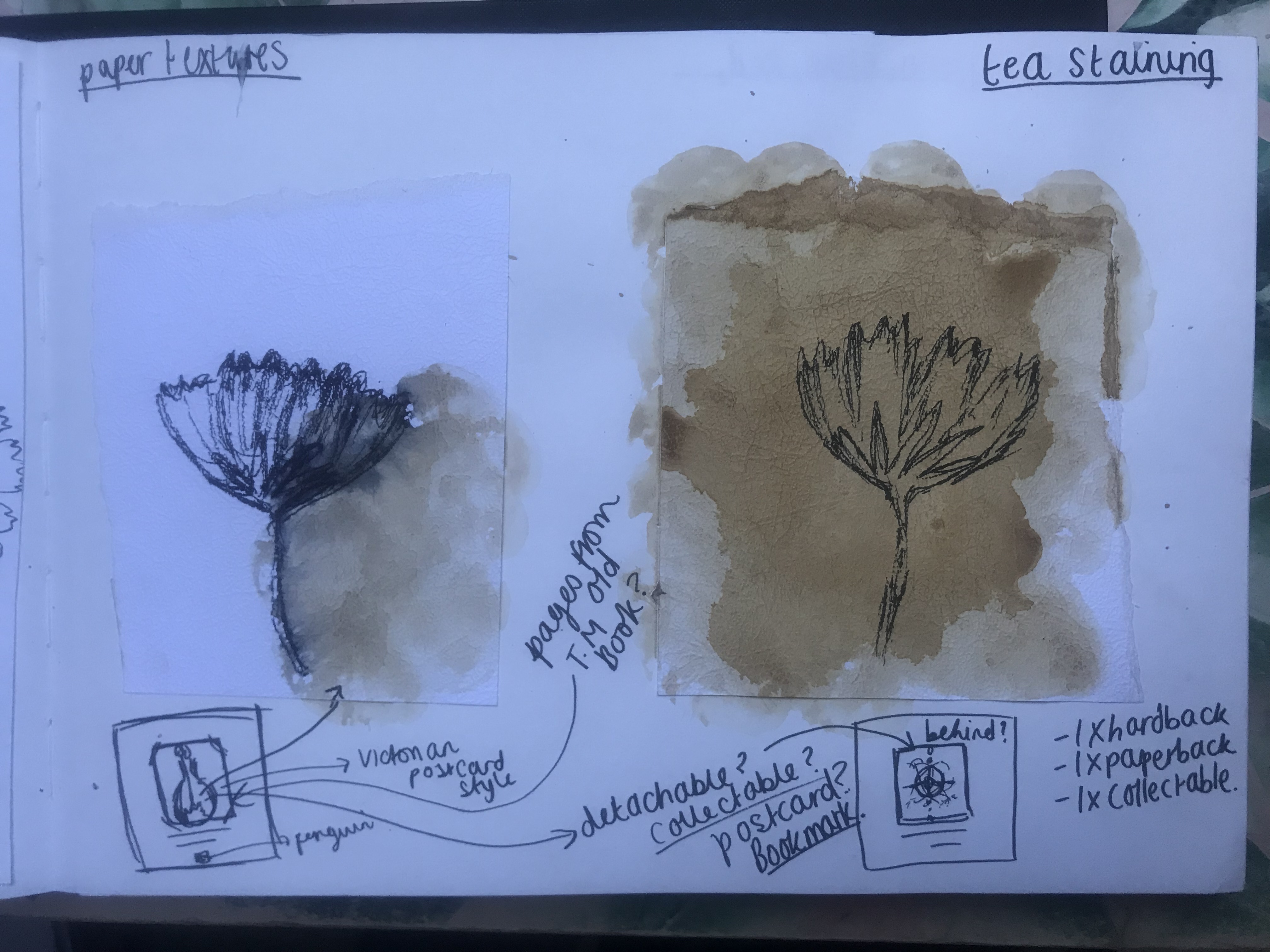
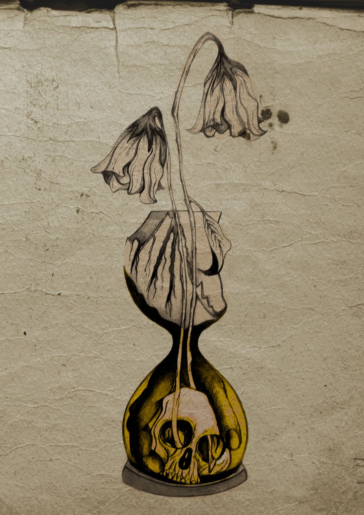
I have a current obsession with textures… which is a good thing seeing as one of the suggestions in my last feedback was to add texture to my work! I watched a video by Roy Cranston on Chris Do’s @thefutur where he spoke about where and how he sourced his textures for his poster work, it was funny because I already collect random photos of interesting textures and findings but just never use them! He also mentioned how you have to scour the internet for the free ones. I thought it might be interesting to add a texture to the covers.. maybe like an old vintage paper feel? This is what I went out to try and do.
I found a texture online which resembled ripped, discoloured old vintage paper (below) I imported this into Photoshop and did an overlay of it with my designs.
I think the texture worked extremely well! (below) This is what the first cover that I designed looked like with the texture included:
I then had the problem of successfully adding text onto the cover without making it look too drab, boring and old fashioned. Although I wanted the covers to have a vintage feel I also wanted a modern feel to the design to bring the book into the 21st century and to make sure that it is still relevant for many more years.

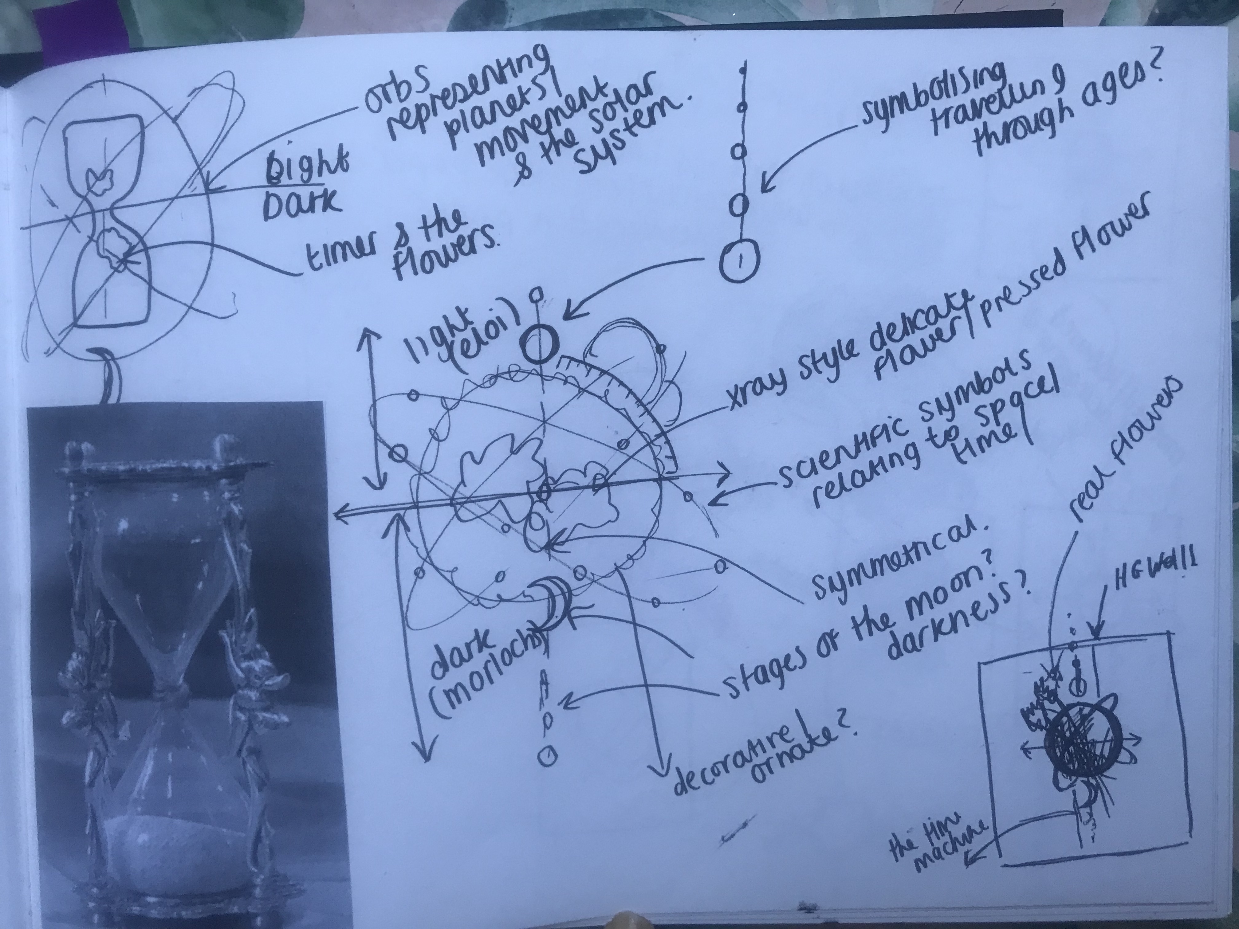
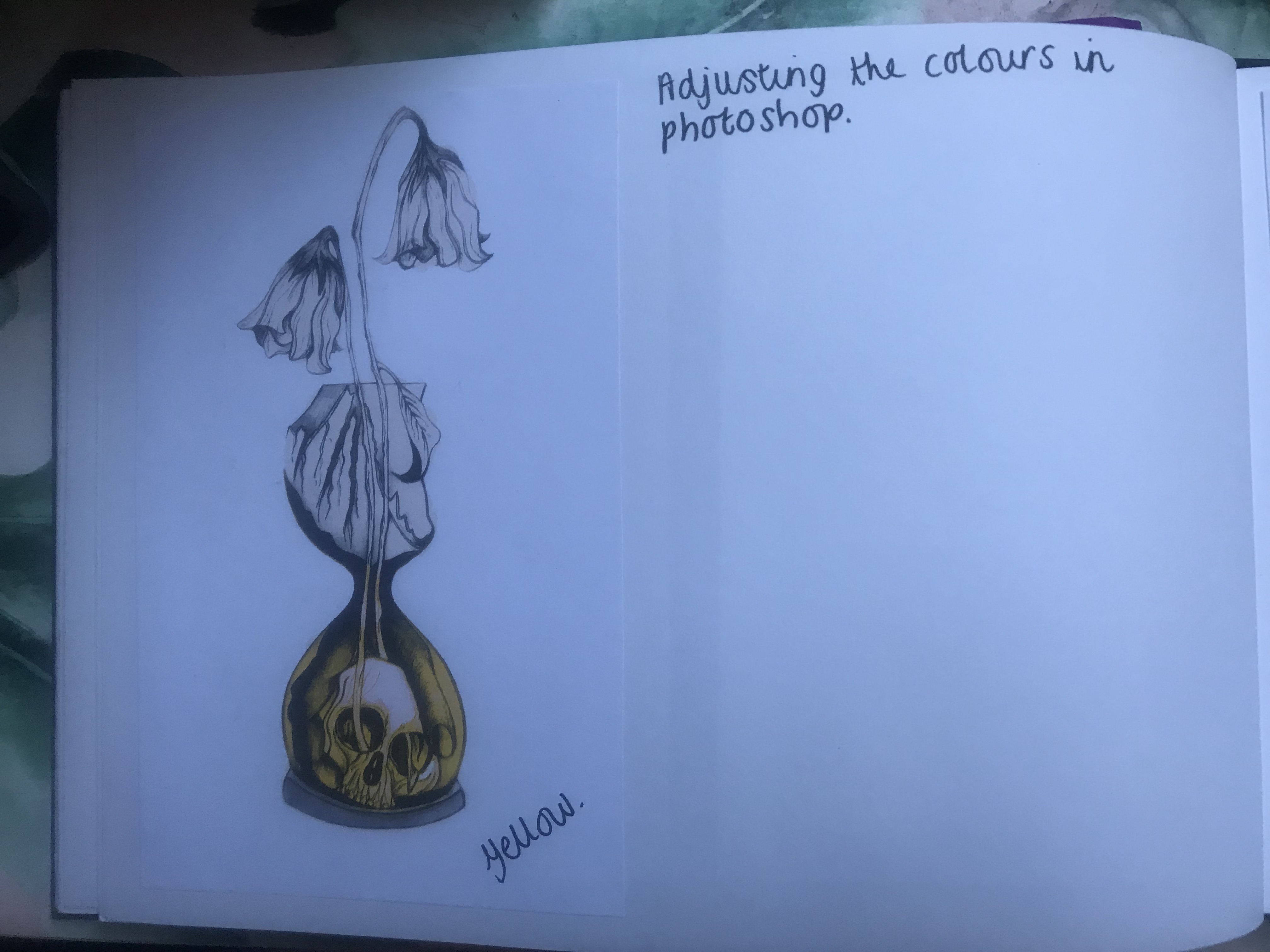
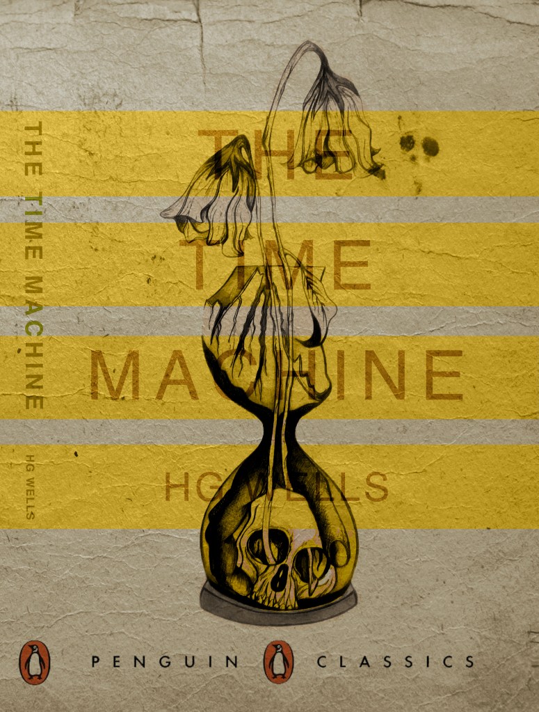
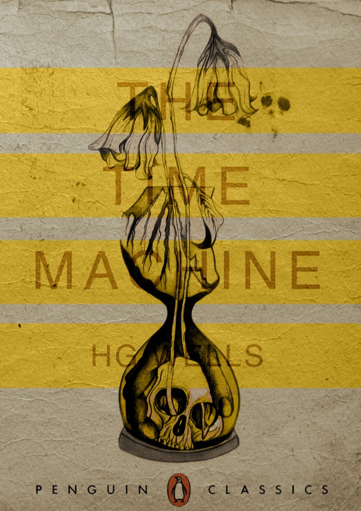
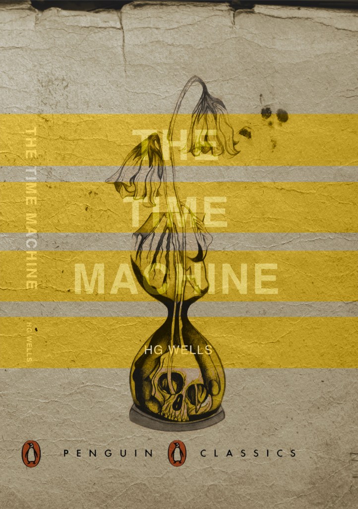
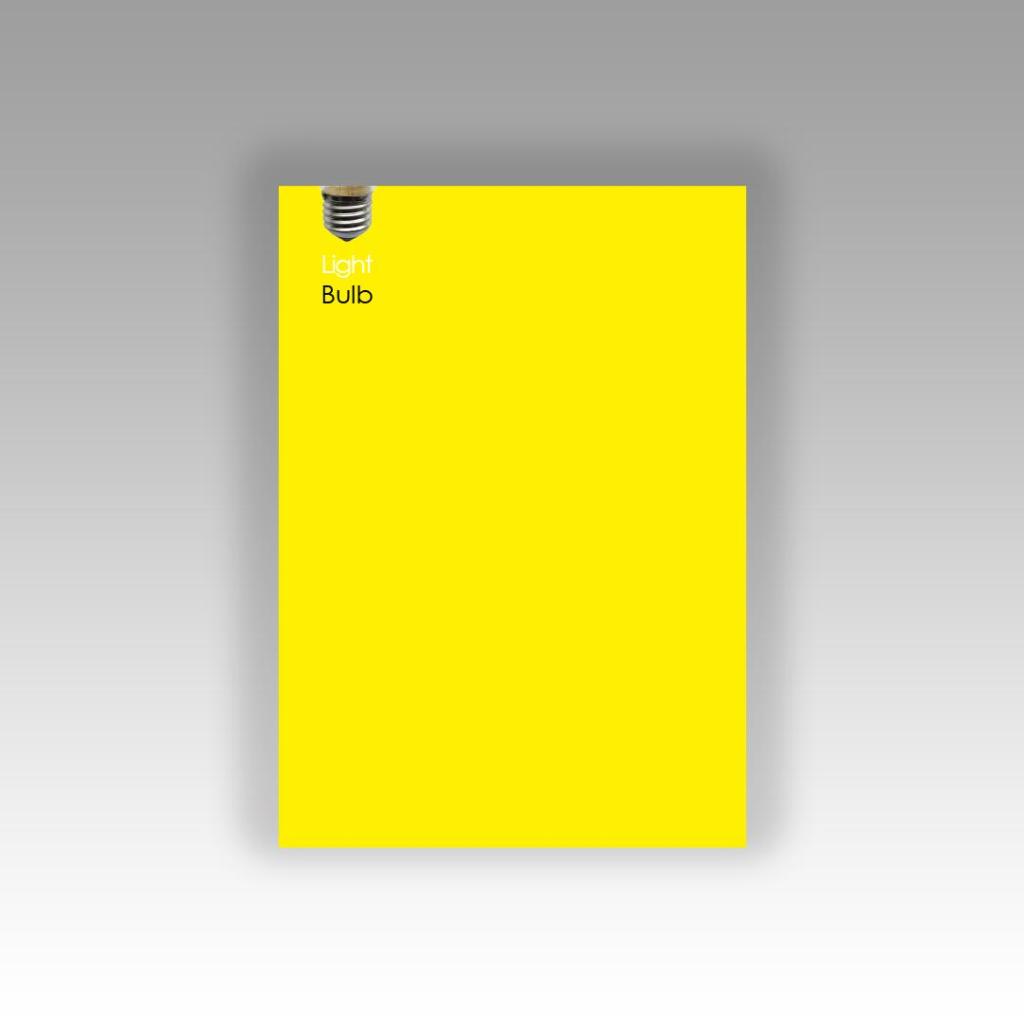
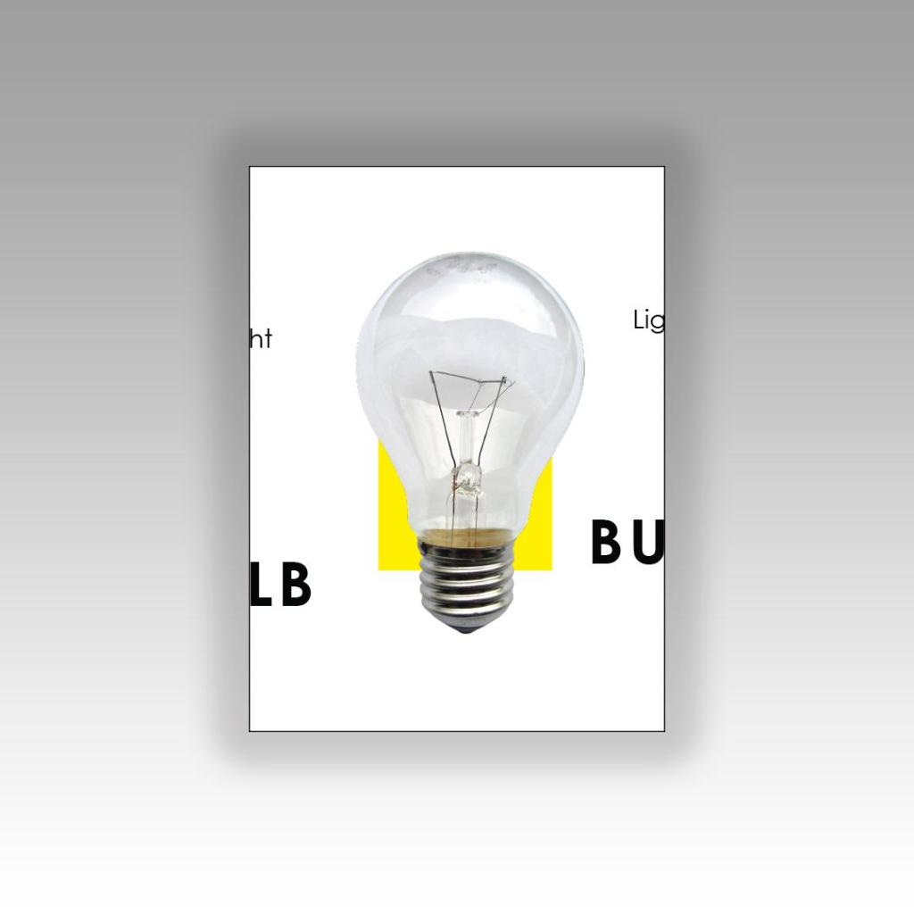
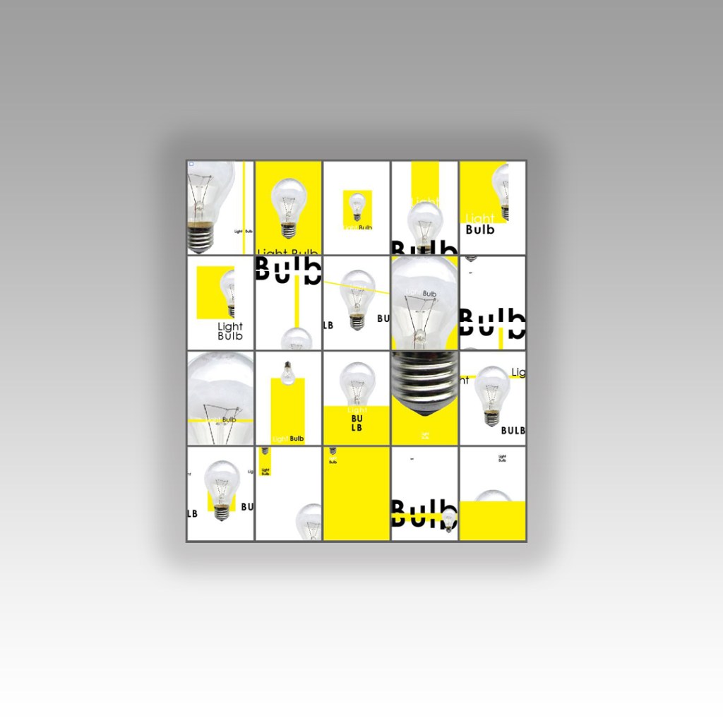
This above is the design I toyed with; I liked the idea of Franklin Gothic as a font at first glance.. it was literally the first trial typeface I used and tried it with. In my head I knew I wanted the text to be quite prominent across the whole cover. I had the idea of turning the opacity down to make it partially see through. I thought as well I could match the colours of the type to the yellow in the hour glass (see below)

I liked this idea, the yellow worked well but it was still missing something… This is when I thought of the idea of using coloured bands across it (one for each line of the title)

I really liked this idea! The only thing I needed to work on was the typography! I spent a while (a fair time!) picking out some of the best fonts and using them on all the designs to print out and compare! I sent photos also to my Mum who using her expert opinion and eye ;p picked out Helvetica! I also shared captions on my Instagram and people replied also with Helvetica. The reasons?.. obviously with it being the font of choice for most designers and also for the fact it is strong and stands out on a cover.
These are the sheets I shared with all the different fonts! (below)

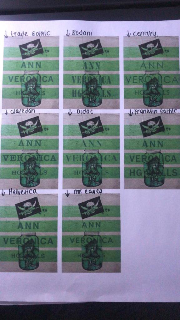
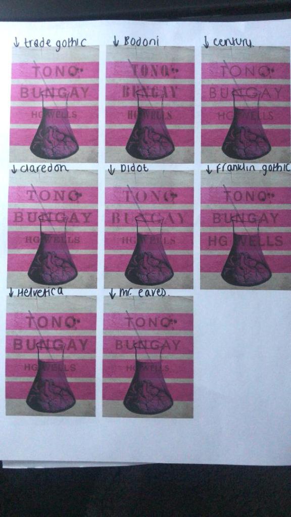
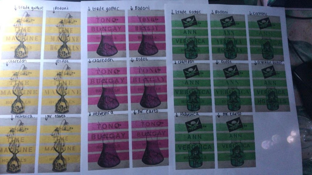
So! Helvetica was the popular opinion!… and you know what?!… There is a reason why Helvetica rules all!.. I actually really like the look of them! The type is still illegible in places but I can work on that!


I then wanted to give it a go adding the publishers name and logo. I decided to go for Penguin – The classics! I found a logo online (not the best way to do it for pixelization and plagarim… BUT the brief states to use one so!…)
This one is perfect!… I then added it to each of the designs and adjusted the layouts accordingly and this is what they look like so far! 😀 really, really chuffed with them so far!
I still have adjustments to make; the illegible type, the hyphen in Tono – Bungay, the bars so that they all line up, the spine to design, bring everything together to create the final cover and then make mockups on actual books but at the moment I am pleased!

Portfolio


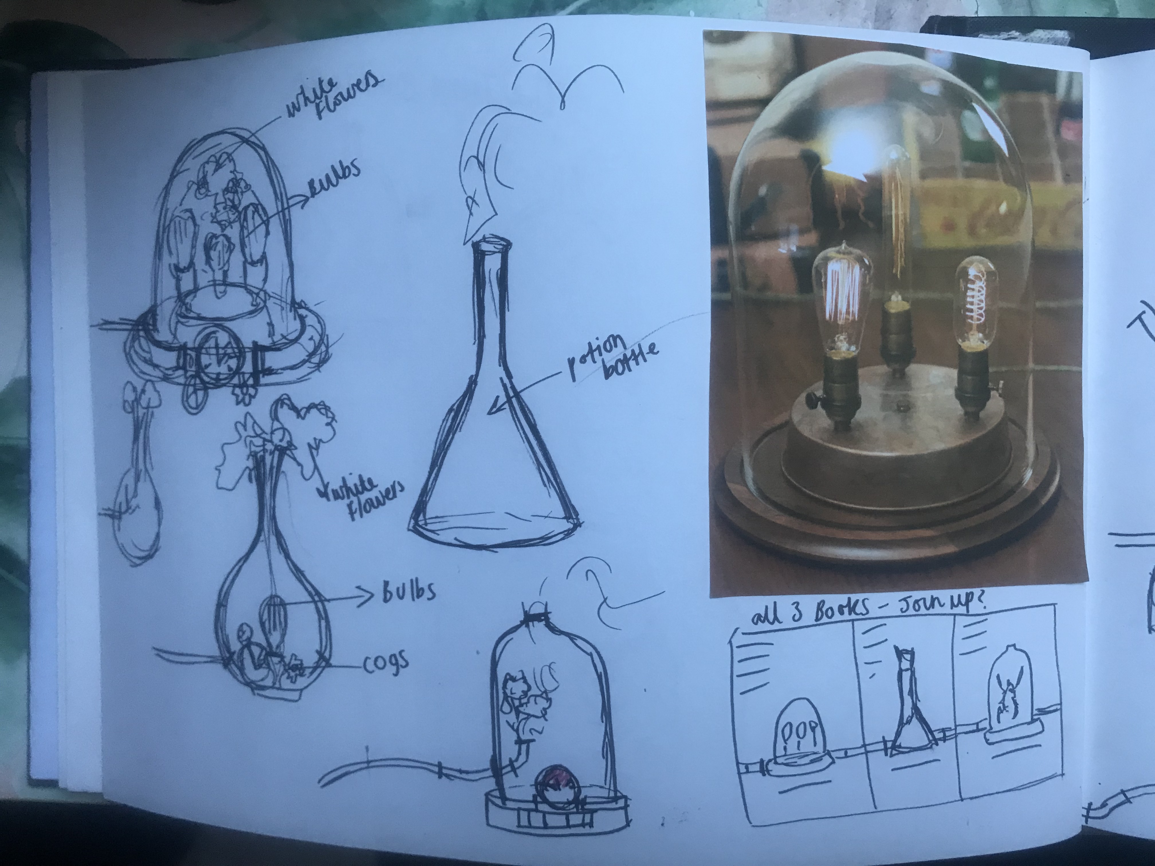
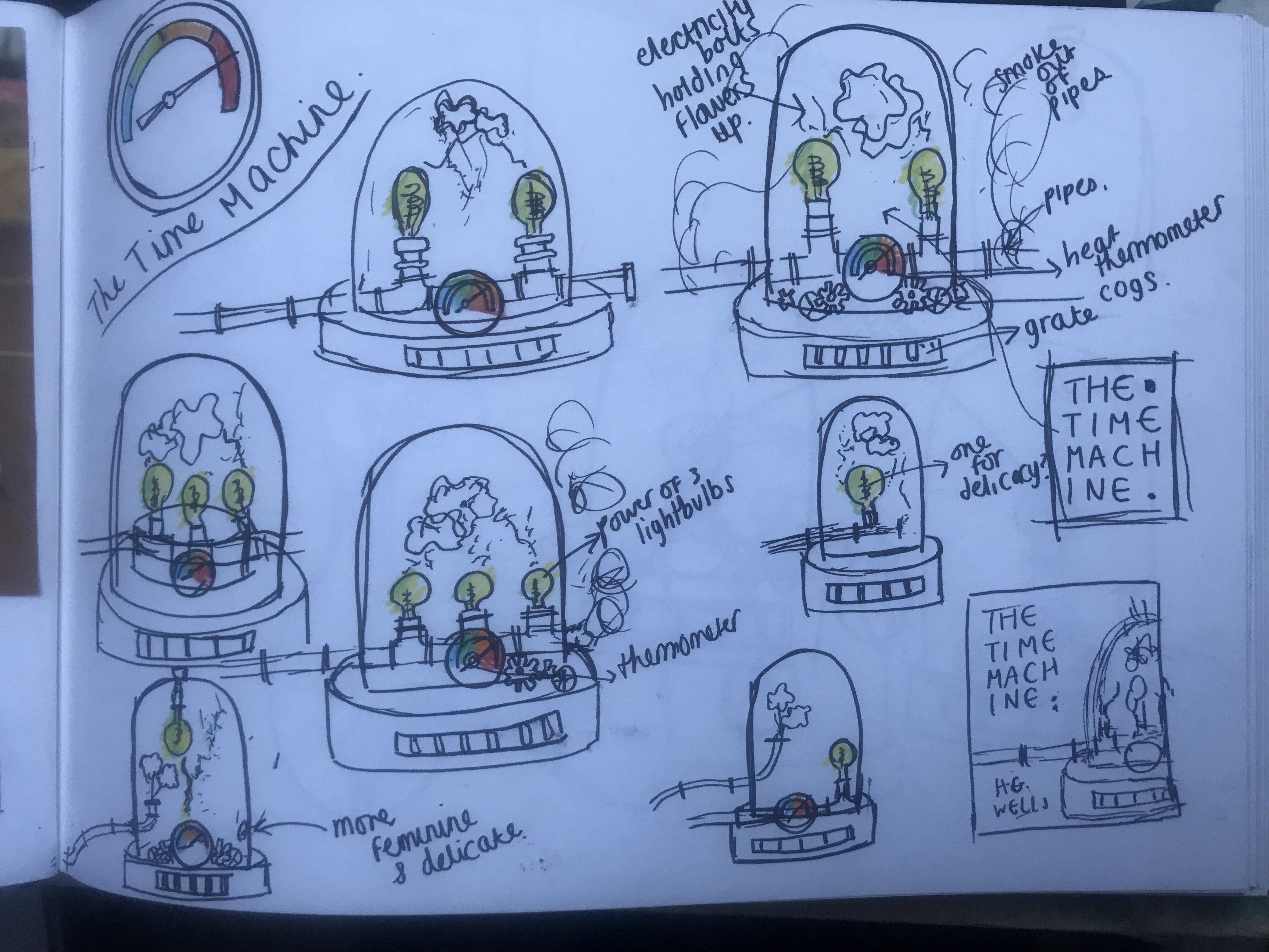
Tono Bungay Design Development
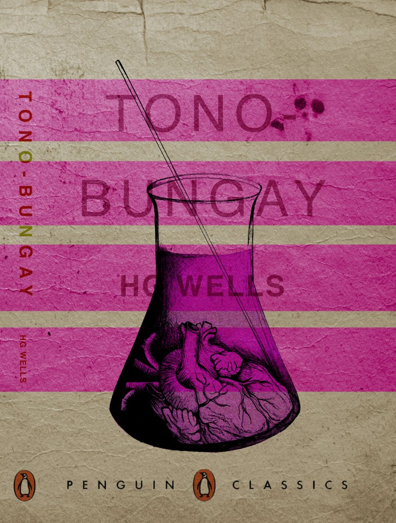
Over the weekend I completed the design for book design number 3 which is Tono Bungay. Again, it did not take as long as the first design because it is basically repeating the same style and appearance. All 3 are pretty much exactly the same apart from the original drawings.
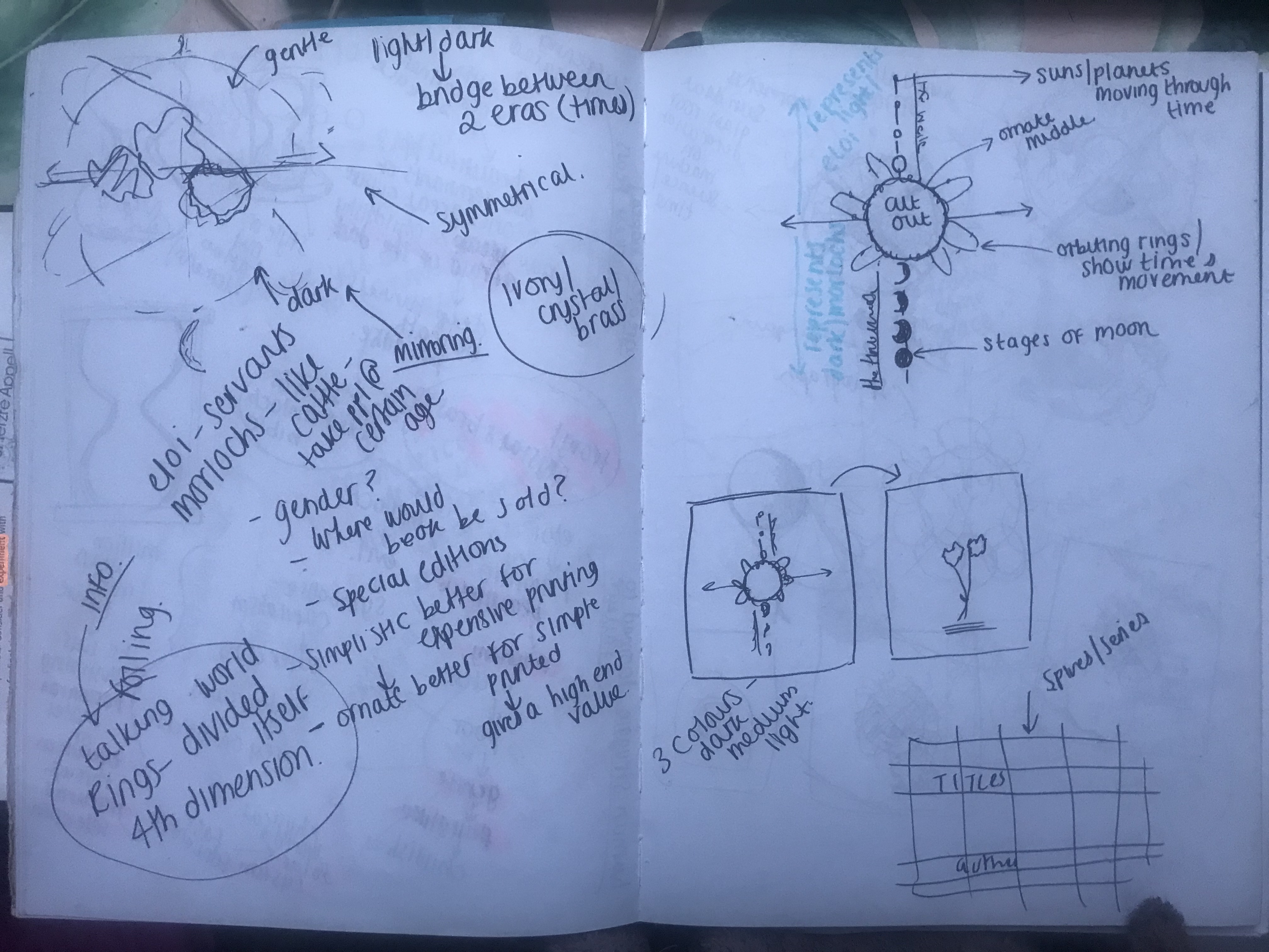
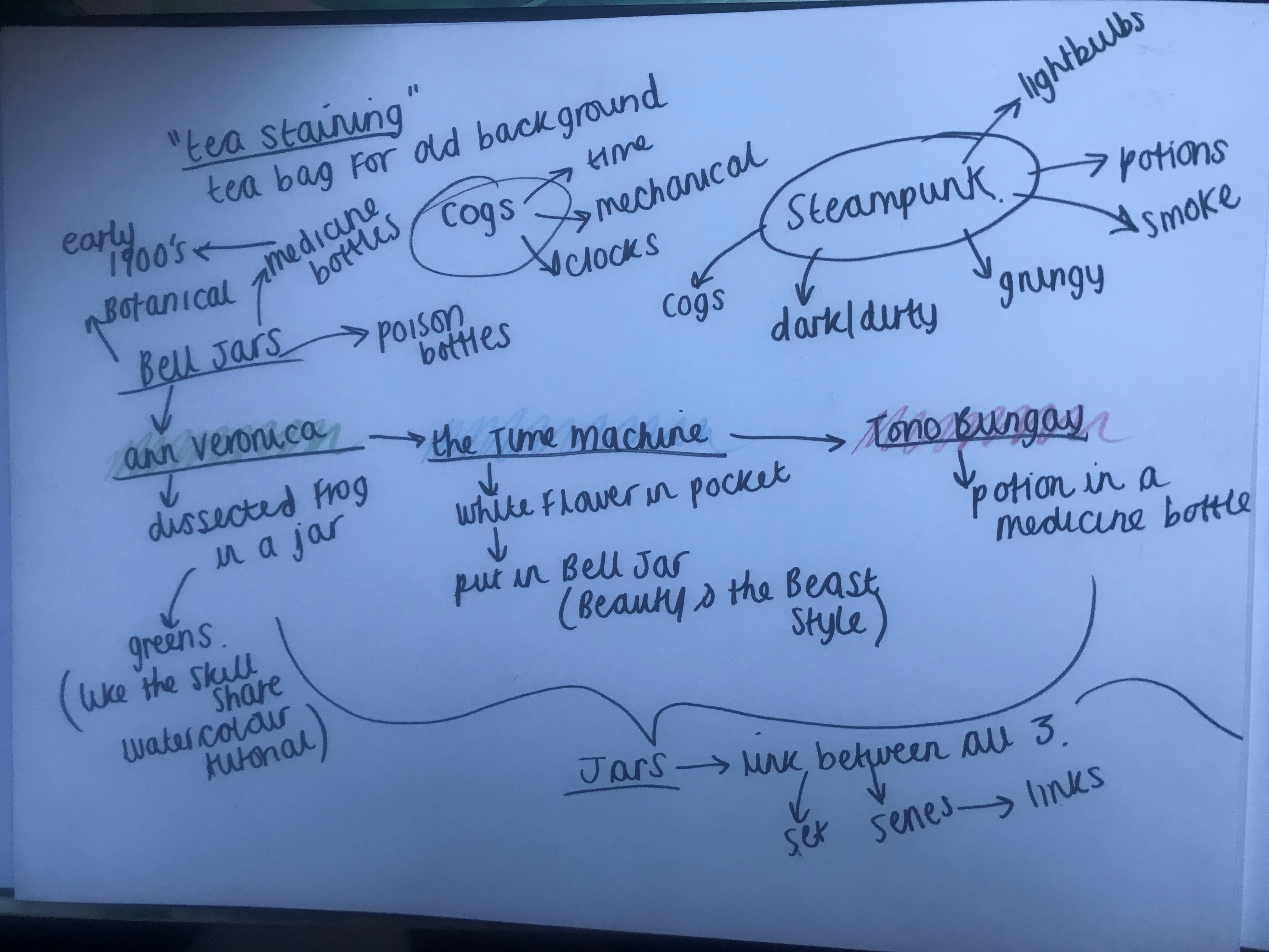
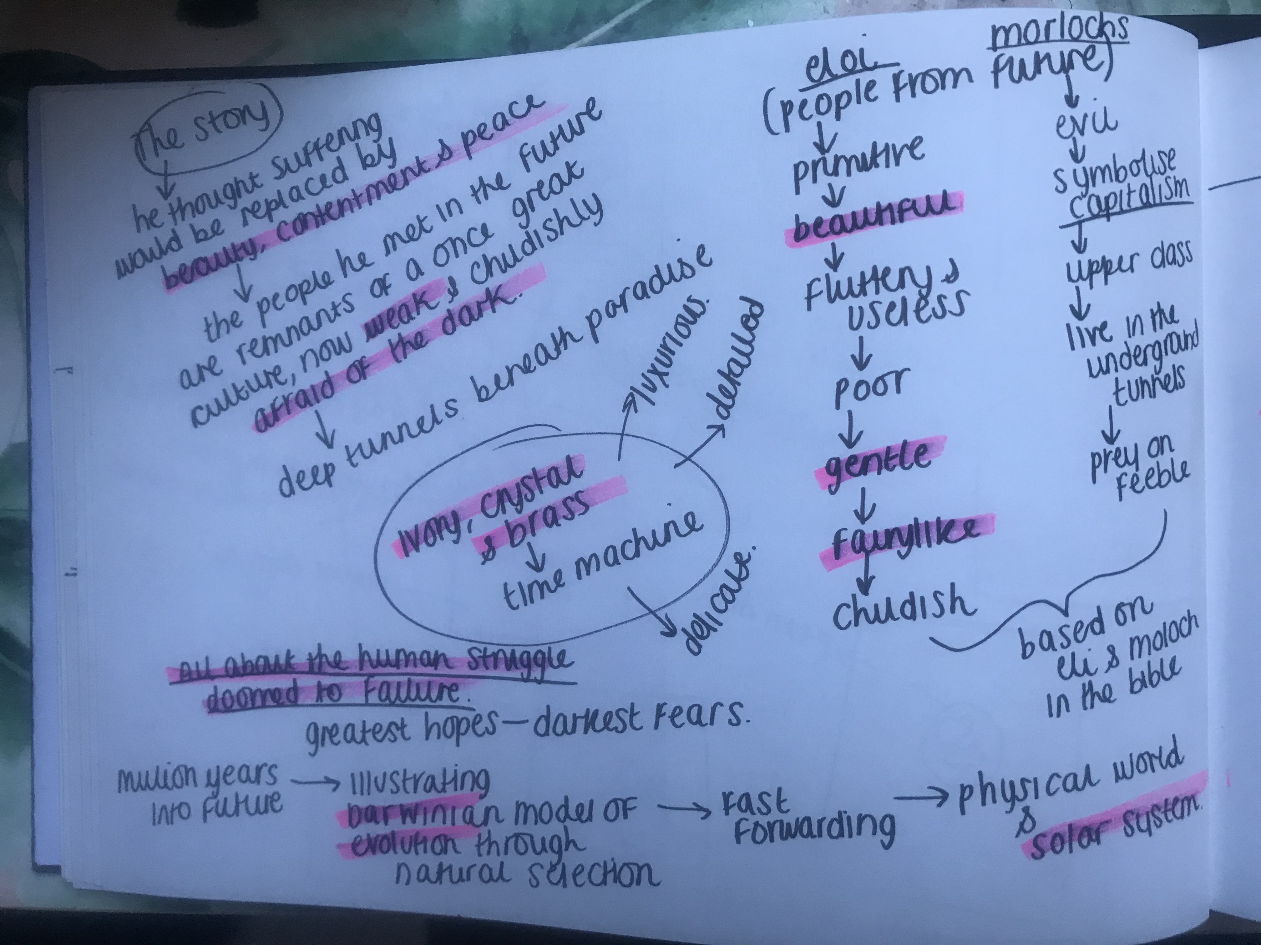
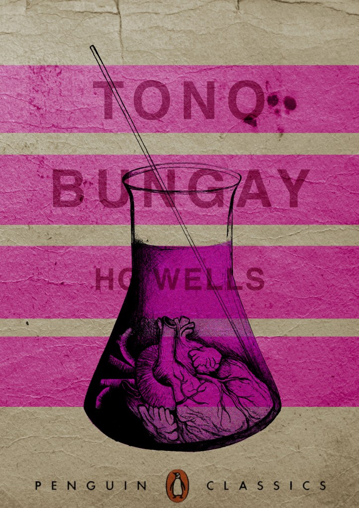
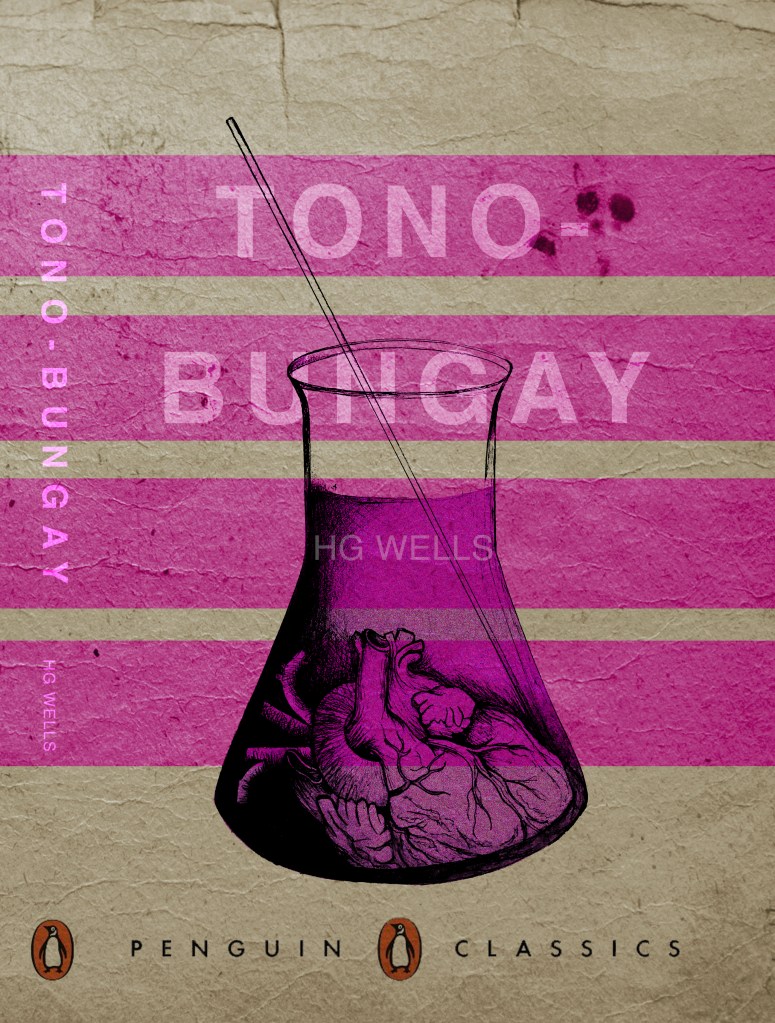
I started researching into Tono Bungay the book as I knew what the plot was about but again wanted to pick up on the more detailed facts and details from the story which might help me in the design process. I found a free PDF version online and began reading for key facts and details. The novel is written in a autobiography style; the key character is telling the story as if it was true. It is the most creative of all HG Wells book; it focuses mainly on advertising and selling this “miracle cure all” to the people.
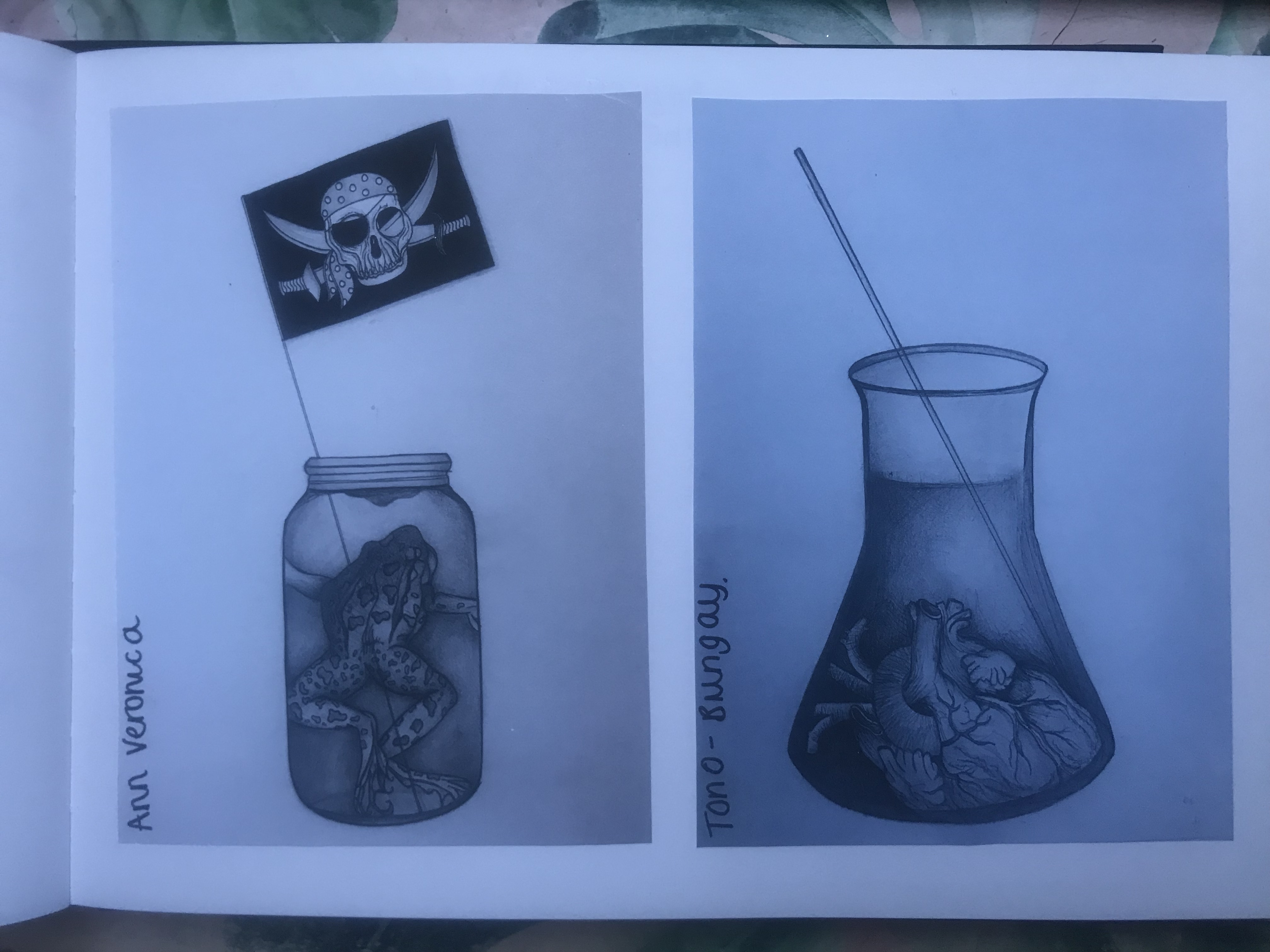
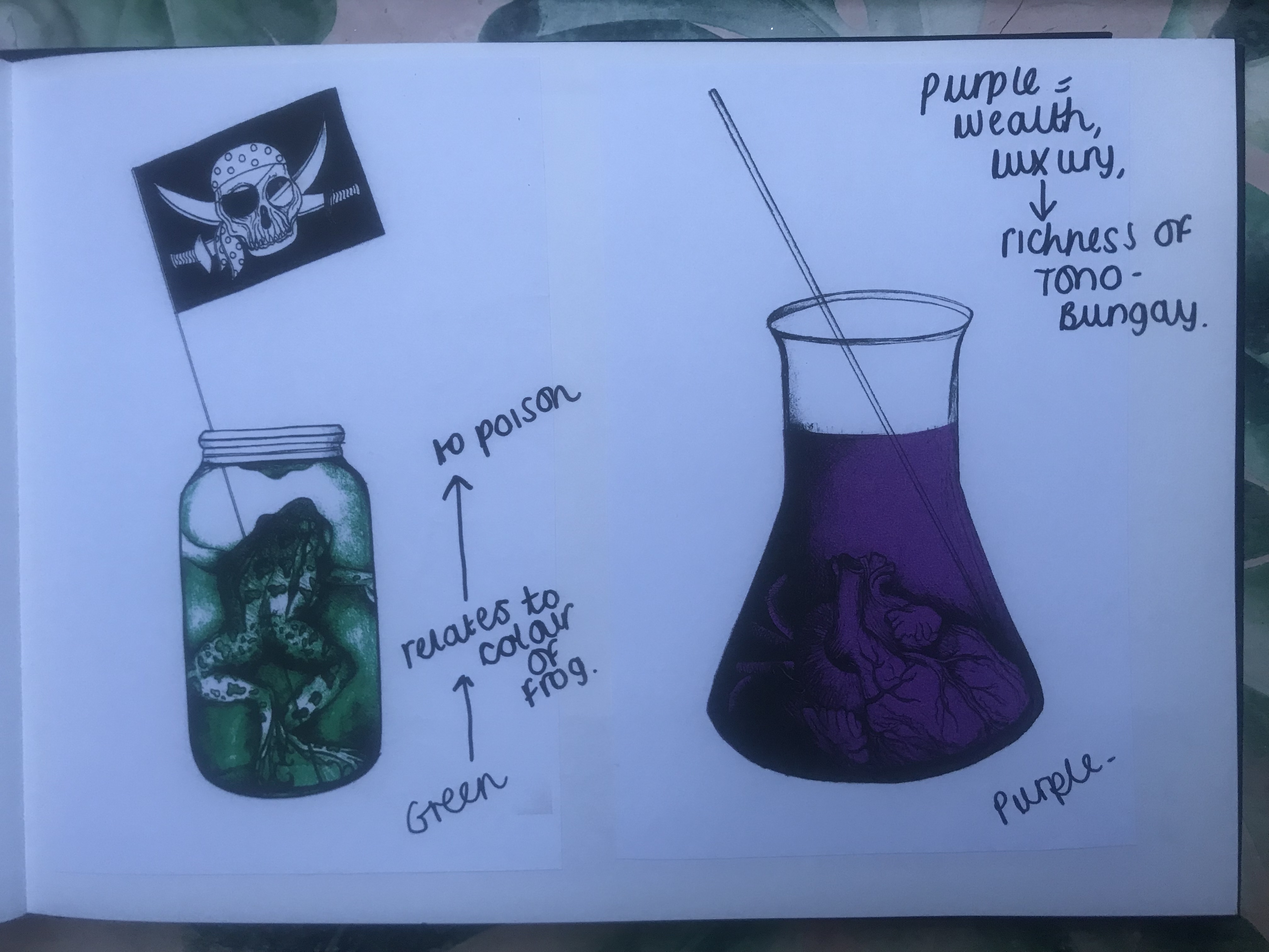
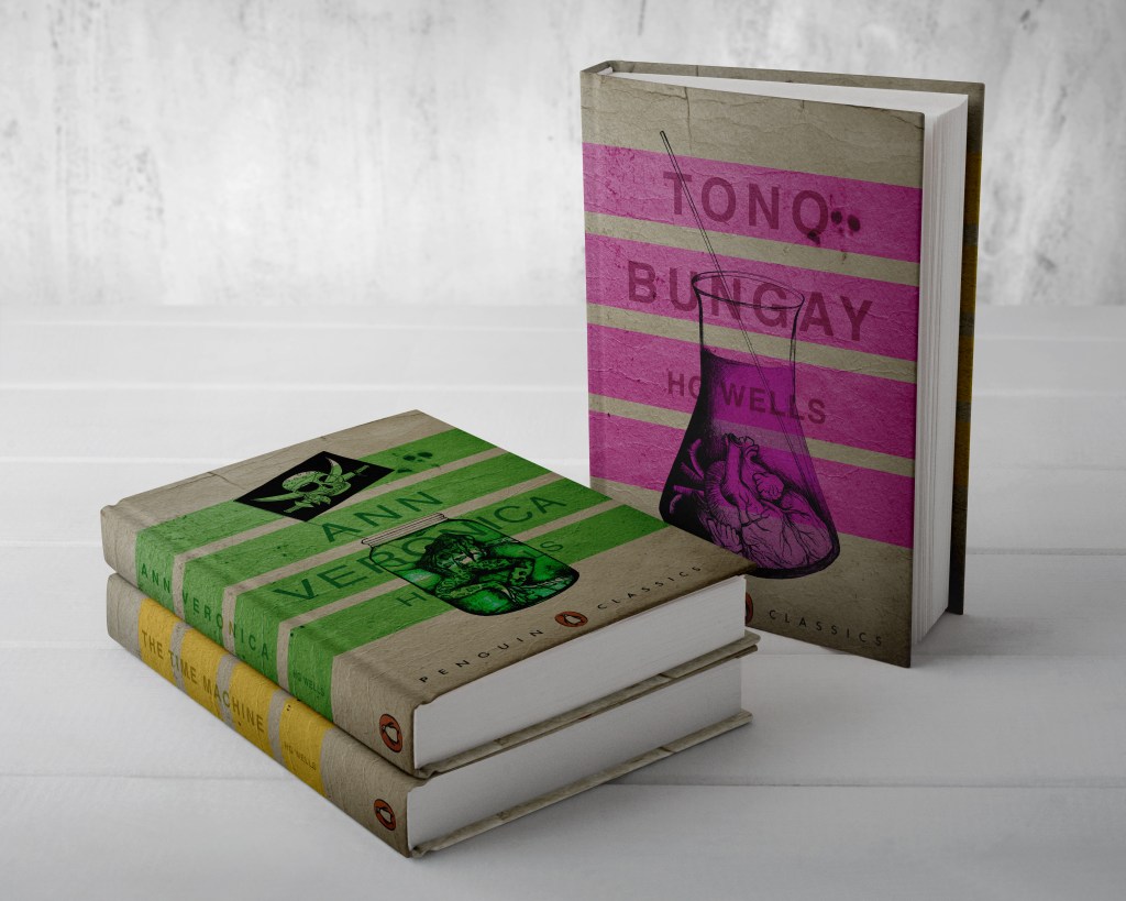
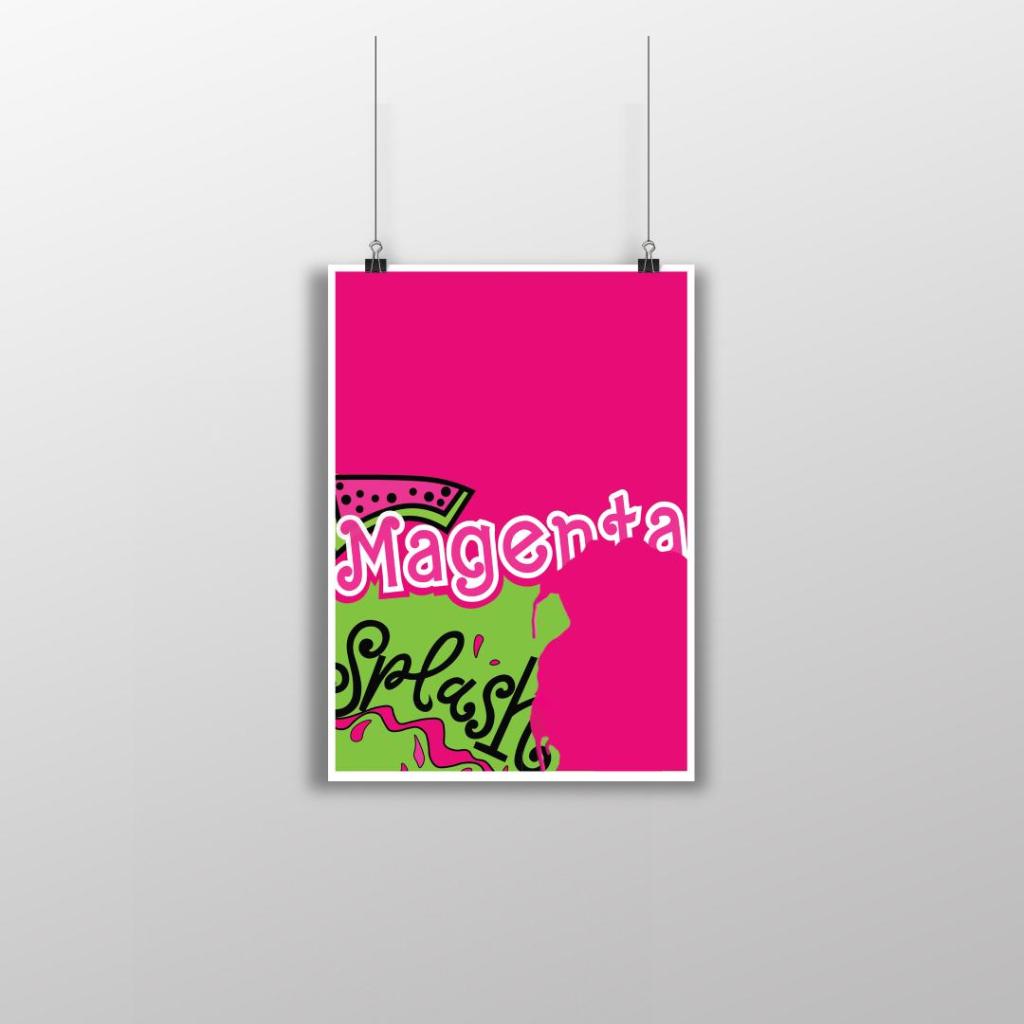
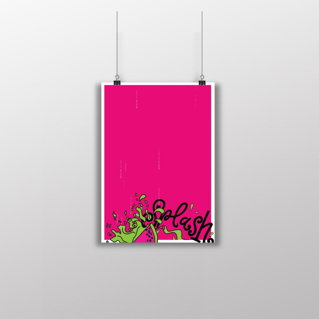
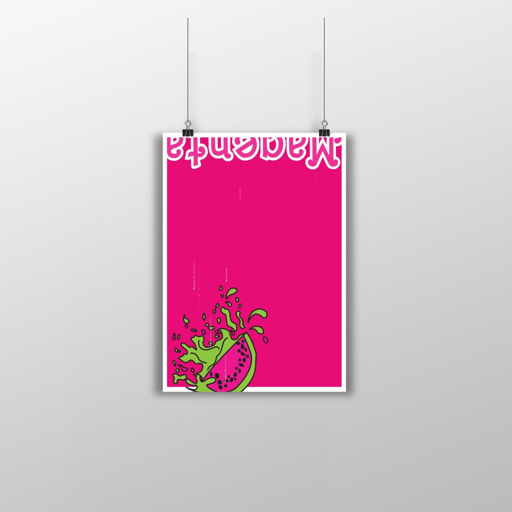
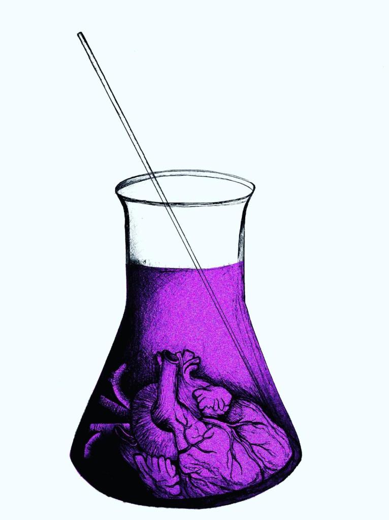
It is a socialist novel, HG Wells was trying to convey how easily it was to dupe people into a naive way of thinking. It is all about money and greed and selling a cheap product for ridiculous amounts. In the book the character referred to Tono Bungay as “The sickness at the heart of society” This is what I have played on within the design. I have used a human heart in a potion beaker to convey the heart in Tono Bungay.
- The heart represents “the sickness at the heart of society”
- The heart represents the scientific element
- The beaker glass represents what Tono Bungay was made in within the book
- The purple I have eventually used in the colour of my design reflects wealth and richness (even though the medicine was phoney)
I started off with an original sketch and then continued from there;
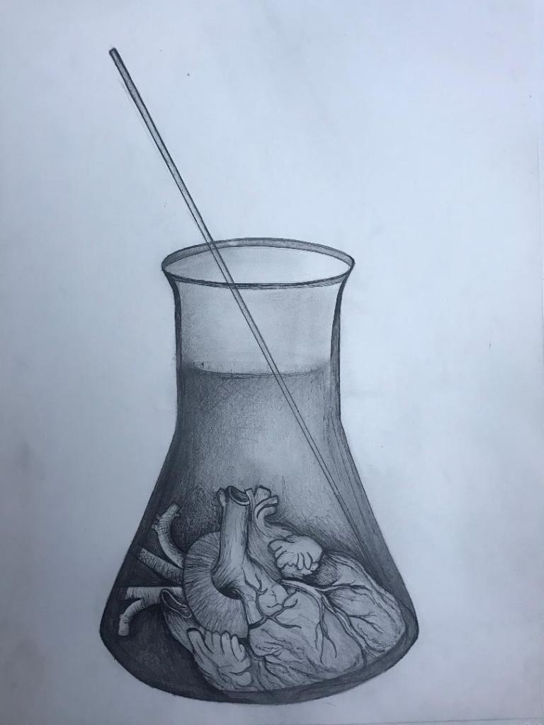
I then took the image into Photoshop and adjusted the brightness/contrast/levels etc and changed the colour of the liquid.
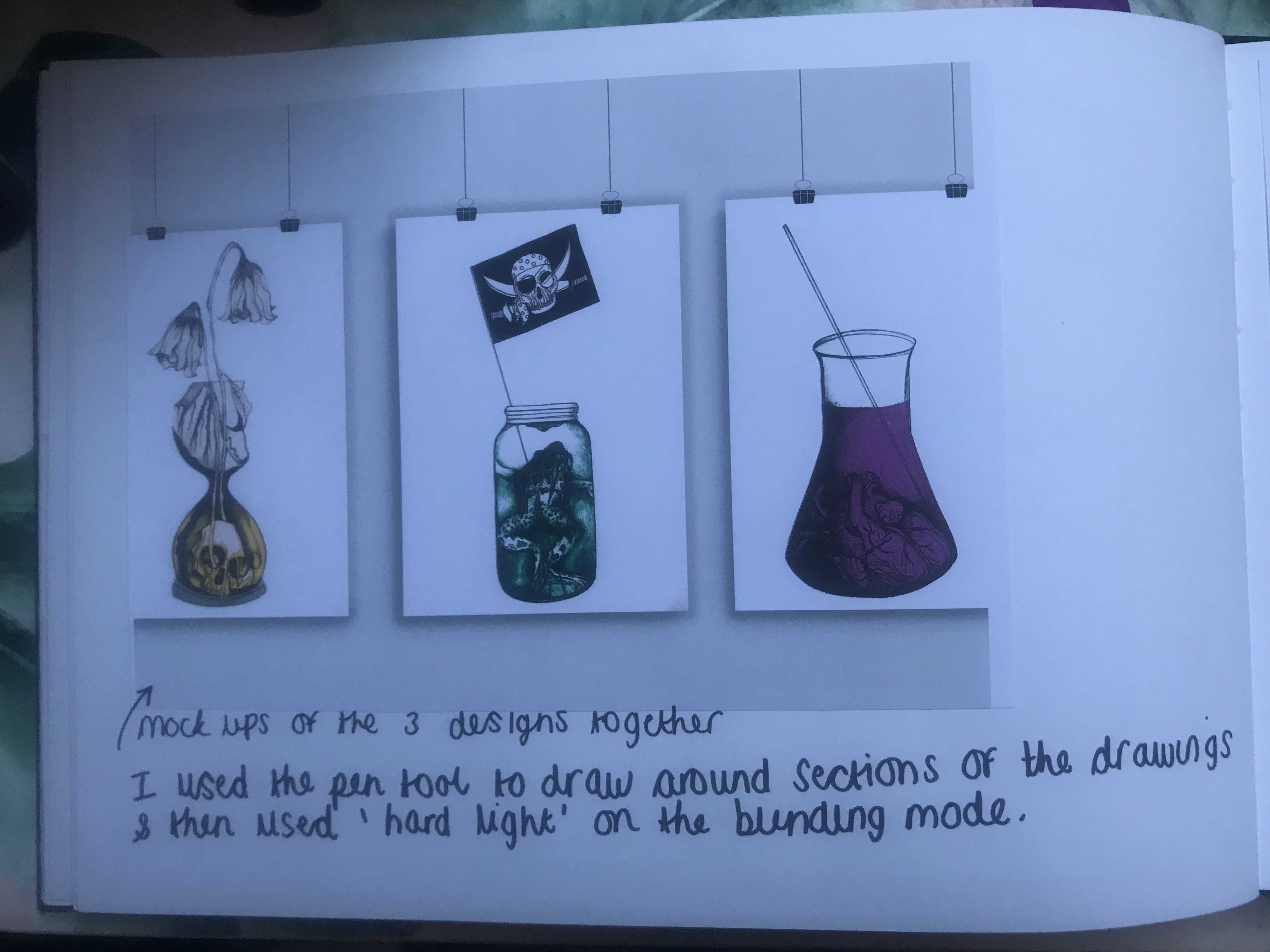
I think the colours work well. I then did a mock up of all 3 covers together to see what they would look like. I think they all work very well together. It is obvious that they are a series of books that link together, the simplistic colours work well and help you see which ones link to which book. The covers relate to the Science Fiction genre of HG Wells but also reflect elements from the stories which might have been overlooked by other designers who have designed previous books and also by people reading the books who possibly wouldn’t necessarily see these as important factirs within the story. Chip Kidd always said “See what other designers are doing and then do the opposite.” This is what I have tried to do in these designs.
I now need to work on making them “timeless classics” by mocking them up into actual book covers with spine, author, title and publishing house.
My next step is to sketch some layouts to see how I can effectively do this.
Bad dates, being alive and trying not to “half ass” my uni life :P
Morninnnng! 🙂
It’s been a few weeks again since I last posted on this “Dear Diary” area of my blog; I want this area of my blog to be quite personal and to be a place where I can vent or air any of my thoughts/ worries/happenings about the course or just my life in general!
Further on from my last post about getting back into studying again after my break, I did get an email from Student Services to check I was still alive 😛 because I haven’t submitted an assignment for a while now! My heart did skip a beat! – I am an over thinker and a worrier and I was worried they were about to boot me off the course for being so slow!! There was a conversation in our student emails that I was involved with a few weeks ago, where it was discussed how the exercises in the course seem to take just as long as the main assignments… I am pleased I am not alone in this way of thinking! I do now feel though that I am being “hurried” to finish this unit off ASAP. The thing is I want to spend time and effort into getting it right, I don’t want to “half ass” it. I have managed to tone down my perfectionism slightly but I still want to do the very best that I can possibly do for each exercise and assignment.
Maybe time management is something I need to organise more…
My personal life has been very up and down lately, In my last post I mentioned I hoped for a better “dating life in 2020” and how I was going on a lunch date… it was going well until…. well until it wasn’t (*shoulder shrug because he left with no explanation*). We went on 3 dates and things seemed to be very promising until bad vibes, my gut instinct and some suspicious wedding photos emerged! I am going to read between the (silent on his behalf) lines and assume that he was potentially married with a family. Dating for 2020 is now a definite no go for me. My work colleague Ashleigh joked that I should have replied to student services with an email that said “I am still alive, I am still chipping away at my course but I have just been dating 2 horrendous men over the Christmas/New Year period!” I think I shall now lick my wounds and spend this year concentrating purely on myself and uni and getting my head back into the game.
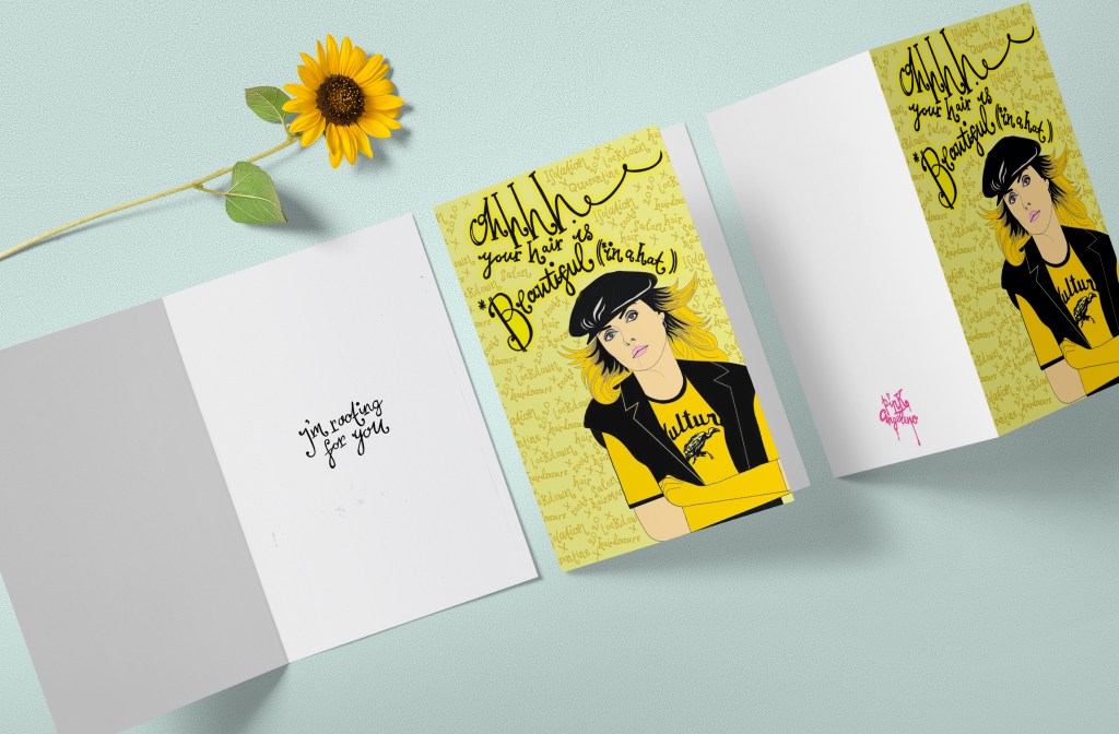
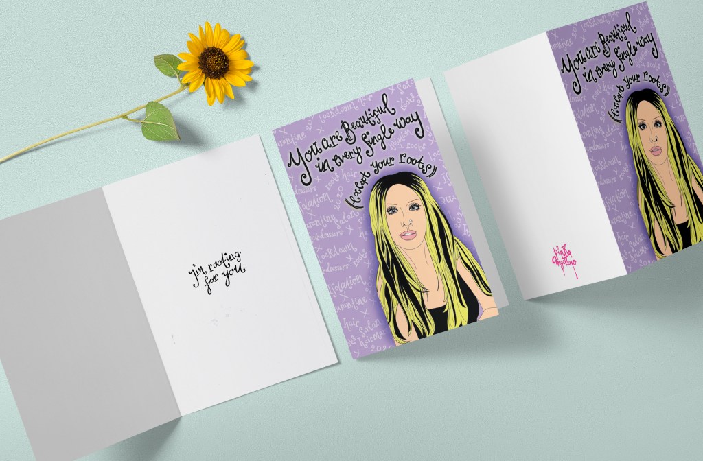
(These experiences over the last couple of months though have inspired me for the greeting card assignment in this unit… I might do a line of cards for single girls! – “you pulled yet another dickhead… better luck next time” style haha!) :p
Design Development: Ann Veronica
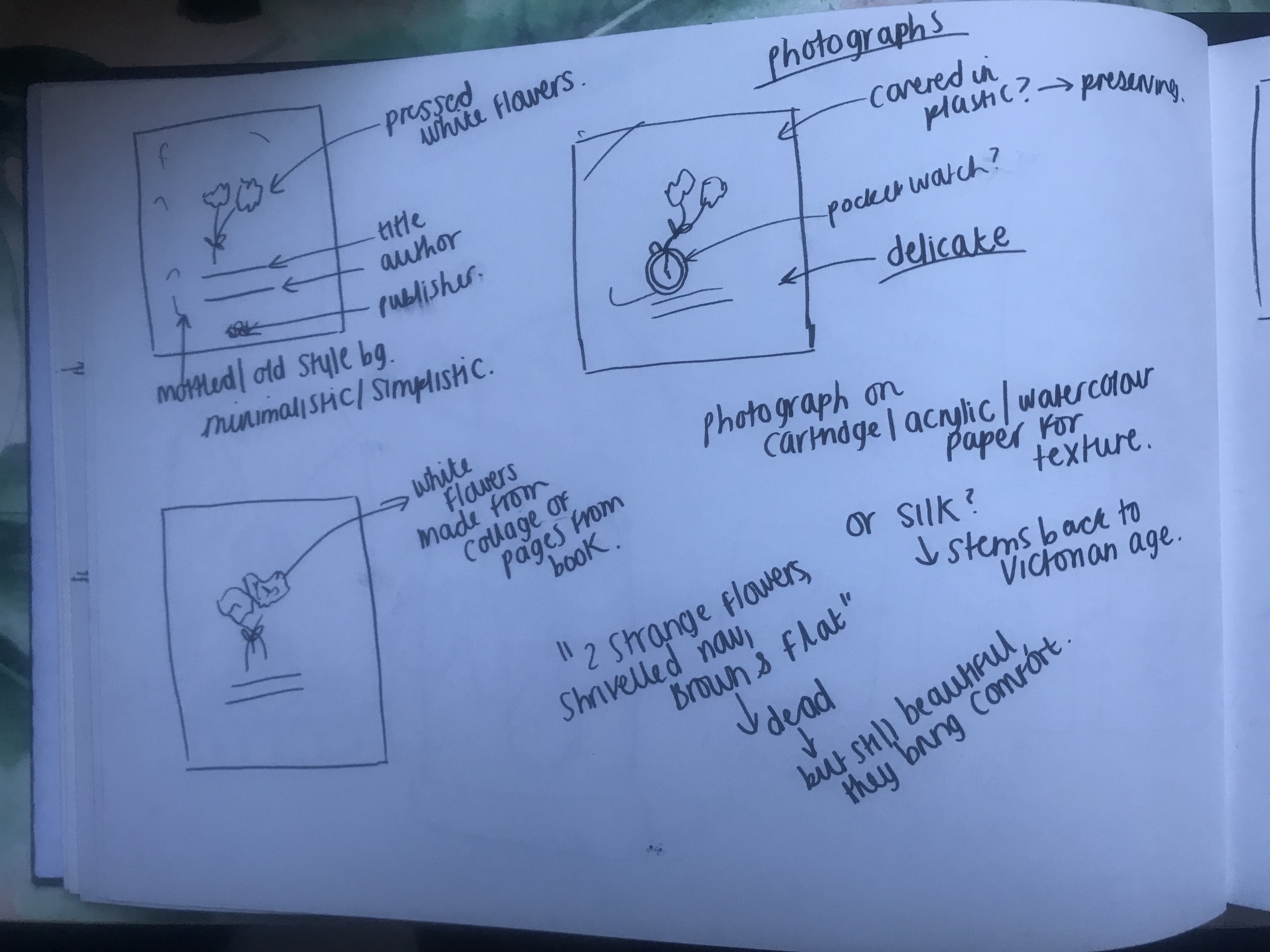
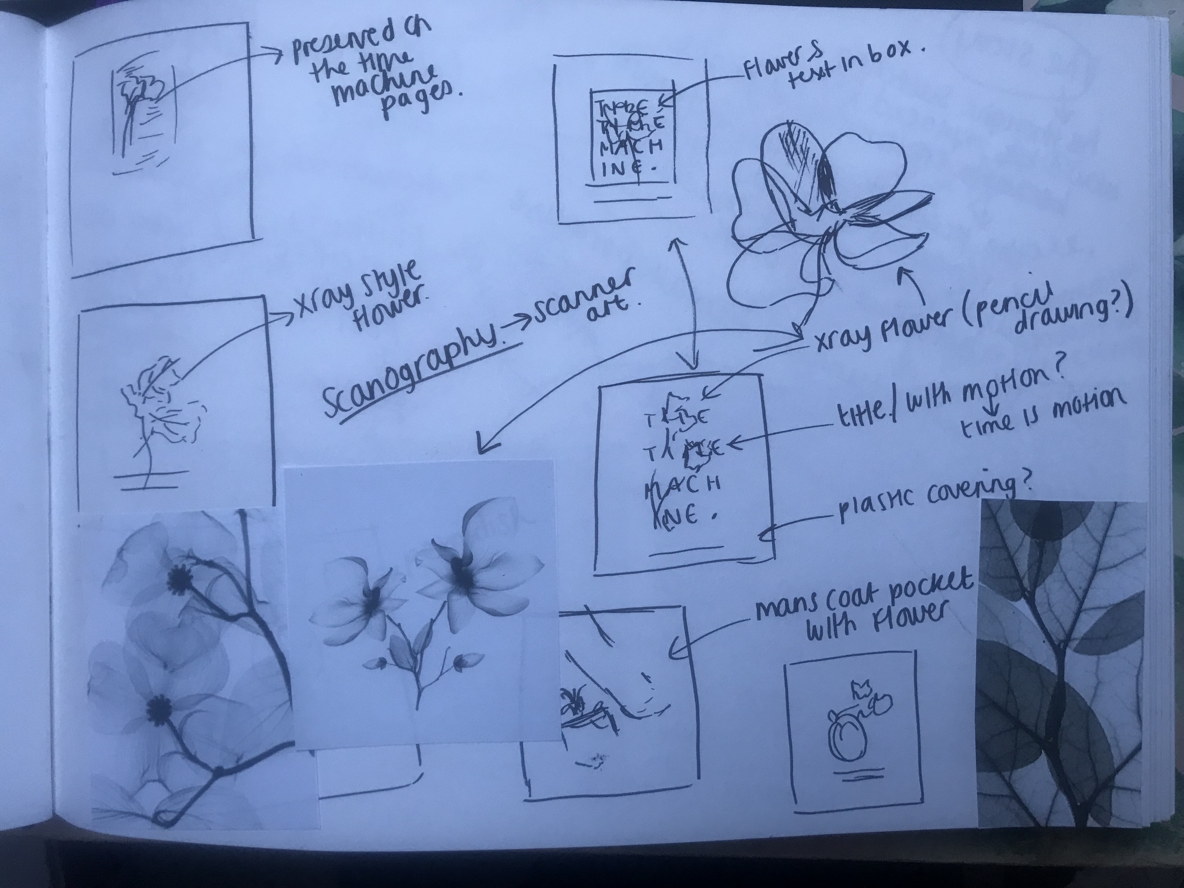
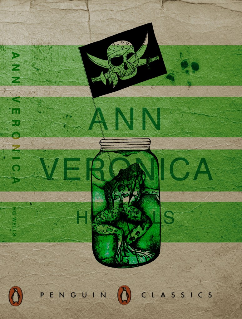
I have finished the development for Book cover design number 2 which is Ann Veronica. This did not take me long at all to complete in comparison to the first design for The Time Machine. I think that this is because I am pretty much repeating the first design for the second and third and not as much development has to go into it. With this book cover design I had the idea in my head and then from that idea I drew what I have now and then pretty much repeated what I did for the first design.
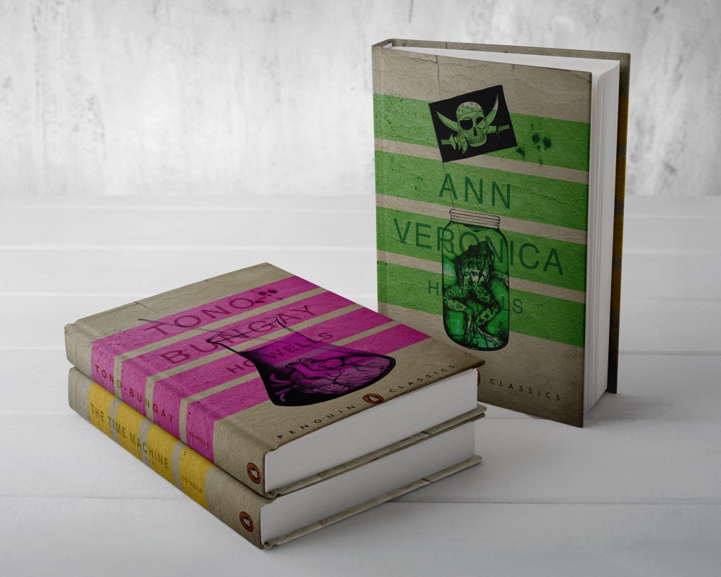
I decided to draw the pirate flag coming out of the jar with the frog in and this is what I ended up with;
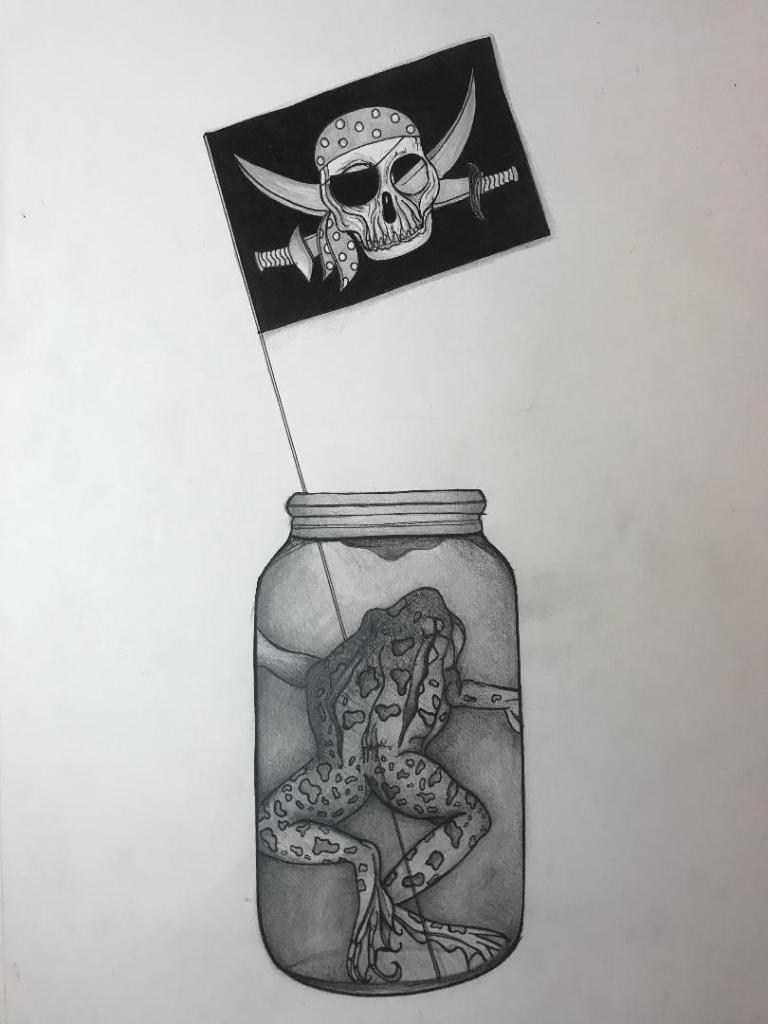
I then did the same as what I did for my first book cover design and alter the colours in Photoshop. The colour scheme for this book cover is Green, that matches the frog and the colour of the liquid in the bottle.
This is a mock up of both covers side by side so far;
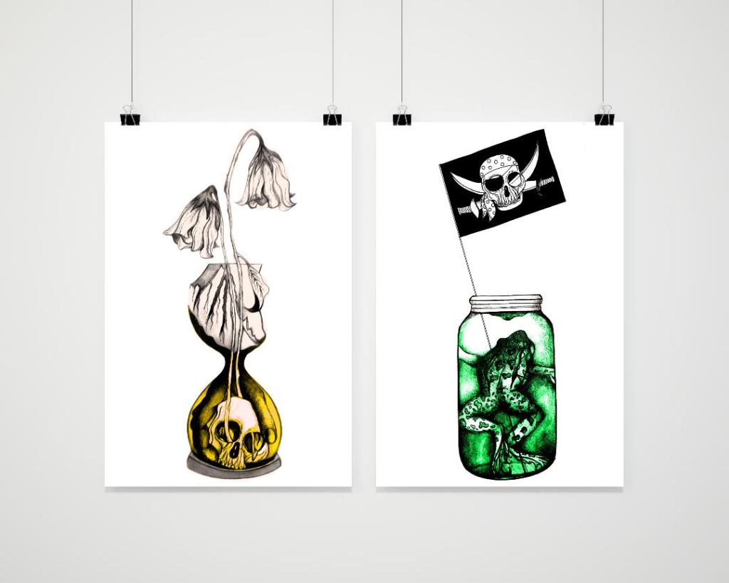
I think that they both work really well together, the contrast between the Black and White and the pop of colour. They work together well as a set also – It is clear that they all belong together and that there is repetition and a link between the designs.
Design Development – Ann Veronica
After a long break away from this exercise I have decided to get back into it and draw up a potential design for the Ann Veronica book cover.
As I said from my research I wanted to incorporate the preserved frog she keeps in a jar in her room as part of the design.
Last night during a personal life mental break down (another 2020 nightmare dating story and idiot boy I’ll save for one of my posters!.. *eyeroll) I decided to draw up the first potential version of this.
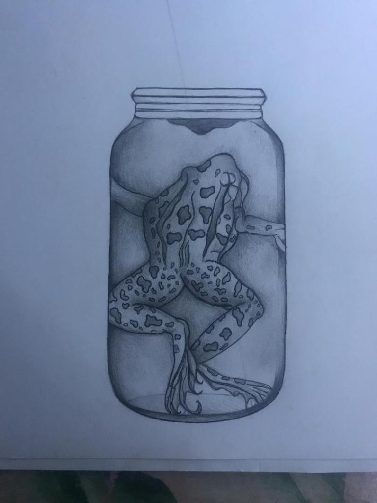
So far I do not like it as much as my first design – However this could be due to the fact that I have not yet added enough shading and pen work. I think that by the time it is edited in Photoshop it could look potentially good.
I also want to incorporate the Pirate theme within it; In the book Ann Veronica wants to go to a Pirate fancy dress party that her Dad greatly disapproves of and tries to make her not attend, this is the basis for the rest of the story; to rebel against the expectation that was put on women of their era.
I thought about putting a pirate flag inside the jar… so that the design is similar to the first one with the dead flowers coming out of the top. I think that this is what I shall work on next.

Hello and welcome 2020!
Sorry I’m late to the party!…
Apologies that I am a little late! (22 days!) I have been a little bit M.I.A lately… I feel like I haven’t written on this blog now for so long! Not going to lie, my uni work has taken a massive back seat since Christmas 😦 Completely unintentional, In fact I am going to have to massively backtrack and catch up with where I left off just over a month ago! Still!… I needed the break! Although in all fairness I am not sure it has fully been a break :s I have worked non stop at my “double life” and my personal life has been up and down more than the Nemesis at Alton Towers! :s (*dating in 2019…..well, let me tell ya I was sooo over it!)
Anyway! I’m backkkkkk! 😀
I have also stuck to my “a poster a day challenge” which at first the concept and thought of absolutely scared the crap out of me! I am on day 22 today and so far I feel like I have hugely benefited from it!
The posters are far from perfect but I feel now I am confident with spending an hour a day (that’s all!) coming up with the idea and producing them. My perfectionism I feel has turned down a notch. I am getting used to producing designs that I might not love but that I am happy to showcase to the world on my Insta! I have also uploaded them all onto this blog also! I am trying out different techniques, media, ideas and layouts with them.
I refer back to my personal life being up and down which actually in a funny strange kinda way massively helped my creative process! 😀 I even make a joke about how I am the Taylor Swift of Graphic Design; she writes songs about bad men and plays them on her guitar, I simply design a naff poster about them! (lets call it – “Doing a Taylor Swift!”) :p
Creative genius! In the words of Kurt Cobain – “Thanks for the tragedy I needed it for my art!” Vent the anger and frustrations into something a little remotely positive!
For some reason I am at my creative best when I have fuel ready to fire up!
Anyway, please have a look at my poster art and see what you think!… any suggestions and ideas for future posters are appreciated! I feel like I have “poster plateaued” as of late… I have really struggled with ideas as I have gone about my normal, everyday, mediocre working life!…
Here is to 2020! – A new start, a new decade, better designs.. and hopefully a better dating life! (*I have a lunch date Saturday so hopefully I won’t need to do a “Taylor Swift” for this one! :p)
