Exercise: Visualising your ideas
These are my sketchbook pages with the ideas and development work for this exercise.
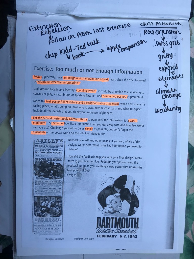
This next brief is based around Occam’s Razor and the principal that you strip design down to its simplest form.. the bare basics and essentials. I watched a TED talk with Chip Kidd where he basically explained that when you see a picture of an apple you do not need the word “apple” to appear with it as you already know what it is. This is the same principle. It is taking all the information and then seeing what you can strip back whilst still making the message clear.
Below is the brief that has been given me for this exercise:

I have decided to follow on from the last exercise; I studied an organisation called Extinction Rebellion and I shall continue to base this exercise around them and one of their upcoming events.
I am a big fan of poster design, I have spent many hours watching tutorials by the @chrisdo on Youtube where he critiques his students (and viewers) posters. I have learned a lot of the theory behind good poster design so I am looking forward to this exercise.
I want to however try something different… slightly out of my comfort zone.
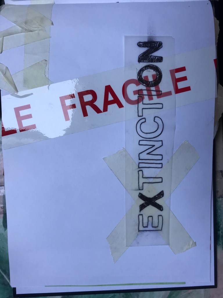
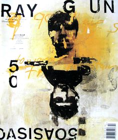
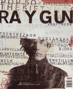
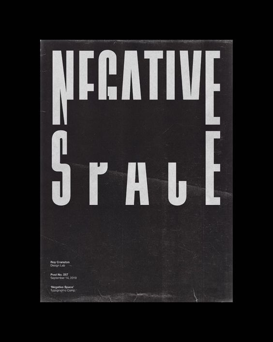
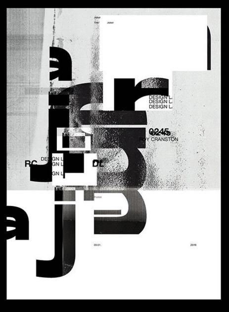
I am a big fan of “swiss grit”; Swiss typography, grunge typography and experimental layouts and collage. I particularly like the works of David Carson, Chris Ashworth and most recently Roy Cranston. “Swiss grit” is a term coined by Chris Ashworth to describe design style. David Carson and Chris Ashworth worked together on Raygun and they both have a very experimental design style; experimental typography and layouts and they are very old school in approach with hand drawn elements, old letraset typography, collage and mixed media. Roy Cranston is the new cool kid on the block. He started his design career by posting a poster a day on his instagram and now he has developed a big fan base for his designs. He has a very similar style to Carson and Ashworth in that his work is very experimental finding inspiration from everyday objects and from all kinds of different textures. The style of his work is very “swiss grit”.
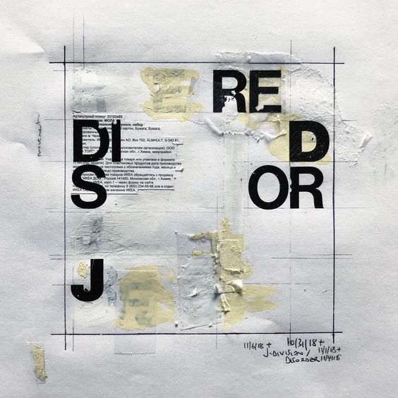
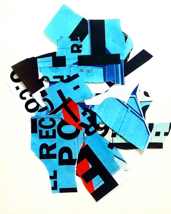


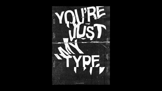
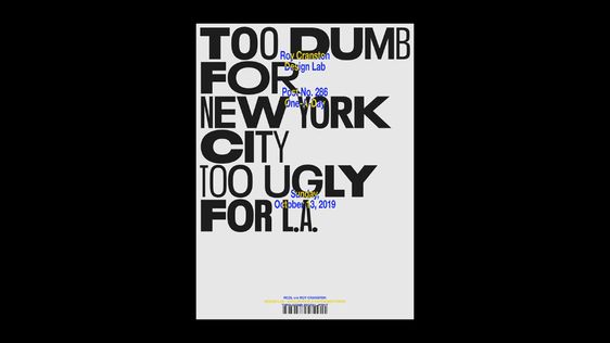

So I have decided to try and do these 2 posters in the style of “swiss grit” taking inspiration from these designers! I am not sure I am cool enough to pull it off as it is not my usual style but I really want to give it a go!..
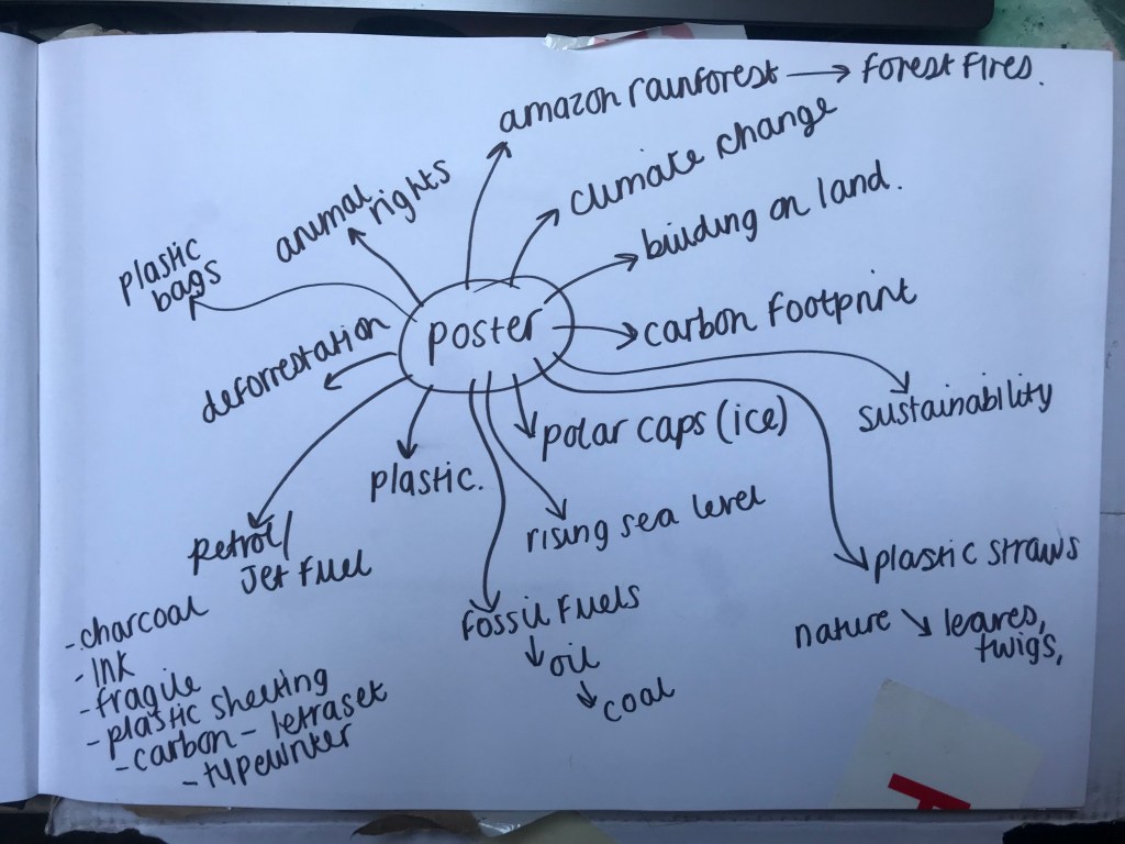
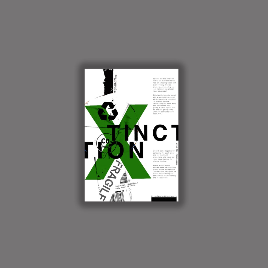
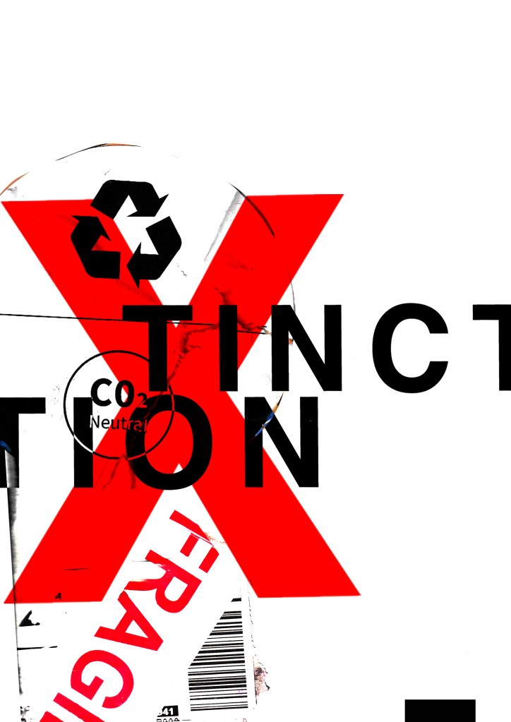
I have a bag at home filled with random things I have collected; parcel wrap, bubble wrap, plastic sheets, tracing paper, postage labels, cardboard, textured paper, fragile tape, masking tape and I also ordered some vintage Helvetica Letraset carbon sheets! I feel like this style would really go well with the organisation I have chosen; The organisation is an environmental group and the materials that I have chosen all contribute towards climate change and the carbon footprint so it would be interesting to see what I can do with the poster from these.
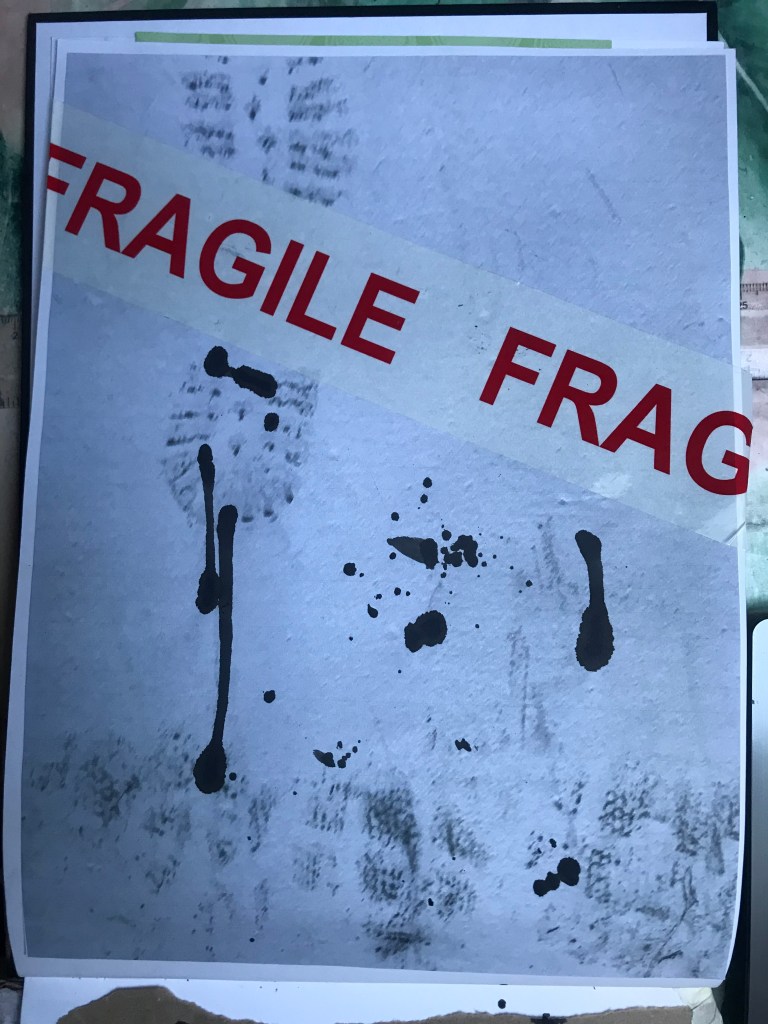
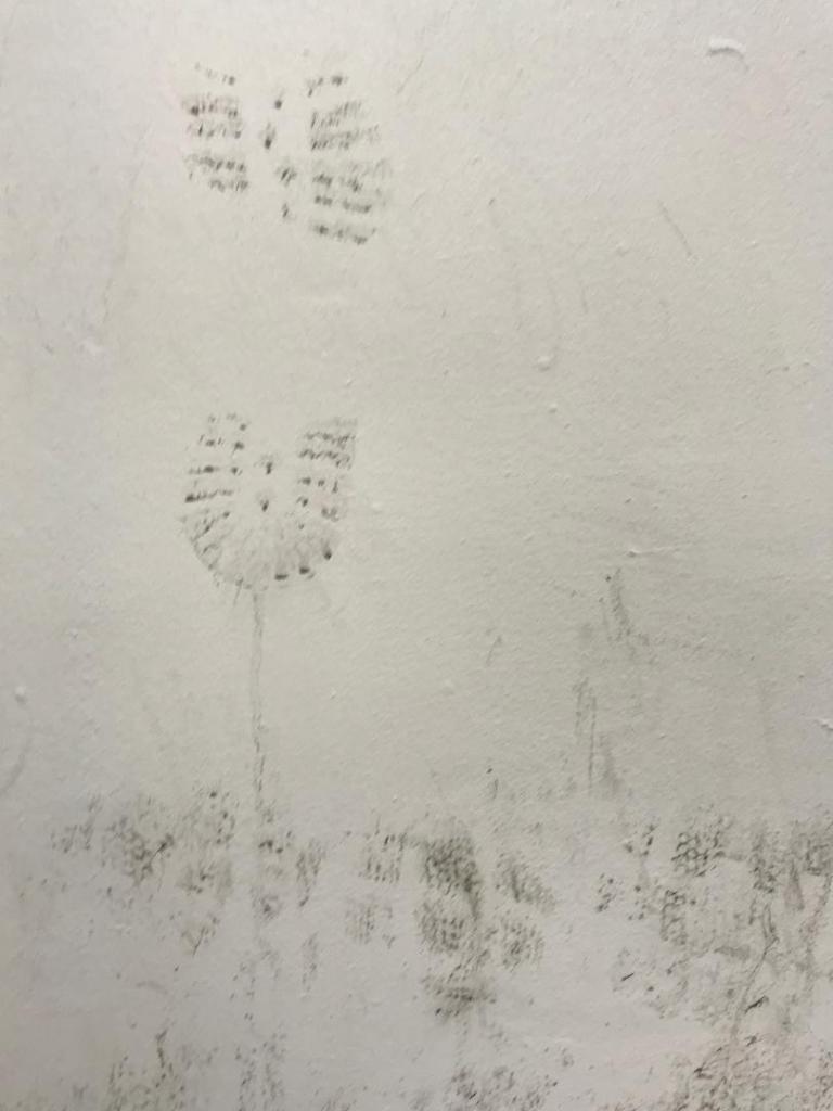
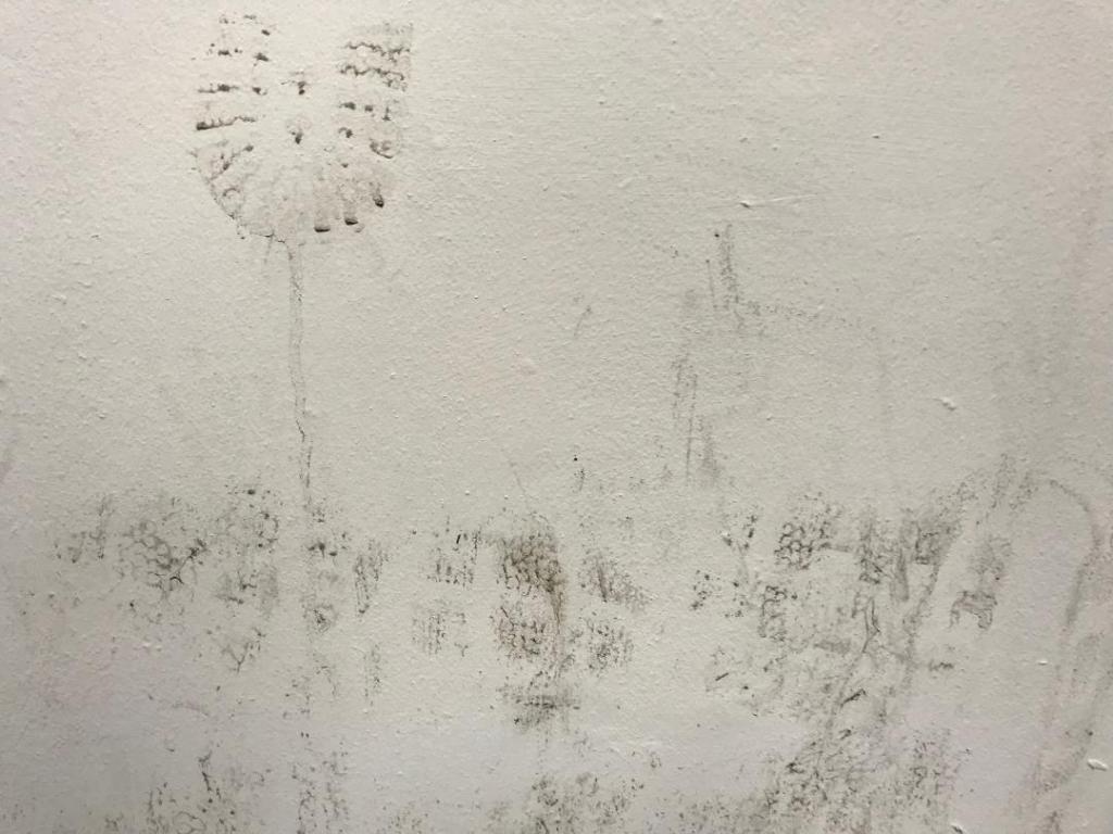
I also went for a visit to Nottingham recently and as I was walking through the car park I spotted a muddy wall with shoe prints on it. I instantly thought that this would be good as a texture for carbon footprint. I have used this on one of my trial pieces.

I had a bit of a mess around.. I did some experimental pieces in my sketchbook (below) and then imported them into Photoshop to see how they would turn out. I like the bottom 2 however, when you zoom out one of them does not work well as a poster as there is not enough contrast between the image and the text. The text should be in white maybe to contrast against the dark background.
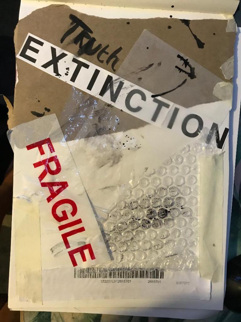


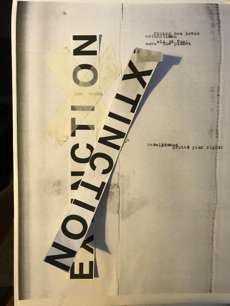

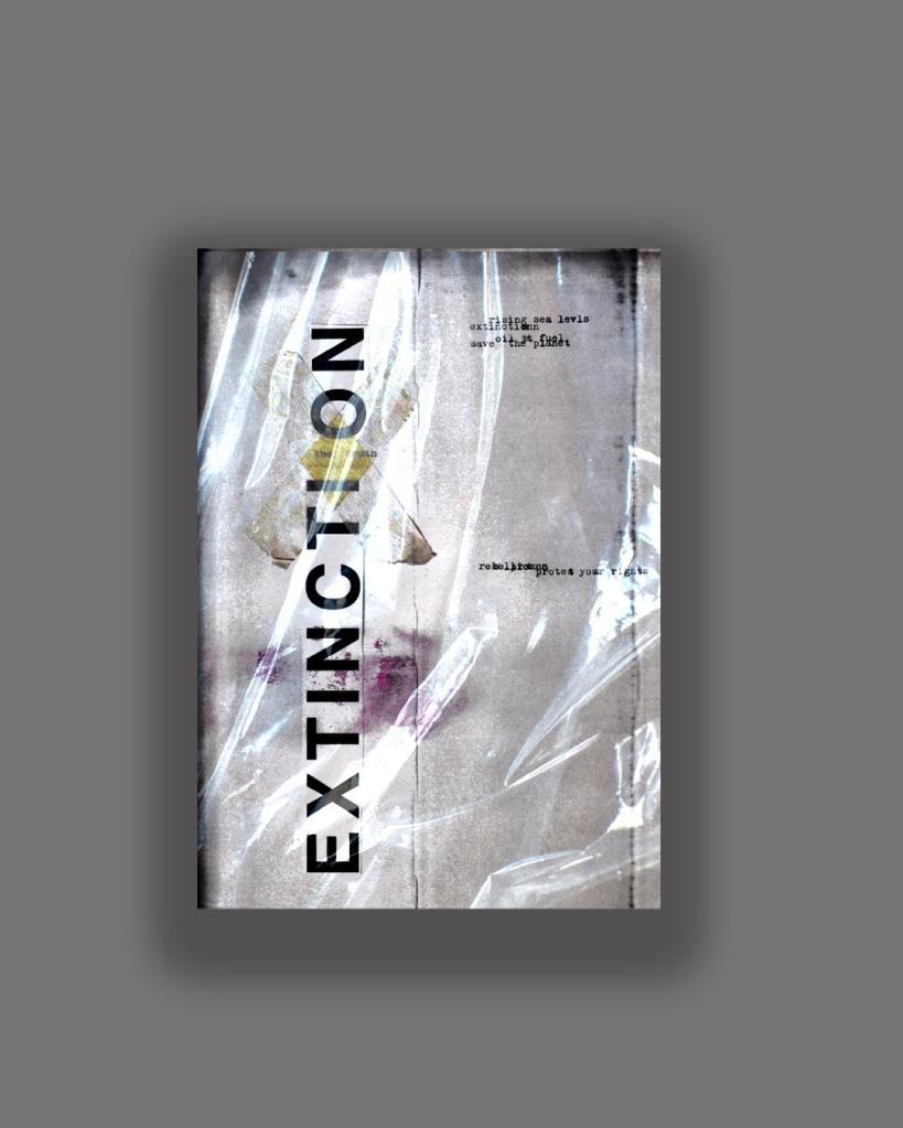

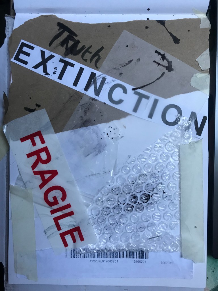
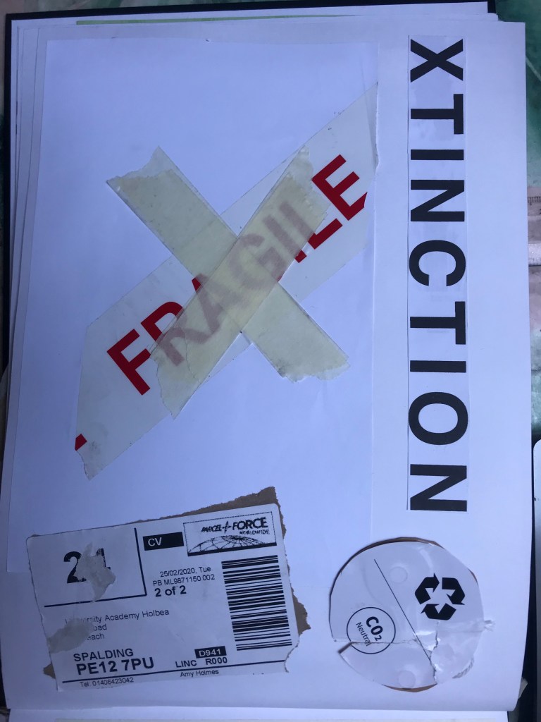
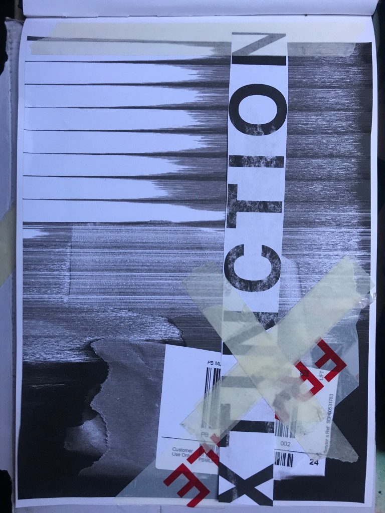
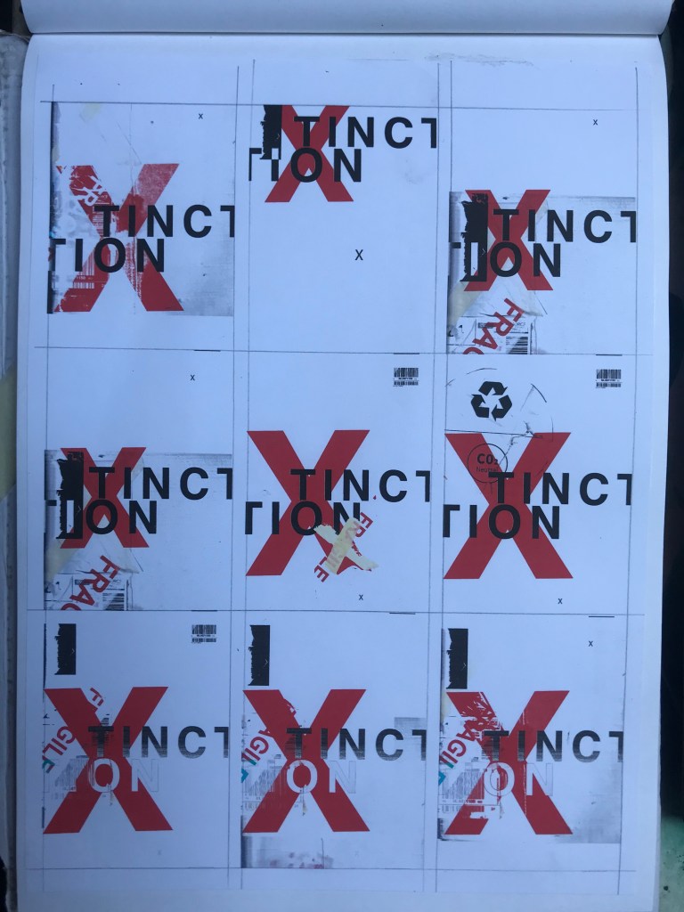
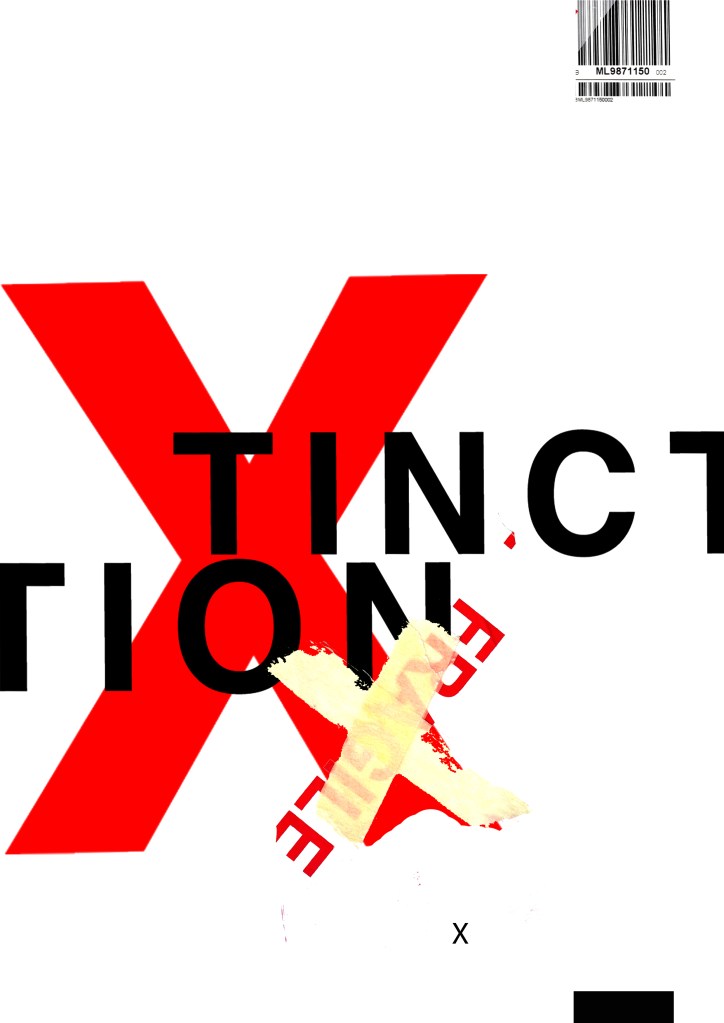
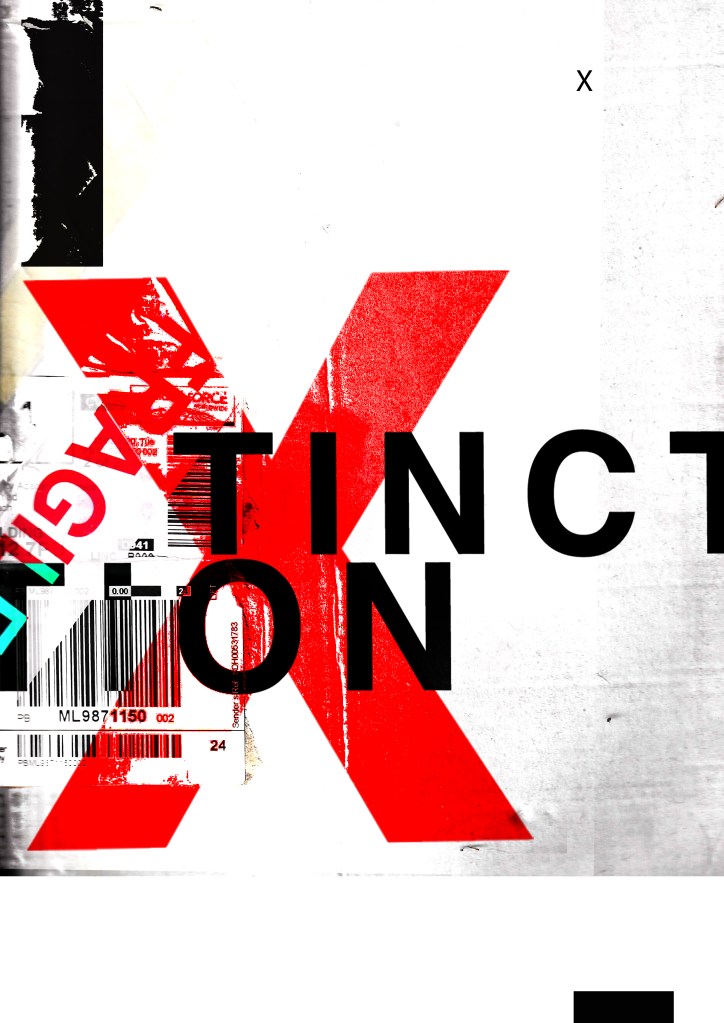
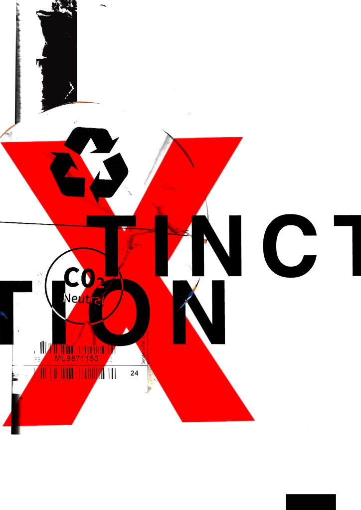
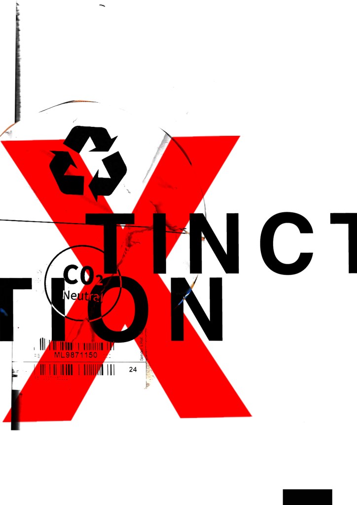
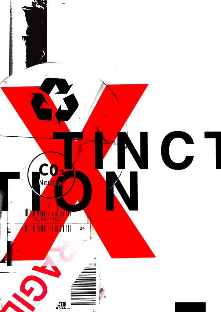
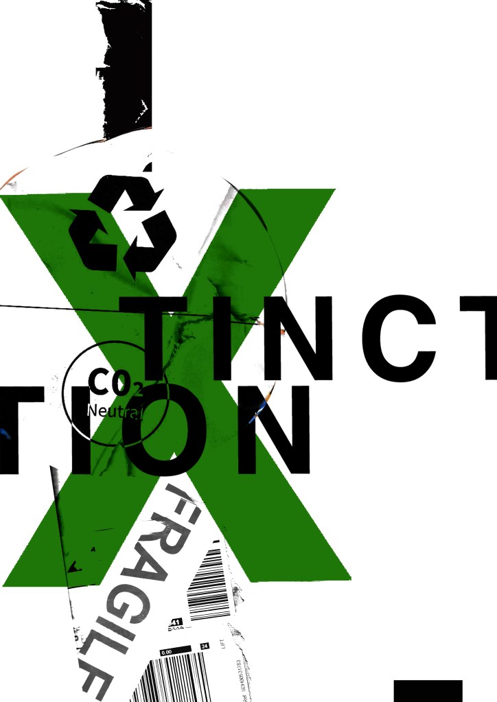
These have all been created by hand and from the resources that I have collected. I then scanned them in and added a texture in the background just to see what they would look like. I decided to trial these designs with the lettering “extinction” to match the organisations name but then I had a “happy accident” and accidentally shortened it by not sizing it correctly on one of the pieces and I actually quite liked the outcome; “XTINCTION. I think I would keep this! – (using the Occars Razor theory – why do I need the silent E? :D)
I like the idea of the FRAGILE tape and the masking tape to form the X. I had the idea to wrap something natural up using the parcel wrap and tape to show how the natural world is being affected by mankind, pollution and rubbish. I had the idea to find something natural that has been broken that I could stick back together on my collage piece to represent mankind’s input on the natural world.Something simplistic though to not take the attention away from the rest of the poster.
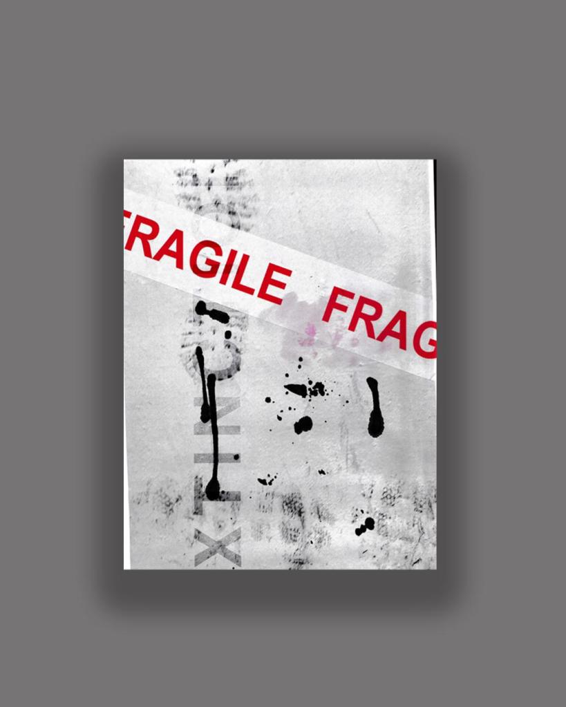
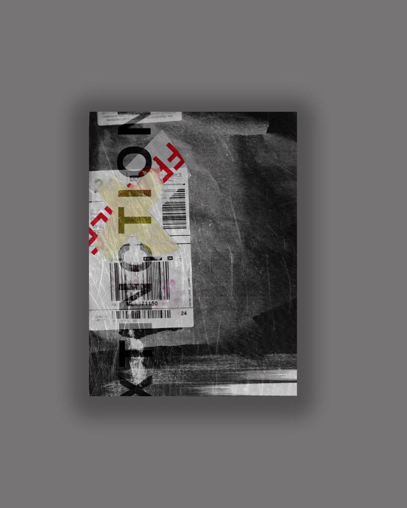
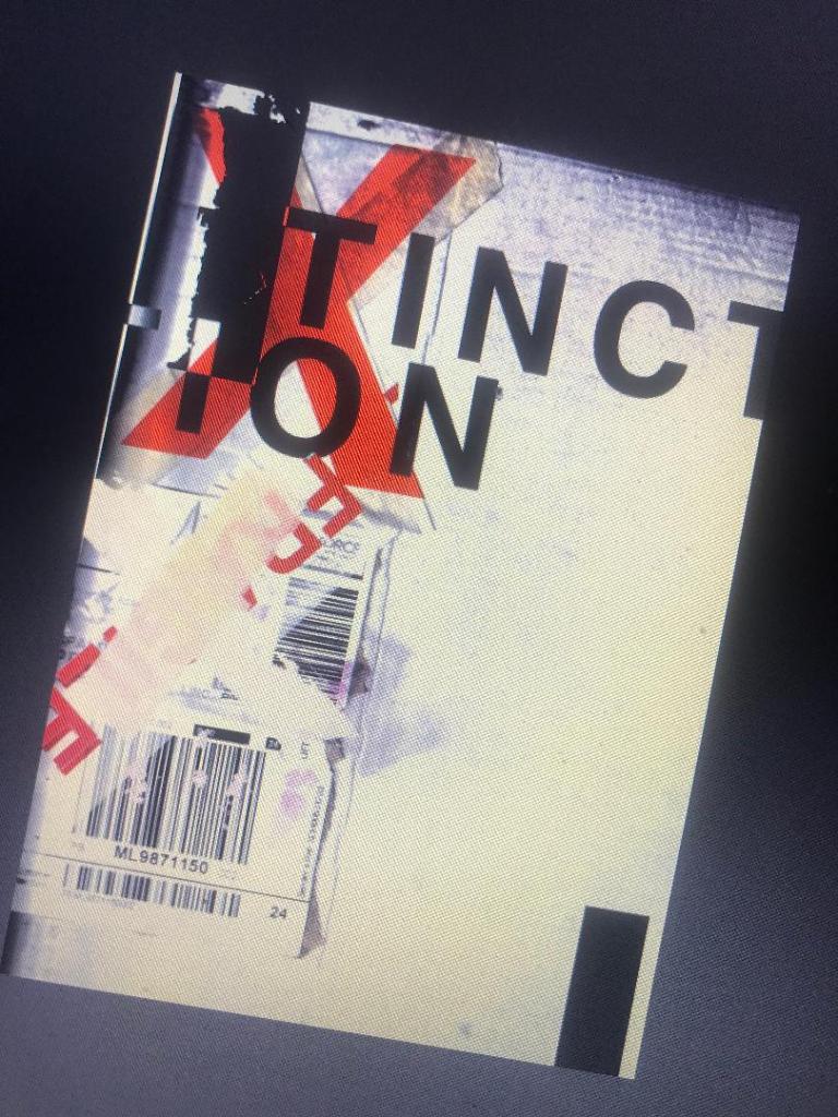
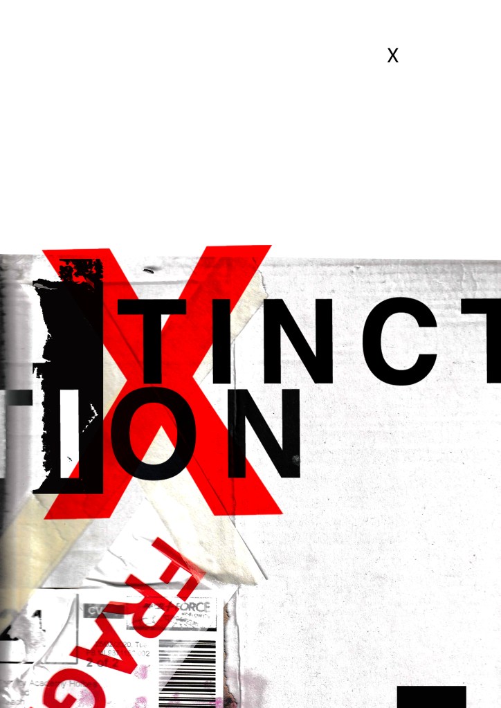
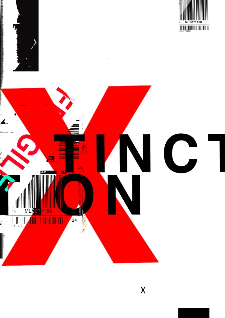
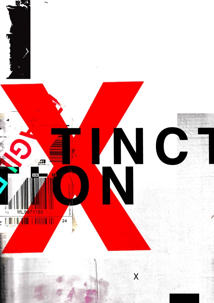
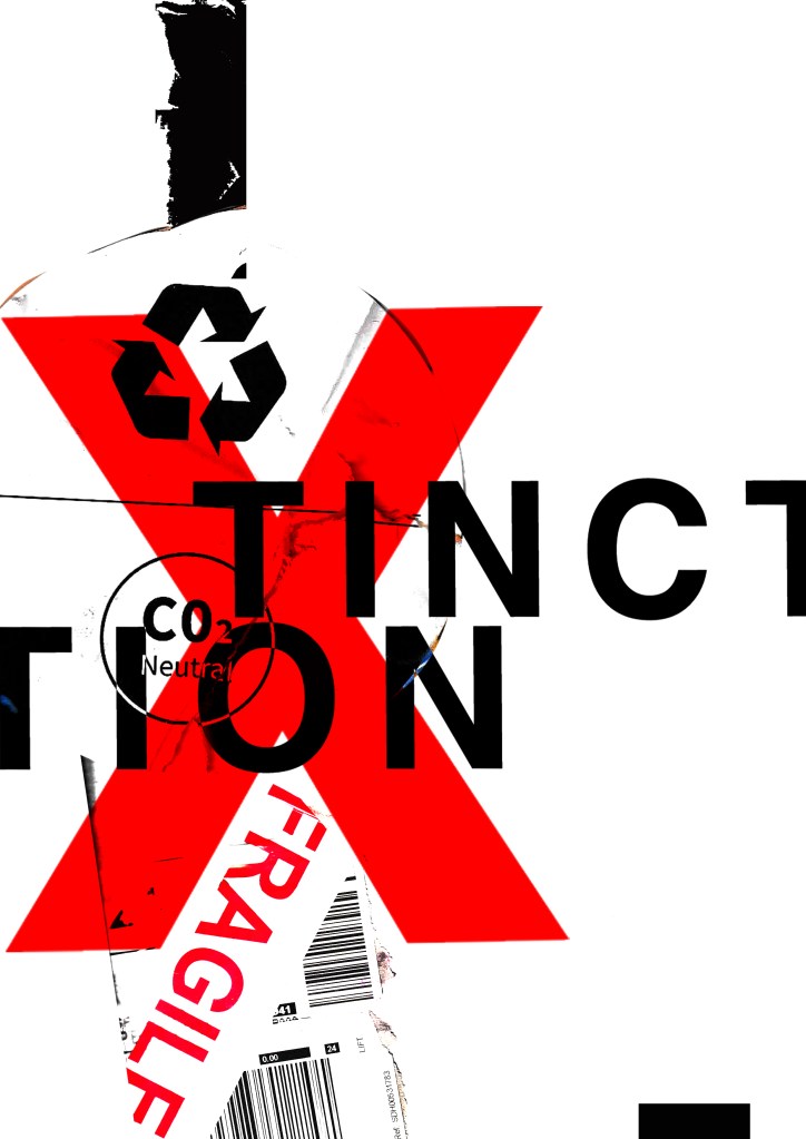
These are 2 more that I messed around with.. I like the simplistic approach of the first one but I also like the typography on the 2nd one. The like the way that I have separated xtinction and made the x bold and in red. At the moment though although I like the textures I don’t think that overall it conveys a message of what potentially the poster could be about. I think also that it needs more negative space.. at the moment there is a lot going on… too much happening all at once that the eye does not know what to look at first. I prefer the 2nd design but it needs more negative space and potentially everything to be sized down inside it. The bottom rectangle helps to draw your eye in but I think it needs to be shortened so it only just only shows at the bottom of the poster.

I then went and changed them some more.. This time I did not use a lot of texture in the designs. I kept them quite plain and simple. I think the colours “pop” more this way.


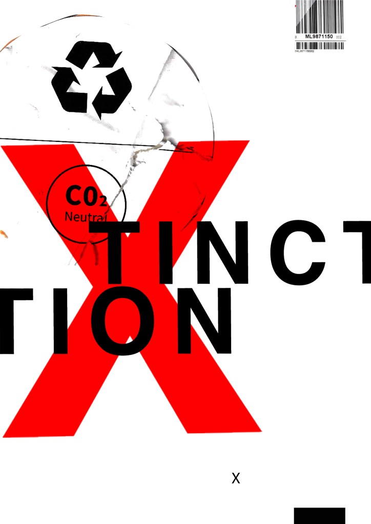
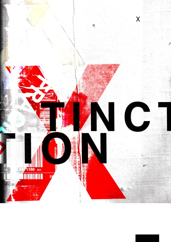


I resized elements on the poster. I also took the texture background away and I quite liked the contrast and clean look of the pure white and red. I tried to add more negative space to these and to also try and make the design flow better. Using the rule of thirds I have tried to separate elements into thirds. I have split the poster grid and layout into 3rds and placed each section of text within each 1/3 of the grid. I also tested out different layouts and placement of the text to see what flows best and what works better. It is still missing the environmental/climate change element though… You would not really know what this poster represented without the image.
…………
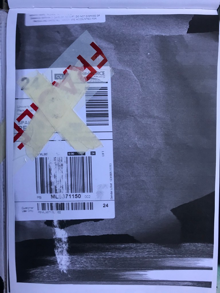
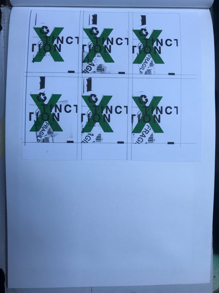
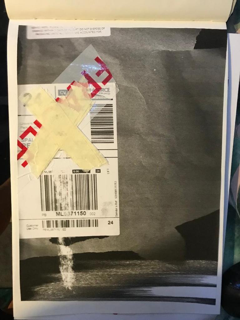
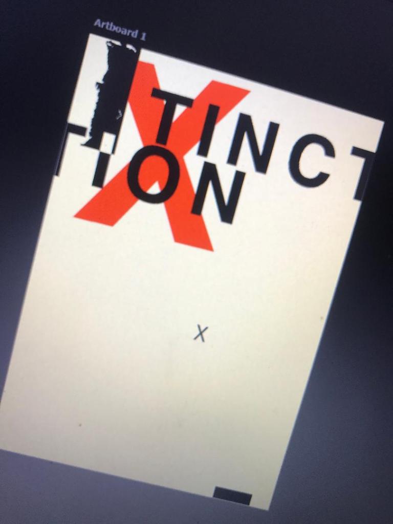
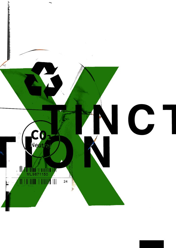
I then found this!
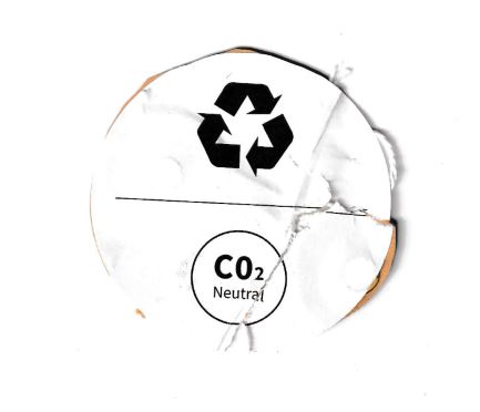
This was on the back of some packaging from a book that I ordered and received in the post. I thought it might be perfect to scan in and use on my posters because it is environmental and you know instantly what it is about. I thought maybe that this could be one of my main images. I then did some more trial pieces…

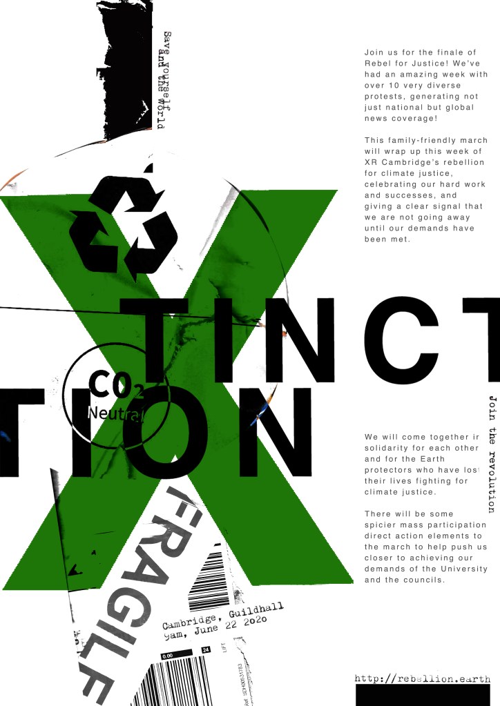
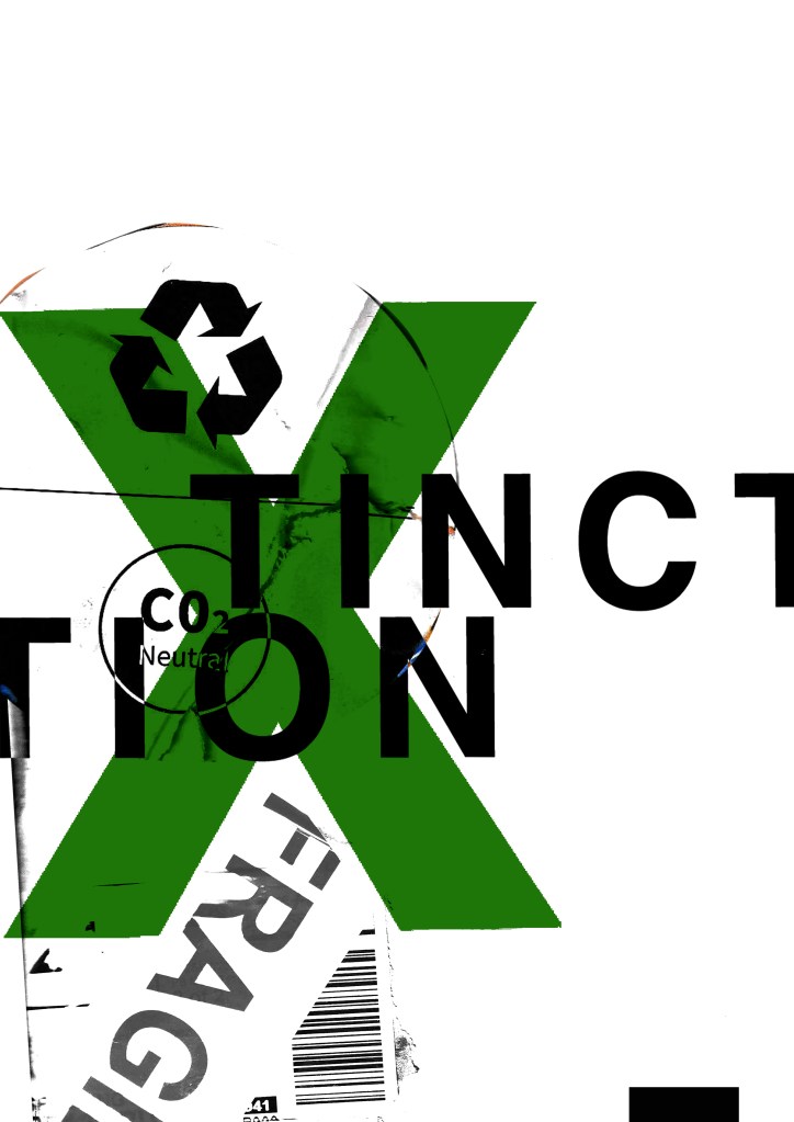
I much prefer the green colour. The green is not so threatening in appearance and it relates more to the environment. When you look at this poster it is more clear with the green to what it might represent.
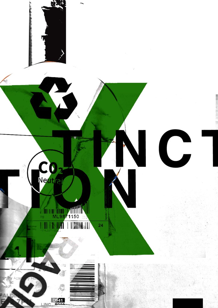


I was then torn between 2 designs..


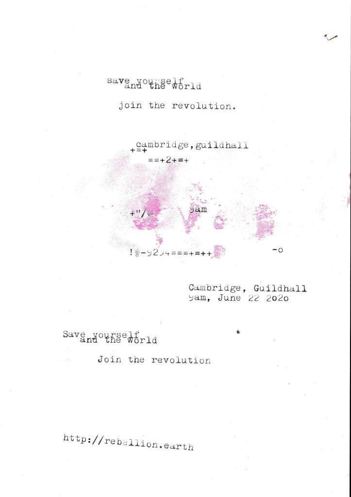
I needed to add the text into the designs also… I took the designs from above that I have made minimalist and applied Occars Razor to. I wanted to place as little text as possible to make it really minimal and to let the design deliver the message and entice the viewer in. I wanted to use a different form of media for the type instead of just typing it into Photoshop… I decided to use my typewriter to write out the text I wanted for the posters and then scan them in to alter and adjust in Photoshop.
The text that I typed out was “save the world and yourself”, “Join the revolution”, the time and date for the event followed by the organisations website. I did not want to describe the event in great detail at all in this stripped back Occars Razor poster because the nature of this version is to have as little information as possible and to let the image and the design do the talking. The snippets of information that I have put on there allow the viewer to know what the poster is about as well as a time and place and then letting them seek out more information if they want to by looking at the website.

I also had the seal of approval from the man and legend himself David Carson!…

I then went back to the second design and reworked it to jam pack it full of all the information that is needed.

The next step was to ask for some feedback…
I emailed my fellow students in our OCA email group… (if reading this years in advance from now, the crazy times I talk about are the corona virus… )
I shall now wait for some feedback! 🙂

After I completed my paper mock up I then started to develop the final digital prototype in Indesign. I want to create a few digital mock ups of my final leaflet to photograph in an environment where they would be distributed, handed out or picked up.
I opened a new document up to the size of my paper mock up (30cm x 30cm) and then took the exact measurements of the paper mock up that I made and drew these out using the measurement tool in Indesign. I then placed the images that I collected from the free resources on the Extinction Rebellion website into the spaces that I want them to go on my final prototype. I much prefer the blue design as I feel it contrasts more with the green, it looks brighter and it stand out more.
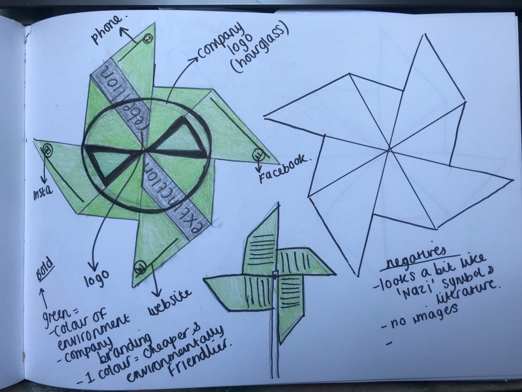
I also needed to put the logo onto my design. The original logo colour was yellow and I needed to make it green and black to match my design. I opened a new document in Photoshop and filled the background colour green, changed the colour of the text on the logo and then imported it into Indesign to place into my document.
The images above are the logo that I altered to match the design on my leaflet.


Creating the finals on Indesign.


The images above are the trial digital prototypes. I printed them out using the colour laser printer at work just to make sure that the measurements were exact etc… they were! 😀


I did worry that the images might look low res but actually because they have come straight off a PDF file they clear. I was pleased that my measurements and template worked! The printed colours obviously differ from the RGB screen colours but this is OK, I actually feel that the printed versions look better.
Once I realised that everything measured up I then continued to finish it all off in InDesign;


I used plain green on the back because I didn’t want to take the attention away from the information being shown; (The information shown is actually just Lorem Ipsum – 120 words in each section exactly!) The layout of the text is not perfect – if this was a proper design I would spend the time to adjust the text accordingly; making sure the justification, hyphenation, kerning, spacing etc was correct. The plain green is also cost effective as there is a lot of colour happening at the front of the leaflet. I have tried to restrict the colours the best I can to try and avoid printing cost implications for if it were to go to print in industry.


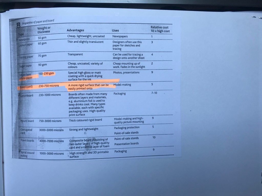
I then needed to decide what paper to print my final prototype on. I did not want to use card as it is more costly, but I needed something that would be more appropriate towards modelling because really that is what my leaflet is; a model. The best option was to use a 230gsm weight paper… it is borderline into the card category but still classed as a good quality thick paper. This allowed my prototype model to be strong and still look high quality. The cost however would be slightly more than inkjet/laser paper.

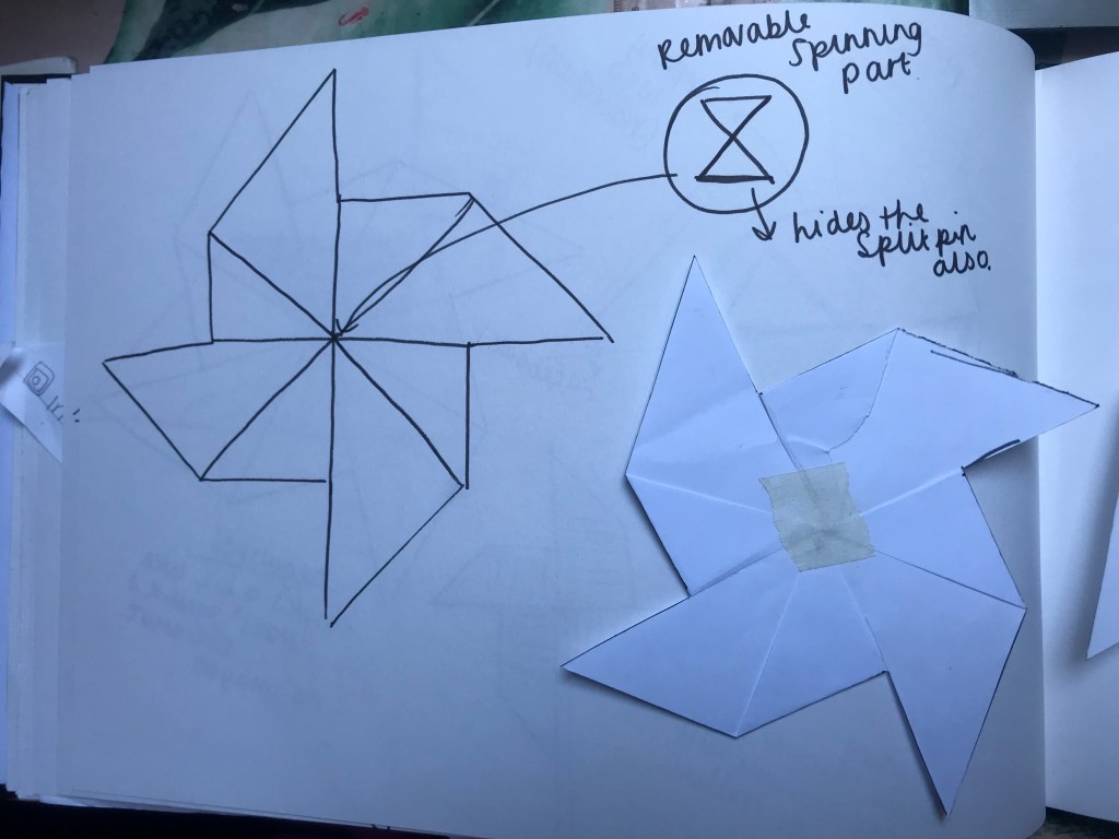
I then got to making the final thing! My paper straws were far too small for the windmills so I had to improvise and stick 2 together! – obviously if these were being made for real they would need the proper sized straws; however, I think it worked for my prototypes.

I am pleased with how they turned out! I think I have been quite playful and creative in my approach with these which is what the brief stated; however, I am not sure that they would be cost effective long term because of the colour printing; I have used a few colours on the front of the leaflet. The split pins that are needed to make them are also a cost factor and also because of the paper straws.. the straws could also become a costly factor but as much as they are paper and are environmentally friendlier for the environment, they are still an environmental factor to consider.

I had a rethink on my design and how I would do the final layout…
I don’t want to spend too much time concentrating on the design as the exercise is more about the layout and style of the leaflet rather than the overall design. I made a paper mock up of how I think I shall design the final prototype. The size is just larger than A4, 30cm x 30cm in size.


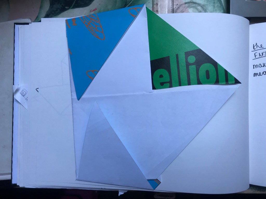
Using black and green as solid colours on the design would appear too harsh so I started to have a think about what image could potentially go onto the leaflet. I had a look online at Extinction Rebellions images and artwork to see if there was anything I could use…I actually found a section on their website dedicated to their art resources; free printable resources to use on their protest days etc… It did say that the artwork is free to use as long as they are not used commercially or for any other fundraising… I think using them for the sake of my student project will not matter all too much. There was a lot to look through so I decided on 2 that might work on my leaflet:


Extinction Rebellion use Butterflies/moths in their designs a lot. I decided to use the same on my version. I shall try and take sections of the images and incorporate them into my mock up. The 2 images above are quite nice in appearance. I prefer the blue version so I shall try and incorporate that into the design the best I can. Most of my leaflet will be a toxic green colour however so I need the colours to contrast. I am concerned about the blue and yellow as neither of them will really contrast against the green. I am hoping more for the blue though as this stands out more.
I shall now try to create a final prototype in Indesign so that I can print the leaflet off several times and make a few to photograph in a place where they might potentially be handed out or picked up.
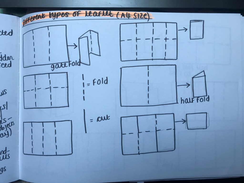
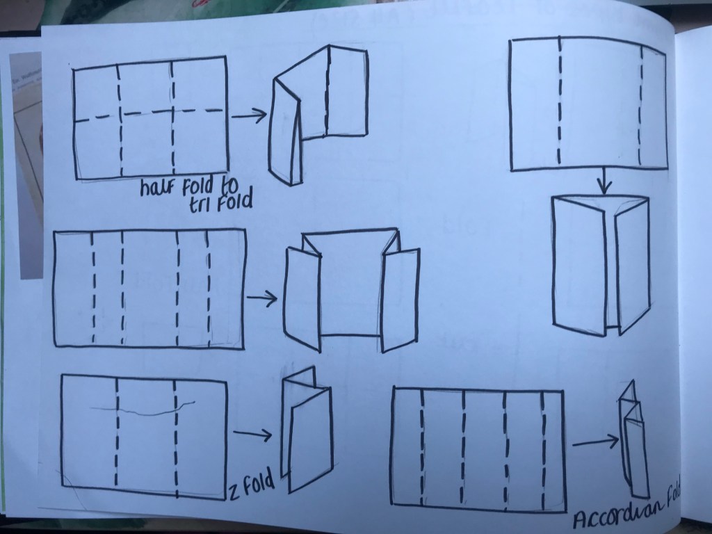
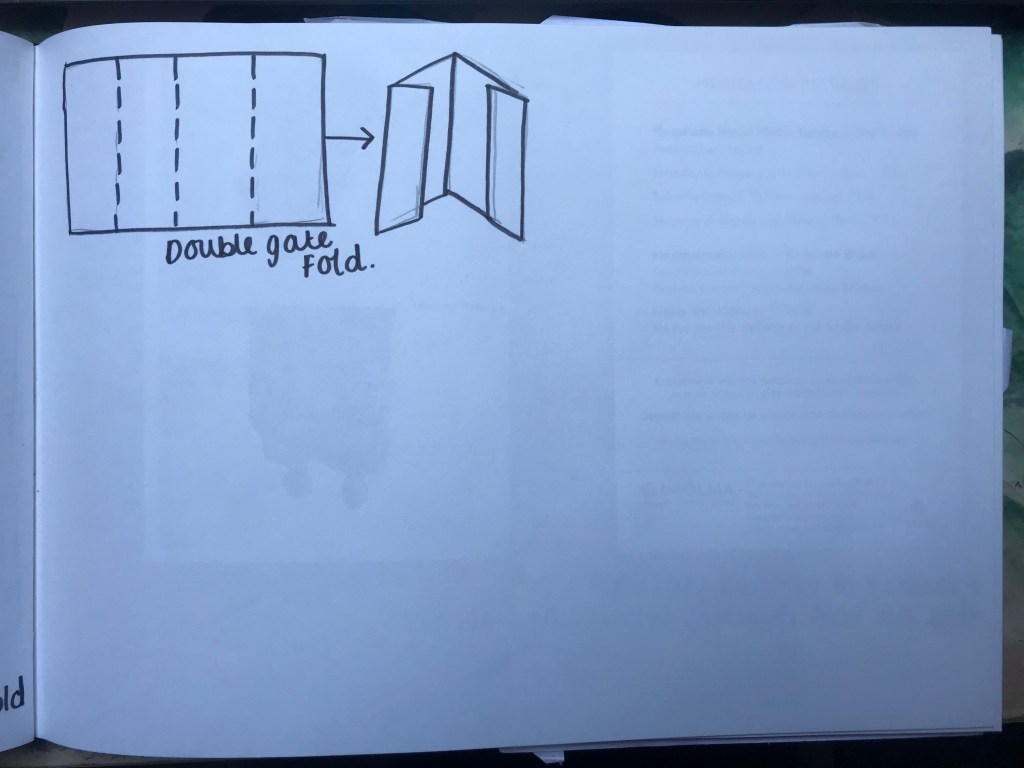
I started off today by experimenting with different leaflet folds.. to be honest from doing some leaflet research, collecting and seeing what is out there, (I have stuck some down in my sketchbook) there is not a lot of creativity. Most of the leaflet designs are a basic 3 panel folded leaflet!
I decided to trial out different leaflet folds myself to get an idea for the different combinations out there and also to get an idea for the format and layout for my potential designs.

These are the basic ones that I came up with. I imagine that these layouts are used the most by companies for their leaflets. I was not feeling very inspired by any of these. Following on from my previous Guerrilla art post I really wanted to look into something more creative…


How could I come up with a creative solution that would get across the information that I needed it to but to also represent climate change and also be appealing for people to want to pick it up and read about what it is all about?
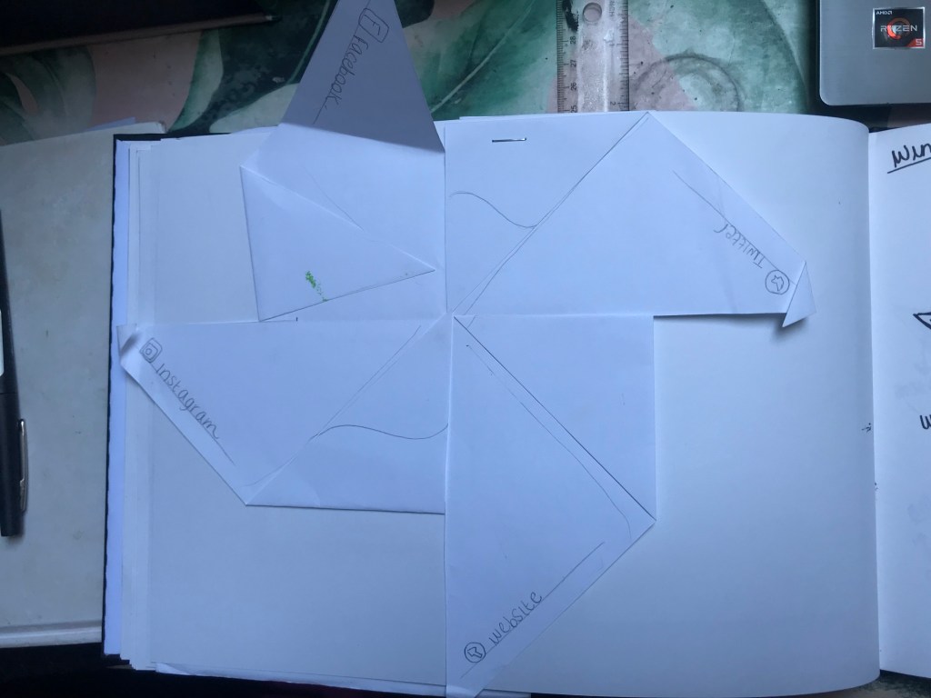
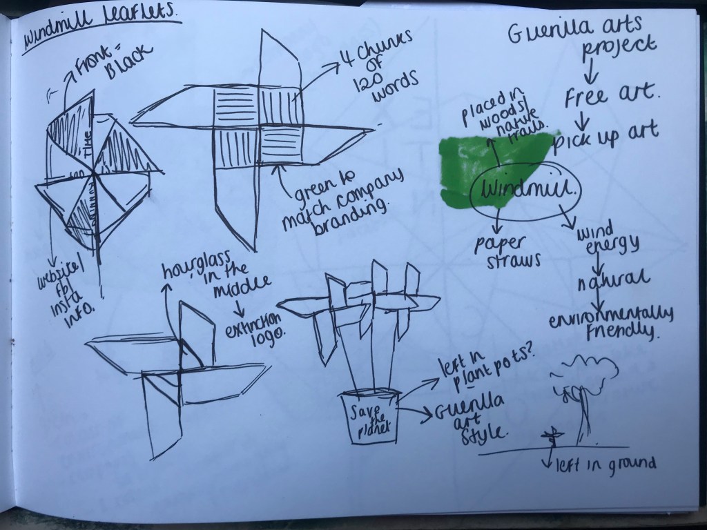
The idea I have right now and which I am developing came from me organising my desk at work and I just realised that it might just work!…


On my desk is a paper windmill that we make with the year 5s and 6s on open days at school… this one was one that I made as a demonstration piece but kept on my desk! Looking at it gave me the idea to make my leaflet into one of these windmills! The windmill relates to climate change (environmentally friendly wind power) they would appeal to a new target audience (younger children and families – although the organisation that I am using are quite a controversial group!)
They could also be handed out, picked up at events or left in the style of Guerilla art outside in public places; for example left in a plant pot on the corner of a busy city high street . The windmills would be easily accessible to take.
I have done some mock ups and some sketches of some designs I could potentially do.. I am a little bit concerned with how they look so far though… The shape and style of my windmill in my mock up sketches reminds me of German Nazi logos and literature.. I think it is the harsh design and also the colours used.
“Extinction Rebellion” seem to be quite a controversial group the more I read and research into them, their logo and literature designs to date are also very brash, bold, simplistic and hard hitting.

It is difficult to soften down the appearance of the design as I am using their branding and style of design that they use in all of their existing promotional literature. I shall try further to soften down the overall design and not make it look so hostile! There needs to be 4 chunks of 120 words so I shall use Lorem Ipsum to fill the copy text for this.
I also did some research into straws as the ones I originally did with the year 5s and 6s use plastic straws… this is not environmentally friendly especially since the publication is for a climate change group! Obviously I need a cheap, environmentally friendly alternative. I researched into bamboo vs paper straws. Bamboo straws work out at about £5 for a pack of 6 which long term producing lots of leaflets would could a fair amount of money! They are however bio-degradable and nicer for the planet! Bamboo straws would also be more difficult to attach to the windmills. Paper straws seems like the best option… They are friendlier for the environment than plastic straws, they are reasonably cheap (I picked up 100 for £5) they are easily attachable to the windmills (using a split pin).
I will post more about how I put it together when I make my mockups! I now need to go away and think further how to make the design look less hostile!
Watch this space!//…..
As part of the research into this exercise I have decided to look into Guerilla art and marketing.
Guerrilla Art emerged in the UK as “free art” left by artists in public places. There are many reasons behind this; self promotion, to make a statement, for fun, marketing or just for the love of giving free art a new home! I have always liked the idea of this kind of art! I have seen some interestingly placed art on the streets being photographed and shown online and on social media. As well as just for the love of giving out free art – I think it is also a good and effective marketing idea.

Guerilla art is very cleverly done in the placement of where they are hidden and also for the randomness behind it. I like the idea of beautiful pieces of art being hidden or being adapted to the urban environment around them.


This exercise is all about being playful and creative in approach and looking outside the box for an unusual answer to the problem. It would be interesting to see if I can bring the Guerrilla style approach to my leaflet design. Instead of making the leaflet just a readable leaflet to pick up or pass around, it would be a good idea to consider making it a physical object that could be placed in an outside public place to be picked up and taken away and to act as marketing and as a piece of art.
I have collected some imagery of Guerilla art and clever marketing techniques on my Pinterest:
If I made my leaflet in the style of Guerilla art, I would have to have a good think as to where I would leave them in public. My leaflet is aimed towards climate change meaning that they would need to be left in places that relate or are affected by climate change. I could leave them in woodlands, the coast, nature reserves and walks or in quiet corners of hustling busy cities just to show that nature still exists in concrete jungles!
This photo below is a good example of a piece of nature being left in a concrete jungle!

The next steps of my research are to look into different leaflet styles and to also have a think some more of how I can bring the Guerilla Art style into the marketing aspect of my leaflet!

This exercise is more practical hand based than the ones I have done so far.. Instead of focussing on the final polished design outcome, this is based more around physical mock ups and trial pieces and trying out different outcomes, combinations and formats before a final outcome is reached.
The brief is to design a leaflet for an organisation who want to reach out to invite people to volunteer for their cause. The brief states that they want to target a new clientele. I am to ignore the actual body copy on the leaflet and all of the sub headings and just concentrate on the different folds, styles, layout and formats of leaflets. The brief encourages me to be creative and playful in my approach and to find as many different combinations as I can.
To start this brief I first needed to know what organisation I wanted to target this brief at. I started off with a brainstorm in my sketchbook of different potential events and volunteering tasks:
I then decided to look online to see what upcoming volunteer events were happening. I found an interesting one based in Bristol called Upfest which is a celebration of street artists and graffiti. It is a festival of street art and music. The event runs in May 2020. I might actually consider attending this event as it is something that interests me! – The festival runs purely from volunteer work and the charity that they back is NACOA (National association for children of alcoholics).

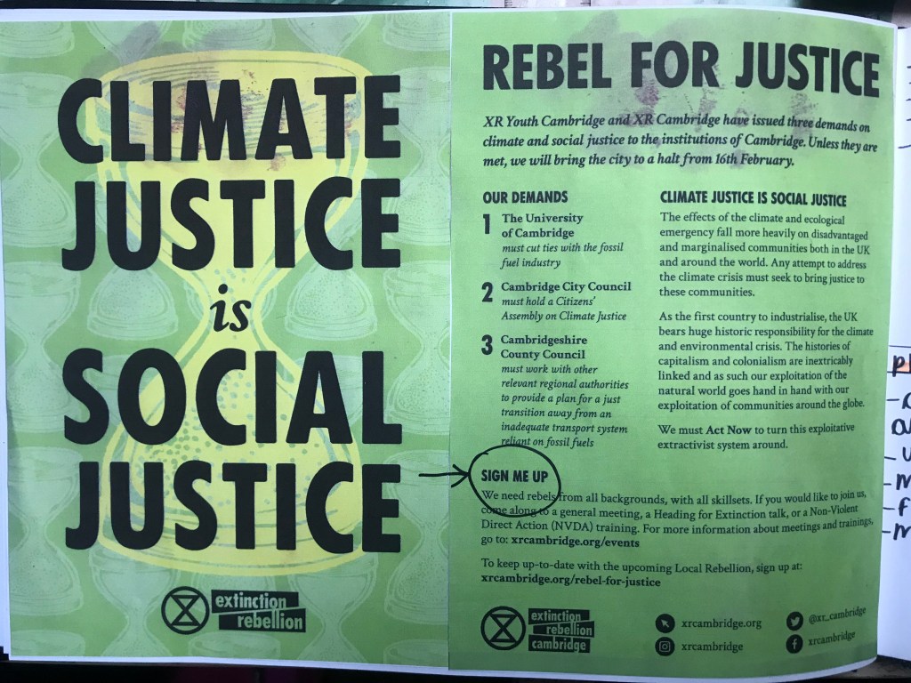
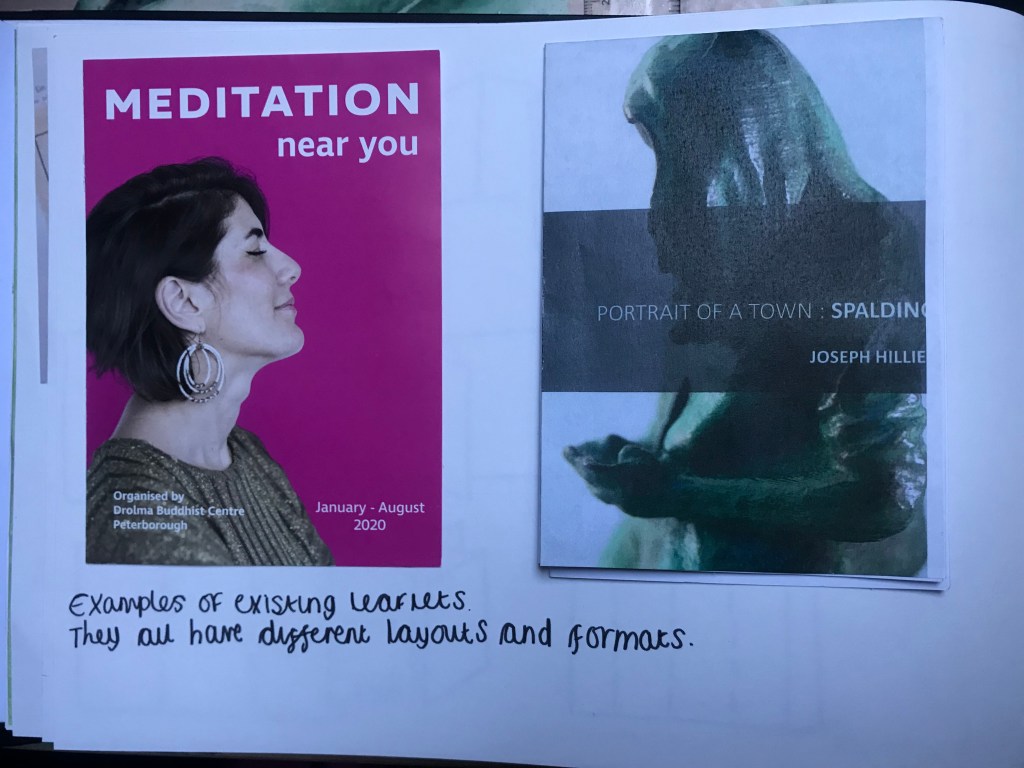
I then realised I was given a leaflet when I went on a visit to Cambridge at the weekend… I decided to look into that organisation.
They are an organisation called “Extinction Rebellion” and they focus on protesting their rights towards climate change and saving the planet. When I visited Cambridge at the weekend they were doing an activist protest near Kings College in the streets and handing out these leaflets:


I figured that this would be a good organisation to focus on. They are conscientious about saving the planet and sustainability and this would be perfect for designing the leaflets as it means I will have to take into account the paper and materials used and also how the leaflets would be distributed…
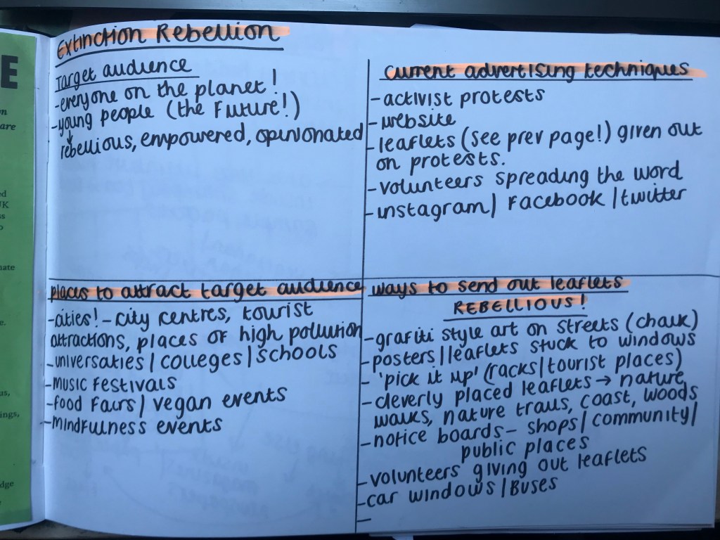
I then looked into the target audience for this organisation:
Overall I feel that as someone who was in the middle of one of their protests and who was given one of these leaflets, that yes! It intrigued me to read and see what the protest and the organisation was all about but otherwise I would not have actively gone out of my way to pick up a leaflet myself.
The organisation seems to be a very rebellious and carefree “pushing the boundaries” and I feel that they could really be naughty with their advertising and place it wherever they feel pushes the point across…
(I mean…This group dug up the lawn of the Trinity College in Cambridge!…They are not scared!)
They already stick posters etc on controversial windows and buildings… political, religious…which grabs attention but this kind of media is not really promoting them needing volunteers or explaining what the cause is specifically for.
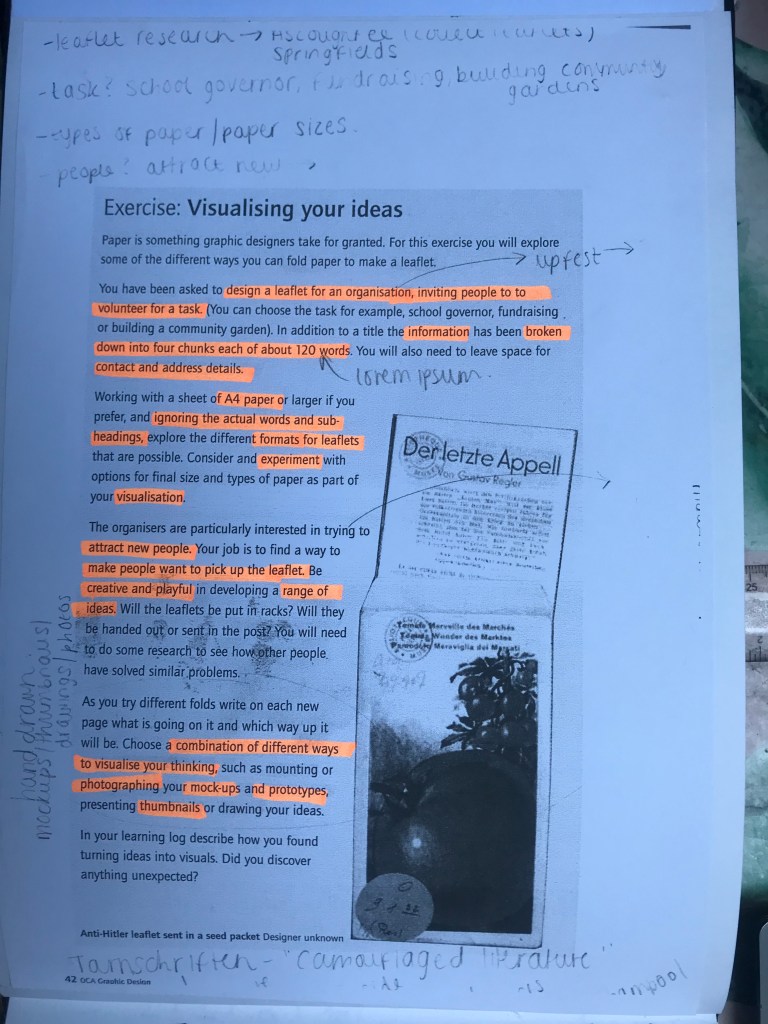
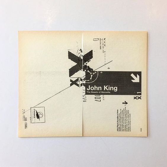
The image used on the brief given me by the OCA intrigued me….
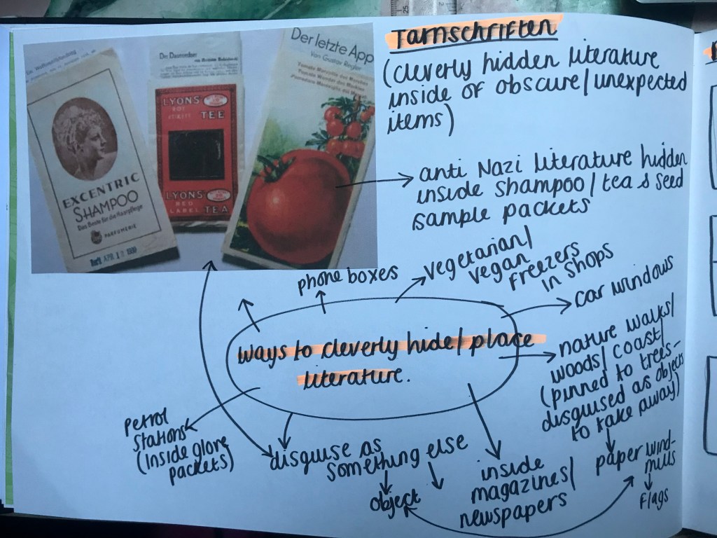
The image showed Anti-Nazi literature hidden inside everyday objects.. I liked this idea and decided to research more into it. The examples I found were hidden inside samples of shampoo, seed packets and tea bags. It is a clever way of hiding something where no one would think to look for it.

Hiding the literature in everyday items also ensures that they are reaching a wide target audience. 84% of Britain drink tea (I am in the 16% who don’t! – although I do at Afternoon tea parties so I do not look like the odd one out! haha!) therefore by placing the literature inside tea bags they are ensuring that they are hitting the vast majority of the country with their information. It is also the last place the Germans would have gone to look for it!
I then mused about where I might put some climate change leaflets.. Again, climate change affects everything from transport to food to migration to deforestation to land ownership to petrol, planes, carbon footprint, building, the rising sea level… the places and ways of hiding these leaflets would be endless as everything ultimately comes back to it!…
The next stage for this exercise now is to experiment with different leaflet styles, formats and combinations so that I can hopefully decide where to move forward with my design!
Keep posted for the next installment! 🙂

As per my last post I made the adjustments I felt I needed for the designs and here they are!

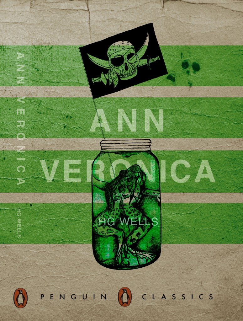
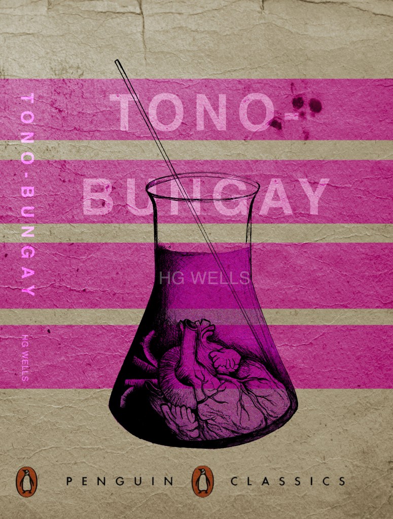
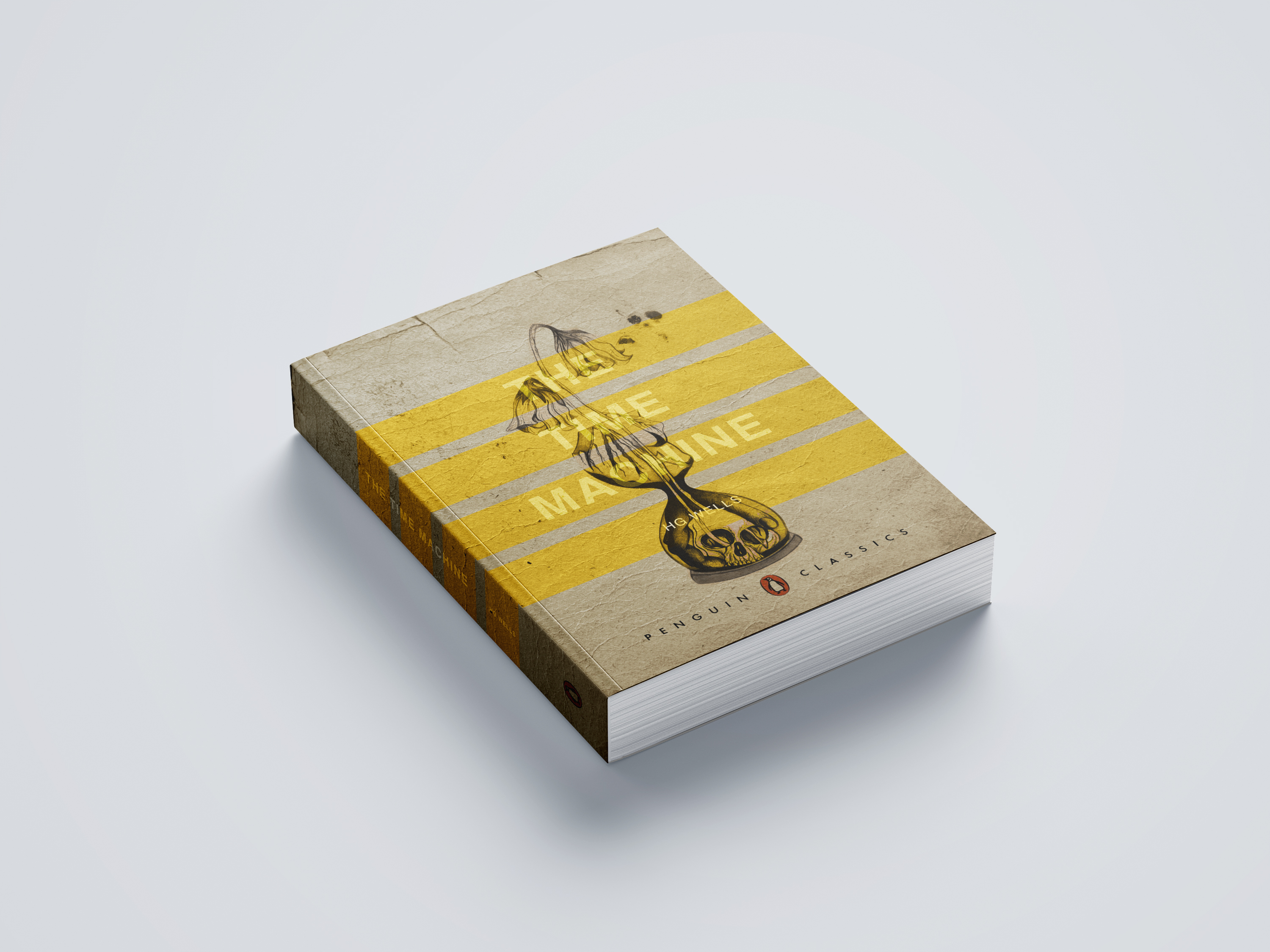
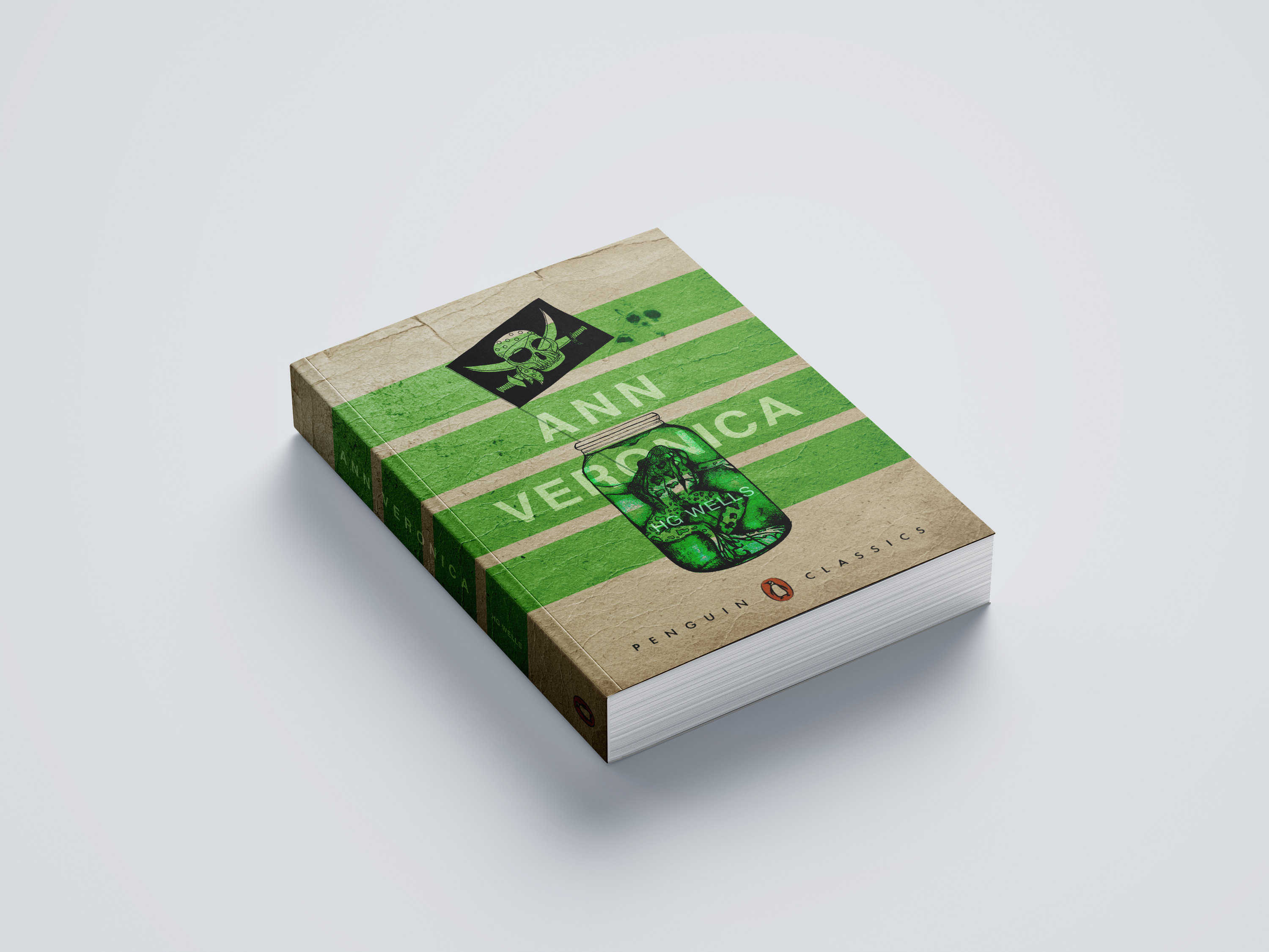
I also found an appropriate paperback book mockup (as stated by the brief) to mock my designs on!
I feel now that there is more contrast in the designs and the text of the authors name (although smaller) is more legible and does not take the attention away too much from the main title.