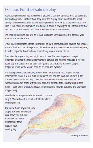
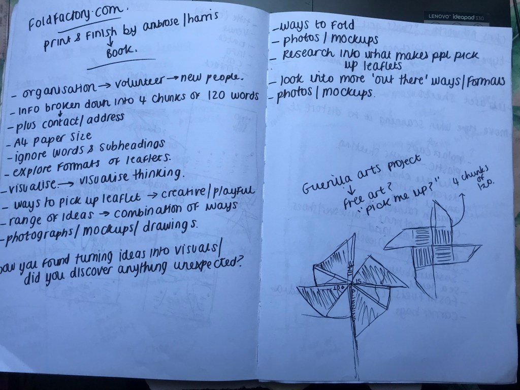
Exercise: Signs and Symbols

  • The brief
  • First thoughts
  • Research
  • Initial Ideas
  • First designs
  • Final design
  • Critique and Feedback

The Brief

First Thoughts

I will admit that when I first read this brief I felt confused and frightened by it and I had no idea of what I would do! – There was just so much being asked and explained and so much information to absorb!

I think that including metaphors and similes into the equation made me initially freeze and panic and make the brief seem far more sophisticated and complex than it actually is. My brain was trying to find complicated answers when actually it was quite a simple response.

My first thoughts were to familiarise myself with metaphors and similes as my GCSE English days were a very long time ago!..

Metaphors – To compare something as something else (2 unrelated subjects) Refers to one subject by mentioning another or it might identify hidden similarities between the 2 things.

Similes – To liken or to say something is similar to something else, particularity using the words “like” “as” or “than”. “As brave as a lion”.

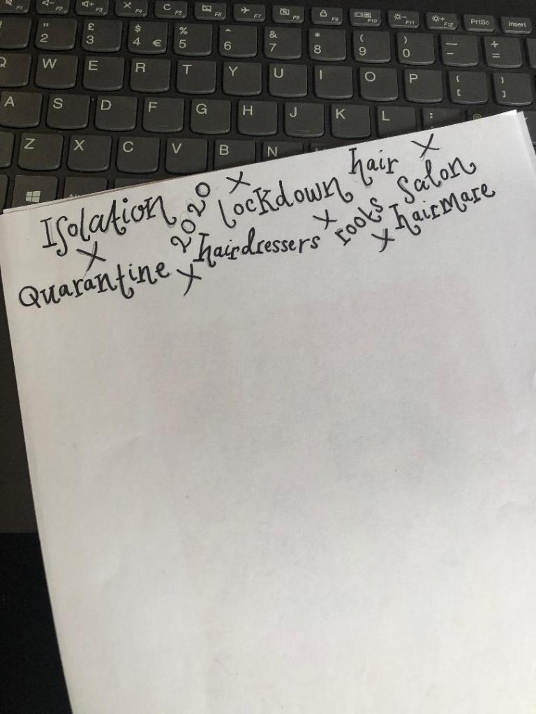
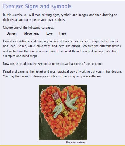
Moving on from this I decided to research some metaphors and similes around the 4 words I have been given to choose from in the brief. I chose Love and Danger to look at some examples and then to decide which one I would choose;

Love

  • “Falling in love”
  • “blanket of love”
  • “Love is a battlefield”
  • “Love is a garden”

Danger –

  • “Skating on thin ice”
  • “playing with fire”
  • “On dangerous ground”
  • “sail close to the wind”

Research

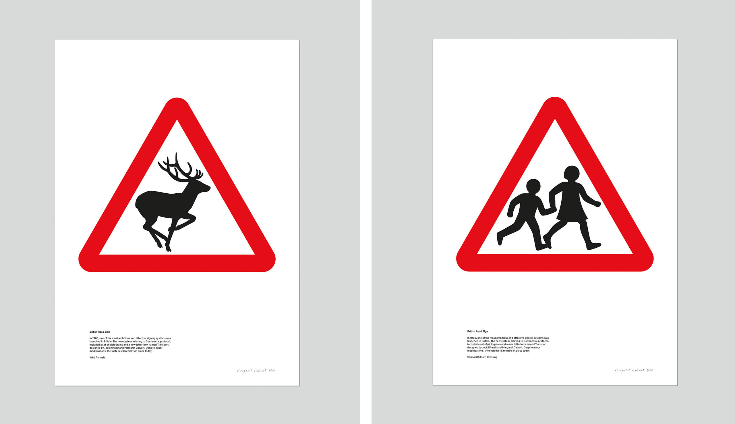
The next step in this exercise was to research existing signs and symbols. When I first read this brief there was only one designer who sprang to mind – Margaret Calvert who designed and implemented signs and symbols for our roads. I decided to refresh my memory on her work.

Margaret Calvert

Margaret Calvert is a famous British typographer and Graphic Designer who designed many of the existing road signs on the roads in the UK. Margaret also designed the typeface “Transport” which is also used on road signs.

Transport font.svg

Calvert was South African born and bred, she moved to England in 1950 where she started studying at the Chelsea College of Art. Her tutor there named Kinneir, asked her to help him design the signs for Gatwick Airport. They both chose the black on yellow scheme for the signs after researching that this was the most effective combination.

In 1957, Kinneir was appointed as head of signs for Britains roads. This worked out well for Calvert as he asked her to redesign the road sign system. Calvert came up with a very simple and easy to understand approach by using pictograms. Some examples of this are:

  • “men at work” (A man digging) – Calvert would appear on an episode of Top Gear where she would try and defend this controversial sign which to many looks like a man is having a fight with an umbrella!
  • “Farm animals” – This sign was based around a cow called Patience that she grew up on a farm with as a child!
  • “School children nearby” (A girl leading a younger boy by the hand)

All of her signs used triangles and circles; triangles showed warning whilst circles showed mandatory restrictions.

Signs and symbols are everywhere. There is a saying which goes;

“It is always better to show than to tell.”

Signs and symbols have the power to cross language barriers and can help to engage with an audience on a deeper level other than just words. Symbols are universal. Where words fail us, a sign or a symbol communicate a message quite simply and effectively. In my opinion what makes a successful sign or symbol is one which does not need any written word beside it.

I read and own a book called “GO” by the Graphic Designer Chip Kidd and in it he wrote about an image of an apple and the fact that you do not need to write the word “Apple” above or below it to convey that it IS an apple. The symbol or picture speaks for itself. This is the link to the TED talk relating to this:

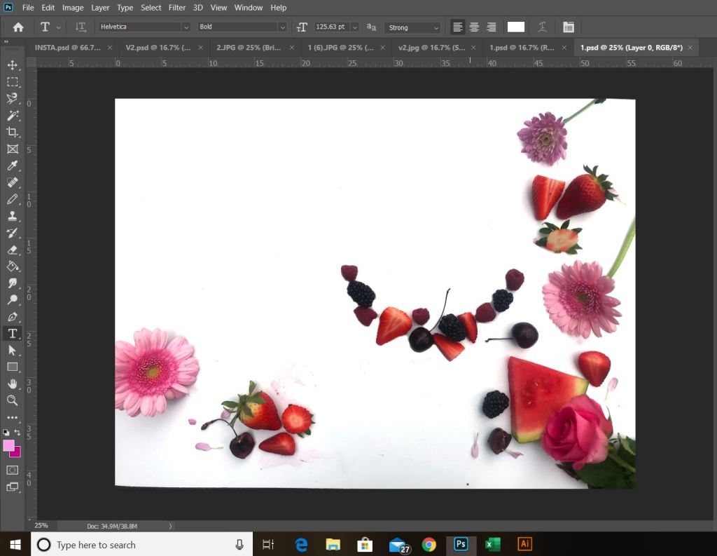
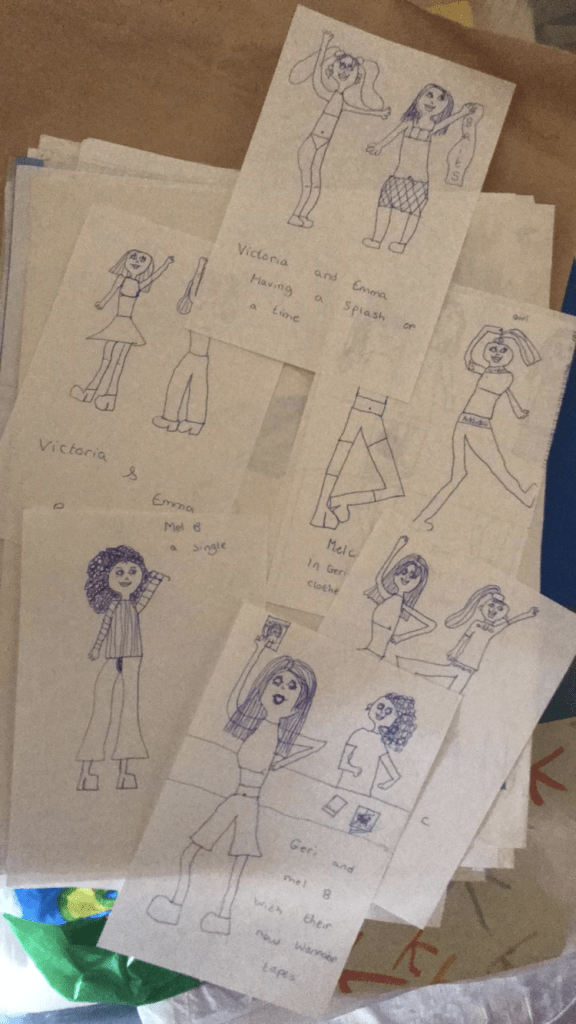
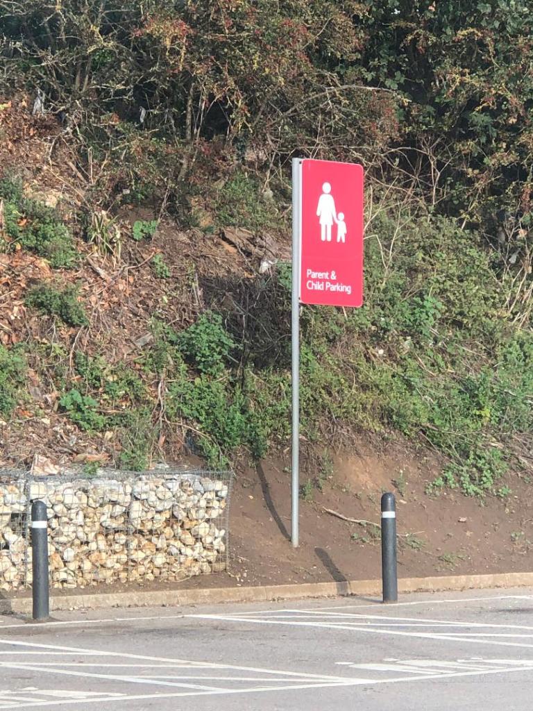
Driving out and about signs and symbols are everywhere. These are just 2 that I decided to photograph in Hunstanton whilst I was sat waiting in the car in Tesco car park.

The most commonly used symbols worldwide are:

  • Arrow symbols: used to represent directions
  • Cloud, rain, snow and sun symbols: used to represent weather
  • Power, disk, wifi and bluetooth symbols: used to represent tech
  • Wheelchair, information, bathroom and no-smoking symbols: used on different signs found in public places

These are known as universal symbols. There is no language barrier; everyone from any background, culture or country can understand what they symbolise and mean. They are understood immediately with no ned for explanation.

Sign and Symbol shapes

It is not just the symbol itself though that needs great thought.. it is the shape that the symbol goes within. Different shapes represent different meanings.

  • Circle: Completeness, cycles, continuation, playfulness
  • Square: Stability, tradition, security, straightforward
  • Triangle: Transformation, movement, balance
  • Intersecting lines: Relationships, connected
  • Spiral: Growth, evolution, transformation
  • Five-pointed star: Excellence
  • Arrow: Direction, movement, force
  • Curved lines: Movement, connection, fluidity
  • Diagonal lines: Tension, excitement
  • Zigzag: Path, confusion

Circles and Triangles are the main shapes used on signs. Circles symbolise something that has to be conformed and adhered to whilst triangles carry warning. Triangles are renowned for their harsh sharp edges which carry warning in itself alone.

Sign and Symbol colours

The colours used within signs and symbols is another very important factor to consider. Signs need to stand out and be visibly noticeable right before you even reach them and the only way this is going to happen is with the use of simple contrasting colours. Black and yellow contrast each other and stand out. Black and yellow are always used in warning signs. Red and white are other commonly used colours.. particularly in the road signs by Calvert.

From looking at this research I had a good idea of where I wanted to go with this brief…

Initial Ideas

I knew that I wanted to use the word “Danger” as my chosen word to design for. From looking at the metaphors I researched, I knew that I wanted to explore “Playing with fire”.

I knew that I did not want to over complicate the design, it needed to be the simplest possible form, no use of words and clearly communicate the message of DANGER.

Playing with fire is very self explanatory. When you play with fire you are putting yourself in great risk of danger. When you play with fire you are usually well aware of the hazards and danger involved but pursue it anyway.

With this mentality in mind, it gave me the vibe and feeling of children messing around; children playing with fire. This led me back to my research around Margaret Calvert; the schoolchildren road sign. What if I could design something very similar to that of what she did but portray playing with fire instead?…

With this idea in mind, I had visions of a triangle warning sign with an image inside of children literally playing with a fireball. I did need to convince myself however that if I created a very similar sign to those of Margaret Calvert that I would not be seen as copying her work.

In the brief it states;

I will read existing signs (Margaret Calvert’s) and then drawing on their visual language (using their designs as inspiration) create my own.

In the back of my head I remember an interview with Chipp Kidd where he explained how he sourced the inspiration for his book cover designs; he regularly stole snippets, photographs, scans or past designs of other peoples work to use on his own and manipulate or change. Making work similar or copying other designers work is always a grey shady area.. but I decided I would use my own silhouette drawings of children and I made sure that there was no existing signs for playing with fire. I asked for the second opinion from my boyfriend, who is a teacher (although a teacher of motor mechanics – no design knowledge at all! :p) and he was also in agreement that the brief is pretty much asking me to create something very similar to what already exists. I am not trying to reinvent the wheel here!

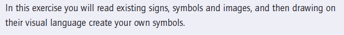
From this point I started sketching some rough drawings. I wanted to make the “playing” part very clear. As soon as you look at the sign the message of “play” needs to be very clear. I pondered using football and other ball sports which could include the use of a fireball but the idea of skipping was very dominant in myself and my boyfriends mind. The idea was to have the 2 children holding a skipping rope either side and the fireball is playing in the middle. I think the idea works. It is simplistic, snappy and easily understood.

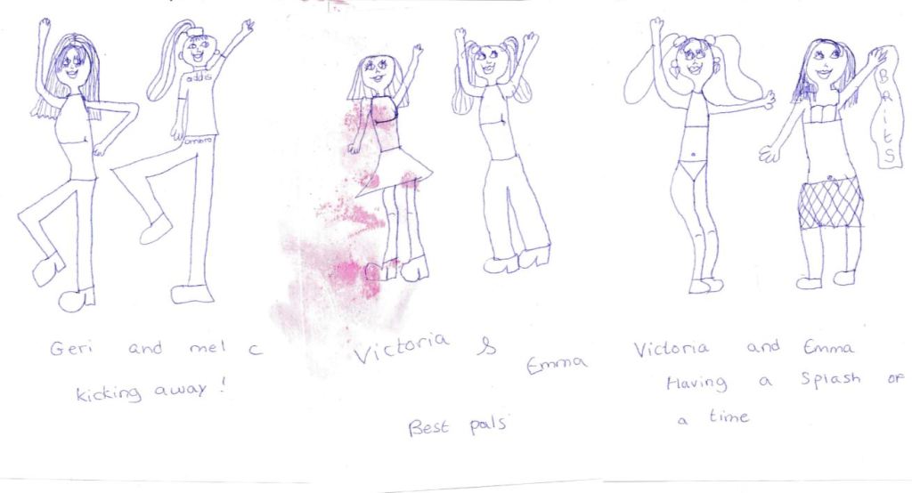
These are the first sketches of this thought process;

Once I had the initial idea in place, the next step was to perfect the poses of the silhouette children, they needed to differ from those that already exist of Margaret Calvert but they still needed to be simple to understand and have a posture that would appear as though they are playing.

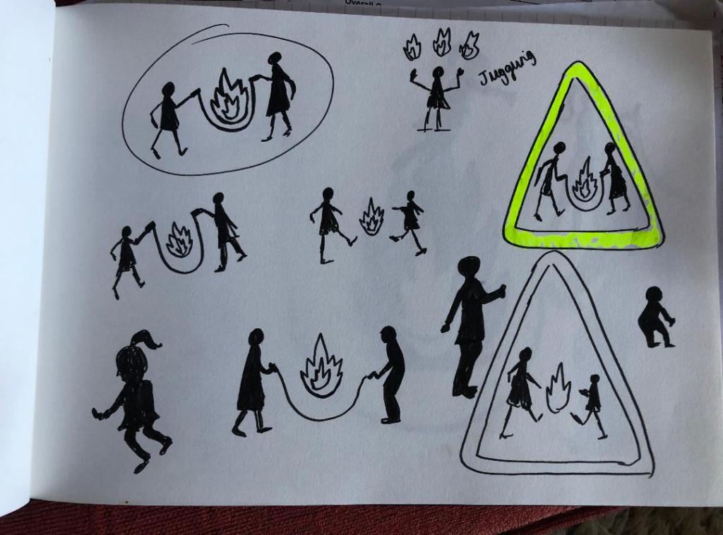
I like this pose of the girl. It is clearly visible that she is a girl and her pose is very naive and playful.

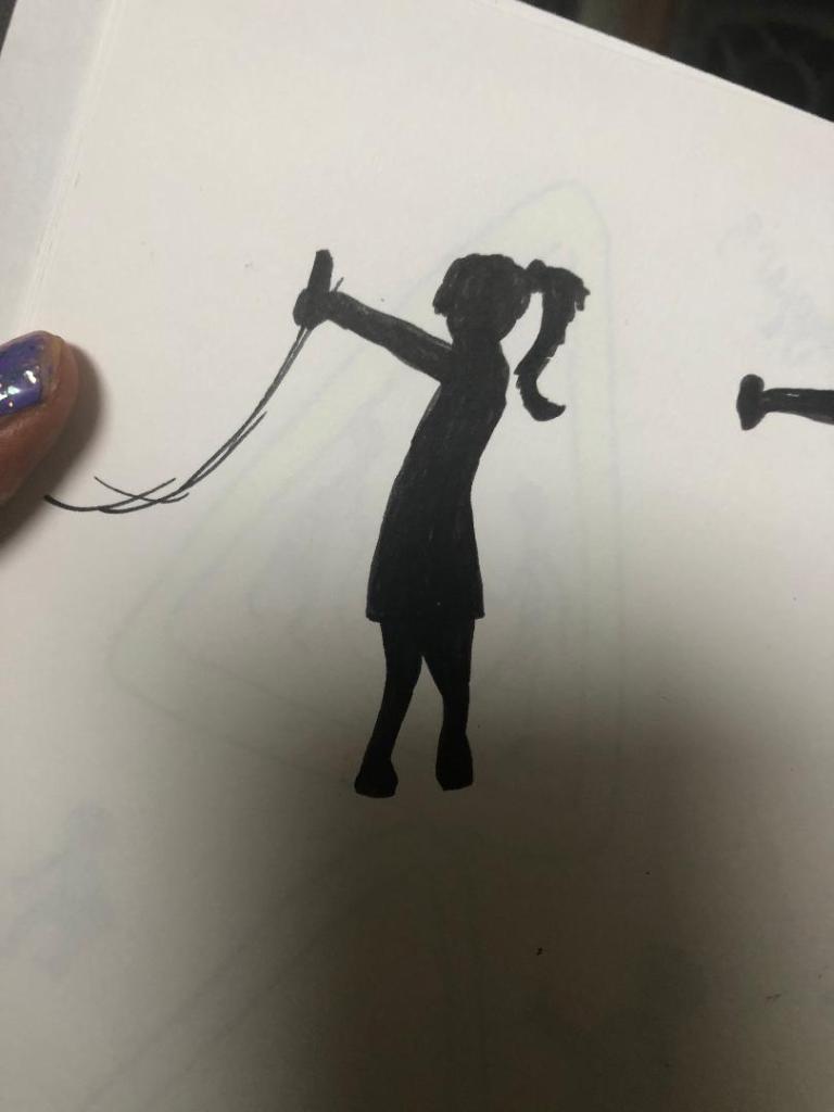
For the boy I played around with the idea of him squatting as if he was to jump or that he is moving in time to the rope swinging. His pose is not ideal and needed work.

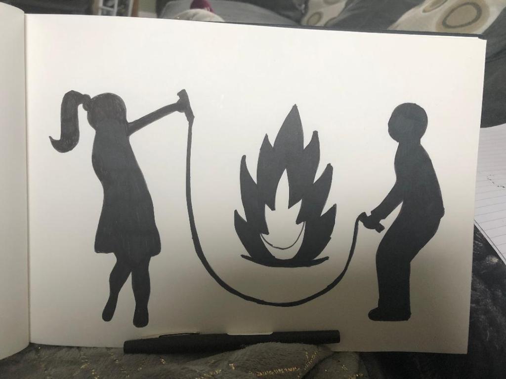
This is a rough mock up drawing that I have done of the 2 children and the fireball. There was much need for improvement on this design. The girls arm was too high up in her face and her other arm needed to be included. The boys posture was not ideal.. he looks like he is squatting from a great height off the toilet seat! – I remembered the flack that Margaret Calvert received for the men at work sign looking like an upside down umbrella and figured that if mine was a sign to actually be used in public it would be mocked considerably more!

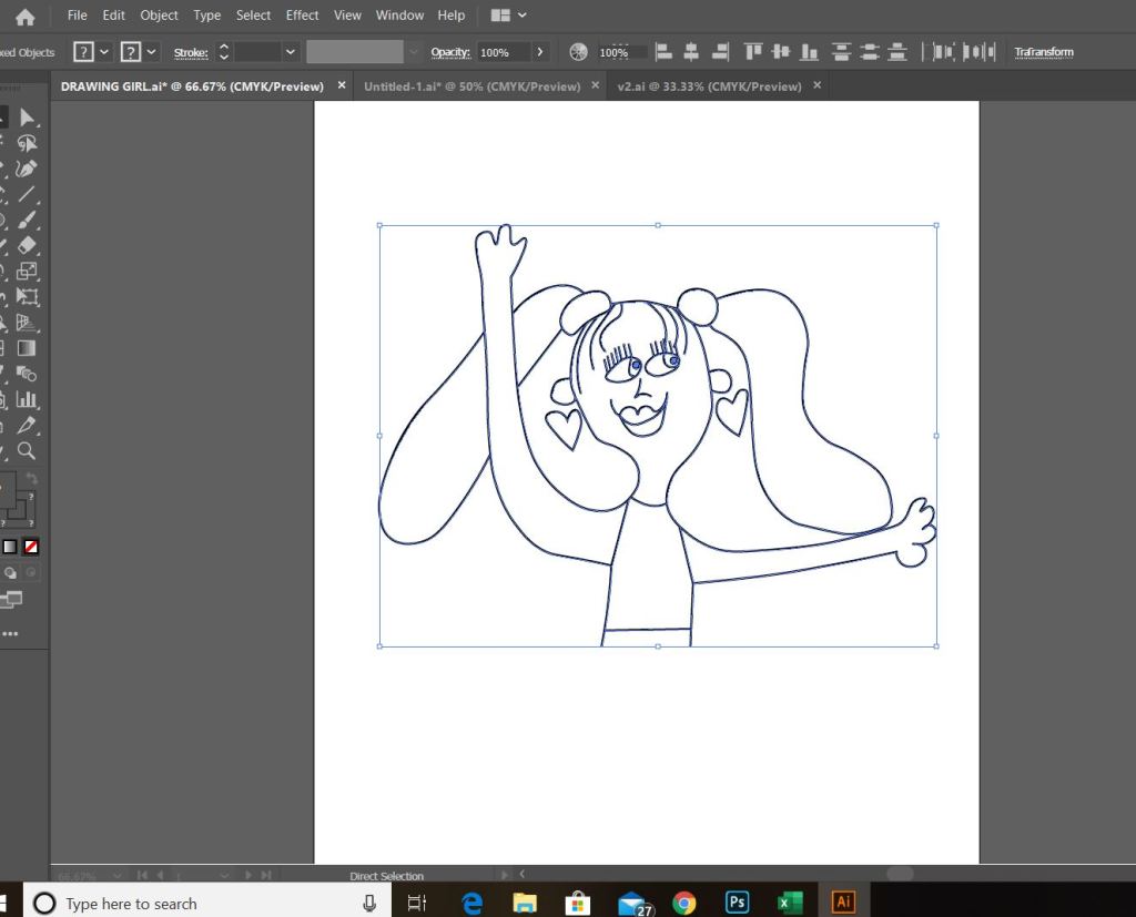
With this in mind I decided to re-look at the silhouette shapes of the children. I decided to take a photo of what I already had drawn in rough and then import it into Illustrator to draw around in there and adjust accordingly.

The above screenshot is from Illustrator. It shows the original shape of the girl that I drew on the left hand side and how I altered her into the middle girl that she now is. I altered the shape of the boy completely from the rough drawing that I originally drew of him – this version shows more movement and looks far more playful. I altered the girl slightly by copying elements from the boy (the nose, side profile of the face and the arms) and merging it into the middle image of the girl.

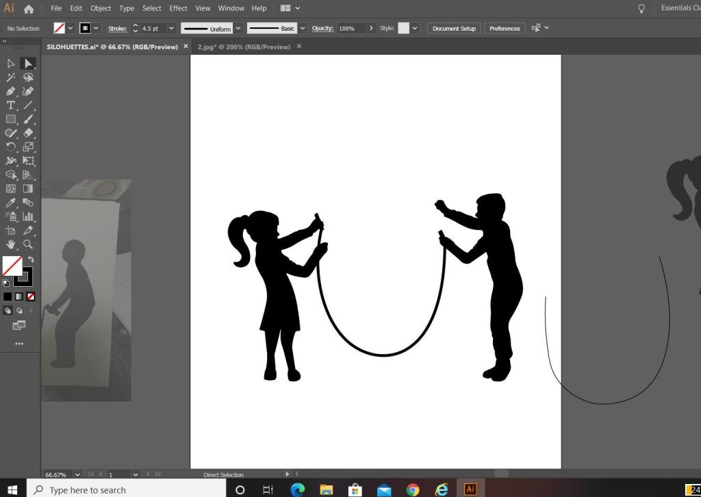
The next step was to add the skipping rope into the equation. I used the pen tool to create a perfect arc shape for it and then added handles in the hands of the children. I played with the thickness of the rope; I chose in the end to keep the rope thick in appearance to match the rest of the sign, I did think about making the thickness (or weight) of the rope thinner to give contrast to the image and to potentially break elements up to see if it would be clearer on the eye but swayed against this decision because it all needs to be bold to stand out as a caution sign potentially from a distance.

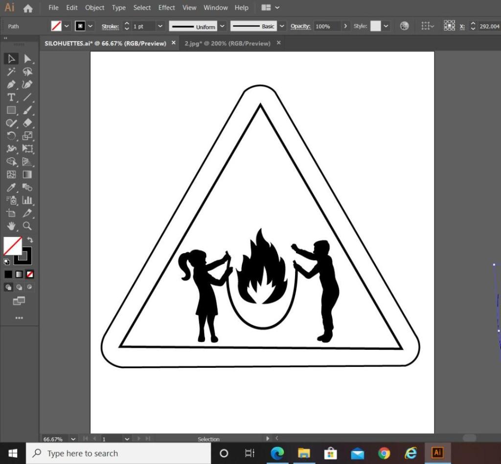
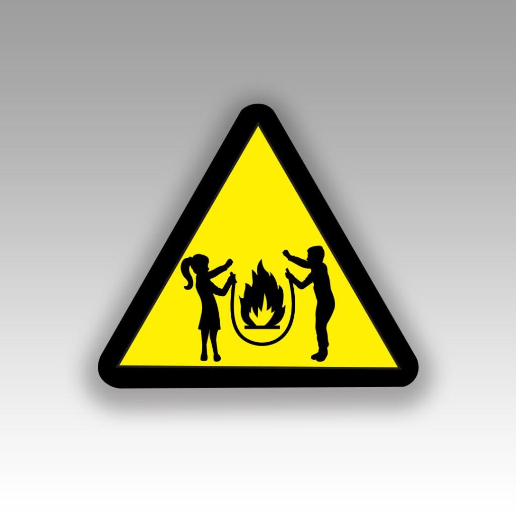
I then went on to draw the sign to put the symbol inside. The sign is a triangle warning sign, but as soon as I placed the symbol into the triangle shape I realised that I had a potential issue…

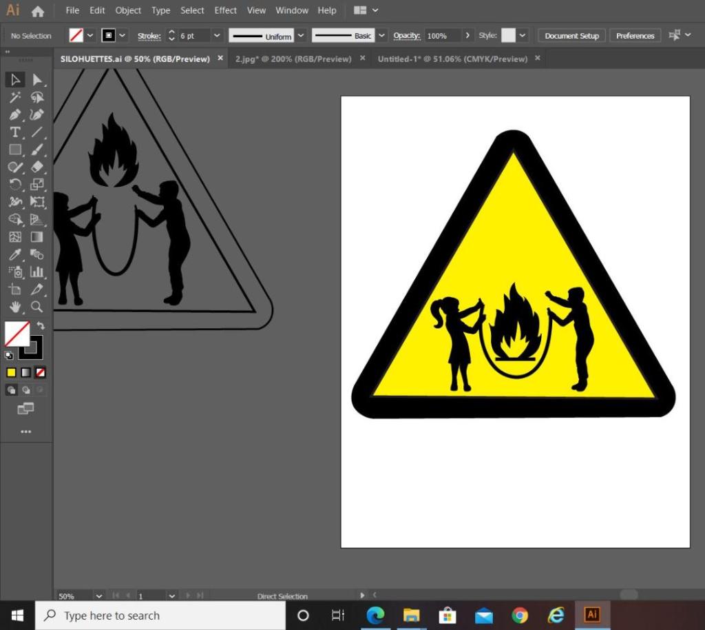
My symbol did not fill the whole inside of the triangle shape; it only filled the lower half, I knew I would have to try and play around with the sizing and positioning of the symbol itself to try and make it more dominant within the triangle. Firstly though I added colour to see how clear it works as a sign.

In the images above I was playing around with the positioning and sizing of some of the elements on my symbol. On the far left hand image (on the grey art board) you can see that I tried to decrease the gap between the children and made the skipping rope smaller and narrower; this did not work at all, the image looked distorted and squashed. The only way to make the symbol fit within the triangle shape better was to heighten the size of the children, push them together a tiny amount adjust the skipping rope accordingly. I also played around with the positioning of the flame symbol; I wasn’t sure if I wanted it to appear above the skipping rope or within the rope. Placing it above the rope shows that it is being tossed in the air by the rope, however with it placed within the rope it appears larger and also the eyes attention is drawn to the symbol as a whole rather than to different elements in different areas. The children’s arms are also high in the air and I wasn’t sure if I wanted the flame to be that little bit higher so that it appears as though they are trying to reach out and touch it as it is being flown into the air by the rope. My eye though is drawn to several different areas of the symbol when I separate it this way; with this in mind I think it is better to keep the flame low within the rope.

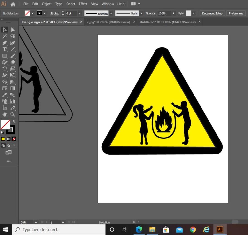
I decided to end this exercise on the above final symbol design.

I heightened the length of the children and kept the flame low in the rope to keep the eyes attention on the symbol as one whole image other than separated elements within the triangle.

Overall I am pleased with how it has turned out. I think I have met the brief by drawing on inspiration from existing signs and symbols, choosing one of the words I was given and by including a metaphor that linked to my chosen word “Danger”. I have looked into the design theory behind what makes symbols and signs effective and I have tried to include that into my own design. I would like to think that it is obvious when looking at this sign what I am referring to.

Greetings card 3 – Design Development

I chose Christina Aguilera for my 3rd and final card because she is a modern iconic blonde. Her songs are well recognised and some of her looks and music videos are iconic. I chose “Beautiful” as this is one of her best known songs and music videos and it also relates back well to the “covid roots” theme.

I started off by scouring Google for images of Christina Aguilera in her Beautiful music video to place into Illustrator to start to trace around for my main illustration. (Exactly the same as what I did for Marilyn and Blondie).

These were the images that I found. I just had to choose the perfect facial expressions for the piece. I chose the middle image.

I followed the same process as I did for Marilyn and Blondie to complete Christina’s illustration.

My final 3 finished card designs

  • The mock ups
  • Critique of my own work
  • Customer Feedback

The mock ups

The above is the layout in InDesign for my cards for if they were to be sent to a professional printers.

Critique of my own work

I have enjoyed this assignment but I do not think it will be one of my all time favourite briefs! – The brief was very open; the outcome possibilities for this assignment were very broad and I think that I would have preferred to have been given a more specific, closed brief.

There were so many subjects, events and occasions I could have done for my cards which made the possibilities endless! – I think I went for the right subject given the timing I started the assignment and with all that is going on in the world. It was the obvious choice. I tailored my cards at a specific target audience (platinum blonde females) and the cards themselves could be sent to either your favourite hairdresser who you missed so greatly during lockdown (I actually sent my designs to mine!) or they could be sent to the desperate blonde in your life just to let them know that you are “rooting” for them during the hard times!

The style of the cards are supposed to be humorous, jokey, young, fun and vibrant! I think I achieved this. I chose 3 of the most famous blondes of our time but I could have chosen more.. Dolly Parton was on the list, if I was to expand the series further she would be another face I would put on the designs. I tried to choose iconic blondes from different decades to appeal to different ages; Marilyn Monroe is relatively well known to all ages, Debbie Harry would be more specific to teenagers of the 70s whereas Christina Aguilera would be more well known to women of my age.. children of the 00s who are now in their late 20s/30s. The cards are aimed towards a target audience of late twenties +.

The messages I have used on the front of the cards relate to film titles or lyrics and I am hoping that this comes across clear to the audience. The Marilyn Monroe and Christina Aguilera ones I feel are the clearest; unless you are a Blondie fan the lyrics to “Atomic” might not be all that clear. I did think of using “Atomic” as the inside message on that card but then decided to keep all the inside messages the same – “I’m rooting for you.” I did originally write the inside of the cards in Helvetica just because I wanted a simplistic, clean message inside, however it just did not look right against the vector lettering on the front. I decided to keep the theme going and make the inside lettering the same as the front. I think this has worked well because it keeps consistency flowing throughout the designs. I also added my Pink Angeleno logo to the back of the cards.

I am hoping that the illustrations and the dark roots I have added onto each of them makes sense to the audience, I think the fact that I have used the words in the background help explain to the audience what the theme is all about (hairmare, isolation, lockdown, roots, hair). I like the illustrations; I am pleased with how they have turned out considering I was worried that they would not look anything like the celebrities themselves!

I have tried to use colours that work together and compliment each other and which work as a series. I like how the dark colours contrast with the bright pastel colours. In regards to professional printing, I have kept a max of 3 colours which would help to keep printing costs down.

My least favourite card however would be Christina’s; I just feel that the writing does not stand out as much as the other 2 when it is by itself – however when it is seen with the other 2 as a series it does work well.

The hand lettering could be difficult to read from a distance; it is not as legible as having an existing font and would definitely not be a good choice for most Graphic Design outcomes; however, I feel that having this style of lettering separates my designs from any others that are or might appear on the current market. The designs and my cards are 100 percent my artistic work; right from the original drawings and hand drawn lettering though to the end finished digital vector art and lettering.

Overall I am pleased with how my 3 designs have turned out. I had a vision in my mind of how I wanted them to look (from looking at existing products and items and finding things that inspired and influenced me) I think I have closely matched that idea in my head.

Feedback

To conclude this assignment and design process I decided to have my cards printed and made professionally so that I could send them out to get feedback and to also see how well they would be received.

I found and used a company that I found online called Snapfish.

It was a simple process of choosing the size/finish of the cards (I chose A5) and then uploading high res jpegs of each of my designs. Although it is not a typical place where designers in industry would go to complete their printing needs, for what I need right now with this assignment the website sufficed. The website at the time was offering 50% off all print costs which actually was a good deal!

When they arrived I was very impressed with the print quality (I chose a glossy finish) and my illustrations turned out really well! I would definitely purchase from this site again for any future print requirements.

I sent one of each design to my hairdresser and his team at K Collective salon. I posted them through the door one evening and awaited feedback! The feedback I received from them was really good! They were all quite impressed that I had actually drawn out the illustrations myself and designed the cards from scratch!

They featured my cards on all of their Instagram stories. I have reposted the screenshots of them here!

Development of text: hand to vector lettering

This post is dedicated to my initial ideas and thought process through to the final art development of the text that appears on the front and inside my greetings cards.

This post consists of:

  • Ideas
  • Research
  • Text artwork development

Ideas

The hardest part of this assignment was knowing how to display the messages of the cards and getting the typography right.

I did not want to use simplistic text – I did not want to choose a font and type the message out onto the card and that be that! To choose a typeface or a font and use it effectively would require me to choose an appropriate font to match the feel of my cards which I knew would have to be fun, vibrant and humorous. I knew this would possibly turn out to be a disaster because I definitely did not want “fun” “gimmicky” fonts on my cards! – (think Comic Sans!) The only way forward was to create my own vector lettering using Illustrator – although this could also be a challenge!

Research

I started to look around to find inspiration. I found it in several places.. random Instagram posts, quotes I had seen online, products I found in shops.. These are some of the images which helped to inspire the text on my cards;

This was a post on Instagram that I stumbled upon. The style of illustration is very similar to my own. I like the appearance of the text in the background. This is the sort of thing I had in mind for my own design. It looks like a brush effect has even created this style of text.

This is a quote that again I stumbled across, I was not even interested by the quote but the style of lettering on it. It looks like someone handwriting, which gave me the idea that I could too hand write the message and then import it into Illustrator and trace around it to create some vector type.

This image above again I found on Instagram; what is relevant about this post is that they have used Dolly Parton as the main focus on some postcards who is one of the blonde icons I had in mind for using on my own designs.

The above image I took a photo of whilst I was at work. My “double life” or my second job is within the retail sector (I work toiletries!) I saw this Simple bottle and the black background text on it gave me an idea as to what sort of style I could do in my own designs. The text is very much like bubble writing – at a guess it is vector lettering.

This image above is the image that inspired me the most for my card designs. It is the cover of Debut magazine that I own and I liked the style of writing and how it looks. Out of all the images I have found I shall try and replicate this image within my own designs more.

Development of vector lettering

As I stated at the beginning of this post, I did not want to use an existing font because I thought I would struggle with finding a suitable one to match the feel of my cards and to also give a professional appearance. I decided to create my own vector lettering from my own style of hand lettering…

I created 2 pieces of text for each card:

  • The main card title
  • The background text of the card

I started off by drawing out on paper the original text I planned to use for my main card title. I drew out my text using my papermate flair pen (these are ideal for ink drawings and lettering!) and then imported them into Illustrator via my scanner to trace around using the pen tool to make into vector lettering.

These are my hand drawn original lettering drawings that I then imported into illustrator to trace around:

These are the beginning stages of the main titles of each card:

The last thing to do was to create the background text for the cards.

Most of the inspiration for the background lettering that I used on my designs came from the Debut magazine cover; the cover is full of words that relate to that particular magazine which I decided I could bring forward into my own design (apart from I have used words that relate to hair, roots and lockdown)

Again, just like I did for the main text of the cards I drew out by hand the lettering for the background text and then imported it into illustrator to trace around. I chose to use the words: lockdown, Quarantine, roots, salon, hairdresser, 2020, hairmare, isolation and hair. I felt that these words best summed up the lockdown hair nightmare best!

I then imported it into Illustrator.

I then changed the colours of the text to match the cards and changed the stroke of the lettering and copied it over to the card documents to place behind the “blonde icons” (Marilyn, Debbie Harry and Christina Aguilera). I then cropped out any words that I did not need or that were out of the print border.

I then saw an inconsistency within my series of cards with the colours that I used for the text. On the Marilyn card I used white as the main text colour whereas on the rest I used black, black works a lot better. The black stands out much more and it also shows a pattern within my designs; they all follow the same colour scheme. The following images will show my development in this stage:

I then finally reached the stage where I was relatively happy with the front of my 3 designs!

Here they are in all their glory! 🙂

The next stage was to write the inside messages of the cards. I was unsure as to whether I wanted to use the same style of hand lettering that I had used on the front of all my designs or whether I wanted to use a more simplistic approach. Most greetings cards that are on the market use simple sans-serif fonts to feature inside the cards. I tried this out for mine using Helvetica. I also toyed with different messages for each of the cards; “Atomic (blonde)” for inside Blondies, “Don’t look at me” for Christina (the starting famous lyrics to Beautiful) and finally “I’m rooting for you” was the message I originally thought of with Marilyn’s.

This is what I ended up with. When I put it next to the designs it just didn’t look right. It looked like it did not belong with the cards. I decided to use the same hand lettering that I used in the rest of my designs with the same message –

“I’m rooting for you”

Again, I drew it out and traced around it in Illustrator to place on the inside of the cards.

Card 2 – Design development

The second card that I designed in my series was based around Debbie Harry (Blondie).

Debbie Harry is another iconic blonde of our time, she seemed suitable to use for one of the illustrations in my range of cards. One of Blondies most iconic songs is “Atomic” where the lyrics are: “Oh, your hair is beautiful” I decided to put a twist on this and use the lyrics as the message on my card but change it to “Oh, your hair is beautiful.. (in a hat)”. Debbie Harry was well known for wearing baker boy style hats and hats are ideal right now for covering dodgy isolation hair and roots!

All I needed to do at this point was to find a photograph online of Debbie Harry wearing a hat to be able to draw inspiration from and trace around.

This was the image that I found on Google and the beginnings of tracing around it using the pen tool in Illustrator!

This is exactly the same process as what I did with Marilyn. I traced around the image completely in Illustrator with the pen tool and just added colour, texture, tone etc! I wanted to represent Debbie Harry as true as possible from the “Atomic” music video and this image that I have found of her is not from that video.. therefore I had to find several separate images of her outfits to draw from. I did try and play the music video and screengrab from that but the resolution was too poor. In the music video she wears an iconic “Vulture” t-shirt, I searched online to find this logo to draw from.

These images below show the progress at this tracing out stage;

I actually found Blondie a lot more easier to draw out than what I did Marilyn. I don’t know whether that is because I was a little rusty from not illustrating for so long and now I have got back into the swing of things I have picked up pace?.. However, I am pleased with how she turned out!

This is my final finished drawing of Blondie;

Again, the same goes as with Marilyn – I need to research and come up with ways of how I am going to portray the message. As I explained in my previous post I want the text on the card to be in the same similar illustrative approach to the drawings… I am going to do a separate post to research my findings and document the design development around the rest of the cards.

Responding to Tutor feedback…

“Be sure to use photographic reference with care: for example, the image used as reference
for Debbie Harry doesn’t give you the clear information you need in relation to the folded
hand and visual info for the little finger. Identifying this type of issue means you just need to
reference the position, getting someone to model the position so that the fingers are not
distorted in their translation”.

I completely agree with the feedback that Bee gave me for this piece of work. Even though I have a qualification in Life Drawing, over the years my drawing skills have become a bit rusty!

I found a random image online at the time and I traced the fingers on the hand from that onto my drawing of Debbie Harry as the original photo of Debbie Harry I used as reference did not include her fingers. I tried to go back and find the image I did use to reference the hands and fingers from in my archive of photographs but sadly I did not keep it!

I have however taken this advice and used it in future exercises and assignments… for Assignment 5 I drew illustrations for a children’s book – in this me and my boyfriend modelled in photographs to use as reference and to give me an idea of scale for my own drawings! (I am so sorry Chris for including the photo of you topless ;D…I needed a reference for someone clutching something in their arm… the Pokemon toy got the short straw!)

Greetings card 1 – Design development

I decided to have a go putting my first idea into motion.. “Hairdressers are a girls best friend”

I really found the start of my Marilyn idea difficult. I scoured through to find appropriate photos on google that I could turn into illustrations but I really struggled to make them look like her digitially! These were the images I felt that I could best use:

I started off with using the photograph of Marilyn with long hair as a basis for my first attempt. I thought it would be a good photo to use as she has long hair whereas she used to have it short- this could represent during isolation it growing longer!

I drew up an illustration using this photograph as the base.. however, as much as I liked it; it did not look anything like her!

I really liked it though because of her unkempt hair, dark roots and the style I have drawn it in – (I love ink drawings). I used one of her iconic halter neck dresses but did not feel like it really helped distinguish who she is supposed to be. I then looked into “Diamonds are a girls best friend” which I could change to “hairdressers are a girls best friend” and googled her outfit that she wore in that film which was a pink dress and long matching gloves and diamond earrings and necklace. I then drew this to alter the original drawing:

I figured that this would be more recognisable as Marilyn Monroe. I then imported the images into Illustrator and drew around it to create this:

Again, the hair is clear.. but again, she looks nothing like Marilyn Monroe. I then scrapped that idea and went back to the drawing board drawing out countless faces of Marilyn Monroe to try and get it right!

I then went back to one of the other images I found on Google and decided to try and draw her face from that to see if I could draw something that might closely match Marilyn’s face. Finally I settled on something that does not entirely look like her like for like but I think you can tell who she is supposed to be (even with making her hair a little bit more longer!)

Once I had my drawing that I roughly drew out, I then scanned it onto my laptop and imported it into Illustrator so that I could start to trace around it using my pen tool in Illustrator! I used the original photograph as reference to refer to for the different colours and to get the exact details (the eyes needed details!)

I like the expression on her face in this illustration; it is a look of woe and that she is feeling sorry for herself. This matches the mood of the card entirely. I then needed to work on the main focus of the card which is the dodgy roots.

I also worked on the detailing for the necklace too. I wanted it to appear like diamonds as much as I could. (This is a screenshot from my Instagram page)

This is the finished Marilyn drawing! – complete with very dark roots! Overall I am pleased with the look of her. You can tell it is Marilyn Monroe from the outfit she is wearing which relates to the film. I like the look on her face as well at the fact she is in dismay and misery from the fact she can’t get to a hairdressers!

Now that I have finished the vector drawing of Marilyn the next stages are to complete the other designs in the series; I then need to work on the background and the messages of the cards.

I have ideas of what I want to do for the background and the messages of the cards from things I have collected and seen whilst being out and about. I want to keep the messages and the text of the cards in the same digital, illustrative format. I shall document these and this development on another post!

Assignment 2 – Thinking of you

The stages of the assignment:

  • The brief
  • First thoughts
  • First ideas
  • Research
  • Moving forward

The brief

From first look at this brief it reminded me very much of Assignment 1 where I had to design postcards to show who I am. It is a very open brief once again and allows for a lot of creativity. There were so many directions I could go down with this assignment and so many calendar dates/ events I could explore to create a range of greetings cards for!

There are no specifications either for what format the finished artwork should be in, i.e.; digital, vector art, photographic, hand drawn, collage etc.. so there were very few limitations for this assignment.

First thoughts!

I start off this assignment in a very strange and unpredictable time, sitting at my desk in lockdown!.. I did think I had a rough final idea for one of these cards and I actually did some rough drawings and writings for this assignment way back in October when my car went in for it MOT and cost me a lovely little £800!….(*massive eye roll!) I had the idea of a card to remind you of how much of a failure your car is and as a friendly (the least expensive part at least!) reminder for its MOT but now with the current situation and climate I felt that it was more appropriate to do designs relating to Covid-19 or as we all are now too familiar with… our least favourite C- word…. Coronavirus! I think that to try and bring some positives out of the situation might be nice. Everyone is concentrating on the negatives but there are actually many positives there… as Hugh Grant says in Love actually – ” If you look for it – I’ve got a sneaking suspicion that love IS all around”. The fear of change, the fear of the unknown, people sadly dying…. but there is also a lot of good to take from the situation. Children are painting rainbows on walls, hiding teddies in windows for children to find on their “bear hunt” daily exercise, people are posting bright, happy, colourful pictures in windows (even the adults are!.. I’ll get to that in a minute! :P) there is clapping for our wonderful NHS, there is praise for keyworkers and people stop each other to thank them for the work they are contributing. Nature roams the streets once again and rivers are running clear.. Another quote – “Muddy water left long enough will clear again”. These times are not forever, just waves that we have to ride out. These can also be uplifting times that remind us that although we are facing a pandemic like none other we have seen or hopefully will ever see again in our lifetimes.. we are all united and in this together.

Motivational speech done! 😀

and I almost forgot… oh yep… adults posting stuff in windows…

my house currently! – (I am not apologising! ;D)

First Ideas

So what do I miss most other than alcohol?.. and to be honest I am not missing that!.. My insides must literally be like the contents of hand sanitiser.. 99% alcohol! I certainly have not gone without this isolation and also with the weather being as wonderful as it is right now has definitely made isolating in the garden 100 x better! I do however miss my social life, freedom and being able to meet up with friends where and when I can! (although to be honest the majority of them I work with every night!) I have only just this month since the rules have been relaxed more, met up with my family who I hadn’t seen in 9 weeks!

I had a conversation with my best friend down voice note on WhatsApp to what I could potentially do for my greetings cards in the time of the dreaded “rona”.. I have hardly seen her either until fairly recently, usually we would meet up once a week on a Sunday and go for a long walk in the sun, grab some beers and chill out into the early evening at her house with a takeaway but now we are sneaking beer into children’s’ beakers like we are 15 again and drinking along the riverbank outside! Her response was simple… design cards for couples who are isolating away from each other (my sister and her fiancé – who again up until recently were having to have virtual date nights and meals) and design cards for best friends who cannot see each other. The idea she came up with was to create a card to send off to your lover/friend/family as like an invite for a virtual meet up; set time aside to facetime and put on a face mask (not a corona mask – a beauty face mask!) watch a movie together or have a meal together! I thought this was a good idea as many people would do this… however it could be deemed more as an invite than a greetings card…

I had an idea of virtual kisses in my head and the vision of someone wearing a face mask with bright pink lips drawn on the front of them.. (pink obviously is my signature colour!) This is possibly inspired subconsciously in my mind by Vogue Portugal’s April cover I love which shows a model couple kissing through face masks. I love the concept behind it! “Freedom on hold” so much so that I actually ordered a copy of the magazine and a commemorative print to frame in my house! (as weird as that might sound!) It also reminds me a lot of the CK one advert from 2003 that I also have a print of in my house!

I then brainstormed about what have played a crucial part in this whole experience so far.. I came up with:

  • toilet rolls
  • hand sanitiser
  • face masks
  • dodgy hair roots
  • quarantine/isolation
  • social distancing
  • washing hands
  • stay at home
  • 2 metres
  • queues
  • non hand shakes
  • save the NHS
  • home schooling
  • pyjamas
  • alcohol consumption
  • virtual hugs
  • virtual Instagram clubs (one of my faves is Gok Wans!)
  • potential C-19 baby boom!

At the moment I have an idea for one card which at the moment is a MASSIVE problem for me! My hair is platinum blonde and because of the hairdressers closing for the duration my roots are TERRIBLE! My usual 8 week appointment is currently a 12 week colour correction and as my appointment was supposed to be a day after lockdown happened 😦 (worst timing ever!..) I am on the verge of looking like Cruella De Ville! One card that came to mind was “I thought blondes had more fun?…” and inside the message “I’m rooting for you”. It is a play on words and very relevant to a lot of ladies right now who bleach! I quite like the illustrative style I did for assignment one (my Pink Angeleno post cards which I created in Illustrator) so the idea that came into my head for this was something very similar. Obviously the cards would be tailored to girls and women with platinum blonde hair! I thought of having an illustration of Marilyn Monroe despairing at her hair on the front as she was known for the quote “Gentlemen prefer blondes” and “Blondes have more fun”.

With this idea in mind I scoured google for some images of Marilyn Monroe for some inspiration… Just to see where I could go with it! I absolutely love Marilyn Monroe – she was an icon! I am always aware though that her image has been massively over used and dare I say over abused! – There are a lot of cheesy, tacky designs out there with her face on and obviously I would not want my designs to fall into that category! However, this photo I found gives me inspiration for progressing the idea further. In this image she has long hair whereas it is usually short – again, representative of the fact no one can get to a hairdressers! I have a vision of her rolling her eyes and holding a can of dry shampoo (root cover up) just for the funny factor! The perfect heading seems like it could be “Hairdressers are a girl’s best friend” it would be the ideal card to send to your hairdresser in this time of need or with the message “I’m rooting for you” inside just makes it a supportive card to send to that desperate blonde in your life!

I then had the idea that I could make a series of cards using the same theme.. If I found some iconic blondes from throughout the times to feature on the front of the cards with their own message. A few that I initially thought of are:

  • Blondie – “You’re hair is beautiful (in a hat!) the lyrics from Atomic.
  • Christina Aguilera – “You are beautiful (even with roots)” the lyrics from Beautiful
  • Dolly Parton “Jolen, Jolen, Jolen… ” after the song Jolene but “Jolen” because that is the name of a brand of bleach. I would have to cleverly think this idea through because there is a brand name involved and also because the original song was aimed at a redhead not taking her man!

Although I like my illustrative style for these cards, I would also like to explore more around the “swiss grit” idea like what I did for my “Xtinction” poster in the exercise “Too much or not enough information” I really enjoyed experimenting with this style and was really pleased with the outcome! It was different to anything I have designed before.

Isolation cards research

Before I continued with this idea I first needed to establish whether the idea has been done before.. There are a LOT of isolation/quarantine cards online already for people to purchase to send to loved ones and friends during the lock down and also for people who are unfortunate enough to have a birthday during this time. However, so far (fingers crossed) I have not found any cards that relate to dodgy hair roots! I have seen some for dodgy hair cuts but none for platinum blondes who need their roots doing!

I created a Pinterest board for some of the inspiration that I found that helped me with my ideas for my designs. On this board were some isolation memes as well which made me laugh! The idea is that I want to create cards that bring humour to a bad situation!

Where would my cards be sold?

Another very important question is where would my cards be sold? I have potentially found a target audience and a niche or a gap in the market for my cards but now I need to think of where they could possibly be sold. There are so many card shops and stationery shops which appeal to the kind of card that I wish to design..

My three personal favourites are:

  • Paperchase
  • Scribbler
  • Typo

All these shops are at Cambridge, one of my favourite places to visit and everyone who ever goes there with me know that I drag them around like a big kid laughing at the hilarious cards! – especially Scribbler.. their cards are so inappropriate but at the same time funny! Typo is also a quirky shop which specialises in stationery with funky patterns, prints and designs. They also do a range of postcards and greetings cards.

However, in the current climate with the ongoing Corona virus; no one can get to the shops and the shops are not open so the best alternative is online.

There are a lot of online card shops – Love Layla being another hilarious one!

https://www.paperchase.com/en_gb/

https://typo.com/UK/

https://www.scribbler.com/

https://www.lovelayladesigns.co.uk/

Moving forward

From my initial thoughts and ideas about this assignment, I am now going to move forward to Idea 1 and start creating the design and artwork for this. I am going to start with the Marilyn idea and start creating this in Illustrator. The artwork will be vector, digital art!

Point of sale display

The Brief:

I could not have started this exercise at the worst possible time!… with the ongoing Corona Virus that has hit the world and currently put the UK into lockdown… The brief states to take photographs of fruit and veg which in normal times would not be an issue, however with the state of things at the moment (not being allowed out the house only for essentials and all the social distancing) the shortage of products and fresh produce in the shops I really had to think about this brief!

I started this brief by firstly looking into what point of sale is (POS) I have done point of sale design once before and that was for my GCSE Graphics product where I designed a video display! (showing my age!) I started doing some research by googling point of sale displays for fruit and vegetable shops. The whole idea of point of sale is to be near the point where customers would pay to attract sales more.

Most of the findings were:

  • Hanging signs
  • posters
  • fruit and veg cardboard promotional holders
  • standees
  • baskets at checkout points

The brief states that my POS needs to be in the window to attract passers by and to go above the fruit and veg in their shop. The brief also states that “the posters will be seen from quite a distance” (which is a crucial part I almost missed!)

I established that it needed to be posters that I was designing. In theory in my head I was thinking that it would be fruit on one side of the shop window and veg over the other side of the shop window. (Uusally fruit and veg are down different aisles).

I then looked into who the target audience would be for this POS. The brief states that the shop is in a small precinct that it shares with a baker, newsagent, shoe shop and is en route to a primary school. In my head this gives me the idea of a very local, warm, family driven community. It also gives an exclusive, elite feel. It seems as though only a small community would use these shops. My initial thoughts were that I should be designing high quality designs to match the overall impression of the precinct.

There is strong emphasis on the primary school. This is where I am led to believe that the brief wants to target parents and their children on the school run. I decided to focus one poster for girls and one for boys. I had the idea to focus the girls poster around fruit – I could make the poster quite girly with summery, pink, vibrant colours. I decided to focus the boys poster on vegetables such as broccoli which make you strong and build muscles etc.

I used my Pinterest to search for different ideas on how to make fruit and vegetables appealing for children:

I decided that the best way to make fruit and veg more appealing for children is to either dip it completely in chocolate (as my friend suggested! *eye roll!) or try and healthily disguise it.

I decided to start off in familiar territory! – designing for the girls!

The brief suggests taking photographs of whole, sliced or dissected pieces of fruit or using illustrations to portray them. I decided to try and mix the two together in a “childlike” way. Children like to play with food and after finding an idea on Pinterest for summer fruit ice lollies I got the idea to create my own!..

Ice lollies are appealing to children especially with the upcoming summer months and they are also a healthy way to get fruit into a child’s diet. I had the idea though to use photographs of actual fruit and the lollies but then to add childish illustrations onto them as if a child had drawn them on themselves. I had the idea to make the lolly into a figure – the lolly as the body, the stick as the legs and then I would create an illustration of a girl or something to feature on top of it. I did have the idea to make the figures into superheroes as when I was googling ways to make children want to eat fruit and veg and how important they are to children’s diets, it suggested that they are like super vitamins – real life powers.

I started off with making the fruit ice lollies… I managed to queue my way through social distancing/isolation hell in Aldi and pick up some strawberries, raspberries, cherries, blueberries and melon slices. I also ordered some ice lolly moulds off Amazon and set to work making them! I also chopped some fruit up to create some flatlay photography to use in the background of my posters!

** Small confession – these are actually not appropriate for children! I did use rose to add colour to the lollies and to make them more appealing for me to eat afterwards!! – especially during lockdown! haha! For actual children’s lollies fruit juice could be used instead!

These are some of my photographic pieces where I had the idea to take them into Photoshop and tweak them up and add the lollies at a later date.

I then uploaded them into Photoshop to tweak and potentially make into the posters! The sizes that the brief specifies are landscape A1.. however, them file sizes would be massive to work on and save so I have downsized my artwork to A3 so that then they can be saved as a PDF or JPEG and scaled up.

After a few hours of waiting for the lollies to freeze, I took them out and attempted (several times!) to photograph them… Whilst on facetime to one of my best friends (in my lockdown fashion attire! – dressing gown!) who was also laughing at me trying to pull the lollies out of the moulds and watching them fly across my kitchen! FAIL!

I ended up with these photographs that I then uploaded to Photoshop to adjust the colours and cut around the image etc..

I then altered the colours to make them more vibrant and more tempting in appearance.

I then added the lolly into my design creating a drop shadow behind it so that it did not look flat, whilst duplicating the stick to create the appearance of legs for my figure. I changed the background colour to pink to match the target audience I was aiming at and to also give the summer feeling that I was hoping to achieve.

I then had a go at drawing some of the illustrations along the bottom of the design. I wanted to include some facts about the fruit in there to make it factual as well as childlike. I decided to add butterflies, bees and flowers to give a summer vibe to start with.

I then needed to figure out what kind of illustration to use for the figure on the lolly. I originally had an idea similar to fashion illustration but figured that this would not really be relevant to young children and they would not relate to it! I then had the idea to actually use a child’s drawing as the illustration – this would then encourage the children to create their own fruit lollies and maybe use the illustrations as inspiration to create their own illustrations for their own lollies. I asked one of my friends if her daughter would be willing to draw me a girly illustration for my piece….. sadly she declined! DECLINED!! lol! I then almost gave up on the idea until I realised that over in the Tarantulas den (my garage!) my Mum kept boxes and boxes of me and my sisters schoolwork and drawings. I managed to fight off my fear of the spiders hanging off the beams in there and find some drawings (which mostly made me laugh at my young, unrealistic views on romance!) but that also that I might be able to use in my design! The ones that seemed most appropriate were cartoons I drew of the Spice Girls back in 1997! I scanned them in and then drew around one in illustrator!

I then went about bringing that into Illustrator and placing it on my design to see what I thought…

I hated it! I did not like it at all! It looked cluttered, all over the place, lack of space and just really amateurish! The idea behind it was good but it just did not come together right in my opinion! I feel as though the attention is taken from the main purpose of the poster. The focal point becomes the illustrations rather than the fruit itself.

I then stripped back the designs to come up with another route to go down.. I also added in the background lolly drips as I thought this would help to not make the image so flat.. I liked this adjustment.

I really just liked the space that was left on the image… however I knew that I could not keep the design this way as it was not communicating a message at all!

I then decided to bring in the other 2 lollies (the power of 3!) onto the design and make them bigger so that they are the main focal point of the design.

I added drip marks also onto the lollies to give the childlike illustrative effect again. I liked this design a lot more than the previous but it still needed work. There is less negative space now which I dislike and also it still seems quite chaotic… although I don’t know if this is good or bad as it is designed to get the attention of children and for that to happen it needs to be interactive, fun, colourful and “alive!”

I also needed to think about the message that would finally appear on the poster. I needed something witty and fun that relates to strawberries. I also looked into the typeface for the message and decided there could only be one clear, bold, sophisticated one for the job….. Helvetica! Again, I had to think about this because I have already used a different typeface for the childlike text on the illustrations… the rule is really only 1 typeface.. 2 at the most but they need to contrast each other impeccably! The 2 typefaces I used are both sans-serif which do not really contrast and also I chose to align the text ragged right… Breaking some serious design laws there!

I then decided to put it to the world of Facebook to see if anyone could come up with a decent pun for my poster… my work colleague and her husband came up with “Sweet treats for tiny feet” I quite liked this because it relates to the sweetness of the fruit and the treat being the lolly but also the fact that it is for young children. I then decided to bring back one of my original ideas for the design; the second lolly stick for the second leg.. it relates back to the tiny feet!

I also attempted to add contrast… adding the dashed lines with a heavier weight allows the lollies to be seen more and stand out. I also added shoes onto the lolly sticks to give more the impression of lively little feet!

I decided to stick with Helvetica for the text, It is clear, legible, functional and reminds me very much of a ladybird book for children (in that the letters are childishly spaced and easy to read)

This is my final piece for poster number 1 aimed towards fruit and targeted towards young girls and their families. I am pleased with how it has turned out! I feel that it is bright and engaging for a window to attract attention but also to deliver the message that eating fruit can be sweet and fun! Hopefully it would inspire the idea to create their own lollies at home to encourage getting fresh fruit into their daily diet.

Poster 2

I then went about poster number 2. I knew that I wanted this poster to be exactly like the first in appearance but to have the text aligned ragged left on this one. When they both go in opposite windows they would reflect each other.

This poster was to represent vegetables and I decided to aim it at boys. I wanted to use the same design layout as the first poster that I created. I firstly figured out what I would try and make out of veg to try and appeal to lads!

I scoured my Pinterest again… I found trains made out of peppers and celery.. faces made of different elements of food but I still felt stuck!

For some reason Dinosaurs stuck out to me… I went on Amazon and found some cookie cutters in Dino shapes that appealed to me.. now what on earth could I make with them that promotes vegetables and eating healthily in a “fun” way?…

What followed was a couple of days in the making! – The first day a complete disaster!…

I decided to make vegetable patties in the pan with the cookie cutter and have it cook to the shape of the Dino! – The thought was there but in reality it was horrendous! It involved a 5 hour facetime chat with my best mate trying to teach me how to make mashed potato to make the mixture gel together! (I am the worst cook EVER! – HATE COOKING! It has just never interested me in the slightest lol!)

I compared these above images to a meme that absolutely cracks me up! xD

So after a day of making 3 lots of mixture and trying them out in 3 different ways I went to bed deflated and uninspired.. Then came breakfast where I had the idea to make myself an omelette with my leftover salad and veg, I then had the idea to cook the omelettes into the cutters! – this way also you would see the bright colours and be able to visually see the veg in the omlettes!

This idea worked out much better!

The only one that didn’t turn out great was the pterodactyl! He fell apart at the seams! I did not include him in the finals!

I also took photographs of segments of veg and arranged them in a way that would appear at the bottom of the poster.

I then adjusted and altered it in Photoshop.

I then brought in the photographs of the Dinosaurs and adjusted and altered them to make them look more visually appealing for the poster.

I then started work on the final poster, same format as the first one – A3 in size which is more manageable to work on within the design software and in industry it could be blown up or shrunk down. I went for the same approach, apart from that I did not use the melted lolly drips. I decided to use greens in this design to match the theme of Dinosaurs and in replacement of the lolly drips I used grass instead.

I then took this into Illustrator and worked the same illustrative style on it as the first poster. Again, it is very childlike in appearance and bright and colourful which is ideal for the target audience.

Again, I used the typeface “Felt tip woman Bold” for the little captions around the veg… It works for the childish factor but I am not a fan of using it really in my work! I must prefer to use clear, sans serif typefaces! I also had to put 2 different typefaces together on this piece also and again I am not a fan of doing that.. also as “felt tip woman bold” is also a sans serif typeface.. there is no contrast between the 2. However, it is a fun typeface and would be appealing to children and their families… it gives a happy, friendly vibe.

I then had the problem of finding a pun or a headline for this poster.. which actually did not take me very long at all! I wanted to include the fact that the omelette could have been made using Dino eggs and that the veggies are awesome or ROAR-some.. The headline I went for was “ROAR-some veg on Dino eggs” I feel that this works. It says what it is but in a clever fun way.

I had to play around with the spacing and text size however to get the right feel for the message. “Roar” had to “ROAR” and for that to happen it had to be bigger than the rest of the body copy. I then had to alter the leading of the rest of the text so that it looked right.

This is what I ended up with… I could have gone on with this exercise and tried to further improve it some more.. I was not happy at the placement of the hyphen but I felt it worked better on the second line that what it did on the first.. but I try and remind myself that Perfection can never be achieved and that time is ticking to get through the rest of the unit…

These are the finished mock ups! I tried to find a fruit and veg shop with windows that I could use to place my posters into, however I could not find one at all! I found this stock photo image (in the slideshow below) and imposed my posters onto it to give an idea of what they might look like on display in an actual shop!